Creating The “Moving Highlight” Navigation Bar With JavaScript And CSS

Creating The “Moving Highlight” Navigation Bar With JavaScript And CSS

Creating The “Moving Highlight” Navigation Bar With JavaScript And CSS

Blake Lundquist

2025-06-11T13:00:00+00:00
2025-06-20T10:32:35+00:00

I recently came across an old jQuery tutorial demonstrating a “moving highlight” navigation bar and decided the concept was due for a modern upgrade. With this pattern, the border around the active navigation item animates directly from one element to another as the user clicks on menu items. In 2025, we have much better tools to manipulate the DOM via vanilla JavaScript. New features like the View Transition API make progressive enhancement more easily achievable and handle a lot of the animation minutiae.

An example of a “moving highlight” navigation bar
(Large preview)

In this tutorial, I will demonstrate two methods of creating the “moving highlight” navigation bar using plain JavaScript and CSS. The first example uses the getBoundingClientRect method to explicitly animate the border between navigation bar items when they are clicked. The second example achieves the same functionality using the new View Transition API.

The Initial Markup

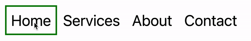
Let’s assume that we have a single-page application where content changes without the page being reloaded. The starting HTML and CSS are your standard navigation bar with an additional div element containing an id of #highlight. We give the first navigation item a class of .active.

See the Pen [Moving Highlight Navbar Starting Markup [forked]](https://codepen.io/smashingmag/pen/EajQyBW) by Blake Lundquist.

See the Pen Moving Highlight Navbar Starting Markup [forked] by Blake Lundquist.

For this version, we will position the #highlight element around the element with the .active class to create a border. We can utilize absolute positioning and animate the element across the navigation bar to create the desired effect. We’ll hide it off-screen initially by adding left: -200px and include transition styles for all properties so that any changes in the position and size of the element will happen gradually.

#highlight {
  z-index: 0;
  position: absolute;
  height: 100%;
  width: 100px;
  left: -200px;
  border: 2px solid green;
  box-sizing: border-box;
  transition: all 0.2s ease;
}

Add A Boilerplate Event Handler For Click Interactions

We want the highlight element to animate when a user changes the .active navigation item. Let’s add a click event handler to the nav element, then filter for events caused only by elements matching our desired selector. In this case, we only want to change the .active nav item if the user clicks on a link that does not already have the .active class.

Initially, we can call console.log to ensure the handler fires only when expected:

const navbar = document.querySelector('nav');

navbar.addEventListener('click', function (event) {
  // return if the clicked element doesn't have the correct selector
  if (!event.target.matches('nav a:not(active)')) {
    return;
  }
  
  console.log('click');
});

Open your browser console and try clicking different items in the navigation bar. You should only see "click" being logged when you select a new item in the navigation bar.

Now that we know our event handler is working on the correct elements let’s add code to move the .active class to the navigation item that was clicked. We can use the object passed into the event handler to find the element that initialized the event and give that element a class of .active after removing it from the previously active item.

const navbar = document.querySelector('nav');

navbar.addEventListener('click', function (event) {
  // return if the clicked element doesn't have the correct selector
  if (!event.target.matches('nav a:not(active)')) {
    return;
  }
  
-  console.log('click');
+  document.querySelector('nav a.active').classList.remove('active');
+  event.target.classList.add('active');
  
});

Our #highlight element needs to move across the navigation bar and position itself around the active item. Let’s write a function to calculate a new position and width. Since the #highlight selector has transition styles applied, it will move gradually when its position changes.

Using getBoundingClientRect, we can get information about the position and size of an element. We calculate the width of the active navigation item and its offset from the left boundary of the parent element. Then, we assign styles to the highlight element so that its size and position match.

// handler for moving the highlight
const moveHighlight = () => {
  const activeNavItem = document.querySelector('a.active');
  const highlighterElement = document.querySelector('#highlight');
  
  const width = activeNavItem.offsetWidth;

  const itemPos = activeNavItem.getBoundingClientRect();
  const navbarPos = navbar.getBoundingClientRect()
  const relativePosX = itemPos.left - navbarPos.left;

  const styles = {
    left: `${relativePosX}px`,
    width: `${width}px`,
  };

  Object.assign(highlighterElement.style, styles);
}

Let’s call our new function when the click event fires:

navbar.addEventListener('click', function (event) {
  // return if the clicked element doesn't have the correct selector
  if (!event.target.matches('nav a:not(active)')) {
    return;
  }
  
  document.querySelector('nav a.active').classList.remove('active');
  event.target.classList.add('active');
  
+  moveHighlight();
});

Finally, let’s also call the function immediately so that the border moves behind our initial active item when the page first loads:

// handler for moving the highlight
const moveHighlight = () => {
 // ...
}

// display the highlight when the page loads
moveHighlight();

Now, the border moves across the navigation bar when a new item is selected. Try clicking the different navigation links to animate the navigation bar.

See the Pen [Moving Highlight Navbar [forked]](https://codepen.io/smashingmag/pen/WbvMxqV) by Blake Lundquist.

See the Pen Moving Highlight Navbar [forked] by Blake Lundquist.

That only took a few lines of vanilla JavaScript and could easily be extended to account for other interactions, like mouseover events. In the next section, we will explore refactoring this feature using the View Transition API.

Using The View Transition API

The View Transition API provides functionality to create animated transitions between website views. Under the hood, the API creates snapshots of “before” and “after” views and then handles transitioning between them. View transitions are useful for creating animations between documents, providing the native-app-like user experience featured in frameworks like Astro. However, the API also provides handlers meant for SPA-style applications. We will use it to reduce the JavaScript needed in our implementation and more easily create fallback functionality.

For this approach, we no longer need a separate #highlight element. Instead, we can style the .active navigation item directly using pseudo-selectors and let the View Transition API handle the animation between the before-and-after UI states when a new navigation item is clicked.

We’ll start by getting rid of the #highlight element and its associated CSS and replacing it with styles for the nav a::after pseudo-selector:


- #highlight {
-  z-index: 0;
-  position: absolute;
-  height: 100%;
-  width: 0;
-  left: 0;
-  box-sizing: border-box;
-  transition: all 0.2s ease;
- }

+ nav a::after {
+  content: " ";
+  position: absolute;
+  left: 0;
+  top: 0;
+  width: 100%;
+  height: 100%;
+  border: none;
+  box-sizing: border-box;
+ }

For the .active class, we include the view-transition-name property, thus unlocking the magic of the View Transition API. Once we trigger the view transition and change the location of the .active navigation item in the DOM, “before” and “after” snapshots will be taken, and the browser will animate the border across the bar. We’ll give our view transition the name of highlight, but we could theoretically give it any name.

nav a.active::after {
  border: 2px solid green;
  view-transition-name: highlight;
}

Once we have a selector that contains a view-transition-name property, the only remaining step is to trigger the transition using the startViewTransition method and pass in a callback function.

const navbar = document.querySelector('nav');

// Change the active nav item on click
navbar.addEventListener('click', async  function (event) {

  if (!event.target.matches('nav a:not(.active)')) {
    return;
  }
  
  document.startViewTransition(() => {
    document.querySelector('nav a.active').classList.remove('active');

    event.target.classList.add('active');
  });
});

Above is a revised version of the click handler. Instead of doing all the calculations for the size and position of the moving border ourselves, the View Transition API handles all of it for us. We only need to call document.startViewTransition and pass in a callback function to change the item that has the .active class!

Adjusting The View Transition

At this point, when clicking on a navigation link, you’ll notice that the transition works, but some strange sizing issues are visible.

The view transition with sizing issues
(Large preview)

This sizing inconsistency is caused by aspect ratio changes during the course of the view transition. We won’t go into detail here, but Jake Archibald has a detailed explanation you can read for more information. In short, to ensure the height of the border stays uniform throughout the transition, we need to declare an explicit height for the ::view-transition-old and ::view-transition-new pseudo-selectors representing a static snapshot of the old and new view, respectively.

::view-transition-old(highlight) {
  height: 100%;
}

::view-transition-new(highlight) {
  height: 100%;
}

Let’s do some final refactoring to tidy up our code by moving the callback to a separate function and adding a fallback for when view transitions aren’t supported:

const navbar = document.querySelector('nav');

// change the item that has the .active class applied
const setActiveElement = (elem) => {
  document.querySelector('nav a.active').classList.remove('active');
  elem.classList.add('active');
}

// Start view transition and pass in a callback on click
navbar.addEventListener('click', async  function (event) {
  if (!event.target.matches('nav a:not(.active)')) {
    return;
  }

  // Fallback for browsers that don't support View Transitions:
  if (!document.startViewTransition) {
    setActiveElement(event.target);
    return;
  }
  
  document.startViewTransition(() => setActiveElement(event.target));
});

Here’s our view transition-powered navigation bar! Observe the smooth transition when you click on the different links.

See the Pen [Moving Highlight Navbar with View Transition [forked]](https://codepen.io/smashingmag/pen/ogXELKE) by Blake Lundquist.

See the Pen Moving Highlight Navbar with View Transition [forked] by Blake Lundquist.

Conclusion

Animations and transitions between website UI states used to require many kilobytes of external libraries, along with verbose, confusing, and error-prone code, but vanilla JavaScript and CSS have since incorporated features to achieve native-app-like interactions without breaking the bank. We demonstrated this by implementing the “moving highlight” navigation pattern using two approaches: CSS transitions combined with the getBoundingClientRect() method and the View Transition API.

Resources

Smashing Editorial
(gg, yk)

Building An Offline-Friendly Image Upload System

Building An Offline-Friendly Image Upload System

Building An Offline-Friendly Image Upload System

Amejimaobari Ollornwi

2025-04-23T10:00:00+00:00
2025-06-20T10:32:35+00:00

So, you’re filling out an online form, and it asks you to upload a file. You click the input, select a file from your desktop, and are good to go. But something happens. The network drops, the file disappears, and you’re stuck having to re-upload the file. Poor network connectivity can lead you to spend an unreasonable amount of time trying to upload files successfully.

What ruins the user experience stems from having to constantly check network stability and retry the upload several times. While we may not be able to do much about network connectivity, as developers, we can always do something to ease the pain that comes with this problem.

One of the ways we can solve this problem is by tweaking image upload systems in a way that enables users to upload images offline — eliminating the need for a reliable network connection, and then having the system retry the upload process when the network becomes stable, without the user intervening.

This article is going to focus on explaining how to build an offline-friendly image upload system using PWA (progressive web application) technologies such as IndexedDB, service workers, and the Background Sync API. We will also briefly cover tips for improving the user experience for this system.

Planning The Offline Image Upload System

Here’s a flow chart for an offline-friendly image upload system.

Flow chart of an offline-friendly image upload system

Flow chart of an offline-friendly image upload system (Large preview)

As shown in the flow chart, the process unfolds as follows:

  1. The user selects an image.
    The process begins by letting the user select their image.
  2. The image is stored locally in IndexedDB.
    Next, the system checks for network connectivity. If network connectivity is available, the system uploads the image directly, avoiding unnecessary local storage usage. However, if the network is not available, the image will be stored in IndexedDB.
  3. The service worker detects when the network is restored.
    With the image stored in IndexedDB, the system waits to detect when the network connection is restored to continue with the next step.
  4. The background sync processes pending uploads.
    The moment the connection is restored, the system will try to upload the image again.
  5. The file is successfully uploaded.
    The moment the image is uploaded, the system will remove the local copy stored in IndexedDB.

Implementing The System

The first step in the system implementation is allowing the user to select their images. There are different ways you can achieve this:

  • You can use a simple element;
  • A drag-and-drop interface.

I would advise that you use both. Some users prefer to use the drag-and-drop interface, while others think the only way to upload images is through the element. Having both options will help improve the user experience. You can also consider allowing users to paste images directly in the browser using the Clipboard API.

Registering The Service Worker

At the heart of this solution is the service worker. Our service worker is going to be responsible for retrieving the image from the IndexedDB store, uploading it when the internet connection is restored, and clearing the IndexedDB store when the image has been uploaded.

To use a service worker, you first have to register one:

if ('serviceWorker' in navigator) {
  navigator.serviceWorker.register('/service-worker.js')
    .then(reg => console.log('Service Worker registered', reg))
    .catch(err => console.error('Service Worker registration failed', err));
}

Checking For Network Connectivity

Remember, the problem we are trying to solve is caused by unreliable network connectivity. If this problem does not exist, there is no point in trying to solve anything. Therefore, once the image is selected, we need to check if the user has a reliable internet connection before registering a sync event and storing the image in IndexedDB.

function uploadImage() {
  if (navigator.onLine) {
    // Upload Image
  } else {
    // register Sync Event
    // Store Images in IndexedDB
  }
}

Note: I’m only using the navigator.onLine property here to demonstrate how the system would work. The navigator.onLine property is unreliable, and I would suggest you come up with a custom solution to check whether the user is connected to the internet or not. One way you can do this is by sending a ping request to a server endpoint you’ve created.

Registering The Sync Event

Once the network test fails, the next step is to register a sync event. The sync event needs to be registered at the point where the system fails to upload the image due to a poor internet connection.

async function registerSyncEvent() {
  if ('SyncManager' in window) {
    const registration = await navigator.serviceWorker.ready;
    await registration.sync.register('uploadImages');
    console.log('Background Sync registered');
  }
}

After registering the sync event, you need to listen for it in the service worker.

self.addEventListener('sync', (event) => {
  if (event.tag === 'uploadImages') {
    event.waitUntil(sendImages());
  }
});

The sendImages function is going to be an asynchronous process that will retrieve the image from IndexedDB and upload it to the server. This is what it’s going to look like:

async function sendImages() {
  try {
    // await image retrieval and upload
  } catch (error) {
    // throw error
  }
}

Opening The Database

The first thing we need to do in order to store our image locally is to open an IndexedDB store. As you can see from the code below, we are creating a global variable to store the database instance. The reason for doing this is that, subsequently, when we want to retrieve our image from IndexedDB, we wouldn’t need to write the code to open the database again.

let database; // Global variable to store the database instance

function openDatabase() {
  return new Promise((resolve, reject) => {
    if (database) return resolve(database); // Return existing database instance 

    const request = indexedDB.open("myDatabase", 1);

    request.onerror = (event) => {
      console.error("Database error:", event.target.error);
      reject(event.target.error); // Reject the promise on error
    };

    request.onupgradeneeded = (event) => {
        const db = event.target.result;
        // Create the "images" object store if it doesn't exist.
        if (!db.objectStoreNames.contains("images")) {
          db.createObjectStore("images", { keyPath: "id" });
        }
        console.log("Database setup complete.");
    };

    request.onsuccess = (event) => {
      database = event.target.result; // Store the database instance globally
      resolve(database); // Resolve the promise with the database instance
    };
  });
}

Storing The Image In IndexedDB

With the IndexedDB store open, we can now store our images.

Now, you may be wondering why an easier solution like localStorage wasn’t used for this purpose.

The reason for that is that IndexedDB operates asynchronously and doesn’t block the main JavaScript thread, whereas localStorage runs synchronously and can block the JavaScript main thread if it is being used.

Here’s how you can store the image in IndexedDB:

async function storeImages(file) {
  // Open the IndexedDB database.
  const db = await openDatabase();
  // Create a transaction with read and write access.
  const transaction = db.transaction("images", "readwrite");
  // Access the "images" object store.
  const store = transaction.objectStore("images");
  // Define the image record to be stored.
  const imageRecord = {
    id: IMAGE_ID,   // a unique ID
    image: file     // Store the image file (Blob)
  };
  // Add the image record to the store.
  const addRequest = store.add(imageRecord);
  // Handle successful addition.
  addRequest.onsuccess = () => console.log("Image added successfully!");
  // Handle errors during insertion.
  addRequest.onerror = (e) => console.error("Error storing image:", e.target.error);
}

With the images stored and the background sync set, the system is ready to upload the image whenever the network connection is restored.

Retrieving And Uploading The Images

Once the network connection is restored, the sync event will fire, and the service worker will retrieve the image from IndexedDB and upload it.

async function retrieveAndUploadImage(IMAGE_ID) {
  try {
    const db = await openDatabase(); // Ensure the database is open
    const transaction = db.transaction("images", "readonly");
    const store = transaction.objectStore("images");
    const request = store.get(IMAGE_ID);
    request.onsuccess = function (event) {
      const image = event.target.result;
      if (image) {
        // upload Image to server here
      } else {
        console.log("No image found with ID:", IMAGE_ID);
      }
    };
    request.onerror = () => {
        console.error("Error retrieving image.");
    };
  } catch (error) {
    console.error("Failed to open database:", error);
  }
}

Deleting The IndexedDB Database

Once the image has been uploaded, the IndexedDB store is no longer needed. Therefore, it should be deleted along with its content to free up storage.

function deleteDatabase() {
  // Check if there's an open connection to the database.
  if (database) {
    database.close(); // Close the database connection
    console.log("Database connection closed.");
  }

  // Request to delete the database named "myDatabase".
  const deleteRequest = indexedDB.deleteDatabase("myDatabase");

  // Handle successful deletion of the database.
  deleteRequest.onsuccess = function () {
    console.log("Database deleted successfully!");
  };

  // Handle errors that occur during the deletion process.
  deleteRequest.onerror = function (event) {
    console.error("Error deleting database:", event.target.error);
  };

  // Handle cases where the deletion is blocked (e.g., if there are still open connections).
  deleteRequest.onblocked = function () {
    console.warn("Database deletion blocked. Close open connections and try again.");
  };
}

With that, the entire process is complete!

Considerations And Limitations

While we’ve done a lot to help improve the experience by supporting offline uploads, the system is not without its limitations. I figured I would specifically call those out because it’s worth knowing where this solution might fall short of your needs.

  • No Reliable Internet Connectivity Detection
    JavaScript does not provide a foolproof way to detect online status. For this reason, you need to come up with a custom solution for detecting online status.
  • Chromium-Only Solution
    The Background Sync API is currently limited to Chromium-based browsers. As such, this solution is only supported by Chromium browsers. That means you will need a more robust solution if you have the majority of your users on non-Chromium browsers.
  • IndexedDB Storage Policies
    Browsers impose storage limitations and eviction policies for IndexedDB. For instance, in Safari, data stored in IndexedDB has a lifespan of seven days if the user doesn’t interact with the website. This is something you should bear in mind if you do come up with an alternative for the background sync API that supports Safari.

Enhancing The User Experience

Since the entire process happens in the background, we need a way to inform the users when images are stored, waiting to be uploaded, or have been successfully uploaded. Implementing certain UI elements for this purpose will indeed enhance the experience for the users. These UI elements may include toast notifications, upload status indicators like spinners (to show active processes), progress bars (to show state progress), network status indicators, or buttons to provide retry and cancel options.

Wrapping Up

Poor internet connectivity can disrupt the user experience of a web application. However, by leveraging PWA technologies such as IndexedDB, service workers, and the Background Sync API, developers can help improve the reliability of web applications for their users, especially those in areas with unreliable internet connectivity.

Smashing Editorial
(gg, yk)

How To Fix Largest Contentful Paint Issues With Subpart Analysis

How To Fix Largest Contentful Paint Issues With Subpart Analysis

How To Fix Largest Contentful Paint Issues With Subpart Analysis

Matt Zeunert

2025-03-06T10:00:00+00:00
2025-06-20T10:32:35+00:00

This article is sponsored by DebugBear

The Largest Contentful Paint (LCP) in Core Web Vitals measures how quickly a website loads from a visitor’s perspective. It looks at how long after opening a page the largest content element becomes visible. If your website is loading slowly, that’s bad for user experience and can also cause your site to rank lower in Google.

When trying to fix LCP issues, it’s not always clear what to focus on. Is the server too slow? Are images too big? Is the content not being displayed? Google has been working to address that recently by introducing LCP subparts, which tell you where page load delays are coming from. They’ve also added this data to the Chrome UX Report, allowing you to see what causes delays for real visitors on your website!

Let’s take a look at what the LCP subparts are, what they mean for your website speed, and how you can measure them.

The Four LCP Subparts

LCP subparts split the Largest Contentful Paint metric into four different components:

  1. Time to First Byte (TTFB): How quickly the server responds to the document request.
  2. Resource Load Delay: Time spent before the LCP image starts to download.
  3. Resource Load Time: Time spent downloading the LCP image.
  4. Element Render Delay: Time before the LCP element is displayed.

The resource timings only apply if the largest page element is an image or background image. For text elements, the Load Delay and Load Time components are always zero.

How To Measure LCP Subparts

One way to measure how much each component contributes to the LCP score on your website is to use DebugBear’s website speed test. Expand the Largest Contentful Paint metric to see subparts and other details related to your LCP score.

Here, we can see that TTFB and image Load Duration together account for 78% of the overall LCP score. That tells us that these two components are the most impactful places to start optimizing.

LCP Subparts

(Large preview)

What’s happening during each of these stages? A network request waterfall can help us understand what resources are loading through each stage.

The LCP Image Discovery view filters the waterfall visualization to just the resources that are relevant to displaying the Largest Contentful Paint image. In this case, each of the first three stages contains one request, and the final stage finishes quickly with no new resources loaded. But that depends on your specific website and won’t always be the case.

LCP image discovery

(Large preview)

Time To First Byte

The first step to display the largest page element is fetching the document HTML. We recently published an article about how to improve the TTFB metric.

In this example, we can see that creating the server connection doesn’t take all that long. Most of the time is spent waiting for the server to generate the page HTML. So, to improve the TTFB, we need to speed up that process or cache the HTML so we can skip the HTML generation entirely.

Resource Load Delay

The “resource” we want to load is the LCP image. Ideally, we just have an tag near the top of the HTML, and the browser finds it right away and starts loading it.

But sometimes, we get a Load Delay, as is the case here. Instead of loading the image directly, the page uses lazysize.js, an image lazy loading library that only loads the LCP image once it has detected that it will appear in the viewport.

Part of the Load Delay is caused by having to download that JavaScript library. But the browser also needs to complete the page layout and start rendering content before the library will know that the image is in the viewport. After finishing the request, there’s a CPU task (in orange) that leads up to the First Contentful Paint milestone, when the page starts rendering. Only then does the library trigger the LCP image request.

Load Delay

(Large preview)

How do we optimize this? First of all, instead of using a lazy loading library, you can use the native loading="lazy" image attribute. That way, loading images no longer depends on first loading JavaScript code.

But more specifically, the LCP image should not be lazily loaded. That way, the browser can start loading it as soon as the HTML code is ready. According to Google, you should aim to eliminate resource load delay entirely.

Resources Load Duration

The Load Duration subpart is probably the most straightforward: you need to download the LCP image before you can display it!

In this example, the image is loaded from the same domain as the HTML. That’s good because the browser doesn’t have to connect to a new server.

Other techniques you can use to reduce load delay:

Element Render Delay

The fourth and final LCP component, Render Delay, is often the most confusing. The resource has loaded, but for some reason, the browser isn’t ready to show it to the user yet!

Luckily, in the example we’ve been looking at so far, the LCP image appears quickly after it’s been loaded. One common reason for render delay is that the LCP element is not an image. In that case, the render delay is caused by render-blocking scripts and stylesheets. The text can only appear after these have loaded and the browser has completed the rendering process.

Render Delay

(Large preview)

Another reason you might see render delay is when the website preloads the LCP image. Preloading is a good idea, as it practically eliminates any load delay and ensures the image is loaded early.

However, if the image finishes downloading before the page is ready to render, you’ll see an increase in render delay on the page. And that’s fine! You’ve improved your website speed overall, but after optimizing your image, you’ve uncovered a new bottleneck to focus on.

Render Delay with preloaded LCP image

(Large preview)

LCP Subparts In Real User CrUX Data

Looking at the Largest Contentful Paint subparts in lab-based tests can provide a lot of insight into where you can optimize. But all too often, the LCP in the lab doesn’t match what’s happening for real users!

That’s why, in February 2025, Google started including subpart data in the CrUX data report. It’s not (yet?) included in PageSpeed Insights, but you can see those metrics in DebugBear’s “Web Vitals” tab.

Subpart data in the CrUX data report

(Large preview)

One super useful bit of info here is the LCP resource type: it tells you how many visitors saw the LCP element as a text element or an image.

Even for the same page, different visitors will see slightly different content. For example, different elements are visible based on the device size, or some visitors will see a cookie banner while others see the actual page content.

To make the data easier to interpret, Google only reports subpart data for images.

If the LCP element is usually text on the page, then the subparts info won’t be very helpful, as it won’t apply to most of your visitors.

But breaking down text LCP is relatively easy: everything that’s not part of the TTFB score is render-delayed.

Track Subparts On Your Website With Real User Monitoring

Lab data doesn’t always match what real users experience. CrUX data is superficial, only reported for high-traffic pages, and takes at least 4 weeks to fully update after a change has been rolled out.

That’s why a real-user monitoring tool like DebugBear comes in handy when fixing your LCP scores. You can track scores across all pages on your website over time and get dedicated dashboards for each LCP subpart.

Dashboards for each LCP subpart

(Large preview)

You can also review specific visitor experiences, see what the LCP image was for them, inspect a request waterfall, and check LCP subpart timings. Sign up for a free trial.

DebugBear tool where you can review visitor experiences and check LCP subpart timings

(Large preview)

Conclusion

Having more granular metric data available for the Largest Contentful Paint gives web developers a big leg up when making their website faster.

Including subparts in CrUX provides new insight into how real visitors experience your website and can tell if the optimizations you’re considering would really be impactful.

Smashing Editorial
(gg, yk)

Time To First Byte: Beyond Server Response Time

Time To First Byte: Beyond Server Response Time

Time To First Byte: Beyond Server Response Time

Matt Zeunert

2025-02-12T17:00:00+00:00
2025-06-20T10:32:35+00:00

This article is sponsored by DebugBear

Loading your website HTML quickly has a big impact on visitor experience. After all, no page content can be displayed until after the first chunk of the HTML has been loaded. That’s why the Time to First Byte (TTFB) metric is important: it measures how soon after navigation the browser starts receiving the HTML response.

Generating the HTML document quickly plays a big part in minimizing TTFB delays. But actually, there’s a lot more to optimizing this metric. In this article, we’ll take a look at what else can cause poor TTFB and what you can do to fix it.

What Components Make Up The Time To First Byte Metric?

TTFB stands for Time to First Byte. But where does it measure from?

Different tools handle this differently. Some only count the time spent sending the HTTP request and getting a response, ignoring everything else that needs to happen first before the resource can be loaded. However, when looking at Google’s Core Web Vitals, TTFB starts from the time when the users start navigating to a new page. That means TTFB includes:

  • Cross-origin redirects,
  • Time spent connecting to the server,
  • Same-origin redirects, and
  • The actual request for the HTML document.

We can see an example of this in this request waterfall visualization.

Request waterfall visualization

(Large preview)

The server response time here is only 183 milliseconds, or about 12% of the overall TTFB metric. Half of the time is instead spent on a cross-origin redirect — a separate HTTP request that returns a redirect response before we can even make the request that returns the website’s HTML code. And when we make that request, most of the time is spent on establishing the server connection.

Connecting to a server on the web typically takes three round trips on the network:

  1. DNS: Looking up the server IP address.
  2. TCP: Establishing a reliable connection to the server.
  3. TLS: Creating a secure encrypted connection.

What Network Latency Means For Time To First Byte

Let’s add up all the network round trips in the example above:

  • 2 server connections: 6 round trips.
  • 2 HTTP requests: 2 round trips.

That means that before we even get the first response byte for our page we actually have to send data back and forth between the browser and a server eight times!

That’s where network latency comes in, or network round trip time (RTT) if we look at the time it takes to send data to a server and receive a response in the browser. On a high-latency connection with a 150 millisecond RTT, making those eight round trips will take 1.2 seconds. So, even if the server always responds instantly, we can’t get a TTFB lower than that number.

Network latency depends a lot on the geographic distances between the visitor’s device and the server the browser is connecting to. You can see the impact of that in practice by running a global TTFB test on a website. Here, I’ve tested a website that’s hosted in Brazil. We get good TTFB scores when testing from Brazil and the US East Coast. However, visitors from Europe, Asia, or Australia wait a while for the website to load.

Visualisation with a map of a global TTFB test

(Large preview)

What Content Delivery Networks Mean for Time to First Byte

One way to speed up your website is by using a Content Delivery Network (CDN). These services provide a network of globally distributed server locations. Instead of each round trip going all the way to where your web application is hosted, browsers instead connect to a nearby CDN server (called an edge node). That greatly reduces the time spent on establishing the server connection, improving your overall TTFB metric.

By default, the actual HTML request still has to be sent to your web app. However, if your content isn’t dynamic, you can also cache responses at the CDN edge node. That way, the request can be served entirely through the CDN instead of data traveling all across the world.

If we run a TTFB test on a website that uses a CDN, we can see that each server response comes from a regional data center close to where the request was made. In many cases, we get a TTFB of under 200 milliseconds, thanks to the response already being cached at the edge node.

An expanded version of TTFB test with a list of test locations with its server responses

(Large preview)

How To Improve Time To First Byte

What you need to do to improve your website’s TTFB score depends on what its biggest contributing component is.

  • A lot of time is spent establishing the connection: Use a global CDN.
  • The server response is slow: Optimize your application code or cache the response
  • Redirects delay TTFB: Avoid chaining redirects and optimize the server returning the redirect response.

TTFB details, including Redirect, DNS Lookup, TCP Connection, SSL Handshake, Response

(Large preview)

Keep in mind that TTFB depends on how visitors are accessing your website. For example, if they are logged into your application, the page content probably can’t be served from the cache. You may also see a spike in TTFB when running an ad campaign, as visitors are redirected through a click-tracking server.

Monitor Real User Time To First Byte

If you want to get a breakdown of what TTFB looks like for different visitors on your website, you need real user monitoring. That way, you can break down how visitor location, login status, or the referrer domain impact real user experience.

DebugBear can help you collect real user metrics for Time to First Byte, Google Core Web Vitals, and other page speed metrics. You can track individual TTFB components like TCP duration or redirect time and break down website performance by country, ad campaign, and more.

Time to First Byte map

(Large preview)

Conclusion

By looking at everything that’s involved in serving the first byte of a website to a visitor, we’ve seen that just reducing server response time isn’t enough and often won’t even be the most impactful change you can make on your website.

Just because your website is fast in one location doesn’t mean it’s fast for everyone, as website speed varies based on where the visitor is accessing your site from.

Content Delivery Networks are an incredibly powerful way to improve TTFB. Even if you don’t use any of their advanced features, just using their global server network saves a lot of time when establishing a server connection.

Smashing Editorial
(gg, yk)

9 Best WordPress Themes for 2025 (Free and Paid)

When it comes to building a WordPress website that doesn’t just look good today but can also hold its own tomorrow, staying power becomes paramount.

For Hongkiat.com readers-web designers, developers, and creatives who value innovation-this is especially true.

BestWordPress Themes

If a WordPress theme doesn’t look 2025-ready, doesn’t offer built-in flexibility, or hasn’t been actively maintained, it’s bound to cause headaches down the road.

Whichever design or theme you choose should be able to evolve alongside your business (or side project), not hold it back.

But with 5,000+ free and paid WordPress themes (and counting) on the market, it’s easy to feel lost.

So which ones really shine if you aim to stay ahead of the curve?

Below, we’ll take a look at the best WordPress themes (free and paid) in 2025-each one tested, refined, and backed by robust design capabilities.

The Best WordPress Themes for 2025 Include:

UiCore PROBethemeBlocksy
LithoUncodeAvada
Total ThemeWoodmartPro Theme + Cornerstone Builder

These themes feature intuitive page builders, beautiful designs, and the flexibility that developers crave. If you’re looking to streamline your workflow while ensuring your sites look next-level, read on.


Key Takeaways

  • Focus on Future-Proofing: Themes must be actively updated and sport a contemporary look. That way, you won’t need to rebuild your site a year from now just because the theme is stuck in 2019.
  • Thousands of Options-But Only a Few Will Do: With so many WordPress themes available, the real standouts for 2025 are those like UiCore PRO and Betheme, thanks to their extensive feature sets and design adaptability.
  • Look for Developer-Friendly Features: A good theme in 2025 isn’t just about drag-and-drop. It’s about customization, easy mobile editing, high performance, and reliable support-all crucial for developers managing multiple sites or advanced features.
  • Why These Themes Shine: Themes like UiCore PRO offer niche benefits such as agency-focused structures, while something like Betheme is famed for its multipurpose approach. Each suits a slightly different developer need, so you can choose based on your unique project.
  • Support & Feedback: Themes with dedicated support-like Litho-often spark glowing reviews. This makes a difference when troubleshooting complex builds or rolling out advanced features.

What Sets These WordPress Themes Apart?

These top themes share defining traits that can streamline your development process and enhance your site’s UX.

  • Ease of Use: Pre-built demos are fantastic, but only if they’re simple to edit. If you’re spending hours in a confusing backend, that’s a red flag. Themes highlighted here pride themselves on intuitive interfaces and well-documented builder tools.
  • Multiple Builder Options: From WordPress’s native block editor (Gutenberg) to powerhouse plugins like Elementor, different developers have different preferences. These themes typically support multiple major page builders, ensuring you don’t have to alter your workflow.
  • Flexible Customization: These best WordPress themes for 2025 come loaded with website demos, yet remain highly flexible. Tweak layouts, adjust color schemes, or integrate custom scripts-whatever your vision, you won’t be locked into a cookie-cutter style.
  • Forward-Thinking Design: “2025-ready” means not just looking modern but ensuring sites can adapt to future design trends. The multipurpose demos included with each theme should remain fresh and relevant for years to come.
  • Mobile Editing: A significant portion of web traffic comes from mobile devices. While nearly all top-tier themes boast responsive design, the page builder’s mobile editing features are vital. You need an easy way to refine how your site appears on various screen sizes.
  • Performance: If a theme or builder loads slowly, everyone loses-developers spend more time waiting, and visitors bounce. Each theme here scores well on performance tests, so you can focus on building your site rather than dealing with speed issues.
  • Reliable Customer Support: Even pro developers appreciate a guiding hand when deadlines loom. Whether it’s a ticket-based system, knowledge base, or community forum, these themes are backed by active support teams.

Quick Reality Check

It’s tempting to think finding a perfectly matched theme is a walk in the park. While the process can be straightforward with proper research, choosing a future-ready theme is crucial to avoid unexpected redesigns. Keep these points in mind:

  • Make a Strong First Impression: Your site should look professional and stand out in a crowded online space. Every theme mentioned here can help you achieve that when used effectively.
  • Future Readiness Is Non-Negotiable: As web standards shift, so do theme requirements. A theme that’s frequently updated and built on flexible code can evolve right along with your business-or your personal brand.

The Themes at a Glance

In creating this list, we considered:

  • Performance & Adaptability
  • Developer Tools
  • Business Owner Requirements for 2025 and Beyond

All of these future-proof themes feature clean code, top-notch responsiveness, and SEO-ready structures.

Why These Themes Excel

  • Performance: Comprehensive demo libraries to launch site projects quickly
  • Ease of Use: Intuitive drag-and-drop builders for pages, headers, footers-even WooCommerce
  • Adaptability: Design blocks, templates, developer-friendly layouts, and more
  • Ongoing Support: Responsive help desks, thorough documentation, and video tutorials for quick problem-solving

Your Next Steps

Based on the context of the article discussing WordPress themes and their features, I’d complete the last point like this:

  • Preview Themes & Builders: Take time to explore each theme’s demos. See if their builder tools align with your typical workflow, whether that’s Elementor, WPBakery, or another preferred editor.
  • Match Templates to Project Specs: If you want to see how a theme might look for an eCommerce site versus a personal portfolio, explore the pre-built websites and templates. These provide insight into the theme’s range and design capabilities.
  • Pick One That Feels Right: Ultimately, the best theme is the one that keeps pace with your vision and offers the right balance of features, customization options, and ease of use for your specific needs.

1. UiCore Pro: WordPress Theme for Gutenberg and Elementor

A powerful yet creative-friendly theme built for Elementor users, offering an expansive library of templates. Ideal if you need quick setups with high design flexibility.


This video features UiCore Pro’s top-rated template. Click to explore it.

UiCore Pro’s impressive array of blocks, widgets, and page sections allows you to customize every nook and cranny of your website.

Its standout feature is its huge library of website templates, template blocks, and inner pages. A beautiful example is Slate, a UiCore Pro top 10 downloaded demo in 2024. Slate would provide an ideal template for creating a services-oriented startup. New demos/pre-built websites are added to the existing library of 60+ pre-built websites monthly.

Other features you will love:

  • Next-Gen Theme Options: Provides total control over your site’s look and feel
  • Theme Builder: Does the same for the static elements of your website
  • Premium Widgets: 250+ premium widgets that take the place of plugins you might otherwise need to generate traffic to your site
  • Admin Customizer: Allows users to personalize the admin panel’s look and feel to suit their preferences
  • White Label Option: Ideal for anyone interested in customizing UiCore Pro to conform to their own brand

Primary users include Agencies, Architects, Online Shop owners, Startups, and SaaS providers.

Check Out UiCore Pro

Current Rating: 4.6 on Trustpilot

User Review: “I’ve tried over 20 different premium WordPress themes. The ones from UiCore are the best of all of them! Not only are there a lot of features but also the demos and support are top-notch.”

2. Betheme: Fastest Theme of Them All

A top-tier multipurpose theme boasting 700+ pre-built sites. It’s speedy, feature-rich, and perfect for developers juggling various client projects or design styles.


This video features Betheme’s top-rated template. Click to explore it.

With Betheme it’s possible to build virtually any type or style website quickly. That is good news for busy web designers, web developers and businesses seeking an online presence.

Betheme’s standout feature (one of several) is its outstanding library of 700+ responsive and fully customizable pre-built websites, and each is just a click away. New demos are made available every month.

How would one of these pre-built websites help you get a project off to a quick start? Try the Be Gadget example, a top downloaded demo in 2024. If you are thinking of opening a small online shop you might be able to put it to immediate use.

Other cool features include:

  • Superfast BeBuilder: Completely rewritten for enhanced speed and performance, making site building faster than ever
  • WooBuilder: Includes 40+ WooCommerce demos, allowing quick and easy creation of online stores
  • Customizable Layouts: Offers flexible layout options for portfolio, blog, and shop pages
  • Tools for All Users: A Developer Mode and a Query Loop Builder for developers, Popups for Marketers, and a WooCommerce Builder for sellers
  • Five-Star Customer Support: Betheme’s customer service center ensures five-star treatment

Check Out Betheme

User Review: “Their ‘template’ is a very sophisticated graphical framework. I have been using their solution for many years, I have purchased many licenses to build websites and online stores for clients located all over the world, and it is the best graphic framework for WordPress that I have used throughout my professional career.”

3. Blocksy: Popular WooCommerce Theme

Lightweight and Gutenberg-friendly, Blocksy is a smart choice for minimalists aiming for modern WooCommerce sites. Expect faster loading times and easy customizations.


This video features Blocksy’s top-rated template. Click to explore it.

Blocksy’s standout feature is its Header Builder that enables you to craft a header that exactly fits your brand. Header elements offer a range of customization options that allow you to design user-friendly and engaging headers. Blocksy is fully integrated with WooCommerce and is an ideal choice for shop owners and web designers with business and marketing clients.

  • Starter Site Example: Would you be interested in an idea or example to help initiate a project for a startup business? Blocksy’s Biz Consult starter site example might be just what you need. Be sure to view the live video to get the full effect
  • Monthly Pre-Built Sites: New pre-built website selections are released monthly
  • Easy Customization: Every part of a Blocksy-designed site will lend itself to easy customization
  • Developer-Friendly Tools: Blocksy’s functionality extending hooks, filters, and actions make it developer friendly
  • WooCommerce Integration: Blocksy is fully integrated with WooCommerce and is an ideal choice for shop owners and web designers with business and marketing clients
  • Top-Notch Support: The average ticket resolution time is less than 24 hours. Documentation and selections of YouTube videos are readily available

Check Out Blocksy

Current Rating: 4.97 on WordPress.org

User Review: “Well done guys, 5 stars is a must have, not just because my website passes Google’s PageSpeed Insights, and all is ‘green’… everyone who is having a website with old generation builder like WPBakery, Divi, Thrive, Elementor etc. should give it a go. Try Blocksy, try Gutenberg and try awesome blocks to make your new website solid and friendly in Google Core Web Vitals. Enjoy!”

4. Litho: Modern and Creative Elementor WordPress Theme

An Elementor-compatible theme with fresh demos and robust customization options. Great if you’re into dynamic effects, unique animations, and bold visual elements.


This video features Litho’s top-rated template. Click to explore it.

Litho is an all-purpose theme that can be used for any type of business or industry niche, whether the need is to create a website, a portfolio, a blog, or all the above.

Features include 37+ ready home pages, 200+ creative elements, and more than 300 templates, all of which can be imported with a single click. Are you in need of a template of an idea for a startup site? Litho’s Home Startup example could be just what you need to get your project underway.

Litho has plenty more to offer, including:

  • Integrated Header-Footer Builder: Choose from pre-built layouts or design custom headers and footers tailored to your needs
  • Client-Specific Features: Designed to meet the needs of digital agencies, businesses, bloggers, shop owners, and more
  • Portfolio Features: Cool portfolio-build features that include attractive hover styles
  • Plugin Compatibility: Compatibility with most well-known free and premium plugins, including WooCommerce

Support includes online documentation, YouTube videos, and installation and update guidelines. Average support ticket time less than 24 hours.

Check Out Litho

User Review: “I have purchased more than a couple themes through ThemeForest and by far, the support that I received from the ThemeZaa team has been the best I have ever gotten. For all of the questions that I had, they always went the extra mile to ensure everything was resolved. Keep up the great work!”

5. Uncode: WordPress Theme for Creatives

A design-focused theme spotlighting pixel-perfect layouts and smooth UX. Fantastic for creative portfolios or visually engaging projects.


This video features Uncode’s top-rated template. Click to explore it.

Uncode does not advertise a main feature, and its primary client or target use would be any person, enterprise, or niche.

  • Demo Popularity: Uncode’s demos are extremely popular with its users. They often provide the ideas and inspiration that needed to get a project underway
  • User Showcase: Uncode even highlights sites its users have created based on these demos
  • Featured Demo: Take for example Uncode’s Creative Marketing demo, one of the most popular downloaded demos in 2024. It’s a real attention-getter featuring a clever hover effect and could be just what you are looking for to introduce yourself or your business!

The topical range of available pre-built designs is exceptional. New pre-built website releases take place every 3 to 6 months.

Other popular features include:

  • Enhanced Frontend Page Builder: Comes with 85 meticulously designed modules for a streamlined and efficient building experience
  • Wireframes Plugin: Includes access to a selection of 750+ wireframes
  • Exceptional Support: First-rate support (ticket resolution less than 24 hrs.), plus there is a support group on Facebook

Updates are continuously released based on customer demands.

Check Out Uncode

Current Rating: 4.89

User Review: “I’ve used many themes so far, but Uncode beats all of them IMHO and the new update is mind-blowing! You can create any kind of design, any kind of site. It’s a wonderful solid theme with tons of options and settings. I’m very happy with that! A big thank you!”

6. Avada WordPress Theme: #1 Best Seller

One of the most popular WordPress themes around, backed by a powerful front-end builder. Versatile, scalable, and well-suited for eCommerce or complex sites.


This video features Avada’s top-rated template. Click to explore it.

They have plenty to say with Avada as it is the #1 best-selling WordPress theme of all time with 750,000+ satisfied customers; more than enough to suggest that theme, often referred to as the Swiss Army Knife of WordPress themes has everything going for it.

Avada Business pre-built website is a professional and fully customizable template. It is one you could easily use for showcasing corporate services or creating an awesome online presence for any business.

Avada is responsive, speed-optimized, WooCommerce ready, and lets you design anything you want the way you want to without touching a line of code.

Ideal for anyone from the first-time web designer to the professional with its:

  • Responsive Framework: Ensures your website adapts perfectly to any screen size or device
  • 1-Click Demo Importer: Quickly import pre-built demos
  • Pre-Built Websites: 85+ professionally designed pre-built websites
  • Live Visual Drag and Drop Builder: Build and customize your site with an intuitive drag-and-drop interface
  • Advanced Theme Options: Capability to customize anything
  • Extensive Design Library: 400+ pre-built web pages together with more than 120 design and layout elements

Avada is eCommerce enabled. You can expect to receive 5-star support from Avada’s support team while having ready access to free lifetime updates, its extensive video tutorial library, and its comprehensive documentation.

Check Out Avada

Avada has over 24,000 5-star reviews on ThemeForest. Current Rating: 4.77


7. Total: Easy Website Builder for All Levels

True to its name, Total delivers an all-in-one solution-a balance of simplicity and flexibility. Users can drag-and-drop their way to unique websites without steep learning curves.


This video features Total’s top-rated template. Click to explore it.

Any website-building project type can benefit from using Total due to its superior flexibility, clean code, and its multiplicity of time-saving website building features.

Total’s standout feature is its easy page builder for DIYers. Total also features comprehensive selections of developer-friendly hooks, filters, snippets, and more.

  • Flexible Page Builder Integration: Total uses WPBakery as its page builder as it considers it to be the superior page builder for WordPress. If you happen to be an Elementor fan, Total has built in integration with both Elementor and Gutenberg
  • Extensive Design Features: Other features include dynamic layout templates, boxed and full-width layouts CSS effects (animations), custom backgrounds, sticky headers, mobile menu styles, and more
  • Robust Design Resources: Total gives you more than 100 builder elements, 90+ WPBakery patterns, and 50+ premade demos to work with. The inspirational demos provide an excellent way to get a project off to a fast start. The Biz for example is a sweet little one-page website that could be used as the basis for starting a business

Check Out Total

Current Rating: 4.86

User Review: “This theme is all round the best one I came across. I have been working with Total for about 10 years now. Highly customizable, there simply is nothing that isn’t possible. And AJ is great for support if needed. I really love this theme which gets better with every update. Good work!”

8. Woodmart: Popular Multipurpose WooCommerce Theme

A WooCommerce-centric theme with advanced shop layout features and built-in performance optimizations. Perfect for devs who want to launch stylish, fast-loading stores.


This video features Woodmart’s top-rated template. Click to explore it.

A first glance at the Woodmart site can be a revelation in that you’re apt to experience an array of content sections that appear to have been created exactly the way you would like to be able to do it when you are having a good day.

Woodmart’s standout feature is its custom layout builder for shop, product cart, and other client-centric features that include “Frequently Bought Together” and “Dynamic Discounts.”

  • Store-Focused Design: Much of what Woodmart offers is directed toward in-store design, but there are client-specific features as well including a White Label option, and social integrations for Marketers
  • Scalable Store Solutions: Whether your goal is to create a small store, or a multivendor marketplace site, Woodmart has what you need to make it a success
  • WooCommerce-Based: Fully integrated with WooCommerce, so you won’t need additional plugins to build your store

Woodmart’s Mega Electronics demo is a great example of the realism you can expect. Substitute your content and you have your store. A new selection of demos is released every month.

Check Out Woodmart


9. Pro Theme + Cornerstone Builder: Most Advanced WP Theme

A developer’s playground pairing a powerful theme with the Cornerstone front-end builder. Expect regular updates, a code-friendly envir

onment, and freedom to experiment.
This video features Pro Theme’s top-rated template. Click to explore it.

As these features are maintained at a high degree of usability Pro Theme’s standout feature is the constant flow of updates and features this theme can place before its users.

These features:

  • Comprehensive Family of Builders: Includes a Header Builder, Page Builder, Footer Builder, Layout Builder, Blog Builder, Shop Builder, and more
  • Design Cloud: Access a rich collection of design assets
  • Max Service: Includes a wealth of premium plugins, templates, and multiple custom-designed websites from a leading personal brand agency that designs websites for various leading brands and celebrities
  • Demo Collection: An excellent collection of demos like this Konnect example that can be used to kick off an online store project
  • Extensive Support Resources: Support materials that feature a support manual, YouTube tutorial videos and a Forum

Updates are released every two weeks.

What is the ideal website project type that Pro supports? The answer is simple: Anything.

Check Out Pro Theme

User Review: “Performance-wise, Pro is one of the fastest themes on the market, both in the back end and in the front end. This is thanks to the modern lean architecture. Themeco made sure it was as SEO friendly as possible. To this day, it has never had a single security breach!”

Why the Right WordPress Theme Matters

A WordPress theme sets the visual and functional foundation of your website.

In 2025, it’s not enough for a theme to look good on desktop alone.

It needs to:

  • Work seamlessly with top page builders like Elementor, Gutenberg, or WPBakery
  • Offer high-quality prebuilt templates, so you can launch quickly and efficiently
  • Support mobile editing, ensuring visitors have a smooth experience on any device
  • Provide reliable speed and overall stability, essential for keeping bounce rates low and user engagement high
  • Feature dedicated support, so you won’t spend hours troubleshooting an issue that could be resolved in minutes

Spotting a Future-Ready Theme

Much like staying current with design trends and coding best practices, succeeding in WordPress means choosing a theme that’s actively maintained and flexible enough to adapt to technological changes.

A top-tier theme won’t restrict you to specific layouts or color schemes. Instead, it will let you experiment with everything from parallax effects to dynamic animations-without compromising performance.

Testing the Waters

Before committing, test-drive a theme’s builder tools and explore its templates. This hands-on approach reveals how well each theme matches your project’s requirements-whether you’re creating a personal portfolio, a sleek eCommerce shop, or something more experimental.

Making the Final Call

Ultimately, the best theme is one that supports your vision and has the performance capabilities to power your boldest ideas. With the right choice, you’ll avoid costly re-platforming later and can focus on innovation.

If you’re overwhelmed by the 5,000+ WordPress themes available, don’t worry. By focusing on builder compatibility, mobile responsiveness, speed, and reliable support, you’ll quickly identify the ideal themes to power your projects through 2024 and beyond.

WordPress ThemeQuick OverviewTop Feature
UiCore PROBest WordPress theme for ElementorPre-built website templates for rapid design and customization
BethemeFastest WordPress and WooCommerce theme700+ pre-built websites, robust BeBuilder & WooBuilder for eCommerce
BlocksySuperior for WooCommerce design with free versionDeep WooCommerce integrations and minimal bloat for fast-loading shops
LithoHighly customizable themeDiverse demos and advanced customization options for unique frontends
UncodeWooCommerce Theme for CreativesCreative layouts and minimal codebase for enhanced performance
Avada#1 Best-Selling ThemeBuilt-in speed optimizations and robust eCommerce functionality
Total ThemeEasy Website Builder for all levelsSuperior flexibility and clean code for customizing any layout
WoodmartPerfect for shops and startupsCustom shop layout builder and performance optimizations for better UX
Pro Theme + Cornerstone BuilderAdvanced theme with powerful real-time frontend builder for developersRegular updates and code-friendly environment for advanced customization

The post 9 Best WordPress Themes for 2025 (Free and Paid) appeared first on Hongkiat.

Tight Mode: Why Browsers Produce Different Performance Results

Tight Mode: Why Browsers Produce Different Performance Results

Tight Mode: Why Browsers Produce Different Performance Results

Geoff Graham

2025-01-09T13:00:00+00:00
2025-06-20T10:32:35+00:00

This article is sponsored by DebugBear

I was chatting with DebugBear’s Matt Zeunert and, in the process, he casually mentioned this thing called Tight Mode when describing how browsers fetch and prioritize resources. I wanted to nod along like I knew what he was talking about but ultimately had to ask: What the heck is “Tight” mode?

What I got back were two artifacts, one of them being the following video of Akamai web performance expert Robin Marx speaking at We Love Speed in France a few weeks ago:

The other artifact is a Google document originally published by Patrick Meenan in 2015 but updated somewhat recently in November 2023. Patrick’s blog has been inactive since 2014, so I’ll simply drop a link to the Google document for you to review.

That’s all I have and what I can find on the web about this thing called Tight Mode that appears to have so much influence on the way the web works. Robin acknowledged the lack of information about it in his presentation, and the amount of first-person research in his talk is noteworthy and worth calling out because it attempts to describe and illustrate how different browsers fetch different resources with different prioritization. Given the dearth of material on the topic, I decided to share what I was able to take away from Robin’s research and Patrick’s updated article.

It’s The First of Two Phases

The fact that Patrick’s original publication date falls in 2015 makes it no surprise that we’re talking about something roughly 10 years old at this point. The 2023 update to the publication is already fairly old in “web years,” yet Tight Mode is still nowhere when I try looking it up.

So, how do we define Tight Mode? This is how Patrick explains it:

“Chrome loads resources in 2 phases. “Tight mode” is the initial phase and constraints [sic] loading lower-priority resources until the body is attached to the document (essentially, after all blocking scripts in the head have been executed).”

— Patrick Meenan

OK, so we have this two-part process that Chrome uses to fetch resources from the network and the first part is focused on anything that isn’t a “lower-priority resource.” We have ways of telling browsers which resources we think are low priority in the form of the Fetch Priority API and lazy-loading techniques that asynchronously load resources when they enter the viewport on scroll — all of which Robin covers in his presentation. But Tight Mode has its own way of determining what resources to load first.

Chrome Tight Mode screenshot

Figure 1: Chrome loads resources in two phases, the first of which is called “Tight Mode.” (Large preview)

Tight Mode discriminates resources, taking anything and everything marked as High and Medium priority. Everything else is constrained and left on the outside, looking in until the body is firmly attached to the document, signaling that blocking scripts have been executed. It’s at that point that resources marked with Low priority are allowed in the door during the second phase of loading.

There’s a big caveat to that, but we’ll get there. The important thing to note is that…

Chrome And Safari Enforce Tight Mode

Yes, both Chrome and Safari have some working form of Tight Mode running in the background. That last image illustrates Chrome’s Tight Mode. Let’s look at Safari’s next and compare the two.

A screenshot comparing Tight Mode in Chrome with Tight Mode in Safari.

Figure 2: Comparing Tight Mode in Chrome with Tight Mode in Safari. Notice that Chrome allows five images marked with High priority to slip out of Tight Mode. (Large preview)

Look at that! Safari discriminates High-priority resources in its initial fetch, just like Chrome, but we get wildly different loading behavior between the two browsers. Notice how Safari appears to exclude the first five PNG images marked with Medium priority where Chrome allows them. In other words, Safari makes all Medium- and Low-priority resources wait in line until all High-priority items are done loading, even though we’re working with the exact same HTML. You might say that Safari’s behavior makes the most sense, as you can see in that last image that Chrome seemingly excludes some High-priority resources out of Tight Mode. There’s clearly some tomfoolery happening there that we’ll get to.

Where’s Firefox in all this? It doesn’t take any extra tightening measures when evaluating the priority of the resources on a page. We might consider this the “classic” waterfall approach to fetching and loading resources.

Comparison of Chrome, Safari, and Firefox Tight Mode

Figure 3: Chrome and Safari have implemented Tight Mode while Firefox maintains a simple waterfall.(Large preview)

Chrome And Safari Trigger Tight Mode Differently

Robin makes this clear as day in his talk. Chrome and Safari are both Tight Mode proponents, yet trigger it under differing circumstances that we can outline like this:

ChromeSafari
Tight Mode triggeredWhile blocking JS in the is busy.While blocking JS or CSS anywhere is busy.

Notice that Chrome only looks at the document when prioritizing resources, and only when it involves JavaScript. Safari, meanwhile, also looks at JavaScript, but CSS as well, and anywhere those things might be located in the document — regardless of whether it’s in the or . That helps explain why Chrome excludes images marked as High priority in Figure 2 from its Tight Mode implementation — it only cares about JavaScript in this context.

So, even if Chrome encounters a script file with fetchpriority="high" in the document body, the file is not considered a “High” priority and it will be loaded after the rest of the items. Safari, meanwhile, honors fetchpriority anywhere in the document. This helps explain why Chrome leaves two scripts on the table, so to speak, in Figure 2, while Safari appears to load them during Tight Mode.

That’s not to say Safari isn’t doing anything weird in its process. Given the following markup:


…you might expect that Safari would delay the two Low-priority scripts in the until the five images in the are downloaded. But that’s not the case. Instead, Safari loads those two scripts during its version of Tight Mode.

Safari deferred scripts

Figure 4: Safari treats deferred scripts in the with High priority. (Large preview)

Chrome And Safari Exceptions

I mentioned earlier that Low-priority resources are loaded in during the second phase of loading after Tight Mode has been completed. But I also mentioned that there’s a big caveat to that behavior. Let’s touch on that now.

According to Patrick’s article, we know that Tight Mode is “the initial phase and constraints loading lower-priority resources until the body is attached to the document (essentially, after all blocking scripts in the head have been executed).” But there’s a second part to that definition that I left out:

“In tight mode, low-priority resources are only loaded if there are less than two in-flight requests at the time that they are discovered.”

A-ha! So, there is a way for low-priority resources to load in Tight Mode. It’s when there are less than two “in-flight” requests happening when they’re detected.

Wait, what does “in-flight” even mean?

That’s what’s meant by less than two High- or Medium-priority items being requested. Robin demonstrates this by comparing Chrome to Safari under the same conditions, where there are only two High-priority scripts and ten regular images in the mix:


Let’s look at what Safari does first because it’s the most straightforward approach:

Safari Tight Mode

(Large preview)

Nothing tricky about that, right? The two High-priority scripts are downloaded first and the 10 images flow in right after. Now let’s look at Chrome:

Chrome Tight Mode

(Large preview)

We have the two High-priority scripts loaded first, as expected. But then Chrome decides to let in the first five images with Medium priority, then excludes the last five images with Low priority. What. The. Heck.

The reason is a noble one: Chrome wants to load the first five images because, presumably, the Largest Contentful Paint (LCP) is often going to be one of those images and Chrome is hedging bets that the web will be faster overall if it automatically handles some of that logic. Again, it’s a noble line of reasoning, even if it isn’t going to be 100% accurate. It does muddy the waters, though, and makes understanding Tight Mode a lot harder when we see Medium- and Low-priority items treated as High-priority citizens.

Even muddier is that Chrome appears to only accept up to two Medium-priority resources in this discriminatory process. The rest are marked with Low priority.

That’s what we mean by “less than two in-flight requests.” If Chrome sees that only one or two items are entering Tight Mode, then it automatically prioritizes up to the first five non-critical images as an LCP optimization effort.

Truth be told, Safari does something similar, but in a different context. Instead of accepting Low-priority items when there are less than two in-flight requests, Safari accepts both Medium and Low priority in Tight Mode and from anywhere in the document regardless of whether they are located in the or not. The exception is any asynchronous or deferred script because, as we saw earlier, those get loaded right away anyway.

How To Manipulate Tight Mode

This might make for a great follow-up article, but this is where I’ll refer you directly to Robin’s video because his first-person research is worth consuming directly. But here’s the gist:

  • We have these high-level features that can help influence priority, including resource hints (i.e., preload and preconnect), the Fetch Priority API, and lazy-loading techniques.
  • We can indicate fetchpriority="high" and fetchpriority="low" on items.


  • Using fetchpriority="high" is one way we can get items lower in the source included in Tight Mode. Using fetchpriority="low is one way we can get items higher in the source excluded from Tight Mode.
  • For Chrome, this works on images, asynchronous/deferred scripts, and scripts located at the bottom of the .
  • For Safari, this only works on images.

Again, watch Robin’s talk for the full story starting around the 28:32 marker.

That’s Tight… Mode

It’s bonkers to me that there is so little information about Tight Mode floating around the web. I would expect something like this to be well-documented somewhere, certainly over at Chrome Developers or somewhere similar, but all we have is a lightweight Google Doc and a thorough presentation to paint a picture of how two of the three major browsers fetch and prioritize resources. Let me know if you have additional information that you’ve either published or found — I’d love to include them in the discussion.

Smashing Editorial
(yk)

How To Design For High-Traffic Events And Prevent Your Website From Crashing

How To Design For High-Traffic Events And Prevent Your Website From Crashing

How To Design For High-Traffic Events And Prevent Your Website From Crashing

Saad Khan

2025-01-07T14:00:00+00:00
2025-06-20T10:32:35+00:00

This article is sponsored by Cloudways

Product launches and sales typically attract large volumes of traffic. Too many concurrent server requests can lead to website crashes if you’re not equipped to deal with them. This can result in a loss of revenue and reputation damage.

The good news is that you can maximize availability and prevent website crashes by designing websites specifically for these events. For example, you can switch to a scalable cloud-based web host, or compress/optimize images to save bandwidth.

In this article, we’ll discuss six ways to design websites for high-traffic events like product drops and sales:

  1. Compress and optimize images,
  2. Choose a scalable web host,
  3. Use a CDN,
  4. Leverage caching,
  5. Stress test websites,
  6. Refine the backend.

Let’s jump right in!

How To Design For High-Traffic Events

Let’s take a look at six ways to design websites for high-traffic events, without worrying about website crashes and other performance-related issues.

1. Compress And Optimize Images

One of the simplest ways to design a website that accommodates large volumes of traffic is to optimize and compress images. Typically, images have very large file sizes, which means they take longer for browsers to parse and display. Additionally, they can be a huge drain on bandwidth and lead to slow loading times.

You can free up space and reduce the load on your server by compressing and optimizing images. It’s a good idea to resize images to make them physically smaller. You can often do this using built-in apps on your operating system.

There are also online optimization tools available like Tinify, as well as advanced image editing software like Photoshop or GIMP:

GIMP

Image format is also a key consideration. Many designers rely on JPG and PNG, but adaptive modern image formats like WebP can reduce the weight of the image and provide a better user experience (UX).

You may even consider installing an image optimization plugin or an image CDN to compress and scale images automatically. Additionally, you can implement lazy loading, which prioritizes the loading of images above the fold and delays those that aren’t immediately visible.

2. Choose A Scalable Web Host

The most convenient way to design a high-traffic website without worrying about website crashes is to upgrade your web hosting solution.

Traditionally, when you sign up for a web hosting plan, you’re allocated a pre-defined number of resources. This can negatively impact your website performance, particularly if you use a shared hosting service.

Upgrading your web host ensures that you have adequate resources to serve visitors flocking to your site during high-traffic events. If you’re not prepared for this eventuality, your website may crash, or your host may automatically upgrade you to a higher-priced plan.

Therefore, the best solution is to switch to a scalable web host like Cloudways Autonomous:

Cloudways

This is a fully managed WordPress hosting service that automatically adjusts your web resources based on demand. This means that you’re able to handle sudden traffic surges without the hassle of resource monitoring and without compromising on speed.

With Cloudways Autonomous your website is hosted on multiple servers instead of just one. It uses Kubernetes with advanced load balancing to distribute traffic among these servers. Kubernetes is capable of spinning up additional pods (think of pods as servers) based on demand, so there’s no chance of overwhelming a single server with too many requests.

High-traffic events like sales can also make your site a prime target for hackers. This is because, in high-stress situations, many sites enter a state of greater vulnerability and instability. But with Cloudways Autonomous, you’ll benefit from DDoS mitigation and a web application firewall to improve website security.

3. Use A CDN

As you’d expect, large volumes of traffic can significantly impact the security and stability of your site’s network. This can result in website crashes unless you take the proper precautions when designing sites for these events.

A content delivery network (CDN) is an excellent solution to the problem. You’ll get access to a collection of strategically-located servers, scattered all over the world. This means that you can reduce latency and speed up your content delivery times, regardless of where your customers are based.

When a user makes a request for a website, they’ll receive content from a server that’s physically closest to their location. Plus, having extra servers to distribute traffic can prevent a single server from crashing under high-pressure conditions. Cloudflare is one of the most robust CDNs available, and luckily, you’ll get access to it when you use Cloudways Autonomous.

You can also find optimization plugins or caching solutions that give you access to a CDN. Some tools like Jetpack include a dedicated image CDN, which is built to accommodate and auto-optimize visual assets.

4. Leverage Caching

When a user requests a website, it can take a long time to load all the HTML, CSS, and JavaScript contained within it. Caching can help your website combat this issue.

A cache functions as a temporary storage location that keeps copies of your web pages on hand (once they’ve been requested). This means that every subsequent request will be served from the cache, enabling users to access content much faster.

The cache mainly deals with static content like HTML which is much quicker to parse compared to dynamic content like JavaScript. However, you can find caching technologies that accommodate both types of content.

There are different caching mechanisms to consider when designing for high-traffic events. For example, edge caching is generally used to cache static assets like images, videos, or web pages. Meanwhile, database caching enables you to optimize server requests.

If you’re expecting fewer simultaneous sessions (which isn’t likely in this scenario), server-side caching can be a good option. You could even implement browser caching, which affects static assets based on your HTTP headers.

There are plenty of caching plugins available if you want to add this functionality to your site, but some web hosts provide built-in solutions. For example, Cloudways Autonomous uses Cloudflare’s edge cache and integrated object cache.

5. Stress Test Websites

One of the best ways to design websites while preparing for peak traffic is to carry out comprehensive stress tests.

This enables you to find out how your website performs in various conditions. For instance, you can simulate high-traffic events and discover the upper limits of your server’s capabilities. This helps you avoid resource drainage and prevent website crashes.

You might have experience with speed testing tools like Pingdom, which assess your website performance. But these tools don’t help you understand how performance may be impacted by high volumes of traffic.

Therefore, you’ll need to use a dedicated stress test tool like Loader.io:

Loader.io

This is completely free to use, but you’ll need to register for an account and verify your website domain. You can then download your preferred file and upload it to your server via FTP.

After that, you’ll find three different tests to carry out. Once your test is complete, you can take a look at the average response time and maximum response time, and see how this is affected by a higher number of clients.

6. Refine The Backend

The final way to design websites for high-traffic events is to refine the WordPress back end.

The admin panel is where you install plugins, activate themes, and add content. The more of these features that you have on your site, the slower your pages will load.

Therefore, it’s a good idea to delete any old pages, posts, and images that are no longer needed. If you have access to your database, you can even go in and remove any archived materials.

On top of this, it’s best to remove plugins that aren’t essential for your website to function. Again, with database access, you can get in there and delete any tables that sometimes get left behind when you uninstall plugins via the WordPress dashboard.

When it comes to themes, you’ll want to opt for a simple layout with a minimalist design. Themes that come with lots of built-in widgets or rely on third-party plugins will likely add bloat to your loading times. Essentially, the lighter your back end, the quicker it will load.

Conclusion

Product drops and sales are a great way to increase revenue, but these events can result in traffic spikes that affect a site’s availability and performance. To prevent website crashes, you’ll have to make sure that the sites you design can handle large numbers of server requests at once.

The easiest way to support fluctuating traffic volumes is to upgrade to a scalable web hosting service like Cloudways Autonomous. This way, you can adjust your server resources automatically, based on demand. Plus, you’ll get access to a CDN, caching, and an SSL certificate. Get started today!

Smashing Editorial
(il)

Creating An Effective Multistep Form For Better User Experience

Creating An Effective Multistep Form For Better User Experience

Creating An Effective Multistep Form For Better User Experience

Amejimaobari Ollornwi

2024-12-03T10:00:00+00:00
2025-06-20T10:32:35+00:00

For a multistep form, planning involves structuring questions logically across steps, grouping similar questions, and minimizing the number of steps and the amount of required information for each step. Whatever makes each step focused and manageable is what should be aimed for.

In this tutorial, we will create a multistep form for a job application. Here are the details we are going to be requesting from the applicant at each step:

  • Personal Information
    Collects applicant’s name, email, and phone number.
  • Work Experience
    Collects the applicant’s most recent company, job title, and years of experience.
  • Skills & Qualifications
    The applicant lists their skills and selects their highest degree.
  • Review & Submit
    This step is not going to collect any information. Instead, it provides an opportunity for the applicant to go back and review the information entered in the previous steps of the form before submitting it.

You can think of structuring these questions as a digital way of getting to know somebody. You can’t meet someone for the first time and ask them about their work experience without first asking for their name.

Based on the steps we have above, this is what the body of our HTML with our form should look like. First, the main element:


Step 1 is for filling in personal information, like the applicant’s name, email address, and phone number:


Step 1: Personal Information

Once the applicant completes the first step, we’ll navigate them to Step 2, focusing on their work experience so that we can collect information like their most recent company, job title, and years of experience. We’ll tack on a new

with those inputs:


Step 3 is all about the applicant listing their skills and qualifications for the job they’re applying for:


And, finally, we’ll allow the applicant to review their information before submitting it:


Notice: We’ve added a hidden attribute to every fieldset element but the first one. This ensures that the user sees only the first step. Once they are done with the first step, they can proceed to fill out their work experience on the second step by clicking a navigational button. We’ll add this button later on.

Adding Styles

To keep things focused, we’re not going to be emphasizing the styles in this tutorial. What we’ll do to keep things simple is leverage the Simple.css style framework to get the form in good shape for the rest of the tutorial.

If you’re following along, we can include Simple’s styles in the document :


And from there, go ahead and create a style.css file with the following styles that I’ve folded up.

View CSS body { min-height: 100vh; display: flex; align-items: center; justify-content: center; } main { padding: 0 30px; } h1 { font-size: 1.8rem; text-align: center; } .stepper { display: flex; justify-content: flex-end; padding-right: 10px; } form { box-shadow: 0px 0px 6px 2px rgba(0, 0, 0, 0.2); padding: 12px; } input, textarea, select { outline: none; } input:valid, textarea:valid, select:valid, input:focus:valid, textarea:focus:valid, select:focus:valid { border-color: green; } input:focus:invalid, textarea:focus:invalid, select:focus:invalid { border: 1px solid red; }

Form Navigation And Validation

An easy way to ruin the user experience for a multi-step form is to wait until the user gets to the last step in the form before letting them know of any error they made along the way. Each step of the form should be validated for errors before moving on to the next step, and descriptive error messages should be displayed to enable users to understand what is wrong and how to fix it.

Now, the only part of our form that is visible is the first step. To complete the form, users need to be able to navigate to the other steps. We are going to use several buttons to pull this off. The first step is going to have a Next button. The second and third steps are going to have both a Previous and a Next button, and the fourth step is going to have a Previous and a Submit button.


Notice: We’ve added onclick attributes to the Previous and Next buttons to link them to their respective JavaScript functions: previousStep() and nextStep().

The “Next” Button

The nextStep() function is linked to the Next button. Whenever the user clicks the Next button, the nextStep() function will first check to ensure that all the fields for whatever step the user is on have been filled out correctly before moving on to the next step. If the fields haven’t been filled correctly, it displays some error messages, letting the user know that they’ve done something wrong and informing them what to do to make the errors go away.

Before we go into the implementation of the nextStep function, there are certain variables we need to define because they will be needed in the function. First, we need the input fields from the DOM so we can run checks on them to make sure they are valid.

// Step 1 fields
const name = document.getElementById("name");
const email = document.getElementById("email");
const phone = document.getElementById("phone");

// Step 2 fields
const company = document.getElementById("company");
const jobTitle = document.getElementById("jobTitle");
const yearsExperience = document.getElementById("yearsExperience");

// Step 3 fields
const skills = document.getElementById("skills");
const highestDegree = document.getElementById("highestDegree");

Then, we’re going to need an array to store our error messages.

let errorMsgs = [];

Also, we would need an element in the DOM where we can insert those error messages after they’ve been generated. This element should be placed in the HTML just below the last fieldset closing tag:

Add the above div to the JavaScript code using the following line:

const errorMessagesDiv = document.getElementById("errorMessages");

And finally, we need a variable to keep track of the current step.

let currentStep = 1;

Now that we have all our variables in place, here’s the implementation of the nextstep() function:

function nextStep() {
  errorMsgs = [];
  errorMessagesDiv.innerText = "";

  switch (currentStep) {
    case 1:
      addValidationErrors(name, email, phone);
      validateStep(errorMsgs);
      break;

    case 2:
      addValidationErrors(company, jobTitle, yearsExperience);
      validateStep(errorMsgs);
      break;

    case 3:
      addValidationErrors(skills, highestDegree);
      validateStep(errorMsgs);
      break;
  }
}

The moment the Next button is pressed, our code first checks which step the user is currently on, and based on this information, it validates the data for that specific step by calling the addValidationErrors() function. If there are errors, we display them. Then, the form calls the validateStep() function to verify that there are no errors before moving on to the next step. If there are errors, it prevents the user from going on to the next step.

Whenever the nextStep() function runs, the error messages are cleared first to avoid appending errors from a different step to existing errors or re-adding existing error messages when the addValidationErrors function runs. The addValidationErrors function is called for each step using the fields for that step as arguments.

Here’s how the addValidationErrors function is implemented:

function addValidationErrors(fieldOne, fieldTwo, fieldThree = undefined) {
  if (!fieldOne.checkValidity()) {
    const label = document.querySelector(`label[for="${fieldOne.id}"]`);
    errorMsgs.push(`Please Enter A Valid ${label.textContent}`);
  }

  if (!fieldTwo.checkValidity()) {
    const label = document.querySelector(`label[for="${fieldTwo.id}"]`);
    errorMsgs.push(`Please Enter A Valid ${label.textContent}`);
  }

  if (fieldThree && !fieldThree.checkValidity()) {
    const label = document.querySelector(`label[for="${fieldThree.id}"]`);
    errorMsgs.push(`Please Enter A Valid ${label.textContent}`);
  }

  if (errorMsgs.length > 0) {
    errorMessagesDiv.innerText = errorMsgs.join("n");
  }
}

This is how the validateStep() function is defined:

function validateStep(errorMsgs) {
  if (errorMsgs.length === 0) {
    showStep(currentStep + 1);
  }
}

The validateStep() function checks for errors. If there are none, it proceeds to the next step with the help of the showStep() function.

function showStep(step) {
  steps.forEach((el, index) => {
    el.hidden = index + 1 !== step;
  });
  currentStep = step;
}

The showStep() function requires the four fieldsets in the DOM. Add the following line to the top of the JavaScript code to make the fieldsets available:

const steps = document.querySelectorAll(".step");

What the showStep() function does is to go through all the fieldsets in our form and hide whatever fieldset is not equal to the one we’re navigating to. Then, it updates the currentStep variable to be equal to the step we’re navigating to.

The “Previous” Button

The previousStep() function is linked to the Previous button. Whenever the previous button is clicked, similarly to the nextStep function, the error messages are also cleared from the page, and navigation is also handled by the showStep function.

function previousStep() {
  errorMessagesDiv.innerText = "";
  showStep(currentStep - 1);
}

Whenever the showStep() function is called with “currentStep - 1” as an argument (as in this case), we go back to the previous step, while moving to the next step happens by calling the showStep() function with “currentStep + 1” as an argument (as in the case of the validateStep() function).

Improving User Experience With Visual Cues

One other way of improving the user experience for a multi-step form, is by integrating visual cues, things that will give users feedback on the process they are on. These things can include a progress indicator or a stepper to help the user know the exact step they are on.

Integrating A Stepper

To integrate a stepper into our form (sort of like this one from Material Design), the first thing we need to do is add it to the HTML just below the opening tag.


1/4

Next, we need to query the part of the stepper that will represent the current step. This is the span tag with the class name of currentStep.

const currentStepDiv = document.querySelector(".currentStep");

Now, we need to update the stepper value whenever the previous or next buttons are clicked. To do this, we need to update the showStep() function by appending the following line to it:

currentStepDiv.innerText = currentStep;

This line is added to the showStep() function because the showStep() function is responsible for navigating between steps and updating the currentStep variable. So, whenever the currentStep variable is updated, the currentStepDiv should also be updated to reflect that change.

Storing And Retrieving User Data

One major way we can improve the form’s user experience is by storing user data in the browser. Multistep forms are usually long and require users to enter a lot of information about themselves. Imagine a user filling out 95% of a form, then accidentally hitting the F5 button on their keyboard and losing all their progress. That would be a really bad experience for the user.

Using localStorage, we can store user information as soon as it is entered and retrieve it as soon as the DOM content is loaded, so users can always continue filling out their forms from wherever they left off. To add this feature to our forms, we can begin by saving the user’s information as soon as it is typed. This can be achieved using the input event.

Before adding the input event listener, get the form element from the DOM:

const form = document.getElementById("jobApplicationForm");

Now we can add the input event listener:

// Save data on each input event
form.addEventListener("input", () => {
  const formData = {
    name: document.getElementById("name").value,
    email: document.getElementById("email").value,
    phone: document.getElementById("phone").value,
    company: document.getElementById("company").value,
    jobTitle: document.getElementById("jobTitle").value,
    yearsExperience: document.getElementById("yearsExperience").value,
    skills: document.getElementById("skills").value,
    highestDegree: document.getElementById("highestDegree").value,
  };
  localStorage.setItem("formData", JSON.stringify(formData));
});

Next, we need to add some code to help us retrieve the user data once the DOM content is loaded.

window.addEventListener("DOMContentLoaded", () => {
  const savedData = JSON.parse(localStorage.getItem("formData"));
  if (savedData) {
    document.getElementById("name").value = savedData.name || "";
    document.getElementById("email").value = savedData.email || "";
    document.getElementById("phone").value = savedData.phone || "";
    document.getElementById("company").value = savedData.company || "";
    document.getElementById("jobTitle").value = savedData.jobTitle || "";
    document.getElementById("yearsExperience").value = savedData.yearsExperience || "";
    document.getElementById("skills").value = savedData.skills || "";
    document.getElementById("highestDegree").value = savedData.highestDegree || "";
  }
});

Lastly, it is good practice to remove data from localStorage as soon as it is no longer needed:

// Clear data on form submit
form.addEventListener('submit', () => {
  // Clear localStorage once the form is submitted
  localStorage.removeItem('formData');
}); 

Adding The Current Step Value To localStorage

If the user accidentally closes their browser, they should be able to return to wherever they left off. This means that the current step value also has to be saved in localStorage.

To save this value, append the following line to the showStep() function:

localStorage.setItem("storedStep", currentStep);

Now we can retrieve the current step value and return users to wherever they left off whenever the DOM content loads. Add the following code to the DOMContentLoaded handler to do so:

const storedStep = localStorage.getItem("storedStep");

if (storedStep) {
    const storedStepInt = parseInt(storedStep);
    steps.forEach((el, index) => {
      el.hidden = index + 1 !== storedStepInt;
    });
    currentStep = storedStepInt;
    currentStepDiv.innerText = currentStep;
  }

Also, do not forget to clear the current step value from localStorage when the form is submitted.

localStorage.removeItem("storedStep");

The above line should be added to the submit handler.

Wrapping Up

Creating multi-step forms can help improve user experience for complex data entry. By carefully planning out steps, implementing form validation at each step, and temporarily storing user data in the browser, you make it easier for users to complete long forms.

For the full implementation of this multi-step form, you can access the complete code on GitHub.

Smashing Editorial
(gg, yk)

Why Optimizing Your Lighthouse Score Is Not Enough For A Fast Website

Why Optimizing Your Lighthouse Score Is Not Enough For A Fast Website

Why Optimizing Your Lighthouse Score Is Not Enough For A Fast Website

Geoff Graham

2024-11-05T10:00:00+00:00
2025-06-20T10:32:35+00:00

This article is sponsored by DebugBear

We’ve all had that moment. You’re optimizing the performance of some website, scrutinizing every millisecond it takes for the current page to load. You’ve fired up Google Lighthouse from Chrome’s DevTools because everyone and their uncle uses it to evaluate performance.

A screenshot from Google DevTools

(Large preview)

After running your 151st report and completing all of the recommended improvements, you experience nirvana: a perfect 100% performance score!

A screenshot with the 100% performance score on DevTools

Heck yeah. (Large preview)

Time to pat yourself on the back for a job well done. Maybe you can use this to get that pay raise you’ve been wanting! Except, don’t — at least not using Google Lighthouse as your sole proof. I know a perfect score produces all kinds of good feelings. That’s what we’re aiming for, after all!

Google Lighthouse is merely one tool in a complete performance toolkit. What it’s not is a complete picture of how your website performs in the real world. Sure, we can glean plenty of insights about a site’s performance and even spot issues that ought to be addressed to speed things up. But again, it’s an incomplete picture.

What Google Lighthouse Is Great At

I hear other developers boasting about perfect Lighthouse scores and see the screenshots published all over socials. Hey, I just did that myself in the introduction of this article!

Lighthouse might be the most widely used web performance reporting tool. I’d wager its ubiquity is due to convenience more than the quality of its reports.

Open DevTools, click the Lighthouse tab, and generate the report! There are even many ways we can configure Lighthouse to measure performance in simulated situations, such as slow internet connection speeds or creating separate reports for mobile and desktop. It’s a very powerful tool for something that comes baked into a free browser. It’s also baked right into Google’s PageSpeed Insights tool!

And it’s fast. Run a report in Lighthouse, and you’ll get something back in about 10-15 seconds. Try running reports with other tools, and you’ll find yourself refilling your coffee, hitting the bathroom, and maybe checking your email (in varying order) while waiting for the results. There’s a good reason for that, but all I want to call out is that Google Lighthouse is lightning fast as far as performance reporting goes.

To recap: Lighthouse is great at many things!

  • It’s convenient to access,
  • It provides a good deal of configuration for different levels of troubleshooting,
  • And it spits out reports in record time.

And what about that bright and lovely animated green score — who doesn’t love that?!

OK, that’s the rosy side of Lighthouse reports. It’s only fair to highlight its limitations as well. This isn’t to dissuade you or anyone else from using Lighthouse, but more of a heads-up that your score may not perfectly reflect reality — or even match the scores you’d get in other tools, including Google’s own PageSpeed Insights.

It Doesn’t Match “Real” Users

Not all data is created equal in capital Web Performance. It’s important to know this because data represents assumptions that reporting tools make when evaluating performance metrics.

The data Lighthouse relies on for its reporting is called simulated data. You might already have a solid guess at what that means: it’s synthetic data. Now, before kicking simulated data in the knees for not being “real” data, know that it’s the reason Lighthouse is super fast.

You know how there’s a setting to “throttle” the internet connection speed? That simulates different conditions that either slow down or speed up the connection speed, something that you configure directly in Lighthouse. By default, Lighthouse collects data on a fast connection, but we can configure it to something slower to gain insights on slow page loads. But beware! Lighthouse then estimates how quickly the page would have loaded on a different connection.

DebugBear founder Matt Zeunert outlines how data runs in a simulated throttling environment, explaining how Lighthouse uses “optimistic” and “pessimistic” averages for making conclusions:

“[Simulated throttling] reduces variability between tests. But if there’s a single slow render-blocking request that shares an origin with several fast responses, then Lighthouse will underestimate page load time.

Lighthouse averages optimistic and pessimistic estimates when it’s unsure exactly which nodes block rendering. In practice, metrics may be closer to either one of these, depending on which dependency graph is more correct.”

And again, the environment is a configuration, not reality. It’s unlikely that your throttled conditions match the connection speeds of an average real user on the website, as they may have a faster network connection or run on a slower CPU. What Lighthouse provides is more like “on-demand” testing that’s immediately available.

That makes simulated data great for running tests quickly and under certain artificially sweetened conditions. However, it sacrifices accuracy by making assumptions about the connection speeds of site visitors and averages things in a way that divorces it from reality.

While simulated throttling is the default in Lighthouse, it also supports more realistic throttling methods. Running those tests will take more time but give you more accurate data. The easiest way to run Lighthouse with more realistic settings is using an online tool like the DebugBear website speed test or WebPageTest.

It Doesn’t Impact Core Web Vitals Scores

These Core Web Vitals everyone talks about are Google’s standard metrics for measuring performance. They go beyond simple “Your page loaded in X seconds” reports by looking at a slew of more pertinent details that are diagnostic of how the page loads, resources that might be blocking other resources, slow user interactions, and how much the page shifts around from loading resources and content. Zeunert has another great post here on Smashing Magazine that discusses each metric in detail.

The main point here is that the simulated data Lighthouse produces may (and often does) differ from performance metrics from other tools. I spent a good deal explaining this in another article. The gist of it is that Lighthouse scores do not impact Core Web Vitals data. The reason for that is Core Web Vitals relies on data about real users pulled from the monthly-updated Chrome User Experience (CrUX) report. While CrUX data may be limited by how recently the data was pulled, it is a more accurate reflection of user behaviors and browsing conditions than the simulated data in Lighthouse.

The ultimate point I’m getting at is that Lighthouse is simply ineffective at measuring Core Web Vitals performance metrics. Here’s how I explain it in my bespoke article:

“[Synthetic] data is fundamentally limited by the fact that it only looks at a single experience in a pre-defined environment. This environment often doesn’t even match the average real user on the website, who may have a faster network connection or a slower CPU.”

I emphasized the important part. In real life, users are likely to have more than one experience on a particular page. It’s not as though you navigate to a site, let it load, sit there, and then close the page; you’re more likely to do something on that page. And for a Core Web Vital metric that looks for slow paint in response to user input — namely, Interaction to Next Paint (INP) — there’s no way for Lighthouse to measure that at all!

It’s the same deal for a metric like Cumulative Layout Shift (CLS) that measures the “visible stability” of a page layout because layout shifts often happen lower on the page after a user has scrolled down. If Lighthouse relied on CrUX data (which it doesn’t), then it would be able to make assumptions based on real users who interact with the page and can experience CLS. Instead, Lighthouse waits patiently for the full page load and never interacts with parts of the page, thus having no way of knowing anything about CLS.

But It’s Still a “Good Start”

That’s what I want you to walk away with at the end of the day. A Lighthouse report is incredibly good at producing reports quickly, thanks to the simulated data it uses. In that sense, I’d say that Lighthouse is a handy “gut check” and maybe even a first step to identifying opportunities to optimize performance.

But a complete picture, it’s not. For that, what we’d want is a tool that leans on real user data. Tools that integrate CrUX data are pretty good there. But again, that data is pulled every month (28 days to be exact) so it may not reflect the most recent user behaviors and interactions, although it is updated daily on a rolling basis and it is indeed possible to query historical records for larger sample sizes.

Even better is using a tool that monitors users in real-time.

Data pulled directly from the site of origin is truly the gold standard data we want because it comes from the source of truth. That makes tools that integrate with your site the best way to gain insights and diagnose issues because they tell you exactly how your visitors are experiencing your site.

I’ve written about using the Performance API in JavaScript to evaluate custom and Core Web Vitals metrics, so it’s possible to roll that on your own. But there are plenty of existing services out there that do this for you, complete with visualizations, historical records, and true real-time user monitoring (often abbreviated as RUM). What services? Well, DebugBear is a great place to start. I cited Matt Zeunert earlier, and DebugBear is his product.

So, if what you want is a complete picture of your site’s performance, go ahead and start with Lighthouse. But don’t stop there because you’re only seeing part of the picture. You’ll want to augment your findings and diagnose performance with real-user monitoring for the most complete, accurate picture.

Smashing Editorial
(gg, yk)

How to Create a WordPress Settings Page with React

While building some plugins, I figured creating dynamic applications in WordPress Admin is much easier with React components compared to using PHP and jQuery like back in the old days. However, integrating React components with WordPress Admin can be a bit challenging, especially when it comes to styling and accessibility. This led me to create Kubrick UI.

Kubrick UI is a React-based library offering pre-built, customizable components that seamlessly integrate with the WordPress admin area. It improves both visual consistency and accessibility, making it easier for you to create clean, dynamic interfaces in WordPress Admin, such as creating a Custom Settings Pages.

Before we go further, I’d assume that you’re already familiar with how WordPress plugins work. You’re also familiar with JavaScript, React, and how to install Node.js packages with NPM as we won’t dig into these fundamentals in this tutorial. Otherwise, check out our articles below to help you get up to speed.

If you’re ready, we can now get started with our tutorial on how to create our WordPress Settings page.

Project Structure

First, we are going to create and organize the files required:

.
|-- package.json
|-- settings-page.php
|-- src
    |-- index.js
    |-- App.js
    |-- styles.scss

We have the src directory containing the source files, stylesheet, and JavaScript files, which will contain the app components and the styles. We also created settings-page.php, which contains the WordPress plugin header so that we can load our code as a plugin in WordPress. Lastly, we have package.json so we can install some NPM packages.

NPM Packages

Next, we are going to install the @syntatis/kubrick package for our UI components, as well as a few other packages that it depends on and some that we need to build the page: @wordpress/api-fetch, @wordpress/dom-ready, react, and react-dom.

npm i @syntatis/kubrick @wordpress/api-fetch @wordpress/dom-ready react react-dom

And the @wordpress/scripts package as a development dependency, to allow us to compile the source files easily.

npm i @wordpress/scripts -D

Running the Scripts

Within the package.json, we add a couple of custom scripts, as follows:

{
    "scripts": {
        "build": "wp-scripts build",
        "start": "wp-scripts start"
    }
}

The build script will allow us to compile the files within the src directory into files that we will load on the Settings Page. During development, we are going to run the start script.

npm run start

After running the script, you should find the compiled files in the build directory:

.
|-- index.asset.php
|-- index.css
|-- index.js

Create the Settings Page

There are several steps we are going to do and tie together to create the Settings Page.

First, we are going to update our settings-page.php file to register our settings page in WordPress, and register the settings and the options for the page.

add_action('admin_menu', 'add_submenu');

function add_submenu() {
    add_submenu_page( 
        'options-general.php', // Parent slug.
        'Kubrick Settings',
        'Kubrick',
        'manage_options',
        'kubrick-setting',
        function () { 
            ?>
            

'string', 'sanitize_callback' => 'sanitize_text_field', 'default' => 'footer text', 'show_in_rest' => true, ] ); } add_action('admin_init', 'register_settings'); add_action('rest_api_init', 'register_settings');

Here, we are adding a submenu page under the Settings menu in WordPress Admin. We also register the settings and options for the page. The register_setting function is used to register the setting, and the show_in_rest parameter is set to true, which is important to make the setting and the option available in the WordPress /wp/v2/settings REST API.

The next thing we are going to do is enqueue the stylesheet and JavaScript files that we have compiled in the build directory. We are going to do this by adding an action hook to the admin_enqueue_scripts action.

add_action('admin_enqueue_scripts', function () {
    $assets = include plugin_dir_path(__FILE__) . 'build/index.asset.php';

    wp_enqueue_script(
        'kubrick-setting', 
        plugin_dir_url(__FILE__) . 'build/index.js',
        $assets['dependencies'], 
        $assets['version'],
        true
    );

    wp_enqueue_style(
        'kubrick-setting', 
        plugin_dir_url(__FILE__) . 'build/index.css',
        [], 
        $assets['version']
    );
});

If you load WordPress Admin, you should now see the new submenu under Settings. On the page of this submenu, we render a div with the ID root where we are going to render our React application.

WordPress Settings Page with React.js

At this point, there’s nothing to see on the page just yet. We will need to create a React component and render it on the page.

Creating a React component

To create the React application, we first add the App function component in our App.js file. We also import the index.css from the @syntatis/kubrick package within this file to apply the basic styles to some of the components.

import '@syntatis/kubrick/dist/index.css';
    
export const App = () => {
    return 

Hello World from App

; };

In the index.js, we load and render our App component with React.

import domReady from '@wordpress/dom-ready';
import { createRoot } from 'react-dom/client';
import { App } from './App';

domReady( () => {
    const container = document.querySelector( '#root' );
    if ( container ) {
        createRoot( container ).render(  );
    }
} );

Using the UI components

In this example, we’d like to add a text input on the Settings Page which will allow the user to set the text that will be displayed in the admin footer.

Kubrick UI currently offers around 18 components. To create the example mentioned, we can use the TextField component to create an input field for the “Admin Footer Text” setting, allowing users to modify the text displayed in the WordPress admin footer. The Button component is used to submit the form and save the settings. We also use the Notice component to show feedback to the user, such as when the settings are successfully saved or if an error occurs during the process. The code fetches the current settings on page load and updates them via an API call when the form is submitted.

import { useEffect, useState } from 'react';
import apiFetch from '@wordpress/api-fetch';
import { Button, TextField, Notice } from '@syntatis/kubrick';
import '@syntatis/kubrick/dist/index.css';

export const App = () => {
    const [status, setStatus] = useState(null);
    const [statusMessage, setStatusMessage] = useState(null);
    const [values, setValues] = useState();

    // Load the initial settings when the component mounts.
    useEffect(() => {
        apiFetch({ path: '/wp/v2/settings' })
            .then((data) => {
                setValues({
                    admin_footer_text: data?.admin_footer_text,
                });
            })
            .catch((error) => {
                setStatus('error');
                setStatusMessage('An error occurred. Please try to reload the page.');
                console.error(error);
            });
    }, []);

    // Handle the form submission.
    const handleSubmit = (e) => {
        e.preventDefault();
        const data = new FormData(e.target);

        apiFetch({
            path: '/wp/v2/settings',
            method: 'POST',
            data: {
                admin_footer_text: data.get('admin_footer_text'),
            },
        })
            .then((data) => {
                setStatus('success');
                setStatusMessage('Settings saved.');
                setValues(data);
            })
            .catch((error) => {
                setStatus('error');
                setStatusMessage('An error occurred. Please try again.');
                console.error(error);
            });
    };

    if (!values) {
        return;
    }

    return (
        
            {status &&  setStatus(null)}>{statusMessage}}


Conclusion

We’ve just created a simple custom settings page in WordPress using React components and the Kubrick UI library.

Our Settings Page here is not perfect, and there are still many things we could improve. For example, we could add more components to make the page more accessible or add more features to make the page more user-friendly. We could also add more error handling or add more feedback to the user when the settings are saved. Since we’re working with React, you can also make the page more interactive and visually appealing.

I hope this tutorial helps you get started with creating a custom settings page in WordPress using React components. You can find the source code for this tutorial on GitHub, and feel free to use it as a starting point for your own projects.

The post How to Create a WordPress Settings Page with React appeared first on Hongkiat.