Answering Common Questions About Interpreting Page Speed Reports

Answering Common Questions About Interpreting Page Speed Reports

Answering Common Questions About Interpreting Page Speed Reports

Geoff Graham

2023-10-31T16:00:00+00:00
2025-06-20T10:32:35+00:00

This article is sponsored by DebugBear

Running a performance check on your site isn’t too terribly difficult. It may even be something you do regularly with Lighthouse in Chrome DevTools, where testing is freely available and produces a very attractive-looking report.

Lighthouse report on Smashing Magazine performance

Can’t be perfect every time! (Large preview)

Lighthouse is only one performance auditing tool out of many. The convenience of having it tucked into Chrome DevTools is what makes it an easy go-to for many developers.

But do you know how Lighthouse calculates performance metrics like First Contentful Paint (FCP), Total Blocking Time (TBT), and Cumulative Layout Shift (CLS)? There’s a handy calculator linked up in the report summary that lets you adjust performance values to see how they impact the overall score. Still, there’s nothing in there to tell us about the data Lighthouse is using to evaluate metrics. The linked-up explainer provides more details, from how scores are weighted to why scores may fluctuate between test runs.

Why do we need Lighthouse at all when Google also offers similar reports in PageSpeed Insights (PSI)? The truth is that the two tools were fairly distinct until PSI was updated in 2018 to use Lighthouse reporting.

PSI report on Smashing Magazine performance

(Large preview)

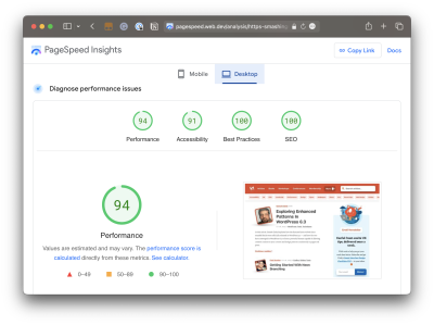
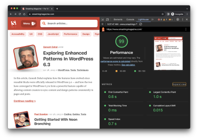
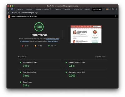
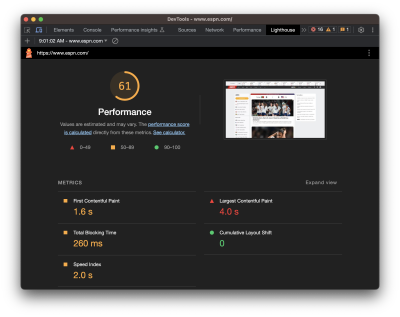
Did you notice that the Performance score in Lighthouse is different from that PSI screenshot? How can one report result in a near-perfect score while the other appears to find more reasons to lower the score? Shouldn’t they be the same if both reports rely on the same underlying tooling to generate scores?

That’s what this article is about. Different tools make different assumptions using different data, whether we are talking about Lighthouse, PageSpeed Insights, or commercial services like DebugBear. That’s what accounts for different results. But there are more specific reasons for the divergence.

Let’s dig into those by answering a set of common questions that pop up during performance audits.

What Does It Mean When PageSpeed Insights Says It Uses “Real-User Experience Data”?

This is a great question because it provides a lot of context for why it’s possible to get varying results from different performance auditing tools. In fact, when we say “real user data,” we’re really referring to two different types of data. And when discussing the two types of data, we’re actually talking about what is called real-user monitoring, or RUM for short.

Type 1: Chrome User Experience Report (CrUX)

What PSI means by “real-user experience data” is that it evaluates the performance data used to measure the core web vitals from your tests against the core web vitals data of actual real-life users. That real-life data is pulled from the Chrome User Experience (CrUX) report, a set of anonymized data collected from Chrome users — at least those who have consented to share data.

CrUX data is important because it is how web core vitals are measured, which, in turn, are a ranking factor for Google’s search results. Google focuses on the 75th percentile of users in the CrUX data when reporting core web vitals metrics. This way, the data represents a vast majority of users while minimizing the possibility of outlier experiences.

But it comes with caveats. For example, the data is pretty slow to update, refreshing every 28 days, meaning it is not the same as real-time monitoring. At the same time, if you plan on using the data yourself, you may find yourself limited to reporting within that floating 28-day range unless you make use of the CrUX History API or BigQuery to produce historical results you can measure against. CrUX is what fuels PSI and Google Search Console, but it is also available in other tools you may already use.

Barry Pollard, a web performance developer advocate for Chrome, wrote an excellent primer on the CrUX Report for Smashing Magazine.

Type 2: Full Real-User Monitoring (RUM)

If CrUX offers one flavor of real-user data, then we can consider “full real-user data” to be another flavor that provides even more in the way individual experiences, such as specific network requests made by the page. This data is distinct from CrUX because it’s collected directly by the website owner by installing an analytics snippet on their website.

Unlike CrUX data, full RUM pulls data from other users using other browsers in addition to Chrome and does so on a continual basis. That means there’s no waiting 28 days for a fresh set of data to see the impact of any changes made to a site.

You can see how you might wind up with different results in performance tests simply by the type of real-user monitoring (RUM) that is in use. Both types are useful, but

You might find that CrUX-based results are excellent for more of a current high-level view of performance than they are an accurate reflection of the users on your site because of that 28-day waiting period, which is where full RUM shines with more immediate results and a greater depth of information.

Does Lighthouse Use RUM Data, Too?

It does not! It uses synthetic data, or what we commonly call lab data. And, just like RUM, we can explain the concept of lab data by breaking it up into two different types.

Type 1: Observed Data

Observed data is performance as the browser sees it. So, instead monitoring real information collected from real users, observed data is more like defining the test conditions ourselves. For example, we could add throttling to the test environment to enforce an artificial condition where the test opens the page on a slower connection. You might think of it like racing a car in virtual reality, where the conditions are decided in advance, rather than racing on a live track where conditions may vary.

A screenshot with a specific performance tab in Chrome DevTools where you can choose between fast 3G, slow 3G, and offline

Chrome DevTools includes a separate “Performance” tab where the testing environment’s CPU and network connection can be artificially throttled to mirror a specific testing condition, such as slow internet speeds. (Large preview)

Type 2: Simulated Data

While we called that last type of data “observed data,” that is not an official industry term or anything. It’s more of a necessary label to help distinguish it from simulated data, which describes how Lighthouse (and many other tools that include Lighthouse in its feature set, such as PSI) applies throttling to a test environment and the results it produces.

The reason for the distinction is that there are different ways to throttle a network for testing. Simulated throttling starts by collecting data on a fast internet connection, then estimates how quickly the page would have loaded on a different connection. The result is a much faster test than it would be to apply throttling before collecting information. Lighthouse can often grab the results and calculate its estimates faster than the time it would take to gather the information and parse it on an artificially slower connection.

Simulated And Observed Data In Lighthouse

Simulated data is the data that Lighthouse uses by default for performance reporting. It’s also what PageSpeed Insights uses since it is powered by Lighthouse under the hood, although PageSpeed Insights also relies on real-user experience data from the CrUX report.

However, it is also possible to collect observed data with Lighthouse. This data is more reliable since it doesn’t depend on an incomplete simulation of Chrome internals and the network stack. The accuracy of observed data depends on how the test environment is set up. If throttling is applied at the operating system level, then the metrics match what a real user with those network conditions would experience. DevTools throttling is easier to set up, but doesn’t accurately reflect how server connections work on the network.

Limitations Of Lab Data

Lab data is fundamentally limited by the fact that it only looks at a single experience in a pre-defined environment. This environment often doesn’t even match the average real user on the website, who may have a faster network connection or a slower CPU. Continuous real-user monitoring can actually tell you how users are experiencing your website and whether it’s fast enough.

So why use lab data at all?

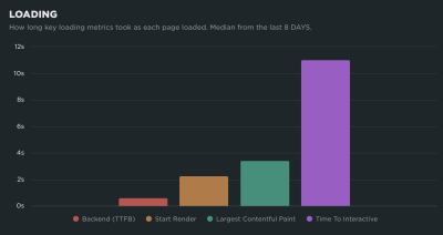
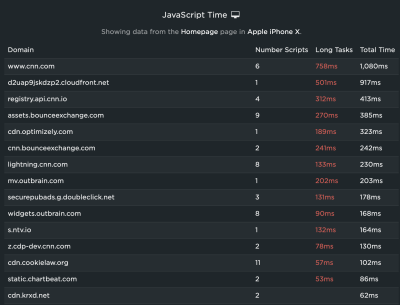
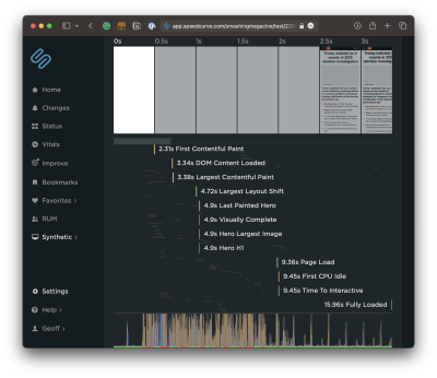
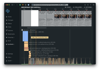
The biggest advantage of lab data is that it produces much more in-depth data than real user monitoring.

Google CrUX data only reports metric values with no debug data telling you how to improve your metrics. In contrast, lab reports contain a lot of analysis and recommendations on how to improve your page speed.

Why Is My Lighthouse LCP Score Worse Than The Real User Data?

It’s a little easier to explain different scores now that we’re familiar with the different types of data used by performance auditing tools. We now know that Google reports on the 75th percentile of real users when reporting web core vitals, which includes LCP.

“By using the 75th percentile, we know that most visits to the site (3 of 4) experienced the target level of performance or better. Additionally, the 75th percentile value is less likely to be affected by outliers. Returning to our example, for a site with 100 visits, 25 of those visits would need to report large outlier samples for the value at the 75th percentile to be affected by outliers. While 25 of 100 samples being outliers is possible, it is much less likely than for the 95th percentile case.”

Brian McQuade

On the flip side, simulated data from Lighthouse neither reports on real users nor accounts for outlier experiences in the same way that CrUX does. So, if we were to set heavy throttling on the CPU or network of a test environment in Lighthouse, we’re actually embracing outlier experiences that CrUX might otherwise toss out. Because Lighthouse applies heavy throttling by default, the result is that we get a worse LCP score in Lighthouse than we do PSI simply because Lighthouse’s data effectively looks at a slow outlier experience.

Why Is My Lighthouse CLS Score Better Than The Real User Data?

Just so we’re on the same page, Cumulative Layout Shift (CLS) measures the “visible stability” of a page layout. If you’ve ever visited a page, scrolled down it a bit before the page has fully loaded, and then noticed that your place on the page shifts when the page load is complete, then you know exactly what CLS is and how it feels.

The nuance here has to do with page interactions. We know that real users are capable of interacting with a page even before it has fully loaded. This is a big deal when measuring CLS because layout shifts often occur lower on the page after a user has scrolled down the page. CrUX data is ideal here because it’s based on real users who would do such a thing and bear the worst effects of CLS.

Lighthouse’s simulated data, meanwhile, does no such thing. It waits patiently for the full page load and never interacts with parts of the page. It doesn’t scroll, click, tap, hover, or interact in any way.

This is why you’re more likely to receive a lower CLS score in a PSI report than you’d get in Lighthouse. It’s not that PSI likes you less, but that the real users in its report are a better reflection of how users interact with a page and are more likely to experience CLS than simulated lab data.

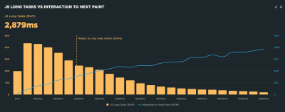
Why Is Interaction to Next Paint Missing In My Lighthouse Report?

This is another case where it’s helpful to know the different types of data used in different tools and how that data interacts — or not — with the page. That’s because the Interaction to Next Paint (INP) metric is all about interactions. It’s right there in the name!

The fact that Lighthouse’s simulated lab data does not interact with the page is a dealbreaker for an INP report. INP is a measure of the latency for all interactions on a given page, where the highest latency — or close to it — informs the final score. For example, if a user clicks on an accordion panel and it takes longer for the content in the panel to render than any other interaction on the page, that is what gets used to evaluate INP.

So, when INP becomes an official core web vitals metric in March 2024, and you notice that it’s not showing up in your Lighthouse report, you’ll know exactly why it isn’t there.

Note: It is possible to script user flows with Lighthouse, including in DevTools. But that probably goes too deep for this article.

Why Is My Time To First Byte Score Worse For Real Users?

The Time to First Byte (TTFB) is what immediately comes to mind for many of us when thinking about page speed performance. We’re talking about the time between establishing a server connection and receiving the first byte of data to render a page.

A graph illustrating the Time to First Byte, which consists of full TTFB and HTTP request TTFB

Source: Source: DebugBear. (Large preview)

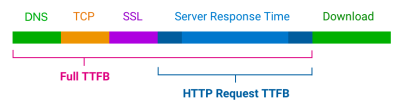
TTFB identifies how fast or slow a web server is to respond to requests. What makes it special in the context of core web vitals — even though it is not considered a core web vital itself — is that it precedes all other metrics. The web server needs to establish a connection in order to receive the first byte of data and render everything else that core web vitals metrics measure. TTFB is essentially an indication of how fast users can navigate, and core web vitals can’t happen without it.

You might already see where this is going. When we start talking about server connections, there are going to be differences between the way that RUM data observes the TTFB versus how lab data approaches it. As a result, we’re bound to get different scores based on which performance tools we’re using and in which environment they are. As such, TTFB is more of a “rough guide,” as Jeremy Wagner and Barry Pollard explain:

“Websites vary in how they deliver content. A low TTFB is crucial for getting markup out to the client as soon as possible. However, if a website delivers the initial markup quickly, but that markup then requires JavaScript to populate it with meaningful content […], then achieving the lowest possible TTFB is especially important so that the client-rendering of markup can occur sooner. […] This is why the TTFB thresholds are a “rough guide” and will need to be weighed against how your site delivers its core content.”

Jeremy Wagner and Barry Pollard

So, if your TTFB score comes in higher when using a tool that relies on RUM data than the score you receive from Lighthouse’s lab data, it’s probably because of caches being hit when testing a particular page. Or perhaps the real user is coming in from a shortened URL that redirects them before connecting to the server. It’s even possible that a real user is connecting from a place that is really far from your web server, which takes a little extra time, particularly if you’re not using a CDN or running edge functions. It really depends on both the user and how you serve data.

Why Do Different Tools Report Different Core Web Vitals? What Values Are Correct?

This article has already introduced some of the nuances involved when collecting web vitals data. Different tools and data sources often report different metric values. So which ones can you trust?

When working with lab data, I suggest preferring observed data over simulated data. But you’ll see differences even between tools that all deliver high-quality data. That’s because no two tests are the same, with different test locations, CPU speeds, or Chrome versions. There’s no one right value. Instead, you can use the lab data to identify optimizations and see how your website changes over time when tested in a consistent environment.

Ultimately, what you want to look at is how real users experience your website. From an SEO standpoint, the 28-day Google CrUX data is the gold standard. However, it won’t be accurate if you’ve rolled out performance improvements over the last few weeks. Google also doesn’t report CrUX data for some high-traffic pages because the visitors may not be logged in to their Google profile.

Installing a custom RUM solution on your website can solve that issue, but the numbers won’t match CrUX exactly. That’s because visitors using browsers other than Chrome are now included, as are users with Chrome analytics reporting disabled.

Finally, while Google focuses on the fastest 75% of experiences, that doesn’t mean the 75th percentile is the correct number to look at. Even with good core web vitals, 25% of visitors may still have a slow experience on your website.

Wrapping Up

This has been a close look at how different performance tools audit and report on performance metrics, such as core web vitals. Different tools rely on different types of data that are capable of producing different results when measuring different performance metrics.

So, if you find yourself with a CLS score in Lighthouse that is far lower than what you get in PSI or DebugBear, go with the Lighthouse report because it makes you look better to the big boss. Just kidding! That difference is a big clue that the data between the two tools is uneven, and you can use that information to help diagnose and fix performance issues.

A screenshot of the DebugBear LCP

(Large preview)

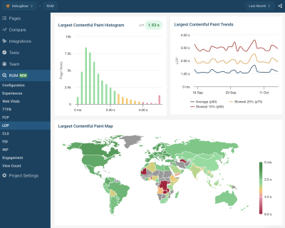
Are you looking for a tool to track lab data, Google CrUX data, and full real-user monitoring data? DebugBear helps you keep track of all three types of data in one place and optimize your page speed where it counts.

Smashing Editorial
(yk)

The Fight For The Main Thread

The Fight For The Main Thread

The Fight For The Main Thread

Geoff Graham

2023-10-24T18:00:00+00:00
2025-06-20T10:32:35+00:00

This article is sponsored by SpeedCurve

Performance work is one of those things, as they say, that ought to happen in development. You know, have a plan for it and write code that’s mindful about adding extra weight to the page.

But not everything about performance happens directly at the code level, right? I’d say many — if not most — sites and apps rely on some number of third-party scripts where we might not have any influence over the code. Analytics is a good example. Writing a hand-spun analytics tracking dashboard isn’t what my clients really want to pay me for, so I’ll drop in the ol’ Google Analytics script and maybe never think of it again.

That’s one example and a common one at that. But what’s also common is managing multiple third-party scripts on a single page. One of my clients is big into user tracking, so in addition to a script for analytics, they’re also running third-party scripts for heatmaps, cart abandonments, and personalized recommendations — typical e-commerce stuff. All of that is dumped on any given page in one fell swoop courtesy of Google Tag Manager (GTM), which allows us to deploy and run scripts without having to go through the pain of re-deploying the entire site.

As a result, adding and executing scripts is a fairly trivial task. It is so effortless, in fact, that even non-developers on the team have contributed their own fair share of scripts, many of which I have no clue what they do. The boss wants something, and it’s going to happen one way or another, and GTM facilitates that work without friction between teams.

All of this adds up to what I often hear described as a “fight for the main thread.” That’s when I started hearing more performance-related jargon, like web workers, Core Web Vitals, deferring scripts, and using pre-connect, among others. But what I’ve started learning is that these technical terms for performance make up an arsenal of tools to combat performance bottlenecks.

The real fight, it seems, is evaluating our needs as developers and stakeholders against a user’s needs, namely, the need for a fast and frictionless page load.

Fighting For The Main Thread

We’re talking about performance in the context of JavaScript, but there are lots of things that happen during a page load. The HTML is parsed. Same deal with CSS. Elements are rendered. JavaScript is loaded, and scripts are executed.

All of this happens on the main thread. I’ve heard the main thread described as a highway that gets cars from Point A to Point B; the more cars that are added to the road, the more crowded it gets and the more time it takes for cars to complete their trip. That’s accurate, I think, but we can take it a little further because this particular highway has just one lane, and it only goes in one direction. My mind thinks of San Francisco’s Lombard Street, a twisty one-way path of a tourist trap on a steep decline.

A picture of San Francisco’s Lombard Street, a twisty one-way path

Credit: Brandon Nelson on Unsplash. (Large preview)

The main thread may not be that curvy, but you get the point: there’s only one way to go, and everything that enters it must go through it.

JavaScript operates in much the same way. It’s “single-threaded,” which is how we get the one-way street comparison. I like how Brian Barbour explains it:

“This means it has one call stack and one memory heap. As expected, it executes code in order and must finish executing a piece of code before moving on to the next. It’s synchronous, but at times that can be harmful. For example, if a function takes a while to execute or has to wait on something, it freezes everything up in the meantime.”

— Brian Barbour

So, there we have it: a fight for the main thread. Each resource on a page is a contender vying for a spot on the thread and wants to run first. If one contender takes its sweet time doing its job, then the contenders behind it in line just have to wait.

Monitoring The Main Thread

If you’re like me, I immediately reach for DevTools and open the Lighthouse tab when I need to look into a site’s performance. It covers a lot of ground, like reporting stats about a page’s load time that include Time to First Byte (TTFB), First Contentful Paint (FCP), Largest Contentful Paint (LCP), Cumulative Layout Shift (CLS), and so on.

A screenshot of DevTool on Smashing Magazine

Hey, look at that — great job, team! (Large preview)

I love this stuff! But I also am scared to death of it. I mean, this is stuff for back-end engineers, right? A measly front-end designer like me can be blissfully ignorant of all this mumbo-jumbo.

Meh, untrue. Like accessibility, performance is everyone’s job because everyone’s work contributes to it. Even the choice to use a particular CSS framework influences performance.

Total Blocking Time

One thing I know would be more helpful than a set of Core Web Vitals scores from Lighthouse is knowing the time it takes to go from the First Contentful Paint (FCP) to the Time to Interactive (TTI), a metric known as the Total Blocking Time (TBT). You can see that Lighthouse does indeed provide that metric. Let’s look at it for a site that’s much “heavier” than Smashing Magazine.

A screenshot of DevTools on espn.com with 61 scores on performance and total blocking time  equals to 260ms

(Large preview)

There we go. The problem with the Lighthouse report, though, is that I have no idea what is causing that TBT. We can get a better view if we run the same test in another service, like SpeedCurve, which digs deeper into the metric. We can expand the metric to glean insights into what exactly is causing traffic on the main thread.

A screenshot of SpeedCurve with TBT of Smahsing Magazine

(Large preview)

That’s a nice big view and is a good illustration of TBT’s impact on page speed. The user is forced to wait a whopping 4.1 seconds between the time the first significant piece of content loads and the time the page becomes interactive. That’s a lifetime in web seconds, particularly considering that this test is based on a desktop experience on a high-speed connection.

One of my favorite charts in SpeedCurve is this one showing the distribution of Core Web Vitals metrics during render. You can see the delta between contentful paints and interaction!

A chart in SpeedCurve showing the distribution of Core Web Vitals metrics during render

(Large preview)

Spotting Long Tasks

What I really want to see is JavaScript, which takes more than 50ms to run. These are called long tasks, and they contribute the most strain on the main thread. If I scroll down further into the report, all of the long tasks are highlighted in red.

A screenshot with long tasks time

(Large preview)

Another way I can evaluate scripts is by opening up the Waterfall View. The default view is helpful to see where a particular event happens in the timeline.

Speedcurve Waterfull view

(Large preview)

But wait! This report can be expanded to see not only what is loaded at the various points in time but whether they are blocking the thread and by how much. Most important are the assets that come before the FCP.

Expanded Waterfull view review

(Large preview)

First & Third Party Scripts

I can see right off the bat that Optimizely is serving a render-blocking script. SpeedCurve can go even deeper by distinguishing between first- and third-party scripts.

Waterfull option of showing third-party scripts

(Large preview)

That way, I can see more detail about what’s happening on the Optimizely side of things.

SpeedCurve showing the First Contentful Paint with distinguishment between first- and third-party scripts

(Large preview)

Monitoring Blocking Scripts

With that in place, SpeedCurve actually lets me track all the resources from a specific third-party source in a custom graph that offers me many more data points to evaluate. For example, I can dive into scripts that come from Optimizely with a set of custom filters to compare them with overall requests and sizes.

SpeedCurve custom graph

(Large preview)

This provides a nice way to compare the impact of different third-party scripts that represent blocking and long tasks, like how much time those long tasks represent.

The total time of long tasks

(Large preview)

Or perhaps which of these sources are actually render-blocking:

The number of blocking requests

(Large preview)

These are the kinds of tools that allow us to identify bottlenecks and make a case for optimizing them or removing them altogether. SpeedCurve allows me to monitor this over time, giving me better insight into the performance of those assets.

Monitoring Interaction to Next Paint

There’s going to be a new way to gain insights into main thread traffic when Interaction to Next Paint (INP) is released as a new core vital metric in March 2024. It replaces the First Input Delay (FID) metric.

What’s so important about that? Well, FID has been used to measure load responsiveness, which is a fancy way of saying it looks at how fast the browser loads the first user interaction on the page. And by interaction, we mean some action the user takes that triggers an event, such as a click, mousedown, keydown, or pointerdown event. FID looks at the time the user sparks an interaction and how long the browser processes — or responds to — that input.

FID might easily be overlooked when trying to diagnose long tasks on the main thread because it looks at the amount of time a user spends waiting after interacting with the page rather than the time it takes to render the page itself. It can’t be replicated with lab data because it’s based on a real user interaction. That said, FID is correlated to TBT in that the higher the FID, the higher the TBT, and vice versa. So, TBT is often the go-to metric for identifying long tasks because it can be measured with lab data as well as real-user monitoring (RUM).

But FID is wrought with limitations, the most significant perhaps being that it’s only a measure of the first interaction. That’s where INP comes into play. Instead of measuring the first interaction and only the first interaction, it measures all interactions on a page. Jeremy Wagner has a more articulate explanation:

“The goal of INP is to ensure the time from when a user initiates an interaction until the next frame is painted is as short as possible for all or most interactions the user makes.”
— Jeremy Wagner

Some interactions are naturally going to take longer to respond than others. So, we might think of FID as merely a first impression of responsiveness, whereas INP is a more complete picture. And like FID, the INP score is closely correlated with TBT but even more so, as Annie Sullivan reports:

<img
loading="lazy"
decoding="async"
fetchpriority="low"
width="800"
height="625"

srcset="https://res.cloudinary.com/indysigner/image/fetch/f_auto,q_80/w_400/https://files.smashing.media/articles/fight-main-thread/annie-sullivan-tweet.png 400w,
https://res.cloudinary.com/indysigner/image/fetch/f_auto,q_80/w_800/https://files.smashing.media/articles/fight-main-thread/annie-sullivan-tweet.png 800w,
https://res.cloudinary.com/indysigner/image/fetch/f_auto,q_80/w_1200/https://files.smashing.media/articles/fight-main-thread/annie-sullivan-tweet.png 1200w,
https://res.cloudinary.com/indysigner/image/fetch/f_auto,q_80/w_1600/https://files.smashing.media/articles/fight-main-thread/annie-sullivan-tweet.png 1600w,
https://res.cloudinary.com/indysigner/image/fetch/f_auto,q_80/w_2000/https://files.smashing.media/articles/fight-main-thread/annie-sullivan-tweet.png 2000w"
src="https://res.cloudinary.com/indysigner/image/fetch/f_auto,q_80/w_400/https://files.smashing.media/articles/fight-main-thread/annie-sullivan-tweet.png"

sizes="100vw"
alt="Tweet by Annie Sullivan: First, is INP correlated with TBT? Is it more correlated with TBT than FID? Yes and yes!

But they are both correlated with TBT; is INP catching more problems with main thread blocking JavaScript? We can break down the percent of sites meeting the good threshold: yes it is!”
/>

(Large preview)

Thankfully, performance tools are already beginning to bake INP into their reports. SpeedCurve is indeed one of them, and its report shows how its RUM capabilities can be used to illustrate the correlation between INP and long tasks on the main thread. This correlation chart illustrates how INP gets worse as the total long tasks’ time increases.

A correlation chart illustrating Long tasks vs Interaction to Next Paint

(Large preview)

What’s cool about this report is that it is always collecting data, providing a way to monitor INP and its relationship to long tasks over time.

Not All Scripts Are Created Equal

There is such a thing as a “good” script. It’s not like I’m some anti-JavaScript bloke intent on getting scripts off the web. But what constitutes a “good” one is nuanced.

Who’s It Serving?

Some scripts benefit the organization, and others benefit the user (or both). The challenge is balancing business needs with user needs.

I think web fonts are a good example that serves both needs. A font is a branding consideration as well as a design asset that can enhance the legibility of a site’s content. Something like that might make loading a font script or file worth its cost to page performance. That’s a tough one. So, rather than fully eliminating a font, maybe it can be optimized instead, perhaps by self-hosting the files rather than connecting to a third-party domain or only loading a subset of characters.

Analytics is another difficult choice. I removed analytics from my personal site long ago because I rarely, if ever, looked at them. And even if I did, the stats were more of an ego booster than insightful details that helped me improve the user experience. It’s an easy decision for me, but not so easy for a site that lives and dies by reports that are used to identify and scope improvements.

If the script is really being used to benefit the user at the end of the day, then yeah, it’s worth keeping around.

When Is It Served?

A script may very well serve a valid purpose and benefit both the organization and the end user. But does it need to load first before anything else? That’s the sort of question to ask when a script might be useful, but can certainly jump out of line to let others run first.

I think of chat widgets for customer support. Yes, having a persistent and convenient way for customers to get in touch with support is going to be important, particularly for e-commerce and SaaS-based services. But does it need to be available immediately? Probably not. You’ll probably have a greater case for getting the site to a state that the user can interact with compared to getting a third-party widget up front and center. There’s little point in rendering the widget if the rest of the site is inaccessible anyway. It is better to get things moving first by prioritizing some scripts ahead of others.

Where Is It Served From?

Just because a script comes from a third party doesn’t mean it has to be hosted by a third party. The web fonts example from earlier applies. Can the font files be self-hosted instead rather than needing to establish another outside connection? It’s worth asking. There are self-hosted alternatives to Google Analytics, after all. And even GTM can be self-hosted! That’s why grouping first and third-party scripts in SpeedCurve’s reporting is so useful: spot what is being served and where it is coming from and identify possible opportunities.

A graph showing first and third party size

(Large preview)

What Is It Serving?

Loading one script can bring unexpected visitors along for the ride. I think the classic case is a third-party script that loads its own assets, like a stylesheet. Even if you think you’re only loading one stylesheet &mdahs; your own — it’s very possible that a script loads additional external stylesheets, all of which need to be downloaded and rendered.

A graph showing a number of requests made by each third party, broken down by content type

(Large preview)

Getting JavaScript Off The Main Thread

That’s the goal! We want fewer cars on the road to alleviate traffic on the main thread. There are a bunch of technical ways to go about it. I’m not here to write up a definitive guide of technical approaches for optimizing the main thread, but there is a wealth of material on the topic.

I’ll break down several different approaches and fill them in with resources that do a great job explaining them in full.

Use Web Workers

A web worker, at its most basic, allows us to establish separate threads that handle tasks off the main thread. Web workers run parallel to the main thread. There are limitations to them, of course, most notably not having direct access to the DOM and being unable to share variables with other threads. But using them can be an effective way to re-route traffic from the main thread to other streets, so to speak.

Split JavaScript Bundles Into Individual Pieces

The basic idea is to avoid bundling JavaScript as a monolithic concatenated file in favor of “code splitting” or splitting the bundle up into separate, smaller payloads to send only the code that’s needed. This reduces the amount of JavaScript that needs to be parsed, which improves traffic along the main thread.

Async or Defer Scripts

Both are ways to load JavaScript without blocking the DOM. But they are different! Adding the async attribute to a tag will load the script asynchronously, executing it as soon as it’s downloaded. That’s different from the defer attribute, which is also asynchronous but waits until the DOM is fully loaded before it executes.

Preconnect Network Connections

I guess I could have filed this with async and defer. That’s because preconnect is a value on the rel attribute that’s used on a tag. It gives the browser a hint that you plan to connect to another domain. It establishes the connection as soon as possible prior to actually downloading the resource. The connection is done in advance, allowing the full script to download later.

While it sounds excellent — and it is — pre-connecting comes with an unfortunate downside in that it exposes a user’s IP address to third-party resources used on the page, which is a breach of GDPR compliance. There was a little uproar over that when it was found out that using a Google Fonts script is prone to that as well.

Non-Technical Approaches

I often think of a Yiddish proverb I first saw in Malcolm Gladwell’s Outliers; however, many years ago it came out:

To a worm in horseradish, the whole world is horseradish.

It’s a more pleasing and articulate version of the saying that goes, “To a carpenter, every problem looks like a nail.” So, too, it is for developers working on performance. To us, every problem is code that needs a technical solution. But there are indeed ways to reduce the amount of work happening on the main thread without having to touch code directly.

We discussed earlier that performance is not only a developer’s job; it’s everyone’s responsibility. So, think of these as strategies that encourage a “culture” of good performance in an organization.

Nuke Scripts That Lack Purpose

As I said at the start of this article, there are some scripts on the projects I work on that I have no idea what they do. It’s not because I don’t care. It’s because GTM makes it ridiculously easy to inject scripts on a page, and more than one person can access it across multiple teams.

So, maybe compile a list of all the third-party and render-blocking scripts and figure out who owns them. Is it Dave in DevOps? Marcia in Marketing? Is it someone else entirely? You gotta make friends with them. That way, there can be an honest evaluation of which scripts are actually helping and are critical to balance.

Bend Google Tag Manager To Your Will

Or any tag manager, for that matter. Tag managers have a pretty bad reputation for adding bloat to a page. It’s true; they can definitely make the page size balloon as more and more scripts are injected.

But that reputation is not totally warranted because, like most tools, you have to use them responsibly. Sure, the beauty of something like GTM is how easy it makes adding scripts to a page. That’s the “Tag” in Google Tag Manager. But the real beauty is that convenience, plus the features it provides to manage the scripts. You know, the “Manage” in Google Tag Manager. It’s spelled out right on the tin!

Wrapping Up

Phew! Performance is not exactly a straightforward science. There are objective ways to measure performance, of course, but if I’ve learned anything about it, it’s that subjectivity is a big part of the process. Different scripts are of different sizes and consist of different resources serving different needs that have different priorities for different organizations and their users.

Having access to a free reporting tool like Lighthouse in DevTools is a great start for diagnosing performance issues by identifying bottlenecks on the main thread. Even better are paid tools like SpeedCurve to dig deeper into the data for more targeted insights and to produce visual reports to help make a case for performance improvements for your team and other stakeholders.

While I wish there were some sort of silver bullet to guarantee good performance, I’ll gladly take these and similar tools as a starting point. Most important, though, is having a performance game plan that is served by the tools. And Vitaly’s front-end performance checklist is an excellent place to start.

Smashing Editorial
(yk, il)

Gatsby Headaches: Working With Media (Part 2)

Gatsby Headaches: Working With Media (Part 2)

Gatsby Headaches: Working With Media (Part 2)

Juan Diego Rodríguez

2023-10-16T13:00:00+00:00
2025-06-20T10:32:35+00:00

Gatsby is a true Jamstack framework. It works with React-powered components that consume APIs before optimizing and bundling everything to serve as static files with bits of reactivity. That includes media files, like images, video, and audio.

The problem is that there’s no “one” way to handle media in a Gatsby project. We have plugins for everything, from making queries off your local filesystem and compressing files to inlining SVGs and serving images in the responsive image format.

Which plugins should be used for certain types of media? How about certain use cases for certain types of media? That’s where you might encounter headaches because there are many plugins — some official and some not — that are capable of handling one or more use cases — some outdated and some not.

That is what this brief two-part series is about. In Part 1, we discussed various strategies and techniques for handling images, video, and audio in a Gatsby project.

This time, in Part 2, we are covering a different type of media we commonly encounter: documents. Specifically, we will tackle considerations for Gatsby projects that make use of Markdown and PDF files. And before wrapping up, we will also demonstrate an approach for using 3D models.

Solving Markdown Headaches In Gatsby

In Gatsby, Markdown files are commonly used to programmatically create pages, such as blog posts. You can write content in Markdown, parse it into your GraphQL data layer, source it into your components, and then bundle it as HTML static files during the build process.

Let’s learn how to load, query, and handle the Markdown for an existing page in Gatsby.

Loading And Querying Markdown From GraphQL

The first step on your Gatsby project is to load the project’s Markdown files to the GraphQL data layer. We can do this using the gatsby-source-filesystem plugin we used to query the local filesystem for image files in Part 1 of this series.

npm i gatsby-source-filesystem

In gatsby-config.js, we declare the folder where Markdown files will be saved in the project:

module.exports = {
  plugins: [
    {
      resolve: `gatsby-source-filesystem`,
      options: {
        name: `assets`,
        path: `${ __dirname }/src/assets`,
      },
    },
  ],
};

Let’s say that we have the following Markdown file located in the project’s ./src/assets directory:

---
title: sample-markdown-file
date: 2023-07-29
---

# Sample Markdown File

Lorem ipsum dolor sit amet, consectetur adipiscing elit. Sed consectetur imperdiet urna, vitae pellentesque mauris sollicitudin at. Sed id semper ex, ac vestibulum nunc. Etiam ,

![A beautiful forest!](/forest.jpg "Forest trail")

```bash
lorem ipsum dolor sit
```

## Subsection

Lorem ipsum dolor sit amet, consectetur adipiscing elit. Sed consectetur imperdiet urna, vitae pellentesque mauris sollicitudin at. Sed id semper ex, ac vestibulum nunc. Etiam efficitur, nunc nec placerat dignissim, ipsum ante ultrices ante, sed luctus nisl felis eget ligula. Proin sed quam auctor, posuere enim eu, vulputate felis. Sed egestas, tortor

This example consists of two main sections: the frontmatter and body. It is a common structure for Markdown files.

  • Frontmatter
    Enclosed in triple dashes (---), this is an optional section at the beginning of a Markdown file that contains metadata and configuration settings for the document. In our example, the frontmatter contains information about the page’s title and date, which Gatsby can use as GraphQL arguments.
  • Body
    This is the content that makes up the page’s main body content.

We can use the gatsby-transformer-remark plugin to parse Markdown files to a GraphQL data layer. Once it is installed, we will need to register it in the project’s gatsby-config.js file:

module.exports = {
  plugins: [
    {
      resolve: `gatsby-transformer-remark`,
      options: { },
    },
  ],
};

Restart the development server and navigate to http://localhost:8000/___graphql in the browser. Here, we can play around with Gatsby’s data layer and check our Markdown file above by making a query using the title property (sample-markdown-file) in the frontmatter:

query {
  markdownRemark(frontmatter: { title: { eq: "sample-markdown-file" } }) {
    html
  }
}

This should return the following result:

{
  "data": {
    "markdownRemark": {
      "html": "

Sample Markdown File

n

Lorem ipsum dolor sit amet, consectetur adipiscing elit. Sed consectetur imperdiet urna, vitae pellentesque mauris sollicitudin at." // etc. } }, "extensions": {} }

Notice that the content in the response is formatted in HTML. We can also query the original body as rawMarkdownBody or any of the frontmatter attributes.

Next, let’s turn our attention to approaches for handling Markdown content once it has been queried.

Using DangerouslySetInnerHTML

dangerouslySetInnerHTML is a React feature that injects raw HTML content into a component’s rendered output by overriding the innerHTML property of the DOM node. It’s considered dangerous since it essentially bypasses React’s built-in mechanisms for rendering and sanitizing content, opening up the possibility of cross-site scripting (XSS) attacks without paying special attention.

That said, if you need to render HTML content dynamically but want to avoid the risks associated with dangerouslySetInnerHTML, consider using libraries that sanitize HTML input before rendering it, such as dompurify.

The dangerouslySetInnerHTML prop takes an __html object with a single key that should contain the raw HTML content. Here’s an example:

const DangerousComponent = () => {
  const rawHTML = "

This is dangerous content!

"; return
; };

To display Markdown using dangerouslySetInnerHTML in a Gatsby project, we need first to query the HTML string using Gatsby’s useStaticQuery hook:

import * as React from "react";
import { useStaticQuery, graphql } from "gatsby";

const DangerouslySetInnerHTML = () => {
  const data = useStaticQuery(graphql`
    query {
      markdownRemark(frontmatter: { title: { eq: "sample-markdown-file" } }) {
        html
      }
    }
  `);

  return 
; };

Now, the html property can be injected into the dangerouslySetInnerHTML prop.

import * as React from "react";
import { useStaticQuery, graphql } from "gatsby";

const DangerouslySetInnerHTML = () => {
  const data = useStaticQuery(graphql`
    query {
      markdownRemark(frontmatter: { title: { eq: "sample-markdown-file" } }) {
        html
      }
    }
  `);

  const markup = { __html: data.markdownRemark.html };

  return 
; };

This might look OK at first, but if we were to open the browser to view the content, we would notice that the image declared in the Markdown file is missing from the output. We never told Gatsby to parse it. We do have two options to include it in the query, each with pros and cons:

  1. Use a plugin to parse Markdown images.
    The gatsby-remark-images plugin is capable of processing Markdown images, making them available when querying the Markdown from the data layer. The main downside is the extra configuration it requires to set and render the files. Besides, Markdown images parsed with this plugin only will be available as HTML, so we would need to select a package that can render HTML content into React components, such as rehype-react.
  2. Save images in the static folder.
    The /static folder at the root of a Gatsby project can store assets that won’t be parsed by webpack but will be available in the public directory. Knowing this, we can point Markdown images to the /static directory, and they will be available anywhere in the client. The disadvantage? We are unable to leverage Gatsby’s image optimization features to minimize the overall size of the bundled package in the build process.

The gatsby-remark-images approach is probably most suited for larger projects since it is more manageable than saving all Markdown images in the /static folder.

Let’s assume that we have decided to go with the second approach of saving images to the /static folder. To reference an image in the /static directory, we just point to the filename without any special argument on the path.

const StaticImage = () => {
  return Desert;
};

react-markdown

The react-markdown package provides a component that renders markdown into React components, avoiding the risks of using dangerouslySetInnerHTML. The component uses a syntax tree to build the virtual DOM, which allows for updating only the changing DOM instead of completely overwriting it. And since it uses remark, we can combine react-markdown with remark’s vast plugin ecosystem.

Let’s install the package:

npm i react-markdown

Next, we replace our prior example with the ReactMarkdown component. However, instead of querying for the html property this time, we will query for rawMarkdownBody and then pass the result to ReactMarkdown to render it in the DOM.

import * as React from "react";
import ReactMarkdown from "react-markdown";
import { useStaticQuery, graphql } from "gatsby";

const MarkdownReact = () => {
  const data = useStaticQuery(graphql`
    query {
      markdownRemark(frontmatter: { title: { eq: "sample-markdown-file" } }) {
        rawMarkdownBody
      }
    }
  `);

  return {data.markdownRemark.rawMarkdownBody};
};

markdown-to-jsx

markdown-to-jsx is the most popular Markdown component — and the lightest since it comes without any dependencies. It’s an excellent tool to consider when aiming for performance, and it does not require remark’s plugin ecosystem. The plugin works much the same as the react-markdown package, only this time, we import a Markdown component instead of ReactMarkdown.

npm i markdown-to-jsx
import * as React from "react";
import Markdown from "markdown-to-jsx";
import { useStaticQuery, graphql } from "gatsby";

const MarkdownToJSX = () => {
  const data = useStaticQuery(graphql`
    query {
      markdownRemark(frontmatter: { title: { eq: "sample-markdown-file" } }) {
        rawMarkdownBody
      }
    }
  `);

  return  { data.markdownRemark.rawMarkdownBody };
};

We have taken raw Markdown and parsed it as JSX. But what if we don’t necessarily want to parse it at all? We will look at that use case next.

react-md-editor

Let’s assume for a moment that we are creating a lightweight CMS and want to give users the option to write posts in Markdown. In this case, instead of parsing the Markdown to HTML, we need to query it as-is.

Rather than creating a Markdown editor from scratch to solve this, several packages are capable of handling the raw Markdown for us. My personal favorite is
react-md-editor.

Let’s install the package:

npm i @uiw/react-md-editor

The MDEditor component can be imported and set up as a controlled component:

import * as React from "react";
import { useState } from "react";
import MDEditor from "@uiw/react-md-editor";

const ReactMDEditor = () => {
  const [value, setValue] = useState("**Hello world!!!**");

  return ;
};

The plugin also comes with a built-in MDEditor.Markdown component used to preview the rendered content:

import * as React from "react";
import { useState } from "react";
import MDEditor from "@uiw/react-md-editor";

const ReactMDEditor = () => {
  const [value, setValue] = useState("**Hello world!**");

  return (


Markdown previewer

The plugin includes a feature that shows a preview of the rendered Markdown. (Large preview)

That was a look at various headaches you might encounter when working with Markdown files in Gatsby. Next, we are turning our attention to another type of file, PDF.

Solving PDF Headaches In Gatsby

PDF files handle content with a completely different approach to Markdown files. With Markdown, we simplify the content to its most raw form so it can be easily handled across different front ends. PDFs, however, are the content presented to users on the front end. Rather than extracting the raw content from the file, we want the user to see it as it is, often by making it available for download or embedding it in a way that the user views the contents directly on the page, sort of like a video.

I want to show you four approaches to consider when embedding a PDF file on a page in a Gatsby project.

Using The Element

The easiest way to embed a PDF into your Gatsby project is perhaps through an iframe element:

import * as React from "react";
import samplePDF from "./assets/lorem-ipsum.pdf";

const IframePDF = () => {
  return ;
};

It’s worth calling out here that the iframe element supports lazy loading (loading="lazy") to boost performance in instances where it doesn’t need to load right away.

Embedding A Third-Party Viewer

There are situations where PDFs are more manageable when stored in a third-party service, such as Drive, which includes a PDF viewer that can embedded directly on the page. In these cases, we can use the same iframe we used above, but with the source pointed at the service.

import * as React from "react";

const ThirdPartyIframePDF = () => {
  return (
    
  );
};

It’s a good reminder that you want to trust the third-party content that’s served in an iframe. If we’re effectively loading a document from someone else’s source that we do not control, your site could become prone to security vulnerabilities should that source become compromised.

Using react-pdf

The react-pdf package provides an interface to render PDFs as React components. It is based on pdf.js, a JavaScript library that renders PDFs using HTML Canvas.

To display a PDF file on a , the react-pdf library exposes the Document and Page components:

  • Document: Loads the PDF passed in its file prop.
  • Page: Displays the page passed in its pageNumber prop. It should be placed inside Document.

We can install to our project:

npm i react-pdf

Before we put react-pdf to use, we will need to set up a service worker for pdf.js to process time-consuming tasks such as parsing and rendering a PDF document.

import * as React from "react";
import { pdfjs } from "react-pdf";

pdfjs.GlobalWorkerOptions.workerSrc = "https://unpkg.com/pdfjs-dist@3.6.172/build/pdf.worker.min.js";

const ReactPDF = () => {
  return 
; };

Now, we can import the Document and Page components, passing the PDF file to their props. We can also import the component’s necessary styles while we are at it.

import * as React from "react";
import { Document, Page } from "react-pdf";

import { pdfjs } from "react-pdf";
import "react-pdf/dist/esm/Page/AnnotationLayer.css";
import "react-pdf/dist/esm/Page/TextLayer.css";

import samplePDF from "./assets/lorem-ipsum.pdf";

pdfjs.GlobalWorkerOptions.workerSrc = "https://unpkg.com/pdfjs-dist@3.6.172/build/pdf.worker.min.js";

const ReactPDF = () => {
  return (


  );
};

Since accessing the PDF will change the current page, we can add state management by passing the current pageNumber to the Page component:

import { useState } from "react";

// ...

const ReactPDF = () => {
  const [currentPage, setCurrentPage] = useState(1);

  return (


  );
};

One issue is that we have pagination but don’t have a way to navigate between pages. We can change that by adding controls. First, we will need to know the number of pages in the document, which is accessed on the Document component’s onLoadSuccess event:

// ...

const ReactPDF = () => {
  const [pageNumber, setPageNumber] = useState(null);
  const [currentPage, setCurrentPage] = useState(1);

  const handleLoadSuccess = ({ numPages }) => {
    setPageNumber(numPages);
  };

  return (


  );
};

Next, we display the current page number and add “Next” and “Previous” buttons with their respective handlers to change the current page:

// ...

const ReactPDF = () => {
  const [currentPage, setCurrentPage] = useState(1);
  const [pageNumber, setPageNumber] = useState(null);

  const handlePrevious = () => {
    // checks if it isn't the first page
    if (currentPage > 1) {
      setCurrentPage(currentPage - 1);
    }
  };

  const handleNext = () => {
    // checks if it isn't the last page
    if (currentPage  {
    setPageNumber(numPages);
  };

  return (
    

{currentPage}

); };

This provides us with everything we need to embed a PDF file on a page via the HTML element using react-pdf and pdf.js.

There is another similar package capable of embedding a PDF file in a viewer, complete with pagination controls. We’ll look at that next.

Using react-pdf-viewer

Unlike react-pdf, the react-pdf-viewer package provides built-in customizable controls right out of the box, which makes embedding a multi-page PDF file a lot easier than having to import them separately.

Let’s install it:

npm i @react-pdf-viewer/core@3.12.0 @react-pdf-viewer/default-layout

Since react-pdf-viewer also relies on pdf.js, we will need to create a service worker as we did with react-pdf, but only if we are not using both packages at the same time. This time, we are using a Worker component with a workerUrl prop directed at the worker’s package.

import * as React from "react";
import { Worker } from "@react-pdf-viewer/core";

const ReactPDFViewer = () => {
  return (


Note that a worker like this ought to be set just once at the layout level. This is especially true if you intend to use the PDF viewer across different pages.

Next, we import the Viewer component with its styles and point it at the PDF through its fileUrl prop.

import * as React from "react";
import { Viewer, Worker } from "@react-pdf-viewer/core";

import "@react-pdf-viewer/core/lib/styles/index.css";

import samplePDF from "./assets/lorem-ipsum.pdf";

const ReactPDFViewer = () => {
  return (


Once again, we need to add controls. We can do that by importing the defaultLayoutPlugin (including its corresponding styles), making an instance of it, and passing it in the Viewer component’s plugins prop.

import * as React from "react";
import { Viewer, Worker } from "@react-pdf-viewer/core";
import { defaultLayoutPlugin } from "@react-pdf-viewer/default-layout";

import "@react-pdf-viewer/core/lib/styles/index.css";
import "@react-pdf-viewer/default-layout/lib/styles/index.css";

import samplePDF from "./assets/lorem-ipsum.pdf";

const ReactPDFViewer = () => {
  const defaultLayoutPluginInstance = defaultLayoutPlugin();

  return (


Again, react-pdf-viewer is an alternative to react-pdf that can be a little easier to implement if you don’t need full control over your PDF files, just the embedded viewer.

There is one more plugin that provides an embedded viewer for PDF files. We will look at it, but only briefly, because I personally do not recommend using it in favor of the other approaches we’ve covered.

Why You Shouldn’t Use react-file-viewer

The last plugin we will check out is react-file-viewer, a package that offers an embedded viewer with a simple interface but with the capacity to handle a variety of media in addition to PDF files, including images, videos, PDFs, documents, and spreadsheets.

import * as React from "react";
import FileViewer from "react-file-viewer";

const PDFReactFileViewer = () => {
  return ;
};

While react-file-viewer will get the job done, it is extremely outdated and could easily create more headaches than it solves with compatibility issues. I suggest avoiding it in favor of either an iframe, react-pdf, or react-pdf-viewer.

Solving 3D Model Headaches In Gatsby

I want to cap this brief two-part series with one more media type that might cause headaches in a Gatsby project: 3D models.

A 3D model file is a digital representation of a three-dimensional object that stores information about the object’s geometry, texture, shading, and other properties of the object. On the web, 3D model files are used to enhance user experiences by bringing interactive and immersive content to websites. You are most likely to encounter them in product visualizations, architectural walkthroughs, or educational simulations.

There is a multitude of 3D model formats, including glTF OBJ, FBX, STL, and so on. We will use glTF models for a demonstration of a headache-free 3D model implementation in Gatsby.

The GL Transmission Format (glTF) was designed specifically for the web and real-time applications, making it ideal for our example. Using glTF files does require a specific webpack loader, so for simplicity’s sake, we will save the glTF model in the /static folder at the root of our project as we look at two approaches to create the 3D visual with Three.js:

  1. Using a vanilla implementation of Three.js,
  2. Using a package that integrates Three.js as a React component.

Using Three.js

Three.js creates and loads interactive 3D graphics directly on the web with the help of WebGL, a JavaScript API for rendering 3D graphics in real-time inside HTML elements.

Three.js is not integrated with React or Gatsby out of the box, so we must modify our code to support it. A Three.js tutorial is out of scope for what we are discussing in this article, although excellent learning resources are available in the Three.js documentation.

We start by installing the three library to the Gatsby project:

npm i three

Next, we write a function to load the glTF model for Three.js to reference it. This means we need to import a GLTFLoader add-on to instantiate a new loader object.

import * as React from "react";
import * as THREE from "three";

import { GLTFLoader } from "three/addons/loaders/GLTFLoader.js";

const loadModel = async (scene) => {
  const loader = new GLTFLoader();
};

We use the scene object as a parameter in the loadModel function so we can attach our 3D model once loaded to the scene.

From here, we use loader.load() which takes four arguments:

  1. The glTF file location,
  2. A callback when the resource is loaded,
  3. A callback while loading is in progress,
  4. A callback for handling errors.
import * as React from "react";
import * as THREE from "three";

import { GLTFLoader } from "three/addons/loaders/GLTFLoader.js";

const loadModel = async (scene) => {
  const loader = new GLTFLoader();

  await loader.load(
    "/strawberry.gltf", // glTF file location
    function (gltf) {
      // called when the resource is loaded
      scene.add(gltf.scene);
    },
    undefined, // called while loading is in progress, but we are not using it
    function (error) {
      // called when loading returns errors
      console.error(error);
    }
  );
};

Let’s create a component to host the scene and load the 3D model. We need to know the element’s client width and height, which we can get using React’s useRef hook to access the element’s DOM properties.

import * as React from "react";
import * as THREE from "three";

import { useRef, useEffect } from "react";

// ...

const ThreeLoader = () => {
  const viewerRef = useRef(null);

  return 
; // Gives the element its dimensions };

Since we are using the element’s clientWidth and clientHeight properties, we need to create the scene on the client side inside React’s useEffect hook where we configure the Three.js scene with its necessary complements, e.g., a camera, the WebGL renderer, and lights.

useEffect(() => {
  const { current: viewer } = viewerRef;

  const scene = new THREE.Scene();

  const camera = new THREE.PerspectiveCamera(75, viewer.clientWidth / viewer.clientHeight, 0.1, 1000);

  const renderer = new THREE.WebGLRenderer();

  renderer.setSize(viewer.clientWidth, viewer.clientHeight);

  const ambientLight = new THREE.AmbientLight(0xffffff, 0.4);
  scene.add(ambientLight);

  const directionalLight = new THREE.DirectionalLight(0xffffff);
  directionalLight.position.set(0, 0, 5);
  scene.add(directionalLight);

  viewer.appendChild(renderer.domElement);
  renderer.render(scene, camera);
}, []);

Now we can invoke the loadModel function, passing the scene to it as the only argument:

useEffect(() => {
  const { current: viewer } = viewerRef;

  const scene = new THREE.Scene();

  const camera = new THREE.PerspectiveCamera(75, viewer.clientWidth / viewer.clientHeight, 0.1, 1000);

  const renderer = new THREE.WebGLRenderer();

  renderer.setSize(viewer.clientWidth, viewer.clientHeight);

  const ambientLight = new THREE.AmbientLight(0xffffff, 0.4);
  scene.add(ambientLight);

  const directionalLight = new THREE.DirectionalLight(0xffffff);
  directionalLight.position.set(0, 0, 5);
  scene.add(directionalLight);

  loadModel(scene); // Here!

  viewer.appendChild(renderer.domElement);
  renderer.render(scene, camera);
}, []);

The last part of this vanilla Three.js implementation is to add OrbitControls that allow users to navigate the model. That might look something like this:

import * as React from "react";
import * as THREE from "three";

import { useRef, useEffect } from "react";
import { OrbitControls } from "three/examples/jsm/controls/OrbitControls";
import { GLTFLoader } from "three/addons/loaders/GLTFLoader.js";

const loadModel = async (scene) => {
  const loader = new GLTFLoader();

  await loader.load(
    "/strawberry.gltf", // glTF file location
    function (gltf) {
      // called when the resource is loaded
      scene.add(gltf.scene);
    },
    undefined, // called while loading is in progress, but it is not used
    function (error) {
      // called when loading has errors
      console.error(error);
    }
  );
};

const ThreeLoader = () => {
  const viewerRef = useRef(null);

  useEffect(() => {
    const { current: viewer } = viewerRef;

    const scene = new THREE.Scene();

    const camera = new THREE.PerspectiveCamera(75, viewer.clientWidth / viewer.clientHeight, 0.1, 1000);

    const renderer = new THREE.WebGLRenderer();

    renderer.setSize(viewer.clientWidth, viewer.clientHeight);

    const ambientLight = new THREE.AmbientLight(0xffffff, 0.4);
    scene.add(ambientLight);

    const directionalLight = new THREE.DirectionalLight(0xffffff);
    directionalLight.position.set(0, 0, 5);
    scene.add(directionalLight);

    loadModel(scene);

    const target = new THREE.Vector3(-0.5, 1.2, 0);
    const controls = new OrbitControls(camera, renderer.domElement);
    controls.target = target;

    viewer.appendChild(renderer.domElement);

    var animate = function () {
      requestAnimationFrame(animate);
      controls.update();
      renderer.render(scene, camera);
    };
    animate();
  }, []);

  
; };

That is a straight Three.js implementation in a Gatsby project. Next is another approach using a library.

Using React Three Fiber

react-three-fiber is a library that integrates the Three.js with React. One of its advantages over the vanilla Three.js approach is its ability to manage and update 3D scenes, making it easier to compose scenes without manually handling intricate aspects of Three.js.

We begin by installing the library to the Gatsby project:

npm i react-three-fiber @react-three/drei

Notice that the installation command includes the @react-three/drei package, which we will use to add controls to the 3D viewer.

I personally love react-three-fiber for being tremendously self-explanatory. For example, I had a relatively easy time migrating the extensive chunk of code from the vanilla approach to this much cleaner code:

import * as React from "react";
import { useLoader, Canvas } from "@react-three/fiber";
import { OrbitControls } from "@react-three/drei";
import { GLTFLoader } from "three/examples/jsm/loaders/GLTFLoader";

const ThreeFiberLoader = () => {
  const gltf = useLoader(GLTFLoader, "/strawberry.gltf");

  return (


  );
};

Thanks to react-three-fiber, we get the same result as a vanilla Three.js implementation but with fewer steps, more efficient code, and a slew of abstractions for managing and updating Three.js scenes.

Two Final Tips

The last thing I want to leave you with is two final considerations to take into account when working with media files in a Gatsby project.

Bundling Assets Via Webpack And The /static Folder

Importing an asset as a module so it can be bundled by webpack is a common strategy to add post-processing and minification, as well as hashing paths on the client. But there are two additional use cases where you might want to avoid it altogether and use the static folder in a Gatsby project:

  • Referencing a library outside the bundled code to prevent webpack compatibility issues or a lack of specific loaders.
  • Referencing assets with a specific name, for example, in a web manifest file.

You can find a detailed explanation of the static folder and use it to your advantage in the Gatsby documentation.

Embedding Files From Third-Party Services

Secondly, you can never be too cautious when embedding third-party services on a website. Replaced content elements, like , can introduce various security vulnerabilities, particularly when you do not have control of the source content. By integrating a third party’s scripts, widgets, or content, a website or app is prone to potential vulnerabilities, such as iframe injection or cross-frame scripting.

Moreover, if an integrated third-party service experiences downtime or performance issues, it can directly impact the user experience.

Conclusion

This article explored various approaches for working around common headaches you may encounter when working with Markdown, PDF, and 3D model files in a Gatsby project. In the process, we leveraged several React plugins and Gatsby features that handle how content is parsed, embed files on a page, and manage 3D scenes.

This is also the second article in a brief two-part series that addresses common headaches working with a variety of media types in Gatsby. The first part covers more common media files, including images, video, and audio.

If you’re looking for more cures to Gatsby headaches, please check out my other two-part series that investigates internationalization.

See Also

Smashing Editorial
(gg, yk, il)

Gatsby Headaches: Working With Media (Part 1)

Gatsby Headaches: Working With Media (Part 1)

Gatsby Headaches: Working With Media (Part 1)

Juan Diego Rodríguez

2023-10-09T11:00:00+00:00
2025-06-20T10:32:35+00:00

Working with media files in Gatsby might not be as straightforward as expected. I remember starting my first Gatsby project. After consulting Gatsby’s documentation, I discovered I needed to use the gatsby-source-filesystem plugin to make queries for local files. Easy enough!

That’s where things started getting complicated. Need to use images? Check the docs and install one — or more! — of the many, many plugins available for handling images. How about working with SVG files? There is another plugin for that. Video files? You get the idea.

It’s all great until any of those plugins or packages become outdated and go unmaintained. That’s where the headaches start.

If you are unfamiliar with Gatsby, it’s a React-based static site generator that uses GraphQL to pull structured data from various sources and uses webpack to bundle a project so it can then be deployed and served as static files. It’s essentially a static site generator with reactivity that can pull data from a vast array of sources.

Like many static site frameworks in the Jamstack, Gatsby has traditionally enjoyed a great reputation as a performant framework, although it has taken a hit in recent years. Based on what I’ve seen, however, it’s not so much that the framework is fast or slow but how the framework is configured to handle many of the sorts of things that impact performance, including media files.

So, let’s solve the headaches you might encounter when working with media files in a Gatsby project. This article is the first of a brief two-part series where we will look specifically at the media you are most likely to use: images, video, and audio. After that, the second part of this series will get into different types of files, including Markdown, PDFs, and even 3D models.

Solving Image Headaches In Gatsby

I think that the process of optimizing images can fall into four different buckets:

  1. Optimize image files.
    Minimizing an image’s file size without losing quality directly leads to shorter fetching times. This can be done manually or during a build process. It’s also possible to use a service, like Cloudinary, to handle the work on demand.
  2. Prioritize images that are part of the First Contentful Paint (FCP).
    FCP is a metric that measures the time between the point when a page starts loading to when the first bytes of content are rendered. The idea is that fetching assets that are part of that initial render earlier results in faster loading rather than waiting for other assets lower on the chain.
  3. Lazy loading other images.
    We can prevent the rest of the images from render-blocking other assets using the loading="lazy" attribute on images.
  4. Load the right image file for the right context.
    With responsive images, we can serve one version of an image file at one screen size and serve another image at a different screen size with the srcset and sizes attributes or with the element.

These are great principles for any website, not only those built with Gatsby. But how we build them into a Gatsby-powered site can be confusing, which is why I’m writing this article and perhaps why you’re reading it.

Lazy Loading Images In Gatsby

We can apply an image to a React component in a Gatsby site like this:

import * as React from "react";

import forest from "./assets/images/forest.jpg";

const ImageHTML = () => {
  return Forest trail;
};

It’s important to import the image as a JavaScript module. This lets webpack know to bundle the image and generate a path to its location in the public folder.

This works fine, but when are we ever working with only one image? What if we want to make an image gallery that contains 100 images? If we try to load that many tags at once, they will certainly slow things down and could affect the FCP. That’s where the third principle that uses the loading="lazy" attribute can come into play.

import * as React from "react";

import forest from "./assets/images/forest.jpg";

const LazyImageHTML = () => {
  return Forest trail;
};

We can do the opposite with loading="eager". It instructs the browser to load the image as soon as possible, regardless of whether it is onscreen or not.

import * as React from "react";

import forest from "./assets/images/forest.jpg";

const EagerImageHTML = () => {
  return Forest trail;
};

Implementing Responsive Images In Gatsby

This is a basic example of the HTML for responsive images:

Forest trail

In Gatsby, we must import the images first and pass them to the srcset attribute as template literals so webpack can bundle them:

import * as React from "react";

import forest800 from "./assets/images/forest-800.jpg";

import forest400 from "./assets/images/forest-400.jpg";

const ResponsiveImageHTML = () => {
  return (
    Forest trail
  );
};

That should take care of any responsive image headaches in the future.

Loading Background Images In Gatsby

What about pulling in the URL for an image file to use on the CSS background-url property? That looks something like this:

import * as React from "react";

import "./style.css";

const ImageBackground = () => {
  return 
; };
/* style.css */

.banner {
    aspect-ratio: 16/9;
      background-size: cover;

    background-image: url("./assets/images/forest-800.jpg");

  /* etc. */
}

This is straightforward, but there is still room for optimization! For example, we can do the CSS version of responsive images, which loads the version we want at specific breakpoints.

/* style.css */

@media (max-width: 500px) {
  .banner {
    background-image: url("./assets/images/forest-400.jpg");
  }
}

Using The gatsby-source-filesystem Plugin

Before going any further, I think it is worth installing the gatsby-source-filesystem plugin. It’s an essential part of any Gatsby project because it allows us to query data from various directories in the local filesystem, making it simpler to fetch assets, like a folder of optimized images.

npm i gatsby-source-filesystem

We can add it to our gatsby-config.js file and specify the directory from which we will query our media assets:

// gatsby-config.js

module.exports = {
  plugins: [
    {
      resolve: `gatsby-source-filesystem`,

      options: {
        name: `assets`,

        path: `${ __dirname }/src/assets`,
      },
    },
  ],
};

Remember to restart your development server to see changes from the gatsby-config.js file.

Now that we have gatsby-source-filesystem installed, we can continue solving a few other image-related headaches. For example, the next plugin we look at is capable of simplifying the cures we used for lazy loading and responsive images.

Using The gatsby-plugin-image Plugin

The gatsby-plugin-image plugin (not to be confused with the outdated gatsby-image plugin) uses techniques that automatically handle various aspects of image optimization, such as lazy loading, responsive sizing, and even generating optimized image formats for modern browsers.

Once installed, we can replace standard tags with either the or components, depending on the use case. These components take advantage of the plugin’s features and use the HTML element to ensure the most appropriate image is served to each user based on their device and network conditions.

We can start by installing gatsby-plugin-image and the other plugins it depends on:

npm install gatsby-plugin-image gatsby-plugin-sharp gatsby-transformer-sharp

Let’s add them to the gatsby-config.js file:

// gatsby-config.js

module.exports = {
plugins: [

// other plugins
`gatsby-plugin-image`,
`gatsby-plugin-sharp`,
`gatsby-transformer-sharp`],

};

This provides us with some features we will put to use a bit later.

Using The StaticImage Component

The StaticImage component serves images that don’t require dynamic sourcing or complex transformations. It’s particularly useful for scenarios where you have a fixed image source that doesn’t change based on user interactions or content updates, like logos, icons, or other static images that remain consistent.

The main attributes we will take into consideration are:

  • src: This attribute is required and should be set to the path of the image you want to display.
  • alt: Provides alternative text for the image.
  • placeholder: This attribute can be set to either blurred or dominantColor to define the type of placeholder to display while the image is loading.
  • layout: This defines how the image should be displayed. It can be set to fixed for, as you might imagine, images with a fixed size, fullWidth for images that span the entire container, and constrained for images scaled down to fit their container.
  • loading: This determines when the image should start loading while also supporting the eager and lazy options.

Using StaticImage is similar to using a regular HTML tag. However, StaticImage requires passing the string directly to the src attribute so it can be bundled by webpack.

import * as React from "react";

import { StaticImage } from "gatsby-plugin-image";

const ImageStaticGatsby = () => {
  return (
    
  );
  };

The StaticImage component is great, but you have to take its constraints into account:

  • No Dynamically Loading URLs
    One of the most significant limitations is that the StaticImage component doesn’t support dynamically loading images based on URLs fetched from data sources or APIs.
  • Compile-Time Image Handling
    The StaticImage component’s image handling occurs at compile time. This means that the images you specify are processed and optimized when the Gatsby site is built. Consequently, if you have images that need to change frequently based on user interactions or updates, the static nature of this component might not fit your needs.
  • Limited Transformation Options
    Unlike the more versatile GatsbyImage component, the StaticImage component provides fewer transformation options, e.g., there is no way to apply complex transformations like cropping, resizing, or adjusting image quality directly within the component. You may want to consider alternative solutions if you require advanced transformations.

Using The GatsbyImage Component

The GatsbyImage component is a more versatile solution that addresses the limitations of the StaticImage component. It’s particularly useful for scenarios involving dynamic image loading, complex transformations, and advanced customization.

Some ideal use cases where GatsbyImage is particularly useful include:

  • Dynamic Image Loading
    If you need to load images dynamically based on data from APIs, content management systems, or other sources, the GatsbyImage component is the go-to choice. It can fetch images and optimize their loading behavior.
  • Complex transformations
    The GatsbyImage component is well-suited for advanced transformations, using GraphQL queries to apply them.
  • Responsive images
    For responsive design, the GatsbyImage component excels by automatically generating multiple sizes and formats of an image, ensuring that users receive an appropriate image based on their device and network conditions.

Unlike the StaticImage component, which uses a src attribute, GatsbyImage has an image attribute that takes a gatsbyImageData object. gatsbyImageData contains the image information and can be queried from GraphQL using the following query.

query {
  file(name: { eq: "forest" }) {
    childImageSharp {
      gatsbyImageData(width: 800, placeholder: BLURRED, layout: CONSTRAINED)
    }

    name
  }
}

If you’re following along, you can look around your Gatsby data layer at http://localhost:8000/___graphql.

From here, we can use the useStaticQuery hook and the graphql tag to fetch data from the data layer:

import * as React from "react";

import { useStaticQuery, graphql } from "gatsby";

import { GatsbyImage, getImage } from "gatsby-plugin-image";

const ImageGatsby = () => {
  // Query data here:

  const data = useStaticQue(graphql``);

  return 
; };

Next, we can write the GraphQL query inside of the graphql tag:

import * as React from "react";

import { useStaticQuery, graphql } from "gatsby";

const ImageGatsby = () => {
  const data = useStaticQuery(graphql`
    query {
      file(name: { eq: "forest" }) {
        childImageSharp {
          gatsbyImageData(width: 800, placeholder: BLURRED, layout: CONSTRAINED)
        }

        name
      }
    }
  `);

  return 
; };

Next, we import the GatsbyImage component from gatsby-plugin-image and assign the image’s gatsbyImageData property to the image attribute:

import * as React from "react";

import { useStaticQuery, graphql } from "gatsby";

import { GatsbyImage } from "gatsby-plugin-image";

const ImageGatsby = () => {
  const data = useStaticQuery(graphql`
    query {
      file(name: { eq: "forest" }) {
        childImageSharp {
          gatsbyImageData(width: 800, placeholder: BLURRED, layout: CONSTRAINED)
        }

        name
      }
    }
  `);

  return ;
};

Now, we can use the getImage helper function to make the code easier to read. When given a File object, the function returns the file.childImageSharp.gatsbyImageData property, which can be passed directly to the GatsbyImage component.

import * as React from "react";

import { useStaticQuery, graphql } from "gatsby";

import { GatsbyImage, getImage } from "gatsby-plugin-image";

const ImageGatsby = () => {
  const data = useStaticQuery(graphql`
    query {
      file(name: { eq: "forest" }) {
        childImageSharp {
          gatsbyImageData(width: 800, placeholder: BLURRED, layout: CONSTRAINED)
        }

        name
      }
    }
  `);

  const image = getImage(data.file);

  return ;
};

Using The gatsby-background-image Plugin

Another plugin we could use to take advantage of Gatsby’s image optimization capabilities is the gatsby-background-image plugin. However, I do not recommend using this plugin since it is outdated and prone to compatibility issues. Instead, Gatsby suggests using gatsby-plugin-image when working with the latest Gatsby version 3 and above.

If this compatibility doesn’t represent a significant problem for your project, you can refer to the plugin’s documentation for specific instructions and use it in place of the CSS background-url usage I described earlier.

Solving Video And Audio Headaches In Gatsby

Working with videos and audio can be a bit of a mess in Gatsby since it lacks plugins for sourcing and optimizing these types of files. In fact, Gatsby’s documentation doesn’t name or recommend any official plugins we can turn to.

That means we will have to use vanilla methods for videos and audio in Gatsby.

Using The HTML video Element

The HTML video element is capable of serving different versions of the same video using the tag, much like the img element uses the srset attribute to do the same for responsive images.

That allows us to not only serve a more performant video format but also to provide a fallback video for older browsers that may not support the bleeding edge:

import * as React from "react";

import natureMP4 from "./assets/videos/nature.mp4";

import natureWEBM from "./assets/videos/nature.webm";

const VideoHTML = () => {
  return (
    
  );
};

P;

We can also apply lazy loading to videos like we do for images. While videos do not support the loading="lazy" attribute, there is a preload attribute that is similar in nature. When set to none, the attribute instructs the browser to load a video and its metadata only when the user interacts with it. In other words, it’s lazy-loaded until the user taps or clicks the video.

We can also set the attribute to metadata if we want the video’s details, such as its duration and file size, fetched right away.


Note: I personally do not recommend using the autoplay attribute since it is disruptive and disregards the preload attribute, causing the video to load right away.

And, like images, display a placeholder image for a video while it is loading with the poster attribute pointing to an image file.


Using The HTML audio Element

The audio and video elements behave similarly, so adding an audio element in Gatsby looks nearly identical, aside from the element:

import * as React from "react";

import audioSampleMP3 from "./assets/audio/sample.mp3";

import audioSampleWAV from "./assets/audio/sample.wav";

const AudioHTML = () => {
  return (
    
  );
};

As you might expect, the audio element also supports the preload attribute:


This is probably as good as we can do to use videos and images in Gatsby with performance in mind, aside from saving and compressing the files as best we can before serving them.

Solving iFrame Headaches In Gatsby

Speaking of video, what about ones embedded in an like we might do with a video from YouTube, Vimeo, or some other third party? Those can certainly lead to performance headaches, but it’s not as we have direct control over the video file and where it is served.

Not all is lost because the HTML iframe element supports lazy loading the same way that images do.

import * as React from "react";

const VideoIframe = () => {
  return (
    
  );
};

Embedding a third-party video player via iframe can possibly be an easier path than using the HTML video element. iframe elements are cross-platform compatible and could reduce hosting demands if you are working with heavy video files on your own server.

That said, an iframe is essentially a sandbox serving a page from an outside source. They’re not weightless, and we have no control over the code they contain. There are also GDPR considerations when it comes to services (such as YouTube) due to cookies, data privacy, and third-party ads.

Solving SVG Headaches In Gatsby

SVGs contribute to improved page performance in several ways. Their vector nature results in a much smaller file size compared to raster images, and they can be scaled up without compromising quality. And SVGs can be compressed with GZIP, further reducing file sizes.

That said, there are several ways that we can use SVG files. Let’s tackle each one in the contact of Gatsby.

Using Inline SVG

SVGs are essentially lines of code that describe shapes and paths, making them lightweight and highly customizable. Due to their XML-based structure, SVG images can be directly embedded within the HTML tag.

import * as React from "react";


const SVGInline = () => {

  return (


  );

};

Just remember to change certain SVG attributes, such as xmlns:xlink or xlink:href, to JSX attribute spelling, like xmlnsXlink and xlinkHref, respectively.

Using SVG In img Elements

An SVG file can be passed into an img element’s src attribute like any other image file.

import * as React from "react";

import picture from "./assets/svg/picture.svg";

const SVGinImg = () => {
  return Picture;
};

Loading SVGs inline or as HTML images are the de facto approaches, but there are React and Gatsby plugins capable of simplifying the process, so let’s look at those next.

Inlining SVG With The react-svg Plugin

react-svg provides an efficient way to render SVG images as React components by swapping a ReactSVG component in the DOM with an inline SVG.

Once installing the plugin, import the ReactSVG component and assign the SVG file to the component’s src attribute:

import * as React from "react";

import { ReactSVG } from "react-svg";

import camera from "./assets/svg/camera.svg";

const SVGReact = () => {
  return ;
};

Using The gatsby-plugin-react-svg Plugin

The gatsby-plugin-react-svg plugin adds svg-react-loader to your Gatsby project’s webpack configuration. The plugin adds a loader to support using SVG files as React components while bundling them as inline SVG.

Once the plugin is installed, add it to the gatsby-config.js file. From there, add a webpack rule inside the plugin configuration to only load SVG files ending with a certain filename, making it easy to split inline SVGs from other assets:

// gatsby-config.js

module.exports = {
  plugins: [
    {
      resolve: "gatsby-plugin-react-svg",

      options: {
        rule: {
          include: /.inline.svg$/,
        },
      },
    },
  ],
};

Now we can import SVG files like any other React component:

import * as React from "react";

import Book from "./assets/svg/book.inline.svg";

const GatsbyPluginReactSVG = () => {
  return ;
};

And just like that, we can use SVGs in our Gatsby pages in several different ways!

Conclusion

Even though I personally love Gatsby, working with media files has given me more than a few headaches.

As a final tip, when needing common features such as images or querying from your local filesystem, go ahead and install the necessary plugins. But when you need a minor feature, try doing it yourself with the methods that are already available to you!

If you have experienced different headaches when working with media in Gatsby or have circumvented them with different approaches than what I’ve covered, please share them! This is a big space, and it’s always helpful to see how others approach similar challenges.

Again, this article is the first of a brief two-part series on curing headaches when working with media files in a Gatsby project. The following article will be about avoiding headaches when working with different media files, including Markdown, PDFs, and 3D models.

Further Reading

Smashing Editorial
(gg, yk)