Reporting Core Web Vitals With The Performance API
Geoff Graham 2024-02-27T12:00:00+00:00
2025-06-20T10:32:35+00:00
This article is sponsored by DebugBear
There’s quite a buzz in the performance community with the Interaction to Next Paint (INP) metric becoming an official Core Web Vitals (CWV) metric in a few short weeks. If you haven’t heard, INP is replacing the First Input Delay (FID) metric, something you can read all about here on Smashing Magazine as a guide to prepare for the change.
But that’s not what I really want to talk about. With performance at the forefront of my mind, I decided to head over to MDN for a fresh look at the Performance API. We can use it to report the load time of elements on the page, even going so far as to report on Core Web Vitals metrics in real time. Let’s look at a few ways we can use the API to report some CWV metrics.
Browser Support Warning
Before we get started, a quick word about browser support. The Performance API is huge in that it contains a lot of different interfaces, properties, and methods. While the majority of it is supported by all major browsers, Chromium-based browsers are the only ones that support all of the CWV properties. The only other is Firefox, which supports the First Contentful Paint (FCP) and Largest Contentful Paint (LCP) API properties.
So, we’re looking at a feature of features, as it were, where some are well-established, and others are still in the experimental phase. But as far as Core Web Vitals go, we’re going to want to work in Chrome for the most part as we go along.
First, We Need Data Access
There are two main ways to retrieve the performance metrics we care about:
- Using the
performance.getEntries()method, or - Using a
PerformanceObserverinstance.
Using a PerformanceObserver instance offers a few important advantages:
PerformanceObserverobserves performance metrics and dispatches them over time. Instead, usingperformance.getEntries()will always return the entire list of entries since the performance metrics started being recorded.PerformanceObserverdispatches the metrics asynchronously, which means they don’t have to block what the browser is doing.- The
elementperformance metric type doesn’t work with theperformance.getEntries()method anyway.
That all said, let’s create a PerformanceObserver:
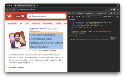
const lcpObserver = new PerformanceObserver(list => {});
For now, we’re passing an empty callback function to the PerformanceObserver constructor. Later on, we’ll change it so that it actually does something with the observed performance metrics. For now, let’s start observing:
lcpObserver.observe({ type: "largest-contentful-paint", buffered: true });
The first very important thing in that snippet is the buffered: true property. Setting this to true means that we not only get to observe performance metrics being dispatched after we start observing, but we also want to get the performance metrics that were queued by the browser before we started observing.
The second very important thing to note is that we’re working with the largest-contentful-paint property. That’s what’s cool about the Performance API: it can be used to measure very specific things but also supports properties that are mapped directly to CWV metrics. We’ll start with the LCP metric before looking at other CWV metrics.
Reporting The Largest Contentful Paint
The largest-contentful-paint property looks at everything on the page, identifying the biggest piece of content on the initial view and how long it takes to load. In other words, we’re observing the full page load and getting stats on the largest piece of content rendered in view.
We already have our Performance Observer and callback:
const lcpObserver = new PerformanceObserver(list => {});
lcpObserver.observe({ type: "largest-contentful-paint", buffered: true });
Let’s fill in that empty callback so that it returns a list of entries once performance measurement starts:
// The Performance Observer const lcpObserver = new PerformanceObserver(list => {// Returns the entire list of entriesconst entries = list.getEntries();}); // Call the Observer lcpObserver.observe({ type: "largest-contentful-paint", buffered: true });
Next, we want to know which element is pegged as the LCP. It’s worth noting that the element representing the LCP is always the last element in the ordered list of entries. So, we can look at the list of returned entries and return the last one:
// The Performance Observer const lcpObserver = new PerformanceObserver(list => { // Returns the entire list of entries const entries = list.getEntries();// The element representing the LCPconst el = entries[entries.length - 1];}); // Call the Observer lcpObserver.observe({ type: "largest-contentful-paint", buffered: true });
The last thing is to display the results! We could create some sort of dashboard UI that consumes all the data and renders it in an aesthetically pleasing way. Let’s simply log the results to the console rather than switch gears.
// The Performance Observer const lcpObserver = new PerformanceObserver(list => { // Returns the entire list of entries const entries = list.getEntries(); // The element representing the LCP const el = entries[entries.length - 1];// Log the results in the consoleconsole.log(el.element);}); // Call the Observer lcpObserver.observe({ type: "largest-contentful-paint", buffered: true });
There we go!
It’s certainly nice knowing which element is the largest. But I’d like to know more about it, say, how long it took for the LCP to render:
// The Performance Observer
const lcpObserver = new PerformanceObserver(list => {

  const entries = list.getEntries();
  const lcp = entries[entries.length - 1];

  entries.forEach(entry => {
    // Log the results in the console
    console.log(
      `The LCP is:`,
      lcp.element,
      `The time to render was ${entry.startTime} milliseconds.`,
    );
  });
});

// Call the Observer
lcpObserver.observe({ type: "largest-contentful-paint", buffered: true });

// The LCP is:
// …
// The time to  render was 832.6999999880791 milliseconds.
Reporting First Contentful Paint
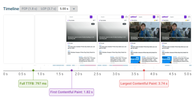
This is all about the time it takes for the very first piece of DOM to get painted on the screen. Faster is better, of course, but the way Lighthouse reports it, a “passing” score comes in between 0 and 1.8 seconds.
Just like we set the type property to largest-contentful-paint to fetch performance data in the last section, we’re going to set a different type this time around: paint.
When we call paint, we tap into the PerformancePaintTiming interface that opens up reporting on first paint and first contentful paint.
// The Performance Observer
const paintObserver = new PerformanceObserver(list => {
  const entries = list.getEntries();
  entries.forEach(entry => {
    // Log the results in the console.
    console.log(
      `The time to ${entry.name} took ${entry.startTime} milliseconds.`,
    );
  });
});

// Call the Observer.
paintObserver.observe({ type: "paint", buffered: true });

// The time to first-paint took 509.29999999981374 milliseconds.
// The time to first-contentful-paint took 509.29999999981374 milliseconds.
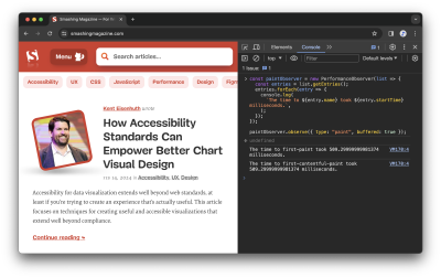
Notice how paint spits out two results: one for the first-paint and the other for the first-contenful-paint. I know that a lot happens between the time a user navigates to a page and stuff starts painting, but I didn’t know there was a difference between these two metrics.
Here’s how the spec explains it:
“The primary difference between the two metrics is that [First Paint] marks the first time the browser renders anything for a given document. By contrast, [First Contentful Paint] marks the time when the browser renders the first bit of image or text content from the DOM.”
As it turns out, the first paint and FCP data I got back in that last example are identical. Since first paint can be anything that prevents a blank screen, e.g., a background color, I think that the identical results mean that whatever content is first painted to the screen just so happens to also be the first contentful paint.
But there’s apparently a lot more nuance to it, as Chrome measures FCP differently based on what version of the browser is in use. Google keeps a full record of the changelog for reference, so that’s something to keep in mind when evaluating results, especially if you find yourself with different results from others on your team.
Reporting Cumulative Layout Shift
How much does the page shift around as elements are painted to it? Of course, we can get that from the Performance API! Instead of largest-contentful-paint or paint, now we’re turning to the layout-shift type.
This is where browser support is dicier than other performance metrics. The LayoutShift interface is still in “experimental” status at this time, with Chromium browsers being the sole group of supporters.
As it currently stands, LayoutShift opens up several pieces of information, including a value representing the amount of shifting, as well as the sources causing it to happen. More than that, we can tell if any user interactions took place that would affect the CLS value, such as zooming, changing browser size, or actions like keydown, pointerdown, and mousedown. This is the lastInputTime property, and there’s an accompanying hasRecentInput boolean that returns true if the lastInputTime is less than 500ms.
Got all that? We can use this to both see how much shifting takes place during page load and identify the culprits while excluding any shifts that are the result of user interactions.
const observer = new PerformanceObserver((list) => {
  let cumulativeLayoutShift = 0;
  list.getEntries().forEach((entry) => {
    // Don't count if the layout shift is a result of user interaction.
    if (!entry.hadRecentInput) {
      cumulativeLayoutShift += entry.value;
    }
    console.log({ entry, cumulativeLayoutShift });
  });
});

// Call the Observer.
observer.observe({ type: "layout-shift", buffered: true });
Given the experimental nature of this one, here’s what an entry object looks like when we query it:
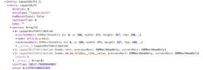
Pretty handy, right? Not only are we able to see how much shifting takes place (0.128) and which element is moving around (article.a.main), but we have the exact coordinates of the element’s box from where it starts to where it ends.
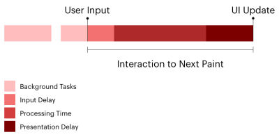
Reporting Interaction To Next Paint
This is the new kid on the block that got my mind wondering about the Performance API in the first place. It’s been possible for some time now to measure INP as it transitions to replace First Input Delay as a Core Web Vitals metric in March 2024. When we’re talking about INP, we’re talking about measuring the time between a user interacting with the page and the page responding to that interaction.
We need to hook into the PerformanceEventTiming class for this one. And there’s so much we can dig into when it comes to user interactions. Think about it! There’s what type of event happened (entryType and name), when it happened (startTime), what element triggered the interaction (interactionId, experimental), and when processing the interaction starts (processingStart) and ends (processingEnd). There’s also a way to exclude interactions that can be canceled by the user (cancelable).
const observer = new PerformanceObserver((list) => {
  list.getEntries().forEach((entry) => {
    // Alias for the total duration.
    const duration = entry.duration;
    // Calculate the time before processing starts.
    const delay = entry.processingStart - entry.startTime;
    // Calculate the time to process the interaction.
    const lag = entry.processingStart - entry.startTime;

    // Don't count interactions that the user can cancel.
    if (!entry.cancelable) {
      console.log(`INP Duration: ${duration}`);
      console.log(`INP Delay: ${delay}`);
      console.log(`Event handler duration: ${lag}`);
    }
  });
});

// Call the Observer.
observer.observe({ type: "event", buffered: true });
Reporting Long Animation Frames (LoAFs)
Let’s build off that last one. We can now track INP scores on our website and break them down into specific components. But what code is actually running and causing those delays?
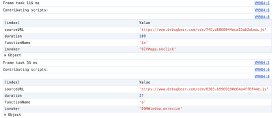
The Long Animation Frames API was developed to help answer that question. It won’t land in Chrome stable until mid-March 2024, but you can already use it in Chrome Canary.
A long-animation-frame entry is reported every time the browser couldn’t render page content immediately as it was busy with other processing tasks. We get an overall duration for the long frame but also a duration for different scripts involved in the processing.
const observer = new PerformanceObserver((list) => {
  list.getEntries().forEach((entry) => {
    if (entry.duration > 50) {
      // Log the overall duration of the long frame.
      console.log(`Frame took ${entry.duration} ms`)
      console.log(`Contributing scripts:`)
      // Log information on each script in a table.
      entry.scripts.forEach(script => {
        console.table({
          // URL of the script where the processing starts
          sourceURL: script.sourceURL,
          // Total time spent on this sub-task
          duration: script.duration,
          // Name of the handler function
          functionName: script.sourceFunctionName,
          // Why was the handler function called? For example,
          // a user interaction or a fetch response arriving.
          invoker: script.invoker
        })
      })
    }
  });
});

// Call the Observer.
observer.observe({ type: "long-animation-frame", buffered: true });
When an INP interaction takes place, we can find the closest long animation frame and investigate what processing delayed the page response.
There’s A Package For This
The Performance API is so big and so powerful. We could easily spend an entire bootcamp learning all of the interfaces and what they provide. There’s network timing, navigation timing, resource timing, and plenty of custom reporting features available on top of the Core Web Vitals we’ve looked at.
If CWVs are what you’re really after, then you might consider looking into the web-vitals library to wrap around the browser Performance APIs.
Need a CWV metric? All it takes is a single function.
webVitals.getINP(function(info) {
  console.log(info)
}, { reportAllChanges: true });
Boom! That reportAllChanges property? That’s a way of saying we only want to report data every time the metric changes instead of only when the metric reaches its final value. For example, as long as the page is open, there’s always a chance that the user will encounter an even slower interaction than the current INP interaction. So, without reportAllChanges, we’d only see the INP reported when the page is closed (or when it’s hidden, e.g., if the user switches to a different browser tab).
We can also report purely on the difference between the preliminary results and the resulting changes. From the web-vitals docs:
function logDelta({ name, id, delta }) {
  console.log(`${name} matching ID ${id} changed by ${delta}`);
}

onCLS(logDelta);
onINP(logDelta);
onLCP(logDelta);
Measuring Is Fun, But Monitoring Is Better
All we’ve done here is scratch the surface of the Performance API as far as programmatically reporting Core Web Vitals metrics. It’s fun to play with things like this. There’s even a slight feeling of power in being able to tap into this information on demand.
At the end of the day, though, you’re probably just as interested in monitoring performance as you are in measuring it. We could do a deep dive and detail what a performance dashboard powered by the Performance API is like, complete with historical records that indicate changes over time. That’s ultimately the sort of thing we can build on this — we can build our own real user monitoring (RUM) tool or perhaps compare Performance API values against historical data from the Chrome User Experience Report (CrUX).
Or perhaps you want a solution right now without stitching things together. That’s what you’ll get from a paid commercial service like DebugBear. All of this is already baked right in with all the metrics, historical data, and charts you need to gain insights into the overall performance of a site over time… and in real-time, monitoring real users.
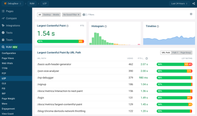
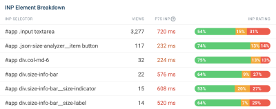
DebugBear can help you identify why users are having slow experiences on any given page. If there is slow INP, what page elements are these users interacting with? What elements often shift around on the page and cause high CLS? Is the LCP typically an image, a heading, or something else? And does the type of LCP element impact the LCP score?
To help explain INP scores, DebugBear also supports the upcoming Long Animation Frames API we looked at, allowing you to see what code is responsible for interaction delays.
The Performance API can also report a list of all resource requests on a page. DebugBear uses this information to show a request waterfall chart that tells you not just when different resources are loaded but also whether the resources were render-blocking, loaded from the cache or whether an image resource is used for the LCP element.
In this screenshot, the blue line shows the FCP, and the red line shows the LCP. We can see that the LCP happens right after the LCP image request, marked by the blue “LCP” badge, has finished.

DebugBear offers a 14-day free trial. See how fast your website is, what’s slowing it down, and how you can improve your Core Web Vitals. You’ll also get monitoring alerts, so if there’s a web vitals regression, you’ll find out before it starts impacting Google search results.
(yk)


