Uniting Web And Native Apps With 4 Unknown JavaScript APIs
Juan Diego Rodríguez 2024-06-20T18:00:00+00:00
2025-06-20T10:32:35+00:00
A couple of years ago, four JavaScript APIs that landed at the bottom of awareness in the State of JavaScript survey. I took an interest in those APIs because they have so much potential to be useful but don’t get the credit they deserve. Even after a quick search, I was amazed at how many new web APIs have been added to the ECMAScript specification that aren’t getting their dues and with a lack of awareness and browser support in browsers.
That situation can be a “catch-22”:
An API is interesting but lacks awareness due to incomplete support, and there is no immediate need to support it due to low awareness.
“
Most of these APIs are designed to power progressive web apps (PWA) and close the gap between web and native apps. Bear in mind that creating a PWA involves more than just adding a manifest file. Sure, it’s a PWA by definition, but it functions like a bookmark on your home screen in practice. In reality, we need several APIs to achieve a fully native app experience on the web. And the four APIs I’d like to shed light on are part of that PWA puzzle that brings to the web what we once thought was only possible in native apps.
You can see all these APIs in action in this demo as we go along.
1. Screen Orientation API
The Screen Orientation API can be used to sniff out the device’s current orientation. Once we know whether a user is browsing in a portrait or landscape orientation, we can use it to enhance the UX for mobile devices by changing the UI accordingly. We can also use it to lock the screen in a certain position, which is useful for displaying videos and other full-screen elements that benefit from a wider viewport.
Using the global screen object, you can access various properties the screen uses to render a page, including the screen.orientation object. It has two properties:
type: The current screen orientation. It can be:"portrait-primary","portrait-secondary","landscape-primary", or"landscape-secondary".angle: The current screen orientation angle. It can be any number from 0 to 360 degrees, but it’s normally set in multiples of 90 degrees (e.g.,0,90,180, or270).
On mobile devices, if the angle is 0 degrees, the type is most often going to evaluate to "portrait" (vertical), but on desktop devices, it is typically "landscape" (horizontal). This makes the type property precise for knowing a device’s true position.
The screen.orientation object also has two methods:
.lock(): This is an async method that takes atypevalue as an argument to lock the screen..unlock(): This method unlocks the screen to its default orientation.
And lastly, screen.orientation counts with an "orientationchange" event to know when the orientation has changed.
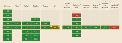
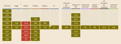
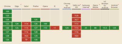
Browser Support
Finding And Locking Screen Orientation
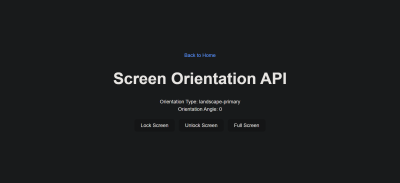
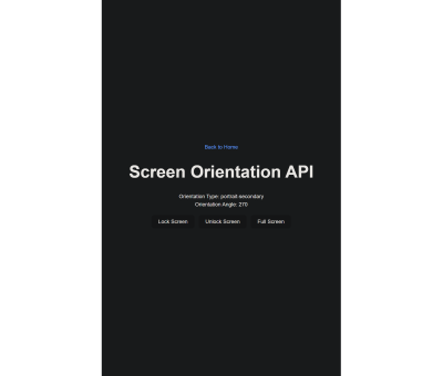
Let’s code a short demo using the Screen Orientation API to know the device’s orientation and lock it in its current position.
This can be our HTML boilerplate:
Orientation Type:
Orientation Angle:
On the JavaScript side, we inject the screen orientation type and angle properties into our HTML.
let currentOrientationType = document.querySelector(".orientation-type");
let currentOrientationAngle = document.querySelector(".orientation-angle");

currentOrientationType.textContent = screen.orientation.type;
currentOrientationAngle.textContent = screen.orientation.angle;
Now, we can see the device’s orientation and angle properties. On my laptop, they are "landscape-primary" and 0°.
If we listen to the window’s orientationchange event, we can see how the values are updated each time the screen rotates.
window.addEventListener("orientationchange", () => {
  currentOrientationType.textContent = screen.orientation.type;
  currentOrientationAngle.textContent = screen.orientation.angle;
});
To lock the screen, we need to first be in full-screen mode, so we will use another extremely useful feature: the Fullscreen API. Nobody wants a webpage to pop into full-screen mode without their consent, so we need transient activation (i.e., a user click) from a DOM element to work.
The Fullscreen API has two methods:
Document.exitFullscreen()is used from the global document object,Element.requestFullscreen()makes the specified element and its descendants go full-screen.
We want the entire page to be full-screen so we can invoke the method from the root element at the document.documentElement object:
const fullscreenButton = document.querySelector(".fullscreen-button");

fullscreenButton.addEventListener("click", async () => {
  // If it is already in full-screen, exit to normal view
  if (document.fullscreenElement) {
    await document.exitFullscreen();
  } else {
    await document.documentElement.requestFullscreen();
  }
});
Next, we can lock the screen in its current orientation:
const lockButton = document.querySelector(".lock-button");

lockButton.addEventListener("click", async () => {
  try {
    await screen.orientation.lock(screen.orientation.type);
  } catch (error) {
    console.error(error);
  }
});
And do the opposite with the unlock button:
const unlockButton = document.querySelector(".unlock-button");

unlockButton.addEventListener("click", () => {
  screen.orientation.unlock();
});
Can’t We Check Orientation With a Media Query?
Yes! We can indeed check page orientation via the orientation media feature in a CSS media query. However, media queries compute the current orientation by checking if the width is “bigger than the height” for landscape or “smaller” for portrait. By contrast,
The Screen Orientation API checks for the screen rendering the page regardless of the viewport dimensions, making it resistant to inconsistencies that may crop up with page resizing.
“
You may have noticed how PWAs like Instagram and X force the screen to be in portrait mode even when the native system orientation is unlocked. It is important to notice that this behavior isn’t achieved through the Screen Orientation API, but by setting the orientation property on the manifest.json file to the desired orientation type.
2. Device Orientation API
Another API I’d like to poke at is the Device Orientation API. It provides access to a device’s gyroscope sensors to read the device’s orientation in space; something used all the time in mobile apps, mainly games. The API makes this happen with a deviceorientation event that triggers each time the device moves. It has the following properties:
event.alpha: Orientation along the Z-axis, ranging from 0 to 360 degrees.event.beta: Orientation along the X-axis, ranging from -180 to 180 degrees.event.gamma: Orientation along the Y-axis, ranging from -90 to 90 degrees.
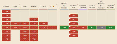
Browser Support
Moving Elements With Your Device
In this case, we will make a 3D cube with CSS that can be rotated with your device! The full instructions I used to make the initial CSS cube are credited to David DeSandro and can be found in his introduction to 3D transforms.
See the Pen [Rotate cube [forked]](https://codepen.io/smashingmag/pen/vYwdMNJ) by Dave DeSandro.
You can see raw full HTML in the demo, but let’s print it here for posterity:
1
2
3
4
5
6
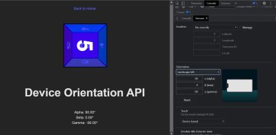
Device Orientation API
Alpha:
Beta:
Gamma:
To keep this brief, I won’t explain the CSS code here. Just keep in mind that it provides the necessary styles for the 3D cube, and it can be rotated through all axes using the CSS rotate() function.
Now, with JavaScript, we listen to the window’s deviceorientation event and access the event orientation data:
const currentAlpha = document.querySelector(".currentAlpha");
const currentBeta = document.querySelector(".currentBeta");
const currentGamma = document.querySelector(".currentGamma");

window.addEventListener("deviceorientation", (event) => {
  currentAlpha.textContent = event.alpha;
  currentBeta.textContent = event.beta;
  currentGamma.textContent = event.gamma;
});
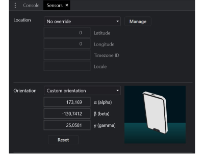
To see how the data changes on a desktop device, we can open Chrome’s DevTools and access the Sensors Panel to emulate a rotating device.
To rotate the cube, we change its CSS transform properties according to the device orientation data:
const currentAlpha = document.querySelector(".currentAlpha");
const currentBeta = document.querySelector(".currentBeta");
const currentGamma = document.querySelector(".currentGamma");

const cube = document.querySelector(".cube");

window.addEventListener("deviceorientation", (event) => {
  currentAlpha.textContent = event.alpha;
  currentBeta.textContent = event.beta;
  currentGamma.textContent = event.gamma;

  cube.style.transform = `rotateX(${event.beta}deg) rotateY(${event.gamma}deg) rotateZ(${event.alpha}deg)`;
});
This is the result:
3. Vibration API
Let’s turn our attention to the Vibration API, which, unsurprisingly, allows access to a device’s vibrating mechanism. This comes in handy when we need to alert users with in-app notifications, like when a process is finished or a message is received. That said, we have to use it sparingly; no one wants their phone blowing up with notifications.
There’s just one method that the Vibration API gives us, and it’s all we need: navigator.vibrate().
vibrate() is available globally from the navigator object and takes an argument for how long a vibration lasts in milliseconds. It can be either a number or an array of numbers representing a patron of vibrations and pauses.
navigator.vibrate(200); // vibrate 200ms
navigator.vibrate([200, 100, 200]); // vibrate 200ms, wait 100, and vibrate 200ms.
Browser Support
Vibration API Demo
Let’s make a quick demo where the user inputs how many milliseconds they want their device to vibrate and buttons to start and stop the vibration, starting with the markup:
We’ll add an event listener for a click and invoke the vibrate() method:
const vibrateButton = document.querySelector(".vibrate-button");
const millisecondsInput = document.querySelector("#milliseconds-input");

vibrateButton.addEventListener("click", () => {
  navigator.vibrate(millisecondsInput.value);
});
To stop vibrating, we override the current vibration with a zero-millisecond vibration.
const stopVibrateButton = document.querySelector(".stop-vibrate-button");

stopVibrateButton.addEventListener("click", () => {
  navigator.vibrate(0);
});
4. Contact Picker API
In the past, it used to be that only native apps could connect to a device’s “contacts”. But now we have the fourth and final API I want to look at: the Contact Picker API.
The API grants web apps access to the device’s contact lists. Specifically, we get the contacts.select() async method available through the navigator object, which takes the following two arguments:
properties: This is an array containing the information we want to fetch from a contact card, e.g.,"name","address","email","tel", and"icon".options: This is an object that can only contain themultipleboolean property to define whether or not the user can select one or multiple contacts at a time.
Browser Support
I’m afraid that browser support is next to zilch on this one, limited to Chrome Android, Samsung Internet, and Android’s native web browser at the time I’m writing this.
Selecting User’s Contacts
We will make another demo to select and display the user’s contacts on the page. Again, starting with the HTML:
Contacts:
Then, in JavaScript, we first construct our elements from the DOM and choose which properties we want to pick from the contacts.
const getContactsButton = document.querySelector(".get-contacts");
const contactList = document.querySelector(".contact-list");

const props = ["name", "tel", "icon"];
const options = {multiple: true};
Now, we asynchronously pick the contacts when the user clicks the getContactsButton.
const getContacts = async () => {
  try {
    const contacts = await navigator.contacts.select(props, options);
  } catch (error) {
    console.error(error);
  }
};

getContactsButton.addEventListener("click", getContacts);
Using DOM manipulation, we can then append a list item to each contact and an icon to the contactList element.
const appendContacts = (contacts) => {
  contacts.forEach(({name, tel, icon}) => {
    const contactElement = document.createElement("li");

    contactElement.innerText = `${name}: ${tel}`;
    contactList.appendChild(contactElement);
  });
};

const getContacts = async () => {
  try {
    const contacts = await navigator.contacts.select(props, options);
    appendContacts(contacts);
  } catch (error) {
    console.error(error);
  }
};

getContactsButton.addEventListener("click", getContacts);
Appending an image is a little tricky since we will need to convert it into a URL and append it for each item in the list.
const getIcon = (icon) => {
  if (icon.length > 0) {
    const imageUrl = URL.createObjectURL(icon[0]);
    const imageElement = document.createElement("img");
    imageElement.src = imageUrl;

    return imageElement;
  }
};

const appendContacts = (contacts) => {
  contacts.forEach(({name, tel, icon}) => {
    const contactElement = document.createElement("li");

    contactElement.innerText = `${name}: ${tel}`;
    contactList.appendChild(contactElement);

    const imageElement = getIcon(icon);
    contactElement.appendChild(imageElement);
  });
};

const getContacts = async () => {
  try {
    const contacts = await navigator.contacts.select(props, options);
    appendContacts(contacts);
  } catch (error) {
    console.error(error);
  }
};

getContactsButton.addEventListener("click", getContacts);
And here’s the outcome:
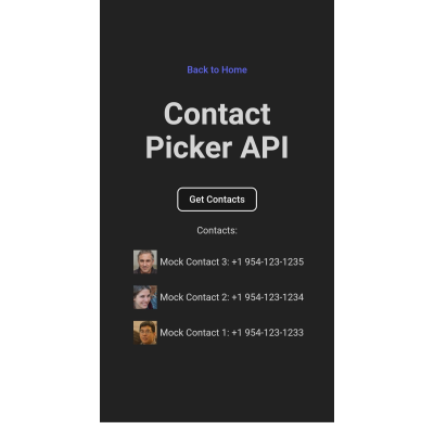
Note: The Contact Picker API will only work if the context is secure, i.e., the page is served over https:// or wss:// URLs.
Conclusion
There we go, four web APIs that I believe would empower us to build more useful and robust PWAs but have slipped under the radar for many of us. This is, of course, due to inconsistent browser support, so I hope this article can bring awareness to new APIs so we have a better chance to see them in future browser updates.
Aren’t they interesting? We saw how much control we have with the orientation of a device and its screen as well as the level of access we get to access a device’s hardware features, i.e. vibration, and information from other apps to use in our own UI.
But as I said much earlier, there’s a sort of infinite loop where a lack of awareness begets a lack of browser support. So, while the four APIs we covered are super interesting, your mileage will inevitably vary when it comes to using them in a production environment. Please tread cautiously and refer to Caniuse for the latest support information, or check for your own devices using WebAPI Check.
(gg, yk)


