The Largest Contentful Paint (LCP) in Core Web Vitals measures how quickly a website loads from a visitor’s perspective. It looks at how long after opening a page the largest content element becomes visible. If your website is loading slowly, that’s bad for user experience and can also cause your site to rank lower in Google.
When trying to fix LCP issues, it’s not always clear what to focus on. Is the server too slow? Are images too big? Is the content not being displayed? Google has been working to address that recently by introducing LCP subparts, which tell you where page load delays are coming from. They’ve also added this data to the Chrome UX Report, allowing you to see what causes delays for real visitors on your website!
Let’s take a look at what the LCP subparts are, what they mean for your website speed, and how you can measure them.
The Four LCP Subparts
LCP subparts split the Largest Contentful Paint metric into four different components:
Time to First Byte (TTFB): How quickly the server responds to the document request.
Resource Load Delay: Time spent before the LCP image starts to download.
Resource Load Time: Time spent downloading the LCP image.
Element Render Delay: Time before the LCP element is displayed.
The resource timings only apply if the largest page element is an image or background image. For text elements, the Load Delay and Load Time components are always zero.
How To Measure LCP Subparts
One way to measure how much each component contributes to the LCP score on your website is to use DebugBear’s website speed test. Expand the Largest Contentful Paint metric to see subparts and other details related to your LCP score.
Here, we can see that TTFB and image Load Duration together account for 78% of the overall LCP score. That tells us that these two components are the most impactful places to start optimizing.
What’s happening during each of these stages? A network request waterfall can help us understand what resources are loading through each stage.
The LCP Image Discovery view filters the waterfall visualization to just the resources that are relevant to displaying the Largest Contentful Paint image. In this case, each of the first three stages contains one request, and the final stage finishes quickly with no new resources loaded. But that depends on your specific website and won’t always be the case.
In this example, we can see that creating the server connection doesn’t take all that long. Most of the time is spent waiting for the server to generate the page HTML. So, to improve the TTFB, we need to speed up that process or cache the HTML so we can skip the HTML generation entirely.
Resource Load Delay
The “resource” we want to load is the LCP image. Ideally, we just have an tag near the top of the HTML, and the browser finds it right away and starts loading it.
But sometimes, we get a Load Delay, as is the case here. Instead of loading the image directly, the page uses lazysize.js, an image lazy loading library that only loads the LCP image once it has detected that it will appear in the viewport.
Part of the Load Delay is caused by having to download that JavaScript library. But the browser also needs to complete the page layout and start rendering content before the library will know that the image is in the viewport. After finishing the request, there’s a CPU task (in orange) that leads up to the First Contentful Paint milestone, when the page starts rendering. Only then does the library trigger the LCP image request.
How do we optimize this? First of all, instead of using a lazy loading library, you can use the native loading="lazy" image attribute. That way, loading images no longer depends on first loading JavaScript code.
The fourth and final LCP component, Render Delay, is often the most confusing. The resource has loaded, but for some reason, the browser isn’t ready to show it to the user yet!
Luckily, in the example we’ve been looking at so far, the LCP image appears quickly after it’s been loaded. One common reason for render delay is that the LCP element is not an image. In that case, the render delay is caused by render-blocking scripts and stylesheets. The text can only appear after these have loaded and the browser has completed the rendering process.
Another reason you might see render delay is when the website preloads the LCP image. Preloading is a good idea, as it practically eliminates any load delay and ensures the image is loaded early.
However, if the image finishes downloading before the page is ready to render, you’ll see an increase in render delay on the page. And that’s fine! You’ve improved your website speed overall, but after optimizing your image, you’ve uncovered a new bottleneck to focus on.
That’s why, in February 2025, Google started including subpart data in the CrUX data report. It’s not (yet?) included in PageSpeed Insights, but you can see those metrics in DebugBear’s “Web Vitals” tab.
One super useful bit of info here is the LCP resource type: it tells you how many visitors saw the LCP element as a text element or an image.
Even for the same page, different visitors will see slightly different content. For example, different elements are visible based on the device size, or some visitors will see a cookie banner while others see the actual page content.
To make the data easier to interpret, Google only reports subpart data for images.
If the LCP element is usually text on the page, then the subparts info won’t be very helpful, as it won’t apply to most of your visitors.
But breaking down text LCP is relatively easy: everything that’s not part of the TTFB score is render-delayed.
Track Subparts On Your Website With Real User Monitoring
That’s why a real-user monitoring tool like DebugBear comes in handy when fixing your LCP scores. You can track scores across all pages on your website over time and get dedicated dashboards for each LCP subpart.
You can also review specific visitor experiences, see what the LCP image was for them, inspect a request waterfall, and check LCP subpart timings. Sign up for a free trial.
Having more granular metric data available for the Largest Contentful Paint gives web developers a big leg up when making their website faster.
Including subparts in CrUX provides new insight into how real visitors experience your website and can tell if the optimizations you’re considering would really be impactful.
Loading your website HTML quickly has a big impact on visitor experience. After all, no page content can be displayed until after the first chunk of the HTML has been loaded. That’s why the Time to First Byte (TTFB) metric is important: it measures how soon after navigation the browser starts receiving the HTML response.
Generating the HTML document quickly plays a big part in minimizing TTFB delays. But actually, there’s a lot more to optimizing this metric. In this article, we’ll take a look at what else can cause poor TTFB and what you can do to fix it.
What Components Make Up The Time To First Byte Metric?
TTFB stands for Time to First Byte. But where does it measure from?
Different tools handle this differently. Some only count the time spent sending the HTTP request and getting a response, ignoring everything else that needs to happen first before the resource can be loaded. However, when looking at Google’s Core Web Vitals, TTFB starts from the time when the users start navigating to a new page. That means TTFB includes:
The server response time here is only 183 milliseconds, or about 12% of the overall TTFB metric. Half of the time is instead spent on a cross-origin redirect — a separate HTTP request that returns a redirect response before we can even make the request that returns the website’s HTML code. And when we make that request, most of the time is spent on establishing the server connection.
Connecting to a server on the web typically takes three round trips on the network:
DNS: Looking up the server IP address.
TCP: Establishing a reliable connection to the server.
TLS: Creating a secure encrypted connection.
What Network Latency Means For Time To First Byte
Let’s add up all the network round trips in the example above:
2 server connections: 6 round trips.
2 HTTP requests: 2 round trips.
That means that before we even get the first response byte for our page we actually have to send data back and forth between the browser and a server eight times!
That’s where network latency comes in, or network round trip time (RTT) if we look at the time it takes to send data to a server and receive a response in the browser. On a high-latency connection with a 150 millisecond RTT, making those eight round trips will take 1.2 seconds. So, even if the server always responds instantly, we can’t get a TTFB lower than that number.
Network latency depends a lot on the geographic distances between the visitor’s device and the server the browser is connecting to. You can see the impact of that in practice by running a global TTFB test on a website. Here, I’ve tested a website that’s hosted in Brazil. We get good TTFB scores when testing from Brazil and the US East Coast. However, visitors from Europe, Asia, or Australia wait a while for the website to load.
What Content Delivery Networks Mean for Time to First Byte
One way to speed up your website is by using a Content Delivery Network (CDN). These services provide a network of globally distributed server locations. Instead of each round trip going all the way to where your web application is hosted, browsers instead connect to a nearby CDN server (called an edge node). That greatly reduces the time spent on establishing the server connection, improving your overall TTFB metric.
By default, the actual HTML request still has to be sent to your web app. However, if your content isn’t dynamic, you can also cache responses at the CDN edge node. That way, the request can be served entirely through the CDN instead of data traveling all across the world.
If we run a TTFB test on a website that uses a CDN, we can see that each server response comes from a regional data center close to where the request was made. In many cases, we get a TTFB of under 200 milliseconds, thanks to the response already being cached at the edge node.
Keep in mind that TTFB depends on how visitors are accessing your website. For example, if they are logged into your application, the page content probably can’t be served from the cache. You may also see a spike in TTFB when running an ad campaign, as visitors are redirected through a click-tracking server.
Monitor Real User Time To First Byte
If you want to get a breakdown of what TTFB looks like for different visitors on your website, you need real user monitoring. That way, you can break down how visitor location, login status, or the referrer domain impact real user experience.
DebugBear can help you collect real user metrics for Time to First Byte, Google Core Web Vitals, and other page speed metrics. You can track individual TTFB components like TCP duration or redirect time and break down website performance by country, ad campaign, and more.
By looking at everything that’s involved in serving the first byte of a website to a visitor, we’ve seen that just reducing server response time isn’t enough and often won’t even be the most impactful change you can make on your website.
Just because your website is fast in one location doesn’t mean it’s fast for everyone, as website speed varies based on where the visitor is accessing your site from.
Content Delivery Networks are an incredibly powerful way to improve TTFB. Even if you don’t use any of their advanced features, just using their global server network saves a lot of time when establishing a server connection.
I was chatting with DebugBear’s Matt Zeunert and, in the process, he casually mentioned this thing called Tight Mode when describing how browsers fetch and prioritize resources. I wanted to nod along like I knew what he was talking about but ultimately had to ask: What the heck is “Tight” mode?
What I got back were two artifacts, one of them being the following video of Akamai web performance expert Robin Marx speaking at We Love Speed in France a few weeks ago:
That’s all I have and what I can find on the web about this thing called Tight Mode that appears to have so much influence on the way the web works. Robin acknowledged the lack of information about it in his presentation, and the amount of first-person research in his talk is noteworthy and worth calling out because it attempts to describe and illustrate how different browsers fetch different resources with different prioritization. Given the dearth of material on the topic, I decided to share what I was able to take away from Robin’s research and Patrick’s updated article.
It’s The First of Two Phases
The fact that Patrick’s original publication date falls in 2015 makes it no surprise that we’re talking about something roughly 10 years old at this point. The 2023 update to the publication is already fairly old in “web years,” yet Tight Mode is still nowhere when I try looking it up.
So, how do we define Tight Mode? This is how Patrick explains it:
“Chrome loads resources in 2 phases. “Tight mode” is the initial phase and constraints [sic] loading lower-priority resources until the body is attached to the document (essentially, after all blocking scripts in the head have been executed).”
— Patrick Meenan
OK, so we have this two-part process that Chrome uses to fetch resources from the network and the first part is focused on anything that isn’t a “lower-priority resource.” We have ways of telling browsers which resources we think are low priority in the form of the Fetch Priority API and lazy-loading techniques that asynchronously load resources when they enter the viewport on scroll — all of which Robin covers in his presentation. But Tight Mode has its own way of determining what resources to load first.
Figure 1: Chrome loads resources in two phases, the first of which is called “Tight Mode.” (Large preview)
Tight Mode discriminates resources, taking anything and everything marked as High and Medium priority. Everything else is constrained and left on the outside, looking in until the body is firmly attached to the document, signaling that blocking scripts have been executed. It’s at that point that resources marked with Low priority are allowed in the door during the second phase of loading.
There’s a big caveat to that, but we’ll get there. The important thing to note is that…
Chrome And Safari Enforce Tight Mode
Yes, both Chrome and Safari have some working form of Tight Mode running in the background. That last image illustrates Chrome’s Tight Mode. Let’s look at Safari’s next and compare the two.
Figure 2: Comparing Tight Mode in Chrome with Tight Mode in Safari. Notice that Chrome allows five images marked with High priority to slip out of Tight Mode. (Large preview)
Look at that! Safari discriminates High-priority resources in its initial fetch, just like Chrome, but we get wildly different loading behavior between the two browsers. Notice how Safari appears to exclude the first five PNG images marked with Medium priority where Chrome allows them. In other words, Safari makes all Medium- and Low-priority resources wait in line until all High-priority items are done loading, even though we’re working with the exact same HTML. You might say that Safari’s behavior makes the most sense, as you can see in that last image that Chrome seemingly excludes some High-priority resources out of Tight Mode. There’s clearly some tomfoolery happening there that we’ll get to.
Where’s Firefox in all this? It doesn’t take any extra tightening measures when evaluating the priority of the resources on a page. We might consider this the “classic” waterfall approach to fetching and loading resources.
Figure 3: Chrome and Safari have implemented Tight Mode while Firefox maintains a simple waterfall.(Large preview)
Chrome And Safari Trigger Tight Mode Differently
Robin makes this clear as day in his talk. Chrome and Safari are both Tight Mode proponents, yet trigger it under differing circumstances that we can outline like this:
Chrome
Safari
Tight Mode triggered
While blocking JS in the is busy.
While blocking JS or CSS anywhere is busy.
Notice that Chrome only looks at the document when prioritizing resources, and only when it involves JavaScript. Safari, meanwhile, also looks at JavaScript, but CSS as well, and anywhere those things might be located in the document — regardless of whether it’s in the or . That helps explain why Chrome excludes images marked as High priority in Figure 2 from its Tight Mode implementation — it only cares about JavaScript in this context.
So, even if Chrome encounters a script file with fetchpriority="high" in the document body, the file is not considered a “High” priority and it will be loaded after the rest of the items. Safari, meanwhile, honors fetchpriority anywhere in the document. This helps explain why Chrome leaves two scripts on the table, so to speak, in Figure 2, while Safari appears to load them during Tight Mode.
That’s not to say Safari isn’t doing anything weird in its process. Given the following markup:
…you might expect that Safari would delay the two Low-priority scripts in the until the five images in the are downloaded. But that’s not the case. Instead, Safari loads those two scripts during its version of Tight Mode.
Figure 4: Safari treats deferred scripts in the with High priority. (Large preview)
Chrome And Safari Exceptions
I mentioned earlier that Low-priority resources are loaded in during the second phase of loading after Tight Mode has been completed. But I also mentioned that there’s a big caveat to that behavior. Let’s touch on that now.
According to Patrick’s article, we know that Tight Mode is “the initial phase and constraints loading lower-priority resources until the body is attached to the document (essentially, after all blocking scripts in the head have been executed).” But there’s a second part to that definition that I left out:
“In tight mode, low-priority resources are only loaded if there are less than two in-flight requests at the time that they are discovered.”
A-ha! So, there is a way for low-priority resources to load in Tight Mode. It’s when there are less than two “in-flight” requests happening when they’re detected.
Wait, what does “in-flight” even mean?
That’s what’s meant by less than two High- or Medium-priority items being requested. Robin demonstrates this by comparing Chrome to Safari under the same conditions, where there are only two High-priority scripts and ten regular images in the mix:
Let’s look at what Safari does first because it’s the most straightforward approach:
We have the two High-priority scripts loaded first, as expected. But then Chrome decides to let in the first five images with Medium priority, then excludes the last five images with Low priority. What. The. Heck.
The reason is a noble one: Chrome wants to load the first five images because, presumably, the Largest Contentful Paint (LCP) is often going to be one of those images and Chrome is hedging bets that the web will be faster overall if it automatically handles some of that logic. Again, it’s a noble line of reasoning, even if it isn’t going to be 100% accurate. It does muddy the waters, though, and makes understanding Tight Mode a lot harder when we see Medium- and Low-priority items treated as High-priority citizens.
Even muddier is that Chrome appears to only accept up to two Medium-priority resources in this discriminatory process. The rest are marked with Low priority.
That’s what we mean by “less than two in-flight requests.” If Chrome sees that only one or two items are entering Tight Mode, then it automatically prioritizes up to the first five non-critical images as an LCP optimization effort.
Truth be told, Safari does something similar, but in a different context. Instead of accepting Low-priority items when there are less than two in-flight requests, Safari accepts both Medium and Low priority in Tight Mode and from anywhere in the document regardless of whether they are located in the or not. The exception is any asynchronous or deferred script because, as we saw earlier, those get loaded right away anyway.
How To Manipulate Tight Mode
This might make for a great follow-up article, but this is where I’ll refer you directly to Robin’s video because his first-person research is worth consuming directly. But here’s the gist:
We have these high-level features that can help influence priority, including resource hints (i.e., preload and preconnect), the Fetch Priority API, and lazy-loading techniques.
We can indicate fetchpriority="high" and fetchpriority="low" on items.
Using fetchpriority="high" is one way we can get items lower in the source included in Tight Mode. Using fetchpriority="low is one way we can get items higher in the source excluded from Tight Mode.
For Chrome, this works on images, asynchronous/deferred scripts, and scripts located at the bottom of the .
It’s bonkers to me that there is so little information about Tight Mode floating around the web. I would expect something like this to be well-documented somewhere, certainly over at Chrome Developers or somewhere similar, but all we have is a lightweight Google Doc and a thorough presentation to paint a picture of how two of the three major browsers fetch and prioritize resources. Let me know if you have additional information that you’ve either published or found — I’d love to include them in the discussion.
Product launches and sales typically attract large volumes of traffic. Too many concurrent server requests can lead to website crashes if you’re not equipped to deal with them. This can result in a loss of revenue and reputation damage.
The good news is that you can maximize availability and prevent website crashes by designing websites specifically for these events. For example, you can switch to a scalable cloud-based web host, or compress/optimize images to save bandwidth.
In this article, we’ll discuss six ways to design websites for high-traffic events like product drops and sales:
Let’s take a look at six ways to design websites for high-traffic events, without worrying about website crashes and other performance-related issues.
1. Compress And Optimize Images
One of the simplest ways to design a website that accommodates large volumes of traffic is to optimize and compress images. Typically, images have very large file sizes, which means they take longer for browsers to parse and display. Additionally, they can be a huge drain on bandwidth and lead to slow loading times.
You can free up space and reduce the load on your server by compressing and optimizing images. It’s a good idea to resize images to make them physically smaller. You can often do this using built-in apps on your operating system.
You may even consider installing an image optimization plugin or an image CDN to compress and scale images automatically. Additionally, you can implement lazy loading, which prioritizes the loading of images above the fold and delays those that aren’t immediately visible.
2. Choose A Scalable Web Host
The most convenient way to design a high-traffic website without worrying about website crashes is to upgrade your web hosting solution.
Traditionally, when you sign up for a web hosting plan, you’re allocated a pre-defined number of resources. This can negatively impact your website performance, particularly if you use a shared hosting service.
Upgrading your web host ensures that you have adequate resources to serve visitors flocking to your site during high-traffic events. If you’re not prepared for this eventuality, your website may crash, or your host may automatically upgrade you to a higher-priced plan.
Therefore, the best solution is to switch to a scalable web host like Cloudways Autonomous:
This is a fully managed WordPress hosting service that automatically adjusts your web resources based on demand. This means that you’re able to handle sudden traffic surges without the hassle of resource monitoring and without compromising on speed.
With Cloudways Autonomous your website is hosted on multiple servers instead of just one. It uses Kubernetes with advanced load balancing to distribute traffic among these servers. Kubernetes is capable of spinning up additional pods (think of pods as servers) based on demand, so there’s no chance of overwhelming a single server with too many requests.
High-traffic events like sales can also make your site a prime target for hackers. This is because, in high-stress situations, many sites enter a state of greater vulnerability and instability. But with Cloudways Autonomous, you’ll benefit from DDoS mitigation and a web application firewall to improve website security.
3. Use A CDN
As you’d expect, large volumes of traffic can significantly impact the security and stability of your site’s network. This can result in website crashes unless you take the proper precautions when designing sites for these events.
A content delivery network (CDN) is an excellent solution to the problem. You’ll get access to a collection of strategically-located servers, scattered all over the world. This means that you can reduce latency and speed up your content delivery times, regardless of where your customers are based.
When a user makes a request for a website, they’ll receive content from a server that’s physically closest to their location. Plus, having extra servers to distribute traffic can prevent a single server from crashing under high-pressure conditions. Cloudflare is one of the most robust CDNs available, and luckily, you’ll get access to it when you use Cloudways Autonomous.
You can also find optimization plugins or caching solutions that give you access to a CDN. Some tools like Jetpack include a dedicated image CDN, which is built to accommodate and auto-optimize visual assets.
4. Leverage Caching
When a user requests a website, it can take a long time to load all the HTML, CSS, and JavaScript contained within it. Caching can help your website combat this issue.
A cache functions as a temporary storage location that keeps copies of your web pages on hand (once they’ve been requested). This means that every subsequent request will be served from the cache, enabling users to access content much faster.
The cache mainly deals with static content like HTML which is much quicker to parse compared to dynamic content like JavaScript. However, you can find caching technologies that accommodate both types of content.
There are different caching mechanisms to consider when designing for high-traffic events. For example, edge caching is generally used to cache static assets like images, videos, or web pages. Meanwhile, database caching enables you to optimize server requests.
If you’re expecting fewer simultaneous sessions (which isn’t likely in this scenario), server-side caching can be a good option. You could even implement browser caching, which affects static assets based on your HTTP headers.
There are plenty of caching plugins available if you want to add this functionality to your site, but some web hosts provide built-in solutions. For example, Cloudways Autonomous uses Cloudflare’s edge cache and integrated object cache.
5. Stress Test Websites
One of the best ways to design websites while preparing for peak traffic is to carry out comprehensive stress tests.
This enables you to find out how your website performs in various conditions. For instance, you can simulate high-traffic events and discover the upper limits of your server’s capabilities. This helps you avoid resource drainage and prevent website crashes.
You might have experience with speed testing tools like Pingdom, which assess your website performance. But these tools don’t help you understand how performance may be impacted by high volumes of traffic.
Therefore, you’ll need to use a dedicated stress test tool like Loader.io:
This is completely free to use, but you’ll need to register for an account and verify your website domain. You can then download your preferred file and upload it to your server via FTP.
After that, you’ll find three different tests to carry out. Once your test is complete, you can take a look at the average response time and maximum response time, and see how this is affected by a higher number of clients.
6. Refine The Backend
The final way to design websites for high-traffic events is to refine the WordPress back end.
The admin panel is where you install plugins, activate themes, and add content. The more of these features that you have on your site, the slower your pages will load.
Therefore, it’s a good idea to delete any old pages, posts, and images that are no longer needed. If you have access to your database, you can even go in and remove any archived materials.
On top of this, it’s best to remove plugins that aren’t essential for your website to function. Again, with database access, you can get in there and delete any tables that sometimes get left behind when you uninstall plugins via the WordPress dashboard.
When it comes to themes, you’ll want to opt for a simple layout with a minimalist design. Themes that come with lots of built-in widgets or rely on third-party plugins will likely add bloat to your loading times. Essentially, the lighter your back end, the quicker it will load.
Conclusion
Product drops and sales are a great way to increase revenue, but these events can result in traffic spikes that affect a site’s availability and performance. To prevent website crashes, you’ll have to make sure that the sites you design can handle large numbers of server requests at once.
The easiest way to support fluctuating traffic volumes is to upgrade to a scalable web hosting service like Cloudways Autonomous. This way, you can adjust your server resources automatically, based on demand. Plus, you’ll get access to a CDN, caching, and an SSL certificate. Get started today!
We’ve all had that moment. You’re optimizing the performance of some website, scrutinizing every millisecond it takes for the current page to load. You’ve fired up Google Lighthouse from Chrome’s DevTools because everyone and their uncle uses it to evaluate performance.
Time to pat yourself on the back for a job well done. Maybe you can use this to get that pay raise you’ve been wanting! Except, don’t — at least not using Google Lighthouse as your sole proof. I know a perfect score produces all kinds of good feelings. That’s what we’re aiming for, after all!
Google Lighthouse is merely one tool in a complete performance toolkit. What it’s not is a complete picture of how your website performs in the real world. Sure, we can glean plenty of insights about a site’s performance and even spot issues that ought to be addressed to speed things up. But again, it’s an incomplete picture.
What Google Lighthouse Is Great At
I hear other developers boasting about perfect Lighthouse scores and see the screenshots published all over socials. Hey, I just did that myself in the introduction of this article!
Lighthouse might be the most widely used web performance reporting tool. I’d wager its ubiquity is due to convenience more than the quality of its reports.
“
Open DevTools, click the Lighthouse tab, and generate the report! There are even many ways we can configure Lighthouse to measure performance in simulated situations, such as slow internet connection speeds or creating separate reports for mobile and desktop. It’s a very powerful tool for something that comes baked into a free browser. It’s also baked right into Google’s PageSpeed Insights tool!
And it’s fast. Run a report in Lighthouse, and you’ll get something back in about 10-15 seconds. Try running reports with other tools, and you’ll find yourself refilling your coffee, hitting the bathroom, and maybe checking your email (in varying order) while waiting for the results. There’s a good reason for that, but all I want to call out is that Google Lighthouse is lightning fast as far as performance reporting goes.
To recap: Lighthouse is great at many things!
It’s convenient to access,
It provides a good deal of configuration for different levels of troubleshooting,
And it spits out reports in record time.
And what about that bright and lovely animated green score — who doesn’t love that?!
OK, that’s the rosy side of Lighthouse reports. It’s only fair to highlight its limitations as well. This isn’t to dissuade you or anyone else from using Lighthouse, but more of a heads-up that your score may not perfectly reflect reality — or even match the scores you’d get in other tools, including Google’s own PageSpeed Insights.
It Doesn’t Match “Real” Users
Not all data is created equal in capital Web Performance. It’s important to know this because data represents assumptions that reporting tools make when evaluating performance metrics.
The data Lighthouse relies on for its reporting is called simulated data. You might already have a solid guess at what that means: it’s synthetic data. Now, before kicking simulated data in the knees for not being “real” data, know that it’s the reason Lighthouse is super fast.
You know how there’s a setting to “throttle” the internet connection speed? That simulates different conditions that either slow down or speed up the connection speed, something that you configure directly in Lighthouse. By default, Lighthouse collects data on a fast connection, but we can configure it to something slower to gain insights on slow page loads. But beware! Lighthouse then estimates how quickly the page would have loaded on a different connection.
“[Simulated throttling] reduces variability between tests. But if there’s a single slow render-blocking request that shares an origin with several fast responses, then Lighthouse will underestimate page load time.
Lighthouse averages optimistic and pessimistic estimates when it’s unsure exactly which nodes block rendering. In practice, metrics may be closer to either one of these, depending on which dependency graph is more correct.”
And again, the environment is a configuration, not reality. It’s unlikely that your throttled conditions match the connection speeds of an average real user on the website, as they may have a faster network connection or run on a slower CPU. What Lighthouse provides is more like “on-demand” testing that’s immediately available.
That makes simulated data great for running tests quickly and under certain artificially sweetened conditions. However, it sacrifices accuracy by making assumptions about the connection speeds of site visitors and averages things in a way that divorces it from reality.
While simulated throttling is the default in Lighthouse, it also supports more realistic throttling methods. Running those tests will take more time but give you more accurate data. The easiest way to run Lighthouse with more realistic settings is using an online tool like the DebugBear website speed test or WebPageTest.
It Doesn’t Impact Core Web Vitals Scores
These Core Web Vitals everyone talks about are Google’s standard metrics for measuring performance. They go beyond simple “Your page loaded in X seconds” reports by looking at a slew of more pertinent details that are diagnostic of how the page loads, resources that might be blocking other resources, slow user interactions, and how much the page shifts around from loading resources and content. Zeunert has another great post here on Smashing Magazine that discusses each metric in detail.
The main point here is that the simulated data Lighthouse produces may (and often does) differ from performance metrics from other tools. I spent a good deal explaining this in another article. The gist of it is that Lighthouse scores do not impact Core Web Vitals data. The reason for that is Core Web Vitals relies on data about real users pulled from the monthly-updated Chrome User Experience (CrUX) report. While CrUX data may be limited by how recently the data was pulled, it is a more accurate reflection of user behaviors and browsing conditions than the simulated data in Lighthouse.
The ultimate point I’m getting at is that Lighthouse is simply ineffective at measuring Core Web Vitals performance metrics. Here’s how I explain it in my bespoke article:
“[Synthetic] data is fundamentally limited by the fact that it only looks at a single experience in a pre-defined environment. This environment often doesn’t even match the average real user on the website, who may have a faster network connection or a slower CPU.”
I emphasized the important part. In real life, users are likely to have more than one experience on a particular page. It’s not as though you navigate to a site, let it load, sit there, and then close the page; you’re more likely to do something on that page. And for a Core Web Vital metric that looks for slow paint in response to user input — namely, Interaction to Next Paint (INP) — there’s no way for Lighthouse to measure that at all!
It’s the same deal for a metric like Cumulative Layout Shift (CLS) that measures the“visible stability” of a page layout because layout shifts often happen lower on the page after a user has scrolled down. If Lighthouse relied on CrUX data (which it doesn’t), then it would be able to make assumptions based on real users who interact with the page and can experience CLS. Instead, Lighthouse waits patiently for the full page load and never interacts with parts of the page, thus having no way of knowing anything about CLS.
But It’s Still a “Good Start”
That’s what I want you to walk away with at the end of the day. A Lighthouse report is incredibly good at producing reports quickly, thanks to the simulated data it uses. In that sense, I’d say that Lighthouse is a handy “gut check” and maybe even a first step to identifying opportunities to optimize performance.
But a complete picture, it’s not. For that, what we’d want is a tool that leans on real user data. Tools that integrate CrUX data are pretty good there. But again, that data is pulled every month (28 days to be exact) so it may not reflect the most recent user behaviors and interactions, although it is updated daily on a rolling basis and it is indeed possible to query historical records for larger sample sizes.
Even better is using a tool that monitors users in real-time.
Data pulled directly from the site of origin is truly the gold standard data we want because it comes from the source of truth. That makes tools that integrate with your site the best way to gain insights and diagnose issues because they tell you exactly how your visitors are experiencing your site.
“
I’ve written about using the Performance API in JavaScript to evaluate custom and Core Web Vitals metrics, so it’s possible to roll that on your own. But there are plenty of existing services out there that do this for you, complete with visualizations, historical records, and true real-time user monitoring (often abbreviated as RUM). What services? Well, DebugBear is a great place to start. I cited Matt Zeunert earlier, and DebugBear is his product.
So, if what you want is a complete picture of your site’s performance, go ahead and start with Lighthouse. But don’t stop there because you’re only seeing part of the picture. You’ll want to augment your findings and diagnose performance with real-user monitoring for the most complete, accurate picture.
Google Lighthouse has been one of the most effective ways to gamify and promote web page performance among developers. Using Lighthouse, we can assess web pages based on overall performance, accessibility, SEO, and what Google considers “best practices”, all with the click of a button.
We might use these tests to evaluate out-of-the-box performance for front-end frameworks or to celebrate performance improvements gained by some diligent refactoring. And you know you love sharing screenshots of your perfect Lighthouse scores on social media. It’s a well-deserved badge of honor worthy of a confetti celebration.
Just the fact that Lighthouse gets developers like us talking about performance is a win. But, whilst I don’t want to be a party pooper, the truth is that web performance is far more nuanced than this. In this article, we’ll examine how Google Lighthouse calculates its performance scores, and, using this information, we will attempt to “hack” those scores in our favor, all in the name of fun and science — because in the end, Lighthouse is simply a good, but rough guide for debugging performance. We’ll have some fun with it and see to what extent we can “trick” Lighthouse into handing out better scores than we may deserve.
But first, let’s talk about data.
Field Data Is Important
Local performance testing is a great way to understand if your website performance is trending in the right direction, but it won’t paint a full picture of reality. The World Wide Web is the Wild West, and collectively, we’ve almost certainly lost track of the variety of device types, internet connection speeds, screen sizes, browsers, and browser versions that people are using to access websites — all of which can have an impact on page performance and user experience.
Web performance is more than a single core web vital metric or Lighthouse performance score. What we’re talking about goes way beyond the type of raw data we’re working with.
Web Performance Is More Than Numbers
Speed is often the first thing that comes up when talking about web performance — just how long does a page take to load? This isn’t the worst thing to measure, but we must bear in mind that speed is probably influenced heavily by business KPIs and sales targets. Google released a report in 2018 suggesting that the probability of bounces increases by 32% if the page load time reaches higher than three seconds, and soars to 123% if the page load time reaches 10 seconds. So, we must conclude that converting more sales requires reducing bounce rates. And to reduce bounce rates, we must make our pages load faster.
But what does “load faster” even mean? At some point, we’re physically incapable of making a web page load any faster. Humans — and the servers that connect them — are spread around the globe, and modern internet infrastructure can only deliver so many bytes at a time.
The bottom line is that page load is not a single moment in time. In an article titled “What is speed?” Google explains that a page load event is:
[…] “an experience that no single metric can fully capture. There are multiple moments during the load experience that can affect whether a user perceives it as ‘fast’, and if you just focus solely on one, you might miss bad experiences that happen during the rest of the time.”
The key word here is experience. Real web performance is less about numbers and speed than it is about how we experience page load and page usability as users. And this segues nicely into a discussion of how Google Lighthouse calculates performance scores. (It’s much less about pure speed than you might think.)
How Google Lighthouse Performance Scores Are Calculated
The Google Lighthouse performance score is calculated using a weighted combination of scores based on core web vital metrics (i.e., First Contentful Paint (FCP), Largest Contentful Paint (LCP), Cumulative Layout Shift (CLS)) and other speed-related metrics (i.e., Speed Index (SI) and Total Blocking Time (TBT)) that are observable throughout the page load timeline.
The weighting assigned to each score gives us insight into how Google prioritizes the different building blocks of a good user experience:
1. A Web Page Should Respond to User Input
The highest weighted metric is Total Blocking Time (TBT), a metric that looks at the total time after the First Contentful Paint (FCP) to help indicate where the main thread may be blocked long enough to prevent speedy responses to user input. The main thread is considered “blocked” any time there’s a JavaScript task running on the main thread for more than 50ms. Minimizing TBT ensures that a web page responds to physical user input (e.g., key presses, mouse clicks, and so on).
2. A Web Page Should Load Useful Content With No Unexpected Visual Shifts
The next most weighted Lighthouse metrics are Largest Contentful Paint (LCP) and Cumulative Layout Shift (CLS). LCP marks the point in the page load timeline when the page’s main content has likely loaded and is therefore useful.
At the point where the main content has likely loaded, you also want to maintain visual stability to ensure that users can use the page and are not affected by unexpected visual shifts (CLS). A good LCP score is anything less than 2.5 seconds (which is a lot higher than we might have thought, given we are often trying to make our websites as fast as possible).
3. A Web Page Should Load Something
The First Contentful Paint (FCP) metric marks the first point in the page load timeline where the user can see something on the screen, and the Speed Index (SI) measures how quickly content is visually displayed during page load over time until the page is “complete”.
Your page is scored based on the speed indices of real websites using performance data from the HTTP Archive. A good FCP score is less than 1.8 seconds and a good SI score is less than 3.4 seconds. Both of these thresholds are higher than you might expect when thinking about speed.
Usability Is Favored Over Raw Speed
Google Lighthouse’s performance scoring is, without a doubt, less about speed and more about usability. Your SI and FCP could be super quick, but if your LCP takes too long to paint, and if CLS is caused by large images or external content taking some time to load and shifting things visually, then your overall performance score will be lower than if your page was a little slower to render the FCP but didn’t cause any CLS. Ultimately, if the page is unresponsive due to JavaScript blocking the main thread for more than 50ms, your performance score will suffer more than if the page was a little slow to paint the FCP.
To understand more about how the weightings of each metric contribute to the final performance score, you can play about with the sliders on the Lighthouse Scoring Calculator, and here’s a rudimentary table demonstrating the effect of skewed individual metric weightings on the overall performance score, proving that page usability and responsiveness is favored over raw speed.
Description
FCP (ms)
SI (ms)
LCP (ms)
TBT (ms)
CLS
Overall Score
Slow to show something on screen
6000
0
0
0
0
90
Slow to load content over time
0
5000
0
0
0
90
Slow to load the largest part of the page
0
0
6000
0
0
76
Visual shifts occurring during page load
0
0
0
0
0.82
76
Page is unresponsive to user input
0
0
0
2000
0
70
The overall Google Lighthouse performance score is calculated by converting each raw metric value into a score from 0 to 100 according to where it falls on its Lighthouse scoring distribution, which is a log-normal distribution derived from the performance metrics of real website performance data from the HTTP Archive. There are two main takeaways from this mathematically overloaded information:
Your Lighthouse performance score is plotted against real website performance data, not in isolation.
Given that the scoring uses log-normal distribution, the relationship between the individual metric values and the overall score is non-linear, meaning you can make substantial improvements to low-performance scores quite easily, but it becomes more difficult to improve an already high score.
I appreciate Google’s focus on usability over pure speed in the web performance conversation. It urges developers to think less about aiming for raw numbers and more about the real experiences we build. That being said, I’ve wondered whether today in 2024, it’s possible to fool Google Lighthouse into believing that a bad page in terms of usability and usefulness is actually a great one.
I put on my lab coat and science goggles to investigate. All tests were conducted:
Using the Chromium Lighthouse plugin,
In an incognito window in the Arc browser,
Using the “navigation” and “mobile” settings (apart from where described differently),
By me, in a lab (i.e., no field data).
That all being said, I fully acknowledge that my controlled test environment contradicts my advice at the top of this post, but the experiment is an interesting ride nonetheless. What I hope you’ll take away from this is that Lighthouse scores are only one piece — and a tiny one at that — of a very large and complex web performance puzzle. And, without field data, I’m not sure any of this matters anyway.
How to Hack FCP and LCP Scores
TL;DR: Show the smallest amount of LCP-qualifying content on load to boost the FCP and LCP scores until the Lighthouse test has likely finished.
FCP marks the first point in the page load timeline where the user can see anything at all on the screen, while LCP marks the point in the page load timeline when the main page content (i.e., the largest text or image element) has likely loaded. A fast LCP helps reassure the user that the page is useful. “Likely” and “useful” are the important words to bear in mind here.
What Counts as an LCP Element
The types of elements on a web page considered by Lighthouse for LCP are:
elements,
elements inside an element,
elements,
An element with a background image loaded using the url() function, (and not a CSS gradient), and
Block-level elements containing text nodes or other inline-level text elements.
The following elements are excluded from LCP consideration due to the likelihood they do not contain useful content:
Elements with zero opacity (invisible to the user),
Elements that cover the full viewport (likely to be background elements), and
Placeholder images or other images with low entropy (i.e., low informational content, such as a solid-colored image).
However, the notion of an image or text element being useful is completely subjective in this case and generally out of the realm of what machine code can reliably determine. For example, I built a page containing nothing but a
element where, after 10 seconds, JavaScript inserts more descriptive text into the DOM and hides the
element.
Lighthouse considers the heading element to be the LCP element in this experiment. At this point, the page load timeline has finished, but the page’s main content has not loaded, even though Lighthouse thinks it is likely to have loaded within those 10 seconds. Lighthouse still awards us with a perfect score of 100 even if the heading is replaced by a single punctuation mark, such as a full stop, which is even less useful.
This test suggests that if you need to load page content via client-side JavaScript, we‘ll want to avoid displaying a skeleton loader screen since that requires loading more elements on the page. And since we know the process will take some time — and that we can offload the network request from the main thread to a web worker so it won’t affect the TBT — we can use some arbitrary “splash screen” that contains a minimal viable LCP element (for better FCP scoring). This way, we’re giving Lighthouse the impression that the page is useful to users quicker than it actually is.
All we need to do is include a valid LCP element that contains something that counts as the FCP. While I would never recommend loading your main page content via client-side JavaScript in 2024 (serve static HTML from a CDN instead or build as much of the page as you can on a server), I would definitely not recommend this “hack” for a good user experience, regardless of what the Lighthouse performance score tells you. This approach also won’t earn you any favors with search engines indexing your site, as the robots are unable to discover the main content while it is absent from the DOM.
I also tried this experiment with a variety of random images representing the LCP to make the page even less useful. But given that I used small file sizes — made smaller and converted into “next-gen” image formats using a third-party image API to help with page load speed — it seemed that Lighthouse interpreted the elements as “placeholder images” or images with “low entropy”. As a result, those images were disqualified as LCP elements, which is a good thing and makes the LCP slightly less hackable.
View the demo page and use Chromium DevTools in an incognito window to see the results yourself.
This hack, however, probably won’t hold up in many other use cases. Discord, for example, uses the “splash screen” approach when you hard-refresh the app in the browser, and it receives a sad 29 performance score.
Compared to my DOM-injected demo, the LCP element was calculated as some content behind the splash screen rather than elements contained within the splash screen content itself, given there were one or more large images in the focussed text channel I tested on. One could argue that Lighthouse scores are less important for apps that are behind authentication anyway: they don’t need to be indexed by search engines.
There are likely many other situations where apps serve user-generated content and you might be unable to control the LCP element entirely, particularly regarding images.
For example, if you can control the sizes of all the images on your web pages, you might be able to take advantage of an interesting hack or “optimization” (in very large quotes) to arbitrarily game the system, as was the case of RentPath. In 2021, developers at RentPath managed to improve their Lighthouse performance score by 17 points when increasing the size of image thumbnails on a web page. They convinced Lighthouse to calculate the LCP element as one of the larger thumbnails instead of a Google Map tile on the page, which takes considerably longer to load via JavaScript.
The bottom line is that you can gain higher Lighthouse performance scores if you are aware of your LCP element and in control of it, whether that’s through a hack like RentPath’s or mine or a real-deal improvement. That being said, whilst I’ve described the splash screen approach as a hack in this post, that doesn’t mean this type of experience couldn’t offer a purposeful and joyful experience. Performance and user experience are about understanding what’s happening during page load, and it’s also about intent.
How to Hack CLS Scores
TL;DR: Defer loading content that causes layout shifts until the Lighthouse test haslikelyfinished to make the test think it has enough data. CSS transforms do not negatively impact CLS, except if used in conjunction with new elements added to the DOM.
CLS is measured on a decimal scale; a good score is less than 0.1, and a poor score is greater than 0.25. Lighthouse calculates CLS from the largest burst of unexpected layout shifts that occur during a user’s time on the page based on a combination of the viewport size and the movement of unstable elements in the viewport between two rendered frames. Smaller one-off instances of layout shift may be inconsequential, but a bunch of layout shifts happening one after the other will negatively impact your score.
If you know your page contains annoying layout shifts on load, you can defer them until after the page load event has been completed, thus fooling Lighthouse into thinking there is no CLS. This demo page I created, for example, earns a CLS score of 0.143 even though JavaScript immediately starts adding new text elements to the page, shifting the original content up. By pausing the JavaScript that adds new nodes to the DOM by an arbitrary five seconds with a setTimeout(), Lighthouse doesn’t capture the CLS that takes place.
This other demo page earns a performance score of 100, even though it is arguably less useful and useable than the last page given that the added elements pop in seemingly at random without any user interaction.
Whilst it is possible to defer layout shift events for a page load test, this hack definitely won’t work for field data and user experience over time (which is a more important focal point, as we discussed earlier). If we perform a “time span” test in Lighthouse on the page with deferred layout shifts, Lighthouse will correctly report a non-green CLS score of around 0.186.
If you do want to intentionally create a chaotic experience similar to the demo, you can use CSS animations and transforms to more purposefully pop the content into view on the page. In Google’s guide to CLS, they state that “content that moves gradually and naturally from one position to another can often help the user better understand what’s going on and guide them between state changes” — again, highlighting the importance of user experience in context.
On this next demo page, I’m using CSS transform to scale() the text elements from 0 to 1 and move them around the page. The transforms fail to trigger CLS because the text nodes are already in the DOM when the page loads. That said, I did observe in my testing that if the text nodes are added to the DOM programmatically after the page loads via JavaScript and then animated, Lighthouse will indeed detect CLS and score things accordingly.
You Can’t Hack a Speed Index Score
The Speed Index score is based on the visual progress of the page as it loads. The quicker your content loads nearer the beginning of the page load timeline, the better.
It is possible to do some hack to trick the Speed Index into thinking a page load timeline is slower than it is. Conversely, there’s no real way to “fake” loading content faster than it does. The only way to make your Speed Index score better is to optimize your web page for loading as much of the page as possible, as soon as possible. Whilst not entirely realistic in the web landscape of 2024 (mainly because it would put designers out of a job), you could go all-in to lower your Speed Index as much as possible by:
Delivering static HTML web pages only (no server-side rendering) straight from a CDN,
Avoiding images on the page,
Minimizing or eliminating CSS, and
Preventing JavaScript or any external dependencies from loading.
You Also Can’t (Really) Hack A TBT Score
TBT measures the total time after the FCP where the main thread was blocked by JavaScript tasks for long enough to prevent responses to user input. A good TBT score is anything lower than 200ms.
JavaScript-heavy web applications (such as single-page applications) that perform complex state calculations and DOM manipulation on the client on page load (rather than on the server before sending rendered HTML) are prone to suffering poor TBT scores. In this case, you could probably hack your TBT score by deferring all JavaScript until after the Lighthouse test has finished. That said, you’d need to provide some kind of placeholder content or loading screen to satisfy the FCP and LCP and to inform users that something will happen at some point. Plus, you’d have to go to extra lengths to hack around the front-end framework you’re using. (You don’t want to load a placeholder page that, at some point in the page load timeline, loads a separate React app after an arbitrary amount of time!)
What’s interesting is that while we’re still doing all sorts of fancy things with JavaScript in the client, advances in the modern web ecosystem are helping us all reduce the probability of a less-than-stellar TBT score. Many front-end frameworks, in partnership with modern hosting providers, are capable of rendering pages and processing complex logic on demand without any client-side JavaScript. While eliminating JavaScript on the client is not the goal, we certainly have a lot of options to use a lot less of it, thus minimizing the risk of doing too much computation on the main thread on page load.
Bottom Line: Lighthouse Is Still Just A Rough Guide
Google Lighthouse can’t detect everything that’s wrong with a particular website. Whilst Lighthouse performance scores prioritize page usability in terms of responding to user input, it still can’t detect every terrible usability or accessibility issue in 2024.
In 2019, Manuel Matuzović published an experiment where he intentionally created a terrible page that Lighthouse thought was pretty great. I hypothesized that five years later, Lighthouse might do better; but it doesn’t.
On this final demo page I put together, input events are disabled by CSS and JavaScript, making the page technically unresponsive to user input. After five seconds, JavaScript flips a switch and allows you to click the button. The page still scores 100 for both performance and accessibility.
You really can’t rely on Lighthouse as a substitute for usability testing and common sense.
Some More Silly Hacks
As with everything in life, there’s always a way to game the system. Here are some more tried and tested guaranteed hacks to make sure your Lighthouse performance score artificially knocks everyone else’s out of the park:
Only run Lighthouse tests using the fastest and highest-spec hardware.
Make sure your internet connection is the fastest it can be; relocate if you need to.
Never use field data, only lab data, collected using the aforementioned fastest and highest-spec hardware and super-speed internet connection.
Rerun the tests in the lab using different conditions and all the special code hacks I described in this post until you get the result(s) you want to impress your friends, colleagues, and random people on the internet.
Note: The best way to learn about web performance and how to optimize your websites is to do the complete opposite of everything we’ve covered in this article all of the time. And finally, to seriously level up your performance skills, use an application monitoring tool like Sentry. Think of Lighthouse as the canary and Sentry as the real-deal production-data-capturing, lean, mean, web vitals machine.
Building successful web products at scale is a multifaceted challenge that demands a combination of technical expertise, strategic decision-making, and a growth-oriented mindset. In Success at Scale, I dive into case studies from some of the web’s most renowned products, uncovering the strategies and philosophies that propelled them to the forefront of their industries.
Here you will find some of the insights I’ve gleaned from these success stories, part of an ongoing effort to build a roadmap for teams striving to achieve scalable success in the ever-evolving digital landscape.
Cultivating A Mindset For Scaling Success
The foundation of scaling success lies in fostering the right mindset within your team. The case studies in Success at Scale highlight several critical mindsets that permeate the culture of successful organizations.
User-Centricity
Successful teams prioritize the user experience above all else.
They invest in understanding their users’ needs, behaviors, and pain points and relentlessly strive to deliver value. Instagram’s performance optimization journey exemplifies this mindset, focusing on improving perceived speed and reducing user frustration, leading to significant gains in engagement and retention.
By placing the user at the center of every decision, Instagram was able to identify and prioritize the most impactful optimizations, such as preloading critical resources and leveraging adaptive loading strategies. This user-centric approach allowed them to deliver a seamless and delightful experience to their vast user base, even as their platform grew in complexity.
Data-Driven Decision Making
Scaling success relies on data, not assumptions.
Teams must embrace a data-driven approach, leveraging metrics and analytics to guide their decisions and measure impact. Shopify’s UI performance improvements showcase the power of data-driven optimization, using detailed profiling and user data to prioritize efforts and drive meaningful results.
By analyzing user interactions, identifying performance bottlenecks, and continuously monitoring key metrics, Shopify was able to make informed decisions that directly improved the user experience. This data-driven mindset allowed them to allocate resources effectively, focusing on the areas that yielded the greatest impact on performance and user satisfaction.
Continuous Improvement
Scaling is an ongoing process, not a one-time achievement.
Successful teams foster a culture of continuous improvement, constantly seeking opportunities to optimize and refine their products. Smashing Magazine’s case study on enhancing Core Web Vitals demonstrates the impact of iterative enhancements, leading to significant performance gains and improved user satisfaction.
By regularly assessing their performance metrics, identifying areas for improvement, and implementing incremental optimizations, Smashing Magazine was able to continuously elevate the user experience. This mindset of continuous improvement ensures that the product remains fast, reliable, and responsive to user needs, even as it scales in complexity and user base.
Collaboration And Inclusivity
Silos hinder scalability.
High-performing teams promote collaboration and inclusivity, ensuring that diverse perspectives are valued and leveraged. The Understood’s accessibility journey highlights the power of cross-functional collaboration, with designers, developers, and accessibility experts working together to create inclusive experiences for all users.
By fostering open communication, knowledge sharing, and a shared commitment to accessibility, The Understood was able to embed inclusive design practices throughout its development process. This collaborative and inclusive approach not only resulted in a more accessible product but also cultivated a culture of empathy and user-centricity that permeated all aspects of their work.
Making Strategic Decisions for Scalability
Beyond cultivating the right mindset, scaling success requires making strategic decisions that lay the foundation for sustainable growth.
Technology Choices
Selecting the right technologies and frameworks can significantly impact scalability. Factors like performance, maintainability, and developer experience should be carefully considered. Notion’s migration to Next.js exemplifies the importance of choosing a technology stack that aligns with long-term scalability goals.
By adopting Next.js, Notion was able to leverage its performance optimizations, such as server-side rendering and efficient code splitting, to deliver fast and responsive pages. Additionally, the developer-friendly ecosystem of Next.js and its strong community support enabled Notion’s team to focus on building features and optimizing the user experience rather than grappling with low-level infrastructure concerns. This strategic technology choice laid the foundation for Notion’s scalable and maintainable architecture.
Ship Only The Code A User Needs, When They Need It
This best practice is so important when we want to ensure that pages load fast without over-eagerly delivering JavaScript a user may not need at that time. For example, Instagram made a concerted effort to improve the web performance of instagram.com, resulting in a nearly 50% cumulative improvement in feed page load time. A key area of focus has been shipping less JavaScript code to users, particularly on the critical rendering path.
The Instagram team found that the uncompressed size of JavaScript is more important for performance than the compressed size, as larger uncompressed bundles take more time to parse and execute on the client, especially on mobile devices. Two optimizations they implemented to reduce JS parse/execute time were inline requires (only executing code when it’s first used vs. eagerly on initial load) and serving ES2017+ code to modern browsers to avoid transpilation overhead. Inline requires improved Time-to-Interactive metrics by 12%, and the ES2017+ bundle was 5.7% smaller and 3% faster than the transpiled version.
While good progress has been made, the Instagram team acknowledges there are still many opportunities for further optimization. Potential areas to explore could include the following:
Improved code-splitting, moving more logic off the critical path,
Optimizing scrolling performance,
Adapting to varying network conditions,
Modularizing their Redux state management.
Continued efforts will be needed to keep instagram.com performing well as new features are added and the product grows in complexity.
Accessibility Integration
Accessibility should be an integral part of the product development process, not an afterthought.
Wix’s comprehensive approach to accessibility, encompassing keyboard navigation, screen reader support, and infrastructure for future development, showcases the importance of building inclusivity into the product’s core.
By considering accessibility requirements from the initial design stages and involving accessibility experts throughout the development process, Wix was able to create a platform that empowered its users to build accessible websites. This holistic approach to accessibility not only benefited end-users but also positioned Wix as a leader in inclusive web design, attracting a wider user base and fostering a culture of empathy and inclusivity within the organization.
Developer Experience Investment
Investing in a positive developer experience is essential for attracting and retaining talent, fostering productivity, and accelerating development.
Apideck’s case study in the book highlights the impact of a great developer experience on community building and product velocity.
By providing well-documented APIs, intuitive SDKs, and comprehensive developer resources, Apideck was able to cultivate a thriving developer community. This investment in developer experience not only made it easier for developers to integrate with Apideck’s platform but also fostered a sense of collaboration and knowledge sharing within the community. As a result, ApiDeck was able to accelerate product development, leverage community contributions, and continuously improve its offering based on developer feedback.
Leveraging Performance Optimization Techniques
Achieving optimal performance is a critical aspect of scaling success. The case studies in Success at Scale showcase various performance optimization techniques that have proven effective.
Progressive Enhancement and Graceful Degradation
Building resilient web experiences that perform well across a range of devices and network conditions requires a progressive enhancement approach. Pinafore’s case study in Success at Scale highlights the benefits of ensuring core functionality remains accessible even in low-bandwidth or JavaScript-constrained environments.
By leveraging server-side rendering and delivering a usable experience even when JavaScript fails to load, Pinafore demonstrates the importance of progressive enhancement. This approach not only improves performance and resilience but also ensures that the application remains accessible to a wider range of users, including those with older devices or limited connectivity. By gracefully degrading functionality in constrained environments, Pinafore provides a reliable and inclusive experience for all users.
Adaptive Loading Strategies
The book’s case study on Tinder highlights the power of sophisticated adaptive loading strategies. By dynamically adjusting the content and resources delivered based on the user’s device capabilities and network conditions, Tinder ensures a seamless experience across a wide range of devices and connectivity scenarios. Tinder’s adaptive loading approach involves techniques like dynamic code splitting, conditional resource loading, and real-time network quality detection. This allows the application to optimize the delivery of critical resources, prioritize essential content, and minimize the impact of poor network conditions on the user experience.
By adapting to the user’s context, Tinder delivers a fast and responsive experience, even in challenging environments.
Efficient Resource Management
Effective management of resources, such as images and third-party scripts, can significantly impact performance. eBay’s journey showcases the importance of optimizing image delivery, leveraging techniques like lazy loading and responsive images to reduce page weight and improve load times.
By implementing lazy loading, eBay ensures that images are only loaded when they are likely to be viewed by the user, reducing initial page load time and conserving bandwidth. Additionally, by serving appropriately sized images based on the user’s device and screen size, eBay minimizes the transfer of unnecessary data and improves the overall loading performance. These resource management optimizations, combined with other techniques like caching and CDN utilization, enable eBay to deliver a fast and efficient experience to its global user base.
Continuous Performance Monitoring
Regularly monitoring and analyzing performance metrics is crucial for identifying bottlenecks and opportunities for optimization. The case study on Yahoo! Japan News demonstrates the impact of continuous performance monitoring, using tools like Lighthouse and real user monitoring to identify and address performance issues proactively.
By establishing a performance monitoring infrastructure, Yahoo! Japan News gains visibility into the real-world performance experienced by their users. This data-driven approach allows them to identify performance regression, pinpoint specific areas for improvement, and measure the impact of their optimizations. Continuous monitoring also enables Yahoo! Japan News to set performance baselines, track progress over time, and ensure that performance remains a top priority as the application evolves.
Embracing Accessibility and Inclusive Design
Creating inclusive web experiences that cater to diverse user needs is not only an ethical imperative but also a critical factor in scaling success. The case studies in Success at Scale emphasize the importance of accessibility and inclusive design.
Comprehensive Accessibility Testing
Ensuring accessibility requires a combination of automated testing tools and manual evaluation. LinkedIn’s approach to automated accessibility testing demonstrates the value of integrating accessibility checks into the development workflow, catching potential issues early, and reducing the reliance on manual testing alone.
By leveraging tools like Deque’s axe and integrating accessibility tests into their continuous integration pipeline, LinkedIn can identify and address accessibility issues before they reach production. This proactive approach to accessibility testing not only improves the overall accessibility of the platform but also reduces the cost and effort associated with retroactive fixes. However, LinkedIn also recognizes the importance of manual testing and user feedback in uncovering complex accessibility issues that automated tools may miss. By combining automated checks with manual evaluation, LinkedIn ensures a comprehensive approach to accessibility testing.
Inclusive Design Practices
Designing with accessibility in mind from the outset leads to more inclusive and usable products. Success With Scale’s case study on Intercom about creating an accessible messenger highlights the importance of considering diverse user needs, such as keyboard navigation and screen reader compatibility, throughout the design process.
By embracing inclusive design principles, Intercom ensures that their messenger is usable by a wide range of users, including those with visual, motor, or cognitive impairments. This involves considering factors such as color contrast, font legibility, focus management, and clear labeling of interactive elements. By designing with empathy and understanding the diverse needs of their users, Intercom creates a messenger experience that is intuitive, accessible, and inclusive. This approach not only benefits users with disabilities but also leads to a more user-friendly and resilient product overall.
By conducting usability studies with users who have diverse abilities and working closely with accessibility consultants, The Understood gains invaluable insights into the real-world challenges faced by their users. This user-centered approach allows them to identify pain points, gather feedback on proposed solutions, and iteratively improve the accessibility of their platform.
By involving users with disabilities throughout the design and development process, The Understood ensures that their products not only meet accessibility standards but also provide a meaningful and inclusive experience for all users.
Accessibility As A Shared Responsibility
Promoting accessibility as a shared responsibility across the organization fosters a culture of inclusivity. Shopify’s case study underscores the importance of educating and empowering teams to prioritize accessibility, recognizing it as a fundamental aspect of the user experience rather than a mere technical checkbox.
By providing accessibility training, guidelines, and resources to designers, developers, and content creators, Shopify ensures that accessibility is considered at every stage of the product development lifecycle. This shared responsibility approach helps to build accessibility into the core of Shopify’s products and fosters a culture of inclusivity and empathy. By making accessibility everyone’s responsibility, Shopify not only improves the usability of their platform but also sets an example for the wider industry on the importance of inclusive design.
Fostering A Culture of Collaboration And Knowledge Sharing
Scaling success requires a culture that promotes collaboration, knowledge sharing, and continuous learning. The case studies in Success at Scale highlight the impact of effective collaboration and knowledge management practices.
Cross-Functional Collaboration
Breaking down silos and fostering cross-functional collaboration accelerates problem-solving and innovation. Airbnb’s design system journey showcases the power of collaboration between design and engineering teams, leading to a cohesive and scalable design language across web and mobile platforms.
By establishing a shared language and a set of reusable components, Airbnb’s design system enables designers and developers to work together more efficiently. Regular collaboration sessions, such as design critiques and code reviews, help to align both teams and ensure that the design system evolves in a way that meets the needs of all stakeholders. This cross-functional approach not only improves the consistency and quality of the user experience but also accelerates the development process by reducing duplication of effort and promoting code reuse.
Knowledge Sharing And Documentation
Capturing and sharing knowledge across the organization is crucial for maintaining consistency and enabling the efficient onboarding of new team members. Stripe’s investment in internal frameworks and documentation exemplifies the value of creating a shared understanding and facilitating knowledge transfer.
By maintaining comprehensive documentation, code examples, and best practices, Stripe ensures that developers can quickly grasp the intricacies of their internal tools and frameworks. This documentation-driven culture not only reduces the learning curve for new hires but also promotes consistency and adherence to established patterns and practices. Regular knowledge-sharing sessions, such as tech talks and lunch-and-learns, further reinforce this culture of learning and collaboration, enabling team members to learn from each other’s experiences and stay up-to-date with the latest developments.
By bringing together individuals passionate about accessibility from across the organization, Shopify’s accessibility guild fosters a sense of community and collective ownership. Regular meetings, workshops, and hackathons provide opportunities for members to share their knowledge, discuss challenges, and collaborate on solutions. This community-driven approach not only accelerates the adoption of accessibility best practices but also helps to build a culture of inclusivity and empathy throughout the organization.
Leveraging Open Source And External Expertise
Collaborating with the wider developer community and leveraging open-source solutions can accelerate development and provide valuable insights. Pinafore’s journey highlights the benefits of engaging with accessibility experts and incorporating their feedback to create a more inclusive and accessible web experience.
By actively seeking input from the accessibility community and leveraging open-source accessibility tools and libraries, Pinafore was able to identify and address accessibility issues more effectively. This collaborative approach not only improved the accessibility of the application but also contributed back to the wider community by sharing their learnings and experiences. By embracing open-source collaboration and learning from external experts, teams can accelerate their own accessibility efforts and contribute to the collective knowledge of the industry.
The Path To Sustainable Success
Achieving scalable success in the web development landscape requires a multifaceted approach that encompasses the right mindset, strategic decision-making, and continuous learning. The Success at Scale book provides a comprehensive exploration of these elements, offering deep insights and practical guidance for teams at all stages of their scaling journey.
By cultivating a user-centric, data-driven, and inclusive mindset, teams can prioritize the needs of their users and make informed decisions that drive meaningful results. Adopting a culture of continuous improvement and collaboration ensures that teams are always striving to optimize and refine their products, leveraging the collective knowledge and expertise of their members.
Making strategic technology choices, such as selecting performance-oriented frameworks and investing in developer experience, lays the foundation for scalable and maintainable architectures. Implementing performance optimization techniques, such as adaptive loading, efficient resource management, and continuous monitoring, helps teams deliver fast and responsive experiences to their users.
Embracing accessibility and inclusive design practices not only ensures that products are usable by a wide range of users but also fosters a culture of empathy and user-centricity. By incorporating accessibility testing, inclusive design principles, and user feedback into the development process, teams can create products that are both technically sound and meaningfully inclusive.
Fostering a culture of collaboration, knowledge sharing, and continuous learning is essential for scaling success. By breaking down silos, promoting cross-functional collaboration, and investing in documentation and communities of practice, teams can accelerate problem-solving, drive innovation, and build a shared understanding of their products and practices.
The case studies featured in Success at Scale serve as powerful examples of how these principles and strategies can be applied in real-world contexts. By learning from the successes and challenges of industry leaders, teams can gain valuable insights and inspiration for their own scaling journeys.
As you embark on your path to scaling success, remember that it is an ongoing process of iteration, learning, and adaptation. Embrace the mindsets and strategies outlined in this article, dive deeper into the learnings from the Success at Scale book, and continually refine your approach based on the unique needs of your users and the evolving landscape of web development.
Conclusion
Scaling successful web products requires a holistic approach that combines technical excellence, strategic decision-making, and a growth-oriented mindset. By learning from the experiences of industry leaders, as showcased in the Success at Scale book, teams can gain valuable insights and practical guidance on their journey towards sustainable success.
Cultivating a user-centric, data-driven, and inclusive mindset lays the foundation for scalability. By prioritizing the needs of users, making informed decisions based on data, and fostering a culture of continuous improvement and collaboration, teams can create products that deliver meaningful value and drive long-term growth.
Making strategic decisions around technology choices, performance optimization, accessibility integration, and developer experience investment sets the stage for scalable and maintainable architectures. By leveraging proven optimization techniques, embracing inclusive design practices, and investing in the tools and processes that empower developers, teams can build products that are fast and resilient.
Through ongoing collaboration, knowledge sharing, and a commitment to learning, teams can navigate the complexities of scaling success and create products that make a lasting impact in the digital landscape.
In an effort to conserve resources here at Smashing, we’re trying something new with Success at Scale. The printed book is 304 pages, and we make an expanded PDF version available to everyone who purchases a print book. This accomplishes a few good things:
We will use less paper and materials because we are making a smaller printed book;
We’ll use fewer resources in general to print, ship, and store the books, leading to a smaller carbon footprint; and
Keeping the book at more manageable size means we can continue to offer free shipping on all Smashing orders!
Smashing Books have always been printed with materials from FSC Certified forests. We are committed to finding new ways to conserve resources while still bringing you the best possible reading experience.
Community Matters ❤️
Producing a book takes quite a bit of time, and we couldn’t pull it off without the support of our wonderful community. A huge shout-out to Smashing Members for the kind, ongoing support. The eBook is and always will be free for Smashing Members. Plus, Members get a friendly discount when purchasing their printed copy. Just sayin’! 😉
More Smashing Books & Goodies
Promoting best practices and providing you with practical tips to master your daily coding and design challenges has always been (and will be) at the core of everything we do at Smashing.
In the past few years, we were very lucky to have worked together with some talented, caring people from the web community to publish their wealth of experience as printed books that stand the test of time. Heather and Steven are two of these people. Have you checked out their books already?
In this article, we’re going to look deeply at React Server Components (RSCs). They are the latest innovation in React’s ecosystem, leveraging both server-side and client-side rendering as well as streaming HTML to deliver content as fast as possible.
We will get really nerdy to get a full understanding of how RSCs fit into the React picture, the level of control they offer over the rendering lifecycle of components, and what page loads look like with RSCs in place.
But before we dive into all of that, I think it’s worth looking back at how React has rendered websites up until this point to set the context for why we need RSCs in the first place.
The Early Days: React Client-Side Rendering
The first React apps were rendered on the client side, i.e., in the browser. As developers, we wrote apps with JavaScript classes as components and packaged everything up using bundlers, like Webpack, in a nicely compiled and tree-shaken heap of code ready to ship in a production environment.
The HTML that returned from the server contained a few things, including:
An HTML document with metadata in the and a blank in the used as a hook to inject the app into the DOM;
JavaScript resources containing React’s core code and the actual code for the web app, which would generate the user interface and populate the app inside of the empty .
A web app under this process is only fully interactive once JavaScript has fully completed its operations. You can probably already see the tension here that comes with an improved developer experience (DX) that negatively impacts the user experience (UX).
The truth is that there were (and are) pros and cons to CSR in React. Looking at the positives, web applications delivered smooth, quick transitions that reduced the overall time it took to load a page, thanks to reactive components that update with user interactions without triggering page refreshes. CSR lightens the server load and allows us to serve assets from speedy content delivery networks (CDNs) capable of delivering content to users from a server location geographically closer to the user for even more optimized page loads.
There are also not-so-great consequences that come with CSR, most notably perhaps that components could fetch data independently, leading to waterfall network requests that dramatically slow things down. This may sound like a minor nuisance on the UX side of things, but the damage can actually be quite large on a human level. Eric Bailey’s “Modern Health, frameworks, performance, and harm” should be a cautionary tale for all CSR work.
Other negative CSR consequences are not quite as severe but still lead to damage. For example, it used to be that an HTML document containing nothing but metadata and an empty
was illegible to search engine crawlers that never get the fully-rendered experience. While that’s solved today, the SEO hit at the time was an anchor on company sites that rely on search engine traffic to generate revenue.
The Shift: Server-Side Rendering (SSR)
Something needed to change. CSR presented developers with a powerful new approach for constructing speedy, interactive interfaces, but users everywhere were inundated with blank screens and loading indicators to get there. The solution was to move the rendering experience from the client to the server. I know it sounds funny that we needed to improve something by going back to the way it was before.
So, yes, React gained server-side rendering (SSR) capabilities. At one point, SSR was such a topic in the React community that it had a moment in the spotlight. The move to SSR brought significant changes to app development, specifically in how it influenced React behavior and how content could be delivered by way of servers instead of browsers.
Instead of sending a blank HTML document with SSR, we rendered the initial HTML on the server and sent it to the browser. The browser was able to immediately start displaying the content without needing to show a loading indicator. This significantly improves the First Contentful Paint (FCP) performance metric in Web Vitals.
Server-side rendering also fixed the SEO issues that came with CSR. Since the crawlers received the content of our websites directly, they were then able to index it right away. The data fetching that happens initially also takes place on the server, which is a plus because it’s closer to the data source and can eliminate fetch waterfalls if done properly.
Hydration
SSR has its own complexities. For React to make the static HTML received from the server interactive, it needs to hydrate it. Hydration is the process that happens when React reconstructs its Virtual Document Object Model (DOM) on the client side based on what was in the DOM of the initial HTML.
Note: React maintains its own Virtual DOM because it’s faster to figure out updates on it instead of the actual DOM. It synchronizes the actual DOM with the Virtual DOM when it needs to update the UI but performs the diffing algorithm on the Virtual DOM.
We now have two flavors of Reacts:
A server-side flavor that knows how to render static HTML from our component tree,
A client-side flavor that knows how to make the page interactive.
We’re still shipping React and code for the app to the browser because — in order to hydrate the initial HTML — React needs the same components on the client side that were used on the server. During hydration, React performs a process calledreconciliation in which it compares the server-rendered DOM with the client-rendered DOM and tries to identify differences between the two. If there are differences between the two DOMs, React attempts to fix them by rehydrating the component tree and updating the component hierarchy to match the server-rendered structure. And if there are still inconsistencies that cannot be resolved, React will throw errors to indicate the problem. This problem is commonly known as a hydration error.
SSR Drawbacks
SSR is not a silver bullet solution that addresses CSR limitations. SSR comes with its own drawbacks. Since we moved the initial HTML rendering and data fetching to the server, those servers are now experiencing a much greater load than when we loaded everything on the client.
Remember when I mentioned that SSR generally improves the FCP performance metric? That may be true, but the Time to First Byte (TTFB) performance metric took a negative hit with SSR. The browser literally has to wait for the server to fetch the data it needs, generate the initial HTML, and send the first byte. And while TTFB is not a Core Web Vital metric in itself, it influences the metrics. A negative TTFB leads to negative Core Web Vitals metrics.
Another drawback of SSR is that the entire page is unresponsive until client-side React has finished hydrating it. Interactive elements cannot listen and “react” to user interactions before React hydrates them, i.e., React attaches the intended event listeners to them. The hydration process is typically fast, but the internet connection and hardware capabilities of the device in use can slow down rendering by a noticeable amount.
The Present: A Hybrid Approach
So far, we have covered two different flavors of React rendering: CSR and SSR. While the two were attempts to improve one another, we now get the best of both worlds, so to speak, as SSR has branched into three additional React flavors that offer a hybrid approach in hopes of reducing the limitations that come with CSR and SSR.
We’ll look at the first two — static site generation and incremental static regeneration — before jumping into an entire discussion on React Server Components, the third flavor.
Static Site Generation (SSG)
Instead of regenerating the same HTML code on every request, we came up with SSG. This React flavor compiles and builds the entire app at build time, generating static (as in vanilla HTML and CSS) files that are, in turn, hosted on a speedy CDN.
As you might suspect, this hybrid approach to rendering is a nice fit for smaller projects where the content doesn’t change much, like a marketing site or a personal blog, as opposed to larger projects where content may change with user interactions, like an e-commerce site.
SSG reduces the burden on the server while improving performance metrics related to TTFB because the server no longer has to perform heavy, expensive tasks for re-rendering the page.
Incremental Static Regeneration (ISR)
One SSG drawback is having to rebuild all of the app’s code when a content change is needed. The content is set in stone — being static and all — and there’s no way to change just one part of it without rebuilding the whole thing.
The Next.js team created the second hybrid flavor of React that addresses the drawback of complete SSG rebuilds: incremental static regeneration (ISR). The name says a lot about the approach in that ISR only rebuilds what’s needed instead of the entire thing. We generate the “initial version” of the page statically during build time but are also able to rebuild any page containing stale data after a user lands on it (i.e., the server request triggers the data check).
From that point on, the server will serve new versions of that page statically in increments when needed. That makes ISR a hybrid approach that is neatly positioned between SSG and traditional SSR.
At the same time, ISR does not address the “stale content” symptom, where users may visit a page before it has finished being generated. Unlike SSG, ISR needs an actual server to regenerate individual pages in response to a user’s browser making a server request. That means we lose the valuable ability to deploy ISR-based apps on a CDN for optimized asset delivery.
The Future: React Server Components
Up until this point, we’ve juggled between CSR, SSR, SSG, and ISR approaches, where all make some sort of trade-off, negatively affecting performance, development complexity, and user experience. Newly introduced React Server Components (RSC) aim to address most of these drawbacks by allowing us — the developer — to choose the right rendering strategy for each individual React component.
RSCs can significantly reduce the amount of JavaScript shipped to the client since we can selectively decide which ones to serve statically on the server and which render on the client side. There’s a lot more control and flexibility for striking the right balance for your particular project.
Note: It’s important to keep in mind that as we adopt more advanced architectures, like RSCs, monitoring solutions become invaluable. Sentry offers robust performance monitoring and error-tracking capabilities that help you keep an eye on the real-world performance of your RSC-powered application. Sentry also helps you gain insights into how your releases are performing and how stable they are, which is yet another crucial feature to have while migrating your existing applications to RSCs. Implementing Sentry in an RSC-enabled framework like Next.js is as easy as running a single terminal command.
But what exactly is an RSC? Let’s pick one apart to see how it works under the hood.
The Anatomy of React Server Components
This new approach introduces two types of rendering components: Server Components and Client Components. The differences between these two are not how they function but where they execute and the environments they’re designed for. At the time of this writing, the only way to use RSCs is through React frameworks. And at the moment, there are only three frameworks that support them: Next.js, Gatsby, and RedwoodJS.
Figure 3: Example of an architecture consisting of Server Components and Client Components. (Large preview)
Server Components
Server Components are designed to be executed on the server, and their code is never shipped to the browser. The HTML output and any props they might be accepting are the only pieces that are served. This approach has multiple performance benefits and user experience enhancements:
Server Components allow for large dependencies to remain on the server side.
Imagine using a large library for a component. If you’re executing the component on the client side, it means that you’re also shipping the full library to the browser. With Server Components, you’re only taking the static HTML output and avoiding having to ship any JavaScript to the browser. Server Components are truly static, and they remove the whole hydration step.
Server Components are located much closer to the data sources — e.g., databases or file systems — they need to generate code.
They also leverage the server’s computational power to speed up compute-intensive rendering tasks and send only the generated results back to the client. They are also generated in a single pass, which avoids request waterfalls and HTTP round trips.
Server Components safely keep sensitive data and logic away from the browser.
That’s thanks to the fact that personal tokens and API keys are executed on a secure server rather than the client.
The rendering results can be cached and reused between subsequent requests and even across different sessions.
This significantly reduces rendering time, as well as the overall amount of data that is fetched for each request.
This architecture also makes use of HTML streaming, which means the server defers generating HTML for specific components and instead renders a fallback element in their place while it works on sending back the generated HTML. Streaming Server Components wrap components in tags that provide a fallback value. The implementing framework uses the fallback initially but streams the newly generated content when it‘s ready. We’ll talk more about streaming, but let’s first look at Client Components and compare them to Server Components.
Client Components
Client Components are the components we already know and love. They’re executed on the client side. Because of this, Client Components are capable of handling user interactions and have access to the browser APIs like localStorage and geolocation.
The term “Client Component” doesn’t describe anything new; they merely are given the label to help distinguish the “old” CSR components from Server Components. Client Components are defined by a "use client" directive at the top of their files.
In Next.js, all components are Server Components by default. That’s why we need to explicitly define our Client Components with "use client". There’s also a "use server" directive, but it’s used for Server Actions (which are RPC-like actions that invoked from the client, but executed on the server). You don’t use it to define your Server Components.
You might (rightfully) assume that Client Components are only rendered on the client, but Next.js renders Client Components on the server to generate the initial HTML. As a result, browsers can immediately start rendering them and then perform hydration later.
The Relationship Between Server Components and Client Components
Client Components can only explicitly import other Client Components. In other words, we’re unable to import a Server Component into a Client Component because of re-rendering issues. But we can have Server Components in a Client Component’s subtree — only passed through the children prop. Since Client Components live in the browser and they handle user interactions or define their own state, they get to re-render often. When a Client Component re-renders, so will its subtree. But if its subtree contains Server Components, how would they re-render? They don’t live on the client side. That’s why the React team put that limitation in place.
But hold on! We actually can import Server Components into Client Components. It’s just not a direct one-to-one relationship because the Server Component will be converted into a Client Component. If you’re using server APIs that you can’t use in the browser, you’ll get an error; if not — you’ll have a Server Component whose code gets “leaked” to the browser.
This is an incredibly important nuance to keep in mind as you work with RSCs.
The Rendering Lifecycle
Here’s the order of operations that Next.js takes to stream contents:
The app router matches the page’s URL to a Server Component, builds the component tree, and instructs the server-side React to render that Server Component and all of its children components.
During render, React generates an “RSC Payload”. The RSC Payload informs Next.js about the page and what to expect in return, as well as what to fall back to during a .
If React encounters a suspended component, it pauses rendering that subtree and uses the suspended component’s fallback value.
When React loops through the last static component, Next.js prepares the generated HTML and the RSC Payload before streaming it back to the client through one or multiple chunks.
The client-side React then uses the instructions it has for the RSC Payload and client-side components to render the UI. It also hydrates each Client Component as they load.
The server streams in the suspended Server Components as they become available as an RSC Payload. Children of Client Components are also hydrated at this time if the suspended component contains any.
We will look at the RSC rendering lifecycle from the browser’s perspective momentarily. For now, the following figure illustrates the outlined steps we covered.
Figure 4: Diagram of the RSC Rendering Lifecycle. (Large preview)
We’ll see this operation flow from the browser’s perspective in just a bit.
RSC Payload
The RSC payload is a special data format that the server generates as it renders the component tree, and it includes the following:
The rendered HTML,
Placeholders where the Client Components should be rendered,
References to the Client Components’ JavaScript files,
Instructions on which JavaScript files it should invoke,
Any props passed from a Server Component to a Client Component.
There’s no reason to worry much about the RSC payload, but it’s worth understanding what exactly the RSC payload contains. Let’s examine an example (truncated for brevity) from a demo app I created:
To find this code in the demo app, open your browser’s developer tools at the Elements tab and look at the tags at the bottom of the page. They’ll contain lines like:
self.__next_f.push([1,"PAYLOAD_STRING_HERE"]).
Every line from the snippet above is an individual RSC payload. You can see that each line starts with a number or a letter, followed by a colon, and then an array that’s sometimes prefixed with letters. We won’t get into too deep in detail as to what they mean, but in general:
HL payloads are called “hints” and link to specific resources like CSS and fonts.
I payloads are called “modules,” and they invoke specific scripts. This is how Client Components are being loaded as well. If the Client Component is part of the main bundle, it’ll execute. If it’s not (meaning it’s lazy-loaded), a fetcher script is added to the main bundle that fetches the component’s CSS and JavaScript files when it needs to be rendered. There’s going to be an I payload sent from the server that invokes the fetcher script when needed.
"$" payloads are DOM definitions generated for a certain Server Component. They are usually accompanied by actual static HTML streamed from the server. That’s what happens when a suspended component becomes ready to be rendered: the server generates its static HTML and RSC Payload and then streams both to the browser.
Streaming
Streaming allows us to progressively render the UI from the server. With RSCs, each component is capable of fetching its own data. Some components are fully static and ready to be sent immediately to the client, while others require more work before loading. Based on this, Next.js splits that work into multiple chunks and streams them to the browser as they become ready. So, when a user visits a page, the server invokes all Server Components, generates the initial HTML for the page (i.e., the page shell), replaces the “suspended” components’ contents with their fallbacks, and streams all of that through one or multiple chunks back to the client.
The server returns a Transfer-Encoding: chunked header that lets the browser know to expect streaming HTML. This prepares the browser for receiving multiple chunks of the document, rendering them as it receives them. We can actually see the header when opening Developer Tools at the Network tab. Trigger a refresh and click on the document request.
Figure 5: Providing a hint to the browser to expect HTML streaming. (Large preview)
We can also debug the way Next.js sends the chunks in a terminal with the curl command:
You probably see the pattern. For each chunk, the server responds with the chunk’s size before sending the chunk’s contents. Looking at the output, we can see that the server streamed the entire page in 16 different chunks. At the end, the server sends back a zero-sized chunk, indicating the end of the stream.
The first chunk starts with the declaration. The second-to-last chunk, meanwhile, contains the closing and tags. So, we can see that the server streams the entire document from top to bottom, then pauses to wait for the suspended components, and finally, at the end, closes the body and HTML before it stops streaming.
Even though the server hasn’t completely finished streaming the document, the browser’s fault tolerance features allow it to draw and invoke whatever it has at the moment without waiting for the closing and tags.
Suspending Components
We learned from the render lifecycle that when a page is visited, Next.js matches the RSC component for that page and asks React to render its subtree in HTML. When React stumbles upon a suspended component (i.e., async function component), it grabs its fallback value from the component (or the loading.js file if it’s a Next.js route), renders that instead, then continues loading the other components. Meanwhile, the RSC invokes the async component in the background, which is streamed later as it finishes loading.
At this point, Next.js has returned a full page of static HTML that includes either the components themselves (rendered in static HTML) or their fallback values (if they’re suspended). It takes the static HTML and RSC payload and streams them back to the browser through one or multiple chunks.
As the suspended components finish loading, React generates HTML recursively while looking for other nested boundaries, generates their RSC payloads and then lets Next.js stream the HTML and RSC Payload back to the browser as new chunks. When the browser receives the new chunks, it has the HTML and RSC payload it needs and is ready to replace the fallback element from the DOM with the newly-streamed HTML. And so on.
In Figures 7 and 8, notice how the fallback elements have a unique ID in the form of B:0, B:1, and so on, while the actual components have a similar ID in a similar form: S:0 and S:1, and so on.
Along with the first chunk that contains a suspended component’s HTML, the server also ships an $RC function (i.e., completeBoundary from React’s source code) that knows how to find the B:0 fallback element in the DOM and replace it with the S:0 template it received from the server. That’s the “replacer” function that lets us see the component contents when they arrive in the browser.
The entire page eventually finishes loading, chunk by chunk.
Lazy-Loading Components
If a suspended Server Component contains a lazy-loaded Client Component, Next.js will also send an RSC payload chunk containing instructions on how to fetch and load the lazy-loaded component’s code. This represents a significant performance improvement because the page load isn’t dragged out by JavaScript, which might not even be loaded during that session.
At the time I’m writing this, the dynamic method to lazy-load a Client Component in a Server Component in Next.js does not work as you might expect. To effectively lazy-load a Client Component, put it in a “wrapper” Client Component that uses the dynamic method itself to lazy-load the actual Client Component. The wrapper will be turned into a script that fetches and loads the Client Component’s JavaScript and CSS files at the time they’re needed.
TL;DR
I know that’s a lot of plates spinning and pieces moving around at various times. What it boils down to, however, is that a page visit triggers Next.js to render as much HTML as it can, using the fallback values for any suspended components, and then sends that to the browser. Meanwhile, Next.js triggers the suspended async components and gets them formatted in HTML and contained in RSC Payloads that are streamed to the browser, one by one, along with an $RC script that knows how to swap things out.
The Page Load Timeline
By now, we should have a solid understanding of how RSCs work, how Next.js handles their rendering, and how all the pieces fit together. In this section, we’ll zoom in on what exactly happens when we visit an RSC page in the browser.
The Initial Load
As we mentioned in the TL;DR section above, when visiting a page, Next.js will render the initial HTML minus the suspended component and stream it to the browser as part of the first streaming chunks.
To see everything that happens during the page load, we’ll visit the “Performance” tab in Chrome DevTools and click on the “reload” button to reload the page and capture a profile. Here’s what that looks like:
When we zoom in at the very beginning, we can see the first “Parse HTML” span. That’s the server streaming the first chunks of the document to the browser. The browser has just received the initial HTML, which contains the page shell and a few links to resources like fonts, CSS files, and JavaScript. The browser starts to invoke the scripts.
After some time, we start to see the page’s first frames appear, along with the initial JavaScript scripts being loaded and hydration taking place. If you look at the frame closely, you’ll see that the whole page shell is rendered, and “loading” components are used in the place where there are suspended Server Components. You might notice that this takes place around 800ms, while the browser started to get the first HTML at 100ms. During those 700ms, the browser is continuously receiving chunks from the server.
Bear in mind that this is a Next.js demo app running locally in development mode, so it’s going to be slower than when it’s running in production mode.
The Suspended Component
Fast forward few seconds and we see another “Parse HTML” span in the page load timeline, but this one it indicates that a suspended Server Component finished loading and is being streamed to the browser.
We can also see that a lazy-loaded Client Component is discovered at the same time, and it contains CSS and JavaScript files that need to be fetched. These files weren’t part of the initial bundle because the component isn’t needed until later on; the code is split into their own files.
This way of code-splitting certainly improves the performance of the initial page load. It also makes sure that the Client Component’s code is shipped only if it’s needed. If the Server Component (which acts as the Client Component’s parent component) throws an error, then the Client Component does not load. It doesn’t make sense to load all of its code before we know whether it will load or not.
Figure 12 shows the DOMContentLoaded event is reported at the end of the page load timeline. And, just before that, we can see that the localhost HTTP request comes to an end. That means the server has likely sent the last zero-sized chunk, indicating to the client that the data is fully transferred and that the streaming communication can be closed.
The End Result
The main localhost HTTP request took around five seconds, but thanks to streaming, we began seeing page contents load much earlier than that. If this was a traditional SSR setup, we would likely be staring at a blank screen for those five seconds before anything arrives. On the other hand, if this was a traditional CSR setup, we would likely have shipped a lot more of JavaScript and put a heavy burden on both the browser and network.
This way, however, the app was fully interactive in those five seconds. We were able to navigate between pages and interact with Client Components that have loaded as part of the initial main bundle. This is a pure win from a user experience standpoint.
Conclusion
RSCs mark a significant evolution in the React ecosystem. They leverage the strengths of server-side and client-side rendering while embracing HTML streaming to speed up content delivery. This approach not only addresses the SEO and loading time issues we experience with CSR but also improves SSR by reducing server load, thus enhancing performance.
I’ve refactored the same RSC app I shared earlier so that it uses the Next.js Page router with SSR. The improvements in RSCs are significant:
Looking at these two reports I pulled from Sentry, we can see that streaming allows the page to start loading its resources before the actual request finishes. This significantly improves the Web Vitals metrics, which we see when comparing the two reports.
The conclusion: Users enjoy faster, more reactive interfaces with an architecture that relies on RSCs.
The RSC architecture introduces two new component types: Server Components and Client Components. This division helps React and the frameworks that rely on it — like Next.js — streamline content delivery while maintaining interactivity.
However, this setup also introduces new challenges in areas like state management, authentication, and component architecture. Exploring those challenges is a great topic for another blog post!
Despite these challenges, the benefits of RSCs present a compelling case for their adoption. We definitely will see guides published on how to address RSC’s challenges as they mature, but, in my opinion, they already look like the future of rendering practices in modern web development.
That means you need to test your website to identify optimizations. Beyond that, monitoring ensures that you can stay ahead of your Core Web Vitals scores for the long term.
Let’s find out how to work with different types of Core Web Vitals data and how monitoring can help you gain a deeper insight into user experiences and help you optimize them.
What Are Core Web Vitals?
There are three web vitals metrics Google uses to measure different aspects of website performance:
The Largest Contentful Paint metric is the closest thing to a traditional load time measurement. However, LCP doesn’t track a purely technical page load milestone like the JavaScript Load Event. Instead, it focuses on what the user can see by measuring how soon after opening a page, the largest content element on the page appears.
The faster the LCP happens, the better, and Google rates a passing LCP score below 2.5 seconds.
Cumulative Layout Shift is a bit of an odd metric, as it doesn’t measure how fast something happens. Instead, it looks at how stable the page layout is once the page starts loading. Layout shifts mean that content moves around, disorienting the user and potentially causing accidental clicks on the wrong UI element.
The CLS score is calculated by looking at how far an element moved and how big the element is. Aim for a score below 0.1 to get a good rating from Google.
Even websites that load quickly often frustrate users when interactions with the page feel sluggish. That’s why Interaction to Next Paint measures how long the page remains frozen after user interaction with no visual updates.
Page interactions should feel practically instant, so Google recommends an INP score below 200 milliseconds.
What Are The Different Types Of Core Web Vitals Data?
You’ll often see different page speed metrics reported by different tools and data sources, so it’s important to understand the differences. We’ve published a whole article just about that, but here’s the high-level breakdown along with the pros and cons of each one:
Synthetic Tests
These tests are run on-demand in a controlled lab environment in a fixed location with a fixed network and device speed. They can produce very detailed reports and recommendations.
Real User Monitoring (RUM)
This data tells you how fast your website is for your actual visitors. That means you need to install an analytics script to collect it, and the reporting that’s available is less detailed than for lab tests.
CrUX Data
Google collects from Chrome users as part of the Chrome User Experience Report (CrUX) and uses it as a ranking signal. It’s available for every website with enough traffic, but since it covers a 28-day rolling window, it takes a while for changes on your website to be reflected here. It also doesn’t include any debug data to help you optimize your metrics.
Start By Running A One-Off Page Speed Test
Before signing up for a monitoring service, it’s best to run a one-off lab test with a free tool like Google’s PageSpeed Insights or the DebugBear Website Speed Test. Both of these tools report with Google CrUX data that reflects whether real users are facing issues on your website.
Note: The lab data you get from some Lighthouse-based tools — like PageSpeed Insights — can be unreliable.
INP is best measured for real users, where you can see the elements that users interact with most often and where the problems lie. But a free tool like the INP Debugger can be a good starting point if you don’t have RUM set up yet.
How To Monitor Core Web Vitals Continuously With Scheduled Lab-Based Testing
Running tests continuously has a few advantages over ad-hoc tests. Most importantly, continuous testing triggers alerts whenever a new issue appears on your website, allowing you to start fixing them right away. You’ll also have access to historical data, allowing you to see exactly when a regression occurred and letting you compare test results before and after to see what changed.
Scheduled lab tests are easy to set up using a website monitoring tool like DebugBear. Enter a list of website URLs and pick a device type, test location, and test frequency to get things running:
As this process runs, it feeds data into the detailed dashboard with historical Core Web Vitals data. You can monitor a number of pages on your website or track the speed of your competition to make sure you stay ahead.
When regression occurs, you can dive deep into the results using DebuBears’s Compare mode. This mode lets you see before-and-after test results side-by-side, giving you context for identifying causes. You see exactly what changed. For example, in the following case, we can see that HTTP compression stopped working for a file, leading to an increase in page weight and longer download times.
Synthetic tests are great for super-detailed reporting of your page load time. However, other aspects of user experience, like layout shifts and slow interactions, heavily depend on how real users use your website. So, it’s worth setting up real user monitoring with a tool like DebugBear.
To monitor real user web vitals, you’ll need to install an analytics snippet that collects this data on your website. Once that’s done, you’ll be able to see data for all three Core Web Vitals metrics across your entire website.
To optimize your scores, you can go into the dashboard for each individual metric, select a specific page you’re interested in, and then dive deeper into the data.
For example, you can see whether a slow LCP score is caused by a slow server response, render blocking resources, or by the LCP content element itself.
You’ll also find that the LCP element varies between visitors. Lab test results are always the same, as they rely on a single fixed screen size. However, in the real world, visitors use a wide range of devices and will see different content when they open your website.
INP is tricky to debug without real user data. Yet an analytics tool like DebugBear can tell you exactly what page elements users are interacting with most often and which of these interactions are slow to respond.
Thanks to the new Long Animation Frames API, we can also see specific scripts that contribute to slow interactions. We can then decide to optimize these scripts, remove them from the page, or run them in a way that does not block interactions for as long.
Continuously monitoring Core Web Vitals lets you see how website changes impact user experience and ensures you get alerted when something goes wrong. While it’s possible to measure Core Web Vitals using a wide range of tools, those tools are limited by the type of data they use to evaluate performance, not to mention they only provide a single snapshot of performance at a specific point in time.
A tool like DebugBear gives you access to several different types of data that you can use to troubleshoot performance and optimize your website, complete with RUM capabilities that offer a historial record of performance for identifying issues where and when they occur. Sign up for a free DebugBear trial here.
There’s quite a buzz in the performance community with the Interaction to Next Paint (INP) metric becoming an official Core Web Vitals (CWV) metric in a few short weeks. If you haven’t heard, INP is replacing the First Input Delay (FID) metric, something you can read all about here on Smashing Magazine as a guide to prepare for the change.
But that’s not what I really want to talk about. With performance at the forefront of my mind, I decided to head over to MDN for a fresh look at the Performance API. We can use it to report the load time of elements on the page, even going so far as to report on Core Web Vitals metrics in real time. Let’s look at a few ways we can use the API to report some CWV metrics.
Browser Support Warning
Before we get started, a quick word about browser support. The Performance API is huge in that it contains a lot of different interfaces, properties, and methods. While the majority of it is supported by all major browsers, Chromium-based browsers are the only ones that support all of the CWV properties. The only other is Firefox, which supports the First Contentful Paint (FCP) and Largest Contentful Paint (LCP) API properties.
So, we’re looking at a feature of features, as it were, where some are well-established, and others are still in the experimental phase. But as far as Core Web Vitals go, we’re going to want to work in Chrome for the most part as we go along.
First, We Need Data Access
There are two main ways to retrieve the performance metrics we care about:
Using the performance.getEntries() method, or
Using a PerformanceObserver instance.
Using a PerformanceObserver instance offers a few important advantages:
PerformanceObserver observes performance metrics and dispatches them over time. Instead, using performance.getEntries() will always return the entire list of entries since the performance metrics started being recorded.
PerformanceObserver dispatches the metrics asynchronously, which means they don’t have to block what the browser is doing.
The element performance metric type doesn’t work with the performance.getEntries() method anyway.
That all said, let’s create a PerformanceObserver:
const lcpObserver = new PerformanceObserver(list => {});
For now, we’re passing an empty callback function to the PerformanceObserver constructor. Later on, we’ll change it so that it actually does something with the observed performance metrics. For now, let’s start observing:
The first very important thing in that snippet is the buffered: true property. Setting this to true means that we not only get to observe performance metrics being dispatched after we start observing, but we also want to get the performance metrics that were queued by the browser before we started observing.
The second very important thing to note is that we’re working with the largest-contentful-paint property. That’s what’s cool about the Performance API: it can be used to measure very specific things but also supports properties that are mapped directly to CWV metrics. We’ll start with the LCP metric before looking at other CWV metrics.
Reporting The Largest Contentful Paint
The largest-contentful-paint property looks at everything on the page, identifying the biggest piece of content on the initial view and how long it takes to load. In other words, we’re observing the full page load and getting stats on the largest piece of content rendered in view.
We already have our Performance Observer and callback:
Let’s fill in that empty callback so that it returns a list of entries once performance measurement starts:
// The Performance Observer
const lcpObserver = new PerformanceObserver(list => {// Returns the entire list of entriesconst entries = list.getEntries();});
// Call the Observer
lcpObserver.observe({ type: "largest-contentful-paint", buffered: true });
Next, we want to know which element is pegged as the LCP. It’s worth noting that the element representing the LCP is always the last element in the ordered list of entries. So, we can look at the list of returned entries and return the last one:
// The Performance Observer
const lcpObserver = new PerformanceObserver(list => {
// Returns the entire list of entries
const entries = list.getEntries();// The element representing the LCPconst el = entries[entries.length - 1];});
// Call the Observer
lcpObserver.observe({ type: "largest-contentful-paint", buffered: true });
The last thing is to display the results! We could create some sort of dashboard UI that consumes all the data and renders it in an aesthetically pleasing way. Let’s simply log the results to the console rather than switch gears.
// The Performance Observer
const lcpObserver = new PerformanceObserver(list => {
// Returns the entire list of entries
const entries = list.getEntries();
// The element representing the LCP
const el = entries[entries.length - 1];// Log the results in the consoleconsole.log(el.element);});
// Call the Observer
lcpObserver.observe({ type: "largest-contentful-paint", buffered: true });
There we go!
LCP support is limited to Chrome and Firefox at the time of writing. (Large preview)
It’s certainly nice knowing which element is the largest. But I’d like to know more about it, say, how long it took for the LCP to render:
// The Performance Observer
const lcpObserver = new PerformanceObserver(list => {

  const entries = list.getEntries();
  const lcp = entries[entries.length - 1];

  entries.forEach(entry => {
    // Log the results in the console
    console.log(
      `The LCP is:`,
      lcp.element,
      `The time to render was ${entry.startTime} milliseconds.`,
    );
  });
});

// Call the Observer
lcpObserver.observe({ type: "largest-contentful-paint", buffered: true });

// The LCP is:
// …
// The time to  render was 832.6999999880791 milliseconds.
Reporting First Contentful Paint
This is all about the time it takes for the very first piece of DOM to get painted on the screen. Faster is better, of course, but the way Lighthouse reports it, a “passing” score comes in between 0 and 1.8 seconds.
Just like we set the type property to largest-contentful-paint to fetch performance data in the last section, we’re going to set a different type this time around: paint.
When we call paint, we tap into the PerformancePaintTiming interface that opens up reporting on first paint and first contentful paint.
// The Performance Observer
const paintObserver = new PerformanceObserver(list => {
  const entries = list.getEntries();
  entries.forEach(entry => {
    // Log the results in the console.
    console.log(
      `The time to ${entry.name} took ${entry.startTime} milliseconds.`,
    );
  });
});

// Call the Observer.
paintObserver.observe({ type: "paint", buffered: true });

// The time to first-paint took 509.29999999981374 milliseconds.
// The time to first-contentful-paint took 509.29999999981374 milliseconds.
Notice how paint spits out two results: one for the first-paint and the other for the first-contenful-paint. I know that a lot happens between the time a user navigates to a page and stuff starts painting, but I didn’t know there was a difference between these two metrics.
“The primary difference between the two metrics is that [First Paint] marks the first time the browser renders anything for a given document. By contrast, [First Contentful Paint] marks the time when the browser renders the first bit of image or text content from the DOM.”
As it turns out, the first paint and FCP data I got back in that last example are identical. Since first paint can be anything that prevents a blank screen, e.g., a background color, I think that the identical results mean that whatever content is first painted to the screen just so happens to also be the first contentful paint.
But there’s apparently a lot more nuance to it, as Chrome measures FCP differently based on what version of the browser is in use. Google keeps a full record of the changelog for reference, so that’s something to keep in mind when evaluating results, especially if you find yourself with different results from others on your team.
Reporting Cumulative Layout Shift
How much does the page shift around as elements are painted to it? Of course, we can get that from the Performance API! Instead of largest-contentful-paint or paint, now we’re turning to the layout-shift type.
As it currently stands, LayoutShift opens up several pieces of information, including a value representing the amount of shifting, as well as the sources causing it to happen. More than that, we can tell if any user interactions took place that would affect the CLS value, such as zooming, changing browser size, or actions like keydown, pointerdown, and mousedown. This is the lastInputTime property, and there’s an accompanying hasRecentInput boolean that returns true if the lastInputTime is less than 500ms.
Got all that? We can use this to both see how much shifting takes place during page load and identify the culprits while excluding any shifts that are the result of user interactions.
const observer = new PerformanceObserver((list) => {
  let cumulativeLayoutShift = 0;
  list.getEntries().forEach((entry) => {
    // Don't count if the layout shift is a result of user interaction.
    if (!entry.hadRecentInput) {
      cumulativeLayoutShift += entry.value;
    }
    console.log({ entry, cumulativeLayoutShift });
  });
});

// Call the Observer.
observer.observe({ type: "layout-shift", buffered: true });
Given the experimental nature of this one, here’s what an entry object looks like when we query it:
Pretty handy, right? Not only are we able to see how much shifting takes place (0.128) and which element is moving around (article.a.main), but we have the exact coordinates of the element’s box from where it starts to where it ends.
Reporting Interaction To Next Paint
This is the new kid on the block that got my mind wondering about the Performance API in the first place. It’s been possible for some time now to measure INP as it transitions to replace First Input Delay as a Core Web Vitals metric in March 2024. When we’re talking about INP, we’re talking about measuring the time between a user interacting with the page and the page responding to that interaction.
We need to hook into the PerformanceEventTiming class for this one. And there’s so much we can dig into when it comes to user interactions. Think about it! There’s what type of event happened (entryType and name), when it happened (startTime), what element triggered the interaction (interactionId, experimental), and when processing the interaction starts (processingStart) and ends (processingEnd). There’s also a way to exclude interactions that can be canceled by the user (cancelable).
const observer = new PerformanceObserver((list) => {
  list.getEntries().forEach((entry) => {
    // Alias for the total duration.
    const duration = entry.duration;
    // Calculate the time before processing starts.
    const delay = entry.processingStart - entry.startTime;
    // Calculate the time to process the interaction.
    const lag = entry.processingStart - entry.startTime;

    // Don't count interactions that the user can cancel.
    if (!entry.cancelable) {
      console.log(`INP Duration: ${duration}`);
      console.log(`INP Delay: ${delay}`);
      console.log(`Event handler duration: ${lag}`);
    }
  });
});

// Call the Observer.
observer.observe({ type: "event", buffered: true });
Reporting Long Animation Frames (LoAFs)
Let’s build off that last one. We can now track INP scores on our website and break them down into specific components. But what code is actually running and causing those delays?
The Long Animation Frames API was developed to help answer that question. It won’t land in Chrome stable until mid-March 2024, but you can already use it in Chrome Canary.
A long-animation-frame entry is reported every time the browser couldn’t render page content immediately as it was busy with other processing tasks. We get an overall duration for the long frame but also a duration for different scripts involved in the processing.
const observer = new PerformanceObserver((list) => {
  list.getEntries().forEach((entry) => {
    if (entry.duration > 50) {
      // Log the overall duration of the long frame.
      console.log(`Frame took ${entry.duration} ms`)
      console.log(`Contributing scripts:`)
      // Log information on each script in a table.
      entry.scripts.forEach(script => {
        console.table({
          // URL of the script where the processing starts
          sourceURL: script.sourceURL,
          // Total time spent on this sub-task
          duration: script.duration,
          // Name of the handler function
          functionName: script.sourceFunctionName,
          // Why was the handler function called? For example,
          // a user interaction or a fetch response arriving.
          invoker: script.invoker
        })
      })
    }
  });
});

// Call the Observer.
observer.observe({ type: "long-animation-frame", buffered: true });
When an INP interaction takes place, we can find the closest long animation frame and investigate what processing delayed the page response.
The Performance API is so big and so powerful. We could easily spend an entire bootcamp learning all of the interfaces and what they provide. There’s network timing, navigation timing, resource timing, and plenty of custom reporting features available on top of the Core Web Vitals we’ve looked at.
If CWVs are what you’re really after, then you might consider looking into the web-vitals library to wrap around the browser Performance APIs.
Need a CWV metric? All it takes is a single function.
Boom! That reportAllChanges property? That’s a way of saying we only want to report data every time the metric changes instead of only when the metric reaches its final value. For example, as long as the page is open, there’s always a chance that the user will encounter an even slower interaction than the current INP interaction. So, without reportAllChanges, we’d only see the INP reported when the page is closed (or when it’s hidden, e.g., if the user switches to a different browser tab).
We can also report purely on the difference between the preliminary results and the resulting changes. From the web-vitals docs:
function logDelta({ name, id, delta }) {
  console.log(`${name} matching ID ${id} changed by ${delta}`);
}

onCLS(logDelta);
onINP(logDelta);
onLCP(logDelta);
Measuring Is Fun, But Monitoring Is Better
All we’ve done here is scratch the surface of the Performance API as far as programmatically reporting Core Web Vitals metrics. It’s fun to play with things like this. There’s even a slight feeling of power in being able to tap into this information on demand.
At the end of the day, though, you’re probably just as interested in monitoring performance as you are in measuring it. We could do a deep dive and detail what a performance dashboard powered by the Performance API is like, complete with historical records that indicate changes over time. That’s ultimately the sort of thing we can build on this — we can build our own real user monitoring (RUM) tool or perhaps compare Performance API values against historical data from the Chrome User Experience Report(CrUX).
Or perhaps you want a solution right now without stitching things together. That’s what you’ll get from a paid commercial service like DebugBear. All of this is already baked right in with all the metrics, historical data, and charts you need to gain insights into the overall performance of a site over time… and in real-time, monitoring real users.
DebugBear can help you identify why users are having slow experiences on any given page. If there is slow INP, what page elements are these users interacting with? What elements often shift around on the page and cause high CLS? Is the LCP typically an image, a heading, or something else? And does the type of LCP element impact the LCP score?
To help explain INP scores, DebugBear also supports the upcoming Long Animation Frames API we looked at, allowing you to see what code is responsible for interaction delays.
The Performance API can also report a list of all resource requests on a page. DebugBear uses this information to show a request waterfall chart that tells you not just when different resources are loaded but also whether the resources were render-blocking, loaded from the cache or whether an image resource is used for the LCP element.
In this screenshot, the blue line shows the FCP, and the red line shows the LCP. We can see that the LCP happens right after the LCP image request, marked by the blue “LCP” badge, has finished.
DebugBear offers a 14-day free trial. See how fast your website is, what’s slowing it down, and how you can improve your Core Web Vitals. You’ll also get monitoring alerts, so if there’s a web vitals regression, you’ll find out before it starts impacting Google search results.


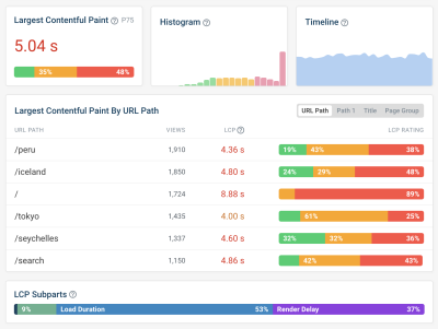


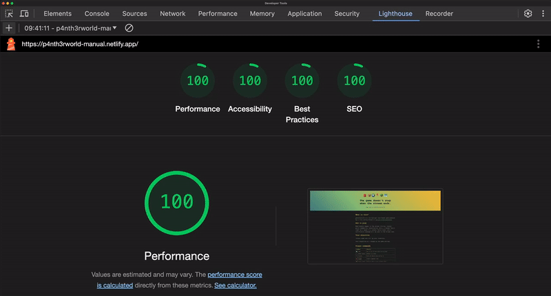
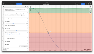
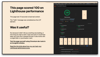

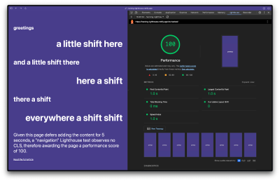
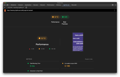


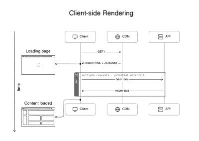
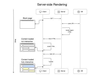


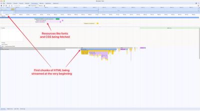
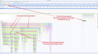
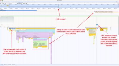
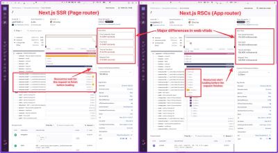
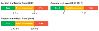
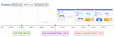
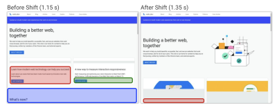
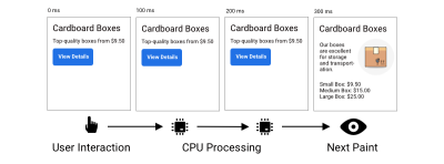
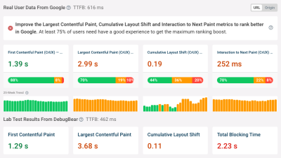
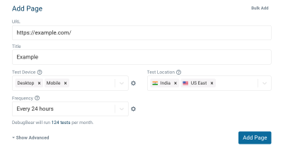
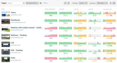
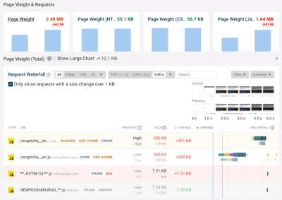
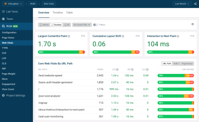
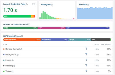
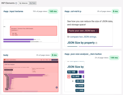
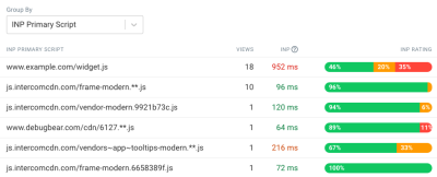
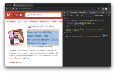
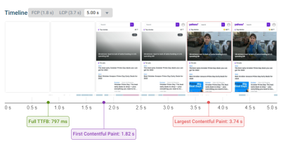

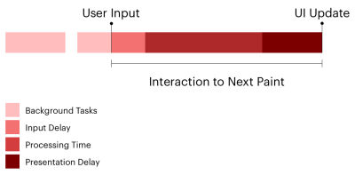
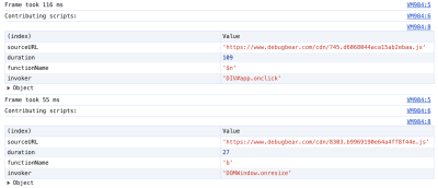
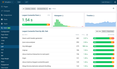
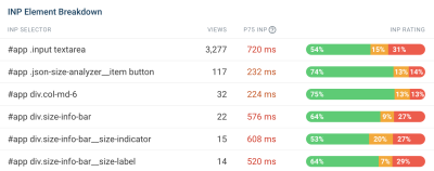
