Preparing For Interaction To Next Paint, A New Web Core Vital

Preparing For Interaction To Next Paint, A New Web Core Vital

Preparing For Interaction To Next Paint, A New Web Core Vital

Geoff Graham

2023-12-07T21:00:00+00:00
2025-06-20T10:32:35+00:00

This article is sponsored by DebugBear

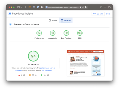
There’s a change coming to the Core Web Vitals lineup. If you’re reading this before March 2024 and fire up your favorite performance monitoring tool, you’re going to to get a Core Web Vitals report like this one pulled from PageSpeed Insights:

Core Web Vitals report with six mini-charts

(Large preview)

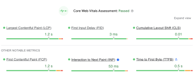
You’re likely used to seeing most of these metrics. But there’s a good reason for the little blue icon sitting next to the second metric in the second row, Interaction to Next Paint (INP). It’s the newest metric of the bunch and is set to formally be a ranking factor in Google search results beginning in March 2024.

And there’s a good reason that INP sits immediately below the First Input Delay (FID) in that chart. INP will officially replace FID when it becomes an official Core Web Vital metric.

The fact that INP is already available in performance reports means we have an opportunity to familiarize ourselves with it today, in advance of its release. That’s what this article is all about. Rather than pushing off INP until after it starts influencing the way we measure site performance, let’s take a few minutes to level up our understanding of what it is and why it’s designed to replace FID. This way, you’ll not only have the information you need to read your performance reports come March 2024 but can proactively prepare your website for the change.

“I’m Not Seeing Those Metrics In My Reports”

Chances are that you’re looking at Lighthouse or some other report based on lab data. And by that, I mean data that isn’t coming from the field in the form of “real” users. You configure the test by applying some form of simulated throttling and start watching the results pour in. In other words, the data is not looking at your actual web traffic but a simulated environment that gives you an approximate view of traffic when certain conditions are in place.

I say all that because it’s important to remember that not all performance data is equal, and some metrics are simply impossible to measure with certain types of data. INP and FID happen to be a couple of metrics where lab data is unsuitable for meaningful results, and that’s because both INP and FID are measurements of user interactions. That may not have been immediately obvious by the name “First Input Delay,” but it’s clear as day when we start talking about “Interaction to Next Paint” — it’s right there in the name!

Simulated lab data, like what is used in Lighthouse reports, does not interact with the page. That means there is no way for it to evaluate the first input a user makes or any other interactions on the page.

So, that’s why you’re not seeing INP or FID in your reports. If you want these metrics, then you will want to use a performance tool that is capable of using real user data, such as DebugBear, which can monitor your actual traffic on an ongoing basis in real time, or PageSpeed Insights which bases its finding on Google’s “Chrome User Experience Report” (commonly referred to as CrUX), though DebugBear is capable of providing CrUX reporting as well. The difference between real-time user monitoring and measuring performance against CrUX data is big enough that it’s worth reading up on it, and we have a full article on Smashing Magazine that goes deeply into the differences for you.

INP Improves How Page Interactions Are Measured

OK, so we now know that both INP and FID are about page interactions. Specifically, they are about measuring the time between a user interacting with the page and the page responding to that interaction.

What’s the difference between the two metrics, then? The answer is two-fold. First, FID is a measure of the time it takes the page to start processing an interaction or the input delay. That sounds fine on the surface — we want to know how much time it takes for a user to start an interaction and optimize it if we can. The problem with it, though, is that it takes just one part of the time for the page to fully respond to an interaction.

A more complete picture considers the input delay in addition to two other components: processing time and presentation delay. In other words, we should also look at the time it takes to process the interaction and the time it takes for the page to render the UI in response. As you may have already guessed, INP considers all three delays, whereas FID considers only the input delay.

Diagram of a timeline aligned with the three INP components.

(Large preview)

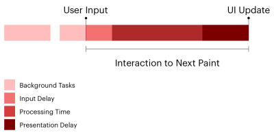
The second difference between INP and FID is which interactions are evaluated. FID is not shy about which interaction it measures: the very first one, as in the input delay of the first interaction on the page. We can think of INP as a more complete and accurate representation of how fast your page responds to user interactions because it looks at every single one on the page. It’s probably rare for a page to have only one interaction, and whatever interactions there are after the first interaction are likely located well down the page and happen after the page has fully loaded.

So, where FID looks at the first interaction — and only the input delay of that interaction — INP considers the entire lifecycle of all interactions.

Measuring Interaction To Next Paint

Both FID and INP are measured in milliseconds. Don’t get too worried if you notice your INP time is greater than your FID. That’s bound to happen when all of the interactions on the page are evaluated instead of the first interaction alone.

Google’s guidance is to maintain an FID under 100ms. And remember, FID does not take into account the time it takes for the event to process, nor does it consider the time it takes the page to update following the event. It only looks at the delay of the event process.

And since INP does indeed take all three of those factors into account — the input delay, processing time, and presentation delay — Google’s guidance for measuring INP is inherently larger than FID: under 200ms for a “good” result, and between 200-500ms for a passing result. Any interaction that adds up to a delay greater than 500ms is a clear bottleneck.

Showing the 200ms-500ms range of passing INP scores.

(Large preview)

The goal is to spot slow interactions and optimize them for a smoother user experience. How exactly do you identify those problems? That’s what we’re looking at next.

Identifying Slow Interactions

There’s already plenty you can do right now to optimize your site for INP before it becomes an official Core Web Vital in March 2024. Let’s walk through the process.

Of course, we’re talking about the user doing something on the page, i.e., an action such as a click or keyboard focus. That might be expanding a panel in an accordion component or perhaps triggering a modal or a prompt any change in a state where the UI updates in response.

Your page may consist of little more than content and images, making for very few, if any, interactions. It could just as well be some sort of game-based UI with thousands of interactions. INP can be a heckuva lot of work, but it really comes down to how many interactions we’re talking about.

We’ve already talked about the difference between field data and lab data and how lab data is simply unable to measure page interactions accurately. That means you will want to rely on field data when pulling INP reports to identify bottlenecks. And when we’re talking about field data, we’re talking about two different flavors:

  1. Data from the CrUX report that is based on the results of real Chrome users. This is readily available in PageSpeed Insights and Google Search Console, not to mention DebugBear. If you use either of Google’s tools, just note that their throttling methods collect metrics on a fast connection and then estimate how fast the page would be on a slower connection. DebugBear actually tests with a slower network, resulting in more accurate data.
  2. Monitoring your website’s real-time traffic, which will require adding a snippet to your source code that sends traffic data to a service. And, yes, DebugBear is one such service, though there are others. You can even take advantage of historical CrUX data integrated with BigQuery to get a historical view of your results dating back as far as 2017 with new data coming in monthly, which isn’t exactly “real-time” monitoring of your actual traffic, but certainly useful.

You will get the most bang for your buck with real-time monitoring that keeps a historical record of data you can use to evaluate INP results over time.

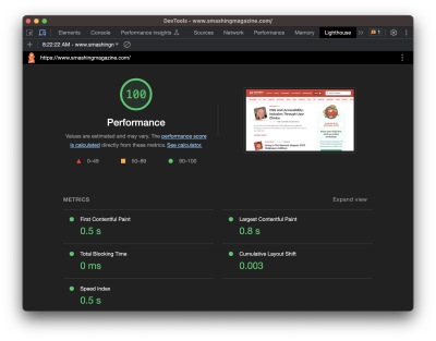
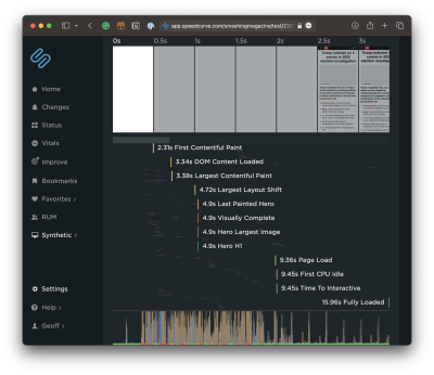
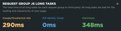
That said, you can still start identifying bottlenecks today if you prefer not to dive into real-time monitoring right this second. DebugBear has a tool that analyzes any URL your throw at it. What’s great about this is that it shows you the elements that receive user interaction and provides the results right next to them. The result of the element that takes the longest is your INP result. That’s true whether you have one component above the 500ms threshold or 100 of them on the page.

The fact that DebugBear’s tool highlights all of the interactions and organizes them by INP makes identifying bottlenecks a straightforward process.

DebugBear INP report.

Whoa there! We have a bottleneck! (Large preview)

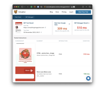
See that? There’s a clear INP offender on Smashing Magazine’s homepage, and it comes in slightly outside the healthy INP range for a score of 510ms even though the next “slowest” result is 184ms. There’s a little work we need to do between now and March to remedy that.

Notice, too, that there are actually two scores in the report: the INP Debugger Result and the Real User Google Data. The results aren’t even close! If we were to go by the Google CrUX data, we’re looking at a result that is 201ms faster than the INP Debugger’s result — a big enough difference that would result in the Smashing Magazine homepage fully passing INP.

Ultimately, what matters is how real users experience your website, and you need to look at the CrUX data to see that. The elements identified by the INP Debugger may cause slow interactions, but if users only interact with them very rarely, that might not be a priority to fix. But for a perfect user experience, you would want both results to be in the green.

Optimizing Slow Interactions

This is the ultimate objective, right? Once we have identified slow interactions — whether through a quick test with CrUX data or a real-time monitoring solution — we need to optimize them so their delays are at least under 500ms, but ideally under 200ms.

Optimizing INP comes down to CPU activity at the end of the day. But as we now know, INP measures two additional components of interactions that FID does not for a total of three components: input delay, processing time, and presentation delay. Each one is an opportunity to optimize the interaction, so let’s break them down.

Reduce The Input Delay

This is what FID is solely concerned with, and it’s the time it takes between the user’s input, such as a click, and for the interaction to start.

Diagram showing FID in relation to Total Blocking Time and UI update.

(Large preview)

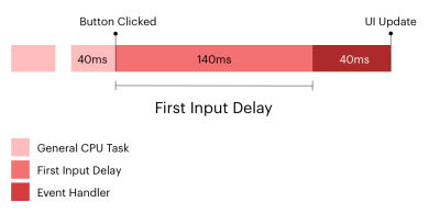
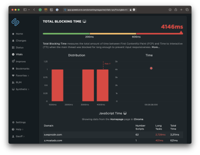
This is where the Total Blocking Time (TBT) metric is a good one because it looks at CPU activity happening on the main thread, which adds time for the page to be able to respond to a user’s interaction. TBT does not count toward Google’s search rankings, but FID and INP do, and both are directly influenced by TBT. So, it’s a pretty big deal.

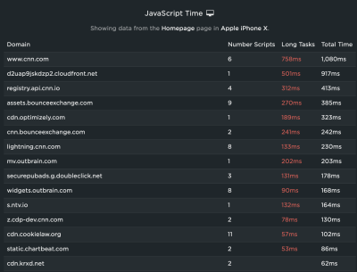
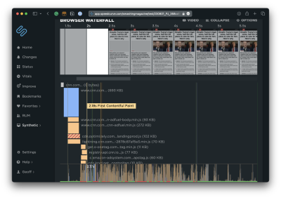
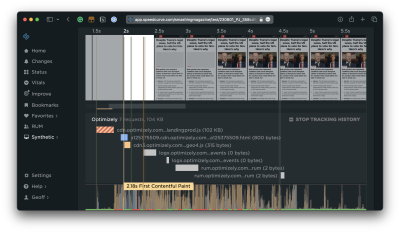
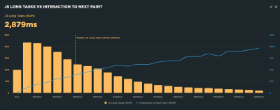
You will want to heavily audit what tasks are running on the main thread to improve your TBT and, as a result, your INP. Specifically, you want to watch for long tasks on the main thread, which are those that take more than 50ms to execute. You can get a decent visualization of tasks on the main thread in DevTools:

Safari DevTools Timelines report

The “Timelines” feature in Safari DevTools records the page load and produces a timeline of activity that can be broken down by network requests, layout and rendering, JavaScript and events, and CPU. Chrome and Firefox offer the same features but may look a little different, as browsers tend to do. (Large preview)

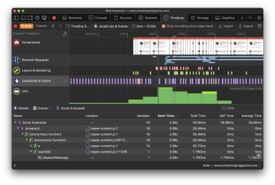
The bottom line: Optimize those long tasks! There are plenty of approaches you could take depending on your app. Not all scripts are equal in the sense that one may be executing a core feature while another is simply a nice-to-have. You’ll have to ask yourself:

  • Who is the script serving?
  • When is it served?
  • Where is it served from?
  • What is it serving?

Then, depending on your answers, you have plenty of options for how to optimize your long tasks:

Or, nuke any scripts that might no longer be needed!

Reduce Processing Time

Let’s say the user’s input triggers a heavy task, and you need to serve a bunch of JavaScript in response — heavy enough that you know a second or two is needed for the app to fully process the update.

Reduce Presentation Delay

Reducing the time it takes for the presentation is really about reducing the time it takes the browser to display updates to the UI, paint styles, and do all of the calculations needed to produce the layout.

Of course, this is entirely dependent on the complexity of the page. That said, there are a few things to consider to help decrease the gap between when an interaction’s callbacks have finished running and when the browser is able to paint the resulting visual changes.

One thing is being mindful of the overall size of the DOM. The bigger the DOM, the more HTML that needs to be processed. That’s generally true, at least, even though the relationship between DOM size and rendering isn’t exactly 1:1; the browser still needs to work harder to render a larger DOM on the initial page load and when there’s a change on the page. That link will take you to a deep explanation of what contributes to the DOM size, how to measure it, and approaches for reducing it. The gist, though, is trying to maintain a flat structure (i.e., limit the levels of nested elements). Additionally, reviewing your CSS for overly complex selectors is another piece of low-hanging fruit to help move things along.

While we’re talking about CSS, you might consider looking into the content-visibility property and how it could possibly help reduce presentation delay. It comes with a lot of considerations, but if used effectively, it can provide the browser with a hint as far as which elements to defer fully rendering. The idea is that we can render an element’s layout containment but skip the paint until other resources have loaded. Chris Coyier explains how and why that happens, and there are aspects of accessibility to bear in mind.

And remember, if you’re outputting HTML from JavaScript, that JavaScript will have to load in order for the HTML to render. That’s a potential cost that comes with many single-page application frameworks.

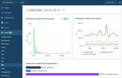
Gain Insight On Your Real User INP Breakdown

The tools we’ve looked at so far can help you look at specific interactions, especially when testing them on your own computer. But how close is that to what your actual visitors experience?

Real user-monitoring (RUM) lets you track how responsive your website is in the real world:

  • What pages have the slowest INP?
  • What INP components have the biggest impact in real life?
  • What page elements do users interact with most often?
  • How fast is the average interaction for a given element?
  • Is our website less responsive for users in different countries?
  • Are our INP scores getting better or worse over time?

There are many RUM solutions out there, and DebugBear RUM is one of them.

DebugBear RUM

(Large preview)

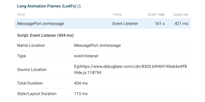
DebugBear also supports the proposed Long Animation Frames API that can help you identify the source code that’s responsible for CPU tasks in the browser.

Long Animation Frames API

(Large preview)

Conclusion

When Interaction to Next Paint makes its official debut as a Core Web Vital in March 2024, we’re gaining a better way to measure a page’s responsiveness to user interactions that is set to replace the First Input Delay metric.

Rather than looking at the input delay of the first interaction on the page, we get a high-definition evaluation of the least responsive component on the page — including the input delay, processing time, and presentation delay — whether it’s the first interaction or another one located way down the page. In other words, INP is a clearer and more accurate way to measure the speed of user interactions.

Will your app be ready for the change in March 2024? You now have a roadmap to help optimize your user interactions and prepare ahead of time as well as all of the tools you need, including a quick, free option from the team over at DebugBear. This is the time to get a jump on the work; otherwise, you could find yourself with unidentified interactions that exceed the 500ms threshold for a “passing” INP score that negatively impacts your search engine rankings… and user experiences.

Smashing Editorial
(yk, il)

Answering Common Questions About Interpreting Page Speed Reports

Answering Common Questions About Interpreting Page Speed Reports

Answering Common Questions About Interpreting Page Speed Reports

Geoff Graham

2023-10-31T16:00:00+00:00
2025-06-20T10:32:35+00:00

This article is sponsored by DebugBear

Running a performance check on your site isn’t too terribly difficult. It may even be something you do regularly with Lighthouse in Chrome DevTools, where testing is freely available and produces a very attractive-looking report.

Lighthouse report on Smashing Magazine performance

Can’t be perfect every time! (Large preview)

Lighthouse is only one performance auditing tool out of many. The convenience of having it tucked into Chrome DevTools is what makes it an easy go-to for many developers.

But do you know how Lighthouse calculates performance metrics like First Contentful Paint (FCP), Total Blocking Time (TBT), and Cumulative Layout Shift (CLS)? There’s a handy calculator linked up in the report summary that lets you adjust performance values to see how they impact the overall score. Still, there’s nothing in there to tell us about the data Lighthouse is using to evaluate metrics. The linked-up explainer provides more details, from how scores are weighted to why scores may fluctuate between test runs.

Why do we need Lighthouse at all when Google also offers similar reports in PageSpeed Insights (PSI)? The truth is that the two tools were fairly distinct until PSI was updated in 2018 to use Lighthouse reporting.

PSI report on Smashing Magazine performance

(Large preview)

Did you notice that the Performance score in Lighthouse is different from that PSI screenshot? How can one report result in a near-perfect score while the other appears to find more reasons to lower the score? Shouldn’t they be the same if both reports rely on the same underlying tooling to generate scores?

That’s what this article is about. Different tools make different assumptions using different data, whether we are talking about Lighthouse, PageSpeed Insights, or commercial services like DebugBear. That’s what accounts for different results. But there are more specific reasons for the divergence.

Let’s dig into those by answering a set of common questions that pop up during performance audits.

What Does It Mean When PageSpeed Insights Says It Uses “Real-User Experience Data”?

This is a great question because it provides a lot of context for why it’s possible to get varying results from different performance auditing tools. In fact, when we say “real user data,” we’re really referring to two different types of data. And when discussing the two types of data, we’re actually talking about what is called real-user monitoring, or RUM for short.

Type 1: Chrome User Experience Report (CrUX)

What PSI means by “real-user experience data” is that it evaluates the performance data used to measure the core web vitals from your tests against the core web vitals data of actual real-life users. That real-life data is pulled from the Chrome User Experience (CrUX) report, a set of anonymized data collected from Chrome users — at least those who have consented to share data.

CrUX data is important because it is how web core vitals are measured, which, in turn, are a ranking factor for Google’s search results. Google focuses on the 75th percentile of users in the CrUX data when reporting core web vitals metrics. This way, the data represents a vast majority of users while minimizing the possibility of outlier experiences.

But it comes with caveats. For example, the data is pretty slow to update, refreshing every 28 days, meaning it is not the same as real-time monitoring. At the same time, if you plan on using the data yourself, you may find yourself limited to reporting within that floating 28-day range unless you make use of the CrUX History API or BigQuery to produce historical results you can measure against. CrUX is what fuels PSI and Google Search Console, but it is also available in other tools you may already use.

Barry Pollard, a web performance developer advocate for Chrome, wrote an excellent primer on the CrUX Report for Smashing Magazine.

Type 2: Full Real-User Monitoring (RUM)

If CrUX offers one flavor of real-user data, then we can consider “full real-user data” to be another flavor that provides even more in the way individual experiences, such as specific network requests made by the page. This data is distinct from CrUX because it’s collected directly by the website owner by installing an analytics snippet on their website.

Unlike CrUX data, full RUM pulls data from other users using other browsers in addition to Chrome and does so on a continual basis. That means there’s no waiting 28 days for a fresh set of data to see the impact of any changes made to a site.

You can see how you might wind up with different results in performance tests simply by the type of real-user monitoring (RUM) that is in use. Both types are useful, but

You might find that CrUX-based results are excellent for more of a current high-level view of performance than they are an accurate reflection of the users on your site because of that 28-day waiting period, which is where full RUM shines with more immediate results and a greater depth of information.

Does Lighthouse Use RUM Data, Too?

It does not! It uses synthetic data, or what we commonly call lab data. And, just like RUM, we can explain the concept of lab data by breaking it up into two different types.

Type 1: Observed Data

Observed data is performance as the browser sees it. So, instead monitoring real information collected from real users, observed data is more like defining the test conditions ourselves. For example, we could add throttling to the test environment to enforce an artificial condition where the test opens the page on a slower connection. You might think of it like racing a car in virtual reality, where the conditions are decided in advance, rather than racing on a live track where conditions may vary.

A screenshot with a specific performance tab in Chrome DevTools where you can choose between fast 3G, slow 3G, and offline

Chrome DevTools includes a separate “Performance” tab where the testing environment’s CPU and network connection can be artificially throttled to mirror a specific testing condition, such as slow internet speeds. (Large preview)

Type 2: Simulated Data

While we called that last type of data “observed data,” that is not an official industry term or anything. It’s more of a necessary label to help distinguish it from simulated data, which describes how Lighthouse (and many other tools that include Lighthouse in its feature set, such as PSI) applies throttling to a test environment and the results it produces.

The reason for the distinction is that there are different ways to throttle a network for testing. Simulated throttling starts by collecting data on a fast internet connection, then estimates how quickly the page would have loaded on a different connection. The result is a much faster test than it would be to apply throttling before collecting information. Lighthouse can often grab the results and calculate its estimates faster than the time it would take to gather the information and parse it on an artificially slower connection.

Simulated And Observed Data In Lighthouse

Simulated data is the data that Lighthouse uses by default for performance reporting. It’s also what PageSpeed Insights uses since it is powered by Lighthouse under the hood, although PageSpeed Insights also relies on real-user experience data from the CrUX report.

However, it is also possible to collect observed data with Lighthouse. This data is more reliable since it doesn’t depend on an incomplete simulation of Chrome internals and the network stack. The accuracy of observed data depends on how the test environment is set up. If throttling is applied at the operating system level, then the metrics match what a real user with those network conditions would experience. DevTools throttling is easier to set up, but doesn’t accurately reflect how server connections work on the network.

Limitations Of Lab Data

Lab data is fundamentally limited by the fact that it only looks at a single experience in a pre-defined environment. This environment often doesn’t even match the average real user on the website, who may have a faster network connection or a slower CPU. Continuous real-user monitoring can actually tell you how users are experiencing your website and whether it’s fast enough.

So why use lab data at all?

The biggest advantage of lab data is that it produces much more in-depth data than real user monitoring.

Google CrUX data only reports metric values with no debug data telling you how to improve your metrics. In contrast, lab reports contain a lot of analysis and recommendations on how to improve your page speed.

Why Is My Lighthouse LCP Score Worse Than The Real User Data?

It’s a little easier to explain different scores now that we’re familiar with the different types of data used by performance auditing tools. We now know that Google reports on the 75th percentile of real users when reporting web core vitals, which includes LCP.

“By using the 75th percentile, we know that most visits to the site (3 of 4) experienced the target level of performance or better. Additionally, the 75th percentile value is less likely to be affected by outliers. Returning to our example, for a site with 100 visits, 25 of those visits would need to report large outlier samples for the value at the 75th percentile to be affected by outliers. While 25 of 100 samples being outliers is possible, it is much less likely than for the 95th percentile case.”

Brian McQuade

On the flip side, simulated data from Lighthouse neither reports on real users nor accounts for outlier experiences in the same way that CrUX does. So, if we were to set heavy throttling on the CPU or network of a test environment in Lighthouse, we’re actually embracing outlier experiences that CrUX might otherwise toss out. Because Lighthouse applies heavy throttling by default, the result is that we get a worse LCP score in Lighthouse than we do PSI simply because Lighthouse’s data effectively looks at a slow outlier experience.

Why Is My Lighthouse CLS Score Better Than The Real User Data?

Just so we’re on the same page, Cumulative Layout Shift (CLS) measures the “visible stability” of a page layout. If you’ve ever visited a page, scrolled down it a bit before the page has fully loaded, and then noticed that your place on the page shifts when the page load is complete, then you know exactly what CLS is and how it feels.

The nuance here has to do with page interactions. We know that real users are capable of interacting with a page even before it has fully loaded. This is a big deal when measuring CLS because layout shifts often occur lower on the page after a user has scrolled down the page. CrUX data is ideal here because it’s based on real users who would do such a thing and bear the worst effects of CLS.

Lighthouse’s simulated data, meanwhile, does no such thing. It waits patiently for the full page load and never interacts with parts of the page. It doesn’t scroll, click, tap, hover, or interact in any way.

This is why you’re more likely to receive a lower CLS score in a PSI report than you’d get in Lighthouse. It’s not that PSI likes you less, but that the real users in its report are a better reflection of how users interact with a page and are more likely to experience CLS than simulated lab data.

Why Is Interaction to Next Paint Missing In My Lighthouse Report?

This is another case where it’s helpful to know the different types of data used in different tools and how that data interacts — or not — with the page. That’s because the Interaction to Next Paint (INP) metric is all about interactions. It’s right there in the name!

The fact that Lighthouse’s simulated lab data does not interact with the page is a dealbreaker for an INP report. INP is a measure of the latency for all interactions on a given page, where the highest latency — or close to it — informs the final score. For example, if a user clicks on an accordion panel and it takes longer for the content in the panel to render than any other interaction on the page, that is what gets used to evaluate INP.

So, when INP becomes an official core web vitals metric in March 2024, and you notice that it’s not showing up in your Lighthouse report, you’ll know exactly why it isn’t there.

Note: It is possible to script user flows with Lighthouse, including in DevTools. But that probably goes too deep for this article.

Why Is My Time To First Byte Score Worse For Real Users?

The Time to First Byte (TTFB) is what immediately comes to mind for many of us when thinking about page speed performance. We’re talking about the time between establishing a server connection and receiving the first byte of data to render a page.

A graph illustrating the Time to First Byte, which consists of full TTFB and HTTP request TTFB

Source: Source: DebugBear. (Large preview)

TTFB identifies how fast or slow a web server is to respond to requests. What makes it special in the context of core web vitals — even though it is not considered a core web vital itself — is that it precedes all other metrics. The web server needs to establish a connection in order to receive the first byte of data and render everything else that core web vitals metrics measure. TTFB is essentially an indication of how fast users can navigate, and core web vitals can’t happen without it.

You might already see where this is going. When we start talking about server connections, there are going to be differences between the way that RUM data observes the TTFB versus how lab data approaches it. As a result, we’re bound to get different scores based on which performance tools we’re using and in which environment they are. As such, TTFB is more of a “rough guide,” as Jeremy Wagner and Barry Pollard explain:

“Websites vary in how they deliver content. A low TTFB is crucial for getting markup out to the client as soon as possible. However, if a website delivers the initial markup quickly, but that markup then requires JavaScript to populate it with meaningful content […], then achieving the lowest possible TTFB is especially important so that the client-rendering of markup can occur sooner. […] This is why the TTFB thresholds are a “rough guide” and will need to be weighed against how your site delivers its core content.”

Jeremy Wagner and Barry Pollard

So, if your TTFB score comes in higher when using a tool that relies on RUM data than the score you receive from Lighthouse’s lab data, it’s probably because of caches being hit when testing a particular page. Or perhaps the real user is coming in from a shortened URL that redirects them before connecting to the server. It’s even possible that a real user is connecting from a place that is really far from your web server, which takes a little extra time, particularly if you’re not using a CDN or running edge functions. It really depends on both the user and how you serve data.

Why Do Different Tools Report Different Core Web Vitals? What Values Are Correct?

This article has already introduced some of the nuances involved when collecting web vitals data. Different tools and data sources often report different metric values. So which ones can you trust?

When working with lab data, I suggest preferring observed data over simulated data. But you’ll see differences even between tools that all deliver high-quality data. That’s because no two tests are the same, with different test locations, CPU speeds, or Chrome versions. There’s no one right value. Instead, you can use the lab data to identify optimizations and see how your website changes over time when tested in a consistent environment.

Ultimately, what you want to look at is how real users experience your website. From an SEO standpoint, the 28-day Google CrUX data is the gold standard. However, it won’t be accurate if you’ve rolled out performance improvements over the last few weeks. Google also doesn’t report CrUX data for some high-traffic pages because the visitors may not be logged in to their Google profile.

Installing a custom RUM solution on your website can solve that issue, but the numbers won’t match CrUX exactly. That’s because visitors using browsers other than Chrome are now included, as are users with Chrome analytics reporting disabled.

Finally, while Google focuses on the fastest 75% of experiences, that doesn’t mean the 75th percentile is the correct number to look at. Even with good core web vitals, 25% of visitors may still have a slow experience on your website.

Wrapping Up

This has been a close look at how different performance tools audit and report on performance metrics, such as core web vitals. Different tools rely on different types of data that are capable of producing different results when measuring different performance metrics.

So, if you find yourself with a CLS score in Lighthouse that is far lower than what you get in PSI or DebugBear, go with the Lighthouse report because it makes you look better to the big boss. Just kidding! That difference is a big clue that the data between the two tools is uneven, and you can use that information to help diagnose and fix performance issues.

A screenshot of the DebugBear LCP

(Large preview)

Are you looking for a tool to track lab data, Google CrUX data, and full real-user monitoring data? DebugBear helps you keep track of all three types of data in one place and optimize your page speed where it counts.

Smashing Editorial
(yk)

The Fight For The Main Thread

The Fight For The Main Thread

The Fight For The Main Thread

Geoff Graham

2023-10-24T18:00:00+00:00
2025-06-20T10:32:35+00:00

This article is sponsored by SpeedCurve

Performance work is one of those things, as they say, that ought to happen in development. You know, have a plan for it and write code that’s mindful about adding extra weight to the page.

But not everything about performance happens directly at the code level, right? I’d say many — if not most — sites and apps rely on some number of third-party scripts where we might not have any influence over the code. Analytics is a good example. Writing a hand-spun analytics tracking dashboard isn’t what my clients really want to pay me for, so I’ll drop in the ol’ Google Analytics script and maybe never think of it again.

That’s one example and a common one at that. But what’s also common is managing multiple third-party scripts on a single page. One of my clients is big into user tracking, so in addition to a script for analytics, they’re also running third-party scripts for heatmaps, cart abandonments, and personalized recommendations — typical e-commerce stuff. All of that is dumped on any given page in one fell swoop courtesy of Google Tag Manager (GTM), which allows us to deploy and run scripts without having to go through the pain of re-deploying the entire site.

As a result, adding and executing scripts is a fairly trivial task. It is so effortless, in fact, that even non-developers on the team have contributed their own fair share of scripts, many of which I have no clue what they do. The boss wants something, and it’s going to happen one way or another, and GTM facilitates that work without friction between teams.

All of this adds up to what I often hear described as a “fight for the main thread.” That’s when I started hearing more performance-related jargon, like web workers, Core Web Vitals, deferring scripts, and using pre-connect, among others. But what I’ve started learning is that these technical terms for performance make up an arsenal of tools to combat performance bottlenecks.

The real fight, it seems, is evaluating our needs as developers and stakeholders against a user’s needs, namely, the need for a fast and frictionless page load.

Fighting For The Main Thread

We’re talking about performance in the context of JavaScript, but there are lots of things that happen during a page load. The HTML is parsed. Same deal with CSS. Elements are rendered. JavaScript is loaded, and scripts are executed.

All of this happens on the main thread. I’ve heard the main thread described as a highway that gets cars from Point A to Point B; the more cars that are added to the road, the more crowded it gets and the more time it takes for cars to complete their trip. That’s accurate, I think, but we can take it a little further because this particular highway has just one lane, and it only goes in one direction. My mind thinks of San Francisco’s Lombard Street, a twisty one-way path of a tourist trap on a steep decline.

A picture of San Francisco’s Lombard Street, a twisty one-way path

Credit: Brandon Nelson on Unsplash. (Large preview)

The main thread may not be that curvy, but you get the point: there’s only one way to go, and everything that enters it must go through it.

JavaScript operates in much the same way. It’s “single-threaded,” which is how we get the one-way street comparison. I like how Brian Barbour explains it:

“This means it has one call stack and one memory heap. As expected, it executes code in order and must finish executing a piece of code before moving on to the next. It’s synchronous, but at times that can be harmful. For example, if a function takes a while to execute or has to wait on something, it freezes everything up in the meantime.”

— Brian Barbour

So, there we have it: a fight for the main thread. Each resource on a page is a contender vying for a spot on the thread and wants to run first. If one contender takes its sweet time doing its job, then the contenders behind it in line just have to wait.

Monitoring The Main Thread

If you’re like me, I immediately reach for DevTools and open the Lighthouse tab when I need to look into a site’s performance. It covers a lot of ground, like reporting stats about a page’s load time that include Time to First Byte (TTFB), First Contentful Paint (FCP), Largest Contentful Paint (LCP), Cumulative Layout Shift (CLS), and so on.

A screenshot of DevTool on Smashing Magazine

Hey, look at that — great job, team! (Large preview)

I love this stuff! But I also am scared to death of it. I mean, this is stuff for back-end engineers, right? A measly front-end designer like me can be blissfully ignorant of all this mumbo-jumbo.

Meh, untrue. Like accessibility, performance is everyone’s job because everyone’s work contributes to it. Even the choice to use a particular CSS framework influences performance.

Total Blocking Time

One thing I know would be more helpful than a set of Core Web Vitals scores from Lighthouse is knowing the time it takes to go from the First Contentful Paint (FCP) to the Time to Interactive (TTI), a metric known as the Total Blocking Time (TBT). You can see that Lighthouse does indeed provide that metric. Let’s look at it for a site that’s much “heavier” than Smashing Magazine.

A screenshot of DevTools on espn.com with 61 scores on performance and total blocking time  equals to 260ms

(Large preview)

There we go. The problem with the Lighthouse report, though, is that I have no idea what is causing that TBT. We can get a better view if we run the same test in another service, like SpeedCurve, which digs deeper into the metric. We can expand the metric to glean insights into what exactly is causing traffic on the main thread.

A screenshot of SpeedCurve with TBT of Smahsing Magazine

(Large preview)

That’s a nice big view and is a good illustration of TBT’s impact on page speed. The user is forced to wait a whopping 4.1 seconds between the time the first significant piece of content loads and the time the page becomes interactive. That’s a lifetime in web seconds, particularly considering that this test is based on a desktop experience on a high-speed connection.

One of my favorite charts in SpeedCurve is this one showing the distribution of Core Web Vitals metrics during render. You can see the delta between contentful paints and interaction!

A chart in SpeedCurve showing the distribution of Core Web Vitals metrics during render

(Large preview)

Spotting Long Tasks

What I really want to see is JavaScript, which takes more than 50ms to run. These are called long tasks, and they contribute the most strain on the main thread. If I scroll down further into the report, all of the long tasks are highlighted in red.

A screenshot with long tasks time

(Large preview)

Another way I can evaluate scripts is by opening up the Waterfall View. The default view is helpful to see where a particular event happens in the timeline.

Speedcurve Waterfull view

(Large preview)

But wait! This report can be expanded to see not only what is loaded at the various points in time but whether they are blocking the thread and by how much. Most important are the assets that come before the FCP.

Expanded Waterfull view review

(Large preview)

First & Third Party Scripts

I can see right off the bat that Optimizely is serving a render-blocking script. SpeedCurve can go even deeper by distinguishing between first- and third-party scripts.

Waterfull option of showing third-party scripts

(Large preview)

That way, I can see more detail about what’s happening on the Optimizely side of things.

SpeedCurve showing the First Contentful Paint with distinguishment between first- and third-party scripts

(Large preview)

Monitoring Blocking Scripts

With that in place, SpeedCurve actually lets me track all the resources from a specific third-party source in a custom graph that offers me many more data points to evaluate. For example, I can dive into scripts that come from Optimizely with a set of custom filters to compare them with overall requests and sizes.

SpeedCurve custom graph

(Large preview)

This provides a nice way to compare the impact of different third-party scripts that represent blocking and long tasks, like how much time those long tasks represent.

The total time of long tasks

(Large preview)

Or perhaps which of these sources are actually render-blocking:

The number of blocking requests

(Large preview)

These are the kinds of tools that allow us to identify bottlenecks and make a case for optimizing them or removing them altogether. SpeedCurve allows me to monitor this over time, giving me better insight into the performance of those assets.

Monitoring Interaction to Next Paint

There’s going to be a new way to gain insights into main thread traffic when Interaction to Next Paint (INP) is released as a new core vital metric in March 2024. It replaces the First Input Delay (FID) metric.

What’s so important about that? Well, FID has been used to measure load responsiveness, which is a fancy way of saying it looks at how fast the browser loads the first user interaction on the page. And by interaction, we mean some action the user takes that triggers an event, such as a click, mousedown, keydown, or pointerdown event. FID looks at the time the user sparks an interaction and how long the browser processes — or responds to — that input.

FID might easily be overlooked when trying to diagnose long tasks on the main thread because it looks at the amount of time a user spends waiting after interacting with the page rather than the time it takes to render the page itself. It can’t be replicated with lab data because it’s based on a real user interaction. That said, FID is correlated to TBT in that the higher the FID, the higher the TBT, and vice versa. So, TBT is often the go-to metric for identifying long tasks because it can be measured with lab data as well as real-user monitoring (RUM).

But FID is wrought with limitations, the most significant perhaps being that it’s only a measure of the first interaction. That’s where INP comes into play. Instead of measuring the first interaction and only the first interaction, it measures all interactions on a page. Jeremy Wagner has a more articulate explanation:

“The goal of INP is to ensure the time from when a user initiates an interaction until the next frame is painted is as short as possible for all or most interactions the user makes.”
— Jeremy Wagner

Some interactions are naturally going to take longer to respond than others. So, we might think of FID as merely a first impression of responsiveness, whereas INP is a more complete picture. And like FID, the INP score is closely correlated with TBT but even more so, as Annie Sullivan reports:

<img
loading="lazy"
decoding="async"
fetchpriority="low"
width="800"
height="625"

srcset="https://res.cloudinary.com/indysigner/image/fetch/f_auto,q_80/w_400/https://files.smashing.media/articles/fight-main-thread/annie-sullivan-tweet.png 400w,
https://res.cloudinary.com/indysigner/image/fetch/f_auto,q_80/w_800/https://files.smashing.media/articles/fight-main-thread/annie-sullivan-tweet.png 800w,
https://res.cloudinary.com/indysigner/image/fetch/f_auto,q_80/w_1200/https://files.smashing.media/articles/fight-main-thread/annie-sullivan-tweet.png 1200w,
https://res.cloudinary.com/indysigner/image/fetch/f_auto,q_80/w_1600/https://files.smashing.media/articles/fight-main-thread/annie-sullivan-tweet.png 1600w,
https://res.cloudinary.com/indysigner/image/fetch/f_auto,q_80/w_2000/https://files.smashing.media/articles/fight-main-thread/annie-sullivan-tweet.png 2000w"
src="https://res.cloudinary.com/indysigner/image/fetch/f_auto,q_80/w_400/https://files.smashing.media/articles/fight-main-thread/annie-sullivan-tweet.png"

sizes="100vw"
alt="Tweet by Annie Sullivan: First, is INP correlated with TBT? Is it more correlated with TBT than FID? Yes and yes!

But they are both correlated with TBT; is INP catching more problems with main thread blocking JavaScript? We can break down the percent of sites meeting the good threshold: yes it is!”
/>

(Large preview)

Thankfully, performance tools are already beginning to bake INP into their reports. SpeedCurve is indeed one of them, and its report shows how its RUM capabilities can be used to illustrate the correlation between INP and long tasks on the main thread. This correlation chart illustrates how INP gets worse as the total long tasks’ time increases.

A correlation chart illustrating Long tasks vs Interaction to Next Paint

(Large preview)

What’s cool about this report is that it is always collecting data, providing a way to monitor INP and its relationship to long tasks over time.

Not All Scripts Are Created Equal

There is such a thing as a “good” script. It’s not like I’m some anti-JavaScript bloke intent on getting scripts off the web. But what constitutes a “good” one is nuanced.

Who’s It Serving?

Some scripts benefit the organization, and others benefit the user (or both). The challenge is balancing business needs with user needs.

I think web fonts are a good example that serves both needs. A font is a branding consideration as well as a design asset that can enhance the legibility of a site’s content. Something like that might make loading a font script or file worth its cost to page performance. That’s a tough one. So, rather than fully eliminating a font, maybe it can be optimized instead, perhaps by self-hosting the files rather than connecting to a third-party domain or only loading a subset of characters.

Analytics is another difficult choice. I removed analytics from my personal site long ago because I rarely, if ever, looked at them. And even if I did, the stats were more of an ego booster than insightful details that helped me improve the user experience. It’s an easy decision for me, but not so easy for a site that lives and dies by reports that are used to identify and scope improvements.

If the script is really being used to benefit the user at the end of the day, then yeah, it’s worth keeping around.

When Is It Served?

A script may very well serve a valid purpose and benefit both the organization and the end user. But does it need to load first before anything else? That’s the sort of question to ask when a script might be useful, but can certainly jump out of line to let others run first.

I think of chat widgets for customer support. Yes, having a persistent and convenient way for customers to get in touch with support is going to be important, particularly for e-commerce and SaaS-based services. But does it need to be available immediately? Probably not. You’ll probably have a greater case for getting the site to a state that the user can interact with compared to getting a third-party widget up front and center. There’s little point in rendering the widget if the rest of the site is inaccessible anyway. It is better to get things moving first by prioritizing some scripts ahead of others.

Where Is It Served From?

Just because a script comes from a third party doesn’t mean it has to be hosted by a third party. The web fonts example from earlier applies. Can the font files be self-hosted instead rather than needing to establish another outside connection? It’s worth asking. There are self-hosted alternatives to Google Analytics, after all. And even GTM can be self-hosted! That’s why grouping first and third-party scripts in SpeedCurve’s reporting is so useful: spot what is being served and where it is coming from and identify possible opportunities.

A graph showing first and third party size

(Large preview)

What Is It Serving?

Loading one script can bring unexpected visitors along for the ride. I think the classic case is a third-party script that loads its own assets, like a stylesheet. Even if you think you’re only loading one stylesheet &mdahs; your own — it’s very possible that a script loads additional external stylesheets, all of which need to be downloaded and rendered.

A graph showing a number of requests made by each third party, broken down by content type

(Large preview)

Getting JavaScript Off The Main Thread

That’s the goal! We want fewer cars on the road to alleviate traffic on the main thread. There are a bunch of technical ways to go about it. I’m not here to write up a definitive guide of technical approaches for optimizing the main thread, but there is a wealth of material on the topic.

I’ll break down several different approaches and fill them in with resources that do a great job explaining them in full.

Use Web Workers

A web worker, at its most basic, allows us to establish separate threads that handle tasks off the main thread. Web workers run parallel to the main thread. There are limitations to them, of course, most notably not having direct access to the DOM and being unable to share variables with other threads. But using them can be an effective way to re-route traffic from the main thread to other streets, so to speak.

Split JavaScript Bundles Into Individual Pieces

The basic idea is to avoid bundling JavaScript as a monolithic concatenated file in favor of “code splitting” or splitting the bundle up into separate, smaller payloads to send only the code that’s needed. This reduces the amount of JavaScript that needs to be parsed, which improves traffic along the main thread.

Async or Defer Scripts

Both are ways to load JavaScript without blocking the DOM. But they are different! Adding the async attribute to a tag will load the script asynchronously, executing it as soon as it’s downloaded. That’s different from the defer attribute, which is also asynchronous but waits until the DOM is fully loaded before it executes.

Preconnect Network Connections

I guess I could have filed this with async and defer. That’s because preconnect is a value on the rel attribute that’s used on a tag. It gives the browser a hint that you plan to connect to another domain. It establishes the connection as soon as possible prior to actually downloading the resource. The connection is done in advance, allowing the full script to download later.

While it sounds excellent — and it is — pre-connecting comes with an unfortunate downside in that it exposes a user’s IP address to third-party resources used on the page, which is a breach of GDPR compliance. There was a little uproar over that when it was found out that using a Google Fonts script is prone to that as well.

Non-Technical Approaches

I often think of a Yiddish proverb I first saw in Malcolm Gladwell’s Outliers; however, many years ago it came out:

To a worm in horseradish, the whole world is horseradish.

It’s a more pleasing and articulate version of the saying that goes, “To a carpenter, every problem looks like a nail.” So, too, it is for developers working on performance. To us, every problem is code that needs a technical solution. But there are indeed ways to reduce the amount of work happening on the main thread without having to touch code directly.

We discussed earlier that performance is not only a developer’s job; it’s everyone’s responsibility. So, think of these as strategies that encourage a “culture” of good performance in an organization.

Nuke Scripts That Lack Purpose

As I said at the start of this article, there are some scripts on the projects I work on that I have no idea what they do. It’s not because I don’t care. It’s because GTM makes it ridiculously easy to inject scripts on a page, and more than one person can access it across multiple teams.

So, maybe compile a list of all the third-party and render-blocking scripts and figure out who owns them. Is it Dave in DevOps? Marcia in Marketing? Is it someone else entirely? You gotta make friends with them. That way, there can be an honest evaluation of which scripts are actually helping and are critical to balance.

Bend Google Tag Manager To Your Will

Or any tag manager, for that matter. Tag managers have a pretty bad reputation for adding bloat to a page. It’s true; they can definitely make the page size balloon as more and more scripts are injected.

But that reputation is not totally warranted because, like most tools, you have to use them responsibly. Sure, the beauty of something like GTM is how easy it makes adding scripts to a page. That’s the “Tag” in Google Tag Manager. But the real beauty is that convenience, plus the features it provides to manage the scripts. You know, the “Manage” in Google Tag Manager. It’s spelled out right on the tin!

Wrapping Up

Phew! Performance is not exactly a straightforward science. There are objective ways to measure performance, of course, but if I’ve learned anything about it, it’s that subjectivity is a big part of the process. Different scripts are of different sizes and consist of different resources serving different needs that have different priorities for different organizations and their users.

Having access to a free reporting tool like Lighthouse in DevTools is a great start for diagnosing performance issues by identifying bottlenecks on the main thread. Even better are paid tools like SpeedCurve to dig deeper into the data for more targeted insights and to produce visual reports to help make a case for performance improvements for your team and other stakeholders.

While I wish there were some sort of silver bullet to guarantee good performance, I’ll gladly take these and similar tools as a starting point. Most important, though, is having a performance game plan that is served by the tools. And Vitaly’s front-end performance checklist is an excellent place to start.

Smashing Editorial
(yk, il)

Gatsby Headaches: Working With Media (Part 2)

Gatsby Headaches: Working With Media (Part 2)

Gatsby Headaches: Working With Media (Part 2)

Juan Diego Rodríguez

2023-10-16T13:00:00+00:00
2025-06-20T10:32:35+00:00

Gatsby is a true Jamstack framework. It works with React-powered components that consume APIs before optimizing and bundling everything to serve as static files with bits of reactivity. That includes media files, like images, video, and audio.

The problem is that there’s no “one” way to handle media in a Gatsby project. We have plugins for everything, from making queries off your local filesystem and compressing files to inlining SVGs and serving images in the responsive image format.

Which plugins should be used for certain types of media? How about certain use cases for certain types of media? That’s where you might encounter headaches because there are many plugins — some official and some not — that are capable of handling one or more use cases — some outdated and some not.

That is what this brief two-part series is about. In Part 1, we discussed various strategies and techniques for handling images, video, and audio in a Gatsby project.

This time, in Part 2, we are covering a different type of media we commonly encounter: documents. Specifically, we will tackle considerations for Gatsby projects that make use of Markdown and PDF files. And before wrapping up, we will also demonstrate an approach for using 3D models.

Solving Markdown Headaches In Gatsby

In Gatsby, Markdown files are commonly used to programmatically create pages, such as blog posts. You can write content in Markdown, parse it into your GraphQL data layer, source it into your components, and then bundle it as HTML static files during the build process.

Let’s learn how to load, query, and handle the Markdown for an existing page in Gatsby.

Loading And Querying Markdown From GraphQL

The first step on your Gatsby project is to load the project’s Markdown files to the GraphQL data layer. We can do this using the gatsby-source-filesystem plugin we used to query the local filesystem for image files in Part 1 of this series.

npm i gatsby-source-filesystem

In gatsby-config.js, we declare the folder where Markdown files will be saved in the project:

module.exports = {
  plugins: [
    {
      resolve: `gatsby-source-filesystem`,
      options: {
        name: `assets`,
        path: `${ __dirname }/src/assets`,
      },
    },
  ],
};

Let’s say that we have the following Markdown file located in the project’s ./src/assets directory:

---
title: sample-markdown-file
date: 2023-07-29
---

# Sample Markdown File

Lorem ipsum dolor sit amet, consectetur adipiscing elit. Sed consectetur imperdiet urna, vitae pellentesque mauris sollicitudin at. Sed id semper ex, ac vestibulum nunc. Etiam ,

![A beautiful forest!](/forest.jpg "Forest trail")

```bash
lorem ipsum dolor sit
```

## Subsection

Lorem ipsum dolor sit amet, consectetur adipiscing elit. Sed consectetur imperdiet urna, vitae pellentesque mauris sollicitudin at. Sed id semper ex, ac vestibulum nunc. Etiam efficitur, nunc nec placerat dignissim, ipsum ante ultrices ante, sed luctus nisl felis eget ligula. Proin sed quam auctor, posuere enim eu, vulputate felis. Sed egestas, tortor

This example consists of two main sections: the frontmatter and body. It is a common structure for Markdown files.

  • Frontmatter
    Enclosed in triple dashes (---), this is an optional section at the beginning of a Markdown file that contains metadata and configuration settings for the document. In our example, the frontmatter contains information about the page’s title and date, which Gatsby can use as GraphQL arguments.
  • Body
    This is the content that makes up the page’s main body content.

We can use the gatsby-transformer-remark plugin to parse Markdown files to a GraphQL data layer. Once it is installed, we will need to register it in the project’s gatsby-config.js file:

module.exports = {
  plugins: [
    {
      resolve: `gatsby-transformer-remark`,
      options: { },
    },
  ],
};

Restart the development server and navigate to http://localhost:8000/___graphql in the browser. Here, we can play around with Gatsby’s data layer and check our Markdown file above by making a query using the title property (sample-markdown-file) in the frontmatter:

query {
  markdownRemark(frontmatter: { title: { eq: "sample-markdown-file" } }) {
    html
  }
}

This should return the following result:

{
  "data": {
    "markdownRemark": {
      "html": "

Sample Markdown File

n

Lorem ipsum dolor sit amet, consectetur adipiscing elit. Sed consectetur imperdiet urna, vitae pellentesque mauris sollicitudin at." // etc. } }, "extensions": {} }

Notice that the content in the response is formatted in HTML. We can also query the original body as rawMarkdownBody or any of the frontmatter attributes.

Next, let’s turn our attention to approaches for handling Markdown content once it has been queried.

Using DangerouslySetInnerHTML

dangerouslySetInnerHTML is a React feature that injects raw HTML content into a component’s rendered output by overriding the innerHTML property of the DOM node. It’s considered dangerous since it essentially bypasses React’s built-in mechanisms for rendering and sanitizing content, opening up the possibility of cross-site scripting (XSS) attacks without paying special attention.

That said, if you need to render HTML content dynamically but want to avoid the risks associated with dangerouslySetInnerHTML, consider using libraries that sanitize HTML input before rendering it, such as dompurify.

The dangerouslySetInnerHTML prop takes an __html object with a single key that should contain the raw HTML content. Here’s an example:

const DangerousComponent = () => {
  const rawHTML = "

This is dangerous content!

"; return
; };

To display Markdown using dangerouslySetInnerHTML in a Gatsby project, we need first to query the HTML string using Gatsby’s useStaticQuery hook:

import * as React from "react";
import { useStaticQuery, graphql } from "gatsby";

const DangerouslySetInnerHTML = () => {
  const data = useStaticQuery(graphql`
    query {
      markdownRemark(frontmatter: { title: { eq: "sample-markdown-file" } }) {
        html
      }
    }
  `);

  return 
; };

Now, the html property can be injected into the dangerouslySetInnerHTML prop.

import * as React from "react";
import { useStaticQuery, graphql } from "gatsby";

const DangerouslySetInnerHTML = () => {
  const data = useStaticQuery(graphql`
    query {
      markdownRemark(frontmatter: { title: { eq: "sample-markdown-file" } }) {
        html
      }
    }
  `);

  const markup = { __html: data.markdownRemark.html };

  return 
; };

This might look OK at first, but if we were to open the browser to view the content, we would notice that the image declared in the Markdown file is missing from the output. We never told Gatsby to parse it. We do have two options to include it in the query, each with pros and cons:

  1. Use a plugin to parse Markdown images.
    The gatsby-remark-images plugin is capable of processing Markdown images, making them available when querying the Markdown from the data layer. The main downside is the extra configuration it requires to set and render the files. Besides, Markdown images parsed with this plugin only will be available as HTML, so we would need to select a package that can render HTML content into React components, such as rehype-react.
  2. Save images in the static folder.
    The /static folder at the root of a Gatsby project can store assets that won’t be parsed by webpack but will be available in the public directory. Knowing this, we can point Markdown images to the /static directory, and they will be available anywhere in the client. The disadvantage? We are unable to leverage Gatsby’s image optimization features to minimize the overall size of the bundled package in the build process.

The gatsby-remark-images approach is probably most suited for larger projects since it is more manageable than saving all Markdown images in the /static folder.

Let’s assume that we have decided to go with the second approach of saving images to the /static folder. To reference an image in the /static directory, we just point to the filename without any special argument on the path.

const StaticImage = () => {
  return Desert;
};

react-markdown

The react-markdown package provides a component that renders markdown into React components, avoiding the risks of using dangerouslySetInnerHTML. The component uses a syntax tree to build the virtual DOM, which allows for updating only the changing DOM instead of completely overwriting it. And since it uses remark, we can combine react-markdown with remark’s vast plugin ecosystem.

Let’s install the package:

npm i react-markdown

Next, we replace our prior example with the ReactMarkdown component. However, instead of querying for the html property this time, we will query for rawMarkdownBody and then pass the result to ReactMarkdown to render it in the DOM.

import * as React from "react";
import ReactMarkdown from "react-markdown";
import { useStaticQuery, graphql } from "gatsby";

const MarkdownReact = () => {
  const data = useStaticQuery(graphql`
    query {
      markdownRemark(frontmatter: { title: { eq: "sample-markdown-file" } }) {
        rawMarkdownBody
      }
    }
  `);

  return {data.markdownRemark.rawMarkdownBody};
};

markdown-to-jsx

markdown-to-jsx is the most popular Markdown component — and the lightest since it comes without any dependencies. It’s an excellent tool to consider when aiming for performance, and it does not require remark’s plugin ecosystem. The plugin works much the same as the react-markdown package, only this time, we import a Markdown component instead of ReactMarkdown.

npm i markdown-to-jsx
import * as React from "react";
import Markdown from "markdown-to-jsx";
import { useStaticQuery, graphql } from "gatsby";

const MarkdownToJSX = () => {
  const data = useStaticQuery(graphql`
    query {
      markdownRemark(frontmatter: { title: { eq: "sample-markdown-file" } }) {
        rawMarkdownBody
      }
    }
  `);

  return  { data.markdownRemark.rawMarkdownBody };
};

We have taken raw Markdown and parsed it as JSX. But what if we don’t necessarily want to parse it at all? We will look at that use case next.

react-md-editor

Let’s assume for a moment that we are creating a lightweight CMS and want to give users the option to write posts in Markdown. In this case, instead of parsing the Markdown to HTML, we need to query it as-is.

Rather than creating a Markdown editor from scratch to solve this, several packages are capable of handling the raw Markdown for us. My personal favorite is
react-md-editor.

Let’s install the package:

npm i @uiw/react-md-editor

The MDEditor component can be imported and set up as a controlled component:

import * as React from "react";
import { useState } from "react";
import MDEditor from "@uiw/react-md-editor";

const ReactMDEditor = () => {
  const [value, setValue] = useState("**Hello world!!!**");

  return ;
};

The plugin also comes with a built-in MDEditor.Markdown component used to preview the rendered content:

import * as React from "react";
import { useState } from "react";
import MDEditor from "@uiw/react-md-editor";

const ReactMDEditor = () => {
  const [value, setValue] = useState("**Hello world!**");

  return (


Markdown previewer

The plugin includes a feature that shows a preview of the rendered Markdown. (Large preview)

That was a look at various headaches you might encounter when working with Markdown files in Gatsby. Next, we are turning our attention to another type of file, PDF.

Solving PDF Headaches In Gatsby

PDF files handle content with a completely different approach to Markdown files. With Markdown, we simplify the content to its most raw form so it can be easily handled across different front ends. PDFs, however, are the content presented to users on the front end. Rather than extracting the raw content from the file, we want the user to see it as it is, often by making it available for download or embedding it in a way that the user views the contents directly on the page, sort of like a video.

I want to show you four approaches to consider when embedding a PDF file on a page in a Gatsby project.

Using The Element

The easiest way to embed a PDF into your Gatsby project is perhaps through an iframe element:

import * as React from "react";
import samplePDF from "./assets/lorem-ipsum.pdf";

const IframePDF = () => {
  return ;
};

It’s worth calling out here that the iframe element supports lazy loading (loading="lazy") to boost performance in instances where it doesn’t need to load right away.

Embedding A Third-Party Viewer

There are situations where PDFs are more manageable when stored in a third-party service, such as Drive, which includes a PDF viewer that can embedded directly on the page. In these cases, we can use the same iframe we used above, but with the source pointed at the service.

import * as React from "react";

const ThirdPartyIframePDF = () => {
  return (
    
  );
};

It’s a good reminder that you want to trust the third-party content that’s served in an iframe. If we’re effectively loading a document from someone else’s source that we do not control, your site could become prone to security vulnerabilities should that source become compromised.

Using react-pdf

The react-pdf package provides an interface to render PDFs as React components. It is based on pdf.js, a JavaScript library that renders PDFs using HTML Canvas.

To display a PDF file on a , the react-pdf library exposes the Document and Page components:

  • Document: Loads the PDF passed in its file prop.
  • Page: Displays the page passed in its pageNumber prop. It should be placed inside Document.

We can install to our project:

npm i react-pdf

Before we put react-pdf to use, we will need to set up a service worker for pdf.js to process time-consuming tasks such as parsing and rendering a PDF document.

import * as React from "react";
import { pdfjs } from "react-pdf";

pdfjs.GlobalWorkerOptions.workerSrc = "https://unpkg.com/pdfjs-dist@3.6.172/build/pdf.worker.min.js";

const ReactPDF = () => {
  return 
; };

Now, we can import the Document and Page components, passing the PDF file to their props. We can also import the component’s necessary styles while we are at it.

import * as React from "react";
import { Document, Page } from "react-pdf";

import { pdfjs } from "react-pdf";
import "react-pdf/dist/esm/Page/AnnotationLayer.css";
import "react-pdf/dist/esm/Page/TextLayer.css";

import samplePDF from "./assets/lorem-ipsum.pdf";

pdfjs.GlobalWorkerOptions.workerSrc = "https://unpkg.com/pdfjs-dist@3.6.172/build/pdf.worker.min.js";

const ReactPDF = () => {
  return (


  );
};

Since accessing the PDF will change the current page, we can add state management by passing the current pageNumber to the Page component:

import { useState } from "react";

// ...

const ReactPDF = () => {
  const [currentPage, setCurrentPage] = useState(1);

  return (


  );
};

One issue is that we have pagination but don’t have a way to navigate between pages. We can change that by adding controls. First, we will need to know the number of pages in the document, which is accessed on the Document component’s onLoadSuccess event:

// ...

const ReactPDF = () => {
  const [pageNumber, setPageNumber] = useState(null);
  const [currentPage, setCurrentPage] = useState(1);

  const handleLoadSuccess = ({ numPages }) => {
    setPageNumber(numPages);
  };

  return (


  );
};

Next, we display the current page number and add “Next” and “Previous” buttons with their respective handlers to change the current page:

// ...

const ReactPDF = () => {
  const [currentPage, setCurrentPage] = useState(1);
  const [pageNumber, setPageNumber] = useState(null);

  const handlePrevious = () => {
    // checks if it isn't the first page
    if (currentPage > 1) {
      setCurrentPage(currentPage - 1);
    }
  };

  const handleNext = () => {
    // checks if it isn't the last page
    if (currentPage  {
    setPageNumber(numPages);
  };

  return (
    

{currentPage}

); };

This provides us with everything we need to embed a PDF file on a page via the HTML element using react-pdf and pdf.js.

There is another similar package capable of embedding a PDF file in a viewer, complete with pagination controls. We’ll look at that next.

Using react-pdf-viewer

Unlike react-pdf, the react-pdf-viewer package provides built-in customizable controls right out of the box, which makes embedding a multi-page PDF file a lot easier than having to import them separately.

Let’s install it:

npm i @react-pdf-viewer/core@3.12.0 @react-pdf-viewer/default-layout

Since react-pdf-viewer also relies on pdf.js, we will need to create a service worker as we did with react-pdf, but only if we are not using both packages at the same time. This time, we are using a Worker component with a workerUrl prop directed at the worker’s package.

import * as React from "react";
import { Worker } from "@react-pdf-viewer/core";

const ReactPDFViewer = () => {
  return (


Note that a worker like this ought to be set just once at the layout level. This is especially true if you intend to use the PDF viewer across different pages.

Next, we import the Viewer component with its styles and point it at the PDF through its fileUrl prop.

import * as React from "react";
import { Viewer, Worker } from "@react-pdf-viewer/core";

import "@react-pdf-viewer/core/lib/styles/index.css";

import samplePDF from "./assets/lorem-ipsum.pdf";

const ReactPDFViewer = () => {
  return (


Once again, we need to add controls. We can do that by importing the defaultLayoutPlugin (including its corresponding styles), making an instance of it, and passing it in the Viewer component’s plugins prop.

import * as React from "react";
import { Viewer, Worker } from "@react-pdf-viewer/core";
import { defaultLayoutPlugin } from "@react-pdf-viewer/default-layout";

import "@react-pdf-viewer/core/lib/styles/index.css";
import "@react-pdf-viewer/default-layout/lib/styles/index.css";

import samplePDF from "./assets/lorem-ipsum.pdf";

const ReactPDFViewer = () => {
  const defaultLayoutPluginInstance = defaultLayoutPlugin();

  return (


Again, react-pdf-viewer is an alternative to react-pdf that can be a little easier to implement if you don’t need full control over your PDF files, just the embedded viewer.

There is one more plugin that provides an embedded viewer for PDF files. We will look at it, but only briefly, because I personally do not recommend using it in favor of the other approaches we’ve covered.

Why You Shouldn’t Use react-file-viewer

The last plugin we will check out is react-file-viewer, a package that offers an embedded viewer with a simple interface but with the capacity to handle a variety of media in addition to PDF files, including images, videos, PDFs, documents, and spreadsheets.

import * as React from "react";
import FileViewer from "react-file-viewer";

const PDFReactFileViewer = () => {
  return ;
};

While react-file-viewer will get the job done, it is extremely outdated and could easily create more headaches than it solves with compatibility issues. I suggest avoiding it in favor of either an iframe, react-pdf, or react-pdf-viewer.

Solving 3D Model Headaches In Gatsby

I want to cap this brief two-part series with one more media type that might cause headaches in a Gatsby project: 3D models.

A 3D model file is a digital representation of a three-dimensional object that stores information about the object’s geometry, texture, shading, and other properties of the object. On the web, 3D model files are used to enhance user experiences by bringing interactive and immersive content to websites. You are most likely to encounter them in product visualizations, architectural walkthroughs, or educational simulations.

There is a multitude of 3D model formats, including glTF OBJ, FBX, STL, and so on. We will use glTF models for a demonstration of a headache-free 3D model implementation in Gatsby.

The GL Transmission Format (glTF) was designed specifically for the web and real-time applications, making it ideal for our example. Using glTF files does require a specific webpack loader, so for simplicity’s sake, we will save the glTF model in the /static folder at the root of our project as we look at two approaches to create the 3D visual with Three.js:

  1. Using a vanilla implementation of Three.js,
  2. Using a package that integrates Three.js as a React component.

Using Three.js

Three.js creates and loads interactive 3D graphics directly on the web with the help of WebGL, a JavaScript API for rendering 3D graphics in real-time inside HTML elements.

Three.js is not integrated with React or Gatsby out of the box, so we must modify our code to support it. A Three.js tutorial is out of scope for what we are discussing in this article, although excellent learning resources are available in the Three.js documentation.

We start by installing the three library to the Gatsby project:

npm i three

Next, we write a function to load the glTF model for Three.js to reference it. This means we need to import a GLTFLoader add-on to instantiate a new loader object.

import * as React from "react";
import * as THREE from "three";

import { GLTFLoader } from "three/addons/loaders/GLTFLoader.js";

const loadModel = async (scene) => {
  const loader = new GLTFLoader();
};

We use the scene object as a parameter in the loadModel function so we can attach our 3D model once loaded to the scene.

From here, we use loader.load() which takes four arguments:

  1. The glTF file location,
  2. A callback when the resource is loaded,
  3. A callback while loading is in progress,
  4. A callback for handling errors.
import * as React from "react";
import * as THREE from "three";

import { GLTFLoader } from "three/addons/loaders/GLTFLoader.js";

const loadModel = async (scene) => {
  const loader = new GLTFLoader();

  await loader.load(
    "/strawberry.gltf", // glTF file location
    function (gltf) {
      // called when the resource is loaded
      scene.add(gltf.scene);
    },
    undefined, // called while loading is in progress, but we are not using it
    function (error) {
      // called when loading returns errors
      console.error(error);
    }
  );
};

Let’s create a component to host the scene and load the 3D model. We need to know the element’s client width and height, which we can get using React’s useRef hook to access the element’s DOM properties.

import * as React from "react";
import * as THREE from "three";

import { useRef, useEffect } from "react";

// ...

const ThreeLoader = () => {
  const viewerRef = useRef(null);

  return 
; // Gives the element its dimensions };

Since we are using the element’s clientWidth and clientHeight properties, we need to create the scene on the client side inside React’s useEffect hook where we configure the Three.js scene with its necessary complements, e.g., a camera, the WebGL renderer, and lights.

useEffect(() => {
  const { current: viewer } = viewerRef;

  const scene = new THREE.Scene();

  const camera = new THREE.PerspectiveCamera(75, viewer.clientWidth / viewer.clientHeight, 0.1, 1000);

  const renderer = new THREE.WebGLRenderer();

  renderer.setSize(viewer.clientWidth, viewer.clientHeight);

  const ambientLight = new THREE.AmbientLight(0xffffff, 0.4);
  scene.add(ambientLight);

  const directionalLight = new THREE.DirectionalLight(0xffffff);
  directionalLight.position.set(0, 0, 5);
  scene.add(directionalLight);

  viewer.appendChild(renderer.domElement);
  renderer.render(scene, camera);
}, []);

Now we can invoke the loadModel function, passing the scene to it as the only argument:

useEffect(() => {
  const { current: viewer } = viewerRef;

  const scene = new THREE.Scene();

  const camera = new THREE.PerspectiveCamera(75, viewer.clientWidth / viewer.clientHeight, 0.1, 1000);

  const renderer = new THREE.WebGLRenderer();

  renderer.setSize(viewer.clientWidth, viewer.clientHeight);

  const ambientLight = new THREE.AmbientLight(0xffffff, 0.4);
  scene.add(ambientLight);

  const directionalLight = new THREE.DirectionalLight(0xffffff);
  directionalLight.position.set(0, 0, 5);
  scene.add(directionalLight);

  loadModel(scene); // Here!

  viewer.appendChild(renderer.domElement);
  renderer.render(scene, camera);
}, []);

The last part of this vanilla Three.js implementation is to add OrbitControls that allow users to navigate the model. That might look something like this:

import * as React from "react";
import * as THREE from "three";

import { useRef, useEffect } from "react";
import { OrbitControls } from "three/examples/jsm/controls/OrbitControls";
import { GLTFLoader } from "three/addons/loaders/GLTFLoader.js";

const loadModel = async (scene) => {
  const loader = new GLTFLoader();

  await loader.load(
    "/strawberry.gltf", // glTF file location
    function (gltf) {
      // called when the resource is loaded
      scene.add(gltf.scene);
    },
    undefined, // called while loading is in progress, but it is not used
    function (error) {
      // called when loading has errors
      console.error(error);
    }
  );
};

const ThreeLoader = () => {
  const viewerRef = useRef(null);

  useEffect(() => {
    const { current: viewer } = viewerRef;

    const scene = new THREE.Scene();

    const camera = new THREE.PerspectiveCamera(75, viewer.clientWidth / viewer.clientHeight, 0.1, 1000);

    const renderer = new THREE.WebGLRenderer();

    renderer.setSize(viewer.clientWidth, viewer.clientHeight);

    const ambientLight = new THREE.AmbientLight(0xffffff, 0.4);
    scene.add(ambientLight);

    const directionalLight = new THREE.DirectionalLight(0xffffff);
    directionalLight.position.set(0, 0, 5);
    scene.add(directionalLight);

    loadModel(scene);

    const target = new THREE.Vector3(-0.5, 1.2, 0);
    const controls = new OrbitControls(camera, renderer.domElement);
    controls.target = target;

    viewer.appendChild(renderer.domElement);

    var animate = function () {
      requestAnimationFrame(animate);
      controls.update();
      renderer.render(scene, camera);
    };
    animate();
  }, []);

  
; };

That is a straight Three.js implementation in a Gatsby project. Next is another approach using a library.

Using React Three Fiber

react-three-fiber is a library that integrates the Three.js with React. One of its advantages over the vanilla Three.js approach is its ability to manage and update 3D scenes, making it easier to compose scenes without manually handling intricate aspects of Three.js.

We begin by installing the library to the Gatsby project:

npm i react-three-fiber @react-three/drei

Notice that the installation command includes the @react-three/drei package, which we will use to add controls to the 3D viewer.

I personally love react-three-fiber for being tremendously self-explanatory. For example, I had a relatively easy time migrating the extensive chunk of code from the vanilla approach to this much cleaner code:

import * as React from "react";
import { useLoader, Canvas } from "@react-three/fiber";
import { OrbitControls } from "@react-three/drei";
import { GLTFLoader } from "three/examples/jsm/loaders/GLTFLoader";

const ThreeFiberLoader = () => {
  const gltf = useLoader(GLTFLoader, "/strawberry.gltf");

  return (


  );
};

Thanks to react-three-fiber, we get the same result as a vanilla Three.js implementation but with fewer steps, more efficient code, and a slew of abstractions for managing and updating Three.js scenes.

Two Final Tips

The last thing I want to leave you with is two final considerations to take into account when working with media files in a Gatsby project.

Bundling Assets Via Webpack And The /static Folder

Importing an asset as a module so it can be bundled by webpack is a common strategy to add post-processing and minification, as well as hashing paths on the client. But there are two additional use cases where you might want to avoid it altogether and use the static folder in a Gatsby project:

  • Referencing a library outside the bundled code to prevent webpack compatibility issues or a lack of specific loaders.
  • Referencing assets with a specific name, for example, in a web manifest file.

You can find a detailed explanation of the static folder and use it to your advantage in the Gatsby documentation.

Embedding Files From Third-Party Services

Secondly, you can never be too cautious when embedding third-party services on a website. Replaced content elements, like , can introduce various security vulnerabilities, particularly when you do not have control of the source content. By integrating a third party’s scripts, widgets, or content, a website or app is prone to potential vulnerabilities, such as iframe injection or cross-frame scripting.

Moreover, if an integrated third-party service experiences downtime or performance issues, it can directly impact the user experience.

Conclusion

This article explored various approaches for working around common headaches you may encounter when working with Markdown, PDF, and 3D model files in a Gatsby project. In the process, we leveraged several React plugins and Gatsby features that handle how content is parsed, embed files on a page, and manage 3D scenes.

This is also the second article in a brief two-part series that addresses common headaches working with a variety of media types in Gatsby. The first part covers more common media files, including images, video, and audio.

If you’re looking for more cures to Gatsby headaches, please check out my other two-part series that investigates internationalization.

See Also

Smashing Editorial
(gg, yk, il)

Gatsby Headaches: Working With Media (Part 1)

Gatsby Headaches: Working With Media (Part 1)

Gatsby Headaches: Working With Media (Part 1)

Juan Diego Rodríguez

2023-10-09T11:00:00+00:00
2025-06-20T10:32:35+00:00

Working with media files in Gatsby might not be as straightforward as expected. I remember starting my first Gatsby project. After consulting Gatsby’s documentation, I discovered I needed to use the gatsby-source-filesystem plugin to make queries for local files. Easy enough!

That’s where things started getting complicated. Need to use images? Check the docs and install one — or more! — of the many, many plugins available for handling images. How about working with SVG files? There is another plugin for that. Video files? You get the idea.

It’s all great until any of those plugins or packages become outdated and go unmaintained. That’s where the headaches start.

If you are unfamiliar with Gatsby, it’s a React-based static site generator that uses GraphQL to pull structured data from various sources and uses webpack to bundle a project so it can then be deployed and served as static files. It’s essentially a static site generator with reactivity that can pull data from a vast array of sources.

Like many static site frameworks in the Jamstack, Gatsby has traditionally enjoyed a great reputation as a performant framework, although it has taken a hit in recent years. Based on what I’ve seen, however, it’s not so much that the framework is fast or slow but how the framework is configured to handle many of the sorts of things that impact performance, including media files.

So, let’s solve the headaches you might encounter when working with media files in a Gatsby project. This article is the first of a brief two-part series where we will look specifically at the media you are most likely to use: images, video, and audio. After that, the second part of this series will get into different types of files, including Markdown, PDFs, and even 3D models.

Solving Image Headaches In Gatsby

I think that the process of optimizing images can fall into four different buckets:

  1. Optimize image files.
    Minimizing an image’s file size without losing quality directly leads to shorter fetching times. This can be done manually or during a build process. It’s also possible to use a service, like Cloudinary, to handle the work on demand.
  2. Prioritize images that are part of the First Contentful Paint (FCP).
    FCP is a metric that measures the time between the point when a page starts loading to when the first bytes of content are rendered. The idea is that fetching assets that are part of that initial render earlier results in faster loading rather than waiting for other assets lower on the chain.
  3. Lazy loading other images.
    We can prevent the rest of the images from render-blocking other assets using the loading="lazy" attribute on images.
  4. Load the right image file for the right context.
    With responsive images, we can serve one version of an image file at one screen size and serve another image at a different screen size with the srcset and sizes attributes or with the element.

These are great principles for any website, not only those built with Gatsby. But how we build them into a Gatsby-powered site can be confusing, which is why I’m writing this article and perhaps why you’re reading it.

Lazy Loading Images In Gatsby

We can apply an image to a React component in a Gatsby site like this:

import * as React from "react";

import forest from "./assets/images/forest.jpg";

const ImageHTML = () => {
  return Forest trail;
};

It’s important to import the image as a JavaScript module. This lets webpack know to bundle the image and generate a path to its location in the public folder.

This works fine, but when are we ever working with only one image? What if we want to make an image gallery that contains 100 images? If we try to load that many tags at once, they will certainly slow things down and could affect the FCP. That’s where the third principle that uses the loading="lazy" attribute can come into play.

import * as React from "react";

import forest from "./assets/images/forest.jpg";

const LazyImageHTML = () => {
  return Forest trail;
};

We can do the opposite with loading="eager". It instructs the browser to load the image as soon as possible, regardless of whether it is onscreen or not.

import * as React from "react";

import forest from "./assets/images/forest.jpg";

const EagerImageHTML = () => {
  return Forest trail;
};

Implementing Responsive Images In Gatsby

This is a basic example of the HTML for responsive images:

Forest trail

In Gatsby, we must import the images first and pass them to the srcset attribute as template literals so webpack can bundle them:

import * as React from "react";

import forest800 from "./assets/images/forest-800.jpg";

import forest400 from "./assets/images/forest-400.jpg";

const ResponsiveImageHTML = () => {
  return (
    Forest trail
  );
};

That should take care of any responsive image headaches in the future.

Loading Background Images In Gatsby

What about pulling in the URL for an image file to use on the CSS background-url property? That looks something like this:

import * as React from "react";

import "./style.css";

const ImageBackground = () => {
  return 
; };
/* style.css */

.banner {
    aspect-ratio: 16/9;
      background-size: cover;

    background-image: url("./assets/images/forest-800.jpg");

  /* etc. */
}

This is straightforward, but there is still room for optimization! For example, we can do the CSS version of responsive images, which loads the version we want at specific breakpoints.

/* style.css */

@media (max-width: 500px) {
  .banner {
    background-image: url("./assets/images/forest-400.jpg");
  }
}

Using The gatsby-source-filesystem Plugin

Before going any further, I think it is worth installing the gatsby-source-filesystem plugin. It’s an essential part of any Gatsby project because it allows us to query data from various directories in the local filesystem, making it simpler to fetch assets, like a folder of optimized images.

npm i gatsby-source-filesystem

We can add it to our gatsby-config.js file and specify the directory from which we will query our media assets:

// gatsby-config.js

module.exports = {
  plugins: [
    {
      resolve: `gatsby-source-filesystem`,

      options: {
        name: `assets`,

        path: `${ __dirname }/src/assets`,
      },
    },
  ],
};

Remember to restart your development server to see changes from the gatsby-config.js file.

Now that we have gatsby-source-filesystem installed, we can continue solving a few other image-related headaches. For example, the next plugin we look at is capable of simplifying the cures we used for lazy loading and responsive images.

Using The gatsby-plugin-image Plugin

The gatsby-plugin-image plugin (not to be confused with the outdated gatsby-image plugin) uses techniques that automatically handle various aspects of image optimization, such as lazy loading, responsive sizing, and even generating optimized image formats for modern browsers.

Once installed, we can replace standard tags with either the or components, depending on the use case. These components take advantage of the plugin’s features and use the HTML element to ensure the most appropriate image is served to each user based on their device and network conditions.

We can start by installing gatsby-plugin-image and the other plugins it depends on:

npm install gatsby-plugin-image gatsby-plugin-sharp gatsby-transformer-sharp

Let’s add them to the gatsby-config.js file:

// gatsby-config.js

module.exports = {
plugins: [

// other plugins
`gatsby-plugin-image`,
`gatsby-plugin-sharp`,
`gatsby-transformer-sharp`],

};

This provides us with some features we will put to use a bit later.

Using The StaticImage Component

The StaticImage component serves images that don’t require dynamic sourcing or complex transformations. It’s particularly useful for scenarios where you have a fixed image source that doesn’t change based on user interactions or content updates, like logos, icons, or other static images that remain consistent.

The main attributes we will take into consideration are:

  • src: This attribute is required and should be set to the path of the image you want to display.
  • alt: Provides alternative text for the image.
  • placeholder: This attribute can be set to either blurred or dominantColor to define the type of placeholder to display while the image is loading.
  • layout: This defines how the image should be displayed. It can be set to fixed for, as you might imagine, images with a fixed size, fullWidth for images that span the entire container, and constrained for images scaled down to fit their container.
  • loading: This determines when the image should start loading while also supporting the eager and lazy options.

Using StaticImage is similar to using a regular HTML tag. However, StaticImage requires passing the string directly to the src attribute so it can be bundled by webpack.

import * as React from "react";

import { StaticImage } from "gatsby-plugin-image";

const ImageStaticGatsby = () => {
  return (
    
  );
  };

The StaticImage component is great, but you have to take its constraints into account:

  • No Dynamically Loading URLs
    One of the most significant limitations is that the StaticImage component doesn’t support dynamically loading images based on URLs fetched from data sources or APIs.
  • Compile-Time Image Handling
    The StaticImage component’s image handling occurs at compile time. This means that the images you specify are processed and optimized when the Gatsby site is built. Consequently, if you have images that need to change frequently based on user interactions or updates, the static nature of this component might not fit your needs.
  • Limited Transformation Options
    Unlike the more versatile GatsbyImage component, the StaticImage component provides fewer transformation options, e.g., there is no way to apply complex transformations like cropping, resizing, or adjusting image quality directly within the component. You may want to consider alternative solutions if you require advanced transformations.

Using The GatsbyImage Component

The GatsbyImage component is a more versatile solution that addresses the limitations of the StaticImage component. It’s particularly useful for scenarios involving dynamic image loading, complex transformations, and advanced customization.

Some ideal use cases where GatsbyImage is particularly useful include:

  • Dynamic Image Loading
    If you need to load images dynamically based on data from APIs, content management systems, or other sources, the GatsbyImage component is the go-to choice. It can fetch images and optimize their loading behavior.
  • Complex transformations
    The GatsbyImage component is well-suited for advanced transformations, using GraphQL queries to apply them.
  • Responsive images
    For responsive design, the GatsbyImage component excels by automatically generating multiple sizes and formats of an image, ensuring that users receive an appropriate image based on their device and network conditions.

Unlike the StaticImage component, which uses a src attribute, GatsbyImage has an image attribute that takes a gatsbyImageData object. gatsbyImageData contains the image information and can be queried from GraphQL using the following query.

query {
  file(name: { eq: "forest" }) {
    childImageSharp {
      gatsbyImageData(width: 800, placeholder: BLURRED, layout: CONSTRAINED)
    }

    name
  }
}

If you’re following along, you can look around your Gatsby data layer at http://localhost:8000/___graphql.

From here, we can use the useStaticQuery hook and the graphql tag to fetch data from the data layer:

import * as React from "react";

import { useStaticQuery, graphql } from "gatsby";

import { GatsbyImage, getImage } from "gatsby-plugin-image";

const ImageGatsby = () => {
  // Query data here:

  const data = useStaticQue(graphql``);

  return 
; };

Next, we can write the GraphQL query inside of the graphql tag:

import * as React from "react";

import { useStaticQuery, graphql } from "gatsby";

const ImageGatsby = () => {
  const data = useStaticQuery(graphql`
    query {
      file(name: { eq: "forest" }) {
        childImageSharp {
          gatsbyImageData(width: 800, placeholder: BLURRED, layout: CONSTRAINED)
        }

        name
      }
    }
  `);

  return 
; };

Next, we import the GatsbyImage component from gatsby-plugin-image and assign the image’s gatsbyImageData property to the image attribute:

import * as React from "react";

import { useStaticQuery, graphql } from "gatsby";

import { GatsbyImage } from "gatsby-plugin-image";

const ImageGatsby = () => {
  const data = useStaticQuery(graphql`
    query {
      file(name: { eq: "forest" }) {
        childImageSharp {
          gatsbyImageData(width: 800, placeholder: BLURRED, layout: CONSTRAINED)
        }

        name
      }
    }
  `);

  return ;
};

Now, we can use the getImage helper function to make the code easier to read. When given a File object, the function returns the file.childImageSharp.gatsbyImageData property, which can be passed directly to the GatsbyImage component.

import * as React from "react";

import { useStaticQuery, graphql } from "gatsby";

import { GatsbyImage, getImage } from "gatsby-plugin-image";

const ImageGatsby = () => {
  const data = useStaticQuery(graphql`
    query {
      file(name: { eq: "forest" }) {
        childImageSharp {
          gatsbyImageData(width: 800, placeholder: BLURRED, layout: CONSTRAINED)
        }

        name
      }
    }
  `);

  const image = getImage(data.file);

  return ;
};

Using The gatsby-background-image Plugin

Another plugin we could use to take advantage of Gatsby’s image optimization capabilities is the gatsby-background-image plugin. However, I do not recommend using this plugin since it is outdated and prone to compatibility issues. Instead, Gatsby suggests using gatsby-plugin-image when working with the latest Gatsby version 3 and above.

If this compatibility doesn’t represent a significant problem for your project, you can refer to the plugin’s documentation for specific instructions and use it in place of the CSS background-url usage I described earlier.

Solving Video And Audio Headaches In Gatsby

Working with videos and audio can be a bit of a mess in Gatsby since it lacks plugins for sourcing and optimizing these types of files. In fact, Gatsby’s documentation doesn’t name or recommend any official plugins we can turn to.

That means we will have to use vanilla methods for videos and audio in Gatsby.

Using The HTML video Element

The HTML video element is capable of serving different versions of the same video using the tag, much like the img element uses the srset attribute to do the same for responsive images.

That allows us to not only serve a more performant video format but also to provide a fallback video for older browsers that may not support the bleeding edge:

import * as React from "react";

import natureMP4 from "./assets/videos/nature.mp4";

import natureWEBM from "./assets/videos/nature.webm";

const VideoHTML = () => {
  return (
    
  );
};

P;

We can also apply lazy loading to videos like we do for images. While videos do not support the loading="lazy" attribute, there is a preload attribute that is similar in nature. When set to none, the attribute instructs the browser to load a video and its metadata only when the user interacts with it. In other words, it’s lazy-loaded until the user taps or clicks the video.

We can also set the attribute to metadata if we want the video’s details, such as its duration and file size, fetched right away.


Note: I personally do not recommend using the autoplay attribute since it is disruptive and disregards the preload attribute, causing the video to load right away.

And, like images, display a placeholder image for a video while it is loading with the poster attribute pointing to an image file.


Using The HTML audio Element

The audio and video elements behave similarly, so adding an audio element in Gatsby looks nearly identical, aside from the element:

import * as React from "react";

import audioSampleMP3 from "./assets/audio/sample.mp3";

import audioSampleWAV from "./assets/audio/sample.wav";

const AudioHTML = () => {
  return (
    
  );
};

As you might expect, the audio element also supports the preload attribute:


This is probably as good as we can do to use videos and images in Gatsby with performance in mind, aside from saving and compressing the files as best we can before serving them.

Solving iFrame Headaches In Gatsby

Speaking of video, what about ones embedded in an like we might do with a video from YouTube, Vimeo, or some other third party? Those can certainly lead to performance headaches, but it’s not as we have direct control over the video file and where it is served.

Not all is lost because the HTML iframe element supports lazy loading the same way that images do.

import * as React from "react";

const VideoIframe = () => {
  return (
    
  );
};

Embedding a third-party video player via iframe can possibly be an easier path than using the HTML video element. iframe elements are cross-platform compatible and could reduce hosting demands if you are working with heavy video files on your own server.

That said, an iframe is essentially a sandbox serving a page from an outside source. They’re not weightless, and we have no control over the code they contain. There are also GDPR considerations when it comes to services (such as YouTube) due to cookies, data privacy, and third-party ads.

Solving SVG Headaches In Gatsby

SVGs contribute to improved page performance in several ways. Their vector nature results in a much smaller file size compared to raster images, and they can be scaled up without compromising quality. And SVGs can be compressed with GZIP, further reducing file sizes.

That said, there are several ways that we can use SVG files. Let’s tackle each one in the contact of Gatsby.

Using Inline SVG

SVGs are essentially lines of code that describe shapes and paths, making them lightweight and highly customizable. Due to their XML-based structure, SVG images can be directly embedded within the HTML tag.

import * as React from "react";


const SVGInline = () => {

  return (


  );

};

Just remember to change certain SVG attributes, such as xmlns:xlink or xlink:href, to JSX attribute spelling, like xmlnsXlink and xlinkHref, respectively.

Using SVG In img Elements

An SVG file can be passed into an img element’s src attribute like any other image file.

import * as React from "react";

import picture from "./assets/svg/picture.svg";

const SVGinImg = () => {
  return Picture;
};

Loading SVGs inline or as HTML images are the de facto approaches, but there are React and Gatsby plugins capable of simplifying the process, so let’s look at those next.

Inlining SVG With The react-svg Plugin

react-svg provides an efficient way to render SVG images as React components by swapping a ReactSVG component in the DOM with an inline SVG.

Once installing the plugin, import the ReactSVG component and assign the SVG file to the component’s src attribute:

import * as React from "react";

import { ReactSVG } from "react-svg";

import camera from "./assets/svg/camera.svg";

const SVGReact = () => {
  return ;
};

Using The gatsby-plugin-react-svg Plugin

The gatsby-plugin-react-svg plugin adds svg-react-loader to your Gatsby project’s webpack configuration. The plugin adds a loader to support using SVG files as React components while bundling them as inline SVG.

Once the plugin is installed, add it to the gatsby-config.js file. From there, add a webpack rule inside the plugin configuration to only load SVG files ending with a certain filename, making it easy to split inline SVGs from other assets:

// gatsby-config.js

module.exports = {
  plugins: [
    {
      resolve: "gatsby-plugin-react-svg",

      options: {
        rule: {
          include: /.inline.svg$/,
        },
      },
    },
  ],
};

Now we can import SVG files like any other React component:

import * as React from "react";

import Book from "./assets/svg/book.inline.svg";

const GatsbyPluginReactSVG = () => {
  return ;
};

And just like that, we can use SVGs in our Gatsby pages in several different ways!

Conclusion

Even though I personally love Gatsby, working with media files has given me more than a few headaches.

As a final tip, when needing common features such as images or querying from your local filesystem, go ahead and install the necessary plugins. But when you need a minor feature, try doing it yourself with the methods that are already available to you!

If you have experienced different headaches when working with media in Gatsby or have circumvented them with different approaches than what I’ve covered, please share them! This is a big space, and it’s always helpful to see how others approach similar challenges.

Again, this article is the first of a brief two-part series on curing headaches when working with media files in a Gatsby project. The following article will be about avoiding headaches when working with different media files, including Markdown, PDFs, and 3D models.

Further Reading

Smashing Editorial
(gg, yk)

UX & UI Best Practices To Increase Sales with Your B2B Website Design

B2B website design with appropriate UX and UI can increase lead generation and support prospective customers at every stage of the purchase process.

There are key characteristics of B2B websites and B2B customers as well as effective UX and UI design practices that can help you convert new users into leads.

Key Differences Between B2B and B2C Sales

Nowadays, it’s extremely important to provide customers with more helpful and relevant shopping experiences. Brands have to get creative and find new, more meaningful ways to connect with consumers. To follow the latest 4 COVID-era trends and to further improve products and consumer experience, it makes sense to dive into the broad theme of what distinctive needs characterize B2B customers compared to B2C customers. Understanding these unique characteristics and the needs of your target audience is the key to the successful creation and implementation of the most relevant UX (user experience) and UI (user interface) web design decisions. Let’s start!

b2b-vs-b2c-key-differences-table

Time for a Decision 

First of all, unlike most B2C customers, B2B clients often research potential purchase for several weeks. The reason is that B2B customers often involve multiple people in this process, from both the vendor’s company and their own.

Services and Products Specifications

B2B purchases are often big–ticket items or service contracts. The sites’ products and services are often extremely specialized, with complex specifications. Finally, decisions made on B2B websites can have long-term implications — after all, customers aren’t just making one-time purchases. They’re often buying into a long-term vendor relationship that includes support, follow-ups, and future enhancements and add-ons.

Content Requirements 

Research and multicriteria decision-making dominate the B2B user experience. B2B websites must provide a much wider range of information than what’s common in the B2C sector. A B2B website has to offer simple facts that can be easily and quickly understood by an early prospect who’s just looking around to see what’s available.

Creating a well-designed and informative B2B customer journey map can greatly enhance this process, providing a clear roadmap for engaging and converting prospects at each stage of their buying journey.

Target Audience

Another major difference is that B2C users typically buy for themselves. Therefore, they use a one-person decision process: a single user provides the budget and approval, researches the options, makes the decision, completes the purchase, receives the shipment, and uses the product. In contrast, in B2B, each of these steps might involve different people and different departments. That’s why among B2B salespeople there are widely used terms like “choosers” and “users”. Later, as companies and individuals send transactional emails, these become more personalized and precise.

But a B2B website must address many different types of users with various needs. That’s why this added complexity only strengthens the argument for B2B websites to emphasize usability in their UX design.

In the meantime, you should also take security measures such as regarding DDoS attacks, cyberattacks, etc.

The Purchasing Phases of B2B Customers

It doesn’t matter whether you close the sale online or offline, supporting your target users’ purchase process is essential to converting prospects into paying customers. The key component in effective B2B marketing and sales is establishing credibility among prospective clients.

The nature of B2B products and services often demands long sales cycles that can take months or even years. Additionally, depending on the purchase phase, customers will have different needs. Therefore, B2B websites must consider all these variables, in order to:

  • support the purchase process at each stage,
  • establish and maintain good relationships with customers,
  • increase TCR (task completion rate) on your website.
7-purchasing-phases-for-b2b-sales

Research Company Problem

Usually, B2B customers start with a company problem that needs solving, not with a product they’ll have to justify purchasing. Especially when this is a new challenge to their business, this initial research phase is all about seeking out common solutions and identifying the top vendors. Some buyers skip this step for industries or problems that they are already familiar with.

What a good B2B website design needs at this stage:

  • Content that shows expertise, examples of solutions, and already solved challenges. This can take the form of: blog posts and articles, case studies, landing pages that describe managed solutions for specific industries, and product pages about specific customer problems that can be solved with the vendor’s help. You can then repurpose that content sharing it in email newsletters that reach your potential clients directly. And to ensure data safety on both sides, you may want to use an SPF checker as well. Another way to do that is through a high quality podcast series featuring discussions with industry experts, video tutorials demonstrating product benefits, and interactive webinars showcasing real-world implementations to effectively educate, engage, and convert your target audience.

Collect Options and Assess

At this stage, users want to find lists of top vendors, learn more about the shortlisted companies, get a feel for them, call if necessary to fill in missing details, and refine research by getting answers to specific questions. Colleagues will often share options and collaborate to help put together a rubric or requirements for assessing the shortlisted companies.

What a good B2B website design needs at this stage:

  • Detailed specs,
  • Pricing information,
  • Clear product photos,
  • Case studies,
  • Testimonials,
  • Downloadable product assets.

Discuss and Decide

This stage features a heavy collaboration with colleagues from multiple departments to narrow the list of companies and make a final decision. Many B2B customers create presentation materials for the leadership to explain their decision in order to be granted authorization.

What a good B2B website design needs at this stage:

  • Presentation materials,
  • Pricing information,
  • Lead times,
  • Corporate and team member information,
  • Comparison tools.

Purchase

Customers engage with sales representatives to negotiate a price or make an online purchase.

What a good B2B website design needs at this stage:

  • Contact information,
  • Locations of offices,
  • Warranty for support information,
  • Pricing information.

Post-Purchase Support 

In the initial aftermath of the purchase, your customers will have higher support needs from your B2B website, ranging from technical support to questions about migrating from a competitor’s product to requesting adjustments.

What a good B2B website design needs at this stage:

  • Technical support,
  • Contact information for service and account representatives,
  • Turnaround time for service,
  • Implementation and migration guides,
  • Technical documentation,
  • Content on how to get the most value from the product.

Providing top-notch customer support is therefore essential in this stage. If you’re using email to do that, using an email verifier to ensure good deliverability might be a good idea.

Upgrade and Maintain 

At this stage, your customers will be looking to extend the life of their purchase as much as possible. For large mechanical equipment, this often means buying parts, accessories, or consumables; sometimes users will want to upgrade service contracts to accommodate company growth. For software, this can mean purchasing upgrades, modules, and other stopgap solutions to make an older product retain usefulness until the next major purchasing cycle.

What a good B2B website design needs at this stage:

  • Technical information for already owned products,
  • Newer products that can replace older models,
  • Add–ons, modules, and upgrades that can be added to the current product for more benefits,
  • Parts and consumables.

Replace

The process starts again when a service contract ends or equipment reaches the end of its life.

What a good B2B website design needs at this stage:

  • Newer products that can replace older models,
  • Changes in the industry that require new equipment or services,
  • Detailed specs,
  • Clear product photos,
  • Case studies,
  • Testimonials,
  • Downloadable product assets.

Understanding the purchasing phases for B2B customers is extremely important when you plan to implement user-centered design processes (UCD) while working on a website project. At the same time, if you already have a website, you can instantly identify the stages where your users’ needs are poorly covered.

Best Practices for B2B Websites

Demonstrate How You Solve Your Prospect’s Problems

B2B customers are ruthlessly focused on just one thing: how you can solve their problems. Your prospects come to you because their business faces a challenge they cannot deal with on their own, due to the lack of time, resources, or skills. Whether your prospects just need to replace the toner in the office copier, or they look for a partner to help them develop and implement a business strategy, they want to solve a problem. That’s why you should remember to always emphasize these topics on your B2B website and prove you know these challenges inside–out with solutions included.

It’s also a great practice to consider the context of the buyer’s problem and describe your products or services in a way that precedes any questions a client might have. Don’t just say “our cartridges contain 0.8ml of ink”, but rather “with our product, you can print up to 600 pages”. Another great example is Apple’s genius approach to marketing and their famous “1,000 songs in your pocket slogan” — they could have said “5GB of storage”, but instead they’ve turned the information around to make it more relevant to an average customer while addressing the issue of limited space on a device.

Another angle is to consider how people form their queries on Google. Most of the time, they’re not looking for specific models of printers — they will search for solutions to their problems (“why does my printer have lines”) or search for models with specific, non–technical characteristics (“which printer has the cheapest inks”) which also suggests an issue (in this case, limited budget). That’s why it’s important to target all these questions in advance and always be one step ahead of the customer.

Customers need to know immediately whether your organization has the capability to solve their problems. Provide signals on your site to let people know you cater to them.

It is worth emphasizing your unique value proposition too. Determine which elements of your business approach are key differentiators, then advertise them on the homepage and other relevant site areas. In this case, the price can be a key factor, but you should also include:

  • Quick turnaround time for delivery of products,
  • Quick turnaround time for services or consulting to begin,
  • Customization, specialized products, and services,
  • Unique feature set,
  • Perceived quality,
  • Compatibility with existing products or services,
  • Location of the company,
  • Shipping rates and delivery time.

Don’t forget to mention how you solved customer problems in the past. B2B prospects are seeking solutions to their challenges, and while a perfectly written copy might capture their attention, they will still demand proof.

Case studies, testimonials, reviews, and other ways of demonstrating success in past ventures are critical to turning skeptical website visitors into paying customers. For instance, you can offer reviews conducted by external, reputable sources or provide short and true-to-life case studies.

To summarize, demonstrating how you solve your prospect’s problems is a smart approach that can convince users to take specific actions and help you generate new leads on your B2B website.

Keeping Your Customers Engaged

Most B2B websites don’t sell to prospects immediately upon their first visit. With a long sales cycle, B2B websites have to be able to provide valuable information to prospects on a recurring basis in order to close the sale. In fact, the sites that provide the most helpful information to prospects are ones that they return to over and over again as they near the purchasing phase of the sales cycle. This recurring engagement is a crucial part of the customer success process, ensuring that businesses build strong relationships with their clients and guide them through the sales journey effectively.

Providing business value for customers and showcasing valuable content for them is one of digital marketing’s main tasks. There’s lots of talk these days about content strategy (which should be supported by content marketing) and its value for B2B websites.

Content is generated on a recurring basis to both build SEO (Search Engine Optimization) value and to draw returning visitors to your website. Content strategy is only valuable if it helps your prospects understand the business challenges that you solve, and why your expertise helps them.

Focus your efforts on describing common challenges your prospects face and how your company solves these issues. Remember when writing the content that many of your best prospects may have no idea who you are, but if you have a blog post that offers a simple breakdown of their problem, they’re more likely to revisit your website and put you on their shortlist. Providing useful resources differentiates you from your competitors by establishing your organization as having expertise and credibility — qualities every organization seeks.

Considering all of the above, you can use such types of resources as:

  • customer guides,
  • blog page with thorough articles,
  • resource base,
  • whitepapers.

So to increase organic search traffic and lead generation on your B2B website, you should optimize the content on the entire site not only for search engines but also for your specific target audience.

Create Good First Impression 

A first impression can make or break potential transactions. People judge the company’s competence by the way the website looks. An organized and coherent website instills trust and proves competence. UI designers should keep in mind the “less is more” concept — cluttered design and bad information architecture will only lead to confusion. That’s why in the design process, this concept helps to prioritize user interface (UI) elements and, accordingly, reduce the number of unnecessary elements on each page layout.

Also, people have different expectations for what websites should look like depending on the industry. For example, people expect a website in creative industries to reflect a company’s philosophy. Technology companies aren’t held up to the same aesthetic standards as design agencies. More emphasis is placed on clean designs that express professionalism and expertise.

On the other hand, your UI design impacts the audience’s perception of your organization. In a split second, users interact with an interface and decide whether the website is worth their effort. When there’s a mismatch between a site’s user interface design and the company’s business image, people assume that the organization doesn’t have what they want and go elsewhere. UI design also serves another important purpose: people can instantly identify whether they’re on the right web page.

UI Design

Every UI or web designer should remember that a B2B website design isn’t about a lifestyle brand, it needs to convey professional expertise and competence. Carefully consider whether trendy design patterns and visual styles support a message of stability and reliability — especially since many design trends come and go. Pay attention to core design principles and visual guidelines that help users understand your website: visual hierarchy, negative space and balance, and element affordance.

No matter where your organization falls on the creativity spectrum, it’s important to have a simple interaction design. Simple interaction models match people’s mental models by behaving in expected ways. Business customers need websites to streamline their processes, answering their questions quickly and easily. Although creative designs can be delightful, simplicity must come first.

Subtle Cues 

Make your UI design more user-friendly and provide subtle cues. Even when users think a website has what they want, scrolling takes effort, and they typically do it only if they see the proper visual cues. How you place critical elements on the web page can dictate whether people scroll or not. Placing indicators such as headers or content that peeks out into the display’s viewable area suggests that there’s more content below.

Loading Time

Make sure that your site loads quickly. If it takes more than six seconds to load, the users abandon the site. To avoid that, remove unnecessary elements and media that negatively impact page speed. Buggy or unstable elements that take too long to load reduce the user experience and prospect’s impression of your organization. Optimize file sizes and minimize loading time, especially when designing for business audiences.

Also, make sure you pick the best web hosting provider.

Tone of Voice

Use a reasoned, neutral voice on your website. Avoid excessive marketing-speak and meaningless sales phrases. Business customers prefer a straightforward tone that describes the company’s business without hyperbole. Easy access to information and even-handed comparison of products or services make participants feel like the company has nothing to hide.

Content

Write and present content in a way that optimizes scanning, for example by using such elements as headings, subheadings, large type, bold text, highlighted text, bulleted lists, graphics, and captions. Write text that is short and to the point. Don’t overload people with too much text; that can feel overwhelming and intimidating. Instead, use concise and simple language, as well as break up large blocks of information into short paragraphs.

About Us Section 

Offer the About Us section regardless of your company’s size. Sometimes small and medium-sized businesses neglect to have an About Us section on their website, thinking it’s not important.

Surprise — it is. According to B2B Web Usability Report from 2015, 52% of respondents indicated that they want to see the About Us section on the vendor website home page. Only two other pages — Contact and Products & Services — got higher results (64% and 86%, respectively).

The About Us page is particularly important to companies whose brand is not widely recognized. On the other hand, household names can afford to neglect this section.

Navigation

Users prefer consistent navigational structures, especially in business situations where time is scarce. Consistent navigation helps users visualize their current location in site structure and identify alternative options, making it easier to find information and keep track of where they are. Make sure that links in header and footer navigation are named and grouped correctly both on desktop and mobile devices.

Key Takeaways

  • Prove your professionalism and expertise to your potential customers at every step. The key is to understand your prospects’ problems and provide appropriate solutions that are better than your competitors.
  • Engage your customers at each stage of the purchasing process. Provide meaningful content and valuable resources that keep the user’s attention.
  • Create a good first impression using appropriate UI design, tone of voice, and convenient navigation that streamlines purchasing processes.

Conclusion

Whether you use all of these practices or just a few, remember to keep in mind that you create a B2B website design for your target audience. If you don’t know the specific problems and needs of your target audience, you should run user research first, or else you’ll totally misjudge your prospects and give the wrong impression.

If you’d like to learn more about shaping your content towards a specific audience and how to generate leads, read this article on Customer Acquisition Strategy. Without that knowledge, even all those tips on UX/UI design won’t save you from lack of engagement.

So keep all that in mind and design away!

Agile Principles Explained: Definitions and Examples for Software Development

Agile was founded based on values and principles. It’s not a methodology or a philosophy to get things done but rather a framework, and a collection of beliefs teams use to make decisions.

The Agile principles will help you guide your team on the right path, even when you’re unsure of your next step. In this article, we will explain the 12 Agile principles and how these help software teams adapt, optimize, and improve the development of software products or services.

What is Agile?

SoftwareDevelopmentLifecycle_Agile-1536x1067

Agile refers to methodologies focused on iterative development where processes and solutions occur through continual collaboration among cross-functional teams.

Instead of following a well-defined and strict plan, Agile teams focus on continual improvement and efficiency. They work under “sprints,” which consist of specific tasks or deliverables boxed in a time frame. Each sprint typically lasts from two to four weeks, but this depends on the product in development. What’s worth noting is that sprints are not used in every single Agile approach. Kanban, for example, doesn’t use it.

In software development, Agile transformed entirely the way teams structured processes. Before Agile, software development life cycles like Waterfall focused on delivering software through a linear and rigid process.

With Agile, there’s no set of rules, procedures, or hierarchy that needs to be followed. The Agile software development life cycle (SDLC) focuses on breaking the process into manageable actions that can be continually improved until it reaches its primary goal. What matters is to deliver the best result possible.

A group of 17 engineers created Agile, focusing on building an efficient foundation to manage projects. However, since its inception, Agile has been more than a series of methodologies.

With 4 core values and 12 principles, Agile has become a globally accepted mindset for managing projects.

4 Agile Values

The Agile manifesto has 4 values and the 12 supporting principles that lead the Agile approach to software development.

1. Individuals and Interactions Over Processes and Tools

You can have high-tech tools and solid processes, but it’s the team that determines a project’s success. This value focuses on the importance of having teams with fluid communication who can respond to changes and customer needs. No matter if your team uses Slack, Microsoft Teams, or a virtual phone system, you simply must communicate clearly to work well.

2. Working Software Over Comprehensive Documentation

One of the reasons software development was slower and ineffective was due to all the technical specifications, requirements, documents, extensive planning, etc. Some Agile requirements are presented as a user story, which helps speed up the process. Documentation is still valuable, but working software is even more valuable in Agile.

3. Customer Collaboration Over Contract Negotiation

Agile aims to have customers engaged and who collaborate throughout the development process. Instead of having a negotiation period to outline all project details, it focuses on having a collaborative relationship from the start resulting in customers being heavily involved in the process. This makes it easy for Agile teams to quickly implement the customer’s feedback, understanding their needs and requirements.

4. Responding to Change Over Following a Plan

What characterizes Agile is that it embraces change. Instead of having a very strict and specific plan of development, the project should focus on delivering value. The definition of what value means for the project will vary, along with the project scope.

The 12 Agile Principles Explained

principles-of-agile-1536x1023

What are the 12 principles of Agile?

The 12 Agile Manifesto Principles are designed to help teams focus on what’s important, such as efficiently delivering valuable software, embracing change, working collaboratively, and prioritizing the customer’s needs, among other things.

These are the 12 principles of Agile explained:

1. “Our highest priority is to satisfy the customer through early and continuous delivery of valuable software.”

Understanding customers’ changing expectations is one of the priorities in Agile teams. Instead of having a linear structure, where they engage with customers only at the start and end of the project, Agile emphasizes the importance of having a continuous cycle of feedback and improvement.

Agile understands that a customer’s needs might change or evolve, so instead of focusing on a rigid plan, teams focus on a series of iterations followed by customer feedback. This way, it’s easier for the product to be aligned with customer expectations and allows the team to focus only on valuable features.

Example:

As this principle focuses on the continuous feedback cycle, Agile teams often build a minimum viable product (MVP), and its response informs future releases. Product teams can test and validate their ideas by using MVP and experimentations. Teams do not release a final product, but iterations continue to make improvements until the product has reached a certain level of satisfaction.

2. “Welcome changing requirements, even late in development. Agile processes harness change for the customer’s competitive advantage.”

One of the main characteristics of an Agile project is its adaptability. This second principle means that teams need to be willing to make changes to stay competitive even when the project is advanced.

Often, software teams think that the most reliable way to achieve a successful product is to make a solid plan and stick to it. But for Agile, it’s the other way around. Allowing change is necessary for teams to gain a competitive advantage.

Agile teams embrace change and are continually reconsidering their strategies and processes to ensure the quality of the product.

Adaptation and the willingness to change are part of Agile’s core strengths. Allowing change becomes necessary for teams to gain a competitive advantage.

 A good way for strengthening your adaptation skills though may be taking part in agile project management training online. Especially, if you haven’t worked in the Agile methodology just yet. Learning directly from experts can particularly speed up the whole process.

Example:

Instead of prioritizing having well-documented plans, the Agile team focuses on observing the market, the customer needs, studying them in-depth, and being aware of the competitive threats they might face along the way.

3. “Deliver working software frequently, from a couple of weeks to a couple of months, with a preference to the shorter timescale.”

As mentioned, for Agile, the clients’ and stakeholders’ feedback is fundamental. Instead of waiting to build a final product to present it, Agile focuses on delivering work frequently.

This means that Agile teams work with “sprints” where tasks and goals are usually planned in the short term.

Sprints allow customers to see how the product is evolving and for the team to evaluate if there are improvements to be made. The idea is to achieve goals on smaller scales that will ultimately contribute to the product as a whole. Teams are aware of the specific goals they need to reach while adapting and changing the product until it fulfills the customer’s expectations.

Example:

Software development teams work in sprints with a set timeframe between 2 and 4 weeks.

4. “Business people and developers must work together daily throughout the project.”

The fourth Agile principle focuses on unifying departments, prioritizing collaboration regularly. The idea is that customers, key stakeholders, and leadership work hand in hand with developers, strengthening the communication channels to ensure everyone is on the same page.

During the development of a product, business and tech groups work together consistently, building trust and transparency throughout the process. It also helps give immediate feedback to developers making sure that new arising requirements and details for existing ones are taken into consideration.

While, for some teams who haven’t applied Agile, having everyone involved through all the stages might seem like it will cost more time, in the long term, it’s more beneficial because it optimizes processes. It helps teams recognize gaps between business and tech teams early enough to avoid future problems.

Transparency while delivering a product is crucial on both sides. Businesses should be aware of development status and blockers as much as developers need to be aware of all market/business or organizational restraints of the project.

Example:

Agile teams prioritize regular meetings. For instance, every day, they have a daily meeting that takes only 15 minutes, and each member of the group shares what they are currently working on and if they have had any roadblocks.

5.  “Build projects around motivated individuals. Give them the environment and support they need, and trust them to get the job done.”

Usually, at the start of the project, where the planning and first steps take place, the team is motivated and ready to get started. However, it is harder for individuals to stay motivated and focused on the final goal when problems arise.

Agile principle 5 emphasizes the importance of choosing the right people with the right skills and roles to be part of the project to achieve success. And it also encourages team leaders to give them the necessary tools and resources.

Motivating team members is also about listening to their ideas and showing that it’s important. Giving team members the confidence to speak up is also a way to help them improve their performance.

This principle also focuses on trust, which translates into avoiding micromanagement. A key aspect of the Agile framework is to empower team members through trust and autonomy.

Example:

Team leaders need to ensure that developers understand strategy and requirements before development starts. Not necessarily focusing on how something will be built, but more on the “what” and “why”. The delivery team is who determines the “how” through the process.

The goal is to provide support when roadblocks appear and brainstorm on possible solutions through the sprints, not micromanaging.

6. “The most efficient and effective method of conveying information to and within a development team is face-to-face conversation.”

The sixth Agile principle translates primarily into two things: Communication and collaboration. The most effective way for teams to be on the same page is to communicate continually.

While this principle focuses on the face-to-face aspects, something to keep in mind is that it was written two decades ago, when Zoom and other remote tools weren’t part of the panorama.

In today’s world, applying this principle is not for face-to-face exclusively, but it highlights the importance of meaningful connections and conversations. While email and texting are fast and easier alternatives, video calls, and even regular phone calls are the best channels for remote teams to communicate effectively.

Example:

This principle is applied in software teams through daily meetings, brainstorming sessions, sprint planning meetings, frequent demos, and pair programming.

7. “Working software is the primary measure of progress.”

To understand this principle, let’s rewind to pre-Agile times to understand how teams used to measure success.

As mentioned, in many cases, software development was a hierarchical and linear process. This meant that teams, instead of working through iterations, left most of the testing and refactoring to the final stage. In the end, this left unhappy customers and many problems to review and improve, and that took time.

Agile focuses on maintaining a working software, measuring the progress of what has been completed. Each feature and addition is reviewed by the tech team and the client. So when it’s time to work on the next steps, the client is happy, and revisions and testing have already taken place.

Working software is not the final product, but it refers to each iteration. Agile teams work on Minimum Viable Features. That way, they measure success by delivering a working product that satisfies customers.

Example:

Software teams design and release Minimum Viable Features instead of fully-fledged features to get feedback and validate the product while building software. This makes agile teams have the capacity to adapt to change and gain a competitive advantage, as explained in the previous principles.

8. “Agile processes promote sustainable development. The sponsors, developers, and users should be able to maintain a constant pace indefinitely.”

The key concept in this principle is “sustainable development.” What Agile means by this is that project managers and leaders should set realistic and clear expectations, even if that means that a project will take longer than expected.

In some cases, software development teams set high expectations trying to fulfill all requirements in a short period. And the problem is that putting in extra time to meet deadlines quickly burns out the team, impacting the quality of the outcome, morale, and motivation.

The idea is to strengthen morale by encouraging a healthy work-life balance with realistic goals. It’s not about finishing projects fast, but about making them at a constant rate.

Example:

Before every sprint takes place, teams need to consider the amount of work they can commit to. Instead of overpromising and not fulfilling expectations, teams should set realistic goals without adding more tasks through the process. Once a sprint starts, teams stick to the goals and tasks they have already established.

9. “Continuous attention to technical excellence and good design enhances agility.”

This principle focuses on constantly reviewing the product after every iteration. Agile promotes continuous attention to technical excellence and good quality design.

The purpose of this principle is to encourage teams to avoid shortcuts just because they want to finish a project faster. Most of the time, shortcuts become more costly in the long run.

Example:

Developers and the product management team work hand in hand to understand if the technical debt is acceptable. Usually, they will need to allocate development resources to refactoring efforts.

10. “Simplicity—the art of maximizing the amount of work not done—is essential.”

This Agile principle focuses on keeping processes as simple as possible. In other words, it talks about working smart, not hard.

Agile teams recognize what adds value to a project and what doesn’t, which enables them to maximize the resources that best serve their project. Too many features and planning are avoided at all costs. The idea is to avoid distractions and streamline the cycle to make it more efficient.

For Agile, simplifying and focusing on the things that truly matter is what has the most impact. In a product management context, leaders should always be focused on prioritizing, even if that means making difficult decisions.

Example:

Product managers are strongly aligned with organizational goals, and the customer wants and needs. This makes them selective in the user stories and features they pick. With prioritization techniques, they ensure that the strategies they implement always have a purpose and a “why” behind them.

11. “The best architectures, requirements, and designs emerge from self-organizing teams.”

Self-organizing teams are made up of a committed and motivated group able to plan, estimate and complete the work autonomously while engaging with the customers. This also breaks down the traditional vertical management style.

This Agile principle focuses on self-organizing teams that work under a more flat and horizontal management style. This translates into autonomous teams capable of acting faster, as they don’t need permission for every decision they make.

Example:

In practice, Agile teams are autonomous groups in an organization that have full control over their projects and take ownership in such areas.

12. “At regular intervals, the team reflects on how to become more effective, then tunes and adjusts its behavior accordingly.”

This last Agile principle encourages leaders to take time to evaluate what the team has done, how they’ve performed, and how they can improve.

Agile focuses on delivering products through continual improvement, always considering feedback. Similar to this process, teams need to frequently evaluate their process and see ways to make it more efficient.

Example:

The idea behind this principle is to have sessions where the team reflects on their performance and discuss ways management and technical skills can be improved.

Key Takeaways

Agile Principles focus on providing guidelines to ensure teams focus on the right things. These are the 12 Agile Principles, explained in simpler terms:

1. Customer satisfaction through early and continuous delivery of software.

2. Focus on working on smaller and achievable tasks.

3. Adhere to a timeframe for the delivery of a working product.

4. Stakeholders need to frequently collaborate throughout the entire development process to ensure the project moves in the right direction.

5. Create a supportive environment that motivates team members.

6. Constant communication is key to a project’s success.

7. Progress is measured by working software.

8. Maintain a constant and realistic pace of development.

9. Always keep an eye out for technical details.

10. Simplicity is key.

11. Promote self-organization.

12. Reflect on the team’s performance to continue improving.

Conclusion

Thousands of organizations across the world claim to be Agile. However, as explained in the article, Agile is not a methodology or a philosophy; it is a framework.

Understanding the values and the principles of Agile provides teams with a foundation to make the right decisions, create quality software, and solid cross-functional teams.

Web App vs Mobile App: Which One to Invest in?

In fact, it’s projected that in 2022 the mobile app revenue worldwide will reach $808.7 billion, and in 2023 it’ll reach the astonishing number of $935.2 billion. Compared to 2014, the revenue difference would be $837.5 billion. Quite impressive, isn’t it?

There’s also a wide choice of available options when it comes to the development of web or mobile applications. What’s the difference though? Do they actually differ, even if they look the same? In this article, we’ll cover all sorts of information about web apps, mobile apps, and how they’re built. What’s more, we’ll try to resolve the web app vs mobile app clash once and for all!

Web App and Mobile App – What’s the Difference?

weight with two phones - what is better mobile or web app?

Have you ever been confused about what a web app and a mobile app are? After all, they look very similar, right? The devil is in the details, so to speak.

Web apps and mobile apps, although they share some similarities to each other, they’re two different types of applications. At first glance, you may notice very few differences between the two as they almost look entirely the same. Design, custom logos, color scheme, functions, icons, they’re probably placed in the same spots. To bring these components to life, the use of cutting-edge AI tools can be of great assistance.

But don’t let this fool you, these two applications are even made differently. One classifies as a web application, and the other is a native mobile app.

The core difference is that native mobile apps are dedicated applications for specific mobile platforms, i.e. Android or iOS, whereas web apps can be accessed through different internet browsers on a computer or on a mobile device.

A great example of how a native app looks compared to a web application would be Uber Eats. You can access it through your mobile device by downloading an application or by accessing the website through your phone’s browser. They will look similar but will be different.

One more noticeable difference between a mobile and a web application would be the ability of native mobile apps to work offline, to a limited extent of course.

Native apps are built from scratch for the mentioned platforms. Users can download them through either App Store or Google Play. That fact alone increases the safety of the app. They require updates that can be done manually or automatically, depending on your preferences. That’s not the case with web apps though, as they are updated by the creators, whenever an update is ready, and it doesn’t take as much time as for the mobile apps.

Coming back to native apps, if you’d like to release an application with paid services for – let’s say – iOS, you’d have to pay a large fee to Apple for every made transaction.

Planning

Before proceeding to the actual building process, it’d be wise to plan your strategy ahead. What we mean is that you could follow one of the software development lifecycle models that would make the development and entire process easier and less complicated, as you would have every step planned and written down.

What’s more, think about your team, what roles would you need for your project. Two roles that you’d definitely need would be a web developer and web designer.

Building Process

Mobile apps are a much faster solution than a typical web application when it comes to performance. Let’s focus on the latter for now. What differentiates a native app from a web app besides the platform? Well, a number of functionalities or time spent on the creation. Your typical programming language or syntaxes for web apps would be either JavaScriptHTML, or CSS. With the help of CMS (like WordPress, Drupal, or Umbraco), devs can build them at a much faster rate.

Things are a little bit different for mobile apps. With more functionalities, native apps have to be developed in a specific programming language with the help of IDE – Integrated Development Environments (though IDEs are not limited to native apps). Additionally, the chosen programming language depends on the target device. For example, if you want to create an application for iOS, you would have to use Swift or Objective-C language. The same situation happens for IDE, as the default for creating apps for iOS would be Xcode. On the contrary to web apps, native mobile apps can be created with SDK – software development kits that are provided by Google and Apple. They can make the mobile app development much better and easier.

How about devices that run on Android? Well, in this case, you’d probably use Java or Kotlin programming languages along with Eclipse IDE or Android Studio software development kits.

There’s also HarmonyOS that’s worth mentioning but it’s much less popular than iOS or Android. So what languages would you use for creating Harmony apps for Huawei? The answer is either C, C++, Java, JavaScript, or Kotlin.

What should you do in a situation where you want to release the native app on multiple platforms? In this particular case, the best solution would be to use one of the cross-platform languages, like Flutter. By doing so you can develop a hybrid app that will land on every mobile platform.

To do so, you can use either React NativeXamarin, or Cordova.

Pros and Cons of Native Mobile Apps

mobile and web apps table comparison

Examples of native apps: Spotify, Pokemon Go, WhatsApp

Pros and Cons of Web Apps

we app pros and cons

Examples of web apps: LinkedIn, Yahoo.

There’s a common ground though, and it’s called progressive web apps. Is it a good solution? Let’s find out.

Progressive Web Apps

A progressive web app (PWA) is a web application that combines features of both native mobile apps and web apps. What exactly? For starters, the ability of mobile apps to work offline. Even though it’s still a web application, it features something called Application Cache that allows it to work without an internet connection. Similar to web apps, they cannot be downloaded but accessed through an internet browser. Though they still can be added to the home screen.

Many programmers additionally use web frameworks like Angular or React to help them build their applications.

In 2020, 24% of worldwide e-commerce companies were planning on investing in progressive web apps. Additionally, 11% already did have PWAs, and 22% simply weren’t sure.

PWAs philosophy is based on three core pillars, they have to be:

  • Capable;
  • Reliable;
  • Installable.
PWA pros and cons

Examples of PWAs: Starbucks, Trivago, The Washington Post.

Hybrid Apps

Hybrid mobile apps may seem similar to PWAs, but they’re definitely not the same. Hybrid apps are a mix of both native and web apps, but they can be downloaded from the app store on either Android or iOS.

It’s a great option for those who wish to try out their idea before investing a lot of money. By developing the MVP release, you can see how your app is doing, take suggestions or release fixes.

hybrid apps pros and cons

Examples of hybrid apps: Instagram, Gmail, Twitter.

The Dilemma

Are you perhaps stuck on deciding whether it’s better to create a web app, PWA, or a mobile app? Check out these facts that may help you make the choice!

As we mentioned before in this article, the number of mobile users grows year by year, month after month, and day by day. In fact, there are more mobile phone users than ones using desktops.

But what factors should you take into consideration when choosing one of the two options?

Costs

If you’d like to start with a mobile app then you better have your wallet at hand. Developing a mobile app instead of a web app requires a higher budget. Additionally, if you’d like to release the application on iOS and Android simultaneously, that will cost extra, both in terms of money and time.

Bottom line is that developing a website application or PWA first is a cheaper option (that of course depends on your idea and goal).

Speed

When it comes to speed, web applications lose (though the difference is minimal). Even though PWAs are still faster than web apps, native apps win the race because they’re launched directly from your device.

There’s a downside to it though. In order to access the mobile app, you have to download it first, whereas to access a website app you only need to type in the address and wait for it to load. For PWAs you don’t even have to launch your browser (with the exception of the first time). You can pin the shortcut to your home screen and access it from there.

Another advantage in favor of a mobile app is the ability to work offline, though probably with limited functions.

Accessibility

A well-written website application should work just fine on every platform, whether it’s Windows, Linux, macOS, Android, or iOS. On the other hand, even a well-written native app can work only on one platform. If you’d like it to work on a different one, you’d have to develop a new code from scratch. Definitely a downside of mobile apps.

User Preferences

Since the start of the SARS-CoV-2 pandemic, our lives have changed drastically. Many of us had to give up on social interactions for the time being. Plenty of employees have been sent to work from home and it’s not the only thing that has changed.

People started using their smartphones or mobile devices even more than they used to. The actual amount of hours spent on mobile apps by an average person is 4.2 hours daily which is a 30% increase compared to 2019. That’s more than half of a typical day of work.

The reason for bringing this up is that the web itself is less browsed by the users, but applications are on the top right now.

Visibility in Search Engines

Unlike mobile apps, web apps can be easily found on the internet due to the fact that they can be indexed by search engines. In order to have your app rank high when it comes to downloads and ratings, take proper screenshots showcasing the design and functionalities of your app. Without such actions, it would be much harder to find the application in the app store, compared to the website.

What’s your Target Audience?

Before allocating your budget to either mobile or web applications, think about your target audience. Do you want to develop a business web application for your company? Or perhaps you wish to create a social media platform that could potentially gather people with similar interests? Or maybe you want to start a pet store and develop an e-commerce website for it?

If the former is the case, then creating a web application would be a wiser choice. If your idea is more like the latter, then only the sky’s the limit.

The Verdict

It’s time to summarize all the things we learned about native, web, hybrid, and progressive web apps so far.

As we mentioned before, your go-to app should be chosen based on your idea and target.

apps comparison table

Real-Life Stories

Starbucks

Everyone heard about Starbucks. It’s one of the most popular coffee shops in the world. Let’s jump right into the time machine and head back to the year 2009.

You can hear Flo Rida’s or Pitbull’s songs all around, David Guetta is just becoming popular, and Starbucks just released their myStarbucks app. It lets the users find coffee shops in their proximity, learn about different coffee types, and more.

That was just the beginning of Starbucks’ online presence. In 2011, Starbucks released a loyalty program aimed at people who use the Card Mobile app. That move enabled users to make payments through their phones. In the following year 2012, Starbucks integrated their native app with Square and Apple passbook, the former is a payment system for mobile devices, and the latter is a place where you can keep your loyalty card information.

That’s still not everything. In 2017, Starbucks decided that it was time for a change. With new app ideas, the company released a PWA with everything that the user needs, like images, animations, and of course, offline accessibility. Customers could finally learn about the offered products, and their nutritional values, and could customize their orders, all done without internet access.

It turned out to be a huge success, as Starbucks doubled its daily active users. Moreover, compared to the huge and heavy iOS app (148MB), their PWA only weighs 233kB.

Instagram

Everyone either has an account on Instagram or knows someone that does. It’s one of the biggest success stories regarding mobile apps. The picture-sharing platform gained a massive number of 100,000 users. To make matters more interesting, it even happened in the first week of its initial launch.

Released in 2010, Instagram continues to be one of the most popular social media platforms. Nothing speaks of success more than money, after all, Instagram was bought by Facebook in 2012, for approximately $1,000,000,000. Just wow.

From the companies’ point of view, now they can post to Instagram from a desktop for better quality and share engaging content to attract new audiences and interact with existing customers.

Pinterest

Pinterest is yet another success story of a low-performing website turned PWA. The company wasn’t doing very well. They had a slow-performing website with not as many views, and a poor conversion rate of 1%.

Even though Pinterest already had iOS and Android apps, they still couldn’t manage to get the wanted results. That’s when the idea of a progressive web app started to form.

Pinterest just hit a jackpot! Their core metrics increased, and users spent 40% more of their time on the app compared to the website. Even better, the company noted a 44% increase in revenue coming from the ads, as well as a 60% increase in user engagement.

After all, their PWA only weighs 150kB.

Trivago

The Trivago situation is a little bit different. They didn’t suffer from low numbers of views or lack of interest. Quite the opposite, actually. They were getting more and more visits from mobile users and it was time to think about the future.

Creating a native mobile app from scratch seemed like an expensive and problematic idea. The question of whether people will actually download the app has been one of the issues. Another one was the noticeable connection problems among the mobile visitors. These facts forced Trivago to rethink the idea.

Since native apps are out of the question, the company decided to place its bet on a progressive web application. The number of advantages like browser accessibilitypush notificationsoffline access, or the ability to add a shortcut to your home screen, had solidified the idea.

Was it a good idea? Did they succeed? They definitely did! Up to 2019, Trivago has been added to the home screen more than 500,000 times! Available in 55 countries and in 33 languages, the company’s user engagement increased by 150%. And that’s not all. Their repeated visits increased from 0.8% to 2%, and the push notifications contributed to increasing the conversion by 97%.

Key Takeaways

I promise, we’re almost here, but before we head to conclusions, let’s summarize what we’ve learned so far:

  • Web applications can be accessed through the internet browser and are good for business websites, social media, etc.;
  • Progressive web apps can be accessed through both the browser and the home screen, and they’re great for social media, news, and more;
  • Hybrid apps can serve as a great starting point for testing the MVPs;
  • Native apps are ideal for mobile games and other applications that require high performance and high usage of device’s components.

Conclusions

And here we are! We went through quite a lot of information here, starting from the difference between a mobile app and a web app, through planning, building, properties, and pros and cons of PWAs, hybrid, native, and web apps, to the dilemma, verdict, and some real-life success stories.

After reading this article you should be able to tell the difference between all those apps and decide which one would suit you and your business best.

Best Web Development Blogs To Follow Right Now [2022]

With this list of 10 best web development blogs, with a treat of best YouTube channels and podcasts, you’ll be able to stay up to date with the latest web standards on all fronts — front end, back end, as well as UX/UI design, and every other branch pertaining to the web development services.

Your experience doesn’t matter; if you’re a code newbie looking for new skills or you’re a veteran in the coding world looking for latest news, new standards or solutions to unconventional problems, this list is still for you. And even if you’re neither, and you simply want to discover all the things web development is about, stay on this page and read on!

Top 9 blogs for web developers.

1. A List Apart

list aparat blog logo

Main Topics: Code, Content, Design, Industry & Business, Process, User Experience

Audience: Front end Developers, Project Managers, UX/UI Designers, Graphic Designers, Content Creators

A List Apart is a webzine that’s been active for 23 years now, with a focus on web design and development, web content and its meaning, best practices and standards of modern web. Most of the content consists of opinion articles, ranging from future trends to environmental impact of IT and career advice. That’s why this site is wonderful for people who are not involved directly with web development — they can prepare themselves for better teamwork, understand common practices and be able to spot frauds during recruitment.

The articles are of the highest quality. They do invite writers to submit their pieces, but they’re all diligently checked over, reviewed, and edited. It’s not easy to submit a guest post, but they promise that it’s very rewarding. So you can expect to find articles from other IT professionals, keen on sharing their coding expertise.

A List Apart doesn’t stop at blogging. They also organise An Event Apart, a conference in San Francisco (which you can also join online) that’s known for being informative, educational, as well as inspirational. For some, it’s an event you can’t miss, especially since the invited speakers are well–known industry leaders.

And if you’re looking for knowledge condensed in one place, check out their book: A Book Apart, for those who design, write, and code. 

2. Codrops

Codrops logo

Main Topics: Tutorials, ResourcesCode, Design, User Experience

Audience: Front end Developers, UX/UI Designers

Codrops is a fantastic source for front end developers, full of inspiration, useful tutorials, free resources that we all love, and articles with practical advice.

Their tutorials are long and comprehensive, and easy to follow through. They have plenty of embedded images, experimental videos, and lines of code shown in action. So if you want to learn fancy tricks, from creating infinite circular galleries to kinetic typography and glitch effects, this is your go–to site. Just like when you need inspiration: Codrops regularly posts Inspirational Websites Roundup, UI Interactions & Animations Roundup, and many others to spark your creativity.

If you’re not experienced enough to jump straight into tutorials and want to start with the CSS basics, there’s a CSS Reference library with the most important properties and information for you. All for free!

And if you want to know what’s happening in the tech world, check out their Collective, bundles of posts highlighting the latest news and resources.

For non–coding people, it’s a good site to see what can be done, and what the possibilities are.

3. CSS Author 

css blog logo

Main Topics: Resources, Design, Content, User Experience

Audience: Front end Developers, UX/UI Designers, Graphic Designers, Content Creators

CSS Author is a front end coding blog that’s a goldmine of resources for web developers and web designers alike, with occasional publications useful for graphic designers and content writers as well. It has a staggering amount of “freebies”: you can find mockups, icons, and templates for WordPress and CMS, such as Magento or Drupal, etc. They’re all available for personal and commercial use.

This site acts as a good place to find free libraries, plugins, bootstraps, and tools for developers working with HTML, CSS, Java Script, jQuery, PHP.

4. CSS–Tricks 

css-tricks

Main Topics: Tutorials, Resources, Code, User Experience

Audience: Front end Developers, UX/UI Designers

CSS–Tricks is a site you can count on to be constantly posting, sometimes even several times a day. They focus on CSS, HTML, and Java Script in the form of tutorials, guides, tricks, and articles. They range from animation, typography, accessibility, web performance, serverless, and many more. And if you’d rather watch a video than read — there’s more than 200 video posts to choose from.

When it comes to resources, there’s an Almanac with CSS Selectors and CSS Properties with lots of examples and demos. If you’d like some concrete knowledge in one place, the author of the site, Chris Coyier, has two books that are available to MVP Supporters.

5. David Walsh

david-welsch

Main Topics: Tips and Guides, Code, Mobile Development, User Experience

Audience: Full–Stack Developers, UX/UI Designers, Content Creators

David Walsh is a personal blog, run by a professional senior full stack engineer

working for MetaMask, who also used to work for Mozilla for eight years. So you can be sure that the guy knows what he’s talking about.

Besides tips and guides mostly on JavaScript (React, Node.js, jQuery), HTML5, CSS3, you can also find sneak peeks into a life in a web development industry, some career advice, and even interviews with other experienced developers. He’s a firm believer that practice triumphs over theory, and that experiments are a worthy pursuit. This approach has resulted in almost 83,000 followers on Twitter.

If you want to discover what a successful web developer needs to make an impact, following David’s blog is a good choice. Especially since new articles just keep on coming, even though the blog has been up for more than a decade.

There’s also some advice on technical SEO, so Content Creators should definitely take a closer look.

6. Dev.to

dev-io

Main Topics: Tutorials, Code, Graphic Design, Content, User Experience, Industry & Business, Career Advice

Audience: Full–Stack Developers, UX/UI Designers, Graphic Designers, Content Creators, Project Managers

Dev.to isn’t really a blog and more of a community of software developers, but we couldn’t not mention it.

On the contrary to all the previous blogs, anyone can contribute to dev.to. All the posts published on the feed are tagged for easier navigation, and it’s easy to notice the popularity of Java Script, React.Js, Python, CSSHTML, Node.js, PHP, Vue.js, and Ruby. There’s also a lot of content for beginners, as well as posts centered around career, testing, machine learning, and security, among others.

If you like podcasts, dev.to has hundreds of them, along with videos in the form of practical tutorials, guides, tips, and useful tricks. You can also find full blog posts that are often cross shared in places like Medium or Hacker Noon. And if you have trouble understanding a concept, you can ask the community to explain it to you “like you’re five years old”. It works wonders and is great even for non–tech people.

7. Joel on Software

joel-on-software

Main Topics: Software Development, Project Management, Industry & Business, Career Advice

Audience: Software developers, Tech Leads, Project Managers, Recruiters, CEOs, Startup Founders

Joel on Software is another personal blog of an accomplished software engineer, Joel Spolsky, a creator of the project management software Trello and a Stack Exchange network. He shares his perspective not only on software development itself, but also on business, project management, recruitment, and getting started in the tech field, served with practical advice on career.

When it comes to the blog, which has been online for over a decade, it has more than 1000 useful articles. Anyone can find valuable content for themselves, from developers and tech leads to project managers, CEOs, and recruiters. Part of that knowledge has been captured into five booksavailable on Amazon.

8. SitePoint

sitepoint

Main Topics: Code, Web Application Development, Graphic Design, User Experience, Industry

Audience: Full–Stack Developers, UI/UX Designers, Entrepreneurs

SitePoint is bursting with books, online courses, and tech talks on topics of Java Script, HTML, CSS, PHP, Python, WordPress, Design & UX, App Development. The library is curated by the experts in web design and web development, so you can trust their input.

This web development blog focuses on a much wider range of subjects. You can learn more about the next wave of web technologies, such as Deno, Eleventy, Gatsby, Rust, WebAssembly, and many others. Reading the blog also ensures that you’re staying up to date with the future of the web and the state of the technology industry.

Not only web developers will benefit from paying attention to this blog, but designers as well. If you want to master Adobe XD, Figma or Sketch, along with any other similar programs, check out their materials. And even those that only want to polish their skills with Notion, Airtable, Obsidian, and other productivity tools, should also take a look.

It’s also a good place for people looking for a web development job or who want to advance their already prospering career. You can find articles full of advice for juniors and seniors alike, along with current job listings for remote positions.

And lastly, if you have questions that are still left unanswered after perusing the blog’s content, you can easily ask the community.

9. Smashing Magazine

smashing-magazine

Main Topics: Code, Mobile App Development, User Experience, Graphic Design

Audience: Full–Stack Developers, Mobile Developers, UX/UI Designers, Graphic Designers

Smashing Magazine is an online magazine of the highest quality, geared towards professional web designers and developers, offering them practical and useful content to improve their skills.

Their goal is to support the virtual community of the coding world with news on the latest web technologies, from app development, responsive web design to accessibility and usability, among many others.

New articles are published several times a week on a wide variety of topics, to keep front end developers, designers, animators, and illustrators more than satisfied. And of course, you can find articles to keep up with the latest trends and opinion articles as food for thought, along with productivity tips

Besides the articles, you can also jump right into guides, books, and online workshops. Not all of them are for free — to access them, you need to buy a membership. There are three levels: for $3, $5 and $9 a month or $30, $50 and $90 a year.

Don’t forget to check out this site’s podcasts. “The Smashing Podcast” runs around 1 hour each, so be prepared to gain a lot of new insight.

Smashing Magazine also takes care to post current job openings and present–day conferences.

Searching For Knowledge Beyond Blogs

Nowadays, blogging sites are not the only source of knowledge that’s worthy of our notice. Several times we’ve mentioned videos and podcasts, that’s why it would have been remiss of us not to list our favourites.

Youtube Channels

freeCodeCamp

FreeCodeCamp is a non–profit organization, supported by donors, with a mission to help people become developers for free. Besides a youtube channel, they run their own site with even more resources, and they also organize study group sessions around the world. They even offer certifications to give you an easier start in the industry.

FreeCodeCamp is perfect for self–learners. You can find there long and comprehensive courses for beginners on Python, SQL, Java Script, C++, C, Penetration Testing, HTML, Data Structure, React, HTML5, CSS3, Django, PHP, APIs, Laravel, and many more. Some of them even last for 15 hours.

TraversyMedia

Traversy Media is perfect for people who already know some basics and wish to learn something new in a quick manner without delving too deeply into each concept. Offered courses last from 20 minutes to 2 hours, with the more comprehensive ones available on Udemy. HTML, CSS, JavaScript, React, Async.js, Laravel, Rust, Ruby, Ruby on Rails, and many more — they’re all waiting to be learned and mastered while building projects from scratch.

The Net Ninja

If you prefer your courses divided into small, digestible parts, look up The Net Ninja. It’s perfect for beginners who want to learn bits and pieces on the run or in between other tasks. The overall tone is light and fun, due to the enthusiastic nature of the host, who is also very thorough and methodical in his approach.

You can choose what to learn next from over 1000 tutorials, that delve into Java Script, Firebase, Flutter, HTML & CSS, Laravel, MongoDB, Node.js, PHP, React, Vue.js, and many more. You can find both beginner and advanced material, so better keep a close eye on this channel.

Fireship

If you’re even more pressed for time, look up Fireship, a channel created by Jeff Delaney on the topic of building web applications of highest quality fast. His longest series is called “100 Seconds of Code”, which is straight to the point while being very informative. It’s perfect for those who want to grasp various concepts quickly before delving into them, or for those who simply want a reminder.

Besides that, you can find out more about development tools, pro tips, productivity tips, 15–25 minutes beginner guides, both for front end and back end, from Java Script to API and cloud infrastructure.

Coding Tech

If you’d like to take a step back from tutorials and to find out what’s happening during tech conferences without attending any, go to Coding Tech. They partner with many different conferences around the world and have their explicit permission to publish videos on youtube. Among their partners are ConFoo, JavaScriptLA, Pixels Camp, PyData, React Amsterdam, You Gotta Love Frontend, and many others. So if you want to stay on top of trends in the tech world, gain some valuable career tips while developing your hard and soft skills, subscribe without further delay.

Podcasts

JavaScript Talks / Conferences as Podcasts

JavaScript Talks was created with accessibility in mind. To bring conferences to those, who cannot attend them themselves, who can’t watch the videos due to visual impairment, or who simply don’t have the time to sit down and press play. It’s also a solution to those who lack a proper internet connection for one reason or another.

Thanks to this initiative, many people around the world can get access to Java Script conference talks, discover what’s new and, of course, to learn.

JS Party: JavaScript, CSS, Web Development

JS Party is a weekly podcast with a heavy focus on Java Script, but including as well Go, Ruby, Python, Node.js, and others. Besides talking about all things code, they also have episodes on developer’s culture, startups, sustainability, web development tools, and many others.

This podcast is well known for being informative (each episode lasts for an hour), yet at the same time, entertaining. With lots of banter involved.

React Talks

Interested in React? Then React Talks are perfect for you, with over 100 episodes, 1 hour long each. Every episode has a new guest invited to share their experience and expertise with React, from starting their career to leading some exciting projects to analyzing the newest and upcoming trends. If you like hearing stories concerning the web development world, listen to this one.

Syntax — Tasty Web Development Treats

Syntax is a podcast created by Full–Stack Developers Wes Bos and Scott Tolinski. It’s updated several times a month and each episode tends to last anywhere from 20 to 60 minutes. It’s well known for being fun, knowledgeable, and suited for both beginners and more experienced developers, improving their soft and hard skills.

Besides talking about their own experience as developers and dishing out career and portfolio tips, they explain Java Script and its frameworks, additionally venturing into HTML, CSS, Deno, development tools, freelancing, and many more.

Web Rush

Web Rush is another weekly JavaScript–centric podcast, run by John Papa, Ward Bell, Craig Shoemaker, and Dan Wahlin. They invite guests to share their stories of web development, challenges they’ve faced and the solutions they came up with. It’s full of practical advice and hands–on approach, making people excited to experiment on their own.

So if you’re curious about Google Maps behind the scenes, developing apps and themes for Shopify, or how to get started as a developer, check out this podcast.

Key Takeaways

Comparison-of-Blogs-Youtube-Channels-and-Podcasts-Table-1203x1536

Following a web development blog — still a necessity

Minimal commitment in website design won’t cut it. You need to stay up to date, which may seem like a challenge in the field that just keeps growing and changing. And if you’re not a web developer, but a graphic designer or a content creator, or an owner of your own website, it’s good to be aware of what’s happening on that front. This way you’ll create better content, by knowing what’s possible, what are the restrictions of web design, and what doesn’t work well in the long run.

And if you’re at the point of your coding journey where you can call yourself a professional, consider setting up your own web development blog or at least contributing to one. It’s a great way of giving back to the community and helping out those who are just starting. If you’re worried about creating competition for yourself, don’t — keep in mind the ongoing shortage of IT professionals that threatens the entire field and contribute to a better world instead.

Software Development Plan Made Easy

The Nature of Software Development Projects

The first issue concerning software development projects is the fact that many of them are uniqueSo unless you’re developing the exact same software over and over again, the parameters differ too much to use them as a one stable point of reference.

The second issue concerns the rapid evolution of technology. We don’t even have to go back 50 years for comparison — it’s enough to see how much has changed just in the last decade. Software development has no choice but to reflect that in the form of constant new programming languages, frameworks, libraries, and tools.

On top of that, clients’ needs along with market demands change as well. Suddenly, the websites have to be SEO friendly, their mobile versions need to be top–notch to satisfy the constantly raising market share of mobile devices, and web apps need to be restricted to one single page, following the example of Facebook and many other successful projects.

Also, it will be beneficial to follow mobile SEO strategies to enhance user experience and improve mobile conversion.

It’s a lot. Each project has the potential to bring something new, and the proposed solutions can’t always be based on experience gained by the years of delivering different software. That’s what makes software development’s estimations so difficult — there’s simply too much uncertainty and novelty to be able to properly assess each project.

That’s also the reason why being an optimist doesn’t pay off. Assuming that everything will go well with no delays, that there won’t be any bugs to fix or last–minute changes, is naive. By thinking of the worst–case scenarios, you can predict many issues and prepare for them in advance — for example, by adding time buffers in recognition of sick leaves developers might have to take.

To properly and masterfully manage all those unknown variables, Steve McConnel, an expert in software engineering and project management, introduced a concept known as the Cone of Uncertainty. It’s a model describing the level of uncertainty throughout the whole project — at the start, the level of uncertainty is huge. The more time passes though, the more data you gather and therefore, the more you know. And so the challenge lies in achieving that level of knowledge as fast as possible.

Software Development Project Plan

Software development plan describes what needs to be done and how in a clear, concise manner, so that the whole team knows their roles and responsibilities, but with enough flexibility to reflect the tumultuous nature of software development.

Instead of having one strict deadline for the whole project, it’s divided into smaller parts instead, and the success rate is measured by milestones. Depending on the type of Software Development Life Cycle, the whole process will include iterations, revisions, and feedback. So even though it may seem chaotic at first, the whole team, as well as stakeholders, will know the state of the project at all times.

How does the software development lifecycle differ from the software development plan? The former is a specific roadmap, describing all the steps and their order necessary to complete the project, while the latter focuses on explaining the scope of the project and all its circumstances. In short, a software development plan explains what will be done and why, while a software development lifecycle explains how it will be done.

Now that we got all that out of the way, let’s move on to the phases that will ensure a proper software development plan everyone can rely on.

software-development-plan-image-1536x864

Defining The Problem

The first phase starts the moment the client contacts a software house. During the first talks, besides deciding on terms of cooperation, the client should say:

  • What software project do they want exactly,
  • What problem it should solve,
  • What demand it’s answering,
  • What business objectives or specific goals hide behind that decision,
  • What will be the criteria of project success.

The software house’s responsibility is to discern whether the project matches the business decisions.

Think of it that way — the client doesn’t come with a project idea, they come with a problem. The vendor doesn’t deliver a project: it delivers a solution. If the solution doesn’t solve the client’s problem, it’s a waste of money. Period.

Finding The Solution

This phase focuses on discovering what can be done to fix the problem and how. And also, whether it’s possible to do so in the first place with the client’s budget, time limit, and other restrictions. That’s within the vendor’s responsibility to figure out, with the client’s help.

Here’s a time for settling on the project’s scope. Besides focusing on the how, it also has to be decided with what — when it comes to tools, languages, resources — and who — when it comes to the members of the software development team, any external groups whose help is needed, and who will be the project manager.

When all of the above has been decided, it’s easier to give a rough estimate of the budget and first deadlines.

Perfecting The Idea

Before digging into details, it’s important to decide on the essential features of the software project (usually via workshops). All the nonessential features should be categorized as “nice–to–haves” to ensure the right order of priorities. If your software project looks modern and sleek, but doesn’t serve its intended purpose, it’s a failure.

Only then you can start creating all the wireframes, user stories, and prototypes. Due to that, you can check if everyone’s on the same page, deal with any misunderstandings or dispel any doubts, as well as assess the risk. This part is also crucial to collect all the feedback you possibly can — mainly from the stakeholders and project team members.

At this point, a final estimation is possible: the scope of the project, the timeline, budget, and so on. There are still uncertain variables in play though: while the scope of the cone of uncertainty is smaller at this stage, it’s still significant enough.

Preparing The Environment

Once the whole scope of the project is known and understood by all, it has to be broken down into smaller phases that end with milestones. A good example of this is sprint, frequently used in agile development, which is a small time–boxed period with set tasks to complete. Sprint is repeated as many times as it’s necessary, till the project’s completion.

This approach ensures constant revision of what’s been done and what’s still left to do, making it easier to control and manage. Those frequent progress checks are also more convenient for stakeholders, who are kept in the loop throughout the whole project.

The biggest upside of creating such a project schedule is its flexibility. It’s easier to implement any change requests, catch glaring mistakes quickly, and to improve the software development process itself at any moment. Most importantly, it makes it simpler to check whether the product delivers significant value to the end–users.

Execution

Once everything on the project organization side is complete, it’s time for the developers to bring the idea to life. It’s also a good moment to set quality assurance in place, if it hasn’t been yet, to simultaneously fix bugs and any other reported issues. Additionally, you can also include User Acceptance Testing (if that’s applicable to your circumstances) or even involve your client in the final testing stages.

office space

Delivering The Answer

At this point, software projects should be done with optional last–minute tasks and bug fixes left to do. But this stage should mostly focus on the release of the product and all the supporting processes surrounding it. Those can be: connecting the domain, activating the website’s certificates, adding payment features, and so on.

See also: How to Buy a Domain Name

All the results should be observed and analyzed, gathering feedback from users and responding to it. Especially if the product is in its beta version, it’s important to check how the users interact with the software, whether it serves its purpose, and if it’s up to everyone’s expectations.

The last thing left to do is the handover. The whole project needs clear and completed documentation, explaining the whole work done and the current state of the product. It ensures that in case of any future development needed, whether it’s further improvement or simple changes, the new development team will be able to jump right to work, without having to waste time to figure out the code. That’s why it’s also necessary for the code to be fairly clean and straightforward.

Common Mistakes In Software Development Planning

Since we know now how to construct a good software development project plan, it’s also proper to know what to avoid. The pitfalls tend to happen on both sides, on the client’s side as well as the vendor’s. Here’s a brief description of what can negatively influence the whole collaboration:

Client’s Perspective

  • Lack of understanding and knowledge of software development process that leads to unrealistic expectations,
  • Demanding drastic changes halfway through the project that go against initial principles,
  • Not being clear enough on the requirements, needs, and goals,
  • Too many people in decisive roles wanting different things and trying to answer the question of how to resolve the problem instead of sharing common goals.

Software Development Company’s Perspective

  • Overpromising while overestimating capabilities and experience while not taking into account uncertainties,
  • Bad communication with developers on the sales’ department side,
  • Bad internal communication between team members,
  • Putting up a wall between the client and the development team (often in the form of unnecessary middlemen),
  • Not including any buffer in the schedule for fixes, unexpected issues, holidays, and sick leave,
  • Neglecting to carry out tests with end–users before the release.

Key Takeaways

A good software development plan should include answers to the following questions:

  1. What problem does your client want to solve?
  2. What business results does the client expect?
  3. What can be done to resolve the client’s problem?
  4. Is it possible to resolve the problem within the client’s means?
  5. How can it be resolved?
  6. What resources are needed to resolve the problem?
  7. How will the development process look like?
  8. How will the project’s progress be measured?
  9. Was risk assessment conducted?