The Forensics Of React Server Components (RSCs)

The Forensics Of React Server Components (RSCs)

The Forensics Of React Server Components (RSCs)

Lazar Nikolov

2024-05-09T13:00:00+00:00
2025-06-20T10:32:35+00:00

This article is sponsored by Sentry.io

In this article, we’re going to look deeply at React Server Components (RSCs). They are the latest innovation in React’s ecosystem, leveraging both server-side and client-side rendering as well as streaming HTML to deliver content as fast as possible.

We will get really nerdy to get a full understanding of how RSCs fit into the React picture, the level of control they offer over the rendering lifecycle of components, and what page loads look like with RSCs in place.

But before we dive into all of that, I think it’s worth looking back at how React has rendered websites up until this point to set the context for why we need RSCs in the first place.

The Early Days: React Client-Side Rendering

The first React apps were rendered on the client side, i.e., in the browser. As developers, we wrote apps with JavaScript classes as components and packaged everything up using bundlers, like Webpack, in a nicely compiled and tree-shaken heap of code ready to ship in a production environment.

The HTML that returned from the server contained a few things, including:

  • An HTML document with metadata in the and a blank

    in the used as a hook to inject the app into the DOM;

  • JavaScript resources containing React’s core code and the actual code for the web app, which would generate the user interface and populate the app inside of the empty

    .

Diagram of the client-side rendering process of a React app, starting with a blank loading page in the browser followed by a series of processes connected to CDNs and APIs to produce content on the loading page.

Figure 1. (Large preview)

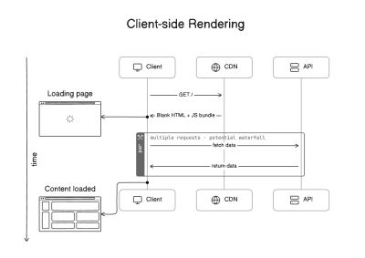
A web app under this process is only fully interactive once JavaScript has fully completed its operations. You can probably already see the tension here that comes with an improved developer experience (DX) that negatively impacts the user experience (UX).

The truth is that there were (and are) pros and cons to CSR in React. Looking at the positives, web applications delivered smooth, quick transitions that reduced the overall time it took to load a page, thanks to reactive components that update with user interactions without triggering page refreshes. CSR lightens the server load and allows us to serve assets from speedy content delivery networks (CDNs) capable of delivering content to users from a server location geographically closer to the user for even more optimized page loads.

There are also not-so-great consequences that come with CSR, most notably perhaps that components could fetch data independently, leading to waterfall network requests that dramatically slow things down. This may sound like a minor nuisance on the UX side of things, but the damage can actually be quite large on a human level. Eric Bailey’s “Modern Health, frameworks, performance, and harm” should be a cautionary tale for all CSR work.

Other negative CSR consequences are not quite as severe but still lead to damage. For example, it used to be that an HTML document containing nothing but metadata and an empty

was illegible to search engine crawlers that never get the fully-rendered experience. While that’s solved today, the SEO hit at the time was an anchor on company sites that rely on search engine traffic to generate revenue.

The Shift: Server-Side Rendering (SSR)

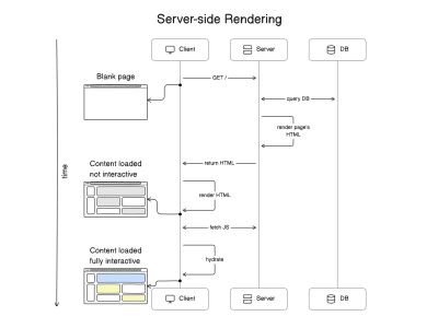
Something needed to change. CSR presented developers with a powerful new approach for constructing speedy, interactive interfaces, but users everywhere were inundated with blank screens and loading indicators to get there. The solution was to move the rendering experience from the client to the server. I know it sounds funny that we needed to improve something by going back to the way it was before.

So, yes, React gained server-side rendering (SSR) capabilities. At one point, SSR was such a topic in the React community that it had a moment in the spotlight. The move to SSR brought significant changes to app development, specifically in how it influenced React behavior and how content could be delivered by way of servers instead of browsers.

Diagram of the server-side rendering process of a React app, starting with a blank loading page in the browser followed by a screen of un-interactive content, then a fully interactive page of content.

Figure 2. (Large preview)

Addressing CSR Limitations

Instead of sending a blank HTML document with SSR, we rendered the initial HTML on the server and sent it to the browser. The browser was able to immediately start displaying the content without needing to show a loading indicator. This significantly improves the First Contentful Paint (FCP) performance metric in Web Vitals.

Server-side rendering also fixed the SEO issues that came with CSR. Since the crawlers received the content of our websites directly, they were then able to index it right away. The data fetching that happens initially also takes place on the server, which is a plus because it’s closer to the data source and can eliminate fetch waterfalls if done properly.

Hydration

SSR has its own complexities. For React to make the static HTML received from the server interactive, it needs to hydrate it. Hydration is the process that happens when React reconstructs its Virtual Document Object Model (DOM) on the client side based on what was in the DOM of the initial HTML.

Note: React maintains its own Virtual DOM because it’s faster to figure out updates on it instead of the actual DOM. It synchronizes the actual DOM with the Virtual DOM when it needs to update the UI but performs the diffing algorithm on the Virtual DOM.

We now have two flavors of Reacts:

  1. A server-side flavor that knows how to render static HTML from our component tree,
  2. A client-side flavor that knows how to make the page interactive.

We’re still shipping React and code for the app to the browser because — in order to hydrate the initial HTML — React needs the same components on the client side that were used on the server. During hydration, React performs a process called reconciliation in which it compares the server-rendered DOM with the client-rendered DOM and tries to identify differences between the two. If there are differences between the two DOMs, React attempts to fix them by rehydrating the component tree and updating the component hierarchy to match the server-rendered structure. And if there are still inconsistencies that cannot be resolved, React will throw errors to indicate the problem. This problem is commonly known as a hydration error.

SSR Drawbacks

SSR is not a silver bullet solution that addresses CSR limitations. SSR comes with its own drawbacks. Since we moved the initial HTML rendering and data fetching to the server, those servers are now experiencing a much greater load than when we loaded everything on the client.

Remember when I mentioned that SSR generally improves the FCP performance metric? That may be true, but the Time to First Byte (TTFB) performance metric took a negative hit with SSR. The browser literally has to wait for the server to fetch the data it needs, generate the initial HTML, and send the first byte. And while TTFB is not a Core Web Vital metric in itself, it influences the metrics. A negative TTFB leads to negative Core Web Vitals metrics.

Another drawback of SSR is that the entire page is unresponsive until client-side React has finished hydrating it. Interactive elements cannot listen and “react” to user interactions before React hydrates them, i.e., React attaches the intended event listeners to them. The hydration process is typically fast, but the internet connection and hardware capabilities of the device in use can slow down rendering by a noticeable amount.

The Present: A Hybrid Approach

So far, we have covered two different flavors of React rendering: CSR and SSR. While the two were attempts to improve one another, we now get the best of both worlds, so to speak, as SSR has branched into three additional React flavors that offer a hybrid approach in hopes of reducing the limitations that come with CSR and SSR.

We’ll look at the first two — static site generation and incremental static regeneration — before jumping into an entire discussion on React Server Components, the third flavor.

Static Site Generation (SSG)

Instead of regenerating the same HTML code on every request, we came up with SSG. This React flavor compiles and builds the entire app at build time, generating static (as in vanilla HTML and CSS) files that are, in turn, hosted on a speedy CDN.

As you might suspect, this hybrid approach to rendering is a nice fit for smaller projects where the content doesn’t change much, like a marketing site or a personal blog, as opposed to larger projects where content may change with user interactions, like an e-commerce site.

SSG reduces the burden on the server while improving performance metrics related to TTFB because the server no longer has to perform heavy, expensive tasks for re-rendering the page.

Incremental Static Regeneration (ISR)

One SSG drawback is having to rebuild all of the app’s code when a content change is needed. The content is set in stone — being static and all — and there’s no way to change just one part of it without rebuilding the whole thing.

The Next.js team created the second hybrid flavor of React that addresses the drawback of complete SSG rebuilds: incremental static regeneration (ISR). The name says a lot about the approach in that ISR only rebuilds what’s needed instead of the entire thing. We generate the “initial version” of the page statically during build time but are also able to rebuild any page containing stale data after a user lands on it (i.e., the server request triggers the data check).

From that point on, the server will serve new versions of that page statically in increments when needed. That makes ISR a hybrid approach that is neatly positioned between SSG and traditional SSR.

At the same time, ISR does not address the “stale content” symptom, where users may visit a page before it has finished being generated. Unlike SSG, ISR needs an actual server to regenerate individual pages in response to a user’s browser making a server request. That means we lose the valuable ability to deploy ISR-based apps on a CDN for optimized asset delivery.

The Future: React Server Components

Up until this point, we’ve juggled between CSR, SSR, SSG, and ISR approaches, where all make some sort of trade-off, negatively affecting performance, development complexity, and user experience. Newly introduced React Server Components (RSC) aim to address most of these drawbacks by allowing us — the developer — to choose the right rendering strategy for each individual React component.

RSCs can significantly reduce the amount of JavaScript shipped to the client since we can selectively decide which ones to serve statically on the server and which render on the client side. There’s a lot more control and flexibility for striking the right balance for your particular project.

Note: It’s important to keep in mind that as we adopt more advanced architectures, like RSCs, monitoring solutions become invaluable. Sentry offers robust performance monitoring and error-tracking capabilities that help you keep an eye on the real-world performance of your RSC-powered application. Sentry also helps you gain insights into how your releases are performing and how stable they are, which is yet another crucial feature to have while migrating your existing applications to RSCs. Implementing Sentry in an RSC-enabled framework like Next.js is as easy as running a single terminal command.

But what exactly is an RSC? Let’s pick one apart to see how it works under the hood.

The Anatomy of React Server Components

This new approach introduces two types of rendering components: Server Components and Client Components. The differences between these two are not how they function but where they execute and the environments they’re designed for. At the time of this writing, the only way to use RSCs is through React frameworks. And at the moment, there are only three frameworks that support them: Next.js, Gatsby, and RedwoodJS.

Wire diagram showing connected server components and client components represented as gray and blue dots, respectively.

Figure 3: Example of an architecture consisting of Server Components and Client Components. (Large preview)

Server Components

Server Components are designed to be executed on the server, and their code is never shipped to the browser. The HTML output and any props they might be accepting are the only pieces that are served. This approach has multiple performance benefits and user experience enhancements:

  • Server Components allow for large dependencies to remain on the server side.
    Imagine using a large library for a component. If you’re executing the component on the client side, it means that you’re also shipping the full library to the browser. With Server Components, you’re only taking the static HTML output and avoiding having to ship any JavaScript to the browser. Server Components are truly static, and they remove the whole hydration step.
  • Server Components are located much closer to the data sources — e.g., databases or file systems — they need to generate code.
    They also leverage the server’s computational power to speed up compute-intensive rendering tasks and send only the generated results back to the client. They are also generated in a single pass, which avoids request waterfalls and HTTP round trips.
  • Server Components safely keep sensitive data and logic away from the browser.
    That’s thanks to the fact that personal tokens and API keys are executed on a secure server rather than the client.
  • The rendering results can be cached and reused between subsequent requests and even across different sessions.
    This significantly reduces rendering time, as well as the overall amount of data that is fetched for each request.

This architecture also makes use of HTML streaming, which means the server defers generating HTML for specific components and instead renders a fallback element in their place while it works on sending back the generated HTML. Streaming Server Components wrap components in tags that provide a fallback value. The implementing framework uses the fallback initially but streams the newly generated content when it‘s ready. We’ll talk more about streaming, but let’s first look at Client Components and compare them to Server Components.

Client Components

Client Components are the components we already know and love. They’re executed on the client side. Because of this, Client Components are capable of handling user interactions and have access to the browser APIs like localStorage and geolocation.

The term “Client Component” doesn’t describe anything new; they merely are given the label to help distinguish the “old” CSR components from Server Components. Client Components are defined by a "use client" directive at the top of their files.

"use client"
export default function LikeButton() {
  const likePost = () => {
    // ...
  }
  return (
    
  )
}

In Next.js, all components are Server Components by default. That’s why we need to explicitly define our Client Components with "use client". There’s also a "use server" directive, but it’s used for Server Actions (which are RPC-like actions that invoked from the client, but executed on the server). You don’t use it to define your Server Components.

You might (rightfully) assume that Client Components are only rendered on the client, but Next.js renders Client Components on the server to generate the initial HTML. As a result, browsers can immediately start rendering them and then perform hydration later.

The Relationship Between Server Components and Client Components

Client Components can only explicitly import other Client Components. In other words, we’re unable to import a Server Component into a Client Component because of re-rendering issues. But we can have Server Components in a Client Component’s subtree — only passed through the children prop. Since Client Components live in the browser and they handle user interactions or define their own state, they get to re-render often. When a Client Component re-renders, so will its subtree. But if its subtree contains Server Components, how would they re-render? They don’t live on the client side. That’s why the React team put that limitation in place.

But hold on! We actually can import Server Components into Client Components. It’s just not a direct one-to-one relationship because the Server Component will be converted into a Client Component. If you’re using server APIs that you can’t use in the browser, you’ll get an error; if not — you’ll have a Server Component whose code gets “leaked” to the browser.

This is an incredibly important nuance to keep in mind as you work with RSCs.

The Rendering Lifecycle

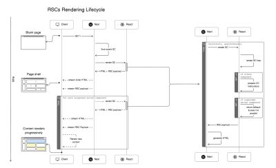
Here’s the order of operations that Next.js takes to stream contents:

  1. The app router matches the page’s URL to a Server Component, builds the component tree, and instructs the server-side React to render that Server Component and all of its children components.
  2. During render, React generates an “RSC Payload”. The RSC Payload informs Next.js about the page and what to expect in return, as well as what to fall back to during a .
  3. If React encounters a suspended component, it pauses rendering that subtree and uses the suspended component’s fallback value.
  4. When React loops through the last static component, Next.js prepares the generated HTML and the RSC Payload before streaming it back to the client through one or multiple chunks.
  5. The client-side React then uses the instructions it has for the RSC Payload and client-side components to render the UI. It also hydrates each Client Component as they load.
  6. The server streams in the suspended Server Components as they become available as an RSC Payload. Children of Client Components are also hydrated at this time if the suspended component contains any.

We will look at the RSC rendering lifecycle from the browser’s perspective momentarily. For now, the following figure illustrates the outlined steps we covered.

Wire diagram of the RSC rendering lifecycle going from a blank page to a page shell to a complete page.

Figure 4: Diagram of the RSC Rendering Lifecycle. (Large preview)

We’ll see this operation flow from the browser’s perspective in just a bit.

RSC Payload

The RSC payload is a special data format that the server generates as it renders the component tree, and it includes the following:

  • The rendered HTML,
  • Placeholders where the Client Components should be rendered,
  • References to the Client Components’ JavaScript files,
  • Instructions on which JavaScript files it should invoke,
  • Any props passed from a Server Component to a Client Component.

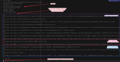
There’s no reason to worry much about the RSC payload, but it’s worth understanding what exactly the RSC payload contains. Let’s examine an example (truncated for brevity) from a demo app I created:

1:HL["/_next/static/media/c9a5bc6a7c948fb0-s.p.woff2","font",{"crossOrigin":"","type":"font/woff2"}]
2:HL["/_next/static/css/app/layout.css?v=1711137019097","style"]
0:"$L3"
4:HL["/_next/static/css/app/page.css?v=1711137019097","style"]
5:I["(app-pages-browser)/./node_modules/next/dist/client/components/app-router.js",["app-pages-internals","static/chunks/app-pages-internals.js"],""]
8:"$Sreact.suspense"
a:I["(app-pages-browser)/./node_modules/next/dist/client/components/layout-router.js",["app-pages-internals","static/chunks/app-pages-internals.js"],""]
b:I["(app-pages-browser)/./node_modules/next/dist/client/components/render-from-template-context.js",["app-pages-internals","static/chunks/app-pages-internals.js"],""]
d:I["(app-pages-browser)/./src/app/global-error.jsx",["app/global-error","static/chunks/app/global-error.js"],""]
f:I["(app-pages-browser)/./src/components/clearCart.js",["app/page","static/chunks/app/page.js"],"ClearCart"]
7:["$","main",null,{"className":"page_main__GlU4n","children":[["$","$Lf",null,{}],["$","$8",null,{"fallback":["$","p",null,{"children":"🌀 loading products..."}],"children":"$L10"}]]}]
c:[["$","meta","0",{"name":"viewport","content":"width=device-width, initial-scale=1"}]...
9:["$","p",null,{"children":["🛍️ ",3]}]
11:I["(app-pages-browser)/./src/components/addToCart.js",["app/page","static/chunks/app/page.js"],"AddToCart"]
10:["$","ul",null,{"children":[["$","li","1",{"children":["Gloves"," - $",20,["$...

To find this code in the demo app, open your browser’s developer tools at the Elements tab and look at the tags at the bottom of the page. They’ll contain lines like:

self.__next_f.push([1,"PAYLOAD_STRING_HERE"]).

Every line from the snippet above is an individual RSC payload. You can see that each line starts with a number or a letter, followed by a colon, and then an array that’s sometimes prefixed with letters. We won’t get into too deep in detail as to what they mean, but in general:

  • HL payloads are called “hints” and link to specific resources like CSS and fonts.
  • I payloads are called “modules,” and they invoke specific scripts. This is how Client Components are being loaded as well. If the Client Component is part of the main bundle, it’ll execute. If it’s not (meaning it’s lazy-loaded), a fetcher script is added to the main bundle that fetches the component’s CSS and JavaScript files when it needs to be rendered. There’s going to be an I payload sent from the server that invokes the fetcher script when needed.
  • "$" payloads are DOM definitions generated for a certain Server Component. They are usually accompanied by actual static HTML streamed from the server. That’s what happens when a suspended component becomes ready to be rendered: the server generates its static HTML and RSC Payload and then streams both to the browser.

Streaming

Streaming allows us to progressively render the UI from the server. With RSCs, each component is capable of fetching its own data. Some components are fully static and ready to be sent immediately to the client, while others require more work before loading. Based on this, Next.js splits that work into multiple chunks and streams them to the browser as they become ready. So, when a user visits a page, the server invokes all Server Components, generates the initial HTML for the page (i.e., the page shell), replaces the “suspended” components’ contents with their fallbacks, and streams all of that through one or multiple chunks back to the client.

The server returns a Transfer-Encoding: chunked header that lets the browser know to expect streaming HTML. This prepares the browser for receiving multiple chunks of the document, rendering them as it receives them. We can actually see the header when opening Developer Tools at the Network tab. Trigger a refresh and click on the document request.

Response header output highlighting the line containing the chunked transfer endcoding

Figure 5: Providing a hint to the browser to expect HTML streaming. (Large preview)

We can also debug the way Next.js sends the chunks in a terminal with the curl command:

curl -D - --raw localhost:3000 > chunked-response.txt

Headers and chunked HTML payloads.

Figure 6. (Large preview)

You probably see the pattern. For each chunk, the server responds with the chunk’s size before sending the chunk’s contents. Looking at the output, we can see that the server streamed the entire page in 16 different chunks. At the end, the server sends back a zero-sized chunk, indicating the end of the stream.

The first chunk starts with the declaration. The second-to-last chunk, meanwhile, contains the closing and tags. So, we can see that the server streams the entire document from top to bottom, then pauses to wait for the suspended components, and finally, at the end, closes the body and HTML before it stops streaming.

Even though the server hasn’t completely finished streaming the document, the browser’s fault tolerance features allow it to draw and invoke whatever it has at the moment without waiting for the closing and tags.

Suspending Components

We learned from the render lifecycle that when a page is visited, Next.js matches the RSC component for that page and asks React to render its subtree in HTML. When React stumbles upon a suspended component (i.e., async function component), it grabs its fallback value from the component (or the loading.js file if it’s a Next.js route), renders that instead, then continues loading the other components. Meanwhile, the RSC invokes the async component in the background, which is streamed later as it finishes loading.

At this point, Next.js has returned a full page of static HTML that includes either the components themselves (rendered in static HTML) or their fallback values (if they’re suspended). It takes the static HTML and RSC payload and streams them back to the browser through one or multiple chunks.

Showing suspended component fallbacks

Figure 7. (Large preview)

As the suspended components finish loading, React generates HTML recursively while looking for other nested boundaries, generates their RSC payloads and then lets Next.js stream the HTML and RSC Payload back to the browser as new chunks. When the browser receives the new chunks, it has the HTML and RSC payload it needs and is ready to replace the fallback element from the DOM with the newly-streamed HTML. And so on.

Static HTML and RSC Payload replacing suspended fallback values.

Figure 8. (Large preview)

In Figures 7 and 8, notice how the fallback elements have a unique ID in the form of B:0, B:1, and so on, while the actual components have a similar ID in a similar form: S:0 and S:1, and so on.

Along with the first chunk that contains a suspended component’s HTML, the server also ships an $RC function (i.e., completeBoundary from React’s source code) that knows how to find the B:0 fallback element in the DOM and replace it with the S:0 template it received from the server. That’s the “replacer” function that lets us see the component contents when they arrive in the browser.

The entire page eventually finishes loading, chunk by chunk.

Lazy-Loading Components

If a suspended Server Component contains a lazy-loaded Client Component, Next.js will also send an RSC payload chunk containing instructions on how to fetch and load the lazy-loaded component’s code. This represents a significant performance improvement because the page load isn’t dragged out by JavaScript, which might not even be loaded during that session.

Fetching additional JavaScript and CSS files for a lazy-loaded Client Component, as shown in developer tools.

Figure 9. (Large preview)

At the time I’m writing this, the dynamic method to lazy-load a Client Component in a Server Component in Next.js does not work as you might expect. To effectively lazy-load a Client Component, put it in a “wrapper” Client Component that uses the dynamic method itself to lazy-load the actual Client Component. The wrapper will be turned into a script that fetches and loads the Client Component’s JavaScript and CSS files at the time they’re needed.

TL;DR

I know that’s a lot of plates spinning and pieces moving around at various times. What it boils down to, however, is that a page visit triggers Next.js to render as much HTML as it can, using the fallback values for any suspended components, and then sends that to the browser. Meanwhile, Next.js triggers the suspended async components and gets them formatted in HTML and contained in RSC Payloads that are streamed to the browser, one by one, along with an $RC script that knows how to swap things out.

The Page Load Timeline

By now, we should have a solid understanding of how RSCs work, how Next.js handles their rendering, and how all the pieces fit together. In this section, we’ll zoom in on what exactly happens when we visit an RSC page in the browser.

The Initial Load

As we mentioned in the TL;DR section above, when visiting a page, Next.js will render the initial HTML minus the suspended component and stream it to the browser as part of the first streaming chunks.

To see everything that happens during the page load, we’ll visit the “Performance” tab in Chrome DevTools and click on the “reload” button to reload the page and capture a profile. Here’s what that looks like:

Showing the first chunks of HTML streamed at the beginning of the timeline in DevTools.

Figure 10. (Large preview)

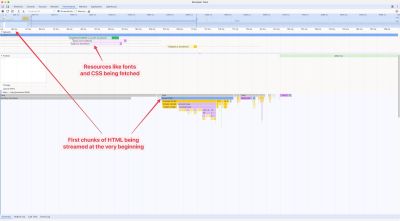
When we zoom in at the very beginning, we can see the first “Parse HTML” span. That’s the server streaming the first chunks of the document to the browser. The browser has just received the initial HTML, which contains the page shell and a few links to resources like fonts, CSS files, and JavaScript. The browser starts to invoke the scripts.

The first frames appear, and parts of the page are rendered

Figure 11. (Large preview)

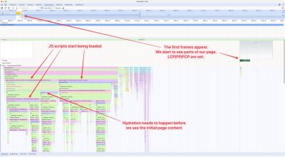
After some time, we start to see the page’s first frames appear, along with the initial JavaScript scripts being loaded and hydration taking place. If you look at the frame closely, you’ll see that the whole page shell is rendered, and “loading” components are used in the place where there are suspended Server Components. You might notice that this takes place around 800ms, while the browser started to get the first HTML at 100ms. During those 700ms, the browser is continuously receiving chunks from the server.

Bear in mind that this is a Next.js demo app running locally in development mode, so it’s going to be slower than when it’s running in production mode.

The Suspended Component

Fast forward few seconds and we see another “Parse HTML” span in the page load timeline, but this one it indicates that a suspended Server Component finished loading and is being streamed to the browser.

The suspended component’s HTML and RSC Payload are streamed to the browser, as shown in the developer tools Network tab.

Figure 12. (Large preview)

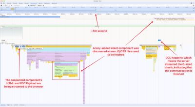
We can also see that a lazy-loaded Client Component is discovered at the same time, and it contains CSS and JavaScript files that need to be fetched. These files weren’t part of the initial bundle because the component isn’t needed until later on; the code is split into their own files.

This way of code-splitting certainly improves the performance of the initial page load. It also makes sure that the Client Component’s code is shipped only if it’s needed. If the Server Component (which acts as the Client Component’s parent component) throws an error, then the Client Component does not load. It doesn’t make sense to load all of its code before we know whether it will load or not.

Figure 12 shows the DOMContentLoaded event is reported at the end of the page load timeline. And, just before that, we can see that the localhost HTTP request comes to an end. That means the server has likely sent the last zero-sized chunk, indicating to the client that the data is fully transferred and that the streaming communication can be closed.

The End Result

The main localhost HTTP request took around five seconds, but thanks to streaming, we began seeing page contents load much earlier than that. If this was a traditional SSR setup, we would likely be staring at a blank screen for those five seconds before anything arrives. On the other hand, if this was a traditional CSR setup, we would likely have shipped a lot more of JavaScript and put a heavy burden on both the browser and network.

This way, however, the app was fully interactive in those five seconds. We were able to navigate between pages and interact with Client Components that have loaded as part of the initial main bundle. This is a pure win from a user experience standpoint.

Conclusion

RSCs mark a significant evolution in the React ecosystem. They leverage the strengths of server-side and client-side rendering while embracing HTML streaming to speed up content delivery. This approach not only addresses the SEO and loading time issues we experience with CSR but also improves SSR by reducing server load, thus enhancing performance.

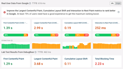
I’ve refactored the same RSC app I shared earlier so that it uses the Next.js Page router with SSR. The improvements in RSCs are significant:

Comparing Next.js Page Router and App Router, side-by-side.

Figure 13. (Large preview)

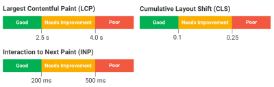
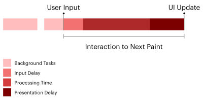
Looking at these two reports I pulled from Sentry, we can see that streaming allows the page to start loading its resources before the actual request finishes. This significantly improves the Web Vitals metrics, which we see when comparing the two reports.

The conclusion: Users enjoy faster, more reactive interfaces with an architecture that relies on RSCs.

The RSC architecture introduces two new component types: Server Components and Client Components. This division helps React and the frameworks that rely on it — like Next.js — streamline content delivery while maintaining interactivity.

However, this setup also introduces new challenges in areas like state management, authentication, and component architecture. Exploring those challenges is a great topic for another blog post!

Despite these challenges, the benefits of RSCs present a compelling case for their adoption. We definitely will see guides published on how to address RSC’s challenges as they mature, but, in my opinion, they already look like the future of rendering practices in modern web development.

Smashing Editorial
(gg, yk)

Converting Plain Text To Encoded HTML With Vanilla JavaScript

Converting Plain Text To Encoded HTML With Vanilla JavaScript

Converting Plain Text To Encoded HTML With Vanilla JavaScript

Alexis Kypridemos

2024-04-17T13:00:00+00:00
2025-06-20T10:32:35+00:00

When copying text from a website to your device’s clipboard, there’s a good chance that you will get the formatted HTML when pasting it. Some apps and operating systems have a “Paste Special” feature that will strip those tags out for you to maintain the current style, but what do you do if that’s unavailable?

Same goes for converting plain text into formatted HTML. One of the closest ways we can convert plain text into HTML is writing in Markdown as an abstraction. You may have seen examples of this in many comment forms in articles just like this one. Write the comment in Markdown and it is parsed as HTML.

Even better would be no abstraction at all! You may have also seen (and used) a number of online tools that take plainly written text and convert it into formatted HTML. The UI makes the conversion and previews the formatted result in real time.

Providing a way for users to author basic web content — like comments — without knowing even the first thing about HTML, is a novel pursuit as it lowers barriers to communicating and collaborating on the web. Saying it helps “democratize” the web may be heavy-handed, but it doesn’t conflict with that vision!

Smashing Magazine comment form that is displayed at the end of articles. It says to leave a comment, followed by instructions for Markdown formatting and a form text area.

Smashing Magazine’s comment form includes instructions for formatting a comment in Markdown syntax. (Large preview)

We can build a tool like this ourselves. I’m all for using existing resources where possible, but I’m also for demonstrating how these things work and maybe learning something new in the process.

Defining The Scope

There are plenty of assumptions and considerations that could go into a plain-text-to-HTML converter. For example, should we assume that the first line of text entered into the tool is a title that needs corresponding

tags? Is each new line truly a paragraph, and how does linking content fit into this?

Again, the idea is that a user should be able to write without knowing Markdown or HTML syntax. This is a big constraint, and there are far too many HTML elements we might encounter, so it’s worth knowing the context in which the content is being used. For example, if this is a tool for writing blog posts, then we can limit the scope of which elements are supported based on those that are commonly used in long-form content:

,

, , and . In other words, it will be possible to include top-level headings, body text, linked text, and images. There will be no support for bulleted or ordered lists, tables, or any other elements for this particular tool.

The front-end implementation will rely on vanilla HTML, CSS, and JavaScript to establish a small form with a simple layout and functionality that converts the text to HTML. There is a server-side aspect to this if you plan on deploying it to a production environment, but our focus is purely on the front end.

Looking At Existing Solutions

There are existing ways to accomplish this. For example, some libraries offer a WYSIWYG editor. Import a library like TinyMCE with a single and you’re good to go. WYSIWYG editors are powerful and support all kinds of formatting, even applying CSS classes to content for styling.

But TinyMCE isn’t the most efficient package at about 500 KB minified. That’s not a criticism as much as an indication of how much functionality it covers. We want something more “barebones” than that for our simple purpose. Searching GitHub surfaces more possibilities. The solutions, however, seem to fall into one of two categories:

  • The input accepts plain text, but the generated HTML only supports the HTML

    and

    tags.

  • The input converts plain text into formatted HTML, but by ”plain text,” the tool seems to mean “Markdown” (or a variety of it) instead. The txt2html Perl module (from 1994!) would fall under this category.

Even if a perfect solution for what we want was already out there, I’d still want to pick apart the concept of converting text to HTML to understand how it works and hopefully learn something new in the process. So, let’s proceed with our own homespun solution.

Setting Up The HTML

We’ll start with the HTML structure for the input and output. For the input element, we’re probably best off using a . For the output element and related styling, choices abound. The following is merely one example with some very basic CSS to place the input on the left and an output

on the right:

See the Pen [Base Form Styles [forked]](https://codepen.io/smashingmag/pen/OJGoNOX) by Geoff Graham.

See the Pen Base Form Styles [forked] by Geoff Graham.

You can further develop the CSS, but that isn’t the focus of this article. There is no question that the design can be prettier than what I am providing here!

Capture The Plain Text Input

We’ll set an onkeyup event handler on the to call a JavaScript function called convert() that does what it says: convert the plain text into HTML. The conversion function should accept one parameter, a string, for the user’s plain text input entered into the element:

onkeyup is a better choice than onkeydown in this case, as onkeyup will call the conversion function after the user completes each keystroke, as opposed to before it happens. This way, the output, which is refreshed with each keystroke, always includes the latest typed character. If the conversion is triggered with an onkeydown handler, the output will exclude the most recent character the user typed. This can be frustrating when, for example, the user has finished typing a sentence but cannot yet see the final punctuation mark, say a period (.), in the output until typing another character first. This creates the impression of a typo, glitch, or lag when there is none.

In JavaScript, the convert() function has the following responsibilities:

  1. Encode the input in HTML.
  2. Process the input line-by-line and wrap each individual line in either a

    or

    HTML tag, whichever is most appropriate.

  3. Process the output of the transformations as a single string, wrap URLs in HTML tags, and replace image file names with elements.

And from there, we display the output. We can create separate functions for each responsibility. Let’s name them accordingly:

  1. html_encode()
  2. convert_text_to_HTML()
  3. convert_images_and_links_to_HTML()

Each function accepts one parameter, a string, and returns a string.

Encoding The Input Into HTML

Use the html_encode() function to HTML encode/sanitize the input. HTML encoding refers to the process of escaping or replacing certain characters in a string input to prevent users from inserting their own HTML into the output. At a minimum, we should replace the following characters:

  • < with <
  • > with >
  • & with &
  • ' with '
  • " with "

JavaScript does not provide a built-in way to HTML encode input as other languages do. For example, PHP has htmlspecialchars(), htmlentities(), and strip_tags() functions. That said, it is relatively easy to write our own function that does this, which is what we’ll use the html_encode() function for that we defined earlier:

function html_encode(input) {
  const textArea = document.createElement("textarea");
  textArea.innerText = input;
  return textArea.innerHTML.split("
").join("n"); }

HTML encoding of the input is a critical security consideration. It prevents unwanted scripts or other HTML manipulations from getting injected into our work. Granted, front-end input sanitization and validation are both merely deterrents because bad actors can bypass them. But we may as well make them work a little harder.

As long as we are on the topic of securing our work, make sure to HTML-encode the input on the back end, where the user cannot interfere. At the same time, take care not to encode the input more than once. Encoding text that is already HTML-encoded will break the output functionality. The best approach for back-end storage is for the front end to pass the raw, unencoded input to the back end, then ask the back-end to HTML-encode the input before inserting it into a database.

That said, this only accounts for sanitizing and storing the input on the back end. We still have to display the encoded HTML output on the front end. There are at least two approaches to consider:

  1. Convert the input to HTML after HTML-encoding it and before it is inserted into a database.
    This is efficient, as the input only needs to be converted once. However, this is also an inflexible approach, as updating the HTML becomes difficult if the output requirements happen to change in the future.
  2. Store only the HTML-encoded input text in the database and dynamically convert it to HTML before displaying the output for each content request.
    This is less efficient, as the conversion will occur on each request. However, it is also more flexible since it’s possible to update how the input text is converted to HTML if requirements change.

Applying Semantic HTML Tags

Let’s use the convert_text_to_HTML() function we defined earlier to wrap each line in their respective HTML tags, which are going to be either

or

. To determine which tag to use, we will split the text input on the newline character (n) so that the text is processed as an array of lines rather than a single string, allowing us to evaluate them individually.

function convert_text_to_HTML(txt) {
  // Output variable
  let out = '';
  // Split text at the newline character into an array
  const txt_array = txt.split("n");
  // Get the number of lines in the array
  const txt_array_length = txt_array.length;
  // Variable to keep track of the (non-blank) line number
  let non_blank_line_count = 0;
  
  for (let i = 0; i < txt_array_length; i++) {
    // Get the current line
    const line = txt_array[i];
    // Continue if a line contains no text characters
    if (line === ''){
      continue;
    }
    
    non_blank_line_count++;
    // If a line is the first line that contains text
    if (non_blank_line_count === 1){
      // ...wrap the line of text in a Heading 1 tag
      out += `

${line}

`; // ...otherwise, wrap the line of text in a Paragraph tag. } else { out += `

${line}

`; } } return out; }

In short, this little snippet loops through the array of split text lines and ignores lines that do not contain any text characters. From there, we can evaluate whether a line is the first one in the series. If it is, we slap a

tag on it; otherwise, we mark it up in a

tag.

This logic could be used to account for other types of elements that you may want to include in the output. For example, perhaps the second line is assumed to be a byline that names the author and links up to an archive of all author posts.

Tagging URLs And Images With Regular Expressions

Next, we’re going to create our convert_images_and_links_to_HTML() function to encode URLs and images as HTML elements. It’s a good chunk of code, so I’ll drop it in and we’ll immediately start picking it apart together to explain how it all works.


function convert_images_and_links_to_HTML(string){
  let urls_unique = [];
  let images_unique = [];
  const urls = string.match(/https*://[^s<),]+[^ss]+.(jpg|jpeg|gif|png|webp)/gmi) ?? [];
                          
  const urls_length = urls.length;
  const images_length = imgs.length;
  
  for (let i = 0; i < urls_length; i++){
    const url = urls[i];
    if (!urls_unique.includes(url)){
      urls_unique.push(url);
    }
  }
  
  for (let i = 0; i < images_length; i++){
    const img = imgs[i];
    if (!images_unique.includes(img)){
      images_unique.push(img);
    }
  }
  
  const urls_unique_length = urls_unique.length;
  const images_unique_length = images_unique.length;
  
  for (let i = 0; i < urls_unique_length; i++){
    const url = urls_unique[i];
    if (images_unique_length === 0 || !images_unique.includes(url)){
      const a_tag = `${url}`;
      string = string.replace(url, a_tag);
    }
  }
  
  for (let i = 0; i < images_unique_length; i++){
    const img = images_unique[i];
    const img_tag = ``;
    const img_link = `${img_tag}`;
    string = string.replace(img, img_link);
  }
  return string;
}

Unlike the convert_text_to_HTML() function, here we use regular expressions to identify the terms that need to be wrapped and/or replaced with or tags. We do this for a couple of reasons:

  1. The previous convert_text_to_HTML() function handles text that would be transformed to the HTML block-level elements

    and

    , and, if you want, other block-level elements such as

    . Block-level elements in the HTML output correspond to discrete lines of text in the input, which you can think of as paragraphs, the text entered between presses of the Enter key.

  2. On the other hand, URLs in the text input are often included in the middle of a sentence rather than on a separate line. Images that occur in the input text are often included on a separate line, but not always. While you could identify text that represents URLs and images by processing the input line-by-line — or even word-by-word, if necessary — it is easier to use regular expressions and process the entire input as a single string rather than by individual lines.

Regular expressions, though they are powerful and the appropriate tool to use for this job, come with a performance cost, which is another reason to use each expression only once for the entire text input.

Remember: All the JavaScript in this example runs each time the user types a character, so it is important to keep things as lightweight and efficient as possible.

I also want to make a note about the variable names in our convert_images_and_links_to_HTML() function. images (plural), image (singular), and link are reserved words in JavaScript. Consequently, imgs, img, and a_tag were used for naming. Interestingly, these specific reserved words are not listed on the relevant MDN page, but they are on W3Schools.

We’re using the String.prototype.match() function for each of the two regular expressions, then storing the results for each call in an array. From there, we use the nullish coalescing operator (??) on each call so that, if no matches are found, the result will be an empty array. If we do not do this and no matches are found, the result of each match() call will be null and will cause problems downstream.

const urls = string.match(/https*://[^s<),]+[^ss]+.(jpg|jpeg|gif|png|webp)/gmi) ?? [];

Next up, we filter the arrays of results so that each array contains only unique results. This is a critical step. If we don’t filter out duplicate results and the input text contains multiple instances of the same URL or image file name, then we break the HTML tags in the output. JavaScript does not provide a simple, built-in method to get unique items in an array that’s akin to the PHP array_unique() function.

The code snippet works around this limitation using an admittedly ugly but straightforward procedural approach. The same problem is solved using a more functional approach if you prefer. There are many articles on the web describing various ways to filter a JavaScript array in order to keep only the unique items.

We’re also checking if the URL is matched as an image before replacing a URL with an appropriate tag and performing the replacement only if the URL doesn’t match an image. We may be able to avoid having to perform this check by using a more intricate regular expression. The example code deliberately uses regular expressions that are perhaps less precise but hopefully easier to understand in an effort to keep things as simple as possible.

And, finally, we’re replacing image file names in the input text with tags that have the src attribute set to the image file name. For example, my_image.png in the input is transformed into in the output. We wrap each tag with an tag that links to the image file and opens it in a new tab when clicked.

There are a couple of benefits to this approach:

  • In a real-world scenario, you will likely use a CSS rule to constrain the size of the rendered image. By making the images clickable, you provide users with a convenient way to view the full-size image.
  • If the image is not a local file but is instead a URL to an image from a third party, this is a way to implicitly provide attribution. Ideally, you should not rely solely on this method but, instead, provide explicit attribution underneath the image in a
    , , or similar element. But if, for whatever reason, you are unable to provide explicit attribution, you are at least providing a link to the image source.

It may go without saying, but “hotlinking” images is something to avoid. Use only locally hosted images wherever possible, and provide attribution if you do not hold the copyright for them.

Before we move on to displaying the converted output, let’s talk a bit about accessibility, specifically the image alt attribute. The example code I provided does add an alt attribute in the conversion but does not populate it with a value, as there is no easy way to automatically calculate what that value should be. An empty alt attribute can be acceptable if the image is considered “decorative,” i.e., purely supplementary to the surrounding text. But one may argue that there is no such thing as a purely decorative image.

That said, I consider this to be a limitation of what we’re building.

Displaying the Output HTML

We’re at the point where we can finally work on displaying the HTML-encoded output! We’ve already handled all the work of converting the text, so all we really need to do now is call it:

function convert(input_string) {
  output.innerHTML = convert_images_and_links_to_HTML(convert_text_to_HTML(html_encode(input_string)));
}

If you would rather display the output string as raw HTML markup, use a

tag as the output element instead of a

:

The only thing to note about this approach is that you would target the

element’s textContent instead of innerHTML:

function convert(input_string) {
  output.textContent = convert_images_and_links_to_HTML(convert_text_to_HTML(html_encode(input_string)));
}

Conclusion

We did it! We built one of the same sort of copy-paste tool that converts plain text on the spot. In this case, we’ve configured it so that plain text entered into a is parsed line-by-line and encoded into HTML that we format and display inside another element.

See the Pen [Convert Plain Text to HTML (PoC) [forked]](https://codepen.io/smashingmag/pen/yLrxOzP) by Geoff Graham.

See the Pen Convert Plain Text to HTML (PoC) [forked] by Geoff Graham.

We were even able to keep the solution fairly simple, i.e., vanilla HTML, CSS, and JavaScript, without reaching for a third-party library or framework. Does this simple solution do everything a ready-made tool like a framework can do? Absolutely not. But a solution as simple as this is often all you need: nothing more and nothing less.

As far as scaling this further, the code could be modified to POST what’s entered into the using a PHP script or the like. That would be a great exercise, and if you do it, please share your work with me in the comments because I’d love to check it out.

References

Smashing Editorial
(gg, yk)

How To Monitor And Optimize Google Core Web Vitals

How To Monitor And Optimize Google Core Web Vitals

How To Monitor And Optimize Google Core Web Vitals

Matt Zeunert

2024-04-16T10:00:00+00:00
2025-06-20T10:32:35+00:00

This article is sponsored by DebugBear

Google’s Core Web Vitals initiative has increased the attention website owners need to pay to user experience. You can now more easily see when users have poor experiences on your website, and poor UX also has a bigger impact on SEO.

That means you need to test your website to identify optimizations. Beyond that, monitoring ensures that you can stay ahead of your Core Web Vitals scores for the long term.

Let’s find out how to work with different types of Core Web Vitals data and how monitoring can help you gain a deeper insight into user experiences and help you optimize them.

What Are Core Web Vitals?

There are three web vitals metrics Google uses to measure different aspects of website performance:

  • Largest Contentful Paint (LCP),
  • Cumulative Layout Shift (CLS),
  • Interaction to Next Paint (INP).

Three web vitals metrics that measure different aspects of website performance

(Large preview)

Largest Contentful Paint (LCP)

The Largest Contentful Paint metric is the closest thing to a traditional load time measurement. However, LCP doesn’t track a purely technical page load milestone like the JavaScript Load Event. Instead, it focuses on what the user can see by measuring how soon after opening a page, the largest content element on the page appears.

The faster the LCP happens, the better, and Google rates a passing LCP score below 2.5 seconds.

Largest Contentful Paint

(Large preview)

Cumulative Layout Shift (CLS)

Cumulative Layout Shift is a bit of an odd metric, as it doesn’t measure how fast something happens. Instead, it looks at how stable the page layout is once the page starts loading. Layout shifts mean that content moves around, disorienting the user and potentially causing accidental clicks on the wrong UI element.

The CLS score is calculated by looking at how far an element moved and how big the element is. Aim for a score below 0.1 to get a good rating from Google.

Cumulative Layout Shift

(Large preview)

Interaction to Next Paint (INP)

Even websites that load quickly often frustrate users when interactions with the page feel sluggish. That’s why Interaction to Next Paint measures how long the page remains frozen after user interaction with no visual updates.

Page interactions should feel practically instant, so Google recommends an INP score below 200 milliseconds.

Interaction to Next Paint

(Large preview)

What Are The Different Types Of Core Web Vitals Data?

You’ll often see different page speed metrics reported by different tools and data sources, so it’s important to understand the differences. We’ve published a whole article just about that, but here’s the high-level breakdown along with the pros and cons of each one:

  • Synthetic Tests
    These tests are run on-demand in a controlled lab environment in a fixed location with a fixed network and device speed. They can produce very detailed reports and recommendations.
  • Real User Monitoring (RUM)
    This data tells you how fast your website is for your actual visitors. That means you need to install an analytics script to collect it, and the reporting that’s available is less detailed than for lab tests.
  • CrUX Data
    Google collects from Chrome users as part of the Chrome User Experience Report (CrUX) and uses it as a ranking signal. It’s available for every website with enough traffic, but since it covers a 28-day rolling window, it takes a while for changes on your website to be reflected here. It also doesn’t include any debug data to help you optimize your metrics.

Start By Running A One-Off Page Speed Test

Before signing up for a monitoring service, it’s best to run a one-off lab test with a free tool like Google’s PageSpeed Insights or the DebugBear Website Speed Test. Both of these tools report with Google CrUX data that reflects whether real users are facing issues on your website.

Note: The lab data you get from some Lighthouse-based tools — like PageSpeed Insights — can be unreliable.

One-Off Page Speed Test with DebugBear

(Large preview)

INP is best measured for real users, where you can see the elements that users interact with most often and where the problems lie. But a free tool like the INP Debugger can be a good starting point if you don’t have RUM set up yet.

How To Monitor Core Web Vitals Continuously With Scheduled Lab-Based Testing

Running tests continuously has a few advantages over ad-hoc tests. Most importantly, continuous testing triggers alerts whenever a new issue appears on your website, allowing you to start fixing them right away. You’ll also have access to historical data, allowing you to see exactly when a regression occurred and letting you compare test results before and after to see what changed.

Scheduled lab tests are easy to set up using a website monitoring tool like DebugBear. Enter a list of website URLs and pick a device type, test location, and test frequency to get things running:

A screenshot of how to schedule lab-based testing with DebugBear

(Large preview)

As this process runs, it feeds data into the detailed dashboard with historical Core Web Vitals data. You can monitor a number of pages on your website or track the speed of your competition to make sure you stay ahead.

An example of detailed dashboard with historical Core Web Vitals data

(Large preview)

When regression occurs, you can dive deep into the results using DebuBears’s Compare mode. This mode lets you see before-and-after test results side-by-side, giving you context for identifying causes. You see exactly what changed. For example, in the following case, we can see that HTTP compression stopped working for a file, leading to an increase in page weight and longer download times.

A screenshot with DebuBears’s Compare mode

(Large preview)

How To Monitor Real User Core Web Vitals

Synthetic tests are great for super-detailed reporting of your page load time. However, other aspects of user experience, like layout shifts and slow interactions, heavily depend on how real users use your website. So, it’s worth setting up real user monitoring with a tool like DebugBear.

To monitor real user web vitals, you’ll need to install an analytics snippet that collects this data on your website. Once that’s done, you’ll be able to see data for all three Core Web Vitals metrics across your entire website.

An analytics snippet to monitor real user web vitals with DebugBear

(Large preview)

To optimize your scores, you can go into the dashboard for each individual metric, select a specific page you’re interested in, and then dive deeper into the data.

For example, you can see whether a slow LCP score is caused by a slow server response, render blocking resources, or by the LCP content element itself.

You’ll also find that the LCP element varies between visitors. Lab test results are always the same, as they rely on a single fixed screen size. However, in the real world, visitors use a wide range of devices and will see different content when they open your website.

An example of a dashboard for the LCP metric with data reflecting the LCP score

(Large preview)

INP is tricky to debug without real user data. Yet an analytics tool like DebugBear can tell you exactly what page elements users are interacting with most often and which of these interactions are slow to respond.

INP elements

(Large preview)

Thanks to the new Long Animation Frames API, we can also see specific scripts that contribute to slow interactions. We can then decide to optimize these scripts, remove them from the page, or run them in a way that does not block interactions for as long.

Long Animation Frames API with a list of INP primary scripts that slow interactions

(Large preview)

Conclusion

Continuously monitoring Core Web Vitals lets you see how website changes impact user experience and ensures you get alerted when something goes wrong. While it’s possible to measure Core Web Vitals using a wide range of tools, those tools are limited by the type of data they use to evaluate performance, not to mention they only provide a single snapshot of performance at a specific point in time.

A tool like DebugBear gives you access to several different types of data that you can use to troubleshoot performance and optimize your website, complete with RUM capabilities that offer a historial record of performance for identifying issues where and when they occur. Sign up for a free DebugBear trial here.

Smashing Editorial
(gg, yk)

Setting And Persisting Color Scheme Preferences With CSS And A “Touch” Of JavaScript

Setting And Persisting Color Scheme Preferences With CSS And A “Touch” Of JavaScript

Setting And Persisting Color Scheme Preferences With CSS And A “Touch” Of JavaScript

Henry Bley-Vroman

2024-03-25T12:00:00+00:00
2025-06-20T10:32:35+00:00

Many modern websites give users the power to set a site-specific color scheme preference. A basic implementation is straightforward with JavaScript: listen for when a user changes a checkbox or clicks a button, toggle a class (or attribute) on the element in response, and write the styles for that class to override design with a different color scheme.

CSS’s new :has() pseudo-class, supported by major browsers since December 2023, opens many doors for front-end developers. I’m especially excited about leveraging it to modify UI in response to user interaction without JavaScript. Where previously we have used JavaScript to toggle classes or attributes (or to set styles directly), we can now pair :has() selectors with HTML’s native interactive elements.

Supporting a color scheme preference, like “Dark Mode,” is a great use case. We can use a element anywhere that toggles color schemes based on the selected — no JavaScript needed, save for a sprinkle to save the user’s choice, which we’ll get to further in.

Respecting System Preferences

First, we’ll support a user’s system-wide color scheme preferences by adopting a “Light Mode”-first approach. In other words, we start with a light color scheme by default and swap it out for a dark color scheme for users who prefer it.

The prefers-color-scheme media feature detects the user’s system preference. Wrap “dark” styles in a prefers-color-scheme: dark media query.

selector {
  /* light styles */

  @media (prefers-color-scheme: dark) {
    /* dark styles */
  }
}

Next, set the color-scheme property to match the preferred color scheme. Setting color-scheme: dark switches the browser into its built-in dark mode, which includes a black default background, white default text, “dark” styles for scrollbars, and other elements that are difficult to target with CSS, and more. I’m using CSS variables to hint that the value is dynamic — and because I like the browser developer tools experience — but plain color-scheme: light and color-scheme: dark would work fine.

:root {
  /* light styles here */
  color-scheme: var(--color-scheme, light);
  
  /* system preference is "dark" */
  @media (prefers-color-scheme: dark) {
    --color-scheme: dark;
    /* any additional dark styles here */
  }
}

Giving Users Control

Now, to support overriding the system preference, let users choose between light (default) and dark color schemes at the page level.

HTML has native elements for handling user interactions. Using one of those controls, rather than, say, a

nest, improves the chances that assistive tech users will have a good experience. I’ll use a menu with options for “system,” “light,” and “dark.” A group of would work, too, if you wanted the options right on the surface instead of a dropdown menu.


  System
  Light
  Dark

Before CSS gained :has(), responding to the user’s selected required JavaScript, for example, setting an event listener on the to toggle a class or attribute on or .

But now that we have :has(), we can now do this with CSS alone! You’ll save spending any of your performance budget on a dark mode script, plus the control will work even for users who have disabled JavaScript. And any “no-JS” folks on the project will be satisfied.

What we need is a selector that applies to the page when it :has() a select menu with a particular [value]:checked. Let’s translate that into CSS:

:root:has(select option[value="dark"]:checked)

We’re defaulting to a light color scheme, so it’s enough to account for two possible dark color scheme scenarios:

  1. The page-level color preference is “system,” and the system-level preference is “dark.”
  2. The page-level color preference is “dark”.

The first one is a page-preference-aware iteration of our prefers-color-scheme: dark case. A “dark” system-level preference is no longer enough to warrant dark styles; we need a “dark” system-level preference and a “follow the system-level preference” at the page-level preference. We’ll wrap the prefers-color-scheme media query dark scheme styles with the :has() selector we just wrote:

:root {
  /* light styles here */
  color-scheme: var(--color-scheme, light);
    
  /* page preference is "system", and system preference is "dark" */
  @media (prefers-color-scheme: dark) {
    &:has(#color-scheme option[value="system"]:checked) {
      --color-scheme: dark;
      /* any additional dark styles, again */
    }
  }
}

Notice that I’m using CSS Nesting in that last snippet. Baseline 2023 has it pegged as “Newly available across major browsers” which means support is good, but at the time of writing, support on Android browsers not included in Baseline’s core browser set is limited. You can get the same result without nesting.

:root {
  /* light styles */
  color-scheme: var(--color-scheme, light);
    
  /* page preference is "dark" */
  &:has(#color-scheme option[value="dark"]:checked) {
    --color-scheme: dark;
    /* any additional dark styles */
  }
}

For the second dark mode scenario, we’ll use nearly the exact same :has() selector as we did for the first scenario, this time checking whether the “dark” option — rather than the “system” option — is selected:

:root {
  /* light styles */
  color-scheme: var(--color-scheme, light);
    
  /* page preference is "dark" */
  &:has(#color-scheme option[value="dark"]:checked) {
    --color-scheme: dark;
    /* any additional dark styles */
  }
    
  /* page preference is "system", and system preference is "dark" */
  @media (prefers-color-scheme: dark) {
    &:has(#color-scheme option[value="system"]:checked) {
      --color-scheme: dark;
      /* any additional dark styles, again */
    }
  }
}

Now the page’s styles respond to both changes in users’ system settings and user interaction with the page’s color preference UI — all with CSS!

But the colors change instantly. Let’s smooth the transition.

Respecting Motion Preferences

Instantaneous style changes can feel inelegant in some cases, and this is one of them. So, let’s apply a CSS transition on the :root to “ease” the switch between color schemes. (Transition styles at the :root will cascade down to the rest of the page, which may necessitate adding transition: none or other transition overrides.)

Note that the CSS color-scheme property does not support transitions.

:root {
  transition-duration: 200ms;
  transition-property: /* properties changed by your light/dark styles */;
}

Not all users will consider the addition of a transition a welcome improvement. Querying the prefers-reduced-motion media feature allows us to account for a user’s motion preferences. If the value is set to reduce, then we remove the transition-duration to eliminate unwanted motion.

:root {
  transition-duration: 200ms;
  transition-property: /* properties changed by your light/dark styles */;
    
  @media screen and (prefers-reduced-motion: reduce) {
    transition-duration: none;
  }
}

Transitions can also produce poor user experiences on devices that render changes slowly, for example, ones with e-ink screens. We can extend our “no motion condition” media query to account for that with the update media feature. If its value is slow, then we remove the transition-duration.

:root {
  transition-duration: 200ms;
  transition-property: /* properties changed by your light/dark styles */;
    
  @media screen and (prefers-reduced-motion: reduce), (update: slow) {
    transition-duration: 0s;
  }
}

Let’s try out what we have so far in the following demo. Notice that, to work around color-scheme’s lack of transition support, I’ve explicitly styled the properties that should transition during theme changes.

See the Pen [CSS-only theme switcher (requires :has()) [forked]](https://codepen.io/smashingmag/pen/YzMVQja) by Henry.

See the Pen CSS-only theme switcher (requires :has()) [forked] by Henry.

Not bad! But what happens if the user refreshes the pages or navigates to another page? The reload effectively wipes out the user’s form selection, forcing the user to re-make the selection. That may be acceptable in some contexts, but it’s likely to go against user expectations. Let’s bring in JavaScript for a touch of progressive enhancement in the form of…

Persistence

Here’s a vanilla JavaScript implementation. It’s a naive starting point — the functions and variables aren’t encapsulated but are instead properties on window. You’ll want to adapt this in a way that fits your site’s conventions, framework, library, and so on.

When the user changes the color scheme from the menu, we’ll store the selected value in a new localStorage item called "preferredColorScheme". On subsequent page loads, we’ll check localStorage for the "preferredColorScheme" item. If it exists, and if its value corresponds to one of the form control options, we restore the user’s preference by programmatically updating the menu selection.

/*
 * If a color scheme preference was previously stored,
 * select the corresponding option in the color scheme preference UI
 * unless it is already selected.
 */
function restoreColorSchemePreference() {
  const colorScheme = localStorage.getItem(colorSchemeStorageItemName);

  if (!colorScheme) {
    // There is no stored preference to restore
    return;
  }

  const option = colorSchemeSelectorEl.querySelector(`[value=${colorScheme}]`);  

  if (!option) {
    // The stored preference has no corresponding option in the UI.
    localStorage.removeItem(colorSchemeStorageItemName);
    return;
  }

  if (option.selected) {  
    // The stored preference's corresponding menu option is already selected
    return;
  }

  option.selected = true;
}

/*
 * Store an event target's value in localStorage under colorSchemeStorageItemName
 */
function storeColorSchemePreference({ target }) {
  const colorScheme = target.querySelector(":checked").value;
  localStorage.setItem(colorSchemeStorageItemName, colorScheme);
}

// The name under which the user's color scheme preference will be stored.
const colorSchemeStorageItemName = "preferredColorScheme";

// The color scheme preference front-end UI.
const colorSchemeSelectorEl = document.querySelector("#color-scheme");

if (colorSchemeSelectorEl) {
  restoreColorSchemePreference();

  // When the user changes their color scheme preference via the UI,
  // store the new preference.
  colorSchemeSelectorEl.addEventListener("input", storeColorSchemePreference);
}

Let’s try that out. Open this demo (perhaps in a new window), use the menu to change the color scheme, and then refresh the page to see your preference persist:

See the Pen [CSS-only theme switcher (requires :has()) with JS persistence [forked]](https://codepen.io/smashingmag/pen/GRLmEXX) by Henry.

See the Pen CSS-only theme switcher (requires :has()) with JS persistence [forked] by Henry.

If your system color scheme preference is “light” and you set the demo’s color scheme to “dark,” you may get the light mode styles for a moment immediately after reloading the page before the dark mode styles kick in. That’s because CodePen loads its own JavaScript before the demo’s scripts. That is out of my control, but you can take care to improve this persistence on your projects.

Persistence Performance Considerations

Where things can get tricky is restoring the user’s preference immediately after the page loads. If the color scheme preference in localStorage is different from the user’s system-level color scheme preference, it’s possible the user will see the system preference color scheme before the page-level preference is restored. (Users who have selected the “System” option will never get that flash; neither will those whose system settings match their selected option in the form control.)

If your implementation is showing a “flash of inaccurate color theme”, where is the problem happening? Generally speaking, the earlier the scripts appear on the page, the lower the risk. The “best option” for you will depend on your specific stack, of course.

What About Browsers That Don’t Support :has()?

All major browsers support :has() today Lean into modern platforms if you can. But if you do need to consider legacy browsers, like Internet Explorer, there are two directions you can go: either hide or remove the color scheme picker for those browsers or make heavier use of JavaScript.

If you consider color scheme support itself a progressive enhancement, you can entirely hide the selection UI in browsers that don’t support :has():

@supports not selector(:has(body)) {
  @media (prefers-color-scheme: dark) {
    :root {
      /* dark styles here */
    }
  }

  #color-scheme {
    display: none;
  }
}

Otherwise, you’ll need to rely on a JavaScript solution not only for persistence but for the core functionality. Go back to that traditional event listener toggling a class or attribute.

The CSS-Tricks “Complete Guide to Dark Mode” details several alternative approaches that you might consider as well when working on the legacy side of things.

Smashing Editorial
(gg, yk)

The End Of My Gatsby Journey

The End Of My Gatsby Journey

The End Of My Gatsby Journey

Juan Diego Rodríguez

2024-03-06T08:00:00+00:00
2025-06-20T10:32:35+00:00

A fun fact about me is that my birthday is on Valentine’s Day. This year, I wanted to celebrate by launching a simple website that lets people receive anonymous letters through a personal link. The idea came up to me at the beginning of February, so I wanted to finish the project as soon as possible since time was of the essence.

Having that in mind, I decided not to do SSR/SSG with Gatsby for the project but rather go with a single-page application (SPA) using Vite and React — a rather hard decision considering my extensive experience with Gatsby. Years ago, when I started using React and learning more and more about today’s intricate web landscape, I picked up Gatsby.js as my render framework of choice because SSR/SSG was necessary for every website, right?

I used it for everything, from the most basic website to the most over-engineered project. I absolutely loved it and thought it was the best tool, and I was incredibly confident in my decision since I was getting perfect Lighthouse scores in the process.

The years passed, and I found myself constantly fighting with Gatsby plugins, resorting to hacky solutions for them and even spending more time waiting for the server to start. It felt like I was fixing more than making. I even started a series for this magazine all about the “Gatsby headaches” I experienced most and how to overcome them.

It was like Gatsby got tougher to use with time because of lots of unaddressed issues: outdated dependencies, cold starts, slow builds, and stale plugins, to name a few. Starting a Gatsby project became tedious for me, and perfect Lighthouse scores couldn’t make up for that.

So, I’ve decided to stop using Gatsby as my go-to framework.

To my surprise, the Vite + React combination I mentioned earlier turned out to be a lot more efficient than I expected while maintaining almost the same great performance measures as Gatsby. It’s a hard conclusion to stomach after years of Gatsby’s loyalty.

I mean, I still think Gatsby is extremely useful for plenty of projects, and I plan on talking about those in a bit. But Gatsby has undergone a series of recent unfortunate events after Netlify acquired it, the impacts of which can be seen in down-trending results from the most recent State of JavaScript survey. The likelihood of a developer picking up Gatsby again after using it for other projects plummeted from 89% to a meager 38% between 2019 and 2022 alone.

A ranking of the rendering frameworks retention.

A ranking of the rendering frameworks retention. (Large preview)

Although Gatsby was still the second most-used rendering framework as recently as 2022 — we are still expecting results from the 2023 survey — my prediction is that the decline will continue and dip well below 38%.

A ranking of the usage of the rendering framework.

A ranking of the usage of the rendering framework. (Large preview)

Seeing as this is my personal farewell to Gatsby, I wanted to write about where, in my opinion, it went wrong, where it is still useful, and how I am handling my future projects.

Gatsby: A Retrospective

Kyle Mathews started working on what would eventually become Gatsby in late 2015. Thanks to its unique data layer and SSG approach, it was hyped for success and achieved a $3.8 million funding seed round in 2018. Despite initial doubts, Gatsby remained steadfast in its commitment and became a frontrunner in the Jamstack community by consistently enhancing its open-source framework and bringing new and better changes with each version.

So… where did it all go wrong?

I’d say it was the introduction of Gatsby Cloud in 2019, as Gatsby aimed at generating continuous revenue and solidifying its business model. Many (myself included) pinpoint Gatsby’s downfall to Gatsby Cloud, as it would end up cutting resources from the main framework and even making it harder to host in other cloud providers.

The core framework had been optimized in a way that using Gatsby and Gatsby Cloud together required no additional hosting configurations, which, as a consequence, made deployments in other platforms much more difficult, both by neglecting to provide documentation for third-party deployments and by releasing exclusive features, like incremental builds, that were only available to Gatsby users who had committed to using Gatsby Cloud. In short, hosting projects on anything but Gatsby Cloud felt like a penalty.

As a framework, Gatsby lost users to Next.js, as shown in both surveys and npm trends, while Gatsby Cloud struggled to compete with the likes of Vercel and Netlify; the former acquiring Gatsby in February of 2023.

“It [was] clear after a while that [Gatsby] weren’t winning the framework battle against Vercel, as a general purpose framework […] And they were probably a bit boxed in by us in terms of building a cloud platform.”

Matt Biilmann, Netlify CEO

The Netlify acquisition was the last straw in an already tumbling framework haystack. The migration from Gatsby Cloud to Netlify wasn’t pretty for customers either; some teams were charged 120% more — or had incurred extraneous fees — after converting from Gatsby Cloud to Netlify, even with the same Gatsby Cloud plan they had! Many key Gatsby Cloud features, specifically incremental builds that reduced build times of small changes from minutes to seconds, were simply no longer available in Netlify, despite Kyle Mathews saying they would be ported over to Netlify:

“Many performance innovations specifically for large, content-heavy websites, preview, and collaboration workflows, will be incorporated into the Netlify platform and, where relevant, made available across frameworks.”

— Kyle Mathews

However, in a Netlify forum thread dated August 2023, a mere six months after the acquisition, a Netlify support engineer contradicted Mathews’s statement, saying there were no plans to add incremental features in Netlify.

Netlify forum message from a support engineer.

Netlify forum message from a support engineer. (Large preview)

That left no significant reason to remain with Gatsby. And I think this comment on the same thread perfectly sums up the community’s collective sentiment:

“Yikes. Huge blow to Gatsby Cloud customers. The incremental build speed was exactly why we switched from Netlify to Gatsby Cloud in the first place. It’s really unfortunate to be forced to migrate while simultaneously introducing a huge regression in performance and experience.”

Netlify forum message from a user

Netlify forum message from a user. (Large preview)

Netlify’s acquisition also brought about a company restructuring that substantially reduced the headcount of Gatsby’s engineering team, followed by a complete stop in commit activities. A report in an ominous tweet by Astro co-founder Fred Schott further exacerbated concerns about Gatsby’s future.

Fred Schott’s tweet reading, ‘There have been zero commits to the Gatsby repo in the last 24 days.’

(Large preview)

Lennart Jörgens, former full-stack developer at Gatsby and Netlify, replied, insinuating there was only one person left after the layoffs:

Lennart Jörgens tweet reading, ‘Don’t expect the one person remaining to do all the work.’

(Large preview)

You can see all these factors contributing to Gatsby’s usage downfall in the 2023 Stack Overflow survey.

Stacks overflow ranking of the rendering framework usage.

Stacks overflow ranking of the rendering framework usage. (Large preview)

Biilmann addressed the community’s concerns about Gatsby’s viability in an open issue from the Gatsby repository:

“While we don’t plan for Gatsby to be where the main innovation in the framework ecosystem takes place, it will be a safe, robust and reliable choice to build production quality websites and e-commerce stores, and will gain new powers by ways of great complementary tools.”

— Matt Biilmann

He also shed light on Gatsby’s future focus:

  • “First, ensure stability, predictability, and good performance.
  • Second, give it new powers by strong integration with all new tooling that we add to our Composable Web Platform (for more on what’s all that, you can check out our homepage).
  • Third, make Gatsby more open by decoupling some parts of it that were closely tied to proprietary cloud infrastructure. The already-released Adapters feature is part of that effort.”

— Matt Biilmann

So, Gatsby gave up competing against Next.js on innovation, and instead, it will focus on keeping the existing framework clean and steady in its current state. Frankly, this seems like the most reasonable course of action considering today’s state of affairs.

Why Did People Stop Using Gatsby?

Yes, Gatsby Cloud ended abruptly, but as a framework independent of its cloud provider, other aspects encouraged developers to look for alternatives to Gatsby.

As far as I am concerned, Gatsby’s developer experience (DX) became more of a burden than a help, and there are two main culprits where I lay the blame: dependency hell and slow bundling times.

Dependency Hell

Go ahead and start a new Gatsby project:

gatsby new

After waiting a couple of minutes you will get your brand new Gatsby site. You’d rightly expect to have a clean slate with zero vulnerabilities and outdated dependencies with this out-of-the-box setup, but here’s what you will find in the terminal once you run npm audit:

18 vulnerabilities (11 moderate, 6 high, 1 critical)

That looks concerning — and it is — not so much from a security perspective but as an indication of decaying DX. As a static site generator (SSG), Gatsby will, unsurprisingly, deliver a static and safe site that (normally) doesn’t have access to a database or server, making it immune to most cyber attacks. Besides, lots of those vulnerabilities are in the developer tools and never reach the end user. Alas, relying on npm audit to assess your site security is a naive choice at best.

However, those vulnerabilities reveal an underlying issue: the whopping number of dependencies Gatsby uses is 168(!) at the time I’m writing this. For the sake of comparison, Next.js uses 16 dependencies. A lot of Gatsby’s dependencies are outdated, hence the warnings, but trying to update them to their latest versions will likely unleash a dependency hell full of additional npm warnings and errors.

In a related subreddit from 2022, a user asked, “Is it possible to have a Gatsby site without vulnerabilities?”

Reddit comment, ‘Is it possible to have a Gatsby site without vulnerabilities?’

(Large preview)

The real answer is disappointing, but as of March 2024, it remains true.

A Gatsby site should work completely fine, even with that many dependencies, and extending your project shouldn’t be a problem, whether through its plugin ecosystem or other packages. However, when trying to upgrade any existing dependency you will find that you can’t! Or at least you can’t do it without introducing breaking changes to one of the 168 dependencies, many of which rely on outdated versions of other libraries that also cannot be updated.

It’s that inception-like roundabout of dependencies that I call dependency hell.

Slow Build And Development Times

To me, one of the most important aspects of choosing a development tool is how comfortable it feels to use it and how fast it is to get a project up and running. As I’ve said before, users don’t care or know what a “tech stack” is or what framework is in use; they want a good-looking website that helps them achieve the task they came for. Many developers don’t even question what tech stack is used on each site they visit; at least, I hope not.

With that in mind, choosing a framework boils down to how efficiently you can use it. If your development server constantly experiences cold starts and crashes and is unable to quickly reflect changes, that’s a poor DX and a signal that there may be a better option.

That’s the main reason I won’t automatically reach for Gatsby from here on out. Installation is no longer a trivial task; the dependencies are firing off warnings, and it takes the development server upwards of 30 seconds to boot. I’ve even found that the longer the server runs, the slower it gets; this happens constantly to me, though I admittedly have not heard similar gripes from other developers. Regardless, I get infuriated having to constantly restart my development server every time I make a change to gatsby-config.js, gatsby-node.js files, or any other data source.

This new reality is particularly painful, knowing that a Vite.js + React setup can start a server within 500ms thanks to the use of esbuild.

Esbuild time to craft a production bundle of 10 copies of the three.js library from scratch using default settings.

Esbuild time to craft a production bundle of 10 copies of the three.js library from scratch using default settings. (Image source: esbuild) (Large preview)

Running gatsby build gets worse. Build times for larger projects normally take some number of minutes, which is understandable when we consider all of the pages, data sources, and optimizations Gatsby does behind the scenes. However, even a small content edit to a page triggers a full build and deployment process, and the endless waiting is not only exhausting but downright distracting for getting things done. That’s what incremental builds were designed to solve and the reason many people switched from Netlify to Gatsby Cloud when using Gatsby. It’s a shame we no longer have that as an available option.

The moment Gatsby Cloud was discontinued along with incremental builds, the incentives for continuing to use Gatsby became pretty much non-existent. The slow build times are simply too costly to the development workflow.

What Gatsby Did Awesomely Well

I still believe that Gatsby has awesome things that other rendering frameworks don’t, and that’s why I will keep using it, albeit for specific cases, such as my personal website. It just isn’t my go-to framework for everything, mainly because Gatsby (and the Jamstack) wasn’t meant for every project, even if Gatsby was marketed as a general-purpose framework.

Here’s where I see Gatsby still leading the competition:

  • The GraphQL data layer.
    In Gatsby, all the configured data is available in the same place, a data layer that’s easy to access using GraphQL queries in any part of your project. This is by far the best Gatsby feature, and it trivializes the process of building static pages from data, e.g., a blog from a content management system API or documentation from Markdown files.
  • Client performance.
    While Gatsby’s developer experience is questionable, I believe it delivers one of the best user experiences for navigating a website. Static pages and assets deliver the fastest possible load times, and using React Router with pre-rendering of proximate links offers one of the smoothest experiences navigating between pages. We also have to note Gatsby’s amazing image API, which optimizes images to all extents.
  • The plugin ecosystem (kinda).
    There is typically a Gatsby plugin for everything. This is awesome when using a CMS as a data source since you could just install its specific plugin and have all the necessary data in your data layer. However, a lot of plugins went unmaintained and grew outdated, introducing unsolvable dependency issues that come with dependency hell.

I briefly glossed over the good parts of Gatsby in contrast to the bad parts. Does that mean that Gatsby has more bad parts? Absolutely not; you just won’t find the bad parts in any documentation. The bad parts also aren’t deal breakers in isolation, but they snowball into a tedious and lengthy developer experience that pushes away its advocates to other solutions or rendering frameworks.

Do We Need SSR/SSG For Everything?

I’ll go on record saying that I am not replacing Gatsby with another rendering framework, like Next.js or Remix, but just avoiding them altogether. I’ve found they aren’t actually needed in a lot of cases.

Think, why do we use any type of rendering framework in the first place? I’d say it’s for two main reasons: crawling bots and initial loading time.

SEO And Crawling Bots

Most React apps start with a hollow body, only having an empty

alongside tags. The JavaScript code then runs in the browser, where React creates the Virtual DOM and injects the rendered user interface into the browser.

Over slow networks, users may notice a white screen before the page is actually rendered, which is just mildly annoying at best (but devastating at worst).

However, search engines like Google and Bing deploy bots that only see an empty page and decide not to crawl the content. Or, if you are linking up a post on social media, you may not get OpenGraph benefits like a link preview.


This was the case years ago, making SSR/SSG necessary for getting noticed by Google bots. Nowadays, Google can run JavaScript and render the content to crawl your website. While using SSR or SSG does make this process faster, not all bots can run JavaScript. It’s a tradeoff you can make for a lot of projects and one you can minimize on your cloud provider by pre-rendering your content.

Initial Loading Time

Pre-rendered pages load faster since they deliver static content that relieves the browser from having to run expensive JavaScript.

It’s especially useful when loading pages that are behind authentication; in a client-side rendered (CSR) page, we would need to display a loading state while we check if the user is logged in, while an SSR page can perform the check on the server and send back the correct static content. I have found, however, that this trade-off is an uncompelling argument for using a rendering framework over a CSR React app.

In any case, my SPA built on React + Vite.js gave me a perfect Lighthouse score for the landing page. Pages that fetch data behind authentication resulted in near-perfect Core Web Vitals scores.

Near-perfect Lighthouse scores, 99% for performance, 79% for accessibility, 100% for best practices, and 100% for SEO.

Lighthouse scores for the app landing page. (Large preview)

Perfect Lighthouse scores of 100% for performance, accessibility, best practices, and SEO.

Lighthouse scores for pages guarded by authentication. (Large preview)

What Projects Gatsby Is Still Good For

Gatsby and rendering frameworks are excellent for programmatically creating pages from data and, specifically, for blogs, e-commerce, and documentation.

Don’t be disappointed, though, if it isn’t the right tool for every use case, as that is akin to blaming a screwdriver for not being a good hammer. It still has good uses, though fewer than it could due to all the reasons we discussed before.

But Gatsby is still a useful tool. If you are a Gatsby developer the main reason you’d reach for it is because you know Gatsby. Not using it might be considered an opportunity cost in economic terms:

“Opportunity cost is the value of the next-best alternative when a decision is made; it’s what is given up.”

Imagine a student who spends an hour and $30 attending a yoga class the evening before a deadline. The opportunity cost encompasses the time that could have been dedicated to completing the project and the $30 that could have been used for future expenses.

As a Gatsby developer, I could start a new project using another rendering framework like Next.js. Even if Next.js has faster server starts, I would need to factor in my learning curve to use it as efficiently as I do Gatsby. That’s why, for my latest project, I decided to avoid rendering frameworks altogether and use Vite.js + React — I wanted to avoid the opportunity cost that comes with spending time learning how to use an “unfamiliar” framework.

Conclusion

So, is Gatsby dead? Not at all, or at least I don’t think Netlify will let it go away any time soon. The acquisition and subsequent changes to Gatsby Cloud may have taken a massive toll on the core framework, but Gatsby is very much still breathing, even if the current slow commits pushed to the repo look like it’s barely alive or hibernating.

I will most likely stick to Vite.js + React for my future endeavors and only use rendering frameworks when I actually need them. What are the tradeoffs? Sacrificing negligible page performance in favor of a faster and more pleasant DX that maintains my sanity? I’ll take that deal every day.

And, of course, this is my experience as a long-time Gatsby loyalist. Your experience is likely to differ, so the mileage of everything I’m saying may vary depending on your background using Gatsby on your own projects.

That’s why I’d love for you to comment below: if you see it differently, please tell me! Is your current experience using Gatsby different, better, or worse than it was a year ago? What’s different to you, if anything? It would be awesome to get other perspectives in here, perhaps from someone who has been involved in maintaining the framework.

Further Reading On SmashingMag

Smashing Editorial
(gg, yk)

Reporting Core Web Vitals With The Performance API

Reporting Core Web Vitals With The Performance API

Reporting Core Web Vitals With The Performance API

Geoff Graham

2024-02-27T12:00:00+00:00
2025-06-20T10:32:35+00:00

This article is sponsored by DebugBear

There’s quite a buzz in the performance community with the Interaction to Next Paint (INP) metric becoming an official Core Web Vitals (CWV) metric in a few short weeks. If you haven’t heard, INP is replacing the First Input Delay (FID) metric, something you can read all about here on Smashing Magazine as a guide to prepare for the change.

But that’s not what I really want to talk about. With performance at the forefront of my mind, I decided to head over to MDN for a fresh look at the Performance API. We can use it to report the load time of elements on the page, even going so far as to report on Core Web Vitals metrics in real time. Let’s look at a few ways we can use the API to report some CWV metrics.

Browser Support Warning

Before we get started, a quick word about browser support. The Performance API is huge in that it contains a lot of different interfaces, properties, and methods. While the majority of it is supported by all major browsers, Chromium-based browsers are the only ones that support all of the CWV properties. The only other is Firefox, which supports the First Contentful Paint (FCP) and Largest Contentful Paint (LCP) API properties.

So, we’re looking at a feature of features, as it were, where some are well-established, and others are still in the experimental phase. But as far as Core Web Vitals go, we’re going to want to work in Chrome for the most part as we go along.

First, We Need Data Access

There are two main ways to retrieve the performance metrics we care about:

  1. Using the performance.getEntries() method, or
  2. Using a PerformanceObserver instance.

Using a PerformanceObserver instance offers a few important advantages:

  • PerformanceObserver observes performance metrics and dispatches them over time. Instead, using performance.getEntries() will always return the entire list of entries since the performance metrics started being recorded.
  • PerformanceObserver dispatches the metrics asynchronously, which means they don’t have to block what the browser is doing.
  • The element performance metric type doesn’t work with the performance.getEntries() method anyway.

That all said, let’s create a PerformanceObserver:

const lcpObserver = new PerformanceObserver(list => {});

For now, we’re passing an empty callback function to the PerformanceObserver constructor. Later on, we’ll change it so that it actually does something with the observed performance metrics. For now, let’s start observing:

lcpObserver.observe({ type: "largest-contentful-paint", buffered: true });

The first very important thing in that snippet is the buffered: true property. Setting this to true means that we not only get to observe performance metrics being dispatched after we start observing, but we also want to get the performance metrics that were queued by the browser before we started observing.

The second very important thing to note is that we’re working with the largest-contentful-paint property. That’s what’s cool about the Performance API: it can be used to measure very specific things but also supports properties that are mapped directly to CWV metrics. We’ll start with the LCP metric before looking at other CWV metrics.

Reporting The Largest Contentful Paint

The largest-contentful-paint property looks at everything on the page, identifying the biggest piece of content on the initial view and how long it takes to load. In other words, we’re observing the full page load and getting stats on the largest piece of content rendered in view.

We already have our Performance Observer and callback:

const lcpObserver = new PerformanceObserver(list => {});
lcpObserver.observe({ type: "largest-contentful-paint", buffered: true });

Let’s fill in that empty callback so that it returns a list of entries once performance measurement starts:

// The Performance Observer
const lcpObserver = new PerformanceObserver(list => {
  // Returns the entire list of entries
  const entries = list.getEntries();
});

// Call the Observer
lcpObserver.observe({ type: "largest-contentful-paint", buffered: true });

Next, we want to know which element is pegged as the LCP. It’s worth noting that the element representing the LCP is always the last element in the ordered list of entries. So, we can look at the list of returned entries and return the last one:

// The Performance Observer
const lcpObserver = new PerformanceObserver(list => {
  // Returns the entire list of entries
  const entries = list.getEntries();
  // The element representing the LCP
  const el = entries[entries.length - 1];
});

// Call the Observer
lcpObserver.observe({ type: "largest-contentful-paint", buffered: true });

The last thing is to display the results! We could create some sort of dashboard UI that consumes all the data and renders it in an aesthetically pleasing way. Let’s simply log the results to the console rather than switch gears.

// The Performance Observer
const lcpObserver = new PerformanceObserver(list => {
  // Returns the entire list of entries
  const entries = list.getEntries();
  // The element representing the LCP
  const el = entries[entries.length - 1];
  
  // Log the results in the console
  console.log(el.element);
});

// Call the Observer
lcpObserver.observe({ type: "largest-contentful-paint", buffered: true });

There we go!

Open Chrome window showing the LCP results in the DevTools console while highlighting the result on the Smashing Magazine homepage.

LCP support is limited to Chrome and Firefox at the time of writing. (Large preview)

It’s certainly nice knowing which element is the largest. But I’d like to know more about it, say, how long it took for the LCP to render:

// The Performance Observer
const lcpObserver = new PerformanceObserver(list => {

  const entries = list.getEntries();
  const lcp = entries[entries.length - 1];

  entries.forEach(entry => {
    // Log the results in the console
    console.log(
      `The LCP is:`,
      lcp.element,
      `The time to render was ${entry.startTime} milliseconds.`,
    );
  });
});

// Call the Observer
lcpObserver.observe({ type: "largest-contentful-paint", buffered: true });

// The LCP is:
// 

// The time to render was 832.6999999880791 milliseconds.

Reporting First Contentful Paint

This is all about the time it takes for the very first piece of DOM to get painted on the screen. Faster is better, of course, but the way Lighthouse reports it, a “passing” score comes in between 0 and 1.8 seconds.

Showing a timeline of mobile screen frames measured in seconds and how much is painted to the screen at various intervals.

Image source: Source: DebugBear. (Large preview)

Just like we set the type property to largest-contentful-paint to fetch performance data in the last section, we’re going to set a different type this time around: paint.

When we call paint, we tap into the PerformancePaintTiming interface that opens up reporting on first paint and first contentful paint.

// The Performance Observer
const paintObserver = new PerformanceObserver(list => {
  const entries = list.getEntries();
  entries.forEach(entry => {    
    // Log the results in the console.
    console.log(
      `The time to ${entry.name} took ${entry.startTime} milliseconds.`,
    );
  });
});

// Call the Observer.
paintObserver.observe({ type: "paint", buffered: true });

// The time to first-paint took 509.29999999981374 milliseconds.
// The time to first-contentful-paint took 509.29999999981374 milliseconds.

DevTools open on the Smashing Magazine website displaying the paint results in the console.

(Large preview)

Notice how paint spits out two results: one for the first-paint and the other for the first-contenful-paint. I know that a lot happens between the time a user navigates to a page and stuff starts painting, but I didn’t know there was a difference between these two metrics.

Here’s how the spec explains it:

“The primary difference between the two metrics is that [First Paint] marks the first time the browser renders anything for a given document. By contrast, [First Contentful Paint] marks the time when the browser renders the first bit of image or text content from the DOM.”

As it turns out, the first paint and FCP data I got back in that last example are identical. Since first paint can be anything that prevents a blank screen, e.g., a background color, I think that the identical results mean that whatever content is first painted to the screen just so happens to also be the first contentful paint.

But there’s apparently a lot more nuance to it, as Chrome measures FCP differently based on what version of the browser is in use. Google keeps a full record of the changelog for reference, so that’s something to keep in mind when evaluating results, especially if you find yourself with different results from others on your team.

Reporting Cumulative Layout Shift

How much does the page shift around as elements are painted to it? Of course, we can get that from the Performance API! Instead of largest-contentful-paint or paint, now we’re turning to the layout-shift type.

This is where browser support is dicier than other performance metrics. The LayoutShift interface is still in “experimental” status at this time, with Chromium browsers being the sole group of supporters.

As it currently stands, LayoutShift opens up several pieces of information, including a value representing the amount of shifting, as well as the sources causing it to happen. More than that, we can tell if any user interactions took place that would affect the CLS value, such as zooming, changing browser size, or actions like keydown, pointerdown, and mousedown. This is the lastInputTime property, and there’s an accompanying hasRecentInput boolean that returns true if the lastInputTime is less than 500ms.

Got all that? We can use this to both see how much shifting takes place during page load and identify the culprits while excluding any shifts that are the result of user interactions.

const observer = new PerformanceObserver((list) => {
  let cumulativeLayoutShift = 0;
  list.getEntries().forEach((entry) => {
    // Don't count if the layout shift is a result of user interaction.
    if (!entry.hadRecentInput) {
      cumulativeLayoutShift += entry.value;
    }
    console.log({ entry, cumulativeLayoutShift });
  });
});

// Call the Observer.
observer.observe({ type: "layout-shift", buffered: true });

Given the experimental nature of this one, here’s what an entry object looks like when we query it:

Tree outline showing the object properties and values for entries in the LayoutShift class produced by a query.

(Large preview)

Pretty handy, right? Not only are we able to see how much shifting takes place (0.128) and which element is moving around (article.a.main), but we have the exact coordinates of the element’s box from where it starts to where it ends.

Reporting Interaction To Next Paint

This is the new kid on the block that got my mind wondering about the Performance API in the first place. It’s been possible for some time now to measure INP as it transitions to replace First Input Delay as a Core Web Vitals metric in March 2024. When we’re talking about INP, we’re talking about measuring the time between a user interacting with the page and the page responding to that interaction.

Timeline illustration showing the tasks in between input delay and presentation delay in response to user interaction.

(Large preview)

We need to hook into the PerformanceEventTiming class for this one. And there’s so much we can dig into when it comes to user interactions. Think about it! There’s what type of event happened (entryType and name), when it happened (startTime), what element triggered the interaction (interactionId, experimental), and when processing the interaction starts (processingStart) and ends (processingEnd). There’s also a way to exclude interactions that can be canceled by the user (cancelable).

const observer = new PerformanceObserver((list) => {
  list.getEntries().forEach((entry) => {
    // Alias for the total duration.
    const duration = entry.duration;
    // Calculate the time before processing starts.
    const delay = entry.processingStart - entry.startTime;
    // Calculate the time to process the interaction.
    const lag = entry.processingStart - entry.startTime;

    // Don't count interactions that the user can cancel.
    if (!entry.cancelable) {
      console.log(`INP Duration: ${duration}`);
      console.log(`INP Delay: ${delay}`);
      console.log(`Event handler duration: ${lag}`);
    }
  });
});

// Call the Observer.
observer.observe({ type: "event", buffered: true });

Reporting Long Animation Frames (LoAFs)

Let’s build off that last one. We can now track INP scores on our website and break them down into specific components. But what code is actually running and causing those delays?

The Long Animation Frames API was developed to help answer that question. It won’t land in Chrome stable until mid-March 2024, but you can already use it in Chrome Canary.

A long-animation-frame entry is reported every time the browser couldn’t render page content immediately as it was busy with other processing tasks. We get an overall duration for the long frame but also a duration for different scripts involved in the processing.

const observer = new PerformanceObserver((list) => {
  list.getEntries().forEach((entry) => {
    if (entry.duration > 50) {
      // Log the overall duration of the long frame.
      console.log(`Frame took ${entry.duration} ms`)
      console.log(`Contributing scripts:`)
      // Log information on each script in a table.
      entry.scripts.forEach(script => {
        console.table({
          // URL of the script where the processing starts
          sourceURL: script.sourceURL,
          // Total time spent on this sub-task
          duration: script.duration,
          // Name of the handler function
          functionName: script.sourceFunctionName,
          // Why was the handler function called? For example, 
          // a user interaction or a fetch response arriving.
          invoker: script.invoker
        })
      })
    }
  });
});

// Call the Observer.
observer.observe({ type: "long-animation-frame", buffered: true });

When an INP interaction takes place, we can find the closest long animation frame and investigate what processing delayed the page response.

Long animation frames data the Chrome DevTools Console

(Large preview)

There’s A Package For This

The Performance API is so big and so powerful. We could easily spend an entire bootcamp learning all of the interfaces and what they provide. There’s network timing, navigation timing, resource timing, and plenty of custom reporting features available on top of the Core Web Vitals we’ve looked at.

If CWVs are what you’re really after, then you might consider looking into the web-vitals library to wrap around the browser Performance APIs.

Need a CWV metric? All it takes is a single function.

webVitals.getINP(function(info) {
  console.log(info)
}, { reportAllChanges: true });

Boom! That reportAllChanges property? That’s a way of saying we only want to report data every time the metric changes instead of only when the metric reaches its final value. For example, as long as the page is open, there’s always a chance that the user will encounter an even slower interaction than the current INP interaction. So, without reportAllChanges, we’d only see the INP reported when the page is closed (or when it’s hidden, e.g., if the user switches to a different browser tab).

We can also report purely on the difference between the preliminary results and the resulting changes. From the web-vitals docs:

function logDelta({ name, id, delta }) {
  console.log(`${name} matching ID ${id} changed by ${delta}`);
}

onCLS(logDelta);
onINP(logDelta);
onLCP(logDelta);

Measuring Is Fun, But Monitoring Is Better

All we’ve done here is scratch the surface of the Performance API as far as programmatically reporting Core Web Vitals metrics. It’s fun to play with things like this. There’s even a slight feeling of power in being able to tap into this information on demand.

At the end of the day, though, you’re probably just as interested in monitoring performance as you are in measuring it. We could do a deep dive and detail what a performance dashboard powered by the Performance API is like, complete with historical records that indicate changes over time. That’s ultimately the sort of thing we can build on this — we can build our own real user monitoring (RUM) tool or perhaps compare Performance API values against historical data from the Chrome User Experience Report (CrUX).

Or perhaps you want a solution right now without stitching things together. That’s what you’ll get from a paid commercial service like DebugBear. All of this is already baked right in with all the metrics, historical data, and charts you need to gain insights into the overall performance of a site over time… and in real-time, monitoring real users.

DebugBear Largest Contentful Paint dashboard showing overall speed, a histogram, a  timeline, and a performance breakdown of the most popular pages.

(Large preview)

DebugBear can help you identify why users are having slow experiences on any given page. If there is slow INP, what page elements are these users interacting with? What elements often shift around on the page and cause high CLS? Is the LCP typically an image, a heading, or something else? And does the type of LCP element impact the LCP score?

To help explain INP scores, DebugBear also supports the upcoming Long Animation Frames API we looked at, allowing you to see what code is responsible for interaction delays.

Table showing CSS selectors identifying different page elements that users have interacted with, along with their INP score.

(Large preview)

The Performance API can also report a list of all resource requests on a page. DebugBear uses this information to show a request waterfall chart that tells you not just when different resources are loaded but also whether the resources were render-blocking, loaded from the cache or whether an image resource is used for the LCP element.

In this screenshot, the blue line shows the FCP, and the red line shows the LCP. We can see that the LCP happens right after the LCP image request, marked by the blue “LCP” badge, has finished.

A request waterfall visualization showing what resources are loaded by a website and when they are loaded.

(Large preview)

DebugBear offers a 14-day free trial. See how fast your website is, what’s slowing it down, and how you can improve your Core Web Vitals. You’ll also get monitoring alerts, so if there’s a web vitals regression, you’ll find out before it starts impacting Google search results.

Smashing Editorial
(yk)

Vanilla JavaScript, Libraries, And The Quest For Stateful DOM Rendering

Vanilla JavaScript, Libraries, And The Quest For Stateful DOM Rendering

Vanilla JavaScript, Libraries, And The Quest For Stateful DOM Rendering

Frederik Dohr

2024-02-22T18:00:00+00:00
2025-06-20T10:32:35+00:00

In his seminal piece “The Market For Lemons”, renowned web crank Alex Russell lays out the myriad failings of our industry, focusing on the disastrous consequences for end users. This indignation is entirely appropriate according to the bylaws of our medium.

Frameworks factor highly in that equation, yet there can also be good reasons for front-end developers to choose a framework, or library for that matter: Dynamically updating web interfaces can be tricky in non-obvious ways. Let’s investigate by starting from the beginning and going back to the first principles.

Markup Categories

Everything on the web starts with markup, i.e. HTML. Markup structures can roughly be divided into three categories:

  1. Static parts that always remain the same.
  2. Variable parts that are defined once upon instantiation.
  3. Variable parts that are updated dynamically at runtime.

For example, an article’s header might look like this:

«Hello World»

«123» backlinks

Variable parts are wrapped in «guillemets» here: “Hello World” is the respective title, which only changes between articles. The backlinks counter, however, might be continuously updated via client-side scripting; we’re ready to go viral in the blogosphere. Everything else remains identical across all our articles.

The article you’re reading now subsequently focuses on the third category: Content that needs to be updated at runtime.

Color Browser

Imagine we’re building a simple color browser: A little widget to explore a pre-defined set of named colors, presented as a list that pairs a color swatch with the corresponding color value. Users should be able to search colors names and toggle between hexadecimal color codes and Red, Blue, and Green (RGB) triplets. We can create an inert skeleton with just a little bit of HTML and CSS:

See the Pen [Color Browser (inert) [forked]](https://codepen.io/smashingmag/pen/RwdmbGd) by FND.

See the Pen Color Browser (inert) [forked] by FND.

Client-Side Rendering

We’ve grudgingly decided to employ client-side rendering for the interactive version. For our purposes here, it doesn’t matter whether this widget constitutes a complete application or merely a self-contained island embedded within an otherwise static or server-generated HTML document.

Given our predilection for vanilla JavaScript (cf. first principles and all), we start with the browser’s built-in DOM APIs:

function renderPalette(colors) {
  let items = [];
  for(let color of colors) {
    let item = document.createElement("li");
    items.push(item);

    let value = color.hex;
    makeElement("input", {
      parent: item,
      type: "color",
      value
    });
    makeElement("span", {
      parent: item,
      text: color.name
    });
    makeElement("code", {
      parent: item,
      text: value
    });
  }

  let list = document.createElement("ul");
  list.append(...items);
  return list;
}

Note:
The above relies on a small utility function for more concise element creation:

function makeElement(tag, { parent, children, text, ...attribs }) {
  let el = document.createElement(tag);

  if(text) {
    el.textContent = text;
  }

  for(let [name, value] of Object.entries(attribs)) {
    el.setAttribute(name, value);
  }

  if(children) {
    el.append(...children);
  }

  parent?.appendChild(el);
  return el;
}

You might also have noticed a stylistic inconsistency: Within the items loop, newly created elements attach themselves to their container. Later on, we flip responsibilities, as the list container ingests child elements instead.

Voilà: renderPalette generates our list of colors. Let’s add a form for interactivity:

function renderControls() {
  return makeElement("form", {
    method: "dialog",
    children: [
      createField("search", "Search"),
      createField("checkbox", "RGB")
    ]
  });
}

The createField utility function encapsulates DOM structures required for input fields; it’s a little reusable markup component:

function createField(type, caption) {
  let children = [
    makeElement("span", { text: caption }),
    makeElement("input", { type })
  ];
  return makeElement("label", {
    children: type === "checkbox" ? children.reverse() : children
  });
}

Now, we just need to combine those pieces. Let’s wrap them in a custom element:

import { COLORS } from "./colors.js"; // an array of `{ name, hex, rgb }` objects

customElements.define("color-browser", class ColorBrowser extends HTMLElement {
  colors = [...COLORS]; // local copy

  connectedCallback() {
    this.append(
      renderControls(),
      renderPalette(this.colors)
    );
  }
});

Henceforth, a element anywhere in our HTML will generate the entire user interface right there. (I like to think of it as a macro expanding in place.) This implementation is somewhat declarative1, with DOM structures being created by composing a variety of straightforward markup generators, clearly delineated components, if you will.

1 The most useful explanation of the differences between declarative and imperative programming I’ve come across focuses on readers. Unfortunately, that particular source escapes me, so I’m paraphrasing here: Declarative code portrays the what while imperative code describes the how. One consequence is that imperative code requires cognitive effort to sequentially step through the code’s instructions and build up a mental model of the respective result.

Interactivity

At this point, we’re merely recreating our inert skeleton; there’s no actual interactivity yet. Event handlers to the rescue:

class ColorBrowser extends HTMLElement {
  colors = [...COLORS];
  query = null;
  rgb = false;

  connectedCallback() {
    this.append(renderControls(), renderPalette(this.colors));
    this.addEventListener("input", this);
    this.addEventListener("change", this);
  }

  handleEvent(ev) {
    let el = ev.target;
    switch(ev.type) {
    case "change":
      if(el.type === "checkbox") {
        this.rgb = el.checked;
      }
      break;
    case "input":
      if(el.type === "search") {
        this.query = el.value.toLowerCase();
      }
      break;
    }
  }
}

Note:
handleEvent means we don’t have to worry about function binding. It also comes with various advantages. Other patterns are available.

Whenever a field changes, we update the corresponding instance variable (sometimes called one-way data binding). Alas, changing this internal state2 is not reflected anywhere in the UI so far.

2 In your browser’s developer console, check document.querySelector("color-browser").query after entering a search term.

Note that this event handler is tightly coupled to renderControls internals because it expects a checkbox and search field, respectively. Thus, any corresponding changes to renderControls — perhaps switching to radio buttons for color representations — now need to take into account this other piece of code: action at a distance! Expanding this component’s contract to include
field names could alleviate those concerns.

We’re now faced with a choice between:

  1. Reaching into our previously created DOM to modify it, or
  2. Recreating it while incorporating a new state.

Rerendering

Since we’ve already defined our markup composition in one place, let’s start with the second option. We’ll simply rerun our markup generators, feeding them the current state.

class ColorBrowser extends HTMLElement {
  // [previous details omitted]

  connectedCallback() {
    this.#render();
    this.addEventListener("input", this);
    this.addEventListener("change", this);
  }

  handleEvent(ev) {
    // [previous details omitted]
    this.#render();
  }

  #render() {
    this.replaceChildren();
    this.append(renderControls(), renderPalette(this.colors));
  }
}

We’ve moved all rendering logic into a dedicated method3, which we invoke not just once on startup but whenever the state changes.

3 You might want to avoid private properties, especially if others might conceivably build upon your implementation.

Next, we can turn colors into a getter to only return entries matching the corresponding state, i.e. the user’s search query:

class ColorBrowser extends HTMLElement {
  query = null;
  rgb = false;

  // [previous details omitted]

  get colors() {
    let { query } = this;
    if(!query) {
      return [...COLORS];
    }

    return COLORS.filter(color => color.name.toLowerCase().includes(query));
  }
}

Note:
I’m partial to the bouncer pattern.
Toggling color representations is left as an exercise for the reader. You might pass this.rgb into renderPalette and then populate with either color.hex or color.rgb, perhaps employing this utility:

function formatRGB(value) {
  return value.split(",").
    map(num => num.toString().padStart(3, " ")).
    join(", ");
}

This now produces interesting (annoying, really) behavior:

See the Pen [Color Browser (defective) [forked]](https://codepen.io/smashingmag/pen/YzgbKab) by FND.

See the Pen Color Browser (defective) [forked] by FND.

Entering a query seems impossible as the input field loses focus after a change takes place, leaving the input field empty. However, entering an uncommon character (e.g. “v”) makes it clear that something is happening: The list of colors does indeed change.

The reason is that our current do-it-yourself (DIY) approach is quite crude: #render erases and recreates the DOM wholesale with each change. Discarding existing DOM nodes also resets the corresponding state, including form fields’ value, focus, and scroll position. That’s no good!

Incremental Rendering

The previous section’s data-driven UI seemed like a nice idea: Markup structures are defined once and re-rendered at will, based on a data model cleanly representing the current state. Yet our component’s explicit state is clearly insufficient; we need to reconcile it with the browser’s implicit state while re-rendering.

Sure, we might attempt to make that implicit state explicit and incorporate it into our data model, like including a field’s value or checked properties. But that still leaves many things unaccounted for, including focus management, scroll position, and myriad details we probably haven’t even thought of (frequently, that means accessibility features). Before long, we’re effectively recreating the browser!

We might instead try to identify which parts of the UI need updating and leave the rest of the DOM untouched. Unfortunately, that’s far from trivial, which is where libraries like React came into play more than a decade ago: On the surface, they provided a more declarative way to define DOM structures4 (while also encouraging componentized composition, establishing a single source of truth for each individual UI pattern). Under the hood, such libraries introduced mechanisms5 to provide granular, incremental DOM updates instead of recreating DOM trees from scratch — both to avoid state conflicts and to improve performance6.

4 In this context, that essentially means writing something that looks like HTML, which, depending on your belief system, is either essential or revolting. The state of HTML templating was somewhat dire back then and remains subpar in some environments.
5 Nolan Lawson’s “Let’s learn how modern JavaScript frameworks work by building one” provides plenty of valuable insights on that topic. For even more details, lit-html’s developer documentation is worth studying.
6 We’ve since learned that some of those mechanisms are actually ruinously expensive.

The bottom line: If we want to encapsulate markup definitions and then derive our UI from a variable data model, we kinda have to rely on a third-party library for reconciliation.

Actus Imperatus

At the other end of the spectrum, we might opt for surgical modifications. If we know what to target, our application code can reach into the DOM and modify only those parts that need updating.

Regrettably, though, that approach typically leads to calamitously tight coupling, with interrelated logic being spread all over the application while targeted routines inevitably violate components’ encapsulation. Things become even more complicated when we consider increasingly complex UI permutations (think edge cases, error reporting, and so on). Those are the very issues that the aforementioned libraries had hoped to eradicate.

In our color browser’s case, that would mean finding and hiding color entries that do not match the query, not to mention replacing the list with a substitute message if no matching entries remain. We’d also have to swap color representations in place. You can probably imagine how the resulting code would end up dissolving any separation of concerns, messing with elements that originally belonged exclusively to renderPalette.

class ColorBrowser extends HTMLElement {
  // [previous details omitted]

  handleEvent(ev) {
    // [previous details omitted]

    for(let item of this.#list.children) {
      item.hidden = !item.textContent.toLowerCase().includes(this.query);
    }
    if(this.#list.children.filter(el => !el.hidden).length === 0) {
      // inject substitute message
    }
  }

  #render() {
    // [previous details omitted]

    this.#list = renderPalette(this.colors);
  }
}

As a once wise man once said: That’s too much knowledge!

Things get even more perilous with form fields: Not only might we have to update a field’s specific state, but we would also need to know where to inject error messages. While reaching into renderPalette was bad enough, here we would have to pierce several layers: createField is a generic utility used by renderControls, which in turn is invoked by our top-level ColorBrowser.

If things get hairy even in this minimal example, imagine having a more complex application with even more layers and indirections. Keeping on top of all those interconnections becomes all but impossible. Such systems commonly devolve into a big ball of mud where nobody dares change anything for fear of inadvertently breaking stuff.

Conclusion

There appears to be a glaring omission in standardized browser APIs. Our preference for dependency-free vanilla JavaScript solutions is thwarted by the need to non-destructively update existing DOM structures. That’s assuming we value a declarative approach with inviolable encapsulation, otherwise known as “Modern Software Engineering: The Good Parts.”

As it currently stands, my personal opinion is that a small library like lit-html or Preact is often warranted, particularly when employed with replaceability in mind: A standardized API might still happen! Either way, adequate libraries have a light footprint and don’t typically present much of an encumbrance to end users, especially when combined with progressive enhancement.

I don’t wanna leave you hanging, though, so I’ve tricked our vanilla JavaScript implementation to mostly do what we expect it to:

See the Pen [Color Browser [forked]](https://codepen.io/smashingmag/pen/vYPwBro) by FND.

See the Pen Color Browser [forked] by FND.
Smashing Editorial
(yk)

10+ Design Tools and Resources for 2024

The number of design resources and tools available on the market is increasing at a pace faster than one can count to 100. This makes it increasingly challenging to find the tools or resources you want and need to stay ahead of the competition.

To lend a helping hand, we’ve evaluated numerous free and premium resources and tools for designers and small business owners.

The variety of web design tools and resources featured in our list includes:

  • Website Builders – which you can use to quickly and easily create landing pages and multi-page websites, all without the frustration of hitting your head against the desk.
  • WordPress Themes – which allow you to build complex websites and e-stores known for their high conversion rates.
  • WordPress Plugins – which enable the incorporation of otherwise challenging-to-develop functionalities, helping your websites stand out.
  • Vector Illustrations – which can transform a dull website into a captivating one.
  • Font Identifiers – which help you identify appealing fonts used by brands like Nike or Hilton, allowing you to incorporate them into your own web projects.

More than half of the web design resources and tools listed here are either free or offer a free version or trial. They are presented in order of discussion:

BrizyTrafftWpDataTablesLayerSliderAmelia
UncodeSlider RevolutionGetIllustrationsMobirise AIWhatFontIs
BlocksyTotal ThemeEssential GridWoodmartXStore

Common Features of These Design Tools

  • They Exude Quality. The moment you install or download and begin using any of them, you’ll notice there’s something distinctively premium about them. This “special” quality is reflected in how effortless each interaction with the tool or resource feels.
  • They Are User-Friendly. From installation to downloading, using, or editing, all interactions and features are thoughtfully placed and designed.
  • They Deliver Value. Utilizing these tools will enable you to complete web design projects more quickly and enhance the aesthetics of your deliverables. By incorporating them into your workflow, you’re likely to secure higher-paying projects.

Top 15 Web Design Tools & Resources

To simplify your search, we have meticulously compiled essential information about these products, including key features, ratings, user reviews, and access to immediate customer support resources.

Let’s dive right in.

1. Brizy Builder


Click on the video to get a firsthand look at one of Brizy’s most popular templates in action.

Notably, its standout feature is the white label option that allows your clients to build websites using a builder that you own, which prominently showcases your brand.

There’s much more to appreciate about Brizy. Highlights include:

  • Brizy’s intuitiveness: each tool or option is readily available precisely when and where you need it.
  • The capability to directly edit text, images, or any content in place.
  • The elimination of the need to deal with content creation through a disjointed sidebar, a common inconvenience with many other builders.

Brizy Builder also presents its users with a commendable array of demo/template/prebuilt websites. The “Natural Beauty” pre-built website, for instance, is attractive and inspirational, offering a robust foundation for websites aimed at beauty parlors, spas, and other service-oriented businesses.

Agencies and resellers will find value in the marketing integrations, reseller client management, and billing features.


2. Trafft – Booking Software


Click on the video for a firsthand look at one of Trafft’s most popular templates in action.

A highly valued feature among website building or enhancement tools is their adaptability; in this instance, the capability to operate in multiple languages. 70% of Trafft users highlight its powerful multilingual notifications system as the top feature.

The extensive library of prebuilt websites significantly contributes to the enjoyable experience of working with Trafft. The Trafft Barbershop template demonstrates the seamless integration of scheduling and marketing.

Exploring Trafft’s capabilities is a rewarding journey. Key features you’ll appreciate when you start using Trafft include:

  • The backend and frontend interface’s ease of use and innovative design.
  • The strength of the customization options available.
  • The versatility of the white label option.

The white label option is particularly advantageous for digital design agencies and web developers servicing clients. Another key user group includes individuals who require immediate confirmation for their appointments and schedules.


3. wpDataTables -The Best Tables & Charts WordPress Table Plugin


Click on the video for a firsthand look at one of WpDataTables’ most popular uses in action.

The WordPress table plugin’s standout feature, its Multiple Database Connections, marks a significant advance in data management, transforming every table into a comprehensive data hub that can gather information from various databases and servers.

Aside from this, WpDataTables offers numerous features that facilitate the creation of custom, responsive, and easily editable tables and charts, streamlining data management processes. For instance, a financial team could effectively utilize the responsive top mutual fund template.

With WpDataTables, you will quickly realize you have access to:

  • A rich assortment of useful and practical functionalities within an intuitive interface.
  • Unmatched data management capabilities.
  • The expertise to adeptly handle complex data structures.

WpDataTables serves a broad spectrum of client needs effectively.

  • Separate database connections for engaging with specialized database systems.
  • Chart engines for visualizing data trends and comparisons, useful in marketing, finance, and environmental contexts.

4. LayerSlider – Best WordPress Slider Builder Plugin


Click on the video for a firsthand look at one of LayerSlider’s most popular templates in action.

It’s common for a newly added tool or feature to quickly become a favorite among users.

The scroll effect in LayerSlider has become the plugin’s standout feature, prominently featured in the most recently released templates, including full-size landing pages and entire websites. Experience the Parallax City template to see the potential of these designs.

The versatility of LayerSlider contributes to its popularity, enabling the creation of simple sliders or slideshows as well as the integration of complex animated content.

You will appreciate:

  • The customizable interface, making LayerSlider feel like it was tailored specifically for you.
  • The access to connected online services, providing a plethora of visual content creation possibilities.
  • The Project Editor, simplifying the use of this plugin significantly.

LayerSlider particularly excels in creating content for marketing, offering astonishing effects for engaging customers through popups and banners.


5. Amelia – WordPress Booking Plugin for Appointments and Events


Click on the video for a firsthand look at one of Amelia’s most popular templates in action.

Amelia’s automated notification system stands out as its prime feature. Users appreciate the simplicity with which they can categorize appointments as pending, approved, cancelled, rejected, or rescheduled. Additionally, sending birthday greetings or notices for upcoming events helps enhance client engagement and loyalty.

Amelia offers a variety of templates that are easily customizable. The massage therapist template, for instance, exemplifies a stylish and contemporary design.

Engaging with Amelia, you will notice:

  • The seamless navigation and innovative design of both the frontend and backend interfaces, highlighting its functionality and user-friendly approach.
  • The extensive customization options Amelia provides, along with its straightforward pricing plans.

The Amelia plugin is beneficial for any service-oriented business, including ticket sales agencies and event organizers. Developers and programming agencies will also find value in incorporating Amelia into their design toolsets.


6. Uncode – Creative & WooCommerce WordPress Theme


Click on the video for a firsthand look at one of Uncode’s most popular templates in action.

The extensive range of website building tools and options offered by this creative WooCommerce theme certainly contributes to its popularity. However, most users highlight the demo library as its standout feature. The demos exhibit remarkable attention to detail and can serve as significant sources of inspiration.

Choosing a single best feature would be difficult, so it’s best not to attempt it. The Portfolio Video Cover template from Uncode is among its most downloaded. Consider what possibilities it could open up for you.

You will quickly appreciate Uncode’s customization capabilities, the value of its demos and wireframes, and the exceptional customer support provided.

Uncode’s main user base includes:

  • Shop business owners who praise Uncode’s innovative WooCommerce features.
  • Agencies and freelancers who value the advanced customization options available.

7. Slider Revolution – More than just a WordPress Slider


Click on the video for a firsthand look at one of Slider Revolution’s most popular templates in action.

Slider Revolution’s premier feature is its capability to create visually stunning animated effects for WordPress sites without the need for additional effort or coding skills.

But the Slider Revolution plugin’s utility extends beyond just sliders. It allows you to:

  • Design home pages that immediately capture the attention of visitors.
  • Create visually appealing portfolios that demand a closer look.
  • Develop striking website sections that stand out.

If you’re seeking inspiration, explore Slider Revolution’s extensive library of over 250 templates. Many feature unique special effects not found on other websites and are fully optimized for various screen sizes. For instance, the Generative AI WordPress template is nothing short of revolutionary.

Slider Revolution is ideally suited for individual web designers, e-commerce sites, and small agencies.


8. Getillustrations – Creative Stock Illustrations Library


Click on the video for a firsthand look at one of GetIllustrations’ most popular icons in action.

Is GetIllustrations’ top feature its collection of 21,500 vector illustrations, the free updates for one year, or the addition of new illustration packs every week? In fact, it’s the combination of all three.

With over 40 categories to explore, each filled with dozens, hundreds, and even up to 1,200 captivating illustrations, finding the perfect one for your needs is effortlessly easy. The illustrations are so well organized that browsing through them is a breeze.

Designed to cater to a wide range of clients, from students to businesses and developers, the collection includes pencil and basic ink illustrations, several 3D illustration categories, and specific themes like fitness, logistics, and eco illustrations, among others.

Exclusive to GetIllustrations, these illustrations enable users to craft truly unique projects.

Packs are available for purchase, with the Essential Illustrations pack being the most comprehensive. It includes Scenes, Avatars, and Elements, boasting a vast collection of one-color vector illustrations renowned for their depth and timeless appeal.


9. Mobirise AI Website Builder


The Mobirise AI website builder’s premier feature allows for the generation of a website from a single prompt.

Provide a detailed description of your envisioned website, your offerings, and your target audience. The AI website builder leverages your input and intelligent algorithms to automatically create customized, aesthetically pleasing websites. This makes it an excellent choice for those without technical expertise or anyone in search of straightforward, efficient design solutions.

So advanced is Mobirise AI that it can understand instructions in Swahili, showcasing its impressive language capabilities.

  • Once the AI has generated a basic layout, you can use prompts to select a style, color scheme, typography, and more. Pre-generated text and content can also be edited to meet your specific requirements without the need for coding.
  • Important: The AI facilitates website creation but does not claim ownership of the final product.
  • Concerned about optimization for Google or mobile devices? Mobirise AI addresses all such concerns as well.

10. WhatFontIs


There is a 90%+ chance that WhatFontIs will identify any free or licensed font you wish to find.

No other system matches this level of accuracy. WhatFontIs boasts a database of nearly 1 million free and commercial fonts, which is at least five times more than any other font identifier tool.

Users turn to WhatFontIs for various reasons, whether it’s to identify a specific font requested by a client or simply because they’ve encountered an appealing font and wish to know its name and where to find it. The search can be conducted regardless of the font’s publisher, producer, or foundry.

Just drag, drop, and upload a clear font image.

  • An AI-powered search engine swiftly identifies the font along with over 50 similar options.
  • The results will indicate where to download the free font and where to purchase a commercial one.

For the tool to accurately identify your font, the submitted image must be of high quality, and letters in cursive fonts should be separated. If these conditions are not met, the tool may not correctly identify the font.


11. Blocksy – Premium WooCommerce WordPress Theme


Click on the video for a firsthand look at one of Blocksy’s most popular templates in action.

Blocksy’s leading feature is evenly split among its user-friendly header and footer builder, WooCommerce integration with its extensive features, Gutenberg compatibility, and the advanced hooks system equipped with display conditions.

In other words, there’s hardly anything that you won’t find utterly impressive. (The high customer rating supports this assertion).

You’ll quickly come to realize that Blocksy:

  • Leverages the latest web technologies.
  • Delivers exceptional performance.
  • Seamlessly integrates with the most popular plugins.

Blocksy is versatile enough to create any type of website across any niche.

The demos of Blocksy are not just visually appealing but also highly useful for website building. The Daily News creative demo ranks among the top 5 most utilized.


12. Total WordPress Theme


Click on the video for a firsthand look at one of Total’s most popular templates in action.

Total’s versatility is undoubtedly its standout feature, making it a comprehensive toolkit of design options, which justifies its name perfectly. Additionally, its exceptional support distinguishes Total from many other themes.

Engaging with Total will quickly reveal:

  • That Total is optimized for speed, with possibilities for further optimization to enhance performance.
  • An abundance of settings, numerous page builder element options, a font manager, custom post types, and more.
  • Support for dynamic templates for posts and archives.

The prebuilt sites offered by Total are of superior quality. Bolt, known for its minimalistic design, is among the top 5 most downloaded and utilized, adaptable to a variety of purposes.

Total is designed to meet the needs of beginners, developers, DIY enthusiasts, and essentially anyone in need of a flexible and powerful website solution.


13. Essential Grid – WordPress Gallery Plugin


Click on the video for a firsthand look at one of Essential Grid’s most popular grid skins in action.

The hallmark of Essential Grid, its array of over 50 unique grid skins, is undoubtedly its standout feature.

This plugin offers significant value, as few web designers or developers would choose to create a gallery from scratch when such alternatives are available.

Using an Essential Grid gallery skin, you can easily achieve the desired gallery layout, and you might even find yourself enamored with a layout you hadn’t anticipated. For instance, the Funky Instagram cobbled layout social media grid might present an entirely new perspective on gallery design.

You’ll quickly appreciate Essential Grid’s ability to save time and effectively organize content streams.


14. WoodMart – WordPress WooCommerce Theme


Click on the video for a firsthand look at one of WoodMart’s most popular templates in action.

A quick visit to the WoodMart website immediately highlights its standout feature: the custom layouts for shop, cart, and checkout pages are so impressively designed and realistic that you might momentarily forget you’re viewing a demo and attempt to place an order.

WoodMart is distinguished by numerous appealing aspects:

  • A vast array of options available for customization.
  • The ease with which layouts can be customized to add necessary branding, despite their near-perfect initial design.
  • The Theme Settings Search function and performance optimization features significantly save time.
  • Options like “Frequently Bought Together,” “Dynamic Discounts,” and social media integrations are highly favored by store owners and marketers.

Additionally, WoodMart offers a White Label option for further customization.

Identifying the most popular demos can be challenging, as many enjoy widespread usage. However, the Event Agency demo stands out as one of the top 5 most downloaded for clear reasons.


15. XStore – Best WooCommerce WordPress Theme


Click on the video for a firsthand look at one of XStore’s most popular pre-built websites in action.

XStore is clearly designed for shop owners and those aspiring to be, with its range of ready-made stores (pre-built websites) having long been a popular feature. However, the newly introduced selection of Sales Booster features has rapidly become the most celebrated aspect.

You’ll quickly come to value the Builders Panel and the intuitive XStore Control Panel, both of which offer extensive flexibility for building and customizing your store.

The immediate advantage provided by the pre-built websites is evident from the start. Opting for a pre-built website like the XStore Grocery Store, you’ll see how swiftly you can have an e-store operational.

Beyond the ready-to-use layouts, XStore grants you immediate access to the Single Product Builder, Checkout Builder, Cart Builder, Archive Products Builder, and 404 Page Builder, enriching your site-building toolkit.


Summary

The best web design tools & resources all share several things in common.

  • They’re easy to use and set up.
  • They give a finished website a competitive edge in terms of both design and functionality.
  • They have excellent customer support.

Many of them have a free version, or as a minimum come with a lot of information so that you won’t suspect that you bought a completely different product from the one they described.

Tool/ResourceSummaryStandout Feature
BrizyThe most intuitive Website Builder for Agencies & SaaS EnterprisesWhite Label Option
TrafftThe Best Free Booking Scheduling Solution for BusinessesMultilingual notification system
WpDataTablesBest WP plugin for tables and charts with huge amounts of complex dataMultiple database connectivity to disparate sources
LayerSliderTop WP plugin for quickly making simple slidersCool scroll effects for sliders and hero images
Amelia#1 WP plugin for automating an appointment and events booking systemMultilingual notifications system
Uncode#1 WP and WooCommerce go-to solution for creative designers and agenciesDetailed and inspirational demo designs
Slider RevolutionBest WP plugin for creating jaw-dropping sliders, pages, and websitesAnimated WOW effects for WordPress
GetIllustrationsHuge selection and variety of world class illustrationsUniqueness & superior attention to detail
Mobirise AI Website BuilderCreate full page websites with just prompt commandsAI generated layouts and content
WhatFontisThe largest and most accurate free font identifierAI powered search and huge font database
BlocksyThe #1 free WordPress theme for building engaging lightweight websitesGutenberg Support and WooCommerce integration
Total ThemeTop WP theme for crafting websites from scratch or from templatesMaximum website building flexibility
Essential Grid#1 WP Gallery plugin for creating unique and breathtaking gallery layouts50+ unique grid skins
WoodmartIdeal WordPress theme for creating niche eCommerce storesLayouts builder for custom shop and product pages
XStore#1 WooCommerce theme for building engaging customer-centric online storesLarge selection of Sales Boosters

This article is a good place to start looking for design resources and tools for small businesses and designers.

The post 10+ Design Tools and Resources for 2024 appeared first on Hongkiat.

26 Best Classified WordPress Themes (Free and Premium)

Are you looking to create a WordPress-powered website that serves as a classified platform? If so, you’re in the right place. This article showcases more than 20 WordPress themes, carefully selected to cater to a variety of classified site needs. Whether you’re a budding entrepreneur, a small business owner, or simply someone keen on setting up an efficient online classifieds portal, these themes are just what you need.

Classified WordPress Themes

Our list includes both free and premium options, ensuring there’s something for every budget and requirement. Each theme is designed with user-friendliness in mind, making your site not only visually appealing but also easy to navigate and use.

Dive in and find the ideal WordPress theme to launch or enhance your classified website.

Free WordPress Themes for Classified

Best Listing

Best Listing WordPress Theme

Best Listing is designed for professional directory websites. It offers a straightforward directory builder, making it easy to manage different types of directories. You’ll find features like a multi-directory system, unlimited custom fields, and ranked featured listings. Importing data is simple with CSV import capabilities.

Additionally, it includes classified ads functionality, perfect for starting a classified listing business. The responsive design ensures your site looks great on all devices, making it a great choice for launching a directory listing business.

Preview theme


Classified Ads

Classified Ads WordPress Theme

The Classified Ads theme is notable for its striking red, multi-purpose HTML5 layout. It’s effective for classified ad websites, providing a responsive 2-column layout. Customize it with your own ad button text, header, and background https://assets.hongkiat.com/uploads/classified-wordpress-themes/colors.

The premium version includes PayPal integration for paid ads, Adsense JavaScript code, customizable user form fields, and various payment gateways. It’s browser-friendly and offers a user-friendly platform for classified ad listings.

Preview theme


Classified Ads Directory

Classified Ads Directory WordPress Theme

For those looking to build a diverse range of sites, from Yellow Pages to real estate agencies, the Classified Ads Directory Theme is a perfect choice. It includes Open Street Maps support, making it ideal for real estate and location-based services. Check out its versatility in the demo at wpdirectorykit.com.

This theme serves various purposes, whether for realtors, brokers, hotels, or rental services, offering a comprehensive solution for directory-based websites.

Preview theme


Classified Listings

Classified Listings WordPress Theme

Classified Listings is dynamic, suitable for a wide range of online classified ads platforms. Whether for real estate, jobs, or products, it offers an easy-to-use interface for posting and searching ads. The front-end submission system is user-friendly, perfect for a community-driven marketplace.

Its advanced search and filtering help users find listings easily. Customizable templates provide a unique look for each listing, and monetization options are available for revenue generation. It’s responsive, ensuring a smooth experience across devices.

Preview theme


CLClassified

CLClassified WordPress Theme

CLClassified reinvents the classified ad website experience. Suitable for both beginners and experienced users, it focuses on the essentials of a classified ads site. This theme supports multiple revenue streams, including ad promotions and a store facility. It offers extensive customization, with Gutenberg compatibility for easy editing and unlimited color options.

Features like the WordPress Live Customizer and One-Click Demo Importer make setup a breeze. User-friendly elements like Ajax filters and autocomplete search enhance the overall experience. This fully responsive, mobile-friendly theme is also cross-browser compatible and supports unlimited custom fields.

Preview theme


Listdomer

Listdomer WordPress Theme

Listdomer is tailored for listing, directory, and classified websites, adaptable to various industries like events and real estate. Integrated with the Listdom plugin, it offers diverse views such as grid, list, and masonry.

This theme is easy to use, requiring no technical knowledge, and features a powerful, customizable search form. Designing pages is effortless with Elementor’s drag-and-drop functionality. Its mobile compatibility and SEO-friendly design make it a top performer in search engine rankings.

Preview theme


ListingHive

ListingHive WordPress Theme

ListingHive serves as a multipurpose theme for any directory or listing website. Ideal for a business directory, job board, or a classifieds site, its flexibility accommodates various listing types.

The theme’s user-friendly design simplifies site building and management, making it an efficient choice for diverse projects.

Preview theme


NexProperty

NexProperty WordPress Theme

NexProperty is designed for real estate directory listings, suitable for agencies, realtors, and classified ads. It’s tailored for Elementor, allowing visual customization across the board.

The theme includes features for managing listings, categories, and fields, multimedia integration, and messaging support. Fully compatible with Elementor, it offers a visually appealing, customizable experience. Open Street Maps support enhances its real estate listing capabilities. With demo data for real estate and car dealerships, NexProperty provides a complete solution for classified directory or listing businesses.

Preview theme


TerraClasic

TerraClasic WordPress Theme

TerraClasic is the first free theme for the TerraClassifieds plugin, ideal for classified ads. It emphasizes user-friendly ad posting and uses a classic contact form for advertiser communication. Future updates are set to include various payment methods and auction features.

This theme is a great starting point for those new to classified ads, offering a straightforward, functional solution.

Preview theme


Premium Themes for Classified

AdForest

AdForest WordPress Theme

AdForest distinguishes itself as a premium Classified Ads WordPress theme with a modern front-end UI. It offers various color options and WordPress functionalities, including Google Map integration.

Built for the modern era, AdForest is quick to set up and easy to customize. Constructed with HTML5, CSS3, Bootstrap 5, and JQuery 3.1, it promises a robust and responsive design. Extensive documentation is provided for easy setup.

AdForest is designed to meet all classified ad posting needs, making it an excellent choice for those aiming to elevate their classified business.

Preview theme


Adifier

Adifier WordPress Theme

Adifier transforms the classified ads marketplace with its comprehensive and user-focused design. It’s built from the ground up to provide essential features, such as multiple ad types, advanced custom fields, and various monetization options.

Users can choose from a range of payment methods, enjoy a custom messaging and reviews system, and participate in auctions. A standout feature is the ad comparison based on custom fields, elevating the user experience.

Adifier also integrates social login and a user dashboard, making it a complete solution for a sophisticated classified ads marketplace.

Preview theme


Avtorai

Avtorai WordPress Theme

For car dealership businesses, Avtorai emerges as the top pick. Tailored specifically for Car Dealer, Dealership, Car Listing, Classified, and Car Rental sites, this theme is responsive, retina-ready, and built on Bootstrap 4.

With features like 4 Home Page layouts, WPBakery Page Builder, and WooCommerce readiness, it’s highly functional. Avtorai supports one-click installation, touch-enabled carousels, Slider Revolution, and includes a variety of listing features like paid listings, a Trim Cars Database, and multiple layout options.

The frontend dashboard, shortcode elements, and compatibility with Google fonts, WPML, and Contact Form 7, make it versatile for car dealership websites.

Preview theme


Buyent

Buyent WordPress Theme

Buyent stands as a fast and modern option for classified ads and directory websites. Its integration with the Elementor page builder makes homepage customization straightforward.

The theme shines with its monetization features, such as selling ads and ad banner slots. For a classified business looking to stand out, Buyent offers a user-friendly design and efficient monetization capabilities, making it an excellent choice.

Preview theme


CarSpot

CarSpot WordPress Theme

CarSpot, a robust theme for car dealerships, caters to all sizes of automotive businesses. It includes key ad posting features, a modern gallery, a review system, and a car comparison feature.

With 6 premade demos, a one-click demo importer, and various customization options, CarSpot is ideal for creating a feature-rich website. Its exceptional vehicle search functionality and ad features are designed to boost business sales, making it a comprehensive choice for anyone in the car dealership industry seeking a strong online presence.

Preview theme


Clasifico

Clasifico WordPress Theme

Clasifico offers a clean and modern solution for classified advertising and online listing sites. It’s highly responsive and customizable, featuring three homepage layouts, two header styles, and over 15 inner page variations. This flexibility allows for extensive personalization and design choices, making Clasifico a versatile choice for various advertising or online listing sites.

Preview theme


Classiads

Classiads WordPress Theme

Classiads stands as a top choice in the classified ads website arena, thanks to its status as the best-selling theme on ThemeForest. Renowned for its flexibility and feature-rich environment, it offers a user-friendly interface that makes it a reliable choice for building a classified ads platform.

Ideal for those seeking an efficient and trusted solution, Classiads is a standout in its category.

Preview theme


Classiera

Classiera WordPress Theme

Turning to Classiera, this theme is known for its modern and responsive design, making it a popular choice for classified ads websites. It’s SEO optimized and offers a range of features including various ad types and pricing plans.

With its ability to cater to diverse classified ad needs, Classiera is a versatile and professional option for creating classified ads websites.

Preview theme


ClassifiedPro

ClassifiedPro WordPress Theme

ClassifiedPro, using the CubeWP Framework, offers unique versatility with support for three specific post types: General items, Automotive, and Real Estate. This theme suits both local classified websites for cash transactions and pickup, and re-commerce sites that support online transactions and shipping.

ClassifiedPro stands out for its dual functionality, enhancing revenue generation opportunities and making it a top choice for diverse classified ad requirements.

Preview theme


Classifieds

Classifieds WordPress Theme

The Classified Ads WordPress Theme provides a comprehensive solution for classified ads websites. It’s designed to be both beautiful and powerful, with a fast performance that aims to meet all classified ad needs. Their team offers free installation of the latest version and demo content within 48 hours, providing a hassle-free setup and making it an attractive option for a user-friendly classified ads website.

Preview theme


Classify

Classify WordPress Theme

Classify is a responsive and SEO-optimized Classified Advertising Theme for WordPress. Developed using Bootstrap, HTML5, and CSS3, it promises a modern and durable framework.

It’s versatile, particularly excelling in Directory and Classified listings, and integrates social media logins for enhanced user convenience. With lifetime support, free installation, and updates, Classify is a sustainable choice for long-term website development.

Preview theme


Classima

Classima WordPress Theme

Classima, created with creativity and modern design, is ideal for classified listing and directory websites. Optimized for Gutenberg and built with Elementor Page Builder, it offers customizable features like multiple homepages and header styles. It supports various ad layouts, Ajax filters, and autocompletion for searches, making it a comprehensive and user-friendly theme.

Classima is responsive, mobile-friendly, and supports multiple payment options, ensuring it meets the needs of classified ads websites.

Preview theme


Hourty

Hourty WordPress Theme

Hourty Complex Tower, designed for real estate agents and agencies, excels in showcasing single properties and apartment complexes. Its design is both attractive and functional, meeting a variety of real estate needs such as rentals, sales, and commercial projects.

With four homepage demos, Hourty is efficient for creating quality real estate websites. Its comprehensive functionalities and plugins are time-savers, making it a versatile choice for realtors, investors, and construction companies.

Preview theme


Knowhere Pro

Knowhere Pro WordPress Theme

Knowhere Pro is a diverse directory WordPress theme, ideal for a city portal or specialized directories like restaurants, cafes, hotels, job boards, or classified ads. Its flexibility caters to a range of directory styles, from property listings to job portals.

With its diverse page blocks and sections, Knowhere Pro offers a universal solution for any directory-based website.

Preview theme


Lisfinity

Lisfinity WordPress Theme

Lisfinity focuses on classified ads, offering a streamlined platform specifically for this niche. Its design and functionality are tailored to enhance classified listings, providing a focused solution for this sector.

Preview theme


Motodeal

Motodeal WordPress Theme

Motodeal is a multipurpose theme for vehicle dealerships. It suits a variety of vehicles, from luxury cars to bikes, trucks, yachts, and even agricultural vehicles. This theme’s versatile design makes it an excellent platform for any vehicle dealership, providing an attractive and functional website.

Preview theme


Trade

Trade WordPress Theme

Trade stands out for its customization and flexibility. It incorporates the Visual Composer Drag & Drop Page Builder and an extensive options panel. Built on Bootstrap 3.x, it offers a responsive, mobile-first experience. With unlimited color choices, Google Fonts, and cross-browser compatibility, Trade is user-friendly. Its detailed documentation and child theme inclusion simplify customization.

Additionally, it’s translation ready and WPML compatible, appealing to a broad audience.

Preview theme


The post 26 Best Classified WordPress Themes (Free and Premium) appeared first on Hongkiat.

60 Best Responsive WordPress Themes (Free and Paid)

The shift towards mobile browsing has made responsive website design more important than ever. As most people now surf the web on their smartphones, websites must adapt seamlessly to different screen sizes to ensure a user-friendly experience. This is where responsive WordPress themes come into play, offering flexibility and optimal viewing across various devices.

To help you stay ahead in this mobile-first world, we’ve compiled an extensive list of 60 WordPress themes that excel in responsiveness. This collection features a mix of both free and paid options, providing choices for every need and budget. Whether you’re launching a business site, a creative portfolio, or an online store, our selection is designed to help your website not only look fantastic but also perform exceptionally on any device. Explore our carefully curated list and find the perfect responsive WordPress theme to boost your online presence.


Alpus

Alpus stands out with its range of features, perfectly blending with drag & drop page builders and plugins. It excels with unique widgets like Animated Text and Price Table, and advanced tools including Contact Form 7. The theme offers versatile chart options and practical features like Sticky Navigation. Users appreciate its user-friendliness, support, and professional design.

Alpus WordPress Theme

Sydney

Sydney transforms business websites with its free, customizable design. Its array of headers, colors, and typography aligns with any brand. The inclusion of Sydney Studio and layout options enhances its appeal. With Sydney Pro, you get extra WooCommerce features and more Elementor widgets. It’s recognized for its speed and flexibility.

Sydney WordPress Theme

Corporate Moderna

Corporate Moderna, ideal for corporate websites, boasts a modern design and essential features like a portfolio filter. This Bootstrap template is also great for startups and blogs, offering Google fonts and a multi-column footer. Its built-in code editor simplifies customization, and users love its professional look and user-friendly interface.

Corporate Moderna WordPress Theme

Activello

Activello’s clean, minimal design is perfect for various blogs. Built with Bootstrap, it’s responsive and features custom widgets and a fullscreen slider. It supports major plugins and is SEO friendly. Its flexibility and speed make it a favorite among free WordPress themes.

Activello WordPress Theme

Shapely

Shapely’s one-page design is ideal for businesses and blogs. It offers flexibility with customizable homepage widgets and compatibility with major plugins. This theme suits a wide range of websites, boasting SEO optimization and a responsive design.

Shapely WordPress Theme

Blocksy

Blocksy, known for its performance with Gutenberg and WooCommerce, offers a blend of speed and innovative features. Its lightweight design, live preview customizations, and layout options cater to a wide range of projects. Its balance of aesthetics and functionality makes it a versatile choice.

Blocksy WordPress Theme

Free Minimalist WordPress Theme

The Free Minimalist WordPress Theme offers a simple, clean design for designers and bloggers. Its responsive design, custom background options, and SEO optimization make it ideal for those seeking simplicity. It supports major browsers and offers unlimited domain usage.

Free Minimalist WordPress Theme

Hello Theme

Hello Theme by Elementor is a blank canvas for design, tailored for Elementor’s tools. It’s fast, responsive, and SEO-friendly, supporting a variety of languages and widgets. This theme is perfect for any website, from portfolios to eCommerce, thanks to its fast loading time.

Hello Theme WordPress Theme

Futurio

Futurio caters to speed and performance, ideal for professional websites. Its compatibility with Elementor and WooCommerce readiness enhances its appeal for online stores. It’s responsive, supporting various header styles and page builders, suitable for blogs to eCommerce sites.

Futurio WordPress Theme

Kadence

Kadence stands out with its ultra-fast performance and flexibility. Its drag-and-drop header builder and global color palettes offer extensive customization. SEO-optimized and featuring a responsive design, it’s compatible with popular plugins, making it a top choice for diverse websites.

Kadence WordPress Theme

SociallyViral

SociallyViral boosts social shares and viral traffic for WordPress sites. Built for engagement and speed, it’s optimized for social media and includes features that promote sharing on major platforms. With performance enhancements like lazy loading and advanced typography options, it’s a top choice for those seeking to amplify their social media impact and search rankings.

SociallyViral WordPress Theme

Qi Theme

The Qi Theme impresses with its collection of 150 site demos, each rich in features and functionalities. Enhanced by Qi Addons, it offers an extensive range of Elementor widgets, ensuring high performance and reliability. From portfolios to eCommerce, it’s an all-encompassing theme that’s easy to use, even for beginners.

Qi Theme WordPress Theme

Suki

Suki caters to a variety of websites with its flexibility and lightweight design. With over 1000 customization options, it allows full control over design elements. Optimized for speed, Suki integrates seamlessly with page builders like Elementor and offers WooCommerce features, perfect for creating fast, beautiful websites.

Suki WordPress Theme

Ample

Ample, ideal for businesses and portfolios, combines simplicity with performance. It loads swiftly, offers easy customization, and integrates effortlessly with WooCommerce and popular page builders. With its focus on speed and SEO, Ample is a go-to for businesses and portfolios seeking a blend of performance and ease of use.

Ample WordPress Theme

ColorMag

ColorMag, tailored for news and magazine sites, offers extensive customization with Elementor compatibility. Known for its performance and SEO optimization, it provides unique post systems and multiple starter sites. It’s perfect for creating engaging, well-organized magazine-style websites.

ColorMag WordPress Theme

Hestia

Hestia brings a modern touch with its focus on material design. Offering a range of features from WooCommerce integration to page builder compatibility, it’s known for its speed and sleek design. Suitable for various website types, Hestia combines a full-width header and simple footer with efficient design tools.

Hestia WordPress Theme

Neve

Neve’s design focuses on speed and accessibility, offering a mobile-first approach. Compatible with popular page builders, it offers a range of customizable options for different website types. Optimized for speed, SEO, and mobile devices, Neve is a versatile choice for blogs to business sites.

Neve WordPress Theme

CTLG

CTLG, a free WordPress block theme, is perfect for lists, directories, and catalogs. Featuring pre-designed templates and style variations, it showcases content efficiently with a user-friendly interface. CTLG’s emphasis on ease of use and customization makes it ideal for managing content-heavy sites.

CTLG WordPress Theme

Heiwa

Heiwa presents a clean and elegant design, ideal for businesses with a visual focus. It offers sophisticated typography and minimalist design, with full site editing capabilities. Suitable for various website types, Heiwa ensures a clean, professional online presence.

Heiwa WordPress Theme

Masu

Masu brings a modern, light aesthetic to blog themes, inspired by traditional Japanese culture. Ideal for beauty and lifestyle blogs, it features custom colors, block editor styles, and full site editing. Masu combines cultural elegance with modern web design, perfect for a range of blogging niches.

Masu WordPress Theme

Remote

Remote combines a dark, minimal design with easy reading features, perfect for bloggers. It uses a sans-serif font against a dark background, ensuring comfort for readers. Standout elements include large post lists and bordered categories. Its key aspects are customizable colors, support for right-to-left languages, and comprehensive site editing capabilities.

Remote WordPress Theme

Vivre

Moving to Vivre, this theme takes inspiration from fashion and lifestyle magazines, offering a bold and refined look. It’s a perfect match for fashion-focused or modern lifestyle blogs, featuring a mix of heavy sans-serif and elegant serif fonts. Like Remote, it offers customizable colors, right-to-left language support, and full editing options.

Vivre WordPress Theme

Accelerate

Accelerate, in contrast, is a multipurpose theme, great for everything from portfolios to corporate sites. It offers a clean, premium look and supports various post formats. Notably, it allows customization of backgrounds, colors, headers, logos, and menus, and is e-commerce ready.

Accelerate WordPress Theme

Appointment

Appointment stands out for its responsiveness and suitability for diverse fields like law, travel, and art. Developed with Bootstrap 3, it ensures a mobile-friendly experience. Its features range from customizable headers and logos to various widgets, catering to a wide range of needs.

Appointment WordPress Theme

Auberge

For those in the food industry, Auberge is an ideal choice. This retina-ready theme supports popular plugins like Beaver Builder and Jetpack, perfect for restaurants and recipe blogs. It offers a header slideshow, customizable colors, and layout options.

Auberge WordPress Theme

Awaken

Awaken offers an elegant solution for magazine or news sites, with a magazine layout and widget areas. Its responsiveness, powered by Twitter Bootstrap, and its variety of post display styles make it a versatile choice. Additional features include social media integration and a YouTube video widget.

Awaken WordPress Theme

Biography

For personal branding, Biography Theme brings simplicity and elegance. It’s optimized for personal information display, with features like text sliders and various sections including Service and Testimonial. It’s also WooCommerce ready and responsive.

Biography WordPress Theme

Clean Box

Clean Box offers a grid-based design that adapts smoothly to any screen size. Relying on HTML5 and CSS3, it enables real-time customization and is translation-ready. It’s an excellent choice for those prioritizing simplicity and cleanliness in design.

Clean Box WordPress Theme

ColorMag

ColorMag excels in creating modern, elegant websites for news and magazines. With multiple starter demos and ad spaces, it’s tailored for news portals and online magazines. It’s SEO optimized, translation and RTL ready, and features a responsive design with custom widgets.

ColorMag WordPress Theme

Customizr

Customizr is designed to attract and engage, known for its simplicity and effectiveness on smartphones. Powering a vast number of sites, it’s highly rated for its user experience and is smartphone friendly.

Customizr WordPress Theme

Dispatch

Dispatch stands out with its fast-loading, retina-ready design, tailored for a wide array of sites from photography to business. It offers flexible layouts, including Full Width Stretched and Boxed, alongside HTML and image sliders, color customization, and various widgets. Notably, it’s SEO friendly and mobile-optimized.

Dispatch WordPress Theme

Esteem

For a versatile option, Esteem caters to businesses, portfolios, and blogs with its clean, responsive design. It supports custom features like headers and backgrounds and is compatible with essential plugins. Translation readiness is a key aspect, making it accessible for a global audience.

Esteem WordPress Theme

Evolve

Evolve by Theme4Press appeals to those who value minimalism and flexibility. Built on Twitter Bootstrap and Kirki frameworks, it boasts varied header layouts, widget areas, and sliders. Key features include a custom front page builder, blog layouts, and WooCommerce support, ensuring both attractiveness and functionality.

Evolve WordPress Theme

Hueman

Hueman excels in speed and mobile-friendliness, a top choice for blogs and magazines. With custom color options, a flexible header, and various post formats, it’s a theme that powers over 70,000 websites worldwide.

Hueman WordPress Theme

I-Excel

The I-Excel theme combines beauty and flexibility, ideal for creating visually appealing pages. It supports WooCommerce and is multilingual, including RTL languages, making it a versatile choice for diverse needs.

I-Excel WordPress Theme

Interface

Interface offers a simple, flat design, perfect for business sites. Its numerous theme options, layouts, widget areas, and social icons cater to a variety of preferences. Compatibility with WooCommerce and bbPress adds to its versatility.

Interface WordPress Theme

JupiterX Lite

Jupiter X redefines power and speed in WordPress themes. Every aspect is customizable through a visual editor, using WordPress Customizer and Elementor. It’s ideal for all kinds of websites, offering ready-made templates and being developer-friendly.

JupiterX Lite WordPress Theme

MH Magazine Lite

For magazine-style sites, MH Magazine lite offers a free, responsive solution. It’s SEO friendly and suitable for a range of topics, with more features available in the premium version.

MH Magazine Lite WordPress Theme

Modern

Modern focuses on accessibility, making it perfect for personal portfolios and blogs. Optimized for search engines and high-resolution displays, it supports multilingual setups and features like a featured posts slideshow.

Modern WordPress Theme

Newsmag

Newsmag brings a clean, modern feel to magazine, news, and blog sites. Responsive and SEO-friendly, it adapts well to mobile devices and offers a range of customization options, including various blog page styles and a dynamic front page.

Newsmag WordPress Theme

Olsen Light

Olsen Light offers a stylish, elegant solution for bloggers in lifestyle, food, fashion, and more. Its clean, minimal design is responsive and SEO-friendly, with RTL language support. Key features include customizable blog layouts, social icons, and a footer Instagram carousel.

Olsen Light WordPress Theme

Optimizer

The Optimizer stands out as a versatile, multi-purpose theme with live customization. It provides full-width and boxed layouts, an image slider, and a variety of fonts and colors. Fully responsive and SEO-friendly, it supports WooCommerce and other popular plugins, prioritizing speed and clean code.

Optimizer WordPress Theme

Owner

Owner is tailored for business use, offering a powerful yet easy-to-use design that adapts to all screen sizes. It’s highly customizable and well-suited for various business applications, backed by strong customer support.

Owner WordPress Theme

Phlox

Phlox caters to a wide range of websites, from blogs to WooCommerce storefronts. It’s a modern, lightweight theme offering professional portfolio features, 30 exclusive widgets, and compatibility with major page builders. It’s responsive, translation-ready, and GDPR compliant.

Phlox WordPress Theme

Receptar

Receptar presents a unique, split-screen book-like design, ideal for blogs that emphasize imagery and typography. It supports Beaver Builder and Jetpack, is translation-ready, and features a front-page slideshow.

Receptar WordPress Theme

Rowling

Rowling is a simple, elegant magazine theme with great typography and responsive design. Ideal for magazines, it supports gallery post formats and editor styles, focusing on simplicity and ease of use.

Rowling WordPress Theme

Smartline Lite

Smartline Lite is perfect for news, magazine websites, and blogs, offering a responsive design with bold colors. Its flexible, widgetized front page template allows for a magazine-styled homepage, adaptable to any device.

Smartline Lite WordPress Theme

Tracks

Tracks is a bold and minimalist theme, great for personal blogs, magazines, and photography websites. Features include a logo uploader, social media icons, and premium layouts. It’s WooCommerce compatible and suits both text and image-based content.

Tracks WordPress Theme

Vantage

Vantage is a flexible multipurpose theme that works well with powerful plugins for responsive layouts and online selling. Fully responsive and retina ready, it’s suitable for business sites, portfolios, or online stores, and offers free forum support.

Vantage WordPress Theme

Vega

Vega offers a clean, minimal design for one-page business sites, personal blogs, or creative websites. Built on Bootstrap, it’s responsive with animated content, pre-built color choices, and basic WooCommerce support. It’s also suitable for multilanguage websites.

Vega WordPress Theme

Vertex

Vertex presents a sleek and modern look, ideal for portfolio, photography, and blog websites. Its design is clean and contemporary, perfect for highlighting images and content. The responsive layout ensures a great viewing experience on all devices.

Vertex WordPress Theme

Wallstreet

Shifting to Wallstreet, this theme caters to a range of business needs, from corporate to freelance websites. Built on Bootstrap 3, it’s adaptable across devices. Its key features include a featured banner, social icons, and a variety of page templates. The premium version adds more color options and an enhanced slider.

Wallstreet WordPress Theme

Yummy

Yummy offers a specialized platform for restaurants to showcase and sell their offerings online. Customizable through a live preview customizer, it supports various layouts, widgets, and is WooCommerce ready. Its focus is on effective exposure for food and beverage businesses.

Yummy WordPress Theme

Astra

Astra stands out for its speed and customization capabilities. It’s a performance-oriented theme, SEO-friendly, and compatible with major page builders. With features like pre-built demos and extensive layout settings, it’s versatile for various website types.

Astra WordPress Theme

TrueNorth

TrueNorth, a free theme, is designed for showcasing creative work elegantly. Its block-based design facilitates easy page building. Flexible color customization and a real-time preview make it ideal for professionals and creatives to display their skills.

TrueNorth WordPress Theme

Ember

Ember, tailored for creative agencies and freelancers, offers a one-page design that’s responsive and mobile-friendly. It includes parallax support, adding a dynamic dimension to the website.

Ember WordPress Theme

Simple

Simple, from Nimbus Themes, delivers a modern and minimal design. It offers diverse frontpage layouts and is customizable in color, layout, and typography. It’s a blend of quality and flexibility, ensuring a modern web presence.

Simple WordPress Theme

Phlox Pro

Phlox Pro, a free Elementor theme, is perfect for crafting elegant websites. It’s customizable, fast, and SEO-friendly, featuring exclusive elements for Elementor, ready-to-use templates, and online store capabilities.

Phlox Pro WordPress Theme

Bulan

Bulan, ideal for bloggers at any level, provides a clean and modern blogging experience. It includes multiple homepage layouts and custom widgets, enhancing interactivity and engagement.

Bulan WordPress Theme

Zakra

Lastly, Zakra is a versatile, highly-rated theme suitable for various website types. With over 80 templates, it’s friendly with all page builders and includes features like starter templates and extensive customization options. It’s optimized for performance and SEO.

Zakra WordPress Theme

The post 60 Best Responsive WordPress Themes (Free and Paid) appeared first on Hongkiat.