20 Handpicked WordPress Portfolio Themes Free and Premium Options

Building a compelling online portfolio is a vital step for creatives, freelancers, and professionals looking to showcase their work. Understanding this, we’ve put together a selection of 20 WordPress themes, each carefully chosen to help you present your portfolio in the best light. Our list includes both free and premium WordPress themes, ensuring there’s a fit for every budget and style preference.

Portfolio WordPress Themes

These themes are designed with a diverse range of professionals in mind. Whether you’re a photographer, graphic designer, artist, or writer, our collection offers a variety of layouts and features to highlight your work effectively. They’re not just about aesthetics; these themes are user-friendly, responsive, and optimized to make your portfolio stand out and capture the attention of potential clients or employers.


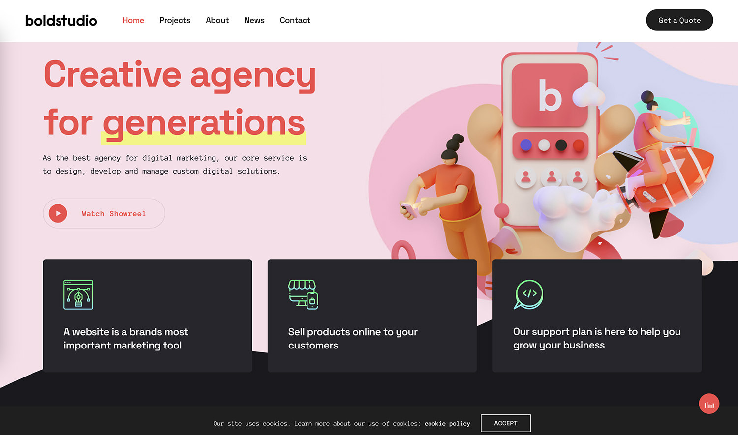
Free Portfolio WordPress Themes
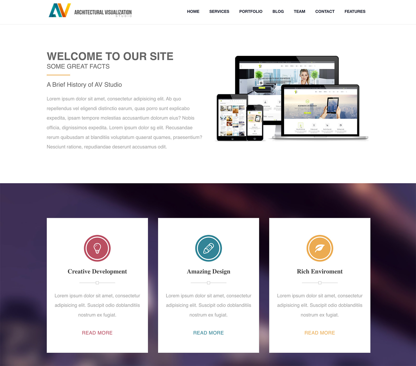
CV Portfolio Blocks

CV Portfolio Blocks WordPress Theme

CV Portfolio Blocks simplifies the task of creating a personal website for job seekers, freelancers, or anyone wanting to display their professional journey online.

This theme features a modern, clean design, enhancing readability and visual appeal on both desktop and mobile devices. Easily personalize it with photos, educational background, work history, and skills. Customization is straightforward, offering options to adjust colors, fonts, and layouts to suit your style.

Key aspects include distinct resume sections like About Me, Work Experience, and Contact, with additional features for resume downloads and direct contact.


Freelancer Portfolio

Freelancer Portfolio WordPress Theme

For freelancers in various fields, the Freelancer Portfolio WordPress Theme offers a dynamic platform to showcase your personality, education, skills, and goals.

This theme is suitable for content creators, photographers, designers, or hobbyists. It’s designed for both professional growth and personal expression, supporting easy content edits and image updates.

The theme’s layout is intuitive, requiring no special skills to manage, making it an excellent choice for maintaining an online presence.


FSE Freelancer Portfolio

FSE Freelancer Portfolio WordPress Theme

FSE Freelancer Portfolio caters to freelancers and creative professionals with its elegant design and easy-to-use interface.

This WordPress theme enables you to display work and services effectively through customizable blocks and layouts. It includes features like project galleries, testimonials, a responsive design for various devices, high-quality media presentation, and social media integration.

Its drag-and-drop content creation and clear navigation enhance user engagement, making it an ideal choice for freelancers looking to attract clients.


Portfolio View

Portfolio View WordPress Theme

Portfolio View WordPress Theme is designed for professionals seeking a visually striking online portfolio. Its modern, clean aesthetic offers customization for various portfolio types and ensures your work is displayed attractively across all devices.

The theme is user-friendly, organizing projects professionally and supporting features like blog creation, contact forms, and social media links. Perfect for artists, photographers, developers, and designers, this theme provides a sophisticated platform for showcasing your work.


Pure Portfolio

Pure Portfolio WordPress Theme

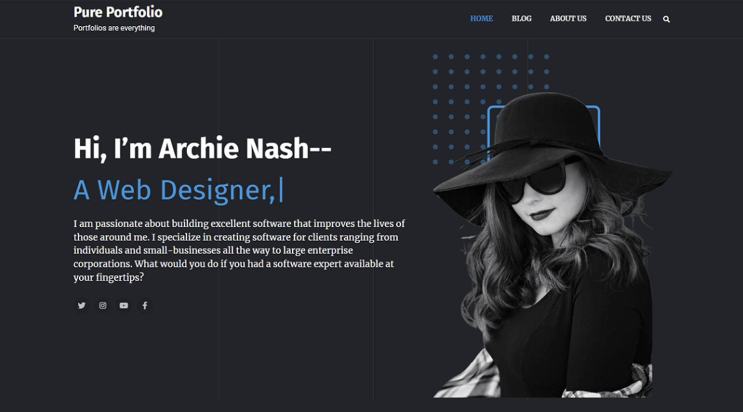
Pure Portfolio is a WordPress theme designed specifically for personal portfolios. It suits freelancers, designers, developers, photographers, and artists who want to create an impactful and engaging website.

With its standout design, the theme is both user-friendly and easily customizable, enabling a quick setup. Key features include a retina-ready display and a responsive layout for excellent mobile compatibility and cross-browser accessibility. It’s a top pick for professionals seeking a stunning yet functional portfolio with ease.
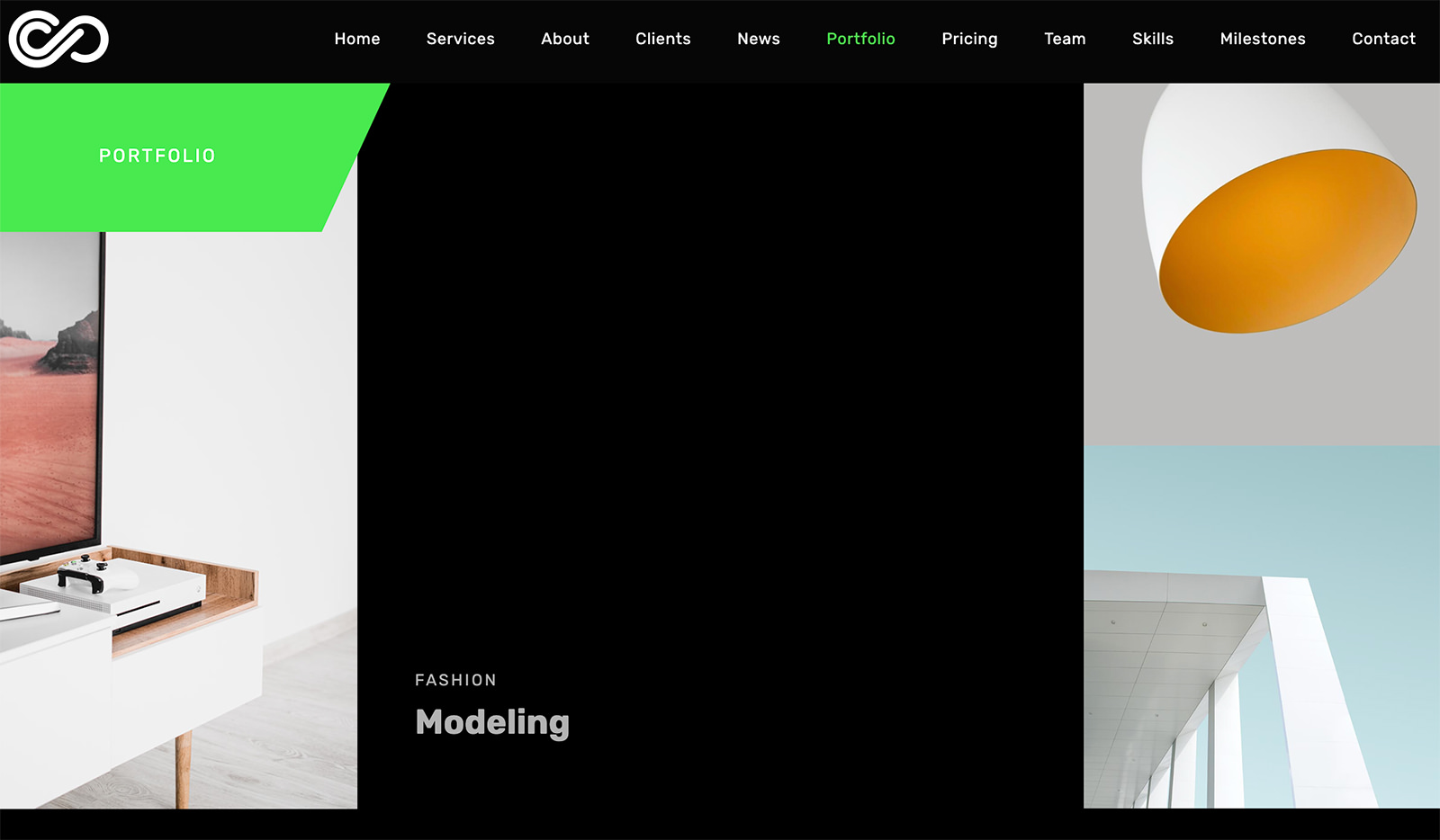
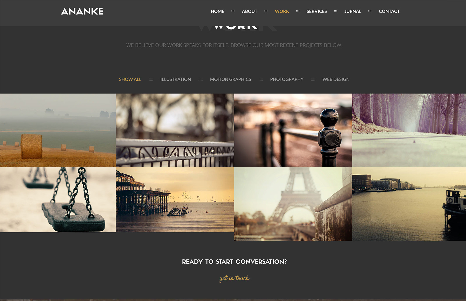

Sleek Portfolio

Sleek Portfolio WordPress Theme

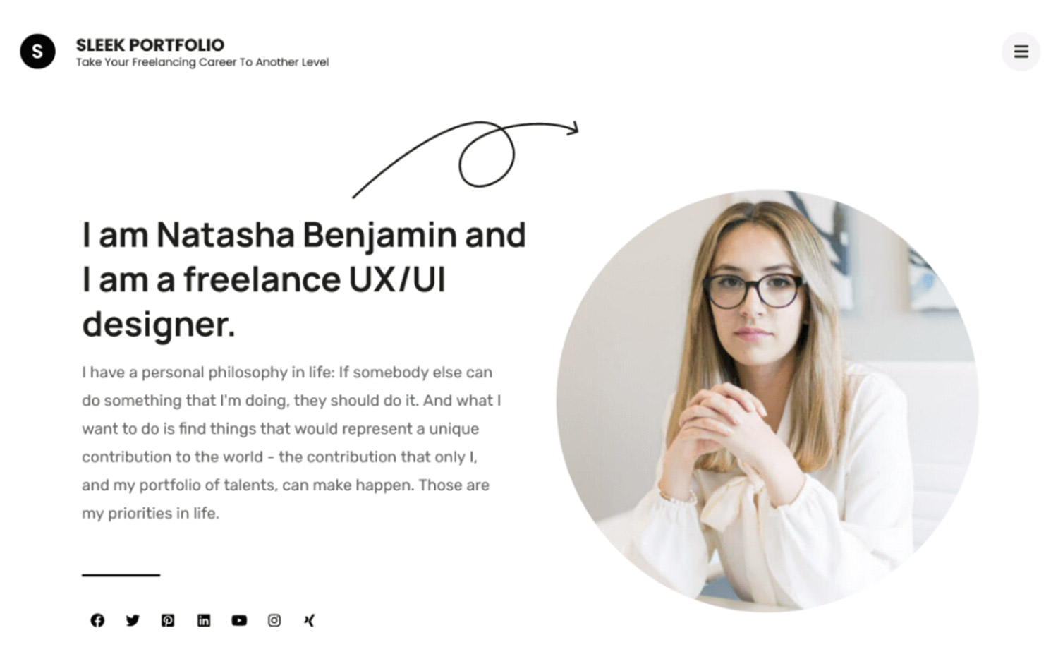
Sleek Portfolio is a free, mobile-friendly WordPress theme for crafting attractive portfolio websites. It caters to photographers, digital agencies, artists, graphic designers, and freelancers.

The theme includes varied sections such as banners, projects, blogs, and calls to action. It’s built with SEO best practices, ensuring your site ranks well in searches. Additionally, it’s WooCommerce compatible, translation-ready, and supports RTL languages. Resources such as the Sleek Portfolio Demo, documentation, and Rara Themes Support are available for further assistance.


Premium Portfolio WordPress Themes

Halogen

Halogen WordPress Theme

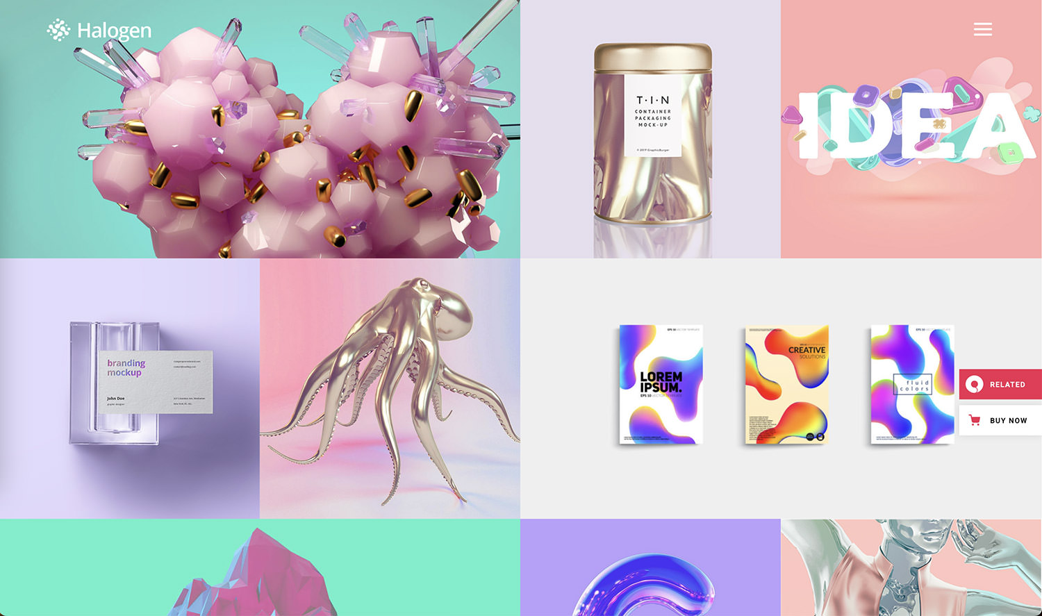
Halogen offers a distinctive approach to portfolio themes, targeting freelancers and creative businesses. More than just a portfolio, it features vibrant home pages and customizable inner pages, making it a fantastic choice for illustrators and artists. Its artistic design, coupled with a multitude of features and layouts, makes it a standout option for displaying your talents and works.

Halogen is designed to provide a fresh and exciting experience for those looking to make a mark with their personal or creative portfolio.
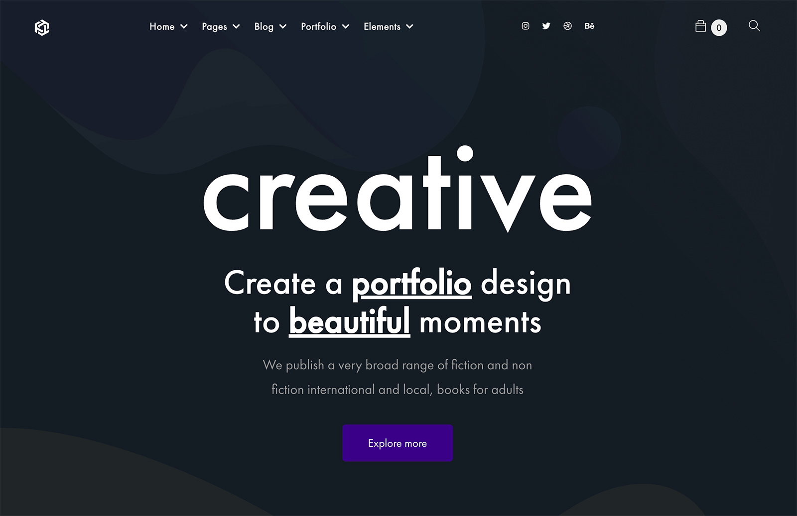

Ukiyo

Ukiyo WordPress Theme

Ukiyo is a responsive, retina-ready, and SEO-optimized WordPress theme ideal for freelancers or agencies desiring a remarkable online presence.

This modern portfolio theme comes with a trendy collection of layouts perfect for digital, design, or creative agencies. Its customizable elements allow for a stunning product showcase, offering various gallery types like split screen or full-screen sliders, and interactive link showcases.

Ukiyo encourages creative experimentation with options like grid portfolio and Pinterest portfolio, making it particularly effective for those who want to display their talents originally.


Brando

Brando WordPress Theme

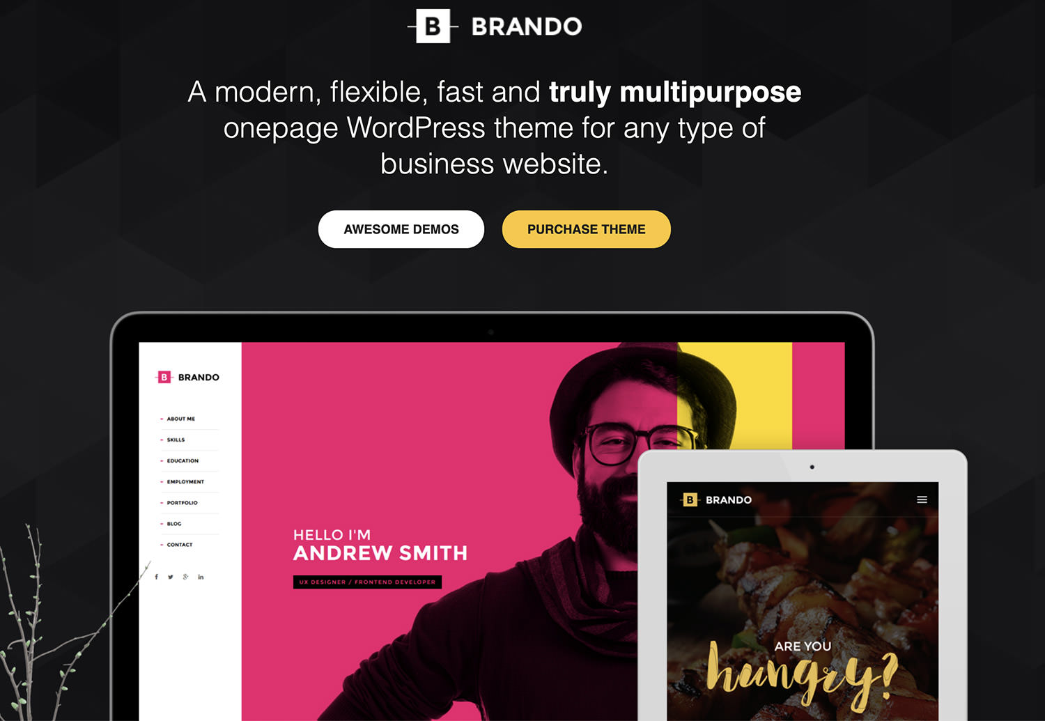
Brando is a WordPress theme designed for various business types, including design agencies, corporate firms, and freelancers. It offers a vast selection of ready-made one-page site demos, granting the freedom to mix elements for a unique style. Features include diverse portfolio and blog layouts, a ‘coming soon’ page, and integration with WPBakery Page Builder for easy, code-free editing.

The comprehensive settings panel allows for customization of layout, colors, fonts, headers, footers, and social sharing options. The theme’s import feature enables quick demo data integration, enhancing user convenience.


Werkstatt

Werkstatt WordPress Theme

Werkstatt offers a visually captivating WordPress experience for portfolios, blogging, and e-commerce, fully integrated with WooCommerce. It’s distinguished by custom elements with multiple settings, including sound effects for clicks and menu animations, background music options, and continuous updates through in-house license verification.

Supporting over 5000 fonts from Google WebFonts and Typekit, Werkstatt is optimized for speed, SEO, and features high-quality animations. It’s compatible with WPML or PolyLang for multilingual sites and offers versatile footer customization.

Werkstatt’s dedication to quality and functionality makes it a top choice for a dynamic online presence.
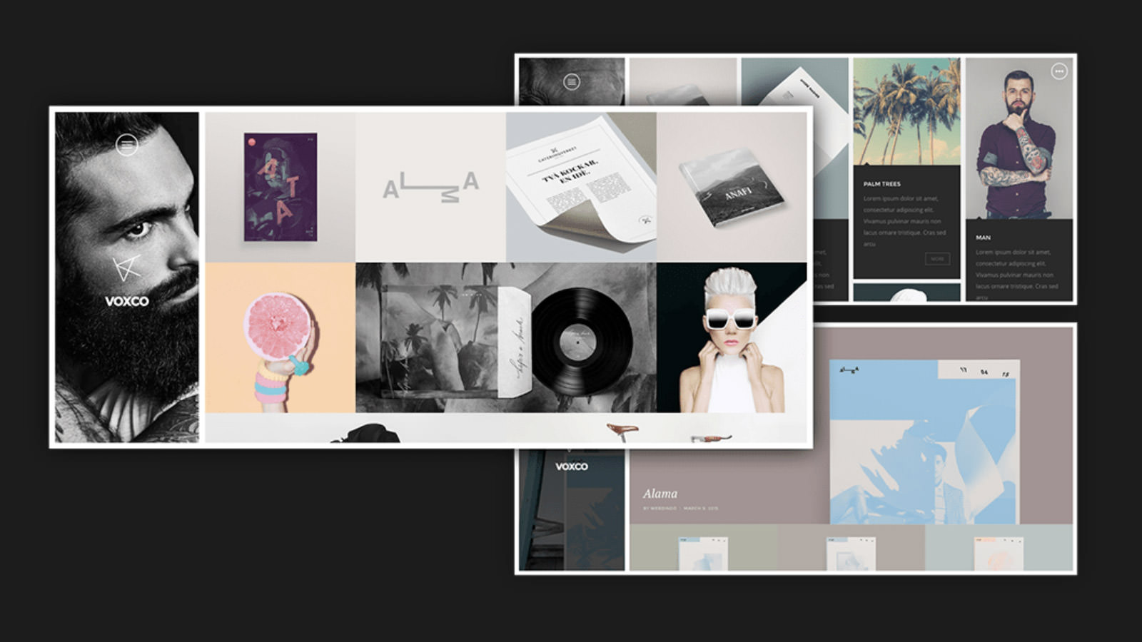

Voxco

Voxco WordPress Theme

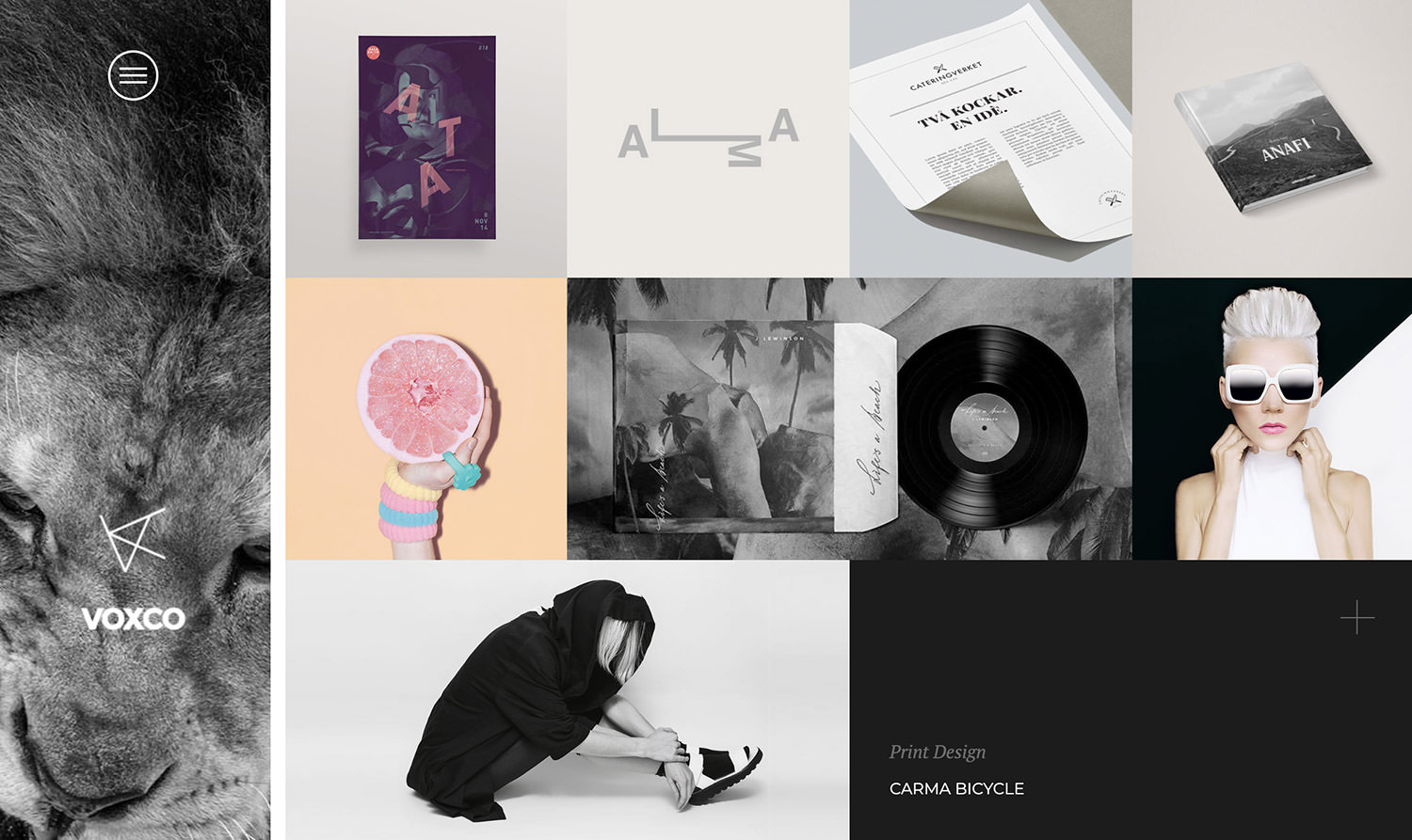
Voxco is a sleek, responsive WordPress portfolio theme, designed for speed and flexibility. Tailored for designers, illustrators, photographers, videographers, and freelancers, it ensures a smooth customization experience.

Voxco is ideal for creating a stylish and efficient portfolio, offering easy layout creation with the Visual Composer plugin. A standout feature is the Voxco Slider, providing a unique image panning effect.

Additionally, dedicated customer support is available to assist users at any stage, making it a go-to for creatives seeking a distinct website.


Adios

Adios WordPress Theme

Adios is a technically sophisticated, design-driven WordPress portfolio theme. Featuring a visual composer and drag-and-drop interface, it enables effortless website customization.

Fully responsive, it performs well on tablets, smartphones, and desktops. Adios offers over nine homepage layouts and various portfolio options, catering to creative styles and product marketing.

It boasts retina-ready high-resolution graphics and comes with extensive, user-friendly documentation, making it accessible for beginners and adaptable across different devices.


Awake

Awake WordPress Theme

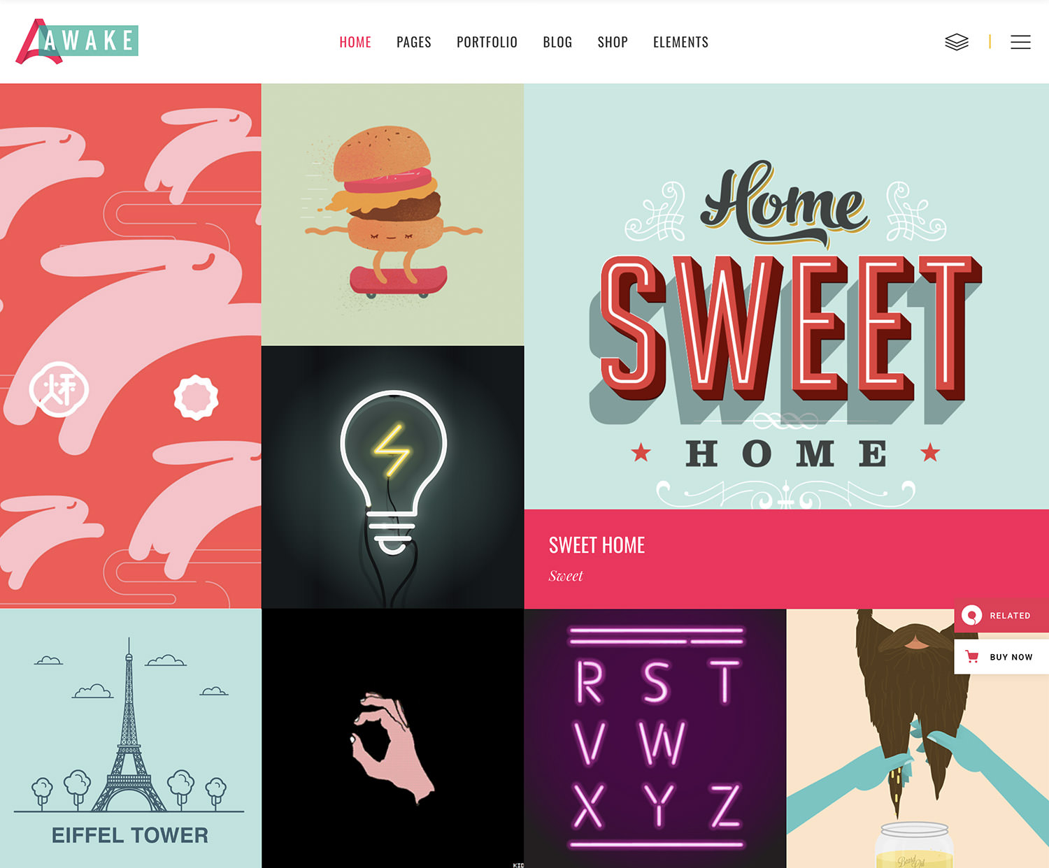
Awake is designed for creative agencies, design studios, and creative businesses. It offers diverse portfolio layouts, making it perfect for personal portfolios too.

Awake’s vibrant and fresh design, coupled with its powerful features, makes it ideal for showcasing creative work, team members, or blog articles. It’s also WooCommerce compatible, enabling an integrated eCommerce experience.

This theme is excellent for creatives looking to enhance their portfolio’s impact and also sell products online.


Oshine

Oshine WordPress Theme

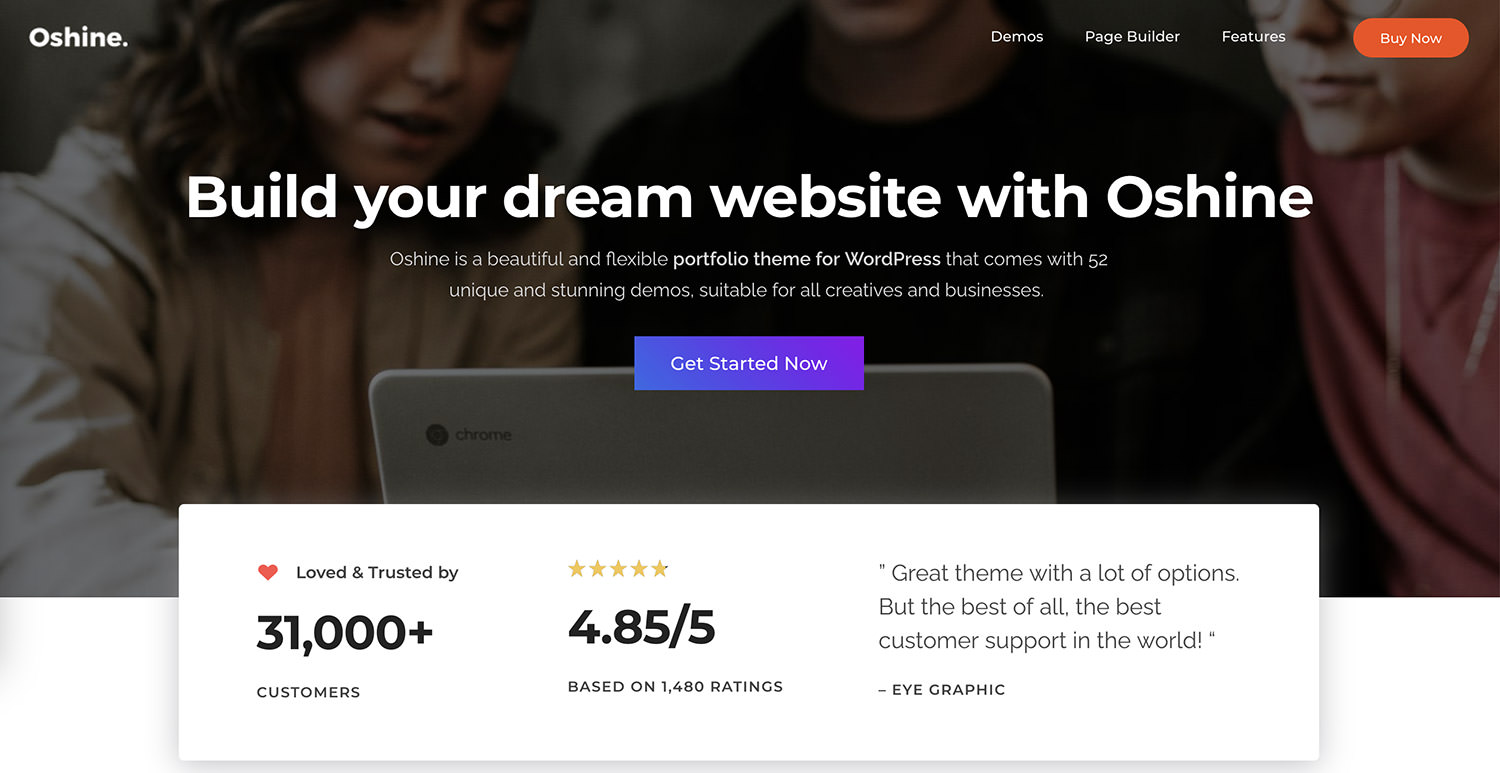
Oshine is a highly versatile and popular WordPress theme, used by over 35,000 users worldwide. It fits a broad spectrum of websites, including portfolios, photography, agencies, blogs, architecture, businesses, and shops.

Known for its high-quality design and intuitive visual page builder, Oshine offers 52 different demos, hundreds of pre-built sample pages, and a one-click demo installer.

With endless ways to showcase portfolios, top-notch customer support, infinite layout possibilities, and full control over fonts and colors, Oshine is compatible with many popular plugins and is regularly updated for optimal performance.


Joanna Norris

Joanna Norris WordPress Theme

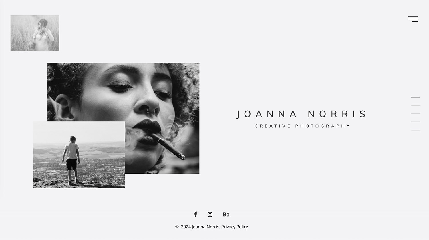
Joanna Norris is a responsive, modern HTML template tailored for photographers. It’s an affordable option for creating a stunning photography gallery, whether you’re building a new website or revamping an existing one.

This template is flexible, easily customizable, and reliable, offering a streamlined solution for web development. Designed to meet the needs of photographers, it ensures a professional online presence without the need for a professional web developer.


VicHax

VicHax WordPress Theme

VicHax is a WordPress Theme designed for a range of creators looking to establish a unique online portfolio. Its sleek design instantly engages visitors.

Featuring Live Customizer and Power Page Builder, it allows easy customization to suit your style or brand identity. Built on the Cherry Framework, it includes Cherry plugins for clear insights into your business services.

VicHax offers extensions for adding personal touches to your online presence, and its live demo showcases its features and customization potential.


Magic

Magic WordPress Theme

Magic is a colorful, multipurpose WordPress theme suitable for personal blogs, online stores (with WooCommerce integration), and more. It stands out with extensive customization options, various slideshow options with Revolution Slider, and multiple post format settings.

The user-friendly Power Builder enables drag-and-drop page building without complex coding. It includes 7 different headers, adaptable to your creative vision, TM Wizard plugin for easy plugin and demo content installation, and TM Dashboard for safe updates.

The post 20 Handpicked WordPress Portfolio Themes Free and Premium Options appeared first on Hongkiat.

Top 10 WordPress Themes to Use (Updated for 2024)

Finding the ideal WordPress theme for your website-building project can be challenging. First, you need to understand your project’s specific needs and identify the optimal solutions for those needs. Then, you must search for an exceptional WordPress theme that provides those solutions – often hidden among thousands of others.

Top WordPress themes

If you don’t have ample time, your search might not be worthwhile. As a perfectionist, if you find a theme that seems to offer the “best” solution, you’ll likely continue searching for an even better one.

The truth is, you don’t need to find the absolute best theme. A top-rated theme will suffice, not only for one project but often for many. That’s the hallmark of top-rated themes.

Top-rated themes share many qualities. They are fast, flexible, responsive, and equipped with the necessary tools, including a vast array of design aids and options.

In this post, we’ve reviewed our top picks for the best WordPress themes. You can easily determine which one suits your needs.


1. Be – The Fastest WordPress Theme Ever Built

Be

BeTheme is more than just a theme for creating WordPress and WooCommerce sites. This rightly acclaimed top-rated theme offers a comprehensive website management system. Whether you’re working on a single website-building project or juggling a hundred, BeTheme has you covered with:

  • Over 700 customizable, responsive, and ready-to-use pre-built websites covering every type of website or niche imaginable, a long-time favorite among BeTheme users.
  • BeBuilder, the fastest and most flexible website builder for WordPress. Available in Blocks, Classic, and Developer modes, it includes a variety of sliders, maps, icons, and other customizable elements. BeBuilder makes BeTheme the speediest WordPress theme around.
  • Recently added website-building tools that enable you to design sliders, blogs, portfolios, or shops of any type without restrictions, including Header and Footer, WooCommerce, Popup, Sidebar Menu, Mega Menu, and Loop builders.
  • Newly introduced features such as Developer Mode for enhanced workflows, a Layer Navigator for easier layer management, Nested Wraps for advanced layouts, and a new Breakpoint for laptops.

A BeTheme license includes the WordPress theme, setup wizard, 70+ powerful core features, and an array of theme options, pre-made layouts, building blocks, and global theme options. Click on the banner to discover more.

Visit Be Theme


2. Pro Theme + Cornerstone Builder

Pro Theme

Combine Cornerstone, the most advanced builder in WordPress, with the Pro Theme, and you’ve got an unmatched combination that epitomizes ‘building in the browser at its best.’ When put to the test, it delivers excellence.

Key features of Cornerstone include:

  • Header Builder, Layout Builder, and Blog Builder, allowing you to create custom templates and layouts for your pages, shops, and blogs without needing additional plugins.
  • Design Cloud, an ecosystem of design aids featuring ready-made templates and premium plugins, plus courses like Cornerstone Charts, Web Design Magic, Super Looper, and Modern Sliders – all just a click away.
  • An industry-unique Grid Editor to harness the power of the CSS Grid natively within Pro, dynamic data features for customized widgets, and a shop demo designed for quick store setups.

Technical features of Cornerstone include:

  • A plethora of Components, Elements, Theme Parameters, Presets, and Responsive Modals, along with Conditional Logic functionality, Native Web Effects, Native Mega Menus, and Blank and Starter Stack.
  • A new and advanced External API feature that enables connections between any 3rd party API and WordPress with Cornerstone.

Click on the banner to see if this powerful WordPress duo is the right choice for you.

Visit Pro Theme


3. Total WordPress Theme

Total WordPress Theme

The Total WordPress theme truly lives up to its name. It’s an ideal choice for developers, small business owners, and both novice and experienced website builders looking to create new websites or enhance existing ones. Total offers a rich array of features, functionality, and website-building capabilities, allowing you to craft your site precisely how you want it. With a selection of action hooks, filters, custom snippets, and more, Total is notably developer-friendly.

Key features of Total include:

  • An extended version of the WPBakery drag-and-drop page builder, over 50 ready-to-use demos, 90+ section templates, hundreds of live customer settings, and more than 100 site builder elements.
  • The premium Slider Revolution plugin.
  • Quick import sample demos, pre-styled cards, ready-to-use patterns, and hundreds of customizer settings, making perfect site design effortless.
  • Various layout options including boxed and full-width layouts, dynamic layouts, one-page sites, page and post designs, and advanced page settings.
  • Compatibility with most popular plugins like bbPress, Uber Menu, Easy Digital Downloads, WPML, Yoast, and Ultimate Addons.
  • A child theme and free extensions to jumpstart your projects.

Total seamlessly integrates with WooCommerce, offering numerous styling options and a built-in custom fonts manager. It is RTL and translation-ready, features a unique WPBakery Slim Mode to accelerate your site, and provides five-star support. Discover what Total can do for you by clicking the banner.

Visit Total


4. Outgrid – Multi-Purpose Elementor WordPress Theme

Outgrid

Outgrid is a lightning-fast Elementor theme that uses UiCore’s interactive design tools and numerous customization options to create award-winning, fully functional websites. Its key features include:

  • A next-generation Theme Options tool for total control over your website’s appearance.
  • The Elementor drag-and-drop page builder, alongside 2,000+ design blocks and 250+ design widgets.
  • A Theme Builder for complete control over your website’s static elements.
  • A system of global colors, fonts, and button styles.
  • Stunning interactive elements like text animations, captivating hover effects, and parallax scrolling.

Outgrid requires only 3 plugins: the UiCore Framework, the free Elementor page builder, and the free Elementor Pack Pro. A White Label option is also available.

Visit Outgrid


5. Avada WordPress Theme – #1 Top Selling Theme of All Time

Avada WordPress Theme

Avada is the all-time best-selling WordPress theme. It’s celebrated by 750,000 users, 24,000 of whom have contributed 5-star reviews. With Avada, you can build everything from one-page business websites to bustling online marketplaces without any need for coding.

  • Avada’s live visual builder makes crafting an impressive website straightforward. Select a template and customize elements with drag-and-drop ease to complete your project.
  • Avada’s theme options allow you to customize global styles across your entire website.
  • Creating a custom shop is effortless with Avada’s WooCommerce builder and shop templates, or you can design your own layouts.

The Avada team is known for providing exceptional support.

Visit Avada


6. Uncode – Creative & WooCommerce WordPress Theme

Uncode

This best-selling multi-use creative and WooCommerce theme (Uncode can boast of more than 110,000 sales) includes an inspirational selection of 95 pre-built websites or concepts; each of which has been designed around a specific purpose.

Among these concepts you’ll find many options and ideas you can work with for projects in the creative industries together with:

  • Uncode’s Drag & Drop Product and Shop Layout Builder, Ajax product filters and single product elements.
  • If you want pixel-perfect product lists visually without having to code, Uncode’s WooCommerce Builder is just right.
  • the Uncode Wireframes Plugin with its more than 550+ section templates (organized in 18 categories) to help you create your landing pages or build a complete website.

Visit Uncode


7. Woodmart – WordPress WooCommerce Theme for Any Kind of Store

Woodmart

With the WoodMart WordPress WooCommerce theme, there’s no need to compromise between building a visually stunning store and maintaining a swift website. WoodMart is rich in features unique to eCommerce themes, all without requiring any plugins.

WoodMart is renowned for its exceptional array of product page display presentations and options. Additional highlights include:

  • Shop and product page Elementor builders.
  • Custom checkout with Elementor.
  • AJAX filters and search, including fullscreen search and search by SKU, plus an AJAX quick shop for every product type.
  • An impressive selection of highly customizable pre-made websites, templates, special pages, and product page display options.

WoodMart’s pre-made website displays are so enticing, you’ll be tempted to place an order yourself.

Visit Woodmart


8. Blocksy – Premium WordPress Theme

Blocksy

Blocksy, an eCommerce WordPress theme, is built atop Gutenberg and the latest web technologies. It’s fully eCommerce-ready and guarantees lightning-fast performance.

Blocksy’s intuitive website-building features include:

  • WooCommerce-compatible customizations, Ajax functionality, and local Google fonts for enhanced performance and GDPR compliance.
  • Support for Custom Post types and Dynamic Data.
  • A Mega Menu extension, Header builder, Footer builder, and a Content Blocks feature that allows you to insert content anywhere on your site.

Blocksy’s White Label Module allows users or agencies to rebrand the theme for an improved user experience and engagement.

Visit Blocksy


9. XStore WordPress & WooCommerce Theme

XStore

XStore WooCommerce theme is celebrated for its quick and straightforward approach to building online stores. Its users appreciate the impressive array of pre-made shops (currently exceeding 130) and the continuous addition of new ones. With XStore’s multi-vendor marketplace building tools and features, along with Single Product, Products Archive, Checkout Layout, and Cart Layout builders, users can efficiently progress with their projects. Additionally, XStore offers 15 Sales booster features, such as:

  • Fake live viewing as a sales-boosting aid.
  • Product variation swatches.
  • Fake sale popup to monitor visitor activities in real time.
  • Frequently bought together ads.
  • A sticky add-to-cart bar, Express checkout, and a 360-product viewer.

Visit XStore


10. Litho Elementor WordPress Theme

Litho

Litho is a creative, modern, highly customizable, and responsive multipurpose Elementor WordPress theme. Fully compatible with Elementor, the world’s leading free page builder, Litho’s versatility and high customization make it an ideal choice for any business, portfolio, blog, or eCommerce website. Key features include:

  • Over 37 ready home pages, more than 200 creative elements, and an extensive library of 300+ templates.
  • The Slider Revolution premium plugin.
  • One-click demo import or the option to import your own content.

Litho ensures fast loading speeds, is WooCommerce ready, WPML compatible for multilingual sites, and optimized for healthy SEO results.

Visit Litho


Final Thoughts

Several factors influence brand perception, with your site’s appearance being a critical one. Therefore, creating a professional, visually appealing, and responsive design is essential for gaining credibility and increasing conversion rates. To achieve this, it’s crucial to select a WordPress theme recognized by experts as one of the best. Fortunately, you don’t need to invest excessive time searching for that ‘perfect’ theme for your project.

A top theme will consistently deliver excellent results. It will be fast, flexible, responsive, and equipped with everything you need, including a vast array of design aids and options.

The post Top 10 WordPress Themes to Use (Updated for 2024) appeared first on Hongkiat.

15 Parallax WordPress Themes for Creatives, Businesses, and Bloggers

Parallax scrolling continues to charm users with its captivating, 3D-like experience in our digital world. This engaging design technique’s popularity shows no signs of fading away.

In this blog post, we’ll look into the cream of the crop when it comes to WordPress themes that feature parallax scrolling. No matter if you’re a blogger, business owner, or web designer, our list has a theme that will fit your needs and keep your audience engaged. So, sit tight and get ready to explore our hand-picked list of the 20 best Parallax WordPress themes available today.

1. Ananke


Ananke WordPress Theme

Ananke is a WordPress theme ideal for personal portfolios and creative agencies. It boasts a modern design with intricate animations for a professional appearance. This theme is responsive and customizable, ensuring cross-device compatibility and easy image and text replacement.

The theme offers eight home page variations and a one-click demo import for easy setup. It comes with a Visual Composer Page Builder and over 23 elements, making site creation a breeze. Ananke also supports unlimited color styles for personalization.

Key features of Ananke include a fully responsive layout, filterable portfolios, animated icons, and smooth scrolling. It’s SEO optimized and supports Google Fonts and Contact Form 7. The theme is built with HTML5 and CSS3. Ananke perfectly blends aesthetics and functionality, making it ideal for displaying creative work.


2. Heylone


Heylone WordPress Theme

Heylone is a one-page WordPress theme ideal for business, portfolio, and personal websites. It offers a modern, responsive design that enhances professional online presence. Known for its customizable layout and ease of use, users can manage page orders and portfolio items through a simple drag-and-drop interface. The theme is built on Twitter Bootstrap, ensuring its compatibility across various devices and screen sizes.

The theme provides three homepage variations and 12 color schemes, with unlimited color customization. It also includes a functional contact form and an expandable portfolio section for effective work showcase.

Focused on performance and user experience, Heylone features carousel effects and full-width video support. It is also SEO optimized. Other features include responsive pricing tables and Twitter feed integration. Its compatibility with Bootstrap and WPML makes it a versatile choice for diverse website projects.


3. AV Studio


AV Studio WordPress Theme

AV Studio is a responsive WordPress theme, perfect for displaying company profiles, portfolios, and creative work. It’s designed to function seamlessly on any device, providing a user-friendly experience.

The theme offers extensive customization options. These include unlimited layout and color variations, allowing you to tailor the design to your needs.

Built using HTML5 and CSS3, AV Studio boasts a modern aesthetic. It also features a dynamic parallax one-page template and retina-ready capabilities for high-quality images.

The theme is SEO optimized and supports Fontello icon fonts and Google Fonts. This ensures varied and attractive typography.

Files are well-organized and commented for easy customization. Plus, the theme is cross-browser compatible, ensuring it works flawlessly on any browser.


4. Archi


Archi WordPress Theme

Archi offers an advanced platform to display your work with a selection of 24 Home Pages and 5 Landing Pages. It comes in both Dark and Light versions to suit your preference.

The theme features a user-friendly interface, complete with WPBakery Page Builder and over 50 custom web elements. This ensures a seamless website-building experience.

Archi supports WooCommerce integration, allowing for easy online selling. The design is responsive, ensuring a smooth appearance across all devices.

Additional features include an Isotope filterable gallery, 800+ Google Web Fonts, and 675 Font Awesome Icons. Archi is also translation-ready, supports RTL layouts, and is built with Bootstrap 3.X.


5. Oblo


Oblo WordPress Theme

Oblo is a modern, minimalist WordPress theme designed by the bslthemes Team. Tailored for creative professionals such as architects and artists, it is compatible with the latest WordPress version and features the Visual Drag & Drop Elementor Page builder for easy customization.

This theme offers unlimited Header & Footer Elementor Builder and includes over 5 pre-built demos, 35+ custom Elementor widgets, and 30+ pre-built pages. It is fully responsive and supports WooCommerce.

Oblo also includes a portfolio with various layouts. It is translation-ready, supports child themes, and comes with comprehensive documentation.


6. Oreades


Oreades WordPress Theme

Oreades is a minimalist, one-page WordPress theme designed for creative professionals and businesses. It boasts a clean, modern design that emphasizes your content. It also has customizable features such as project pages, a drag-and-drop page builder, and a unique color scheme creator.

The theme supports multilingual content and includes a filterable portfolio. It’s fully responsive, ensuring optimal viewing on all devices.

Additionally, Oreades is SEO optimized and integrates with Contact Form 7. It also offers over 400 icons. The theme is built with HTML5 and CSS3 and offers parallax one-page and background effects.


7. Hera


Hera WordPress Theme

Hera is a versatile theme ideal for personal bloggers, creative agencies, and photographers. It boasts a customizable design that works flawlessly on any device, and includes ten distinct home page versions and adjustable headers. The theme also features a user-friendly drag-and-drop page builder.

Additionally, Hera offers unlimited color styles and a Revolution Slider for showcasing content. It is SEO optimized, supporting multilingual content and a filterable portfolio for displaying work.

Finally, Hera enhances user experience with an on-scroll effect layout, parallax one-page and background, and smooth scrolling. It’s a theme that combines functionality and aesthetics for an engaging digital experience.


8. Seppo


Seppo WordPress Theme

Seppo is a one-page WordPress theme ideal for corporate and professional usage. It seamlessly merges aesthetics with functionality, offering sections such as Home, Services, and About on a single scrollable page. The theme features a dynamic slider tool and offers customization options.

The layout is responsive, ensuring mobile compatibility. Seppo also utilizes Ajax for quicker content loading and includes a portfolio post type.

Additional features include smooth scrolling and multi-language support through WPML plugin compatibility. The theme is also compatible with Contact Form 7. Despite its sophisticated design, Seppo is user-friendly and versatile.


9. Rhye


Rhye WordPress Theme

Rhye is a visually striking WordPress theme that offers an elegant aesthetic and seamless browsing through AJAX-powered loading. It includes smooth motion effects, powered by WebGL and GSAP 3. The theme is also built with the Elementor page builder for easy layout creation.

Rhye also boasts performance features such as quick site navigation and responsive design. Customizable color schemes are also available for a personalized touch.

Additional features include a fullscreen overlay menu and compatibility with various plugins. The theme is also SEO optimized and translation-ready, making it a versatile choice for creatives seeking a professional online presence.


10. Lazer


Lazer WordPress Theme

Lazer is suitable for various applications such as business websites, creative agencies, portfolios, and blogs. It boasts a modern design and numerous features aimed at enhancing functionality. Its responsive design ensures it performs optimally on all devices.

Customizing your site’s appearance and layout is a breeze with Lazer. It features a theme options panel and a drag & drop page builder for easy customization. It also includes parallax and video backgrounds, over 600 Google Fonts, and unlimited sidebars.

Lazer is not only optimized for speed and SEO, but is also compatible with popular plugins like WPBakery Page Builder. Regularly updated, it is tested up to WordPress version 5.7.


11. Tattoo


Tattoo WordPress Theme

The Tattoo WordPress theme is a responsive and user-friendly design specifically for tattoo and piercing shops. It’s compatible with WordPress 6.4 and includes the Beaver Builder Drag and Drop Builder for easy customization.

Key features include a Reservation Form, Shop, Reviews, Q&A, and Galleries. It also offers extensive setup guides, video tutorials, and articles for assistance.

The theme is SEO and mobile optimized, and comes with premium features like the Revolution Slider and WooCommerce integration. The Tattoo theme is not only visually attractive but also a practical tool for creating a compelling online presence.


12. Tracem


Tracem WordPress Theme

Tracem theme is designed for a range of uses, from corporate websites to personal portfolios. It incorporates the Elementor Page builder, simplifying the process of website creation. Additionally, it offers a one-click demo install for a swift setup. The theme is built on the responsive Bootstrap 4.x platform.

It also includes engaging parallax sections. Tracem provides a variety of portfolio styles and unlimited color options, along with handy elements for customization. It supports multiple plugins, including Elementor and WooCommerce, ensuring broad functionality.

Moreover, Tracem adheres to HTML5 and CSS3 standards. It also supports PO translation and is compatible with the Loco translate plugin, making it a user-friendly choice for diverse language needs.


13. Sasspark


Sasspark WordPress Theme

Sasspark, with its modern and clean design, is ideal for startups, digital agencies, and SaaS businesses. It provides both one-page and multi-page options and includes the Elementor page builder for easy customization. The Codestar Framework is also integrated, allowing for control over site aesthetics.

The theme boasts features such as multiple homepage blocks, cross-browser compatibility, and a smart sticky header. It’s also retina-ready, ensuring sharp display on all devices. Support for FontAwesome, Icofont Icons, and Remix Icons is also included.

Despite its multitude of features, Sasspark remains lightweight and fast-loading, ensuring an optimal user experience.


14. Startos


Startos WordPress Theme

Startos is a mobile app design platform with a clean, customizable interface. It offers a variety of color and demo options, as well as key features like the Visual Composer Page Builder and Revolution Slider. Users have access to three different home page versions and can easily import demo content.

The platform is fully responsive, ensuring a seamless display on all devices. It also offers unlimited color schemes and Google Fonts for further customization. The robust admin panel and flexible shortcodes make it easy to manage and adapt.

Additional features include video backgrounds, smooth scrolling, and contact forms. Users can also access multiple icons and pricing tables. Startos is compatible with both Android and iOS apps.


15. Talos


Talos WordPress Theme

Talos is suitable for various applications including personal portfolios and creative agencies. It boasts a responsive design for optimal use on mobile and tablet devices.

The theme offers over 20 home page versions and includes a Visual Composer Page Builder. It also features unlimited color styles and supports responsive video.

Talos is SEO optimized and built with HTML5 and CSS3. It provides over 600 Google Web Fonts and 400+ icons for customization.

With detailed documentation, Talos is easy to set up. It’s more than just a theme, it’s a tool for an efficient online presence.

The post 15 Parallax WordPress Themes for Creatives, Businesses, and Bloggers appeared first on Hongkiat.

Preparing For Interaction To Next Paint, A New Web Core Vital

Preparing For Interaction To Next Paint, A New Web Core Vital

Preparing For Interaction To Next Paint, A New Web Core Vital

Geoff Graham

2023-12-07T21:00:00+00:00
2025-06-20T10:32:35+00:00

This article is sponsored by DebugBear

There’s a change coming to the Core Web Vitals lineup. If you’re reading this before March 2024 and fire up your favorite performance monitoring tool, you’re going to to get a Core Web Vitals report like this one pulled from PageSpeed Insights:

Core Web Vitals report with six mini-charts

(Large preview)

You’re likely used to seeing most of these metrics. But there’s a good reason for the little blue icon sitting next to the second metric in the second row, Interaction to Next Paint (INP). It’s the newest metric of the bunch and is set to formally be a ranking factor in Google search results beginning in March 2024.

And there’s a good reason that INP sits immediately below the First Input Delay (FID) in that chart. INP will officially replace FID when it becomes an official Core Web Vital metric.

The fact that INP is already available in performance reports means we have an opportunity to familiarize ourselves with it today, in advance of its release. That’s what this article is all about. Rather than pushing off INP until after it starts influencing the way we measure site performance, let’s take a few minutes to level up our understanding of what it is and why it’s designed to replace FID. This way, you’ll not only have the information you need to read your performance reports come March 2024 but can proactively prepare your website for the change.

“I’m Not Seeing Those Metrics In My Reports”

Chances are that you’re looking at Lighthouse or some other report based on lab data. And by that, I mean data that isn’t coming from the field in the form of “real” users. You configure the test by applying some form of simulated throttling and start watching the results pour in. In other words, the data is not looking at your actual web traffic but a simulated environment that gives you an approximate view of traffic when certain conditions are in place.

I say all that because it’s important to remember that not all performance data is equal, and some metrics are simply impossible to measure with certain types of data. INP and FID happen to be a couple of metrics where lab data is unsuitable for meaningful results, and that’s because both INP and FID are measurements of user interactions. That may not have been immediately obvious by the name “First Input Delay,” but it’s clear as day when we start talking about “Interaction to Next Paint” — it’s right there in the name!

Simulated lab data, like what is used in Lighthouse reports, does not interact with the page. That means there is no way for it to evaluate the first input a user makes or any other interactions on the page.

So, that’s why you’re not seeing INP or FID in your reports. If you want these metrics, then you will want to use a performance tool that is capable of using real user data, such as DebugBear, which can monitor your actual traffic on an ongoing basis in real time, or PageSpeed Insights which bases its finding on Google’s “Chrome User Experience Report” (commonly referred to as CrUX), though DebugBear is capable of providing CrUX reporting as well. The difference between real-time user monitoring and measuring performance against CrUX data is big enough that it’s worth reading up on it, and we have a full article on Smashing Magazine that goes deeply into the differences for you.

INP Improves How Page Interactions Are Measured

OK, so we now know that both INP and FID are about page interactions. Specifically, they are about measuring the time between a user interacting with the page and the page responding to that interaction.

What’s the difference between the two metrics, then? The answer is two-fold. First, FID is a measure of the time it takes the page to start processing an interaction or the input delay. That sounds fine on the surface — we want to know how much time it takes for a user to start an interaction and optimize it if we can. The problem with it, though, is that it takes just one part of the time for the page to fully respond to an interaction.

A more complete picture considers the input delay in addition to two other components: processing time and presentation delay. In other words, we should also look at the time it takes to process the interaction and the time it takes for the page to render the UI in response. As you may have already guessed, INP considers all three delays, whereas FID considers only the input delay.

Diagram of a timeline aligned with the three INP components.

(Large preview)

The second difference between INP and FID is which interactions are evaluated. FID is not shy about which interaction it measures: the very first one, as in the input delay of the first interaction on the page. We can think of INP as a more complete and accurate representation of how fast your page responds to user interactions because it looks at every single one on the page. It’s probably rare for a page to have only one interaction, and whatever interactions there are after the first interaction are likely located well down the page and happen after the page has fully loaded.

So, where FID looks at the first interaction — and only the input delay of that interaction — INP considers the entire lifecycle of all interactions.

Measuring Interaction To Next Paint

Both FID and INP are measured in milliseconds. Don’t get too worried if you notice your INP time is greater than your FID. That’s bound to happen when all of the interactions on the page are evaluated instead of the first interaction alone.

Google’s guidance is to maintain an FID under 100ms. And remember, FID does not take into account the time it takes for the event to process, nor does it consider the time it takes the page to update following the event. It only looks at the delay of the event process.

And since INP does indeed take all three of those factors into account — the input delay, processing time, and presentation delay — Google’s guidance for measuring INP is inherently larger than FID: under 200ms for a “good” result, and between 200-500ms for a passing result. Any interaction that adds up to a delay greater than 500ms is a clear bottleneck.

Showing the 200ms-500ms range of passing INP scores.

(Large preview)

The goal is to spot slow interactions and optimize them for a smoother user experience. How exactly do you identify those problems? That’s what we’re looking at next.

Identifying Slow Interactions

There’s already plenty you can do right now to optimize your site for INP before it becomes an official Core Web Vital in March 2024. Let’s walk through the process.

Of course, we’re talking about the user doing something on the page, i.e., an action such as a click or keyboard focus. That might be expanding a panel in an accordion component or perhaps triggering a modal or a prompt any change in a state where the UI updates in response.

Your page may consist of little more than content and images, making for very few, if any, interactions. It could just as well be some sort of game-based UI with thousands of interactions. INP can be a heckuva lot of work, but it really comes down to how many interactions we’re talking about.

We’ve already talked about the difference between field data and lab data and how lab data is simply unable to measure page interactions accurately. That means you will want to rely on field data when pulling INP reports to identify bottlenecks. And when we’re talking about field data, we’re talking about two different flavors:

  1. Data from the CrUX report that is based on the results of real Chrome users. This is readily available in PageSpeed Insights and Google Search Console, not to mention DebugBear. If you use either of Google’s tools, just note that their throttling methods collect metrics on a fast connection and then estimate how fast the page would be on a slower connection. DebugBear actually tests with a slower network, resulting in more accurate data.
  2. Monitoring your website’s real-time traffic, which will require adding a snippet to your source code that sends traffic data to a service. And, yes, DebugBear is one such service, though there are others. You can even take advantage of historical CrUX data integrated with BigQuery to get a historical view of your results dating back as far as 2017 with new data coming in monthly, which isn’t exactly “real-time” monitoring of your actual traffic, but certainly useful.

You will get the most bang for your buck with real-time monitoring that keeps a historical record of data you can use to evaluate INP results over time.

That said, you can still start identifying bottlenecks today if you prefer not to dive into real-time monitoring right this second. DebugBear has a tool that analyzes any URL your throw at it. What’s great about this is that it shows you the elements that receive user interaction and provides the results right next to them. The result of the element that takes the longest is your INP result. That’s true whether you have one component above the 500ms threshold or 100 of them on the page.

The fact that DebugBear’s tool highlights all of the interactions and organizes them by INP makes identifying bottlenecks a straightforward process.

DebugBear INP report.

Whoa there! We have a bottleneck! (Large preview)

See that? There’s a clear INP offender on Smashing Magazine’s homepage, and it comes in slightly outside the healthy INP range for a score of 510ms even though the next “slowest” result is 184ms. There’s a little work we need to do between now and March to remedy that.

Notice, too, that there are actually two scores in the report: the INP Debugger Result and the Real User Google Data. The results aren’t even close! If we were to go by the Google CrUX data, we’re looking at a result that is 201ms faster than the INP Debugger’s result — a big enough difference that would result in the Smashing Magazine homepage fully passing INP.

Ultimately, what matters is how real users experience your website, and you need to look at the CrUX data to see that. The elements identified by the INP Debugger may cause slow interactions, but if users only interact with them very rarely, that might not be a priority to fix. But for a perfect user experience, you would want both results to be in the green.

Optimizing Slow Interactions

This is the ultimate objective, right? Once we have identified slow interactions — whether through a quick test with CrUX data or a real-time monitoring solution — we need to optimize them so their delays are at least under 500ms, but ideally under 200ms.

Optimizing INP comes down to CPU activity at the end of the day. But as we now know, INP measures two additional components of interactions that FID does not for a total of three components: input delay, processing time, and presentation delay. Each one is an opportunity to optimize the interaction, so let’s break them down.

Reduce The Input Delay

This is what FID is solely concerned with, and it’s the time it takes between the user’s input, such as a click, and for the interaction to start.

Diagram showing FID in relation to Total Blocking Time and UI update.

(Large preview)

This is where the Total Blocking Time (TBT) metric is a good one because it looks at CPU activity happening on the main thread, which adds time for the page to be able to respond to a user’s interaction. TBT does not count toward Google’s search rankings, but FID and INP do, and both are directly influenced by TBT. So, it’s a pretty big deal.

You will want to heavily audit what tasks are running on the main thread to improve your TBT and, as a result, your INP. Specifically, you want to watch for long tasks on the main thread, which are those that take more than 50ms to execute. You can get a decent visualization of tasks on the main thread in DevTools:

Safari DevTools Timelines report

The “Timelines” feature in Safari DevTools records the page load and produces a timeline of activity that can be broken down by network requests, layout and rendering, JavaScript and events, and CPU. Chrome and Firefox offer the same features but may look a little different, as browsers tend to do. (Large preview)

The bottom line: Optimize those long tasks! There are plenty of approaches you could take depending on your app. Not all scripts are equal in the sense that one may be executing a core feature while another is simply a nice-to-have. You’ll have to ask yourself:

  • Who is the script serving?
  • When is it served?
  • Where is it served from?
  • What is it serving?

Then, depending on your answers, you have plenty of options for how to optimize your long tasks:

Or, nuke any scripts that might no longer be needed!

Reduce Processing Time

Let’s say the user’s input triggers a heavy task, and you need to serve a bunch of JavaScript in response — heavy enough that you know a second or two is needed for the app to fully process the update.

Reduce Presentation Delay

Reducing the time it takes for the presentation is really about reducing the time it takes the browser to display updates to the UI, paint styles, and do all of the calculations needed to produce the layout.

Of course, this is entirely dependent on the complexity of the page. That said, there are a few things to consider to help decrease the gap between when an interaction’s callbacks have finished running and when the browser is able to paint the resulting visual changes.

One thing is being mindful of the overall size of the DOM. The bigger the DOM, the more HTML that needs to be processed. That’s generally true, at least, even though the relationship between DOM size and rendering isn’t exactly 1:1; the browser still needs to work harder to render a larger DOM on the initial page load and when there’s a change on the page. That link will take you to a deep explanation of what contributes to the DOM size, how to measure it, and approaches for reducing it. The gist, though, is trying to maintain a flat structure (i.e., limit the levels of nested elements). Additionally, reviewing your CSS for overly complex selectors is another piece of low-hanging fruit to help move things along.

While we’re talking about CSS, you might consider looking into the content-visibility property and how it could possibly help reduce presentation delay. It comes with a lot of considerations, but if used effectively, it can provide the browser with a hint as far as which elements to defer fully rendering. The idea is that we can render an element’s layout containment but skip the paint until other resources have loaded. Chris Coyier explains how and why that happens, and there are aspects of accessibility to bear in mind.

And remember, if you’re outputting HTML from JavaScript, that JavaScript will have to load in order for the HTML to render. That’s a potential cost that comes with many single-page application frameworks.

Gain Insight On Your Real User INP Breakdown

The tools we’ve looked at so far can help you look at specific interactions, especially when testing them on your own computer. But how close is that to what your actual visitors experience?

Real user-monitoring (RUM) lets you track how responsive your website is in the real world:

  • What pages have the slowest INP?
  • What INP components have the biggest impact in real life?
  • What page elements do users interact with most often?
  • How fast is the average interaction for a given element?
  • Is our website less responsive for users in different countries?
  • Are our INP scores getting better or worse over time?

There are many RUM solutions out there, and DebugBear RUM is one of them.

DebugBear RUM

(Large preview)

DebugBear also supports the proposed Long Animation Frames API that can help you identify the source code that’s responsible for CPU tasks in the browser.

Long Animation Frames API

(Large preview)

Conclusion

When Interaction to Next Paint makes its official debut as a Core Web Vital in March 2024, we’re gaining a better way to measure a page’s responsiveness to user interactions that is set to replace the First Input Delay metric.

Rather than looking at the input delay of the first interaction on the page, we get a high-definition evaluation of the least responsive component on the page — including the input delay, processing time, and presentation delay — whether it’s the first interaction or another one located way down the page. In other words, INP is a clearer and more accurate way to measure the speed of user interactions.

Will your app be ready for the change in March 2024? You now have a roadmap to help optimize your user interactions and prepare ahead of time as well as all of the tools you need, including a quick, free option from the team over at DebugBear. This is the time to get a jump on the work; otherwise, you could find yourself with unidentified interactions that exceed the 500ms threshold for a “passing” INP score that negatively impacts your search engine rankings… and user experiences.

Smashing Editorial
(yk, il)

50+ Useful WordPress Keyboard Shortcuts for Windows and Mac

Understanding computer keyboard shortcuts can drastically elevate your productivity. In a similar vein, if you’re acquainted with specific WordPress keyboard shortcuts, your workflow can become notably smoother. This is particularly beneficial for individuals who prefer not to toggle between the keyboard and mouse. Hence, for such users, these shortcuts can be invaluable.

WordPress offers an abundance of shortcuts for tasks like editing content, performing specific actions, or even simple navigation. In this article, we’ll delve into a detailed list of nearly all the WordPress keyboard shortcuts to enhance your efficiency.

Basic Navigation

Navigation in WordPress is akin to browsing through any other website. The essential keys you need for this are Tab, Arrow, Enter, and Backspace. Below, we elaborate on each of these keys and their functions.

Tab

By pressing the Tab key, you can move to the subsequent clickable link or option on the page, starting from the top. By pressing it successively, you can navigate from one option to another. If you need to navigate backward, simply hold Shift and press Tab.

Arrow Keys

Utilizing the arrow keys – , , , and – will enable you to scroll through the content of the post.

Enter/Return

To confirm a dialog box or access a specific option, all you need to do is press the Enter key.

Backspace

The Backspace key lets you navigate back to the preceding page. For forward navigation, hold the Shift key and press Backspace.

Post Editing

Here’s where the excitement truly kicks in. Mastering the post editor shortcuts can significantly streamline the process of editing and formatting your content. Below is a comprehensive list of shortcuts for content management, editing, and formatting – all the tools you’ll require to craft content on WordPress efficiently.

Content Management

ActionWindows ShortcutMac Shortcut
Highlight content per characterShift + / Shift + /
Highlight content per wordCtrl + Shift + / Option + Shift + /
Highlight above/below lineShift + / Shift + /
Select all contentCtrl + ACmd + A
Paste content without formattingCtrl + Shift + VCmd + Shift + V

Content Formatting

ActionWindowsMac
Strikethrough textShift + Alt + DShift + Option + D
Insert linkCtrl + KCommand + K
Remove linkShift + Alt + SShift + Option + S
Apply heading 1Shift + Alt + 1Shift + Option + 1
Apply heading 2Shift + Alt + 2Shift + Option + 2
Apply heading 3Shift + Alt + 3Shift + Option + 3
Apply heading 4Shift + Alt + 4Shift + Option + 4
Apply heading 5Shift + Alt + 5Shift + Option + 5
Apply heading 6Shift + Alt + 6Shift + Option + 6
Apply paragraph formattingShift + Alt + 7Shift + Option + 7
Start bullet listShift + Alt + UShift + Option + U
Start numbered listShift + Alt + OShift + Option + O
BlockquoteShift + Alt + QShift + Option + Q
Apply code formattingShift + Alt + XShift + Option + X
Apply Address formattingShift + Alt + 9Shift + Option + 9
Align centerShift + Alt + CShift + Option + C
Align rightShift + Alt + RShift + Option + R
Align leftShift + Alt + LShift + Option + L
JustifyShift + Alt + JShift + Option + J
Add mediaShift + Alt + MShift + Option + M
Toggle toolbarShift + Alt + ZShift + Option + Z
Insert Page Break tagShift + Alt + PShift + Option + P
Insert Read More tagShift + Alt + TShift + Option + T
Enable/disable Distraction free modeShift + Alt + WShift + Option + W
Open helpShift + Alt + HShift + Option + H

Comments

WordPress provides specialized shortcuts for the comment moderation section to facilitate easier comment management. However, it’s imperative to first enable these keyboard shortcuts for comment moderation prior to utilizing them. Let’s walk through the process:

Begin by navigating to your WordPress user profile. Once there, select the option titled “Enable keyboard shortcuts for comment moderation”. Activating this option will make all the shortcuts mentioned below functional. It’s essential to note that each user must individually enable these shortcuts for them to work.

Enabling keyboard shortcuts for comment moderation in WordPress

Comment Navigation

The keys J and K are all you’ll require to seamlessly navigate through comments.

By pressing J, you can scroll downwards through the comments. If none are highlighted, it will select the topmost comment. Conversely, K allows you to move upwards.

Moreover, upon reaching the last comment, pressing J will take you to the next page of comments, whereas K brings you back to the previous page.

Comment Actions

The following shortcuts, which only require a single key press, become operational when a comment or multiple comments are highlighted:

ActionWindows and Mac
Approve commentA
Mark as spamS
Move to trashD
Undo recent actionZ
Unapprove commentU
Reply to commentR
Enable quick editQ
Open comment editing screenE

Apply Actions in Bulk

WordPress comes with a set of shortcuts designed specifically for executing bulk actions in the comments section. The following table provides a comprehensive list of these shortcuts:

ActionWindows and Mac Shortcut
Select all commentsShift + X
Approve all selected commentsShift + A
Trash selected commentsShift + T
Permanently delete selected commentsShift + D
Mark selected comments as spamShift + S
Unapprove selected commentsShift + U
Restore select commentsShift + Z

Ending Thoughts

Utilizing these keyboard shortcuts can significantly enhance your productivity when managing your WordPress website. Personally, I seldom resort to using the mouse during the editing process, and, despite a brief lag in highlighting content, I’ve encountered no issues.

If you’re acquainted with other handy WordPress keyboard shortcuts or WordPress tips and tricks, we’d love to hear from you in the comments.

The post 50+ Useful WordPress Keyboard Shortcuts for Windows and Mac appeared first on Hongkiat.

Answering Common Questions About Interpreting Page Speed Reports

Answering Common Questions About Interpreting Page Speed Reports

Answering Common Questions About Interpreting Page Speed Reports

Geoff Graham

2023-10-31T16:00:00+00:00
2025-06-20T10:32:35+00:00

This article is sponsored by DebugBear

Running a performance check on your site isn’t too terribly difficult. It may even be something you do regularly with Lighthouse in Chrome DevTools, where testing is freely available and produces a very attractive-looking report.

Lighthouse report on Smashing Magazine performance

Can’t be perfect every time! (Large preview)

Lighthouse is only one performance auditing tool out of many. The convenience of having it tucked into Chrome DevTools is what makes it an easy go-to for many developers.

But do you know how Lighthouse calculates performance metrics like First Contentful Paint (FCP), Total Blocking Time (TBT), and Cumulative Layout Shift (CLS)? There’s a handy calculator linked up in the report summary that lets you adjust performance values to see how they impact the overall score. Still, there’s nothing in there to tell us about the data Lighthouse is using to evaluate metrics. The linked-up explainer provides more details, from how scores are weighted to why scores may fluctuate between test runs.

Why do we need Lighthouse at all when Google also offers similar reports in PageSpeed Insights (PSI)? The truth is that the two tools were fairly distinct until PSI was updated in 2018 to use Lighthouse reporting.

PSI report on Smashing Magazine performance

(Large preview)

Did you notice that the Performance score in Lighthouse is different from that PSI screenshot? How can one report result in a near-perfect score while the other appears to find more reasons to lower the score? Shouldn’t they be the same if both reports rely on the same underlying tooling to generate scores?

That’s what this article is about. Different tools make different assumptions using different data, whether we are talking about Lighthouse, PageSpeed Insights, or commercial services like DebugBear. That’s what accounts for different results. But there are more specific reasons for the divergence.

Let’s dig into those by answering a set of common questions that pop up during performance audits.

What Does It Mean When PageSpeed Insights Says It Uses “Real-User Experience Data”?

This is a great question because it provides a lot of context for why it’s possible to get varying results from different performance auditing tools. In fact, when we say “real user data,” we’re really referring to two different types of data. And when discussing the two types of data, we’re actually talking about what is called real-user monitoring, or RUM for short.

Type 1: Chrome User Experience Report (CrUX)

What PSI means by “real-user experience data” is that it evaluates the performance data used to measure the core web vitals from your tests against the core web vitals data of actual real-life users. That real-life data is pulled from the Chrome User Experience (CrUX) report, a set of anonymized data collected from Chrome users — at least those who have consented to share data.

CrUX data is important because it is how web core vitals are measured, which, in turn, are a ranking factor for Google’s search results. Google focuses on the 75th percentile of users in the CrUX data when reporting core web vitals metrics. This way, the data represents a vast majority of users while minimizing the possibility of outlier experiences.

But it comes with caveats. For example, the data is pretty slow to update, refreshing every 28 days, meaning it is not the same as real-time monitoring. At the same time, if you plan on using the data yourself, you may find yourself limited to reporting within that floating 28-day range unless you make use of the CrUX History API or BigQuery to produce historical results you can measure against. CrUX is what fuels PSI and Google Search Console, but it is also available in other tools you may already use.

Barry Pollard, a web performance developer advocate for Chrome, wrote an excellent primer on the CrUX Report for Smashing Magazine.

Type 2: Full Real-User Monitoring (RUM)

If CrUX offers one flavor of real-user data, then we can consider “full real-user data” to be another flavor that provides even more in the way individual experiences, such as specific network requests made by the page. This data is distinct from CrUX because it’s collected directly by the website owner by installing an analytics snippet on their website.

Unlike CrUX data, full RUM pulls data from other users using other browsers in addition to Chrome and does so on a continual basis. That means there’s no waiting 28 days for a fresh set of data to see the impact of any changes made to a site.

You can see how you might wind up with different results in performance tests simply by the type of real-user monitoring (RUM) that is in use. Both types are useful, but

You might find that CrUX-based results are excellent for more of a current high-level view of performance than they are an accurate reflection of the users on your site because of that 28-day waiting period, which is where full RUM shines with more immediate results and a greater depth of information.

Does Lighthouse Use RUM Data, Too?

It does not! It uses synthetic data, or what we commonly call lab data. And, just like RUM, we can explain the concept of lab data by breaking it up into two different types.

Type 1: Observed Data

Observed data is performance as the browser sees it. So, instead monitoring real information collected from real users, observed data is more like defining the test conditions ourselves. For example, we could add throttling to the test environment to enforce an artificial condition where the test opens the page on a slower connection. You might think of it like racing a car in virtual reality, where the conditions are decided in advance, rather than racing on a live track where conditions may vary.

A screenshot with a specific performance tab in Chrome DevTools where you can choose between fast 3G, slow 3G, and offline

Chrome DevTools includes a separate “Performance” tab where the testing environment’s CPU and network connection can be artificially throttled to mirror a specific testing condition, such as slow internet speeds. (Large preview)

Type 2: Simulated Data

While we called that last type of data “observed data,” that is not an official industry term or anything. It’s more of a necessary label to help distinguish it from simulated data, which describes how Lighthouse (and many other tools that include Lighthouse in its feature set, such as PSI) applies throttling to a test environment and the results it produces.

The reason for the distinction is that there are different ways to throttle a network for testing. Simulated throttling starts by collecting data on a fast internet connection, then estimates how quickly the page would have loaded on a different connection. The result is a much faster test than it would be to apply throttling before collecting information. Lighthouse can often grab the results and calculate its estimates faster than the time it would take to gather the information and parse it on an artificially slower connection.

Simulated And Observed Data In Lighthouse

Simulated data is the data that Lighthouse uses by default for performance reporting. It’s also what PageSpeed Insights uses since it is powered by Lighthouse under the hood, although PageSpeed Insights also relies on real-user experience data from the CrUX report.

However, it is also possible to collect observed data with Lighthouse. This data is more reliable since it doesn’t depend on an incomplete simulation of Chrome internals and the network stack. The accuracy of observed data depends on how the test environment is set up. If throttling is applied at the operating system level, then the metrics match what a real user with those network conditions would experience. DevTools throttling is easier to set up, but doesn’t accurately reflect how server connections work on the network.

Limitations Of Lab Data

Lab data is fundamentally limited by the fact that it only looks at a single experience in a pre-defined environment. This environment often doesn’t even match the average real user on the website, who may have a faster network connection or a slower CPU. Continuous real-user monitoring can actually tell you how users are experiencing your website and whether it’s fast enough.

So why use lab data at all?

The biggest advantage of lab data is that it produces much more in-depth data than real user monitoring.

Google CrUX data only reports metric values with no debug data telling you how to improve your metrics. In contrast, lab reports contain a lot of analysis and recommendations on how to improve your page speed.

Why Is My Lighthouse LCP Score Worse Than The Real User Data?

It’s a little easier to explain different scores now that we’re familiar with the different types of data used by performance auditing tools. We now know that Google reports on the 75th percentile of real users when reporting web core vitals, which includes LCP.

“By using the 75th percentile, we know that most visits to the site (3 of 4) experienced the target level of performance or better. Additionally, the 75th percentile value is less likely to be affected by outliers. Returning to our example, for a site with 100 visits, 25 of those visits would need to report large outlier samples for the value at the 75th percentile to be affected by outliers. While 25 of 100 samples being outliers is possible, it is much less likely than for the 95th percentile case.”

Brian McQuade

On the flip side, simulated data from Lighthouse neither reports on real users nor accounts for outlier experiences in the same way that CrUX does. So, if we were to set heavy throttling on the CPU or network of a test environment in Lighthouse, we’re actually embracing outlier experiences that CrUX might otherwise toss out. Because Lighthouse applies heavy throttling by default, the result is that we get a worse LCP score in Lighthouse than we do PSI simply because Lighthouse’s data effectively looks at a slow outlier experience.

Why Is My Lighthouse CLS Score Better Than The Real User Data?

Just so we’re on the same page, Cumulative Layout Shift (CLS) measures the “visible stability” of a page layout. If you’ve ever visited a page, scrolled down it a bit before the page has fully loaded, and then noticed that your place on the page shifts when the page load is complete, then you know exactly what CLS is and how it feels.

The nuance here has to do with page interactions. We know that real users are capable of interacting with a page even before it has fully loaded. This is a big deal when measuring CLS because layout shifts often occur lower on the page after a user has scrolled down the page. CrUX data is ideal here because it’s based on real users who would do such a thing and bear the worst effects of CLS.

Lighthouse’s simulated data, meanwhile, does no such thing. It waits patiently for the full page load and never interacts with parts of the page. It doesn’t scroll, click, tap, hover, or interact in any way.

This is why you’re more likely to receive a lower CLS score in a PSI report than you’d get in Lighthouse. It’s not that PSI likes you less, but that the real users in its report are a better reflection of how users interact with a page and are more likely to experience CLS than simulated lab data.

Why Is Interaction to Next Paint Missing In My Lighthouse Report?

This is another case where it’s helpful to know the different types of data used in different tools and how that data interacts — or not — with the page. That’s because the Interaction to Next Paint (INP) metric is all about interactions. It’s right there in the name!

The fact that Lighthouse’s simulated lab data does not interact with the page is a dealbreaker for an INP report. INP is a measure of the latency for all interactions on a given page, where the highest latency — or close to it — informs the final score. For example, if a user clicks on an accordion panel and it takes longer for the content in the panel to render than any other interaction on the page, that is what gets used to evaluate INP.

So, when INP becomes an official core web vitals metric in March 2024, and you notice that it’s not showing up in your Lighthouse report, you’ll know exactly why it isn’t there.

Note: It is possible to script user flows with Lighthouse, including in DevTools. But that probably goes too deep for this article.

Why Is My Time To First Byte Score Worse For Real Users?

The Time to First Byte (TTFB) is what immediately comes to mind for many of us when thinking about page speed performance. We’re talking about the time between establishing a server connection and receiving the first byte of data to render a page.

A graph illustrating the Time to First Byte, which consists of full TTFB and HTTP request TTFB

Source: Source: DebugBear. (Large preview)

TTFB identifies how fast or slow a web server is to respond to requests. What makes it special in the context of core web vitals — even though it is not considered a core web vital itself — is that it precedes all other metrics. The web server needs to establish a connection in order to receive the first byte of data and render everything else that core web vitals metrics measure. TTFB is essentially an indication of how fast users can navigate, and core web vitals can’t happen without it.

You might already see where this is going. When we start talking about server connections, there are going to be differences between the way that RUM data observes the TTFB versus how lab data approaches it. As a result, we’re bound to get different scores based on which performance tools we’re using and in which environment they are. As such, TTFB is more of a “rough guide,” as Jeremy Wagner and Barry Pollard explain:

“Websites vary in how they deliver content. A low TTFB is crucial for getting markup out to the client as soon as possible. However, if a website delivers the initial markup quickly, but that markup then requires JavaScript to populate it with meaningful content […], then achieving the lowest possible TTFB is especially important so that the client-rendering of markup can occur sooner. […] This is why the TTFB thresholds are a “rough guide” and will need to be weighed against how your site delivers its core content.”

Jeremy Wagner and Barry Pollard

So, if your TTFB score comes in higher when using a tool that relies on RUM data than the score you receive from Lighthouse’s lab data, it’s probably because of caches being hit when testing a particular page. Or perhaps the real user is coming in from a shortened URL that redirects them before connecting to the server. It’s even possible that a real user is connecting from a place that is really far from your web server, which takes a little extra time, particularly if you’re not using a CDN or running edge functions. It really depends on both the user and how you serve data.

Why Do Different Tools Report Different Core Web Vitals? What Values Are Correct?

This article has already introduced some of the nuances involved when collecting web vitals data. Different tools and data sources often report different metric values. So which ones can you trust?

When working with lab data, I suggest preferring observed data over simulated data. But you’ll see differences even between tools that all deliver high-quality data. That’s because no two tests are the same, with different test locations, CPU speeds, or Chrome versions. There’s no one right value. Instead, you can use the lab data to identify optimizations and see how your website changes over time when tested in a consistent environment.

Ultimately, what you want to look at is how real users experience your website. From an SEO standpoint, the 28-day Google CrUX data is the gold standard. However, it won’t be accurate if you’ve rolled out performance improvements over the last few weeks. Google also doesn’t report CrUX data for some high-traffic pages because the visitors may not be logged in to their Google profile.

Installing a custom RUM solution on your website can solve that issue, but the numbers won’t match CrUX exactly. That’s because visitors using browsers other than Chrome are now included, as are users with Chrome analytics reporting disabled.

Finally, while Google focuses on the fastest 75% of experiences, that doesn’t mean the 75th percentile is the correct number to look at. Even with good core web vitals, 25% of visitors may still have a slow experience on your website.

Wrapping Up

This has been a close look at how different performance tools audit and report on performance metrics, such as core web vitals. Different tools rely on different types of data that are capable of producing different results when measuring different performance metrics.

So, if you find yourself with a CLS score in Lighthouse that is far lower than what you get in PSI or DebugBear, go with the Lighthouse report because it makes you look better to the big boss. Just kidding! That difference is a big clue that the data between the two tools is uneven, and you can use that information to help diagnose and fix performance issues.

A screenshot of the DebugBear LCP

(Large preview)

Are you looking for a tool to track lab data, Google CrUX data, and full real-user monitoring data? DebugBear helps you keep track of all three types of data in one place and optimize your page speed where it counts.

Smashing Editorial
(yk)

The Fight For The Main Thread

The Fight For The Main Thread

The Fight For The Main Thread

Geoff Graham

2023-10-24T18:00:00+00:00
2025-06-20T10:32:35+00:00

This article is sponsored by SpeedCurve

Performance work is one of those things, as they say, that ought to happen in development. You know, have a plan for it and write code that’s mindful about adding extra weight to the page.

But not everything about performance happens directly at the code level, right? I’d say many — if not most — sites and apps rely on some number of third-party scripts where we might not have any influence over the code. Analytics is a good example. Writing a hand-spun analytics tracking dashboard isn’t what my clients really want to pay me for, so I’ll drop in the ol’ Google Analytics script and maybe never think of it again.

That’s one example and a common one at that. But what’s also common is managing multiple third-party scripts on a single page. One of my clients is big into user tracking, so in addition to a script for analytics, they’re also running third-party scripts for heatmaps, cart abandonments, and personalized recommendations — typical e-commerce stuff. All of that is dumped on any given page in one fell swoop courtesy of Google Tag Manager (GTM), which allows us to deploy and run scripts without having to go through the pain of re-deploying the entire site.

As a result, adding and executing scripts is a fairly trivial task. It is so effortless, in fact, that even non-developers on the team have contributed their own fair share of scripts, many of which I have no clue what they do. The boss wants something, and it’s going to happen one way or another, and GTM facilitates that work without friction between teams.

All of this adds up to what I often hear described as a “fight for the main thread.” That’s when I started hearing more performance-related jargon, like web workers, Core Web Vitals, deferring scripts, and using pre-connect, among others. But what I’ve started learning is that these technical terms for performance make up an arsenal of tools to combat performance bottlenecks.

The real fight, it seems, is evaluating our needs as developers and stakeholders against a user’s needs, namely, the need for a fast and frictionless page load.

Fighting For The Main Thread

We’re talking about performance in the context of JavaScript, but there are lots of things that happen during a page load. The HTML is parsed. Same deal with CSS. Elements are rendered. JavaScript is loaded, and scripts are executed.

All of this happens on the main thread. I’ve heard the main thread described as a highway that gets cars from Point A to Point B; the more cars that are added to the road, the more crowded it gets and the more time it takes for cars to complete their trip. That’s accurate, I think, but we can take it a little further because this particular highway has just one lane, and it only goes in one direction. My mind thinks of San Francisco’s Lombard Street, a twisty one-way path of a tourist trap on a steep decline.

A picture of San Francisco’s Lombard Street, a twisty one-way path

Credit: Brandon Nelson on Unsplash. (Large preview)

The main thread may not be that curvy, but you get the point: there’s only one way to go, and everything that enters it must go through it.

JavaScript operates in much the same way. It’s “single-threaded,” which is how we get the one-way street comparison. I like how Brian Barbour explains it:

“This means it has one call stack and one memory heap. As expected, it executes code in order and must finish executing a piece of code before moving on to the next. It’s synchronous, but at times that can be harmful. For example, if a function takes a while to execute or has to wait on something, it freezes everything up in the meantime.”

— Brian Barbour

So, there we have it: a fight for the main thread. Each resource on a page is a contender vying for a spot on the thread and wants to run first. If one contender takes its sweet time doing its job, then the contenders behind it in line just have to wait.

Monitoring The Main Thread

If you’re like me, I immediately reach for DevTools and open the Lighthouse tab when I need to look into a site’s performance. It covers a lot of ground, like reporting stats about a page’s load time that include Time to First Byte (TTFB), First Contentful Paint (FCP), Largest Contentful Paint (LCP), Cumulative Layout Shift (CLS), and so on.

A screenshot of DevTool on Smashing Magazine

Hey, look at that — great job, team! (Large preview)

I love this stuff! But I also am scared to death of it. I mean, this is stuff for back-end engineers, right? A measly front-end designer like me can be blissfully ignorant of all this mumbo-jumbo.

Meh, untrue. Like accessibility, performance is everyone’s job because everyone’s work contributes to it. Even the choice to use a particular CSS framework influences performance.

Total Blocking Time

One thing I know would be more helpful than a set of Core Web Vitals scores from Lighthouse is knowing the time it takes to go from the First Contentful Paint (FCP) to the Time to Interactive (TTI), a metric known as the Total Blocking Time (TBT). You can see that Lighthouse does indeed provide that metric. Let’s look at it for a site that’s much “heavier” than Smashing Magazine.

A screenshot of DevTools on espn.com with 61 scores on performance and total blocking time  equals to 260ms

(Large preview)

There we go. The problem with the Lighthouse report, though, is that I have no idea what is causing that TBT. We can get a better view if we run the same test in another service, like SpeedCurve, which digs deeper into the metric. We can expand the metric to glean insights into what exactly is causing traffic on the main thread.

A screenshot of SpeedCurve with TBT of Smahsing Magazine

(Large preview)

That’s a nice big view and is a good illustration of TBT’s impact on page speed. The user is forced to wait a whopping 4.1 seconds between the time the first significant piece of content loads and the time the page becomes interactive. That’s a lifetime in web seconds, particularly considering that this test is based on a desktop experience on a high-speed connection.

One of my favorite charts in SpeedCurve is this one showing the distribution of Core Web Vitals metrics during render. You can see the delta between contentful paints and interaction!

A chart in SpeedCurve showing the distribution of Core Web Vitals metrics during render

(Large preview)

Spotting Long Tasks

What I really want to see is JavaScript, which takes more than 50ms to run. These are called long tasks, and they contribute the most strain on the main thread. If I scroll down further into the report, all of the long tasks are highlighted in red.

A screenshot with long tasks time

(Large preview)

Another way I can evaluate scripts is by opening up the Waterfall View. The default view is helpful to see where a particular event happens in the timeline.

Speedcurve Waterfull view

(Large preview)

But wait! This report can be expanded to see not only what is loaded at the various points in time but whether they are blocking the thread and by how much. Most important are the assets that come before the FCP.

Expanded Waterfull view review

(Large preview)

First & Third Party Scripts

I can see right off the bat that Optimizely is serving a render-blocking script. SpeedCurve can go even deeper by distinguishing between first- and third-party scripts.

Waterfull option of showing third-party scripts

(Large preview)

That way, I can see more detail about what’s happening on the Optimizely side of things.

SpeedCurve showing the First Contentful Paint with distinguishment between first- and third-party scripts

(Large preview)

Monitoring Blocking Scripts

With that in place, SpeedCurve actually lets me track all the resources from a specific third-party source in a custom graph that offers me many more data points to evaluate. For example, I can dive into scripts that come from Optimizely with a set of custom filters to compare them with overall requests and sizes.

SpeedCurve custom graph

(Large preview)

This provides a nice way to compare the impact of different third-party scripts that represent blocking and long tasks, like how much time those long tasks represent.

The total time of long tasks

(Large preview)

Or perhaps which of these sources are actually render-blocking:

The number of blocking requests

(Large preview)

These are the kinds of tools that allow us to identify bottlenecks and make a case for optimizing them or removing them altogether. SpeedCurve allows me to monitor this over time, giving me better insight into the performance of those assets.

Monitoring Interaction to Next Paint

There’s going to be a new way to gain insights into main thread traffic when Interaction to Next Paint (INP) is released as a new core vital metric in March 2024. It replaces the First Input Delay (FID) metric.

What’s so important about that? Well, FID has been used to measure load responsiveness, which is a fancy way of saying it looks at how fast the browser loads the first user interaction on the page. And by interaction, we mean some action the user takes that triggers an event, such as a click, mousedown, keydown, or pointerdown event. FID looks at the time the user sparks an interaction and how long the browser processes — or responds to — that input.

FID might easily be overlooked when trying to diagnose long tasks on the main thread because it looks at the amount of time a user spends waiting after interacting with the page rather than the time it takes to render the page itself. It can’t be replicated with lab data because it’s based on a real user interaction. That said, FID is correlated to TBT in that the higher the FID, the higher the TBT, and vice versa. So, TBT is often the go-to metric for identifying long tasks because it can be measured with lab data as well as real-user monitoring (RUM).

But FID is wrought with limitations, the most significant perhaps being that it’s only a measure of the first interaction. That’s where INP comes into play. Instead of measuring the first interaction and only the first interaction, it measures all interactions on a page. Jeremy Wagner has a more articulate explanation:

“The goal of INP is to ensure the time from when a user initiates an interaction until the next frame is painted is as short as possible for all or most interactions the user makes.”
— Jeremy Wagner

Some interactions are naturally going to take longer to respond than others. So, we might think of FID as merely a first impression of responsiveness, whereas INP is a more complete picture. And like FID, the INP score is closely correlated with TBT but even more so, as Annie Sullivan reports:

<img
loading="lazy"
decoding="async"
fetchpriority="low"
width="800"
height="625"

srcset="https://res.cloudinary.com/indysigner/image/fetch/f_auto,q_80/w_400/https://files.smashing.media/articles/fight-main-thread/annie-sullivan-tweet.png 400w,
https://res.cloudinary.com/indysigner/image/fetch/f_auto,q_80/w_800/https://files.smashing.media/articles/fight-main-thread/annie-sullivan-tweet.png 800w,
https://res.cloudinary.com/indysigner/image/fetch/f_auto,q_80/w_1200/https://files.smashing.media/articles/fight-main-thread/annie-sullivan-tweet.png 1200w,
https://res.cloudinary.com/indysigner/image/fetch/f_auto,q_80/w_1600/https://files.smashing.media/articles/fight-main-thread/annie-sullivan-tweet.png 1600w,
https://res.cloudinary.com/indysigner/image/fetch/f_auto,q_80/w_2000/https://files.smashing.media/articles/fight-main-thread/annie-sullivan-tweet.png 2000w"
src="https://res.cloudinary.com/indysigner/image/fetch/f_auto,q_80/w_400/https://files.smashing.media/articles/fight-main-thread/annie-sullivan-tweet.png"

sizes="100vw"
alt="Tweet by Annie Sullivan: First, is INP correlated with TBT? Is it more correlated with TBT than FID? Yes and yes!

But they are both correlated with TBT; is INP catching more problems with main thread blocking JavaScript? We can break down the percent of sites meeting the good threshold: yes it is!”
/>

(Large preview)

Thankfully, performance tools are already beginning to bake INP into their reports. SpeedCurve is indeed one of them, and its report shows how its RUM capabilities can be used to illustrate the correlation between INP and long tasks on the main thread. This correlation chart illustrates how INP gets worse as the total long tasks’ time increases.

A correlation chart illustrating Long tasks vs Interaction to Next Paint

(Large preview)

What’s cool about this report is that it is always collecting data, providing a way to monitor INP and its relationship to long tasks over time.

Not All Scripts Are Created Equal

There is such a thing as a “good” script. It’s not like I’m some anti-JavaScript bloke intent on getting scripts off the web. But what constitutes a “good” one is nuanced.

Who’s It Serving?

Some scripts benefit the organization, and others benefit the user (or both). The challenge is balancing business needs with user needs.

I think web fonts are a good example that serves both needs. A font is a branding consideration as well as a design asset that can enhance the legibility of a site’s content. Something like that might make loading a font script or file worth its cost to page performance. That’s a tough one. So, rather than fully eliminating a font, maybe it can be optimized instead, perhaps by self-hosting the files rather than connecting to a third-party domain or only loading a subset of characters.

Analytics is another difficult choice. I removed analytics from my personal site long ago because I rarely, if ever, looked at them. And even if I did, the stats were more of an ego booster than insightful details that helped me improve the user experience. It’s an easy decision for me, but not so easy for a site that lives and dies by reports that are used to identify and scope improvements.

If the script is really being used to benefit the user at the end of the day, then yeah, it’s worth keeping around.

When Is It Served?

A script may very well serve a valid purpose and benefit both the organization and the end user. But does it need to load first before anything else? That’s the sort of question to ask when a script might be useful, but can certainly jump out of line to let others run first.

I think of chat widgets for customer support. Yes, having a persistent and convenient way for customers to get in touch with support is going to be important, particularly for e-commerce and SaaS-based services. But does it need to be available immediately? Probably not. You’ll probably have a greater case for getting the site to a state that the user can interact with compared to getting a third-party widget up front and center. There’s little point in rendering the widget if the rest of the site is inaccessible anyway. It is better to get things moving first by prioritizing some scripts ahead of others.

Where Is It Served From?

Just because a script comes from a third party doesn’t mean it has to be hosted by a third party. The web fonts example from earlier applies. Can the font files be self-hosted instead rather than needing to establish another outside connection? It’s worth asking. There are self-hosted alternatives to Google Analytics, after all. And even GTM can be self-hosted! That’s why grouping first and third-party scripts in SpeedCurve’s reporting is so useful: spot what is being served and where it is coming from and identify possible opportunities.

A graph showing first and third party size

(Large preview)

What Is It Serving?

Loading one script can bring unexpected visitors along for the ride. I think the classic case is a third-party script that loads its own assets, like a stylesheet. Even if you think you’re only loading one stylesheet &mdahs; your own — it’s very possible that a script loads additional external stylesheets, all of which need to be downloaded and rendered.

A graph showing a number of requests made by each third party, broken down by content type

(Large preview)

Getting JavaScript Off The Main Thread

That’s the goal! We want fewer cars on the road to alleviate traffic on the main thread. There are a bunch of technical ways to go about it. I’m not here to write up a definitive guide of technical approaches for optimizing the main thread, but there is a wealth of material on the topic.

I’ll break down several different approaches and fill them in with resources that do a great job explaining them in full.

Use Web Workers

A web worker, at its most basic, allows us to establish separate threads that handle tasks off the main thread. Web workers run parallel to the main thread. There are limitations to them, of course, most notably not having direct access to the DOM and being unable to share variables with other threads. But using them can be an effective way to re-route traffic from the main thread to other streets, so to speak.

Split JavaScript Bundles Into Individual Pieces

The basic idea is to avoid bundling JavaScript as a monolithic concatenated file in favor of “code splitting” or splitting the bundle up into separate, smaller payloads to send only the code that’s needed. This reduces the amount of JavaScript that needs to be parsed, which improves traffic along the main thread.

Async or Defer Scripts

Both are ways to load JavaScript without blocking the DOM. But they are different! Adding the async attribute to a tag will load the script asynchronously, executing it as soon as it’s downloaded. That’s different from the defer attribute, which is also asynchronous but waits until the DOM is fully loaded before it executes.

Preconnect Network Connections

I guess I could have filed this with async and defer. That’s because preconnect is a value on the rel attribute that’s used on a tag. It gives the browser a hint that you plan to connect to another domain. It establishes the connection as soon as possible prior to actually downloading the resource. The connection is done in advance, allowing the full script to download later.

While it sounds excellent — and it is — pre-connecting comes with an unfortunate downside in that it exposes a user’s IP address to third-party resources used on the page, which is a breach of GDPR compliance. There was a little uproar over that when it was found out that using a Google Fonts script is prone to that as well.

Non-Technical Approaches

I often think of a Yiddish proverb I first saw in Malcolm Gladwell’s Outliers; however, many years ago it came out:

To a worm in horseradish, the whole world is horseradish.

It’s a more pleasing and articulate version of the saying that goes, “To a carpenter, every problem looks like a nail.” So, too, it is for developers working on performance. To us, every problem is code that needs a technical solution. But there are indeed ways to reduce the amount of work happening on the main thread without having to touch code directly.

We discussed earlier that performance is not only a developer’s job; it’s everyone’s responsibility. So, think of these as strategies that encourage a “culture” of good performance in an organization.

Nuke Scripts That Lack Purpose

As I said at the start of this article, there are some scripts on the projects I work on that I have no idea what they do. It’s not because I don’t care. It’s because GTM makes it ridiculously easy to inject scripts on a page, and more than one person can access it across multiple teams.

So, maybe compile a list of all the third-party and render-blocking scripts and figure out who owns them. Is it Dave in DevOps? Marcia in Marketing? Is it someone else entirely? You gotta make friends with them. That way, there can be an honest evaluation of which scripts are actually helping and are critical to balance.

Bend Google Tag Manager To Your Will

Or any tag manager, for that matter. Tag managers have a pretty bad reputation for adding bloat to a page. It’s true; they can definitely make the page size balloon as more and more scripts are injected.

But that reputation is not totally warranted because, like most tools, you have to use them responsibly. Sure, the beauty of something like GTM is how easy it makes adding scripts to a page. That’s the “Tag” in Google Tag Manager. But the real beauty is that convenience, plus the features it provides to manage the scripts. You know, the “Manage” in Google Tag Manager. It’s spelled out right on the tin!

Wrapping Up

Phew! Performance is not exactly a straightforward science. There are objective ways to measure performance, of course, but if I’ve learned anything about it, it’s that subjectivity is a big part of the process. Different scripts are of different sizes and consist of different resources serving different needs that have different priorities for different organizations and their users.

Having access to a free reporting tool like Lighthouse in DevTools is a great start for diagnosing performance issues by identifying bottlenecks on the main thread. Even better are paid tools like SpeedCurve to dig deeper into the data for more targeted insights and to produce visual reports to help make a case for performance improvements for your team and other stakeholders.

While I wish there were some sort of silver bullet to guarantee good performance, I’ll gladly take these and similar tools as a starting point. Most important, though, is having a performance game plan that is served by the tools. And Vitaly’s front-end performance checklist is an excellent place to start.

Smashing Editorial
(yk, il)