Gatsby Headaches: Working With Media (Part 2)

Gatsby Headaches: Working With Media (Part 2)

Gatsby Headaches: Working With Media (Part 2)

Juan Diego Rodríguez

2023-10-16T13:00:00+00:00
2025-06-20T10:32:35+00:00

Gatsby is a true Jamstack framework. It works with React-powered components that consume APIs before optimizing and bundling everything to serve as static files with bits of reactivity. That includes media files, like images, video, and audio.

The problem is that there’s no “one” way to handle media in a Gatsby project. We have plugins for everything, from making queries off your local filesystem and compressing files to inlining SVGs and serving images in the responsive image format.

Which plugins should be used for certain types of media? How about certain use cases for certain types of media? That’s where you might encounter headaches because there are many plugins — some official and some not — that are capable of handling one or more use cases — some outdated and some not.

That is what this brief two-part series is about. In Part 1, we discussed various strategies and techniques for handling images, video, and audio in a Gatsby project.

This time, in Part 2, we are covering a different type of media we commonly encounter: documents. Specifically, we will tackle considerations for Gatsby projects that make use of Markdown and PDF files. And before wrapping up, we will also demonstrate an approach for using 3D models.

Solving Markdown Headaches In Gatsby

In Gatsby, Markdown files are commonly used to programmatically create pages, such as blog posts. You can write content in Markdown, parse it into your GraphQL data layer, source it into your components, and then bundle it as HTML static files during the build process.

Let’s learn how to load, query, and handle the Markdown for an existing page in Gatsby.

Loading And Querying Markdown From GraphQL

The first step on your Gatsby project is to load the project’s Markdown files to the GraphQL data layer. We can do this using the gatsby-source-filesystem plugin we used to query the local filesystem for image files in Part 1 of this series.

npm i gatsby-source-filesystem

In gatsby-config.js, we declare the folder where Markdown files will be saved in the project:

module.exports = {
  plugins: [
    {
      resolve: `gatsby-source-filesystem`,
      options: {
        name: `assets`,
        path: `${ __dirname }/src/assets`,
      },
    },
  ],
};

Let’s say that we have the following Markdown file located in the project’s ./src/assets directory:

---
title: sample-markdown-file
date: 2023-07-29
---

# Sample Markdown File

Lorem ipsum dolor sit amet, consectetur adipiscing elit. Sed consectetur imperdiet urna, vitae pellentesque mauris sollicitudin at. Sed id semper ex, ac vestibulum nunc. Etiam ,

![A beautiful forest!](/forest.jpg "Forest trail")

```bash
lorem ipsum dolor sit
```

## Subsection

Lorem ipsum dolor sit amet, consectetur adipiscing elit. Sed consectetur imperdiet urna, vitae pellentesque mauris sollicitudin at. Sed id semper ex, ac vestibulum nunc. Etiam efficitur, nunc nec placerat dignissim, ipsum ante ultrices ante, sed luctus nisl felis eget ligula. Proin sed quam auctor, posuere enim eu, vulputate felis. Sed egestas, tortor

This example consists of two main sections: the frontmatter and body. It is a common structure for Markdown files.

  • Frontmatter
    Enclosed in triple dashes (---), this is an optional section at the beginning of a Markdown file that contains metadata and configuration settings for the document. In our example, the frontmatter contains information about the page’s title and date, which Gatsby can use as GraphQL arguments.
  • Body
    This is the content that makes up the page’s main body content.

We can use the gatsby-transformer-remark plugin to parse Markdown files to a GraphQL data layer. Once it is installed, we will need to register it in the project’s gatsby-config.js file:

module.exports = {
  plugins: [
    {
      resolve: `gatsby-transformer-remark`,
      options: { },
    },
  ],
};

Restart the development server and navigate to http://localhost:8000/___graphql in the browser. Here, we can play around with Gatsby’s data layer and check our Markdown file above by making a query using the title property (sample-markdown-file) in the frontmatter:

query {
  markdownRemark(frontmatter: { title: { eq: "sample-markdown-file" } }) {
    html
  }
}

This should return the following result:

{
  "data": {
    "markdownRemark": {
      "html": "

Sample Markdown File

n

Lorem ipsum dolor sit amet, consectetur adipiscing elit. Sed consectetur imperdiet urna, vitae pellentesque mauris sollicitudin at." // etc. } }, "extensions": {} }

Notice that the content in the response is formatted in HTML. We can also query the original body as rawMarkdownBody or any of the frontmatter attributes.

Next, let’s turn our attention to approaches for handling Markdown content once it has been queried.

Using DangerouslySetInnerHTML

dangerouslySetInnerHTML is a React feature that injects raw HTML content into a component’s rendered output by overriding the innerHTML property of the DOM node. It’s considered dangerous since it essentially bypasses React’s built-in mechanisms for rendering and sanitizing content, opening up the possibility of cross-site scripting (XSS) attacks without paying special attention.

That said, if you need to render HTML content dynamically but want to avoid the risks associated with dangerouslySetInnerHTML, consider using libraries that sanitize HTML input before rendering it, such as dompurify.

The dangerouslySetInnerHTML prop takes an __html object with a single key that should contain the raw HTML content. Here’s an example:

const DangerousComponent = () => {
  const rawHTML = "

This is dangerous content!

"; return
; };

To display Markdown using dangerouslySetInnerHTML in a Gatsby project, we need first to query the HTML string using Gatsby’s useStaticQuery hook:

import * as React from "react";
import { useStaticQuery, graphql } from "gatsby";

const DangerouslySetInnerHTML = () => {
  const data = useStaticQuery(graphql`
    query {
      markdownRemark(frontmatter: { title: { eq: "sample-markdown-file" } }) {
        html
      }
    }
  `);

  return 
; };

Now, the html property can be injected into the dangerouslySetInnerHTML prop.

import * as React from "react";
import { useStaticQuery, graphql } from "gatsby";

const DangerouslySetInnerHTML = () => {
  const data = useStaticQuery(graphql`
    query {
      markdownRemark(frontmatter: { title: { eq: "sample-markdown-file" } }) {
        html
      }
    }
  `);

  const markup = { __html: data.markdownRemark.html };

  return 
; };

This might look OK at first, but if we were to open the browser to view the content, we would notice that the image declared in the Markdown file is missing from the output. We never told Gatsby to parse it. We do have two options to include it in the query, each with pros and cons:

  1. Use a plugin to parse Markdown images.
    The gatsby-remark-images plugin is capable of processing Markdown images, making them available when querying the Markdown from the data layer. The main downside is the extra configuration it requires to set and render the files. Besides, Markdown images parsed with this plugin only will be available as HTML, so we would need to select a package that can render HTML content into React components, such as rehype-react.
  2. Save images in the static folder.
    The /static folder at the root of a Gatsby project can store assets that won’t be parsed by webpack but will be available in the public directory. Knowing this, we can point Markdown images to the /static directory, and they will be available anywhere in the client. The disadvantage? We are unable to leverage Gatsby’s image optimization features to minimize the overall size of the bundled package in the build process.

The gatsby-remark-images approach is probably most suited for larger projects since it is more manageable than saving all Markdown images in the /static folder.

Let’s assume that we have decided to go with the second approach of saving images to the /static folder. To reference an image in the /static directory, we just point to the filename without any special argument on the path.

const StaticImage = () => {
  return Desert;
};

react-markdown

The react-markdown package provides a component that renders markdown into React components, avoiding the risks of using dangerouslySetInnerHTML. The component uses a syntax tree to build the virtual DOM, which allows for updating only the changing DOM instead of completely overwriting it. And since it uses remark, we can combine react-markdown with remark’s vast plugin ecosystem.

Let’s install the package:

npm i react-markdown

Next, we replace our prior example with the ReactMarkdown component. However, instead of querying for the html property this time, we will query for rawMarkdownBody and then pass the result to ReactMarkdown to render it in the DOM.

import * as React from "react";
import ReactMarkdown from "react-markdown";
import { useStaticQuery, graphql } from "gatsby";

const MarkdownReact = () => {
  const data = useStaticQuery(graphql`
    query {
      markdownRemark(frontmatter: { title: { eq: "sample-markdown-file" } }) {
        rawMarkdownBody
      }
    }
  `);

  return {data.markdownRemark.rawMarkdownBody};
};

markdown-to-jsx

markdown-to-jsx is the most popular Markdown component — and the lightest since it comes without any dependencies. It’s an excellent tool to consider when aiming for performance, and it does not require remark’s plugin ecosystem. The plugin works much the same as the react-markdown package, only this time, we import a Markdown component instead of ReactMarkdown.

npm i markdown-to-jsx
import * as React from "react";
import Markdown from "markdown-to-jsx";
import { useStaticQuery, graphql } from "gatsby";

const MarkdownToJSX = () => {
  const data = useStaticQuery(graphql`
    query {
      markdownRemark(frontmatter: { title: { eq: "sample-markdown-file" } }) {
        rawMarkdownBody
      }
    }
  `);

  return  { data.markdownRemark.rawMarkdownBody };
};

We have taken raw Markdown and parsed it as JSX. But what if we don’t necessarily want to parse it at all? We will look at that use case next.

react-md-editor

Let’s assume for a moment that we are creating a lightweight CMS and want to give users the option to write posts in Markdown. In this case, instead of parsing the Markdown to HTML, we need to query it as-is.

Rather than creating a Markdown editor from scratch to solve this, several packages are capable of handling the raw Markdown for us. My personal favorite is
react-md-editor.

Let’s install the package:

npm i @uiw/react-md-editor

The MDEditor component can be imported and set up as a controlled component:

import * as React from "react";
import { useState } from "react";
import MDEditor from "@uiw/react-md-editor";

const ReactMDEditor = () => {
  const [value, setValue] = useState("**Hello world!!!**");

  return ;
};

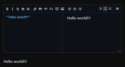
The plugin also comes with a built-in MDEditor.Markdown component used to preview the rendered content:

import * as React from "react";
import { useState } from "react";
import MDEditor from "@uiw/react-md-editor";

const ReactMDEditor = () => {
  const [value, setValue] = useState("**Hello world!**");

  return (


Markdown previewer

The plugin includes a feature that shows a preview of the rendered Markdown. (Large preview)

That was a look at various headaches you might encounter when working with Markdown files in Gatsby. Next, we are turning our attention to another type of file, PDF.

Solving PDF Headaches In Gatsby

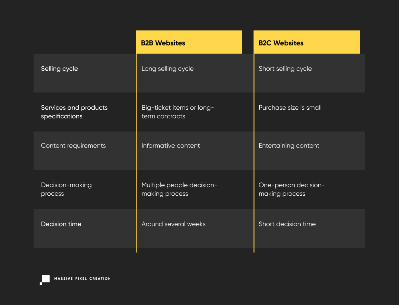
PDF files handle content with a completely different approach to Markdown files. With Markdown, we simplify the content to its most raw form so it can be easily handled across different front ends. PDFs, however, are the content presented to users on the front end. Rather than extracting the raw content from the file, we want the user to see it as it is, often by making it available for download or embedding it in a way that the user views the contents directly on the page, sort of like a video.

I want to show you four approaches to consider when embedding a PDF file on a page in a Gatsby project.

Using The Element

The easiest way to embed a PDF into your Gatsby project is perhaps through an iframe element:

import * as React from "react";
import samplePDF from "./assets/lorem-ipsum.pdf";

const IframePDF = () => {
  return ;
};

It’s worth calling out here that the iframe element supports lazy loading (loading="lazy") to boost performance in instances where it doesn’t need to load right away.

Embedding A Third-Party Viewer

There are situations where PDFs are more manageable when stored in a third-party service, such as Drive, which includes a PDF viewer that can embedded directly on the page. In these cases, we can use the same iframe we used above, but with the source pointed at the service.

import * as React from "react";

const ThirdPartyIframePDF = () => {
  return (
    
  );
};

It’s a good reminder that you want to trust the third-party content that’s served in an iframe. If we’re effectively loading a document from someone else’s source that we do not control, your site could become prone to security vulnerabilities should that source become compromised.

Using react-pdf

The react-pdf package provides an interface to render PDFs as React components. It is based on pdf.js, a JavaScript library that renders PDFs using HTML Canvas.

To display a PDF file on a , the react-pdf library exposes the Document and Page components:

  • Document: Loads the PDF passed in its file prop.
  • Page: Displays the page passed in its pageNumber prop. It should be placed inside Document.

We can install to our project:

npm i react-pdf

Before we put react-pdf to use, we will need to set up a service worker for pdf.js to process time-consuming tasks such as parsing and rendering a PDF document.

import * as React from "react";
import { pdfjs } from "react-pdf";

pdfjs.GlobalWorkerOptions.workerSrc = "https://unpkg.com/pdfjs-dist@3.6.172/build/pdf.worker.min.js";

const ReactPDF = () => {
  return 
; };

Now, we can import the Document and Page components, passing the PDF file to their props. We can also import the component’s necessary styles while we are at it.

import * as React from "react";
import { Document, Page } from "react-pdf";

import { pdfjs } from "react-pdf";
import "react-pdf/dist/esm/Page/AnnotationLayer.css";
import "react-pdf/dist/esm/Page/TextLayer.css";

import samplePDF from "./assets/lorem-ipsum.pdf";

pdfjs.GlobalWorkerOptions.workerSrc = "https://unpkg.com/pdfjs-dist@3.6.172/build/pdf.worker.min.js";

const ReactPDF = () => {
  return (


  );
};

Since accessing the PDF will change the current page, we can add state management by passing the current pageNumber to the Page component:

import { useState } from "react";

// ...

const ReactPDF = () => {
  const [currentPage, setCurrentPage] = useState(1);

  return (


  );
};

One issue is that we have pagination but don’t have a way to navigate between pages. We can change that by adding controls. First, we will need to know the number of pages in the document, which is accessed on the Document component’s onLoadSuccess event:

// ...

const ReactPDF = () => {
  const [pageNumber, setPageNumber] = useState(null);
  const [currentPage, setCurrentPage] = useState(1);

  const handleLoadSuccess = ({ numPages }) => {
    setPageNumber(numPages);
  };

  return (


  );
};

Next, we display the current page number and add “Next” and “Previous” buttons with their respective handlers to change the current page:

// ...

const ReactPDF = () => {
  const [currentPage, setCurrentPage] = useState(1);
  const [pageNumber, setPageNumber] = useState(null);

  const handlePrevious = () => {
    // checks if it isn't the first page
    if (currentPage > 1) {
      setCurrentPage(currentPage - 1);
    }
  };

  const handleNext = () => {
    // checks if it isn't the last page
    if (currentPage  {
    setPageNumber(numPages);
  };

  return (
    

{currentPage}

); };

This provides us with everything we need to embed a PDF file on a page via the HTML element using react-pdf and pdf.js.

There is another similar package capable of embedding a PDF file in a viewer, complete with pagination controls. We’ll look at that next.

Using react-pdf-viewer

Unlike react-pdf, the react-pdf-viewer package provides built-in customizable controls right out of the box, which makes embedding a multi-page PDF file a lot easier than having to import them separately.

Let’s install it:

npm i @react-pdf-viewer/core@3.12.0 @react-pdf-viewer/default-layout

Since react-pdf-viewer also relies on pdf.js, we will need to create a service worker as we did with react-pdf, but only if we are not using both packages at the same time. This time, we are using a Worker component with a workerUrl prop directed at the worker’s package.

import * as React from "react";
import { Worker } from "@react-pdf-viewer/core";

const ReactPDFViewer = () => {
  return (


Note that a worker like this ought to be set just once at the layout level. This is especially true if you intend to use the PDF viewer across different pages.

Next, we import the Viewer component with its styles and point it at the PDF through its fileUrl prop.

import * as React from "react";
import { Viewer, Worker } from "@react-pdf-viewer/core";

import "@react-pdf-viewer/core/lib/styles/index.css";

import samplePDF from "./assets/lorem-ipsum.pdf";

const ReactPDFViewer = () => {
  return (


Once again, we need to add controls. We can do that by importing the defaultLayoutPlugin (including its corresponding styles), making an instance of it, and passing it in the Viewer component’s plugins prop.

import * as React from "react";
import { Viewer, Worker } from "@react-pdf-viewer/core";
import { defaultLayoutPlugin } from "@react-pdf-viewer/default-layout";

import "@react-pdf-viewer/core/lib/styles/index.css";
import "@react-pdf-viewer/default-layout/lib/styles/index.css";

import samplePDF from "./assets/lorem-ipsum.pdf";

const ReactPDFViewer = () => {
  const defaultLayoutPluginInstance = defaultLayoutPlugin();

  return (


Again, react-pdf-viewer is an alternative to react-pdf that can be a little easier to implement if you don’t need full control over your PDF files, just the embedded viewer.

There is one more plugin that provides an embedded viewer for PDF files. We will look at it, but only briefly, because I personally do not recommend using it in favor of the other approaches we’ve covered.

Why You Shouldn’t Use react-file-viewer

The last plugin we will check out is react-file-viewer, a package that offers an embedded viewer with a simple interface but with the capacity to handle a variety of media in addition to PDF files, including images, videos, PDFs, documents, and spreadsheets.

import * as React from "react";
import FileViewer from "react-file-viewer";

const PDFReactFileViewer = () => {
  return ;
};

While react-file-viewer will get the job done, it is extremely outdated and could easily create more headaches than it solves with compatibility issues. I suggest avoiding it in favor of either an iframe, react-pdf, or react-pdf-viewer.

Solving 3D Model Headaches In Gatsby

I want to cap this brief two-part series with one more media type that might cause headaches in a Gatsby project: 3D models.

A 3D model file is a digital representation of a three-dimensional object that stores information about the object’s geometry, texture, shading, and other properties of the object. On the web, 3D model files are used to enhance user experiences by bringing interactive and immersive content to websites. You are most likely to encounter them in product visualizations, architectural walkthroughs, or educational simulations.

There is a multitude of 3D model formats, including glTF OBJ, FBX, STL, and so on. We will use glTF models for a demonstration of a headache-free 3D model implementation in Gatsby.

The GL Transmission Format (glTF) was designed specifically for the web and real-time applications, making it ideal for our example. Using glTF files does require a specific webpack loader, so for simplicity’s sake, we will save the glTF model in the /static folder at the root of our project as we look at two approaches to create the 3D visual with Three.js:

  1. Using a vanilla implementation of Three.js,
  2. Using a package that integrates Three.js as a React component.

Using Three.js

Three.js creates and loads interactive 3D graphics directly on the web with the help of WebGL, a JavaScript API for rendering 3D graphics in real-time inside HTML elements.

Three.js is not integrated with React or Gatsby out of the box, so we must modify our code to support it. A Three.js tutorial is out of scope for what we are discussing in this article, although excellent learning resources are available in the Three.js documentation.

We start by installing the three library to the Gatsby project:

npm i three

Next, we write a function to load the glTF model for Three.js to reference it. This means we need to import a GLTFLoader add-on to instantiate a new loader object.

import * as React from "react";
import * as THREE from "three";

import { GLTFLoader } from "three/addons/loaders/GLTFLoader.js";

const loadModel = async (scene) => {
  const loader = new GLTFLoader();
};

We use the scene object as a parameter in the loadModel function so we can attach our 3D model once loaded to the scene.

From here, we use loader.load() which takes four arguments:

  1. The glTF file location,
  2. A callback when the resource is loaded,
  3. A callback while loading is in progress,
  4. A callback for handling errors.
import * as React from "react";
import * as THREE from "three";

import { GLTFLoader } from "three/addons/loaders/GLTFLoader.js";

const loadModel = async (scene) => {
  const loader = new GLTFLoader();

  await loader.load(
    "/strawberry.gltf", // glTF file location
    function (gltf) {
      // called when the resource is loaded
      scene.add(gltf.scene);
    },
    undefined, // called while loading is in progress, but we are not using it
    function (error) {
      // called when loading returns errors
      console.error(error);
    }
  );
};

Let’s create a component to host the scene and load the 3D model. We need to know the element’s client width and height, which we can get using React’s useRef hook to access the element’s DOM properties.

import * as React from "react";
import * as THREE from "three";

import { useRef, useEffect } from "react";

// ...

const ThreeLoader = () => {
  const viewerRef = useRef(null);

  return 
; // Gives the element its dimensions };

Since we are using the element’s clientWidth and clientHeight properties, we need to create the scene on the client side inside React’s useEffect hook where we configure the Three.js scene with its necessary complements, e.g., a camera, the WebGL renderer, and lights.

useEffect(() => {
  const { current: viewer } = viewerRef;

  const scene = new THREE.Scene();

  const camera = new THREE.PerspectiveCamera(75, viewer.clientWidth / viewer.clientHeight, 0.1, 1000);

  const renderer = new THREE.WebGLRenderer();

  renderer.setSize(viewer.clientWidth, viewer.clientHeight);

  const ambientLight = new THREE.AmbientLight(0xffffff, 0.4);
  scene.add(ambientLight);

  const directionalLight = new THREE.DirectionalLight(0xffffff);
  directionalLight.position.set(0, 0, 5);
  scene.add(directionalLight);

  viewer.appendChild(renderer.domElement);
  renderer.render(scene, camera);
}, []);

Now we can invoke the loadModel function, passing the scene to it as the only argument:

useEffect(() => {
  const { current: viewer } = viewerRef;

  const scene = new THREE.Scene();

  const camera = new THREE.PerspectiveCamera(75, viewer.clientWidth / viewer.clientHeight, 0.1, 1000);

  const renderer = new THREE.WebGLRenderer();

  renderer.setSize(viewer.clientWidth, viewer.clientHeight);

  const ambientLight = new THREE.AmbientLight(0xffffff, 0.4);
  scene.add(ambientLight);

  const directionalLight = new THREE.DirectionalLight(0xffffff);
  directionalLight.position.set(0, 0, 5);
  scene.add(directionalLight);

  loadModel(scene); // Here!

  viewer.appendChild(renderer.domElement);
  renderer.render(scene, camera);
}, []);

The last part of this vanilla Three.js implementation is to add OrbitControls that allow users to navigate the model. That might look something like this:

import * as React from "react";
import * as THREE from "three";

import { useRef, useEffect } from "react";
import { OrbitControls } from "three/examples/jsm/controls/OrbitControls";
import { GLTFLoader } from "three/addons/loaders/GLTFLoader.js";

const loadModel = async (scene) => {
  const loader = new GLTFLoader();

  await loader.load(
    "/strawberry.gltf", // glTF file location
    function (gltf) {
      // called when the resource is loaded
      scene.add(gltf.scene);
    },
    undefined, // called while loading is in progress, but it is not used
    function (error) {
      // called when loading has errors
      console.error(error);
    }
  );
};

const ThreeLoader = () => {
  const viewerRef = useRef(null);

  useEffect(() => {
    const { current: viewer } = viewerRef;

    const scene = new THREE.Scene();

    const camera = new THREE.PerspectiveCamera(75, viewer.clientWidth / viewer.clientHeight, 0.1, 1000);

    const renderer = new THREE.WebGLRenderer();

    renderer.setSize(viewer.clientWidth, viewer.clientHeight);

    const ambientLight = new THREE.AmbientLight(0xffffff, 0.4);
    scene.add(ambientLight);

    const directionalLight = new THREE.DirectionalLight(0xffffff);
    directionalLight.position.set(0, 0, 5);
    scene.add(directionalLight);

    loadModel(scene);

    const target = new THREE.Vector3(-0.5, 1.2, 0);
    const controls = new OrbitControls(camera, renderer.domElement);
    controls.target = target;

    viewer.appendChild(renderer.domElement);

    var animate = function () {
      requestAnimationFrame(animate);
      controls.update();
      renderer.render(scene, camera);
    };
    animate();
  }, []);

  
; };

That is a straight Three.js implementation in a Gatsby project. Next is another approach using a library.

Using React Three Fiber

react-three-fiber is a library that integrates the Three.js with React. One of its advantages over the vanilla Three.js approach is its ability to manage and update 3D scenes, making it easier to compose scenes without manually handling intricate aspects of Three.js.

We begin by installing the library to the Gatsby project:

npm i react-three-fiber @react-three/drei

Notice that the installation command includes the @react-three/drei package, which we will use to add controls to the 3D viewer.

I personally love react-three-fiber for being tremendously self-explanatory. For example, I had a relatively easy time migrating the extensive chunk of code from the vanilla approach to this much cleaner code:

import * as React from "react";
import { useLoader, Canvas } from "@react-three/fiber";
import { OrbitControls } from "@react-three/drei";
import { GLTFLoader } from "three/examples/jsm/loaders/GLTFLoader";

const ThreeFiberLoader = () => {
  const gltf = useLoader(GLTFLoader, "/strawberry.gltf");

  return (


  );
};

Thanks to react-three-fiber, we get the same result as a vanilla Three.js implementation but with fewer steps, more efficient code, and a slew of abstractions for managing and updating Three.js scenes.

Two Final Tips

The last thing I want to leave you with is two final considerations to take into account when working with media files in a Gatsby project.

Bundling Assets Via Webpack And The /static Folder

Importing an asset as a module so it can be bundled by webpack is a common strategy to add post-processing and minification, as well as hashing paths on the client. But there are two additional use cases where you might want to avoid it altogether and use the static folder in a Gatsby project:

  • Referencing a library outside the bundled code to prevent webpack compatibility issues or a lack of specific loaders.
  • Referencing assets with a specific name, for example, in a web manifest file.

You can find a detailed explanation of the static folder and use it to your advantage in the Gatsby documentation.

Embedding Files From Third-Party Services

Secondly, you can never be too cautious when embedding third-party services on a website. Replaced content elements, like , can introduce various security vulnerabilities, particularly when you do not have control of the source content. By integrating a third party’s scripts, widgets, or content, a website or app is prone to potential vulnerabilities, such as iframe injection or cross-frame scripting.

Moreover, if an integrated third-party service experiences downtime or performance issues, it can directly impact the user experience.

Conclusion

This article explored various approaches for working around common headaches you may encounter when working with Markdown, PDF, and 3D model files in a Gatsby project. In the process, we leveraged several React plugins and Gatsby features that handle how content is parsed, embed files on a page, and manage 3D scenes.

This is also the second article in a brief two-part series that addresses common headaches working with a variety of media types in Gatsby. The first part covers more common media files, including images, video, and audio.

If you’re looking for more cures to Gatsby headaches, please check out my other two-part series that investigates internationalization.

See Also

Smashing Editorial
(gg, yk, il)

Gatsby Headaches: Working With Media (Part 1)

Gatsby Headaches: Working With Media (Part 1)

Gatsby Headaches: Working With Media (Part 1)

Juan Diego Rodríguez

2023-10-09T11:00:00+00:00
2025-06-20T10:32:35+00:00

Working with media files in Gatsby might not be as straightforward as expected. I remember starting my first Gatsby project. After consulting Gatsby’s documentation, I discovered I needed to use the gatsby-source-filesystem plugin to make queries for local files. Easy enough!

That’s where things started getting complicated. Need to use images? Check the docs and install one — or more! — of the many, many plugins available for handling images. How about working with SVG files? There is another plugin for that. Video files? You get the idea.

It’s all great until any of those plugins or packages become outdated and go unmaintained. That’s where the headaches start.

If you are unfamiliar with Gatsby, it’s a React-based static site generator that uses GraphQL to pull structured data from various sources and uses webpack to bundle a project so it can then be deployed and served as static files. It’s essentially a static site generator with reactivity that can pull data from a vast array of sources.

Like many static site frameworks in the Jamstack, Gatsby has traditionally enjoyed a great reputation as a performant framework, although it has taken a hit in recent years. Based on what I’ve seen, however, it’s not so much that the framework is fast or slow but how the framework is configured to handle many of the sorts of things that impact performance, including media files.

So, let’s solve the headaches you might encounter when working with media files in a Gatsby project. This article is the first of a brief two-part series where we will look specifically at the media you are most likely to use: images, video, and audio. After that, the second part of this series will get into different types of files, including Markdown, PDFs, and even 3D models.

Solving Image Headaches In Gatsby

I think that the process of optimizing images can fall into four different buckets:

  1. Optimize image files.
    Minimizing an image’s file size without losing quality directly leads to shorter fetching times. This can be done manually or during a build process. It’s also possible to use a service, like Cloudinary, to handle the work on demand.
  2. Prioritize images that are part of the First Contentful Paint (FCP).
    FCP is a metric that measures the time between the point when a page starts loading to when the first bytes of content are rendered. The idea is that fetching assets that are part of that initial render earlier results in faster loading rather than waiting for other assets lower on the chain.
  3. Lazy loading other images.
    We can prevent the rest of the images from render-blocking other assets using the loading="lazy" attribute on images.
  4. Load the right image file for the right context.
    With responsive images, we can serve one version of an image file at one screen size and serve another image at a different screen size with the srcset and sizes attributes or with the element.

These are great principles for any website, not only those built with Gatsby. But how we build them into a Gatsby-powered site can be confusing, which is why I’m writing this article and perhaps why you’re reading it.

Lazy Loading Images In Gatsby

We can apply an image to a React component in a Gatsby site like this:

import * as React from "react";

import forest from "./assets/images/forest.jpg";

const ImageHTML = () => {
  return Forest trail;
};

It’s important to import the image as a JavaScript module. This lets webpack know to bundle the image and generate a path to its location in the public folder.

This works fine, but when are we ever working with only one image? What if we want to make an image gallery that contains 100 images? If we try to load that many tags at once, they will certainly slow things down and could affect the FCP. That’s where the third principle that uses the loading="lazy" attribute can come into play.

import * as React from "react";

import forest from "./assets/images/forest.jpg";

const LazyImageHTML = () => {
  return Forest trail;
};

We can do the opposite with loading="eager". It instructs the browser to load the image as soon as possible, regardless of whether it is onscreen or not.

import * as React from "react";

import forest from "./assets/images/forest.jpg";

const EagerImageHTML = () => {
  return Forest trail;
};

Implementing Responsive Images In Gatsby

This is a basic example of the HTML for responsive images:

Forest trail

In Gatsby, we must import the images first and pass them to the srcset attribute as template literals so webpack can bundle them:

import * as React from "react";

import forest800 from "./assets/images/forest-800.jpg";

import forest400 from "./assets/images/forest-400.jpg";

const ResponsiveImageHTML = () => {
  return (
    Forest trail
  );
};

That should take care of any responsive image headaches in the future.

Loading Background Images In Gatsby

What about pulling in the URL for an image file to use on the CSS background-url property? That looks something like this:

import * as React from "react";

import "./style.css";

const ImageBackground = () => {
  return 
; };
/* style.css */

.banner {
    aspect-ratio: 16/9;
      background-size: cover;

    background-image: url("./assets/images/forest-800.jpg");

  /* etc. */
}

This is straightforward, but there is still room for optimization! For example, we can do the CSS version of responsive images, which loads the version we want at specific breakpoints.

/* style.css */

@media (max-width: 500px) {
  .banner {
    background-image: url("./assets/images/forest-400.jpg");
  }
}

Using The gatsby-source-filesystem Plugin

Before going any further, I think it is worth installing the gatsby-source-filesystem plugin. It’s an essential part of any Gatsby project because it allows us to query data from various directories in the local filesystem, making it simpler to fetch assets, like a folder of optimized images.

npm i gatsby-source-filesystem

We can add it to our gatsby-config.js file and specify the directory from which we will query our media assets:

// gatsby-config.js

module.exports = {
  plugins: [
    {
      resolve: `gatsby-source-filesystem`,

      options: {
        name: `assets`,

        path: `${ __dirname }/src/assets`,
      },
    },
  ],
};

Remember to restart your development server to see changes from the gatsby-config.js file.

Now that we have gatsby-source-filesystem installed, we can continue solving a few other image-related headaches. For example, the next plugin we look at is capable of simplifying the cures we used for lazy loading and responsive images.

Using The gatsby-plugin-image Plugin

The gatsby-plugin-image plugin (not to be confused with the outdated gatsby-image plugin) uses techniques that automatically handle various aspects of image optimization, such as lazy loading, responsive sizing, and even generating optimized image formats for modern browsers.

Once installed, we can replace standard tags with either the or components, depending on the use case. These components take advantage of the plugin’s features and use the HTML element to ensure the most appropriate image is served to each user based on their device and network conditions.

We can start by installing gatsby-plugin-image and the other plugins it depends on:

npm install gatsby-plugin-image gatsby-plugin-sharp gatsby-transformer-sharp

Let’s add them to the gatsby-config.js file:

// gatsby-config.js

module.exports = {
plugins: [

// other plugins
`gatsby-plugin-image`,
`gatsby-plugin-sharp`,
`gatsby-transformer-sharp`],

};

This provides us with some features we will put to use a bit later.

Using The StaticImage Component

The StaticImage component serves images that don’t require dynamic sourcing or complex transformations. It’s particularly useful for scenarios where you have a fixed image source that doesn’t change based on user interactions or content updates, like logos, icons, or other static images that remain consistent.

The main attributes we will take into consideration are:

  • src: This attribute is required and should be set to the path of the image you want to display.
  • alt: Provides alternative text for the image.
  • placeholder: This attribute can be set to either blurred or dominantColor to define the type of placeholder to display while the image is loading.
  • layout: This defines how the image should be displayed. It can be set to fixed for, as you might imagine, images with a fixed size, fullWidth for images that span the entire container, and constrained for images scaled down to fit their container.
  • loading: This determines when the image should start loading while also supporting the eager and lazy options.

Using StaticImage is similar to using a regular HTML tag. However, StaticImage requires passing the string directly to the src attribute so it can be bundled by webpack.

import * as React from "react";

import { StaticImage } from "gatsby-plugin-image";

const ImageStaticGatsby = () => {
  return (
    
  );
  };

The StaticImage component is great, but you have to take its constraints into account:

  • No Dynamically Loading URLs
    One of the most significant limitations is that the StaticImage component doesn’t support dynamically loading images based on URLs fetched from data sources or APIs.
  • Compile-Time Image Handling
    The StaticImage component’s image handling occurs at compile time. This means that the images you specify are processed and optimized when the Gatsby site is built. Consequently, if you have images that need to change frequently based on user interactions or updates, the static nature of this component might not fit your needs.
  • Limited Transformation Options
    Unlike the more versatile GatsbyImage component, the StaticImage component provides fewer transformation options, e.g., there is no way to apply complex transformations like cropping, resizing, or adjusting image quality directly within the component. You may want to consider alternative solutions if you require advanced transformations.

Using The GatsbyImage Component

The GatsbyImage component is a more versatile solution that addresses the limitations of the StaticImage component. It’s particularly useful for scenarios involving dynamic image loading, complex transformations, and advanced customization.

Some ideal use cases where GatsbyImage is particularly useful include:

  • Dynamic Image Loading
    If you need to load images dynamically based on data from APIs, content management systems, or other sources, the GatsbyImage component is the go-to choice. It can fetch images and optimize their loading behavior.
  • Complex transformations
    The GatsbyImage component is well-suited for advanced transformations, using GraphQL queries to apply them.
  • Responsive images
    For responsive design, the GatsbyImage component excels by automatically generating multiple sizes and formats of an image, ensuring that users receive an appropriate image based on their device and network conditions.

Unlike the StaticImage component, which uses a src attribute, GatsbyImage has an image attribute that takes a gatsbyImageData object. gatsbyImageData contains the image information and can be queried from GraphQL using the following query.

query {
  file(name: { eq: "forest" }) {
    childImageSharp {
      gatsbyImageData(width: 800, placeholder: BLURRED, layout: CONSTRAINED)
    }

    name
  }
}

If you’re following along, you can look around your Gatsby data layer at http://localhost:8000/___graphql.

From here, we can use the useStaticQuery hook and the graphql tag to fetch data from the data layer:

import * as React from "react";

import { useStaticQuery, graphql } from "gatsby";

import { GatsbyImage, getImage } from "gatsby-plugin-image";

const ImageGatsby = () => {
  // Query data here:

  const data = useStaticQue(graphql``);

  return 
; };

Next, we can write the GraphQL query inside of the graphql tag:

import * as React from "react";

import { useStaticQuery, graphql } from "gatsby";

const ImageGatsby = () => {
  const data = useStaticQuery(graphql`
    query {
      file(name: { eq: "forest" }) {
        childImageSharp {
          gatsbyImageData(width: 800, placeholder: BLURRED, layout: CONSTRAINED)
        }

        name
      }
    }
  `);

  return 
; };

Next, we import the GatsbyImage component from gatsby-plugin-image and assign the image’s gatsbyImageData property to the image attribute:

import * as React from "react";

import { useStaticQuery, graphql } from "gatsby";

import { GatsbyImage } from "gatsby-plugin-image";

const ImageGatsby = () => {
  const data = useStaticQuery(graphql`
    query {
      file(name: { eq: "forest" }) {
        childImageSharp {
          gatsbyImageData(width: 800, placeholder: BLURRED, layout: CONSTRAINED)
        }

        name
      }
    }
  `);

  return ;
};

Now, we can use the getImage helper function to make the code easier to read. When given a File object, the function returns the file.childImageSharp.gatsbyImageData property, which can be passed directly to the GatsbyImage component.

import * as React from "react";

import { useStaticQuery, graphql } from "gatsby";

import { GatsbyImage, getImage } from "gatsby-plugin-image";

const ImageGatsby = () => {
  const data = useStaticQuery(graphql`
    query {
      file(name: { eq: "forest" }) {
        childImageSharp {
          gatsbyImageData(width: 800, placeholder: BLURRED, layout: CONSTRAINED)
        }

        name
      }
    }
  `);

  const image = getImage(data.file);

  return ;
};

Using The gatsby-background-image Plugin

Another plugin we could use to take advantage of Gatsby’s image optimization capabilities is the gatsby-background-image plugin. However, I do not recommend using this plugin since it is outdated and prone to compatibility issues. Instead, Gatsby suggests using gatsby-plugin-image when working with the latest Gatsby version 3 and above.

If this compatibility doesn’t represent a significant problem for your project, you can refer to the plugin’s documentation for specific instructions and use it in place of the CSS background-url usage I described earlier.

Solving Video And Audio Headaches In Gatsby

Working with videos and audio can be a bit of a mess in Gatsby since it lacks plugins for sourcing and optimizing these types of files. In fact, Gatsby’s documentation doesn’t name or recommend any official plugins we can turn to.

That means we will have to use vanilla methods for videos and audio in Gatsby.

Using The HTML video Element

The HTML video element is capable of serving different versions of the same video using the tag, much like the img element uses the srset attribute to do the same for responsive images.

That allows us to not only serve a more performant video format but also to provide a fallback video for older browsers that may not support the bleeding edge:

import * as React from "react";

import natureMP4 from "./assets/videos/nature.mp4";

import natureWEBM from "./assets/videos/nature.webm";

const VideoHTML = () => {
  return (
    
  );
};

P;

We can also apply lazy loading to videos like we do for images. While videos do not support the loading="lazy" attribute, there is a preload attribute that is similar in nature. When set to none, the attribute instructs the browser to load a video and its metadata only when the user interacts with it. In other words, it’s lazy-loaded until the user taps or clicks the video.

We can also set the attribute to metadata if we want the video’s details, such as its duration and file size, fetched right away.


Note: I personally do not recommend using the autoplay attribute since it is disruptive and disregards the preload attribute, causing the video to load right away.

And, like images, display a placeholder image for a video while it is loading with the poster attribute pointing to an image file.


Using The HTML audio Element

The audio and video elements behave similarly, so adding an audio element in Gatsby looks nearly identical, aside from the element:

import * as React from "react";

import audioSampleMP3 from "./assets/audio/sample.mp3";

import audioSampleWAV from "./assets/audio/sample.wav";

const AudioHTML = () => {
  return (
    
  );
};

As you might expect, the audio element also supports the preload attribute:


This is probably as good as we can do to use videos and images in Gatsby with performance in mind, aside from saving and compressing the files as best we can before serving them.

Solving iFrame Headaches In Gatsby

Speaking of video, what about ones embedded in an like we might do with a video from YouTube, Vimeo, or some other third party? Those can certainly lead to performance headaches, but it’s not as we have direct control over the video file and where it is served.

Not all is lost because the HTML iframe element supports lazy loading the same way that images do.

import * as React from "react";

const VideoIframe = () => {
  return (
    
  );
};

Embedding a third-party video player via iframe can possibly be an easier path than using the HTML video element. iframe elements are cross-platform compatible and could reduce hosting demands if you are working with heavy video files on your own server.

That said, an iframe is essentially a sandbox serving a page from an outside source. They’re not weightless, and we have no control over the code they contain. There are also GDPR considerations when it comes to services (such as YouTube) due to cookies, data privacy, and third-party ads.

Solving SVG Headaches In Gatsby

SVGs contribute to improved page performance in several ways. Their vector nature results in a much smaller file size compared to raster images, and they can be scaled up without compromising quality. And SVGs can be compressed with GZIP, further reducing file sizes.

That said, there are several ways that we can use SVG files. Let’s tackle each one in the contact of Gatsby.

Using Inline SVG

SVGs are essentially lines of code that describe shapes and paths, making them lightweight and highly customizable. Due to their XML-based structure, SVG images can be directly embedded within the HTML tag.

import * as React from "react";


const SVGInline = () => {

  return (


  );

};

Just remember to change certain SVG attributes, such as xmlns:xlink or xlink:href, to JSX attribute spelling, like xmlnsXlink and xlinkHref, respectively.

Using SVG In img Elements

An SVG file can be passed into an img element’s src attribute like any other image file.

import * as React from "react";

import picture from "./assets/svg/picture.svg";

const SVGinImg = () => {
  return Picture;
};

Loading SVGs inline or as HTML images are the de facto approaches, but there are React and Gatsby plugins capable of simplifying the process, so let’s look at those next.

Inlining SVG With The react-svg Plugin

react-svg provides an efficient way to render SVG images as React components by swapping a ReactSVG component in the DOM with an inline SVG.

Once installing the plugin, import the ReactSVG component and assign the SVG file to the component’s src attribute:

import * as React from "react";

import { ReactSVG } from "react-svg";

import camera from "./assets/svg/camera.svg";

const SVGReact = () => {
  return ;
};

Using The gatsby-plugin-react-svg Plugin

The gatsby-plugin-react-svg plugin adds svg-react-loader to your Gatsby project’s webpack configuration. The plugin adds a loader to support using SVG files as React components while bundling them as inline SVG.

Once the plugin is installed, add it to the gatsby-config.js file. From there, add a webpack rule inside the plugin configuration to only load SVG files ending with a certain filename, making it easy to split inline SVGs from other assets:

// gatsby-config.js

module.exports = {
  plugins: [
    {
      resolve: "gatsby-plugin-react-svg",

      options: {
        rule: {
          include: /.inline.svg$/,
        },
      },
    },
  ],
};

Now we can import SVG files like any other React component:

import * as React from "react";

import Book from "./assets/svg/book.inline.svg";

const GatsbyPluginReactSVG = () => {
  return ;
};

And just like that, we can use SVGs in our Gatsby pages in several different ways!

Conclusion

Even though I personally love Gatsby, working with media files has given me more than a few headaches.

As a final tip, when needing common features such as images or querying from your local filesystem, go ahead and install the necessary plugins. But when you need a minor feature, try doing it yourself with the methods that are already available to you!

If you have experienced different headaches when working with media in Gatsby or have circumvented them with different approaches than what I’ve covered, please share them! This is a big space, and it’s always helpful to see how others approach similar challenges.

Again, this article is the first of a brief two-part series on curing headaches when working with media files in a Gatsby project. The following article will be about avoiding headaches when working with different media files, including Markdown, PDFs, and 3D models.

Further Reading

Smashing Editorial
(gg, yk)

UX & UI Best Practices To Increase Sales with Your B2B Website Design

B2B website design with appropriate UX and UI can increase lead generation and support prospective customers at every stage of the purchase process.

There are key characteristics of B2B websites and B2B customers as well as effective UX and UI design practices that can help you convert new users into leads.

Key Differences Between B2B and B2C Sales

Nowadays, it’s extremely important to provide customers with more helpful and relevant shopping experiences. Brands have to get creative and find new, more meaningful ways to connect with consumers. To follow the latest 4 COVID-era trends and to further improve products and consumer experience, it makes sense to dive into the broad theme of what distinctive needs characterize B2B customers compared to B2C customers. Understanding these unique characteristics and the needs of your target audience is the key to the successful creation and implementation of the most relevant UX (user experience) and UI (user interface) web design decisions. Let’s start!

b2b-vs-b2c-key-differences-table

Time for a Decision 

First of all, unlike most B2C customers, B2B clients often research potential purchase for several weeks. The reason is that B2B customers often involve multiple people in this process, from both the vendor’s company and their own.

Services and Products Specifications

B2B purchases are often big–ticket items or service contracts. The sites’ products and services are often extremely specialized, with complex specifications. Finally, decisions made on B2B websites can have long-term implications — after all, customers aren’t just making one-time purchases. They’re often buying into a long-term vendor relationship that includes support, follow-ups, and future enhancements and add-ons.

Content Requirements 

Research and multicriteria decision-making dominate the B2B user experience. B2B websites must provide a much wider range of information than what’s common in the B2C sector. A B2B website has to offer simple facts that can be easily and quickly understood by an early prospect who’s just looking around to see what’s available.

Creating a well-designed and informative B2B customer journey map can greatly enhance this process, providing a clear roadmap for engaging and converting prospects at each stage of their buying journey.

Target Audience

Another major difference is that B2C users typically buy for themselves. Therefore, they use a one-person decision process: a single user provides the budget and approval, researches the options, makes the decision, completes the purchase, receives the shipment, and uses the product. In contrast, in B2B, each of these steps might involve different people and different departments. That’s why among B2B salespeople there are widely used terms like “choosers” and “users”. Later, as companies and individuals send transactional emails, these become more personalized and precise.

But a B2B website must address many different types of users with various needs. That’s why this added complexity only strengthens the argument for B2B websites to emphasize usability in their UX design.

In the meantime, you should also take security measures such as regarding DDoS attacks, cyberattacks, etc.

The Purchasing Phases of B2B Customers

It doesn’t matter whether you close the sale online or offline, supporting your target users’ purchase process is essential to converting prospects into paying customers. The key component in effective B2B marketing and sales is establishing credibility among prospective clients.

The nature of B2B products and services often demands long sales cycles that can take months or even years. Additionally, depending on the purchase phase, customers will have different needs. Therefore, B2B websites must consider all these variables, in order to:

  • support the purchase process at each stage,
  • establish and maintain good relationships with customers,
  • increase TCR (task completion rate) on your website.
7-purchasing-phases-for-b2b-sales

Research Company Problem

Usually, B2B customers start with a company problem that needs solving, not with a product they’ll have to justify purchasing. Especially when this is a new challenge to their business, this initial research phase is all about seeking out common solutions and identifying the top vendors. Some buyers skip this step for industries or problems that they are already familiar with.

What a good B2B website design needs at this stage:

  • Content that shows expertise, examples of solutions, and already solved challenges. This can take the form of: blog posts and articles, case studies, landing pages that describe managed solutions for specific industries, and product pages about specific customer problems that can be solved with the vendor’s help. You can then repurpose that content sharing it in email newsletters that reach your potential clients directly. And to ensure data safety on both sides, you may want to use an SPF checker as well. Another way to do that is through a high quality podcast series featuring discussions with industry experts, video tutorials demonstrating product benefits, and interactive webinars showcasing real-world implementations to effectively educate, engage, and convert your target audience.

Collect Options and Assess

At this stage, users want to find lists of top vendors, learn more about the shortlisted companies, get a feel for them, call if necessary to fill in missing details, and refine research by getting answers to specific questions. Colleagues will often share options and collaborate to help put together a rubric or requirements for assessing the shortlisted companies.

What a good B2B website design needs at this stage:

  • Detailed specs,
  • Pricing information,
  • Clear product photos,
  • Case studies,
  • Testimonials,
  • Downloadable product assets.

Discuss and Decide

This stage features a heavy collaboration with colleagues from multiple departments to narrow the list of companies and make a final decision. Many B2B customers create presentation materials for the leadership to explain their decision in order to be granted authorization.

What a good B2B website design needs at this stage:

  • Presentation materials,
  • Pricing information,
  • Lead times,
  • Corporate and team member information,
  • Comparison tools.

Purchase

Customers engage with sales representatives to negotiate a price or make an online purchase.

What a good B2B website design needs at this stage:

  • Contact information,
  • Locations of offices,
  • Warranty for support information,
  • Pricing information.

Post-Purchase Support 

In the initial aftermath of the purchase, your customers will have higher support needs from your B2B website, ranging from technical support to questions about migrating from a competitor’s product to requesting adjustments.

What a good B2B website design needs at this stage:

  • Technical support,
  • Contact information for service and account representatives,
  • Turnaround time for service,
  • Implementation and migration guides,
  • Technical documentation,
  • Content on how to get the most value from the product.

Providing top-notch customer support is therefore essential in this stage. If you’re using email to do that, using an email verifier to ensure good deliverability might be a good idea.

Upgrade and Maintain 

At this stage, your customers will be looking to extend the life of their purchase as much as possible. For large mechanical equipment, this often means buying parts, accessories, or consumables; sometimes users will want to upgrade service contracts to accommodate company growth. For software, this can mean purchasing upgrades, modules, and other stopgap solutions to make an older product retain usefulness until the next major purchasing cycle.

What a good B2B website design needs at this stage:

  • Technical information for already owned products,
  • Newer products that can replace older models,
  • Add–ons, modules, and upgrades that can be added to the current product for more benefits,
  • Parts and consumables.

Replace

The process starts again when a service contract ends or equipment reaches the end of its life.

What a good B2B website design needs at this stage:

  • Newer products that can replace older models,
  • Changes in the industry that require new equipment or services,
  • Detailed specs,
  • Clear product photos,
  • Case studies,
  • Testimonials,
  • Downloadable product assets.

Understanding the purchasing phases for B2B customers is extremely important when you plan to implement user-centered design processes (UCD) while working on a website project. At the same time, if you already have a website, you can instantly identify the stages where your users’ needs are poorly covered.

Best Practices for B2B Websites

Demonstrate How You Solve Your Prospect’s Problems

B2B customers are ruthlessly focused on just one thing: how you can solve their problems. Your prospects come to you because their business faces a challenge they cannot deal with on their own, due to the lack of time, resources, or skills. Whether your prospects just need to replace the toner in the office copier, or they look for a partner to help them develop and implement a business strategy, they want to solve a problem. That’s why you should remember to always emphasize these topics on your B2B website and prove you know these challenges inside–out with solutions included.

It’s also a great practice to consider the context of the buyer’s problem and describe your products or services in a way that precedes any questions a client might have. Don’t just say “our cartridges contain 0.8ml of ink”, but rather “with our product, you can print up to 600 pages”. Another great example is Apple’s genius approach to marketing and their famous “1,000 songs in your pocket slogan” — they could have said “5GB of storage”, but instead they’ve turned the information around to make it more relevant to an average customer while addressing the issue of limited space on a device.

Another angle is to consider how people form their queries on Google. Most of the time, they’re not looking for specific models of printers — they will search for solutions to their problems (“why does my printer have lines”) or search for models with specific, non–technical characteristics (“which printer has the cheapest inks”) which also suggests an issue (in this case, limited budget). That’s why it’s important to target all these questions in advance and always be one step ahead of the customer.

Customers need to know immediately whether your organization has the capability to solve their problems. Provide signals on your site to let people know you cater to them.

It is worth emphasizing your unique value proposition too. Determine which elements of your business approach are key differentiators, then advertise them on the homepage and other relevant site areas. In this case, the price can be a key factor, but you should also include:

  • Quick turnaround time for delivery of products,
  • Quick turnaround time for services or consulting to begin,
  • Customization, specialized products, and services,
  • Unique feature set,
  • Perceived quality,
  • Compatibility with existing products or services,
  • Location of the company,
  • Shipping rates and delivery time.

Don’t forget to mention how you solved customer problems in the past. B2B prospects are seeking solutions to their challenges, and while a perfectly written copy might capture their attention, they will still demand proof.

Case studies, testimonials, reviews, and other ways of demonstrating success in past ventures are critical to turning skeptical website visitors into paying customers. For instance, you can offer reviews conducted by external, reputable sources or provide short and true-to-life case studies.

To summarize, demonstrating how you solve your prospect’s problems is a smart approach that can convince users to take specific actions and help you generate new leads on your B2B website.

Keeping Your Customers Engaged

Most B2B websites don’t sell to prospects immediately upon their first visit. With a long sales cycle, B2B websites have to be able to provide valuable information to prospects on a recurring basis in order to close the sale. In fact, the sites that provide the most helpful information to prospects are ones that they return to over and over again as they near the purchasing phase of the sales cycle. This recurring engagement is a crucial part of the customer success process, ensuring that businesses build strong relationships with their clients and guide them through the sales journey effectively.

Providing business value for customers and showcasing valuable content for them is one of digital marketing’s main tasks. There’s lots of talk these days about content strategy (which should be supported by content marketing) and its value for B2B websites.

Content is generated on a recurring basis to both build SEO (Search Engine Optimization) value and to draw returning visitors to your website. Content strategy is only valuable if it helps your prospects understand the business challenges that you solve, and why your expertise helps them.

Focus your efforts on describing common challenges your prospects face and how your company solves these issues. Remember when writing the content that many of your best prospects may have no idea who you are, but if you have a blog post that offers a simple breakdown of their problem, they’re more likely to revisit your website and put you on their shortlist. Providing useful resources differentiates you from your competitors by establishing your organization as having expertise and credibility — qualities every organization seeks.

Considering all of the above, you can use such types of resources as:

  • customer guides,
  • blog page with thorough articles,
  • resource base,
  • whitepapers.

So to increase organic search traffic and lead generation on your B2B website, you should optimize the content on the entire site not only for search engines but also for your specific target audience.

Create Good First Impression 

A first impression can make or break potential transactions. People judge the company’s competence by the way the website looks. An organized and coherent website instills trust and proves competence. UI designers should keep in mind the “less is more” concept — cluttered design and bad information architecture will only lead to confusion. That’s why in the design process, this concept helps to prioritize user interface (UI) elements and, accordingly, reduce the number of unnecessary elements on each page layout.

Also, people have different expectations for what websites should look like depending on the industry. For example, people expect a website in creative industries to reflect a company’s philosophy. Technology companies aren’t held up to the same aesthetic standards as design agencies. More emphasis is placed on clean designs that express professionalism and expertise.

On the other hand, your UI design impacts the audience’s perception of your organization. In a split second, users interact with an interface and decide whether the website is worth their effort. When there’s a mismatch between a site’s user interface design and the company’s business image, people assume that the organization doesn’t have what they want and go elsewhere. UI design also serves another important purpose: people can instantly identify whether they’re on the right web page.

UI Design

Every UI or web designer should remember that a B2B website design isn’t about a lifestyle brand, it needs to convey professional expertise and competence. Carefully consider whether trendy design patterns and visual styles support a message of stability and reliability — especially since many design trends come and go. Pay attention to core design principles and visual guidelines that help users understand your website: visual hierarchy, negative space and balance, and element affordance.

No matter where your organization falls on the creativity spectrum, it’s important to have a simple interaction design. Simple interaction models match people’s mental models by behaving in expected ways. Business customers need websites to streamline their processes, answering their questions quickly and easily. Although creative designs can be delightful, simplicity must come first.

Subtle Cues 

Make your UI design more user-friendly and provide subtle cues. Even when users think a website has what they want, scrolling takes effort, and they typically do it only if they see the proper visual cues. How you place critical elements on the web page can dictate whether people scroll or not. Placing indicators such as headers or content that peeks out into the display’s viewable area suggests that there’s more content below.

Loading Time

Make sure that your site loads quickly. If it takes more than six seconds to load, the users abandon the site. To avoid that, remove unnecessary elements and media that negatively impact page speed. Buggy or unstable elements that take too long to load reduce the user experience and prospect’s impression of your organization. Optimize file sizes and minimize loading time, especially when designing for business audiences.

Also, make sure you pick the best web hosting provider.

Tone of Voice

Use a reasoned, neutral voice on your website. Avoid excessive marketing-speak and meaningless sales phrases. Business customers prefer a straightforward tone that describes the company’s business without hyperbole. Easy access to information and even-handed comparison of products or services make participants feel like the company has nothing to hide.

Content

Write and present content in a way that optimizes scanning, for example by using such elements as headings, subheadings, large type, bold text, highlighted text, bulleted lists, graphics, and captions. Write text that is short and to the point. Don’t overload people with too much text; that can feel overwhelming and intimidating. Instead, use concise and simple language, as well as break up large blocks of information into short paragraphs.

About Us Section 

Offer the About Us section regardless of your company’s size. Sometimes small and medium-sized businesses neglect to have an About Us section on their website, thinking it’s not important.

Surprise — it is. According to B2B Web Usability Report from 2015, 52% of respondents indicated that they want to see the About Us section on the vendor website home page. Only two other pages — Contact and Products & Services — got higher results (64% and 86%, respectively).

The About Us page is particularly important to companies whose brand is not widely recognized. On the other hand, household names can afford to neglect this section.

Navigation

Users prefer consistent navigational structures, especially in business situations where time is scarce. Consistent navigation helps users visualize their current location in site structure and identify alternative options, making it easier to find information and keep track of where they are. Make sure that links in header and footer navigation are named and grouped correctly both on desktop and mobile devices.

Key Takeaways

  • Prove your professionalism and expertise to your potential customers at every step. The key is to understand your prospects’ problems and provide appropriate solutions that are better than your competitors.
  • Engage your customers at each stage of the purchasing process. Provide meaningful content and valuable resources that keep the user’s attention.
  • Create a good first impression using appropriate UI design, tone of voice, and convenient navigation that streamlines purchasing processes.

Conclusion

Whether you use all of these practices or just a few, remember to keep in mind that you create a B2B website design for your target audience. If you don’t know the specific problems and needs of your target audience, you should run user research first, or else you’ll totally misjudge your prospects and give the wrong impression.

If you’d like to learn more about shaping your content towards a specific audience and how to generate leads, read this article on Customer Acquisition Strategy. Without that knowledge, even all those tips on UX/UI design won’t save you from lack of engagement.

So keep all that in mind and design away!

Agile Principles Explained: Definitions and Examples for Software Development

Agile was founded based on values and principles. It’s not a methodology or a philosophy to get things done but rather a framework, and a collection of beliefs teams use to make decisions.

The Agile principles will help you guide your team on the right path, even when you’re unsure of your next step. In this article, we will explain the 12 Agile principles and how these help software teams adapt, optimize, and improve the development of software products or services.

What is Agile?

SoftwareDevelopmentLifecycle_Agile-1536x1067

Agile refers to methodologies focused on iterative development where processes and solutions occur through continual collaboration among cross-functional teams.

Instead of following a well-defined and strict plan, Agile teams focus on continual improvement and efficiency. They work under “sprints,” which consist of specific tasks or deliverables boxed in a time frame. Each sprint typically lasts from two to four weeks, but this depends on the product in development. What’s worth noting is that sprints are not used in every single Agile approach. Kanban, for example, doesn’t use it.

In software development, Agile transformed entirely the way teams structured processes. Before Agile, software development life cycles like Waterfall focused on delivering software through a linear and rigid process.

With Agile, there’s no set of rules, procedures, or hierarchy that needs to be followed. The Agile software development life cycle (SDLC) focuses on breaking the process into manageable actions that can be continually improved until it reaches its primary goal. What matters is to deliver the best result possible.

A group of 17 engineers created Agile, focusing on building an efficient foundation to manage projects. However, since its inception, Agile has been more than a series of methodologies.

With 4 core values and 12 principles, Agile has become a globally accepted mindset for managing projects.

4 Agile Values

The Agile manifesto has 4 values and the 12 supporting principles that lead the Agile approach to software development.

1. Individuals and Interactions Over Processes and Tools

You can have high-tech tools and solid processes, but it’s the team that determines a project’s success. This value focuses on the importance of having teams with fluid communication who can respond to changes and customer needs. No matter if your team uses Slack, Microsoft Teams, or a virtual phone system, you simply must communicate clearly to work well.

2. Working Software Over Comprehensive Documentation

One of the reasons software development was slower and ineffective was due to all the technical specifications, requirements, documents, extensive planning, etc. Some Agile requirements are presented as a user story, which helps speed up the process. Documentation is still valuable, but working software is even more valuable in Agile.

3. Customer Collaboration Over Contract Negotiation

Agile aims to have customers engaged and who collaborate throughout the development process. Instead of having a negotiation period to outline all project details, it focuses on having a collaborative relationship from the start resulting in customers being heavily involved in the process. This makes it easy for Agile teams to quickly implement the customer’s feedback, understanding their needs and requirements.

4. Responding to Change Over Following a Plan

What characterizes Agile is that it embraces change. Instead of having a very strict and specific plan of development, the project should focus on delivering value. The definition of what value means for the project will vary, along with the project scope.

The 12 Agile Principles Explained

principles-of-agile-1536x1023

What are the 12 principles of Agile?

The 12 Agile Manifesto Principles are designed to help teams focus on what’s important, such as efficiently delivering valuable software, embracing change, working collaboratively, and prioritizing the customer’s needs, among other things.

These are the 12 principles of Agile explained:

1. “Our highest priority is to satisfy the customer through early and continuous delivery of valuable software.”

Understanding customers’ changing expectations is one of the priorities in Agile teams. Instead of having a linear structure, where they engage with customers only at the start and end of the project, Agile emphasizes the importance of having a continuous cycle of feedback and improvement.

Agile understands that a customer’s needs might change or evolve, so instead of focusing on a rigid plan, teams focus on a series of iterations followed by customer feedback. This way, it’s easier for the product to be aligned with customer expectations and allows the team to focus only on valuable features.

Example:

As this principle focuses on the continuous feedback cycle, Agile teams often build a minimum viable product (MVP), and its response informs future releases. Product teams can test and validate their ideas by using MVP and experimentations. Teams do not release a final product, but iterations continue to make improvements until the product has reached a certain level of satisfaction.

2. “Welcome changing requirements, even late in development. Agile processes harness change for the customer’s competitive advantage.”

One of the main characteristics of an Agile project is its adaptability. This second principle means that teams need to be willing to make changes to stay competitive even when the project is advanced.

Often, software teams think that the most reliable way to achieve a successful product is to make a solid plan and stick to it. But for Agile, it’s the other way around. Allowing change is necessary for teams to gain a competitive advantage.

Agile teams embrace change and are continually reconsidering their strategies and processes to ensure the quality of the product.

Adaptation and the willingness to change are part of Agile’s core strengths. Allowing change becomes necessary for teams to gain a competitive advantage.

 A good way for strengthening your adaptation skills though may be taking part in agile project management training online. Especially, if you haven’t worked in the Agile methodology just yet. Learning directly from experts can particularly speed up the whole process.

Example:

Instead of prioritizing having well-documented plans, the Agile team focuses on observing the market, the customer needs, studying them in-depth, and being aware of the competitive threats they might face along the way.

3. “Deliver working software frequently, from a couple of weeks to a couple of months, with a preference to the shorter timescale.”

As mentioned, for Agile, the clients’ and stakeholders’ feedback is fundamental. Instead of waiting to build a final product to present it, Agile focuses on delivering work frequently.

This means that Agile teams work with “sprints” where tasks and goals are usually planned in the short term.

Sprints allow customers to see how the product is evolving and for the team to evaluate if there are improvements to be made. The idea is to achieve goals on smaller scales that will ultimately contribute to the product as a whole. Teams are aware of the specific goals they need to reach while adapting and changing the product until it fulfills the customer’s expectations.

Example:

Software development teams work in sprints with a set timeframe between 2 and 4 weeks.

4. “Business people and developers must work together daily throughout the project.”

The fourth Agile principle focuses on unifying departments, prioritizing collaboration regularly. The idea is that customers, key stakeholders, and leadership work hand in hand with developers, strengthening the communication channels to ensure everyone is on the same page.

During the development of a product, business and tech groups work together consistently, building trust and transparency throughout the process. It also helps give immediate feedback to developers making sure that new arising requirements and details for existing ones are taken into consideration.

While, for some teams who haven’t applied Agile, having everyone involved through all the stages might seem like it will cost more time, in the long term, it’s more beneficial because it optimizes processes. It helps teams recognize gaps between business and tech teams early enough to avoid future problems.

Transparency while delivering a product is crucial on both sides. Businesses should be aware of development status and blockers as much as developers need to be aware of all market/business or organizational restraints of the project.

Example:

Agile teams prioritize regular meetings. For instance, every day, they have a daily meeting that takes only 15 minutes, and each member of the group shares what they are currently working on and if they have had any roadblocks.

5.  “Build projects around motivated individuals. Give them the environment and support they need, and trust them to get the job done.”

Usually, at the start of the project, where the planning and first steps take place, the team is motivated and ready to get started. However, it is harder for individuals to stay motivated and focused on the final goal when problems arise.

Agile principle 5 emphasizes the importance of choosing the right people with the right skills and roles to be part of the project to achieve success. And it also encourages team leaders to give them the necessary tools and resources.

Motivating team members is also about listening to their ideas and showing that it’s important. Giving team members the confidence to speak up is also a way to help them improve their performance.

This principle also focuses on trust, which translates into avoiding micromanagement. A key aspect of the Agile framework is to empower team members through trust and autonomy.

Example:

Team leaders need to ensure that developers understand strategy and requirements before development starts. Not necessarily focusing on how something will be built, but more on the “what” and “why”. The delivery team is who determines the “how” through the process.

The goal is to provide support when roadblocks appear and brainstorm on possible solutions through the sprints, not micromanaging.

6. “The most efficient and effective method of conveying information to and within a development team is face-to-face conversation.”

The sixth Agile principle translates primarily into two things: Communication and collaboration. The most effective way for teams to be on the same page is to communicate continually.

While this principle focuses on the face-to-face aspects, something to keep in mind is that it was written two decades ago, when Zoom and other remote tools weren’t part of the panorama.

In today’s world, applying this principle is not for face-to-face exclusively, but it highlights the importance of meaningful connections and conversations. While email and texting are fast and easier alternatives, video calls, and even regular phone calls are the best channels for remote teams to communicate effectively.

Example:

This principle is applied in software teams through daily meetings, brainstorming sessions, sprint planning meetings, frequent demos, and pair programming.

7. “Working software is the primary measure of progress.”

To understand this principle, let’s rewind to pre-Agile times to understand how teams used to measure success.

As mentioned, in many cases, software development was a hierarchical and linear process. This meant that teams, instead of working through iterations, left most of the testing and refactoring to the final stage. In the end, this left unhappy customers and many problems to review and improve, and that took time.

Agile focuses on maintaining a working software, measuring the progress of what has been completed. Each feature and addition is reviewed by the tech team and the client. So when it’s time to work on the next steps, the client is happy, and revisions and testing have already taken place.

Working software is not the final product, but it refers to each iteration. Agile teams work on Minimum Viable Features. That way, they measure success by delivering a working product that satisfies customers.

Example:

Software teams design and release Minimum Viable Features instead of fully-fledged features to get feedback and validate the product while building software. This makes agile teams have the capacity to adapt to change and gain a competitive advantage, as explained in the previous principles.

8. “Agile processes promote sustainable development. The sponsors, developers, and users should be able to maintain a constant pace indefinitely.”

The key concept in this principle is “sustainable development.” What Agile means by this is that project managers and leaders should set realistic and clear expectations, even if that means that a project will take longer than expected.

In some cases, software development teams set high expectations trying to fulfill all requirements in a short period. And the problem is that putting in extra time to meet deadlines quickly burns out the team, impacting the quality of the outcome, morale, and motivation.

The idea is to strengthen morale by encouraging a healthy work-life balance with realistic goals. It’s not about finishing projects fast, but about making them at a constant rate.

Example:

Before every sprint takes place, teams need to consider the amount of work they can commit to. Instead of overpromising and not fulfilling expectations, teams should set realistic goals without adding more tasks through the process. Once a sprint starts, teams stick to the goals and tasks they have already established.

9. “Continuous attention to technical excellence and good design enhances agility.”

This principle focuses on constantly reviewing the product after every iteration. Agile promotes continuous attention to technical excellence and good quality design.

The purpose of this principle is to encourage teams to avoid shortcuts just because they want to finish a project faster. Most of the time, shortcuts become more costly in the long run.

Example:

Developers and the product management team work hand in hand to understand if the technical debt is acceptable. Usually, they will need to allocate development resources to refactoring efforts.

10. “Simplicity—the art of maximizing the amount of work not done—is essential.”

This Agile principle focuses on keeping processes as simple as possible. In other words, it talks about working smart, not hard.

Agile teams recognize what adds value to a project and what doesn’t, which enables them to maximize the resources that best serve their project. Too many features and planning are avoided at all costs. The idea is to avoid distractions and streamline the cycle to make it more efficient.

For Agile, simplifying and focusing on the things that truly matter is what has the most impact. In a product management context, leaders should always be focused on prioritizing, even if that means making difficult decisions.

Example:

Product managers are strongly aligned with organizational goals, and the customer wants and needs. This makes them selective in the user stories and features they pick. With prioritization techniques, they ensure that the strategies they implement always have a purpose and a “why” behind them.

11. “The best architectures, requirements, and designs emerge from self-organizing teams.”

Self-organizing teams are made up of a committed and motivated group able to plan, estimate and complete the work autonomously while engaging with the customers. This also breaks down the traditional vertical management style.

This Agile principle focuses on self-organizing teams that work under a more flat and horizontal management style. This translates into autonomous teams capable of acting faster, as they don’t need permission for every decision they make.

Example:

In practice, Agile teams are autonomous groups in an organization that have full control over their projects and take ownership in such areas.

12. “At regular intervals, the team reflects on how to become more effective, then tunes and adjusts its behavior accordingly.”

This last Agile principle encourages leaders to take time to evaluate what the team has done, how they’ve performed, and how they can improve.

Agile focuses on delivering products through continual improvement, always considering feedback. Similar to this process, teams need to frequently evaluate their process and see ways to make it more efficient.

Example:

The idea behind this principle is to have sessions where the team reflects on their performance and discuss ways management and technical skills can be improved.

Key Takeaways

Agile Principles focus on providing guidelines to ensure teams focus on the right things. These are the 12 Agile Principles, explained in simpler terms:

1. Customer satisfaction through early and continuous delivery of software.

2. Focus on working on smaller and achievable tasks.

3. Adhere to a timeframe for the delivery of a working product.

4. Stakeholders need to frequently collaborate throughout the entire development process to ensure the project moves in the right direction.

5. Create a supportive environment that motivates team members.

6. Constant communication is key to a project’s success.

7. Progress is measured by working software.

8. Maintain a constant and realistic pace of development.

9. Always keep an eye out for technical details.

10. Simplicity is key.

11. Promote self-organization.

12. Reflect on the team’s performance to continue improving.

Conclusion

Thousands of organizations across the world claim to be Agile. However, as explained in the article, Agile is not a methodology or a philosophy; it is a framework.

Understanding the values and the principles of Agile provides teams with a foundation to make the right decisions, create quality software, and solid cross-functional teams.

Web App vs Mobile App: Which One to Invest in?

In fact, it’s projected that in 2022 the mobile app revenue worldwide will reach $808.7 billion, and in 2023 it’ll reach the astonishing number of $935.2 billion. Compared to 2014, the revenue difference would be $837.5 billion. Quite impressive, isn’t it?

There’s also a wide choice of available options when it comes to the development of web or mobile applications. What’s the difference though? Do they actually differ, even if they look the same? In this article, we’ll cover all sorts of information about web apps, mobile apps, and how they’re built. What’s more, we’ll try to resolve the web app vs mobile app clash once and for all!

Web App and Mobile App – What’s the Difference?

weight with two phones - what is better mobile or web app?

Have you ever been confused about what a web app and a mobile app are? After all, they look very similar, right? The devil is in the details, so to speak.

Web apps and mobile apps, although they share some similarities to each other, they’re two different types of applications. At first glance, you may notice very few differences between the two as they almost look entirely the same. Design, custom logos, color scheme, functions, icons, they’re probably placed in the same spots. To bring these components to life, the use of cutting-edge AI tools can be of great assistance.

But don’t let this fool you, these two applications are even made differently. One classifies as a web application, and the other is a native mobile app.

The core difference is that native mobile apps are dedicated applications for specific mobile platforms, i.e. Android or iOS, whereas web apps can be accessed through different internet browsers on a computer or on a mobile device.

A great example of how a native app looks compared to a web application would be Uber Eats. You can access it through your mobile device by downloading an application or by accessing the website through your phone’s browser. They will look similar but will be different.

One more noticeable difference between a mobile and a web application would be the ability of native mobile apps to work offline, to a limited extent of course.

Native apps are built from scratch for the mentioned platforms. Users can download them through either App Store or Google Play. That fact alone increases the safety of the app. They require updates that can be done manually or automatically, depending on your preferences. That’s not the case with web apps though, as they are updated by the creators, whenever an update is ready, and it doesn’t take as much time as for the mobile apps.

Coming back to native apps, if you’d like to release an application with paid services for – let’s say – iOS, you’d have to pay a large fee to Apple for every made transaction.

Planning

Before proceeding to the actual building process, it’d be wise to plan your strategy ahead. What we mean is that you could follow one of the software development lifecycle models that would make the development and entire process easier and less complicated, as you would have every step planned and written down.

What’s more, think about your team, what roles would you need for your project. Two roles that you’d definitely need would be a web developer and web designer.

Building Process

Mobile apps are a much faster solution than a typical web application when it comes to performance. Let’s focus on the latter for now. What differentiates a native app from a web app besides the platform? Well, a number of functionalities or time spent on the creation. Your typical programming language or syntaxes for web apps would be either JavaScriptHTML, or CSS. With the help of CMS (like WordPress, Drupal, or Umbraco), devs can build them at a much faster rate.

Things are a little bit different for mobile apps. With more functionalities, native apps have to be developed in a specific programming language with the help of IDE – Integrated Development Environments (though IDEs are not limited to native apps). Additionally, the chosen programming language depends on the target device. For example, if you want to create an application for iOS, you would have to use Swift or Objective-C language. The same situation happens for IDE, as the default for creating apps for iOS would be Xcode. On the contrary to web apps, native mobile apps can be created with SDK – software development kits that are provided by Google and Apple. They can make the mobile app development much better and easier.

How about devices that run on Android? Well, in this case, you’d probably use Java or Kotlin programming languages along with Eclipse IDE or Android Studio software development kits.

There’s also HarmonyOS that’s worth mentioning but it’s much less popular than iOS or Android. So what languages would you use for creating Harmony apps for Huawei? The answer is either C, C++, Java, JavaScript, or Kotlin.

What should you do in a situation where you want to release the native app on multiple platforms? In this particular case, the best solution would be to use one of the cross-platform languages, like Flutter. By doing so you can develop a hybrid app that will land on every mobile platform.

To do so, you can use either React NativeXamarin, or Cordova.

Pros and Cons of Native Mobile Apps

mobile and web apps table comparison

Examples of native apps: Spotify, Pokemon Go, WhatsApp

Pros and Cons of Web Apps

we app pros and cons

Examples of web apps: LinkedIn, Yahoo.

There’s a common ground though, and it’s called progressive web apps. Is it a good solution? Let’s find out.

Progressive Web Apps

A progressive web app (PWA) is a web application that combines features of both native mobile apps and web apps. What exactly? For starters, the ability of mobile apps to work offline. Even though it’s still a web application, it features something called Application Cache that allows it to work without an internet connection. Similar to web apps, they cannot be downloaded but accessed through an internet browser. Though they still can be added to the home screen.

Many programmers additionally use web frameworks like Angular or React to help them build their applications.

In 2020, 24% of worldwide e-commerce companies were planning on investing in progressive web apps. Additionally, 11% already did have PWAs, and 22% simply weren’t sure.

PWAs philosophy is based on three core pillars, they have to be:

  • Capable;
  • Reliable;
  • Installable.
PWA pros and cons

Examples of PWAs: Starbucks, Trivago, The Washington Post.

Hybrid Apps

Hybrid mobile apps may seem similar to PWAs, but they’re definitely not the same. Hybrid apps are a mix of both native and web apps, but they can be downloaded from the app store on either Android or iOS.

It’s a great option for those who wish to try out their idea before investing a lot of money. By developing the MVP release, you can see how your app is doing, take suggestions or release fixes.

hybrid apps pros and cons

Examples of hybrid apps: Instagram, Gmail, Twitter.

The Dilemma

Are you perhaps stuck on deciding whether it’s better to create a web app, PWA, or a mobile app? Check out these facts that may help you make the choice!

As we mentioned before in this article, the number of mobile users grows year by year, month after month, and day by day. In fact, there are more mobile phone users than ones using desktops.

But what factors should you take into consideration when choosing one of the two options?

Costs

If you’d like to start with a mobile app then you better have your wallet at hand. Developing a mobile app instead of a web app requires a higher budget. Additionally, if you’d like to release the application on iOS and Android simultaneously, that will cost extra, both in terms of money and time.

Bottom line is that developing a website application or PWA first is a cheaper option (that of course depends on your idea and goal).

Speed

When it comes to speed, web applications lose (though the difference is minimal). Even though PWAs are still faster than web apps, native apps win the race because they’re launched directly from your device.

There’s a downside to it though. In order to access the mobile app, you have to download it first, whereas to access a website app you only need to type in the address and wait for it to load. For PWAs you don’t even have to launch your browser (with the exception of the first time). You can pin the shortcut to your home screen and access it from there.

Another advantage in favor of a mobile app is the ability to work offline, though probably with limited functions.

Accessibility

A well-written website application should work just fine on every platform, whether it’s Windows, Linux, macOS, Android, or iOS. On the other hand, even a well-written native app can work only on one platform. If you’d like it to work on a different one, you’d have to develop a new code from scratch. Definitely a downside of mobile apps.

User Preferences

Since the start of the SARS-CoV-2 pandemic, our lives have changed drastically. Many of us had to give up on social interactions for the time being. Plenty of employees have been sent to work from home and it’s not the only thing that has changed.

People started using their smartphones or mobile devices even more than they used to. The actual amount of hours spent on mobile apps by an average person is 4.2 hours daily which is a 30% increase compared to 2019. That’s more than half of a typical day of work.

The reason for bringing this up is that the web itself is less browsed by the users, but applications are on the top right now.

Visibility in Search Engines

Unlike mobile apps, web apps can be easily found on the internet due to the fact that they can be indexed by search engines. In order to have your app rank high when it comes to downloads and ratings, take proper screenshots showcasing the design and functionalities of your app. Without such actions, it would be much harder to find the application in the app store, compared to the website.

What’s your Target Audience?

Before allocating your budget to either mobile or web applications, think about your target audience. Do you want to develop a business web application for your company? Or perhaps you wish to create a social media platform that could potentially gather people with similar interests? Or maybe you want to start a pet store and develop an e-commerce website for it?

If the former is the case, then creating a web application would be a wiser choice. If your idea is more like the latter, then only the sky’s the limit.

The Verdict

It’s time to summarize all the things we learned about native, web, hybrid, and progressive web apps so far.

As we mentioned before, your go-to app should be chosen based on your idea and target.

apps comparison table

Real-Life Stories

Starbucks

Everyone heard about Starbucks. It’s one of the most popular coffee shops in the world. Let’s jump right into the time machine and head back to the year 2009.

You can hear Flo Rida’s or Pitbull’s songs all around, David Guetta is just becoming popular, and Starbucks just released their myStarbucks app. It lets the users find coffee shops in their proximity, learn about different coffee types, and more.

That was just the beginning of Starbucks’ online presence. In 2011, Starbucks released a loyalty program aimed at people who use the Card Mobile app. That move enabled users to make payments through their phones. In the following year 2012, Starbucks integrated their native app with Square and Apple passbook, the former is a payment system for mobile devices, and the latter is a place where you can keep your loyalty card information.

That’s still not everything. In 2017, Starbucks decided that it was time for a change. With new app ideas, the company released a PWA with everything that the user needs, like images, animations, and of course, offline accessibility. Customers could finally learn about the offered products, and their nutritional values, and could customize their orders, all done without internet access.

It turned out to be a huge success, as Starbucks doubled its daily active users. Moreover, compared to the huge and heavy iOS app (148MB), their PWA only weighs 233kB.

Instagram

Everyone either has an account on Instagram or knows someone that does. It’s one of the biggest success stories regarding mobile apps. The picture-sharing platform gained a massive number of 100,000 users. To make matters more interesting, it even happened in the first week of its initial launch.

Released in 2010, Instagram continues to be one of the most popular social media platforms. Nothing speaks of success more than money, after all, Instagram was bought by Facebook in 2012, for approximately $1,000,000,000. Just wow.

From the companies’ point of view, now they can post to Instagram from a desktop for better quality and share engaging content to attract new audiences and interact with existing customers.

Pinterest

Pinterest is yet another success story of a low-performing website turned PWA. The company wasn’t doing very well. They had a slow-performing website with not as many views, and a poor conversion rate of 1%.

Even though Pinterest already had iOS and Android apps, they still couldn’t manage to get the wanted results. That’s when the idea of a progressive web app started to form.

Pinterest just hit a jackpot! Their core metrics increased, and users spent 40% more of their time on the app compared to the website. Even better, the company noted a 44% increase in revenue coming from the ads, as well as a 60% increase in user engagement.

After all, their PWA only weighs 150kB.

Trivago

The Trivago situation is a little bit different. They didn’t suffer from low numbers of views or lack of interest. Quite the opposite, actually. They were getting more and more visits from mobile users and it was time to think about the future.

Creating a native mobile app from scratch seemed like an expensive and problematic idea. The question of whether people will actually download the app has been one of the issues. Another one was the noticeable connection problems among the mobile visitors. These facts forced Trivago to rethink the idea.

Since native apps are out of the question, the company decided to place its bet on a progressive web application. The number of advantages like browser accessibilitypush notificationsoffline access, or the ability to add a shortcut to your home screen, had solidified the idea.

Was it a good idea? Did they succeed? They definitely did! Up to 2019, Trivago has been added to the home screen more than 500,000 times! Available in 55 countries and in 33 languages, the company’s user engagement increased by 150%. And that’s not all. Their repeated visits increased from 0.8% to 2%, and the push notifications contributed to increasing the conversion by 97%.

Key Takeaways

I promise, we’re almost here, but before we head to conclusions, let’s summarize what we’ve learned so far:

  • Web applications can be accessed through the internet browser and are good for business websites, social media, etc.;
  • Progressive web apps can be accessed through both the browser and the home screen, and they’re great for social media, news, and more;
  • Hybrid apps can serve as a great starting point for testing the MVPs;
  • Native apps are ideal for mobile games and other applications that require high performance and high usage of device’s components.

Conclusions

And here we are! We went through quite a lot of information here, starting from the difference between a mobile app and a web app, through planning, building, properties, and pros and cons of PWAs, hybrid, native, and web apps, to the dilemma, verdict, and some real-life success stories.

After reading this article you should be able to tell the difference between all those apps and decide which one would suit you and your business best.

Best Web Development Blogs To Follow Right Now [2022]

With this list of 10 best web development blogs, with a treat of best YouTube channels and podcasts, you’ll be able to stay up to date with the latest web standards on all fronts — front end, back end, as well as UX/UI design, and every other branch pertaining to the web development services.

Your experience doesn’t matter; if you’re a code newbie looking for new skills or you’re a veteran in the coding world looking for latest news, new standards or solutions to unconventional problems, this list is still for you. And even if you’re neither, and you simply want to discover all the things web development is about, stay on this page and read on!

Top 9 blogs for web developers.

1. A List Apart

list aparat blog logo

Main Topics: Code, Content, Design, Industry & Business, Process, User Experience

Audience: Front end Developers, Project Managers, UX/UI Designers, Graphic Designers, Content Creators

A List Apart is a webzine that’s been active for 23 years now, with a focus on web design and development, web content and its meaning, best practices and standards of modern web. Most of the content consists of opinion articles, ranging from future trends to environmental impact of IT and career advice. That’s why this site is wonderful for people who are not involved directly with web development — they can prepare themselves for better teamwork, understand common practices and be able to spot frauds during recruitment.

The articles are of the highest quality. They do invite writers to submit their pieces, but they’re all diligently checked over, reviewed, and edited. It’s not easy to submit a guest post, but they promise that it’s very rewarding. So you can expect to find articles from other IT professionals, keen on sharing their coding expertise.

A List Apart doesn’t stop at blogging. They also organise An Event Apart, a conference in San Francisco (which you can also join online) that’s known for being informative, educational, as well as inspirational. For some, it’s an event you can’t miss, especially since the invited speakers are well–known industry leaders.

And if you’re looking for knowledge condensed in one place, check out their book: A Book Apart, for those who design, write, and code. 

2. Codrops

Codrops logo

Main Topics: Tutorials, ResourcesCode, Design, User Experience

Audience: Front end Developers, UX/UI Designers

Codrops is a fantastic source for front end developers, full of inspiration, useful tutorials, free resources that we all love, and articles with practical advice.

Their tutorials are long and comprehensive, and easy to follow through. They have plenty of embedded images, experimental videos, and lines of code shown in action. So if you want to learn fancy tricks, from creating infinite circular galleries to kinetic typography and glitch effects, this is your go–to site. Just like when you need inspiration: Codrops regularly posts Inspirational Websites Roundup, UI Interactions & Animations Roundup, and many others to spark your creativity.

If you’re not experienced enough to jump straight into tutorials and want to start with the CSS basics, there’s a CSS Reference library with the most important properties and information for you. All for free!

And if you want to know what’s happening in the tech world, check out their Collective, bundles of posts highlighting the latest news and resources.

For non–coding people, it’s a good site to see what can be done, and what the possibilities are.

3. CSS Author 

css blog logo

Main Topics: Resources, Design, Content, User Experience

Audience: Front end Developers, UX/UI Designers, Graphic Designers, Content Creators

CSS Author is a front end coding blog that’s a goldmine of resources for web developers and web designers alike, with occasional publications useful for graphic designers and content writers as well. It has a staggering amount of “freebies”: you can find mockups, icons, and templates for WordPress and CMS, such as Magento or Drupal, etc. They’re all available for personal and commercial use.

This site acts as a good place to find free libraries, plugins, bootstraps, and tools for developers working with HTML, CSS, Java Script, jQuery, PHP.

4. CSS–Tricks 

css-tricks

Main Topics: Tutorials, Resources, Code, User Experience

Audience: Front end Developers, UX/UI Designers

CSS–Tricks is a site you can count on to be constantly posting, sometimes even several times a day. They focus on CSS, HTML, and Java Script in the form of tutorials, guides, tricks, and articles. They range from animation, typography, accessibility, web performance, serverless, and many more. And if you’d rather watch a video than read — there’s more than 200 video posts to choose from.

When it comes to resources, there’s an Almanac with CSS Selectors and CSS Properties with lots of examples and demos. If you’d like some concrete knowledge in one place, the author of the site, Chris Coyier, has two books that are available to MVP Supporters.

5. David Walsh

david-welsch

Main Topics: Tips and Guides, Code, Mobile Development, User Experience

Audience: Full–Stack Developers, UX/UI Designers, Content Creators

David Walsh is a personal blog, run by a professional senior full stack engineer

working for MetaMask, who also used to work for Mozilla for eight years. So you can be sure that the guy knows what he’s talking about.

Besides tips and guides mostly on JavaScript (React, Node.js, jQuery), HTML5, CSS3, you can also find sneak peeks into a life in a web development industry, some career advice, and even interviews with other experienced developers. He’s a firm believer that practice triumphs over theory, and that experiments are a worthy pursuit. This approach has resulted in almost 83,000 followers on Twitter.

If you want to discover what a successful web developer needs to make an impact, following David’s blog is a good choice. Especially since new articles just keep on coming, even though the blog has been up for more than a decade.

There’s also some advice on technical SEO, so Content Creators should definitely take a closer look.

6. Dev.to

dev-io

Main Topics: Tutorials, Code, Graphic Design, Content, User Experience, Industry & Business, Career Advice

Audience: Full–Stack Developers, UX/UI Designers, Graphic Designers, Content Creators, Project Managers

Dev.to isn’t really a blog and more of a community of software developers, but we couldn’t not mention it.

On the contrary to all the previous blogs, anyone can contribute to dev.to. All the posts published on the feed are tagged for easier navigation, and it’s easy to notice the popularity of Java Script, React.Js, Python, CSSHTML, Node.js, PHP, Vue.js, and Ruby. There’s also a lot of content for beginners, as well as posts centered around career, testing, machine learning, and security, among others.

If you like podcasts, dev.to has hundreds of them, along with videos in the form of practical tutorials, guides, tips, and useful tricks. You can also find full blog posts that are often cross shared in places like Medium or Hacker Noon. And if you have trouble understanding a concept, you can ask the community to explain it to you “like you’re five years old”. It works wonders and is great even for non–tech people.

7. Joel on Software

joel-on-software

Main Topics: Software Development, Project Management, Industry & Business, Career Advice

Audience: Software developers, Tech Leads, Project Managers, Recruiters, CEOs, Startup Founders

Joel on Software is another personal blog of an accomplished software engineer, Joel Spolsky, a creator of the project management software Trello and a Stack Exchange network. He shares his perspective not only on software development itself, but also on business, project management, recruitment, and getting started in the tech field, served with practical advice on career.

When it comes to the blog, which has been online for over a decade, it has more than 1000 useful articles. Anyone can find valuable content for themselves, from developers and tech leads to project managers, CEOs, and recruiters. Part of that knowledge has been captured into five booksavailable on Amazon.

8. SitePoint

sitepoint

Main Topics: Code, Web Application Development, Graphic Design, User Experience, Industry

Audience: Full–Stack Developers, UI/UX Designers, Entrepreneurs

SitePoint is bursting with books, online courses, and tech talks on topics of Java Script, HTML, CSS, PHP, Python, WordPress, Design & UX, App Development. The library is curated by the experts in web design and web development, so you can trust their input.

This web development blog focuses on a much wider range of subjects. You can learn more about the next wave of web technologies, such as Deno, Eleventy, Gatsby, Rust, WebAssembly, and many others. Reading the blog also ensures that you’re staying up to date with the future of the web and the state of the technology industry.

Not only web developers will benefit from paying attention to this blog, but designers as well. If you want to master Adobe XD, Figma or Sketch, along with any other similar programs, check out their materials. And even those that only want to polish their skills with Notion, Airtable, Obsidian, and other productivity tools, should also take a look.

It’s also a good place for people looking for a web development job or who want to advance their already prospering career. You can find articles full of advice for juniors and seniors alike, along with current job listings for remote positions.

And lastly, if you have questions that are still left unanswered after perusing the blog’s content, you can easily ask the community.

9. Smashing Magazine

smashing-magazine

Main Topics: Code, Mobile App Development, User Experience, Graphic Design

Audience: Full–Stack Developers, Mobile Developers, UX/UI Designers, Graphic Designers

Smashing Magazine is an online magazine of the highest quality, geared towards professional web designers and developers, offering them practical and useful content to improve their skills.

Their goal is to support the virtual community of the coding world with news on the latest web technologies, from app development, responsive web design to accessibility and usability, among many others.

New articles are published several times a week on a wide variety of topics, to keep front end developers, designers, animators, and illustrators more than satisfied. And of course, you can find articles to keep up with the latest trends and opinion articles as food for thought, along with productivity tips

Besides the articles, you can also jump right into guides, books, and online workshops. Not all of them are for free — to access them, you need to buy a membership. There are three levels: for $3, $5 and $9 a month or $30, $50 and $90 a year.

Don’t forget to check out this site’s podcasts. “The Smashing Podcast” runs around 1 hour each, so be prepared to gain a lot of new insight.

Smashing Magazine also takes care to post current job openings and present–day conferences.

Searching For Knowledge Beyond Blogs

Nowadays, blogging sites are not the only source of knowledge that’s worthy of our notice. Several times we’ve mentioned videos and podcasts, that’s why it would have been remiss of us not to list our favourites.

Youtube Channels

freeCodeCamp

FreeCodeCamp is a non–profit organization, supported by donors, with a mission to help people become developers for free. Besides a youtube channel, they run their own site with even more resources, and they also organize study group sessions around the world. They even offer certifications to give you an easier start in the industry.

FreeCodeCamp is perfect for self–learners. You can find there long and comprehensive courses for beginners on Python, SQL, Java Script, C++, C, Penetration Testing, HTML, Data Structure, React, HTML5, CSS3, Django, PHP, APIs, Laravel, and many more. Some of them even last for 15 hours.

TraversyMedia

Traversy Media is perfect for people who already know some basics and wish to learn something new in a quick manner without delving too deeply into each concept. Offered courses last from 20 minutes to 2 hours, with the more comprehensive ones available on Udemy. HTML, CSS, JavaScript, React, Async.js, Laravel, Rust, Ruby, Ruby on Rails, and many more — they’re all waiting to be learned and mastered while building projects from scratch.

The Net Ninja

If you prefer your courses divided into small, digestible parts, look up The Net Ninja. It’s perfect for beginners who want to learn bits and pieces on the run or in between other tasks. The overall tone is light and fun, due to the enthusiastic nature of the host, who is also very thorough and methodical in his approach.

You can choose what to learn next from over 1000 tutorials, that delve into Java Script, Firebase, Flutter, HTML & CSS, Laravel, MongoDB, Node.js, PHP, React, Vue.js, and many more. You can find both beginner and advanced material, so better keep a close eye on this channel.

Fireship

If you’re even more pressed for time, look up Fireship, a channel created by Jeff Delaney on the topic of building web applications of highest quality fast. His longest series is called “100 Seconds of Code”, which is straight to the point while being very informative. It’s perfect for those who want to grasp various concepts quickly before delving into them, or for those who simply want a reminder.

Besides that, you can find out more about development tools, pro tips, productivity tips, 15–25 minutes beginner guides, both for front end and back end, from Java Script to API and cloud infrastructure.

Coding Tech

If you’d like to take a step back from tutorials and to find out what’s happening during tech conferences without attending any, go to Coding Tech. They partner with many different conferences around the world and have their explicit permission to publish videos on youtube. Among their partners are ConFoo, JavaScriptLA, Pixels Camp, PyData, React Amsterdam, You Gotta Love Frontend, and many others. So if you want to stay on top of trends in the tech world, gain some valuable career tips while developing your hard and soft skills, subscribe without further delay.

Podcasts

JavaScript Talks / Conferences as Podcasts

JavaScript Talks was created with accessibility in mind. To bring conferences to those, who cannot attend them themselves, who can’t watch the videos due to visual impairment, or who simply don’t have the time to sit down and press play. It’s also a solution to those who lack a proper internet connection for one reason or another.

Thanks to this initiative, many people around the world can get access to Java Script conference talks, discover what’s new and, of course, to learn.

JS Party: JavaScript, CSS, Web Development

JS Party is a weekly podcast with a heavy focus on Java Script, but including as well Go, Ruby, Python, Node.js, and others. Besides talking about all things code, they also have episodes on developer’s culture, startups, sustainability, web development tools, and many others.

This podcast is well known for being informative (each episode lasts for an hour), yet at the same time, entertaining. With lots of banter involved.

React Talks

Interested in React? Then React Talks are perfect for you, with over 100 episodes, 1 hour long each. Every episode has a new guest invited to share their experience and expertise with React, from starting their career to leading some exciting projects to analyzing the newest and upcoming trends. If you like hearing stories concerning the web development world, listen to this one.

Syntax — Tasty Web Development Treats

Syntax is a podcast created by Full–Stack Developers Wes Bos and Scott Tolinski. It’s updated several times a month and each episode tends to last anywhere from 20 to 60 minutes. It’s well known for being fun, knowledgeable, and suited for both beginners and more experienced developers, improving their soft and hard skills.

Besides talking about their own experience as developers and dishing out career and portfolio tips, they explain Java Script and its frameworks, additionally venturing into HTML, CSS, Deno, development tools, freelancing, and many more.

Web Rush

Web Rush is another weekly JavaScript–centric podcast, run by John Papa, Ward Bell, Craig Shoemaker, and Dan Wahlin. They invite guests to share their stories of web development, challenges they’ve faced and the solutions they came up with. It’s full of practical advice and hands–on approach, making people excited to experiment on their own.

So if you’re curious about Google Maps behind the scenes, developing apps and themes for Shopify, or how to get started as a developer, check out this podcast.

Key Takeaways

Comparison-of-Blogs-Youtube-Channels-and-Podcasts-Table-1203x1536

Following a web development blog — still a necessity

Minimal commitment in website design won’t cut it. You need to stay up to date, which may seem like a challenge in the field that just keeps growing and changing. And if you’re not a web developer, but a graphic designer or a content creator, or an owner of your own website, it’s good to be aware of what’s happening on that front. This way you’ll create better content, by knowing what’s possible, what are the restrictions of web design, and what doesn’t work well in the long run.

And if you’re at the point of your coding journey where you can call yourself a professional, consider setting up your own web development blog or at least contributing to one. It’s a great way of giving back to the community and helping out those who are just starting. If you’re worried about creating competition for yourself, don’t — keep in mind the ongoing shortage of IT professionals that threatens the entire field and contribute to a better world instead.

Software Development Plan Made Easy

The Nature of Software Development Projects

The first issue concerning software development projects is the fact that many of them are uniqueSo unless you’re developing the exact same software over and over again, the parameters differ too much to use them as a one stable point of reference.

The second issue concerns the rapid evolution of technology. We don’t even have to go back 50 years for comparison — it’s enough to see how much has changed just in the last decade. Software development has no choice but to reflect that in the form of constant new programming languages, frameworks, libraries, and tools.

On top of that, clients’ needs along with market demands change as well. Suddenly, the websites have to be SEO friendly, their mobile versions need to be top–notch to satisfy the constantly raising market share of mobile devices, and web apps need to be restricted to one single page, following the example of Facebook and many other successful projects.

Also, it will be beneficial to follow mobile SEO strategies to enhance user experience and improve mobile conversion.

It’s a lot. Each project has the potential to bring something new, and the proposed solutions can’t always be based on experience gained by the years of delivering different software. That’s what makes software development’s estimations so difficult — there’s simply too much uncertainty and novelty to be able to properly assess each project.

That’s also the reason why being an optimist doesn’t pay off. Assuming that everything will go well with no delays, that there won’t be any bugs to fix or last–minute changes, is naive. By thinking of the worst–case scenarios, you can predict many issues and prepare for them in advance — for example, by adding time buffers in recognition of sick leaves developers might have to take.

To properly and masterfully manage all those unknown variables, Steve McConnel, an expert in software engineering and project management, introduced a concept known as the Cone of Uncertainty. It’s a model describing the level of uncertainty throughout the whole project — at the start, the level of uncertainty is huge. The more time passes though, the more data you gather and therefore, the more you know. And so the challenge lies in achieving that level of knowledge as fast as possible.

Software Development Project Plan

Software development plan describes what needs to be done and how in a clear, concise manner, so that the whole team knows their roles and responsibilities, but with enough flexibility to reflect the tumultuous nature of software development.

Instead of having one strict deadline for the whole project, it’s divided into smaller parts instead, and the success rate is measured by milestones. Depending on the type of Software Development Life Cycle, the whole process will include iterations, revisions, and feedback. So even though it may seem chaotic at first, the whole team, as well as stakeholders, will know the state of the project at all times.

How does the software development lifecycle differ from the software development plan? The former is a specific roadmap, describing all the steps and their order necessary to complete the project, while the latter focuses on explaining the scope of the project and all its circumstances. In short, a software development plan explains what will be done and why, while a software development lifecycle explains how it will be done.

Now that we got all that out of the way, let’s move on to the phases that will ensure a proper software development plan everyone can rely on.

software-development-plan-image-1536x864

Defining The Problem

The first phase starts the moment the client contacts a software house. During the first talks, besides deciding on terms of cooperation, the client should say:

  • What software project do they want exactly,
  • What problem it should solve,
  • What demand it’s answering,
  • What business objectives or specific goals hide behind that decision,
  • What will be the criteria of project success.

The software house’s responsibility is to discern whether the project matches the business decisions.

Think of it that way — the client doesn’t come with a project idea, they come with a problem. The vendor doesn’t deliver a project: it delivers a solution. If the solution doesn’t solve the client’s problem, it’s a waste of money. Period.

Finding The Solution

This phase focuses on discovering what can be done to fix the problem and how. And also, whether it’s possible to do so in the first place with the client’s budget, time limit, and other restrictions. That’s within the vendor’s responsibility to figure out, with the client’s help.

Here’s a time for settling on the project’s scope. Besides focusing on the how, it also has to be decided with what — when it comes to tools, languages, resources — and who — when it comes to the members of the software development team, any external groups whose help is needed, and who will be the project manager.

When all of the above has been decided, it’s easier to give a rough estimate of the budget and first deadlines.

Perfecting The Idea

Before digging into details, it’s important to decide on the essential features of the software project (usually via workshops). All the nonessential features should be categorized as “nice–to–haves” to ensure the right order of priorities. If your software project looks modern and sleek, but doesn’t serve its intended purpose, it’s a failure.

Only then you can start creating all the wireframes, user stories, and prototypes. Due to that, you can check if everyone’s on the same page, deal with any misunderstandings or dispel any doubts, as well as assess the risk. This part is also crucial to collect all the feedback you possibly can — mainly from the stakeholders and project team members.

At this point, a final estimation is possible: the scope of the project, the timeline, budget, and so on. There are still uncertain variables in play though: while the scope of the cone of uncertainty is smaller at this stage, it’s still significant enough.

Preparing The Environment

Once the whole scope of the project is known and understood by all, it has to be broken down into smaller phases that end with milestones. A good example of this is sprint, frequently used in agile development, which is a small time–boxed period with set tasks to complete. Sprint is repeated as many times as it’s necessary, till the project’s completion.

This approach ensures constant revision of what’s been done and what’s still left to do, making it easier to control and manage. Those frequent progress checks are also more convenient for stakeholders, who are kept in the loop throughout the whole project.

The biggest upside of creating such a project schedule is its flexibility. It’s easier to implement any change requests, catch glaring mistakes quickly, and to improve the software development process itself at any moment. Most importantly, it makes it simpler to check whether the product delivers significant value to the end–users.

Execution

Once everything on the project organization side is complete, it’s time for the developers to bring the idea to life. It’s also a good moment to set quality assurance in place, if it hasn’t been yet, to simultaneously fix bugs and any other reported issues. Additionally, you can also include User Acceptance Testing (if that’s applicable to your circumstances) or even involve your client in the final testing stages.

office space

Delivering The Answer

At this point, software projects should be done with optional last–minute tasks and bug fixes left to do. But this stage should mostly focus on the release of the product and all the supporting processes surrounding it. Those can be: connecting the domain, activating the website’s certificates, adding payment features, and so on.

See also: How to Buy a Domain Name

All the results should be observed and analyzed, gathering feedback from users and responding to it. Especially if the product is in its beta version, it’s important to check how the users interact with the software, whether it serves its purpose, and if it’s up to everyone’s expectations.

The last thing left to do is the handover. The whole project needs clear and completed documentation, explaining the whole work done and the current state of the product. It ensures that in case of any future development needed, whether it’s further improvement or simple changes, the new development team will be able to jump right to work, without having to waste time to figure out the code. That’s why it’s also necessary for the code to be fairly clean and straightforward.

Common Mistakes In Software Development Planning

Since we know now how to construct a good software development project plan, it’s also proper to know what to avoid. The pitfalls tend to happen on both sides, on the client’s side as well as the vendor’s. Here’s a brief description of what can negatively influence the whole collaboration:

Client’s Perspective

  • Lack of understanding and knowledge of software development process that leads to unrealistic expectations,
  • Demanding drastic changes halfway through the project that go against initial principles,
  • Not being clear enough on the requirements, needs, and goals,
  • Too many people in decisive roles wanting different things and trying to answer the question of how to resolve the problem instead of sharing common goals.

Software Development Company’s Perspective

  • Overpromising while overestimating capabilities and experience while not taking into account uncertainties,
  • Bad communication with developers on the sales’ department side,
  • Bad internal communication between team members,
  • Putting up a wall between the client and the development team (often in the form of unnecessary middlemen),
  • Not including any buffer in the schedule for fixes, unexpected issues, holidays, and sick leave,
  • Neglecting to carry out tests with end–users before the release.

Key Takeaways

A good software development plan should include answers to the following questions:

  1. What problem does your client want to solve?
  2. What business results does the client expect?
  3. What can be done to resolve the client’s problem?
  4. Is it possible to resolve the problem within the client’s means?
  5. How can it be resolved?
  6. What resources are needed to resolve the problem?
  7. How will the development process look like?
  8. How will the project’s progress be measured?
  9. Was risk assessment conducted?

Best Web Development Tools in 2022

In this article, we’ll dive headfirst into the best web development tools available for developers around the world. From desktop development tools, through those available on Linux, to the ones that are meant to program apps for mobile devices. Without further ado, let’s get down to business.

Best Web Development Tools

Development tools were created to make the entire process easier and faster, but with so many of them available on the internet, it’s really hard to pick proper ones. Luckily, you don’t have to resort to only one, but instead, you can have a choice of multiple tools. In fact, you can choose as many as you like or need because your web development project is worth it.

Code Editors (IDE)

Webstorm

webstorm

Webstorm, also known as IntelliJ IDEA, is a popular and famous JavaScript IDE text editor that was released two decades ago in 2001. The latest stable release of the software was published on June 1st, 2021.

What makes Webstorm such a popular software are its features. Among many, the developers can find ones like:

  • Code completion – the editor analyzes the written code and suggests how it should be completed;
  • Plenty of supported programming languages;
  • Supports version control software like Git;
  • Supports various databases like MySQL, etc.

Though bear in mind that Webstorm isn’t free software. In order to use it, you have to pay $12.90 per month or $129 annually.

JetBrains company doesn’t stop here, as they offer more code editors. It all depends on your needs. Perhaps you need a code editor for PHP? Sure, there’s PHP Storm. You’re working on an application written in Python? Take a look at PyCharm. Maybe you like to program in Ruby? There’s an editor for you also and its name is RubyMine.

Visual Studio Code Editor

visual-studio-code

Also known as VScode, Visual Studio Code is a popular cross-platform source-code editor created and maintained by Microsoft. The tool incorporates a variety of features such as GIT commandsdebugging options, and other useful tools.

Visual Studio Code can be upgraded with a wide choice of free extensions. To do so, you need to browse the marketplace and choose the ones that appeal to you the most. JavaScript and Python support also goes a long way for the app. VScode supports plenty, and we really mean plenty of programming languages for free. Take a look!

All things mentioned above make VScode an ideal text editor for programming your web development projects.

Atom

atom

GitHub’s own, Atom is yet another cross-platform code editor on the list. Released in 2014, Atom is based on Electron software and supports many web technologies, such as C and C+JavaScriptPython, and others. It’s ideal for developing desktop web apps as they can be customized with different APIs, themes, or plugins.

Thanks to being an open source code editor, Atom differs from Sublime Text or Visual Studio Code. In this case, you may wonder, what’s the difference? Well, due to Atom being open source it can feature more extensions and is more flexible in terms of development. And it’s free!

Sublime Text

sublime-text

Available for Linux, Windows, and macOS, the cross-platform Sublime Text is one of the best code editors for web development, as it features plenty of interesting and useful functionalities.

Not only that, Sublime Text editor also supports many syntaxes like CSS, PHP, Python, and more. Also, the software allows simultaneous editing, i.e. editing multiple lines of code at the same time.

Since this code editor includes so many features, the best way to visualize them would be to list them:

  • Command palette that uses suggestions for quicker writing along with the ability to change syntax;
  • Python-based API;
  • 23 themes to choose from;
  • Goto anything feature for efficient changing of projects.

In fact, 71% of software professionals confirmed using Sublime Text, Atom, or a similar text editor.

Development Tools

Chrome DevTools

chrome-developer-tools

You probably didn’t notice, but you most likely have it already! If you’re using the Google Chrome browser, you can use the Chrome DevTools any time you want. To do so, simply click the Ctrl+Shift+I button configuration.

Working with JavaScript, Chrome Developer Tools is essentially a set of built-in tools for web developers that allows them to change styles of the page through previewscheck the technical aspect of any website, or view and change the Document Object Model.

Not only that, the Chrome Developer Tools gives the web developers freedom to do things like changing color palettes and formatsoversee the performanceset JavaScript breakpointsedit CSS or HTMLand many more!

Here are some examples of the abilities of Chrome DevTools. With it, you can:

  • View and edit CSS;
  • Edit and view animations;
  • Run JavaScript in the console itself;
  • Check and view network activity;
  • Manage cookies;
  • Manage local storage;
  • Simulate mobile devices;
  • Debug JavaScript;
  • Make the website faster by optimizing it;
  • And many more.

Firefox Developer Edition

firefox-developer-edition

For all those who aren’t fans of Google Chrome, Firefox comes to the rescue. A direct competition of Chrome DevTools, Firefox Developer Edition is a web development tool that serves a similar purpose.

Including features such as WebSocket Inspector or Multi-Line Console Editor, Firefox’s alternative browser is ideal for people who wish to use a different web development tool.

CSS Preprocessors

Sass

sass

Before getting into details of Sass, let’s briefly mention what a CSS preprocessor is. It’s software for generating CSS from the syntax of a preprocessor. Additionally, they can help the developer write the application faster.

Developed in 2006, Sass is the most popular CSS extension language. Being an easy-to-use frontend development tool, Sass can be used with all CSS libraries. It includes features such as nestingmixinsvariables, or selector inheritance.

Sass has been supported for over a decade, not only by the creators but also by a large community of developers. What’s more, some technologies have even been created with Sass, like Bourbon or Compass.

Less

less

Similarly to Sass, Less (Leaner Style Sheets) is an open source preprocessor that serves the purpose of CSS language extension. It can run on both the backend and frontend.

With its release over a decade ago in 2009, Less has since become a rival to Sass, even though they both influenced each other in some ways. The extension can attribute its popularity to various functionalities like nestingmixinsvariables, and more.

What differentiates Less from Sass among many other things is that it runs its compiler via browser by using less.js.

PaaS – Platform as a Service

Docker

docker

Docker is an open source web development tool that serves the purpose of containerization of software. All containers are lightweight and have a common ground that’s called the operating system kernel. What’s worth mentioning is that Docker uses less resources compared to virtual machines.

Docker supports only three main operating systems, i.e. Windows, Linux, and macOS. Additionally, the software works with Github!

In fact, the software is an industry standard that enables zero-downtime deployment.

Git Software

Git

git

Git is a free version control software used for savingeditingstoring, or deleting any part of the code. Ideal for web developers to save their code documentation in so-called repositories. Then, web developers can view and store their repositories in software such as Github.

GitLab

gitlab

Created by Dmytro Zaporozhets and Valery Sizov, GitLab is a DevOps lifecycle tool that works as a Git repository. Not only that, but it also includes plenty of other functionalities like a wikitracking issues, and many more.

Written in Ruby and Go, GitLab is a web-based software that can help developers with their projects.

GitHub

github

Probably everyone has heard about GitHub at some point, even those who aren’t familiar with the IT industry. GitHub is a platform used by over 50 million users and it serves the purpose of storing open-source software.

In the past, GitHub used to charge its users for storing projects, but since Microsoft bought GitHub in 2018 for the jaw-dropping amount of $7.5 billion USD, the projects can be stored free of charge.

Additionally to storing personal projects, you can also code web apps on the platform. Unfortunately, I’m afraid that for those who aren’t fans of the cloud, I’ve got some bad news. GitHub stores all information in the cloud.

Bitbucket

bitbucket

Made by Atlassian, Bitbucket is yet another Git-based storage for open source repositories. Written in Python, it’s available in both free and premium versions.

The storage features a lot of useful functionalities, among them users can find ones like integration with Jira or Trello, or built-in CI/CD.

What’s more, with the premium version you can set up the two-step verification to further secure your account, or set IPs that you would like to have whitelisted.

CI/CD Tools

Github Actions

github-actions

A part of the entire Github, Github Actions is designed to be responsible for the automation of the software workflow with CI/CD (Continuous Integration/Continuous Deployment).

With support for matrix buildsdifferent platforms, and a multitude of programming languages, Github Actions can connect every tool that you’re using to automate the process.

Not only that, the software features a plethora of available plugins that can help you with a variety of actions.

Bitbucket Pipelines

bitbucket-pipelines

We already mentioned Bitbucket on our list, but the Bitbucket Pipelines are worth mentioning as well. It’s an integral part of the Bitbucket that’s responsible for handling CI/CD service.

Thanks to this feature, the user can buildtest, or release the code automatically based on the repository’s configuration file.

Bitbucket Pipelines supports a wide range of platforms, for example, PythonRubyJava and JavaScriptPHP, and even more.

Jenkins Pipelines

Jenkins Pipelines is a set of plugins that serves the purpose of both implementing and integrating CD pipelines into the Jenkins program.

The software works based on the Jenkinsfile. When the user allocates it to source control, a range of benefits comes soon after, like automatic creation of a Pipeline build process with branches and pull requestsability to review or iterate the code, and others.

Why should anyone use Jenkins Pipelines? Well, because it has a couple of advantages, like being durable or versatile. And these are not the only ones! Go ahead and see for yourself.

Project Management Tools and Communicators

Jira

jira

One of the most used project management tools across software development companies, Jira allows the users to track the progress and plan the sprints. If you’re using the Agile/Scrum methodology, Jira is the perfect web application for it. It’s cross-platform software with a variety of options at your disposal, like Kanban boards to efficiently manage the tasks and prepare the sprints.

jira-payments

As you can see in the image above, Jira offers various subscription plans. Even the free plan would be enough for small teams who wish to track their progress throughout the project.

Asana

asana

Similarly to Jira, Asana serves the purpose of a project management tool. There, the user can create new tasks and assign team members to them, create subtasks, or organize lists, and we just named a few.

Asana is a fine example of SaaS – Software as a Service with different subscription plans available. You can even register on Asana for free if you’re just starting a small project with your team. Prices grow accordingly to the needs, for example, if it’s a bigger project or an enterprise.

Trello

trello

Trello is a very popular choice when it comes to project management tools as it’s both simple and efficient. With Trello, users can manage their own projects by creating columns and cards. Similarly to Asana, they can be grouped together in columns such as To Do, Done, etc.

Trello marked its initial release in 2011, making it a decade-year-old software that is still widely used to this day. It’s available in 21 languages and has over 50 million users.

There are three pricing options available for Trello: $0 (free version), $10 per month (billed annually, $12.50 billed monthly), and the last option depends on the number of users, but generally, it’s $17.50 per one user.

Surprisingly, the free version of Trello can still go a long way. Let’s take a look at the comparison. You can see the free version on the left, business class in the middle, and enterprise version on the right.

trello-options

Additionally, Trello can be integrated with a variety of other tools, like Slack, DropBox, and many more.

Slack

slack

Released in 2013, Slack has quickly become a communicator often used by web development companies. It features a friendly GUI (Graphical User Interface) and a structure that can be divided into channels or rooms. Not only that, but you can also make video callsintegrate it with multiple software, and many more.

The application is available on a variety of platforms, like Windows, Linux, macOS, iOS, Android, or Windows Phone. It’s a really versatile tool for communication and it seems that it’ll only keep delivering.

Even though Slack is a great tool, it’s also rivaled by open source MatterMost. Which one is better? You decide.

Zoom

zoom

Zoom is yet another really popular communication tool. When it comes to video conferencing, here is your undisputed champion. Whether you’re working from home or perhaps you need to meet with a client, Zoom comes to the rescue.

Of course, there are plenty of other ways to do so, but using Zoom can not only make it more professional but can also handle higher traffic as up to 100 people can join a conference for free!

Zoom features different subscription options starting from $0 per year up to $240. Bear in mind that the free option can only host conferences or meetings for up to 40 minutes which isn’t a long time. By the way, if you’re interested in online meetings, consider also Zoom alternatives to choose the best match for your online conferences and meetings.

Backlog

backlog

If you’re tired of Jira or perhaps want a change of environment, you can easily switch to Backlog as it includes an easy-to-use Jira importer.

The tool is available in various pricing models, ranging from $0 for a free version that includes 10 slots for developers, 1 project, and 100MB of storage, to $175 per month! The latter is the most expensive option of Backlog, but it includes unlimited slots for developers or projects. Not only that, but it also has 100GB of storage, as well as Gantt charts and custom fields.

With Backlog, developers can manage their projects in an easy and efficient way. Thanks to multiple tools like task hierarchyIP address control, or Gantt charts, Backlog has become a quite popular solution.

Package Managers

Node Package Manager

node-package-manager

Developed by Microsoft, the Node Package Manager is a JavaScript-based web development tool for finding and installing packages for specific programming languages.

It not only makes the search for the proper package quicker but also easier as you can install it from the manager itself. That all makes the software perfect for use as your default package manager.

Yarn

yarn

Yet another manager that serves the purpose of downloading and installing packages. Yarn has been created by Facebook and received a new stable version in January of 2020, called Yarn 2. Interestingly enough, Yarn can also be used as a project manager.

What the users appreciate the most about Yarn is its speedsecurity, and performance.

Composer

composer

Being the third package manager on the list, Composer is widely used among developers around the world. Written in PHP programming language, Composer runs in the command line while installing the so-called dependencies, which are essentially libraries.

Composer was released in 2012, making it yet another almost a decade-old software. What’s worth noting is that Postman was heavily inspired by another package manager mentioned on this list – NPM.

API Tools

Postman

postman

You’ve got mail! Though it will not deliver letters, Postman is a collaboration platform for API development (Application Programming Interface). There are various ways in which you can use the software, for example, using it directly in your web development or you can even create onboarding for new developers.

The Postman web application can also conduct automated tests and simulate endpoints.

Swagger

swagger

Swagger is an open source development toolan API builder, and a tester that was released a decade ago, in 2011. Additionally, the tool allows developers to create testing APIs and makes the frontend development easier, even before releasing the first API.

What’s more, Swagger is a tool that’s easy to understand even for rookies. Additionally, it can be easily adjusted and features a nice and crisp editor.

Frontend and Backend Web Frameworks

Web development frameworks are also considered tools so it wouldn’t be right not to mention that. We’re not going to dive into details in this article, as we already covered the subject of the frameworks on our blog.

However, what we’ll mention here are some of the frameworks that are worth taking into consideration while developing web applications:

Quality Assurance Tools

BrowserStack

browserstack

Founded in 2011 in India, BrowserStack is a testing platform for both mobile applications and websites, all done in the cloud.

For testing, developers can use browsers and operating systems of their choice, along with real mobile devices. What’s more, you don’t have to possess a multitude of devices to test the software on, because you can conduct the tests on virtual phones, operating systems, etc.

With over 2,000,000 registered developers from at least 135 countries, BrowserStack is a key player when it comes to testing applications.

Selenium

selenium

Selenium is an open source automated tool for conducting tests of web applications. Created in 2004 with a stable release in 2018, this testing tool allows the users to write test scripts in various programming languages, such as Node.js, Python, and many others.

Selenium is actually one the most popular testing tools on the market with over 50,000 companies using the software.

Other

Webpack

webpack

To put it in simple words, Webpack is a static module bundler designed for working with JavaScript apps. With Webpack the user can bundle the scripts, pictures, and many other things.

What the software essentially does is create dependency graphs between the files, resulting in the creation of bundles

ESLint

eslint

ESLint is a linter software made for JavaScript. Since its release in 2013, ESLint has been a popular tool for developers programming in JavaScript.

With the help of plugins, the linter can also work with TypeScript or JSX. Additionally, the tool can work across multiple platforms.

Grunt

grunt

With over 5000 plugins available, Grunt is a versatile and popular JavaScript task runner. Used by companies like Microsoft, Twitter, Opera, and others, this software can perform tasks like testingcompilingminificating, or linting.

The tool features a functionality called Gruntfiles. What it essentially is is a file with a defined task that is run in the command-line interface.

Autoprefixer

Autoprefixer is a post CSS processor that is designed to remove vendor prefixes. In fact, you can entirely skip the prefix thing, whether to add it or remove it, as Autoprefixer will take care of everything.

Additionally, you can choose which browser you want to be supported.

Husky

Husky is a really popular package developed to work with Git hooks, that can also lint code or commit messages, and run tests.

Designed to be lightweight, it’s powered by core.hooksPath Git feature. Any project that includes the package.json file can use Husky.

Stylelint

Stylelint is a popular tool for CSS that helps developers write clear and understandable code. It’s a linter that can find and report errors and issues.

It can definitely contribute to faster development and clearer code. Featuring over 170 built-in rules, plugin support, and a constantly growing community, Stylelint can be a really useful tool.

TypeScript

typescript

Based on JavaScript, TypeScript is an open source language used for programming a wide range of applications.

TypeScript is like a direct descendant of JavaScript, with additional features like static type definitions.

Additionally, many companies decided to migrate their applications from JavaScript to TypeScript, for example, the already mentioned Slack or Airbnb.

To get to know more, check out the presentation made by Anders Hejlsberg upon TypeScript’s release.

Web Development Tools for Linux

Most of the web development tools are not only available for Windows, but also for Linux and other operating systems. All of the ones that we’ve listed in the article are available on that platform.

Well, all but one – partially. Asana’s desktop version is not available on Linux. The only way to access it on the platform would be to use the browser version.

Mobile Web Development Tools

So far we’ve listed web development tools for a variety of platforms like Windows or Linux. Now, let’s focus briefly on the mobile web development tools. Of course, some of them are cross-platform, like Slack or Zoom, therefore we’ll skip the ones we already described above.

Android Apps

Android Studio

android-studio

Android Studio is the most popular IDE tool for creating apps for Google’s mobile system – Android. It has been built by the IntelliJ IDEA that we already mentioned in the article.

Available for platforms such as Windows, Linux, or macOS, the software features functionalities like Android Virtual Device (that acts as an emulator for running and debugging the apps), an intelligent code editorAPK Analyzerlint toolsrefactoring and fixesa layout editor with vast options, and many more!

With Android Studio, developers can code applications in various languages. Some of them would be Java or C++. Additionally, the software supports extensions like Go or Kotlin.

Overall, it’s a great tool for creating Android apps.

Charles Proxy

charles-proxy

Created by Karl von Randow, Charles Proxy is a cross-platform debugging tool that allows the user to view HTTP, HTTP/2, SSL, HTTPS traffic.

Released 19 years ago in 2002, Charles Proxy features plenty of functionalities. Among them, the user can find ones like XML/JSON/SOAP interpretationbandwidth throttlingdifferent sorts of debugging features, and a lot more.

Charles is a paid software that costs $50 for one license. However, you may try the software for 30 days before purchasing and see if it suits your needs.

Xcode

xcode

The last entry on our list of web development tools is Xcode. Made by Apple, Xcode is an IDE for macOS and is used for developing applications for Apple platforms, such as the mentioned macOS, iOS, watchOS, tvOS, and last but not least iPadOS.

With Xcode, developers can not only program applications, but also manage the workflow, create new requests, manage the queue, and more. Additional features include the CarPlay simulatorcustom documentationcrash reportsVim mode, and other useful features.

A really well-made tool that happens to be the most popular choice when it comes to developing iOS tools.

Key Takeaways

Almost there! Just one more stop on the road and we’re done! As you’ve seen in the article, we listed some of the most popular web development tools that developers can use during their work.

For your convenience, let’s go through these few bullet points to solidify the knowledge:

  • When choosing a tool, think about your end goal, is it a big project? Or perhaps it requires only a small team?
  • Think about your budget, if you don’t want to spend too much money, choose a tool that’s free or has a free trial;
  • Carefully choose the tools that appeal to you and your project the most.

Conclusions

This is the end, as Adele would sing. In all seriousness though, now you should be able to tell which tool can help you with the development process.

Additionally, if you had any doubts about web development tools, we hope that they have vanished by now! Thank you and see you around next time.

Web Development vs. Web Design: Unveiling The Difference

Does the difference between web development vs web design confuse you? Did you try to get your mind around the various roles and responsibilities of both parties, but found yourself in a ‘chicken and egg’ kind of situation? MPC is coming to the rescue!

In this article, I’ll define the roles of a web developer and a web designer, compare their daily responsibilities and tasks inside a web development process and take a look at the resources and tools they use. This short guide will help you understand the difference between web design and development.

Web Designer vs Web Developer: Is There Even a Difference?!

Both web designers and web developers build websites, so what’s the fuss? Well, the contrast lies in the range of responsibilities and skills of these roles. In a pinch, a web designer is what a fashion designer is for a brand like Chanel, while a web developer is a seamstress. They do different jobs, but the outcome of both heavily depends on and influences the other. And while these people tend to claim they ‘can’t stand’ the other party, in fact they can’t live without each other.

Before I go into details, let me say that some web designers have coding skills as well, and some web developers are skilled in design too. Sometimes, people experienced in both of these roles are called ‘devsigners’ – this term is heavily connected to WordPress development. I won’t go into details here, but let’s just say that a WordPress designer/developer ‘unicorn’ will rely on this CMS and its possibilities; other devsigners may specialize in an even simpler website builder like Wix.

Web Designers: The Visual Aspect Of a Website

A web designer is responsible for the visual elements of the website, but not for making it all work in the end. Most often, web designers create things like a user interface (which is an entire website layout) and graphic design (frequently in the form of wireframes and clickable prototypes) that’s later translated into code. They’re also responsible for choosing color palettes, typography, illustrations, and the overall feeling of the website.

What’s more, visual designers are often engaged in the analysis part of the project, utilizing tools that help them understand the end users’ needs, behaviors, and preferences. They may run user tests and UX analysis to identify problem points in existing designs, and later use the results and their own experience to provide optimal solutions for the new website.

Workshops & Wireframes

In most software development models, the design process forgoes the website development phase, as it’s easier to present & discuss with the stakeholders and get their feedback. This reduces the risk of time and resources being wasted on developing UI elements that won’t make it to the final line.

WebDesignvsWebDevelopment_wireframes-1536x1152 (1)

As web designers tend to have soft skill sets, they usually team up with Project Managers and Solution Architects to run product workshops (however, in most cases, these are attended by both web designers and web developers) for software development outsourcing processes. During these, a variety of tools and techniques are used to achieve a consensus in terms of the end product’s visuals and features. Mood boards, style tiles, storyboards, collages, and wireframes may be used to illustrate the concepts and the general feel of the new website.

Workshops develop the initial idea of a product, set out a roadmap for future development, and give a solid foundation for web designers and web developers to work on. The outcome of this process will include the scope of features required for the product, wireframes, user flows, user stories, color schemes, fonts, and graphic elements.

A web designer may also use their creative juices to create information flow for the end product or, if need be, conceptualize the entire branding of a product or a client’s company. They can design a multitude of products including a website design, a mobile app, native & hybrid apps, e-Commerce websites, marketing design, and more. Regardless of the product, they translate the client’s visions and ideas into an on-screen reality.

Designers in software development can be subdivided into two specialist areas:

UX Designers

The role of a UX designer is heavily connected to skill sets like analytical thinking and knowing how to use data to their advantage. These designers use a handful of tools to understand how users interact with the website: where do they expect to find certain information or links, do they skip specific sections or scroll straight to reach them, do they use buttons and other interactive elements, do they try to click on static elements because they look confusing, etc.

WebDesignbsWebDevelopment_ux-1536x1024

Then, they translate these details into websites that catch the users’ attention, meet their expectations and needs, and make them stay and come back for more. UX designers help you get more money as more and more users feel drawn to the product. Their role is also closely tied to the concept of Information Architecture, which involves planning and organizing the structure of the entire product for optimal usability and great UX.

In a pinch, UX designers work on the end user’s experience with the website, creating different scenarios and steps for using the product.

UI Designers

UI designers are responsible for designing user-friendly layouts that are pleasing to the eye and easy to navigate. They also rewrite business goals to user journeys (simple steps needed to perform a certain interaction with the website, like buying an item from an online shop).

The key differences between them and UX designers really are subtle: UI focuses on the appearance of a product, its aesthetics, and ultimate feel, while UX relies on research, surveys, and data to bring valuable input to the table. However, both roles are crucial for product success, as they focus on different aspects and contribute to the final product in multiple ways.

Other Job Titles & Roles

As you can see, web designers can ‘hide’ under different job titles. The ones I’ve mentioned above are often combined into one role of UX/UI designer (sometimes dubbed as Visual Designer) that has experience and knowledge of both aspects. Other software houses set apart a Product Designer role that involves both robust design experience and business knowledge.

That being said, a web designer of any sorts shouldn’t be confused with a graphic artist.  However, this role can be a valuable addition to a design team. They will greatly contribute to any illustration-heavy project, branding challenge, or any other product that requires high-level custom graphics.

Tools & Resources Of a Web Designer

A web designer’s toolbox is a comprehensive set of weapons serving different purposes.

For mere design functions, web designers typically use tools like Adobe Photoshop, Illustrator, Figma, or other graphic design software that enables high-level design of a web application. For ready-made components, they’ll rely on resources like stock photography, graphic assets, font & icon libraries, and color palettes. All these elements come together to create a stunning brand with perfect fonts, making the website visually appealing and engaging for visitors.

Finally, to deliver designs that meet technical specifications, they’ll utilize image optimization and compression tools. Web designers may also use Zeplin, a tool that acts as a middleman between them and the developers, helping to deliver and code the designs more efficiently.

On the other hand, the analytical part of designing websites requires solutions like Hotjar, CrazyEgg, Google Analytics, and Google Optimize to get valuable data.

WebDesignvsWebDevelopment_toolsdesign-1536x864

Most web designers will follow brand websites, newsletters, and other sources of latest website design trends, standards, and best practices. Platforms like Dribbble, Behance, and even Pinterest are great sources of inspiration as well.

Web Designer’s Skills

Let’s skip the obvious design skills like an ‘artsy’ feel, aesthetic sense, color theory, typography, etc. and get into more detail. On top of these, a web designer should have:

  • a deep understanding of UX mechanisms,
  • a basic analysis skill,
  • strong interpersonal skills,
  • a variety of presentation and discussion techniques in their sleeve.

While no technical skills are required to work as a web designer, it’s worth having a basic understanding of frameworks and their possibilities. This way, visual aspects of a project can be designed and coded easily, with no time wasted on impossible solutions. However, a web designer should have knowledge of HTML and CSS, as well as an understanding of website design principles, web accessibility standards, and responsive design. They should also be familiar with the guidelines for specific platforms, such as iOS/Android for mobile apps, and their basic components.

Web Developers: The Working Aspect Of a Website

Once the web design is established, web developers get to work. They’re responsible for making the visuals clickable, responsive, and usable (i.e. for making a “sign up” button take the website visitors to the signup form that they can fill in, send, and get registered in a customer database), using the designs as reference points to develop exactly what the stakeholders have agreed upon during the initial phase of the project.

Web developers juggle different programming languages to write code that builds the actual website and its components. On top of that, they’re responsible for maintaining websites: overseeing their functionalities, monitoring the performance, facilitating hosting and server management, and developing & implementing updates. This “small” task is sometimes overlooked, but is in fact crucial, especially for big development projects like SaaS.

Earlier on the project, web developers support web designers in planning and workshop phases. They also establish the local environment for future development, staging environment for testing, and then the production environment (for when the product goes live). They may also benefit from tips on SEO strategies for ecommerce websites, optimizing product pages and enhancing overall user experience, or helping secure forms from spam bots flooding the website, alongside the marketing and SEO teams.

WebDesignvsWebDevelopment_webdevelopment-1536x1020

Depending on their skill sets and programming knowledge, developers are usually divided into different roles inside web development.

Front-End Developer

Let’s come back to that fashion designer/seamstress situation. If a web developer is a seamstress for a top-notch business suit brand, then the front-end web developer is responsible for building the visible layer of the suit.

This kind of a web developer works closely with visual designers to turn the wireframes into a functioning website. They ensure smooth and fast user experience to each website visitor, regardless of their device, screen dimensions, and the browser. A seamless browsing is achieved by close collaboration with a quality assurance team who runs thorough compatibility tests for various platforms.

Generally, the front-end developer’s range of tasks is referred to as “client-side development”, as it concerns the aspect of the website that’s visible and usable by the client.

Front-End Development Programming Skills

Front-end developers must know HTML, CSS, and JavaScript. Even though both a developer and a designer tend to have this programming knowledge up their sleeve, bear in mind that a developer needs to know these tools like the back of their hand.

Except for these, front-end developers use a bunch of web development frameworks, like:

  • Angular,
  • Vue,
  • React,
  • Svelte.

They also need to handle version control software (like Git) and understand the principles of responsive design. Client-side developers can rely on front-end libraries like React and jQuery as well as Stack Overflow as an ultimate resource for tough challenges to crack.

Back-End Developer

If back-end developers worked on Savile Row, they’d be the miracle workers that make a suit fit you in all the right places and enhance your posture thanks to an impeccable lining construction and a seamless unification of all its components. A back-end developer handles server-side programming and under-the-hood solutions that integrate the elements built by the front-end team and are responsible for the logic behind them.

Confused? If your website involves a form to fill out or a live chat feature, they’ll work thanks to the back-end team. These team members will create the data flow and triggering patterns that’ll, for example, make the messages appear on the screen in real-time and for both sides of the conversation.

WebDesignvsWebDevelopment_backend-1-1536x1024

In a pinch, a back-end developer utilizes different programming languages and frameworks to set up technical aspects of the website, including user authentication, databases, app behavior, and data flow. If the developed software is meant to be integrated with external systems or APIs, the back-end development will take care of this as well.

Back-end development is also heavily involved in the initial stage of the project, acting as expert advisors to the planning and design team. At this point, they usually help planning the app’s architecture and database.

Back-End Developer’s Tools & Resources

Basic requirements for back-end web development include a number of different coding languages and frameworks:

  • PHP,
  • JavaScript,
  • Laravel,
  • Symfony,
  • Ruby on Rails,
  • Python,
  • Django.

A back-end web developer also has an understanding of databases and tools needed to establish and maintain them, such as MySQL. A knowledge of API architectures and technologies, as well as version control systems, also comes in handy.

Non-technical skills a back-end web developer should have involve problem solving, analytical thinking, and solid communication skills for client consultations.

Full-Stack Developer

For smaller projects that involve less development, a full-stack developer may suffice. They’re a kind of web development unicorns that can look after both front-end and back-end procedures.

WebDesignvsWebDevelopment_fullstack-1-1536x1024

Full-stack developers have a well-rounded experience in web applications. They can create websites that are multi-faceted, functional, and optimized for multiple devices and screens. These team members combine the knowledge of programming languages of both front-end and back-end developers. However, robust products that require a variety of specialized skills and a lot of time may be too much for them to handle.

Curious to know more about different roles and responsibilities inside a software development team? 👉 Check out our guide to software development team structure! 

Web Designer vs. Web Developer: Final Words

As you can see, both a developer and a designer are valuable assets in a software development team. Depending on your project, budget, and deadline, you may find yourself in need of different software development models, like in-house developmentoutsourcing, or freelancing. An experienced freelance developer should have no problem teaming up with a web designer (actually, who knows where this cooperation might lead) and creating a successful product together.

Even though they’re responsible for different things, both a web developer and a web designer greatly contribute to the final outcome of a product. Acquiring the two for your project will definitely give you a competitive edge and a web app that’s well-thought-out, well-designed, and well-developed.

Web Development vs. Web Design: Key Takeaways

Both web designers and web developers have a significant role at multiple stages of product development. To sum up, let’s point out the core factors that make the difference between web development and web design:

  • web designer focuses on visual elements & user interface of the app; they can be divided into UX designers and UI designers, or be a combination of both;
  • UX designers focus on analyzing user interaction with the website and translating it to engaging, intuitive design;
  • UI designers create user journeys and the product’s aesthetics;
  • UX and UI designer’s toolbox consists of tools like Adobe Photoshop, Illustrator, Figma, and Hotjar, as well as stock photography, font libraries, and graphic assets;
  • web developers focus on making all the product’s elements work and interact with each other using multiple coding languages; they can be divided into front-end developers, back-end developers, and full-stack developers;
  • front-end developers handle client-side development, recreating the design in code and ensuring uniform experience to all users, regardless of their device and screen dimensions;
  • a back-end developer work with server-side development; they’re responsible for the logic behind the product and its features as well as integrating different parts of the software;
  • full-stack developers combine front-end and back-end skills in smaller projects;
  • a web developer’s toolbox consists of several different coding languages, libraries, and frameworks, and is rounded out by version control and issue tracking platforms.
WebDesignvsWebDevelopment_skills-1165x1536

10 Most Popular Web Development Frameworks

In this article, you’ll find out what are web development frameworks, how they compare, and which are the most popular ones. Without further ado, let’s dive into the article right away!

What Are Web Development Frameworks?

Frameworks have been designed to help programmers with coding websites, applications, and more. Each of them is a platform that includes moduleslibraries, or tools, all pre-made and waiting for use. They can not only save time for web developers but also save money. Using frameworks contributes to faster web applications deployment and overall security of the application.

Of course, it doesn’t mean that you have to follow the framework blindly and leave everything as is. You can alter the details and adjust the web development frameworks to your needs.

Frameworks can be divided into two categories: frontend and backend. Each of them has different responsibilities, i.e. the former takes care of the user interface of the web application, along with the user experience, local storage, communication with backend, assets, and even more, whereas the latter does all the calculations, data processing, business logic and operations triggered by the requests.

Most Popular Web Development Frameworks

most-popular-web-development-frameworks-1536x876

There are plenty of frameworks out there that you can use for your web applications. The question is which one will suit your needs? For your convenience, we’ve prepared a list of the 10 best web development frameworks that we’re going to take a closer look at!

Backend Web Development Frameworks

Before we proceed to listing backend web frameworks, let’s briefly explain what backend actually is. Let’s say that you launch your browser, type in your favorite website and browse through it. Things that you do on the website like clicking on the blog, scrolling through posts, or checking out categories, are done at the frontend, whereas every calculation, running the scripts, accessing data, is done in the backend which is responsible for all these processes. Everything that happens in the backend is basically like John Cena because you can’t see it.

Now that we’ve gotten that out of the way, we’re finally ready to dive into the backend web frameworks, also known as server-side web development frameworks.

Ruby on Rails

Ruby-on-Rails-1536x499

Based on the MVC architectureRuby on Rails – sometimes referred to as Rails or RoR – is an open-source web development framework. As the name itself suggests, the framework has been written in the Ruby programming language. Many users have decided on Ruby on Rails, as it features simple syntax and high-performance. Though Rails was created 16 years ago, it’s still loved by the developers to this day.

RoR has a feature that is called “assumptions”. What it essentially does is making suggestions about the best ways to write the project. By doing so, Ruby on Rails aims to boost user’s productivity.

Additionally, you should remember that Ruby on Rails web application framework operates with two major principles in mind. The first being the DRY methodology, which states that you should not repeat yourself while working on the code. The second principle is the “convention over configuration”. In other words, the previously mentioned assumptions.

Being such a popular web application framework, it’s no surprise that plenty of big brands use it. Shopify, Hulu, or Airbnb are just among many other brands that use Ruby on Rails.

Express

Express-1536x499

Written in JavaScriptExpress is an open-source, robust framework that’s widely used by users all around the world. Based on Node.js, the framework was flexible enough to win the coders’ hearts as it’s one of the most used frameworks for building web applications.

What’s worth noting is that JavaScript was initially a client-side programming language running in the browser. Its use in the backend can be attributed to Node.js that allowed JS to be used on the server-side.

Not only that, Express also contributes to the easy and fast creation of various APIs. API is an abbreviation for Application Programming Interface. Essentially, its task is to allow communication between two apps.

When your application grows larger and larger, it becomes convoluted and more complex. A logical and wise way to handle it would be to break up the application into microservice architectures in Node.js that would untangle and divide the specific sections of the app. It allows the developer to work on different sections of the application independently, without risking that it would ruin the entire program.

To code microservice architecture you can use a programming language or a framework. In the latter case, Express could be an ideal choice.

Coming back to Express, this popular web framework is not only appreciated by the regular users, but it’s also used by some of the biggest companies like Uber, NASA, LinkedIn, or Netflix, and these are just a few companies among many that do so.

Laravel

Laravel-1536x499

Based on the MVC (Model-View-Controller) architectural pattern and SymfonyLaravel is appreciated by many users as it’s the most popular open-source PHP development tool. Even though rookies may find it difficult to understand at first due to the framework’s heavy documentation, once you get to know it, it becomes much clearer.

Known for its simple, yet elegant syntax, Laravel comes with an out-of-the-box API. The framework aims to make programming an easier and more pleasant experience, while at the same time allowing you to create large-scale web projects. Unfortunately, performance-wise, it loses to frameworks such as Django or Express.

Additionally, Laravel includes a feature that’s called packages. What they do is help the developer complete the project in a faster and more efficient way. Instead of coding certain features, the developer can use pre-made packages. Different packages are responsible for different functionalities, for example, if your application requires user verification, instead of coding it from scratch, you can use the package that’s responsible for it. Thanks to these packages, Laravel has a lower entry threshold.

Since the Laravel PHP framework is so popular, here are just a few companies that use it: Pfizer, BBC, or 9GAG.

Django

Django-1536x499

Yet another server-side web framework, Django is a Python-based tool that offers secure and safe solutions for building web applications. What’s worth noting is that Django works on both Windows and Linux, making it a multi-platform framework. It’s also based on the MVT (Model-View-Template) architectural pattern and includes Object-Relational Mapping which helps access sessions, databases, and more.

Django is a very versatile web development framework, as it can be used for programming almost any kind of website, starting from social media, through blogs, to news sites or wikis, and can work with every client-side framework. Additionally, Django follows Python’s philosophy of batteries included which means additional features and tools.

Django web framework is used by many known companies, among them, you can find brands such as YouTube, Instagram, Spotify, or DropBox.

Spring

Spring-1536x499

Being one of the most popular Java backend frameworks, Spring works based on the MVC architectural pattern. It can attribute its popularity to flexibility, security, and community support.

Thanks to Spring being modular, you can choose which parts of the framework you would like to use. Some of the framework features include transaction managementInversion of Control, or Dependency Injection. Thanks to them a developer can deliver great web services to end-users.

In its more complex forms, Spring is often used in corporate environments or in large projects.

Spring Java framework is used by various brands and institutions, from stores like Zalando to universities like MIT.

Frontend Web Development Frameworks

Since we’re now done with listing backend development frameworks, let’s give client-side frameworks a go! In frontend, the programmers work their magic to turn the code into a visible and pleasant web apps UI. The major difference between the frontend frameworks and backend is that the client-side is concerned with the user interface and user experience on the website, whereas the backend relates to the server-side.

That being said, let’s now focus on the frontend web frameworks.

React

React-1536x499

Although React is categorized as an open-source library, it serves the purpose of a framework. Along with its large supporting community and a plethora of plugins, React is widely used among developers. When used with extensions like Create React App, Material UI, or Redux, React becomes a great and robust framework, even though it’s a frontend library.

It was developed by Facebook in 2013 and is maintained by it to this day. What’s worth mentioning is that React has a cross-platform twin known as React Native. It’s widely used in mobile application development.

Since React is Facebook’s framework, it’s pretty obvious that it’s one of the companies that use it. Among others, you can find brands like Skype, Salesforce, Pinterest, and more.

According to a survey conducted by Stack Overflow, React was one of the most loved web frameworks on the entire market in 2020. The same result seems to be confirmed by a survey conducted by Tsh.io.

Besides, you’ll definitely get a thumbs up from Mark Zuckerberg if you like and use React.

Angular

angular-1536x499

Angular is definitely a popular framework for delivering advanced web apps based on TypeScript. Created by Google in 2016, Angular is a flexible and reliable framework, often used for developing web applications.

One of the best features of the framework is the Command Line Interface that allows the user to generate parts of the code instead of creating them by hand during the development process. Even though Angular is not SEO-friendly, it can still be tweaked for SEO optimization.

Angular wouldn’t be a recommended option for those who wish to release the MVP unless you’re certain that you’d like to use it.

Originally, Angular was written in JavaScript but don’t let that fact misguide you. Indeed, it was based on JavaScript at first, though later it was rewritten from scratch in the TypeScript language that is fully compliant with its predecessor.

But who exactly uses Angular? Well, here are some of the many companies that use Angular in their web development: Samsung, PayPal, Forbes, or Gmail.

Vue

Vue-1536x499

Similarly to Angular, Vue was based on JavaScript but rewritten in TypeScript. However, the similarities to other web application frameworks will most likely end here. Vue web framework has been created as an individual project and in time evolved into what it is today.

A big advantage of Vue is that it’s progressive, which means that even if you started your development process with a different framework, you can still use Vue on another part of the project. Due to Vue being a reactive framework, any changes made during the development will be visible in DOM – Document Object Model.

Although not supported by Facebook or Google, Vue is still one of the most popular frameworks. It’s the lightest and fastest out of the big three, i.e. Angular, Vue, and React. All these things make Vue an ideal choice for single-page apps.

Vue is also chosen by a large variety of leading companies, among them you can find brands such as Apple, Google, BMW, or Nintendo.

Svelte

Svelte-1536x499

Imagine you’re on a trail – hiking, or sitting on the beach near the ocean. You take a deep breath of that pure air. Quite refreshing, isn’t it? Now, Svelte is that breath of fresh air but to the Single Page Applications environment.

Designed to be a fast and efficient web development framework, Svelte does things a little bit differently, compared to other popular web frameworks. Typically, frameworks like Angular or Vue use the user’s website to load their own components.

A different thing happens with Svelte, as it compiles the JavaScript in its vanilla version, instead of virtual DOM. It not only makes the performance better but also contributes to the overall developer experience.

Foundation

Foundation-1536x499

Designed for use by larger companies, Foundation is one of these frameworks that are harder to grasp. However, that doesn’t change the fact that it’s a great web development framework, ideal for HTML or CSS, or for those who are already experienced with other frameworks.

Developed with responsivity in mind, Foundation is a mix of HTML, JavaScript, and CSS which allows the user to create interesting projects. What’s more, due to Foundation being such a collection, it works well on various platforms, whether it’s desktop, tablet, or especially mobile phones, since the framework focuses on mobile app development.

Since Foundation is not your typical web framework, you might wonder who uses it? Well, for example, Workday or Macy’s!

Framework vs Library – What’s The Difference?

framework-vs-library-1536x963

There is a common misconception when it comes to frameworks and libraries, particularly with jQuery. What seems to be the cause of the problem is the “Inversion of Control”, so let’s explain it briefly.

When using a framework, you’re the one that’s being guided. What it means is that a framework is in charge of the flow. It features a set of rules on how you should follow the development. It’s pretty much like driving Tesla, but it’s actually the car driving you.

The opposite situation happens with libraries. When using these web resources, the application flow is in your hands. You decide on what you want to use and how you want to use it. In this case, it’s the other way around, you drive the ol’ American muscle.

Is one better than the other? It all depends on your needs. Sometimes it’s better to use a framework like Angular or Vue if you want to develop a bigger application. On the other hand, when you want to add something to your project, sometimes it’s better to use a library, like jQuery – which we’re gonna dive into right now.

jQuery

jQuery-1536x499

Many web developers choose jQuery because it’s fastreliable, and easy to use. It includes plenty of features that users find appealing, from being fast and easy to learn to make JavaScript programming even simpler. Additionally, with jQuery, you can create dynamic Flash-like animations that can even be viewed on Apple devices.

Many developers choose to start with the jQuery library as it not only features the mentioned animations but can also handle Ajax queries. Additionally, while using jQuery you can refresh one part of the website instead of refreshing the entire platform. To start using it, you only have to add one file with the library to your project and your set!

Taking into consideration everything we mentioned above, jQuery makes a great library for already experienced users. Unfortunately, the same cannot be said when it comes to beginners.

Even though unfriendly towards rookies, jQuery is very popular among big brands such as Twitter, Udemy, Reddit, LinkedIn, and many more.

Key Takeaways

We’ve compared and listed the most popular web frameworks, both for backend and frontend. Now you should have a general overview of the most popular web development frameworks and that should bring you closer to choosing one for yourself and your business logic. If you’re still hesitating and would like to know more, get in touch with us! We’d be happy to help.

Either way, for your convenience, let’s take a quick look at a small recap of the article:

  • Web frameworks provide help with the design of the web pages as well as server-side assistance;
  • Frontend framework is designed to create an entire User Experience, both visual and technical, like the things you see in the browser, connection to the server, animations, and more;
  • If you need a framework that can assist the website on the server-side, pick backend frameworks like Express or Laravel;
  • If it’s a slight tweak or addition to your existing project, you can choose a library like jQuery.

Conclusions

And here we are! We went through the most popular web development frameworks, both backend, and frontend, as well as explained a jQuery library. If you’re still hesitant and don’t know which of them are the best web development frameworks for your project, think thoroughly about your goal.

Different things can apply to different ideas, therefore you can choose one of the web frameworks mentioned above, perhaps a library, or even a framework that didn’t make the list. The point is – you should choose one that corresponds to your end goal.

If you feel like we’ve missed something, go ahead and drop us a message. We’d be happy to hear from you!